


The Brief: A rebrand for the Auckland Opera Studio (AOS), a not-for-profit organisation that nurtures and develops young singing talent.
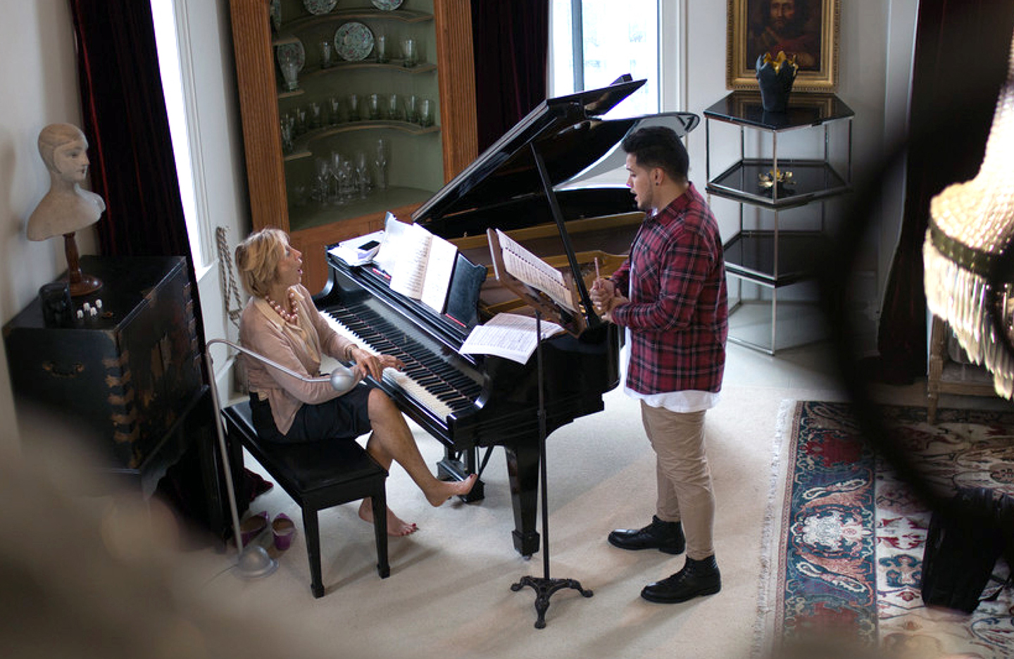
Emerging opera singers in New Zealand need support, guidance and mentorship to thrive. AOS seeks out the most talented young performers and helps to nurture their talent in preparation for an international career.
Equally important is audience development. Through attracting a wider audience to their regular performances, AOS aims to develop a new generation of opera fans. Eventually, it is hoped that these young fans will become the next generation of patrons.
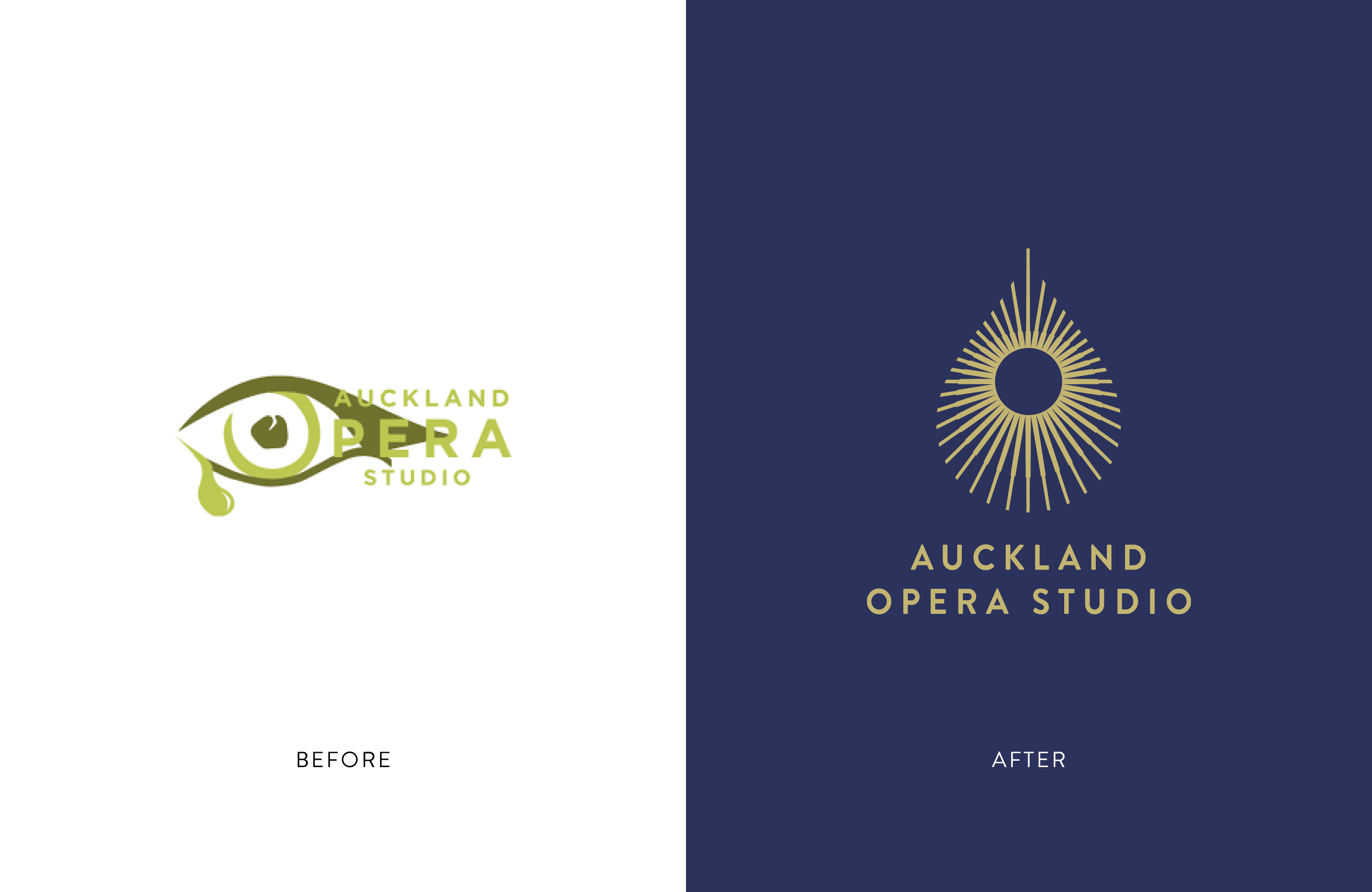
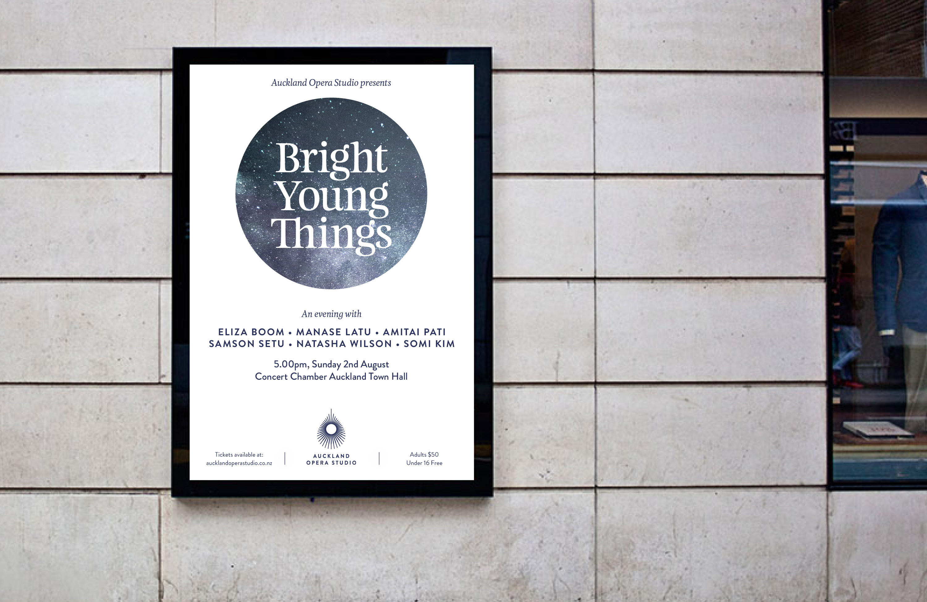
The existing brand was aimed squarely at the existing audience. To attract a younger generation of supporters, it needed to be updated and made relevant. The arts supporter marketplace is a crowded one, so an element of ‘cut-through’ was essential. Finally, the new brand identity needed to both evolve the current look and feel but maintain an aspect of the crying eye symbol.
The Design Response
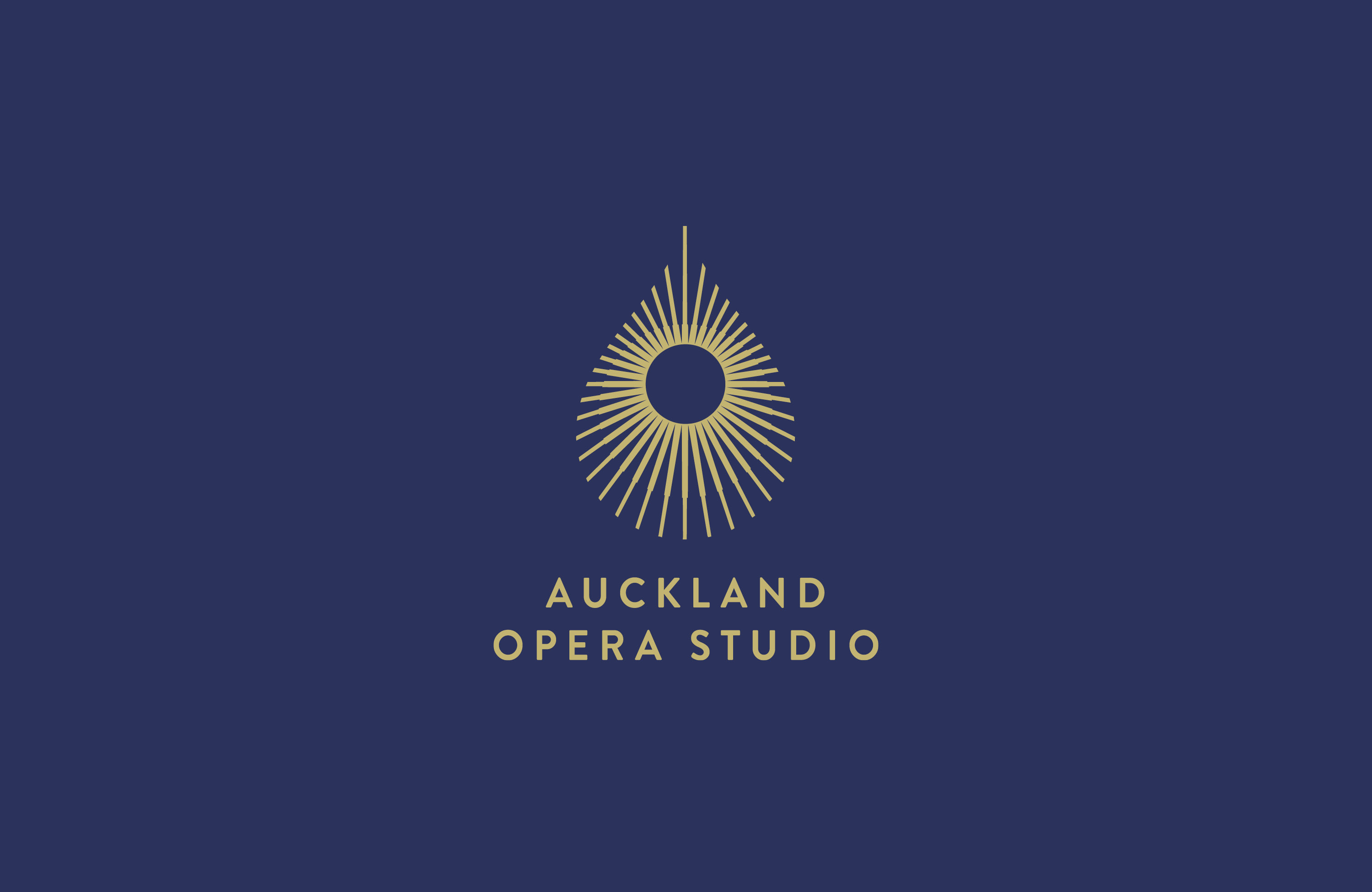
Opera is an art form that expresses the full range of human emotions from the greatest joy to deepest despair.
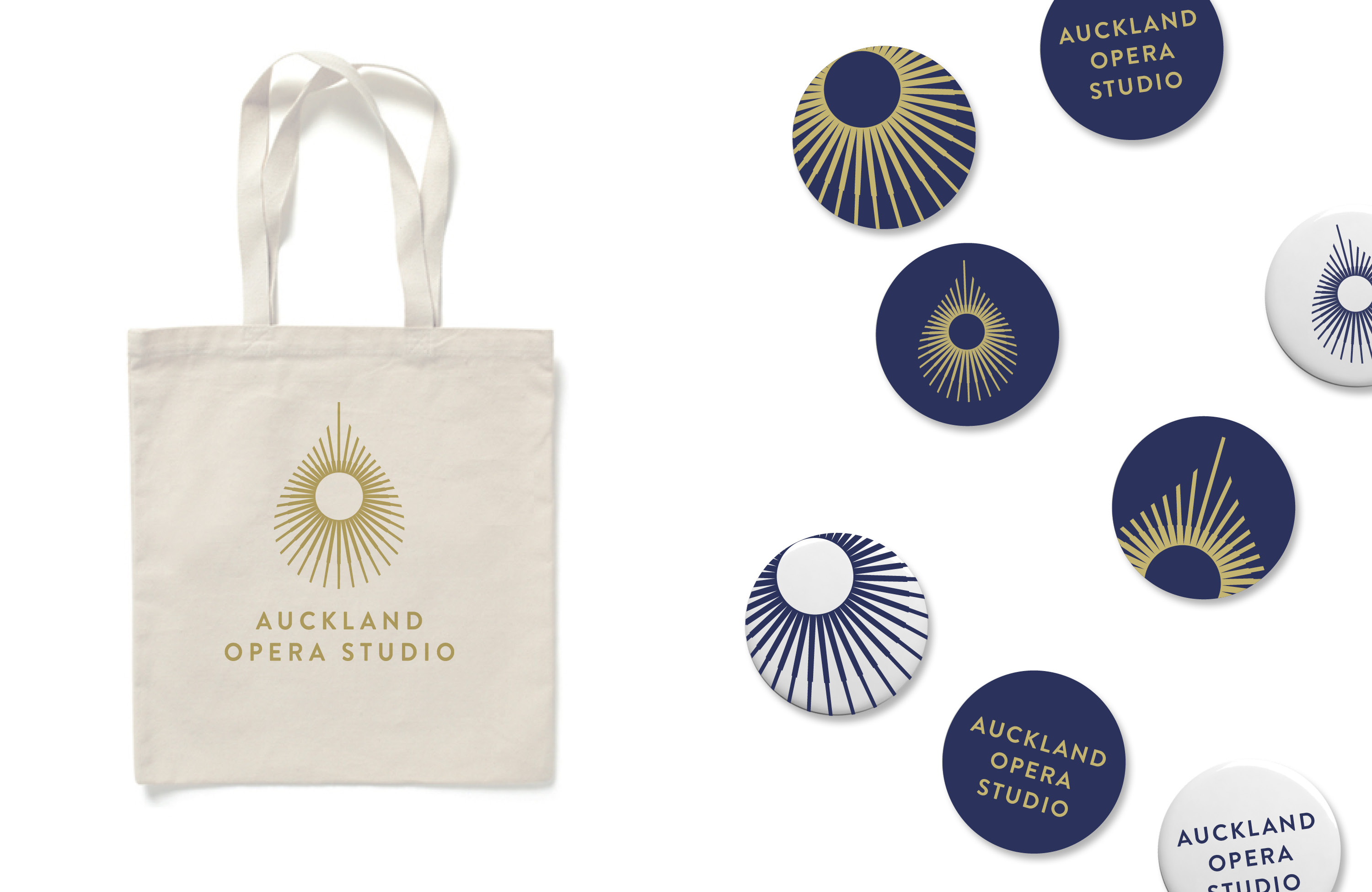
The previous AOS brand marque consisted of a crying eye symbol. As the ‘window to the soul’, eyes are a key conveyor of human emotions. Pupils dilate and contact when scared or enamoured. Tears form in happiness and in grief. The eyes tell every truth of our human condition.
The new AOS brand identity needed to maintain a reference to the original identity but in a more contemporary and sophisticated way.
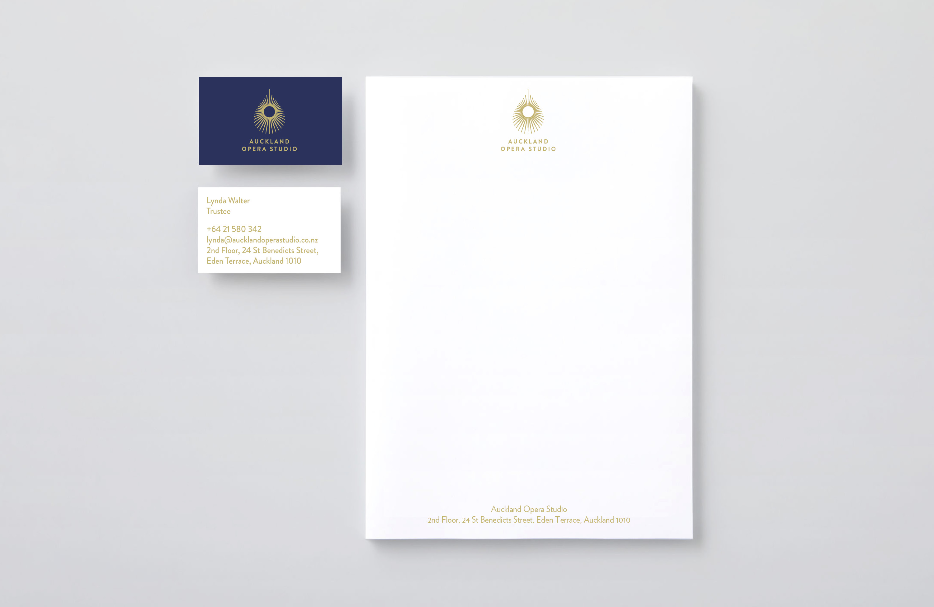
Taking this inspiration on board, a stylised teardrop shaped ‘iris’ formed out of a radiating halo of lines was created. This new intricate and elegant marque served as a modern reinterpretation of what had gone before. The ‘halo’ also represents the nurturing and protective learning environment that is an integral aspect of the studio.
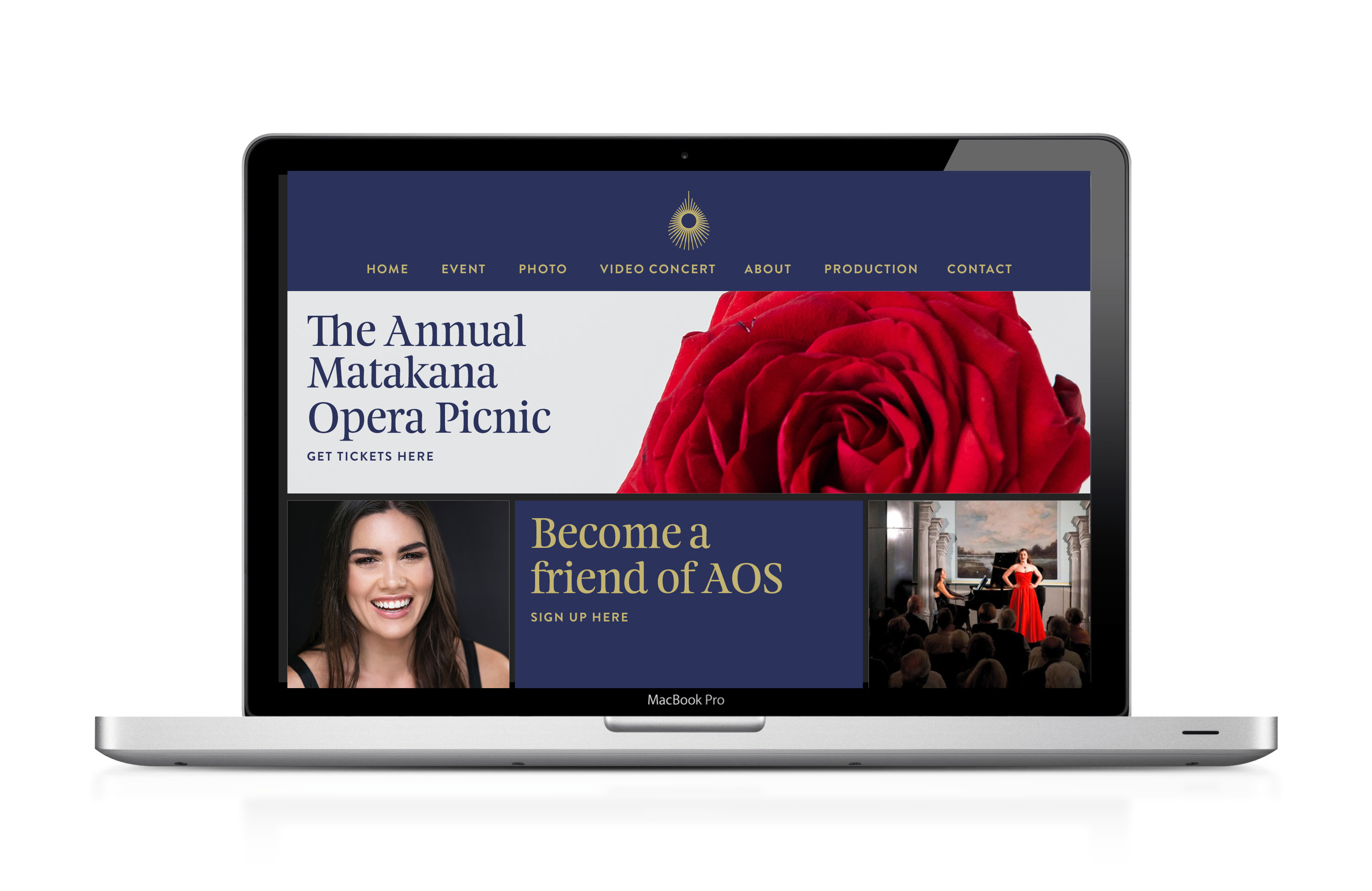
As well as a new brand marque, an updated brand kit was created including a new colour palette of deep blue and gold, a more sophisticated use of typography, event staging and promotional materials.
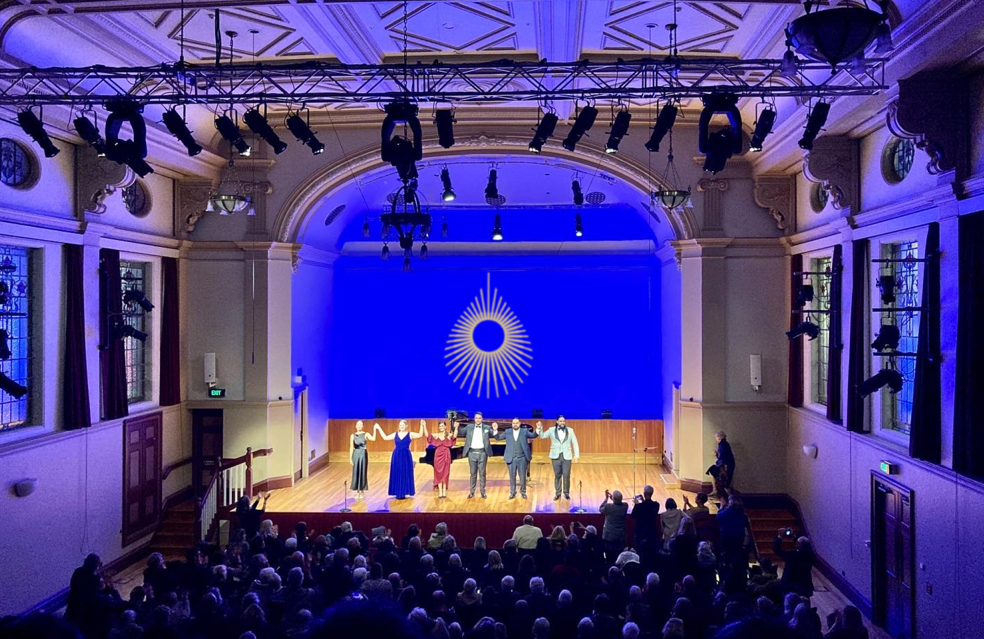
The new brand identity is also more fitting of the beautifully designed studio space, an old Masonic Hall in St Benedict St Auckland and it more effectively communicates the calibre of talent that makes AOS so unique.
The new identity has been very well received by the existing supporters as well as by the younger audience who are just now discovering the allure of this 400 year old art form.
CREDIT
- Agency/Creative: Emily Picot Design
- Article Title: Emily Picot Design Rebrands the Auckland Opera Studio
- Organisation/Entity: Freelance, Published Commercial Design
- Project Type: Identity
- Project Status: Published
- Agency/Creative Country: New Zealand
- Market Region: Oceania
- Project Deliverables: Brand Creation, Brand Guidelines, Brand Identity, Brand Redesign, Brand Refinement, Brand Rejuvenation, Brand Strategy, Branding, Graphic Design, Rebranding
- Keywords: Opera, Opera rebrand, New Zealand graphic design, Opera NZ, Auckland Opera


