


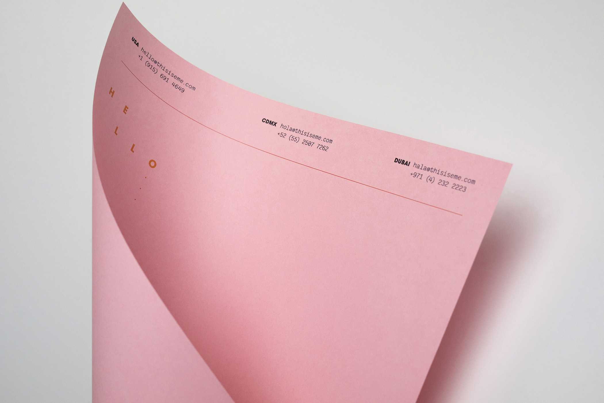
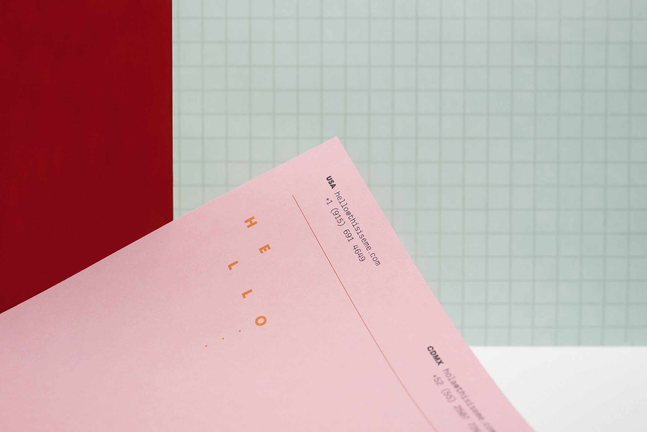
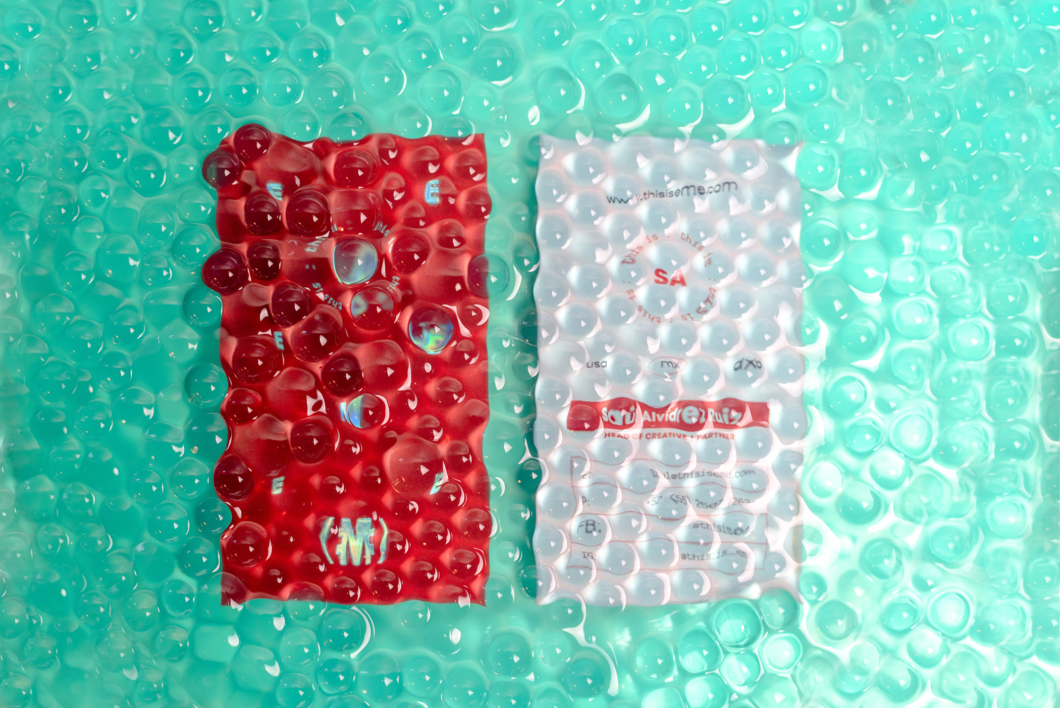
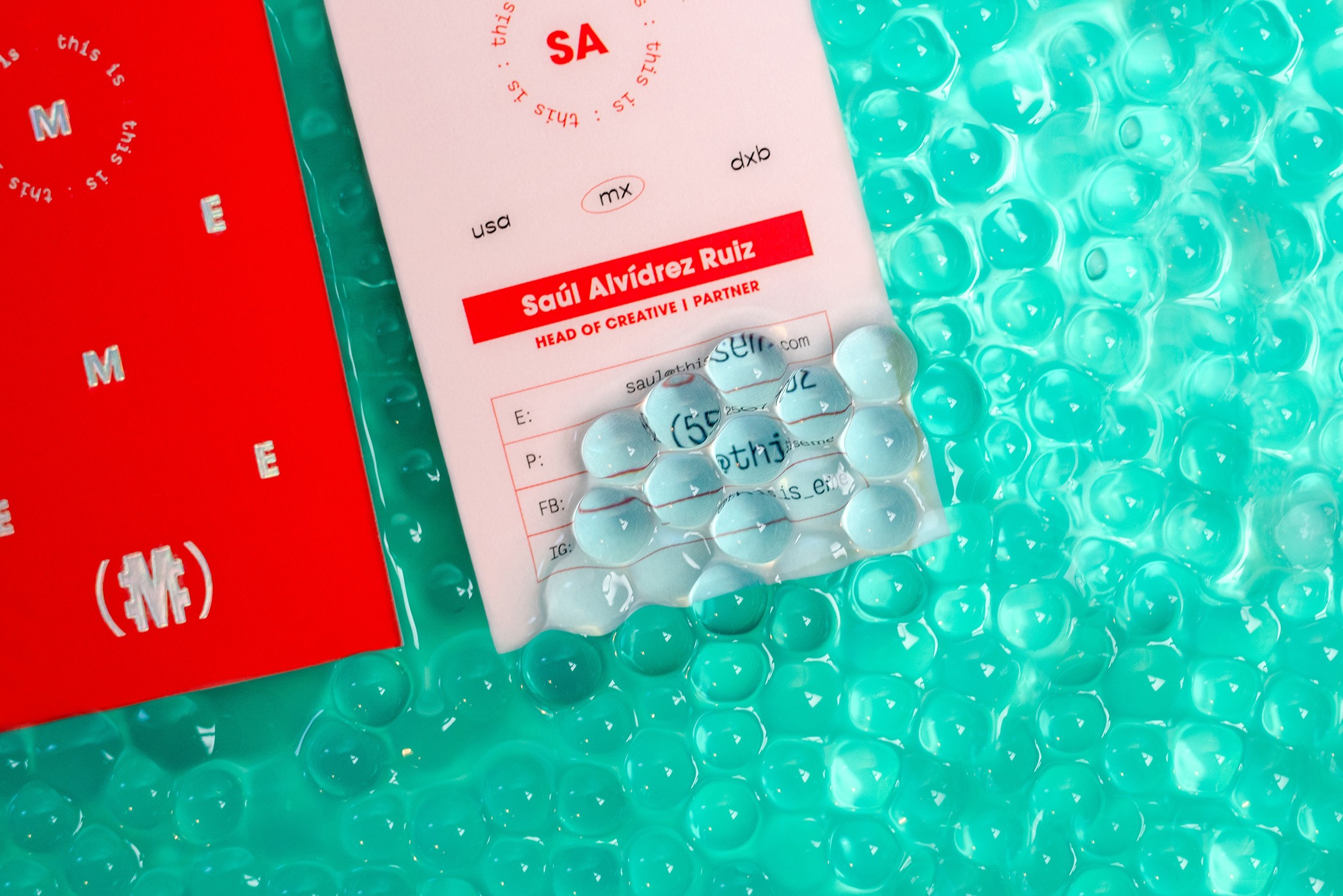
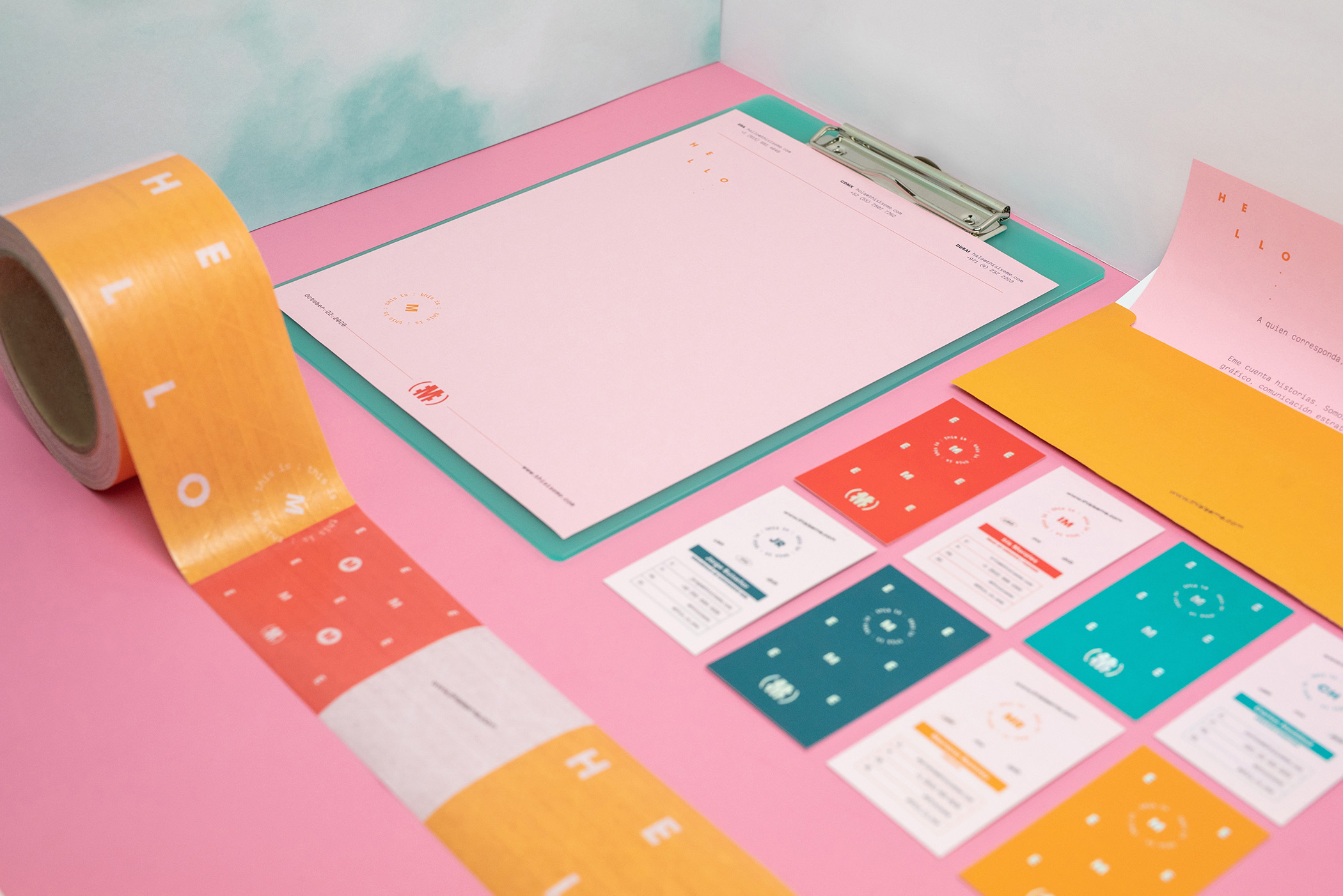
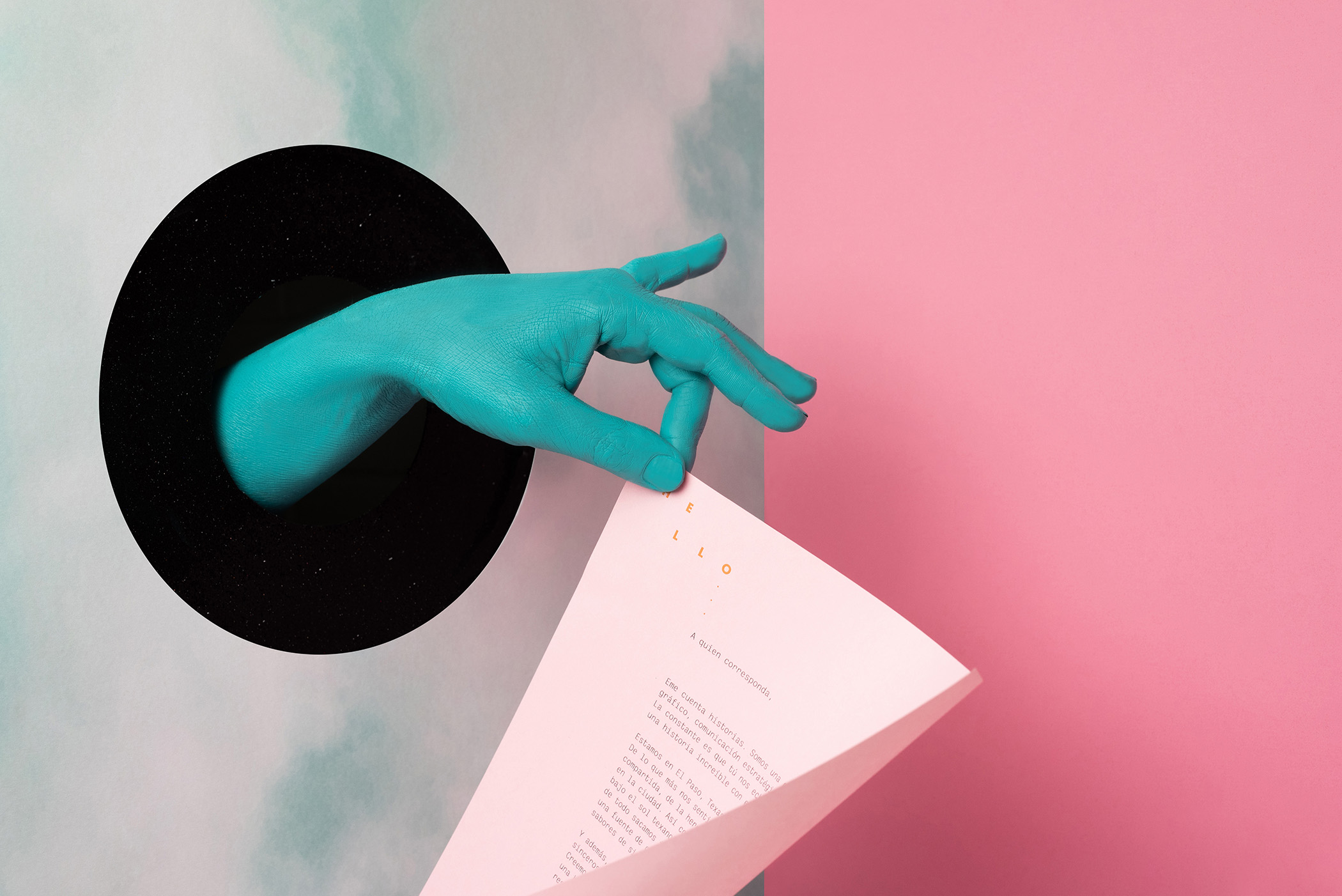
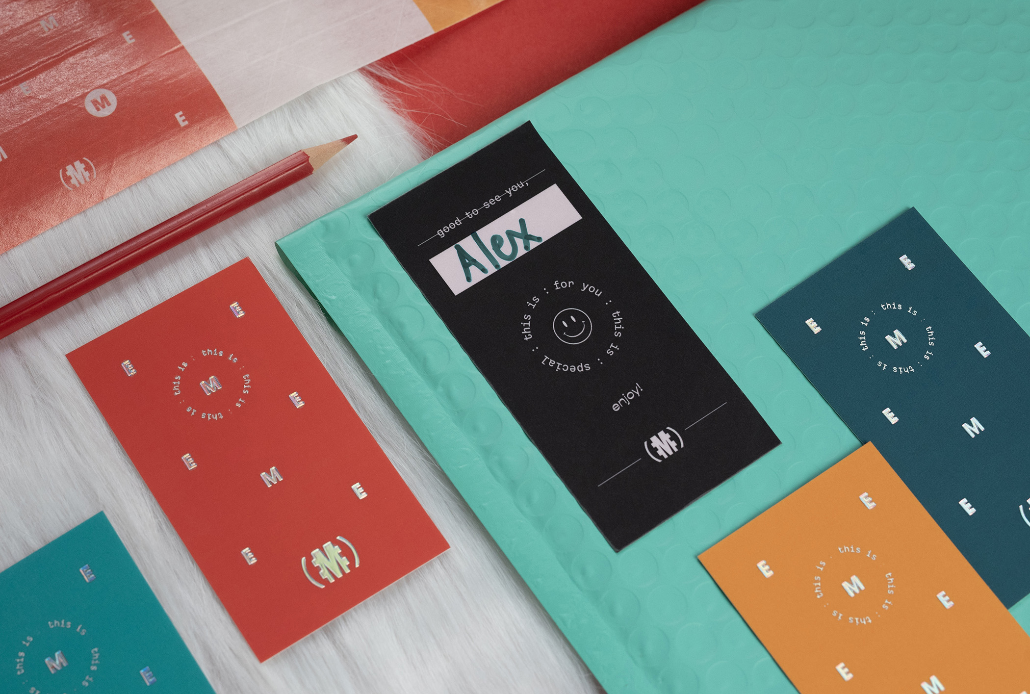
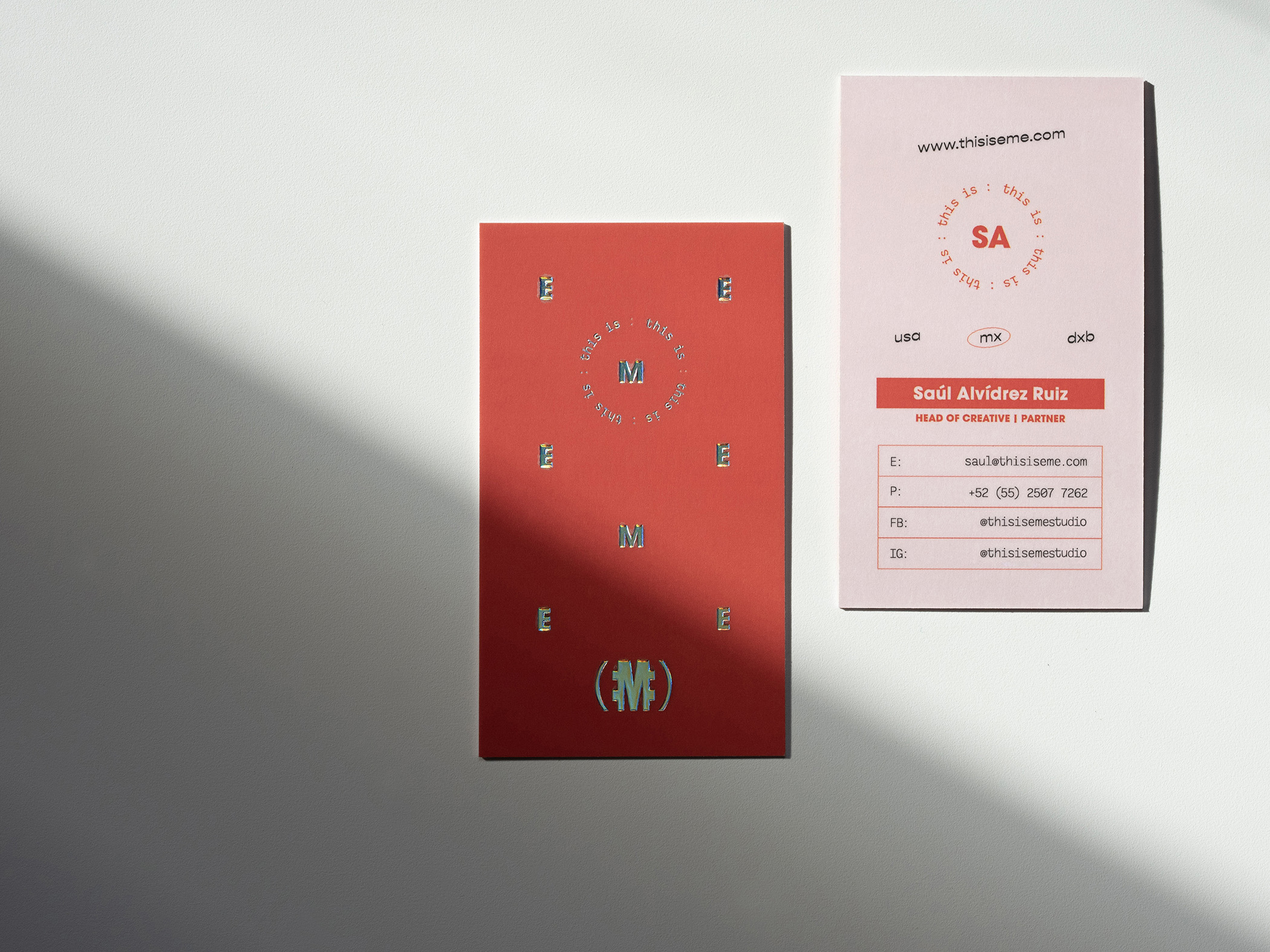
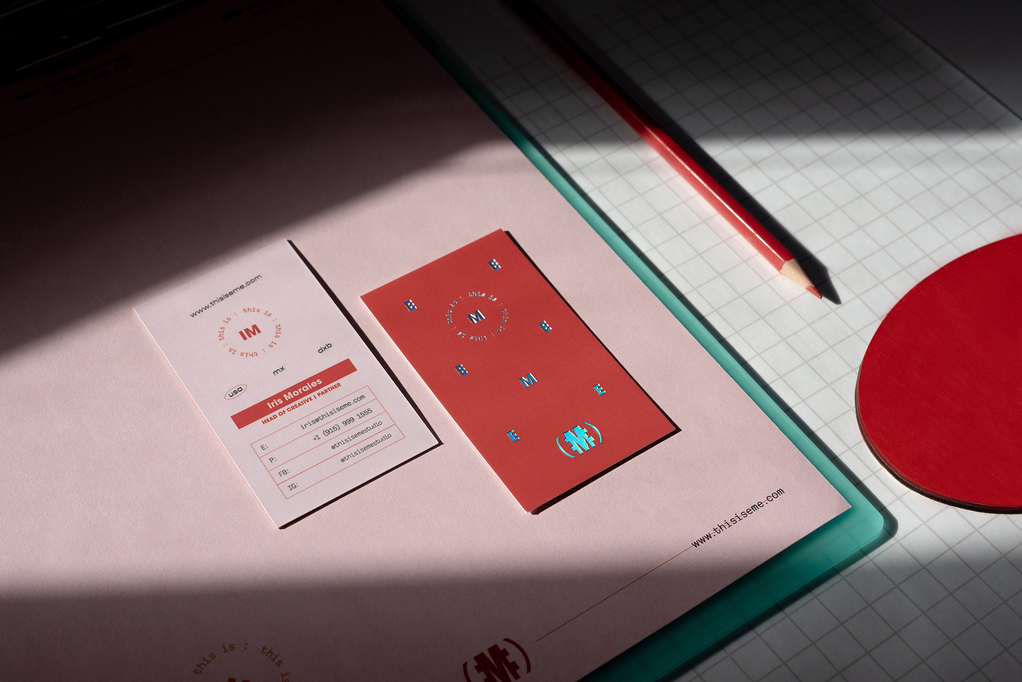
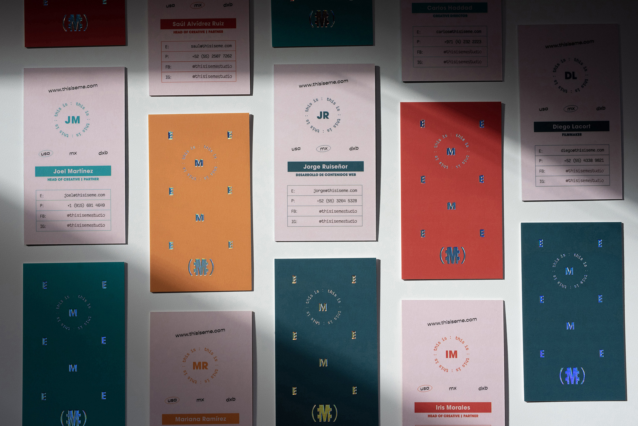
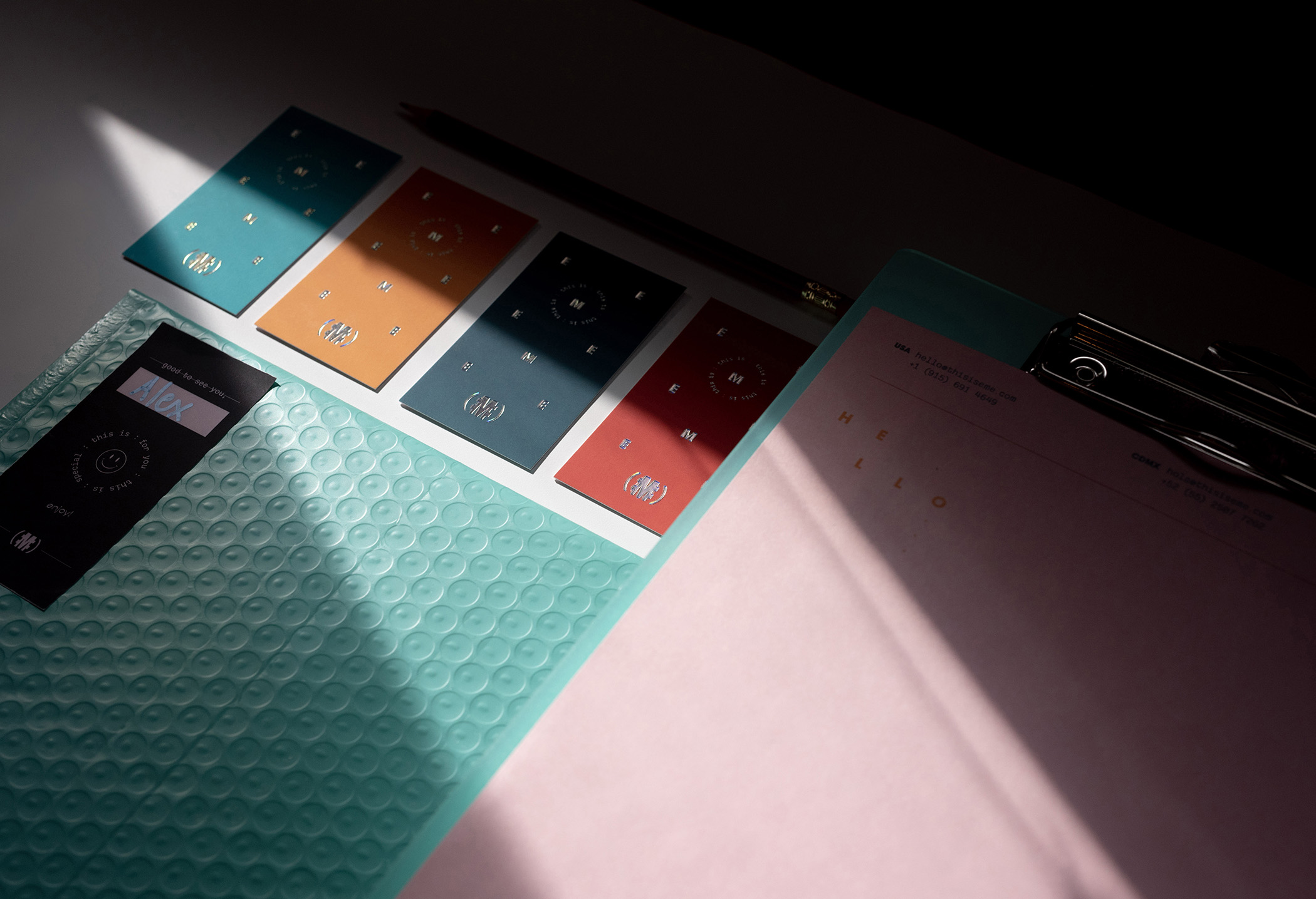
We have been around for almost 10 years. During this pandemic some doors closed and we had to take a step out of our comfort zone. We felt the need to take the risk and open new windows to see beyond the horizon. Fortunately, the puzzle pieces were all there waiting for all of us to put them together. We all decided it was the perfect time to create stronger bonds, and expand. We are expanding the love and the passion that we have for what we do. Now, we have more services to offer, not only in the US, but also in Mexico City and Dubai. In this new era of EME, we came up with a rebrand, to give it a fresh start. Bright, playful, simple but exciting colors that represent all of us and our different backgrounds. We are the same EME, but with a bigger heart.
CREDIT
- Agency/Creative: This is EME
- Article Title: Eme Revamps It Self for Their 10th Year Anniversary
- Organisation/Entity: Agency, Published Self Promotional Design
- Project Type: Identity
- Agency/Creative Country: United States
- Market Region: Global
- Project Deliverables: Brand Identity, Brand Redesign, Brand Rejuvenation, Brand Strategy, Brand World, Branding, Identity System, Photography, Rebranding, Tone of Voice
- Industry: Public Utility
- Keywords: Branding, business cards, letter head, video, envelope, tape, mailing packaging, stationery


