


Elmwood London, the strategic design consultancy, has crafted the new brand identity for Amstel®. The design builds on Amstel’s position as the world’s local beer and strikes the balance of clarifying the brand’s iconic global assets while allowing flexibility to fit the needs of its 115 local markets.
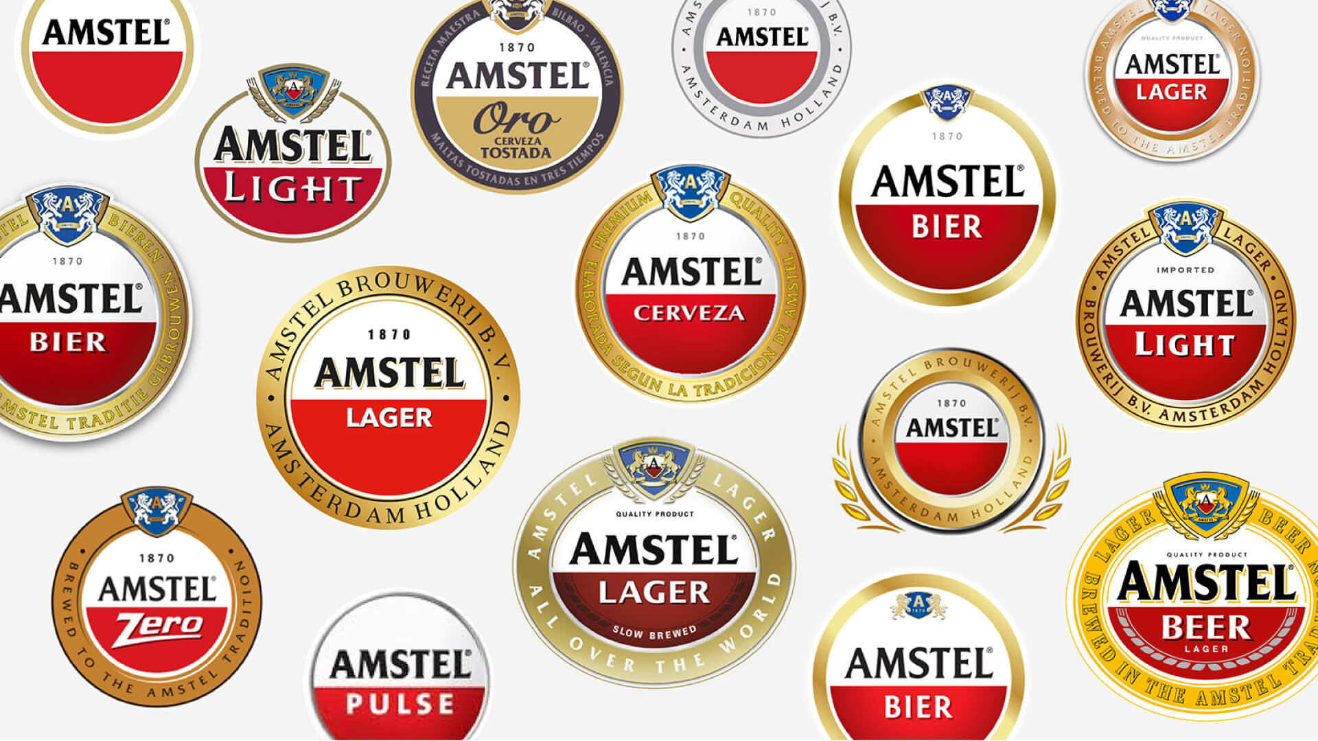
Amsterdam-founded Amstel has been one of the world’s most recognised names in beer for almost 150 years. Its 115 markets required different expressions of the brand to align with local needs. The result was a lack of global coherence in visual identity that devalued Amstel’s brand iconicity. The challenge became how to create globally iconic assets that could carry through all of Amstel’s expressions while remaining flexible enough to meet the needs of local marketers.
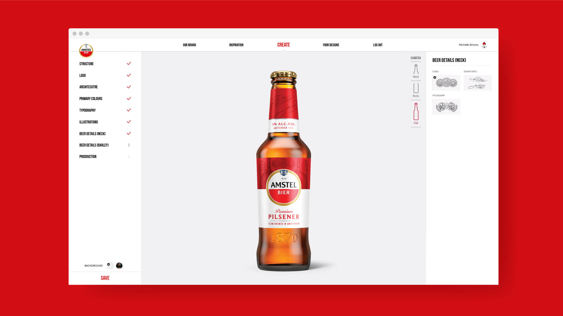
Amstel brought on Elmwood London to design around this challenge. The consultancy worked with the Amstel team to create the “I am Iconic” platform: a global strategic framework with multiple iconic assets available for local markets to choose from in creating their own expressions of the Amstel identity.
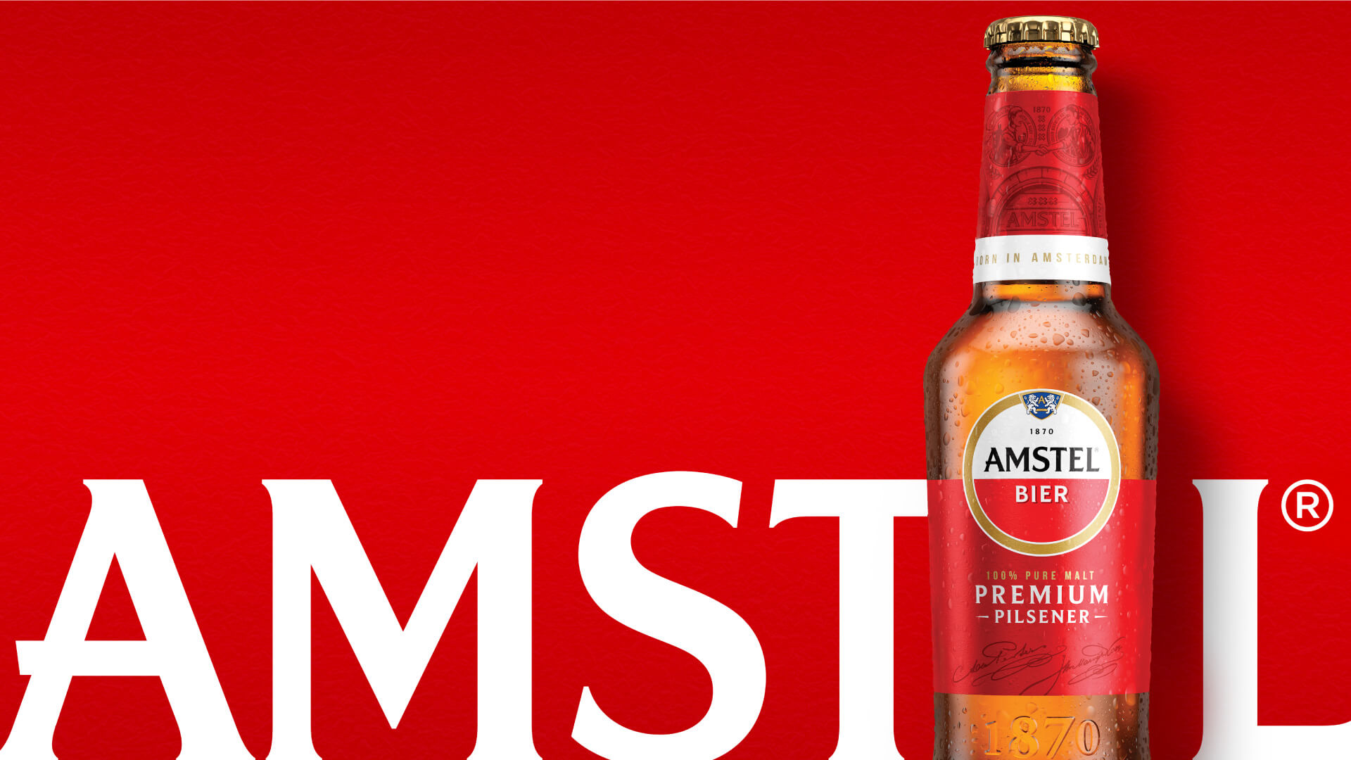
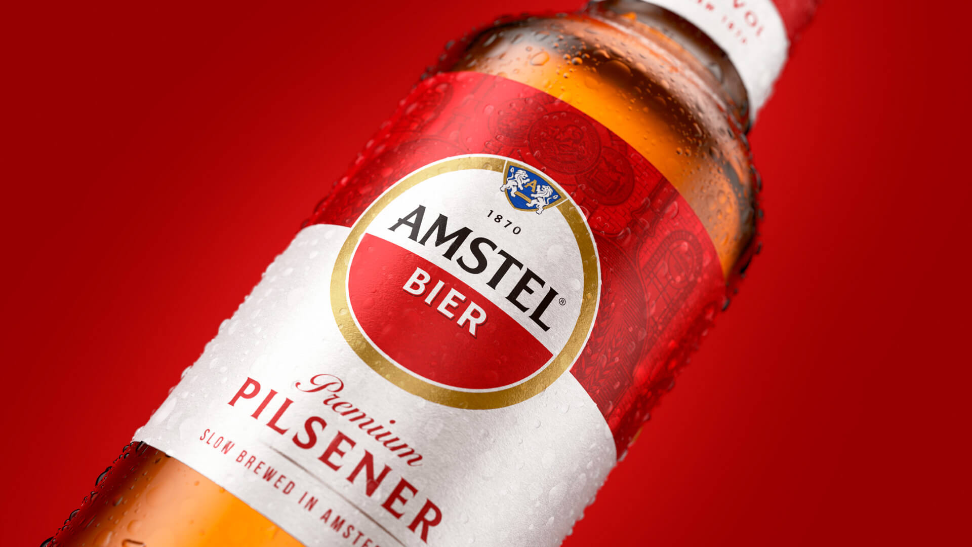
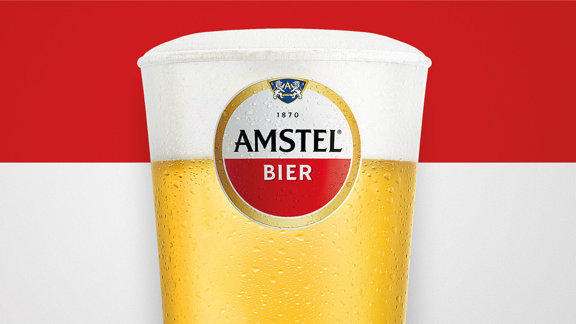
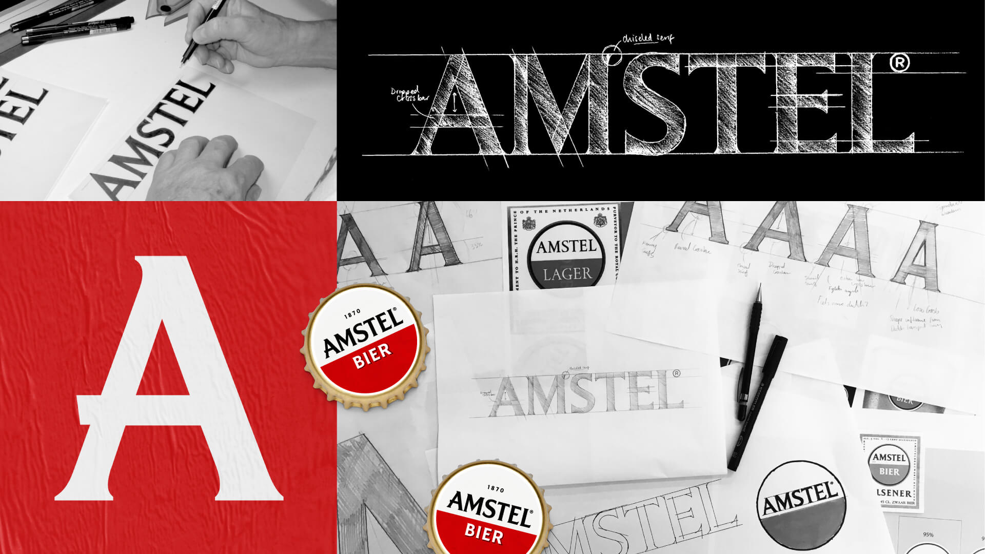
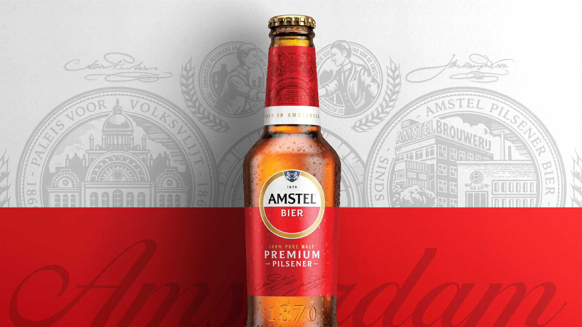
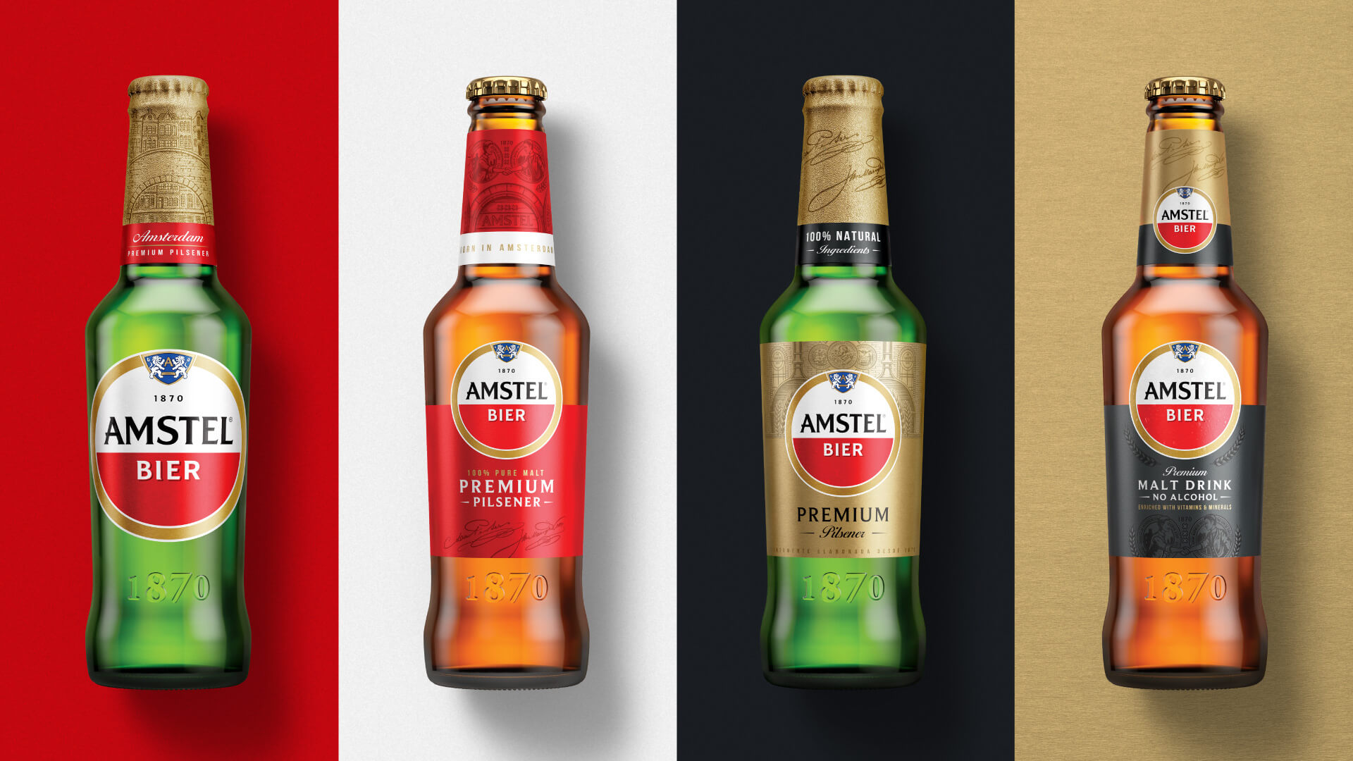
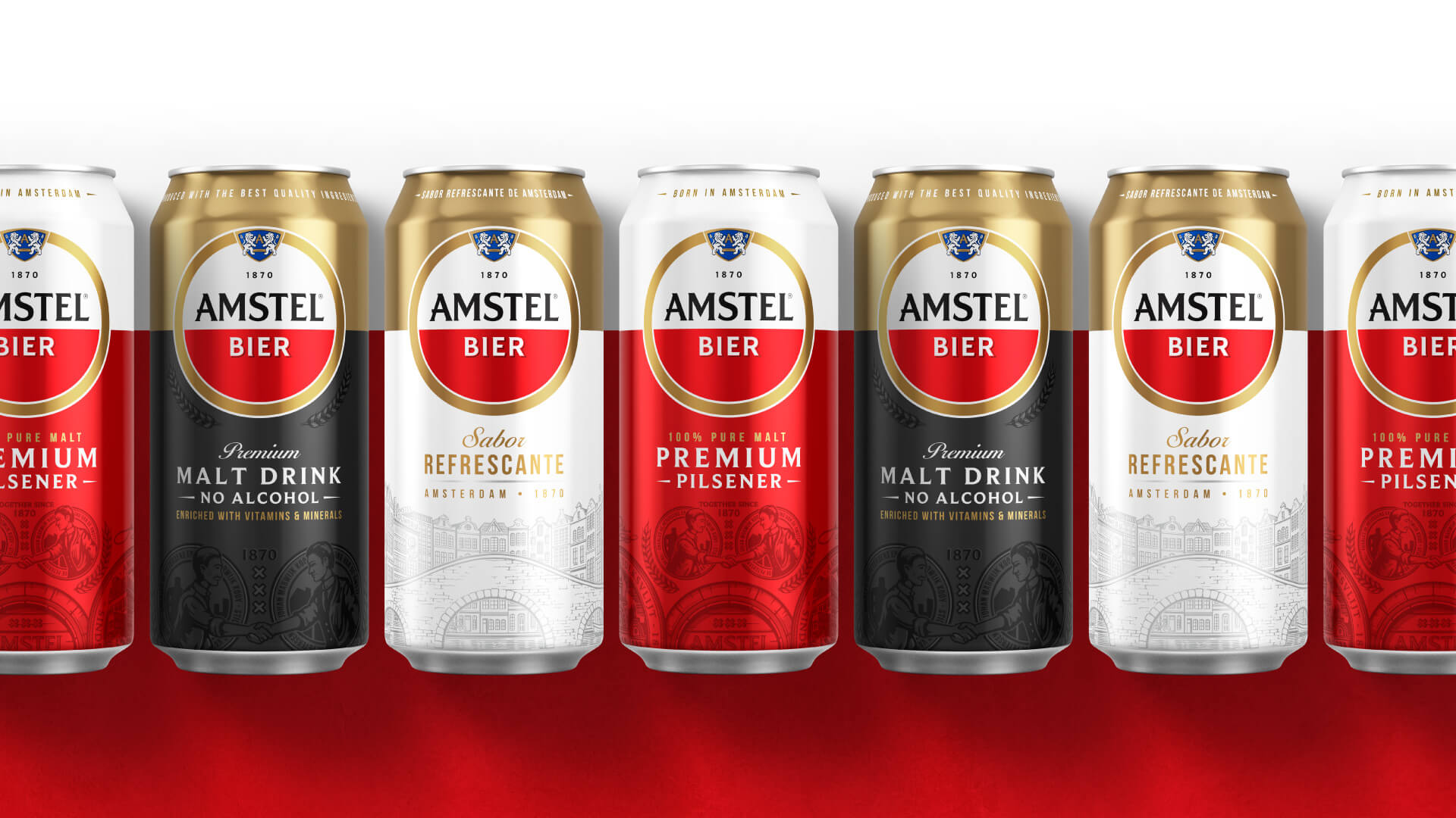
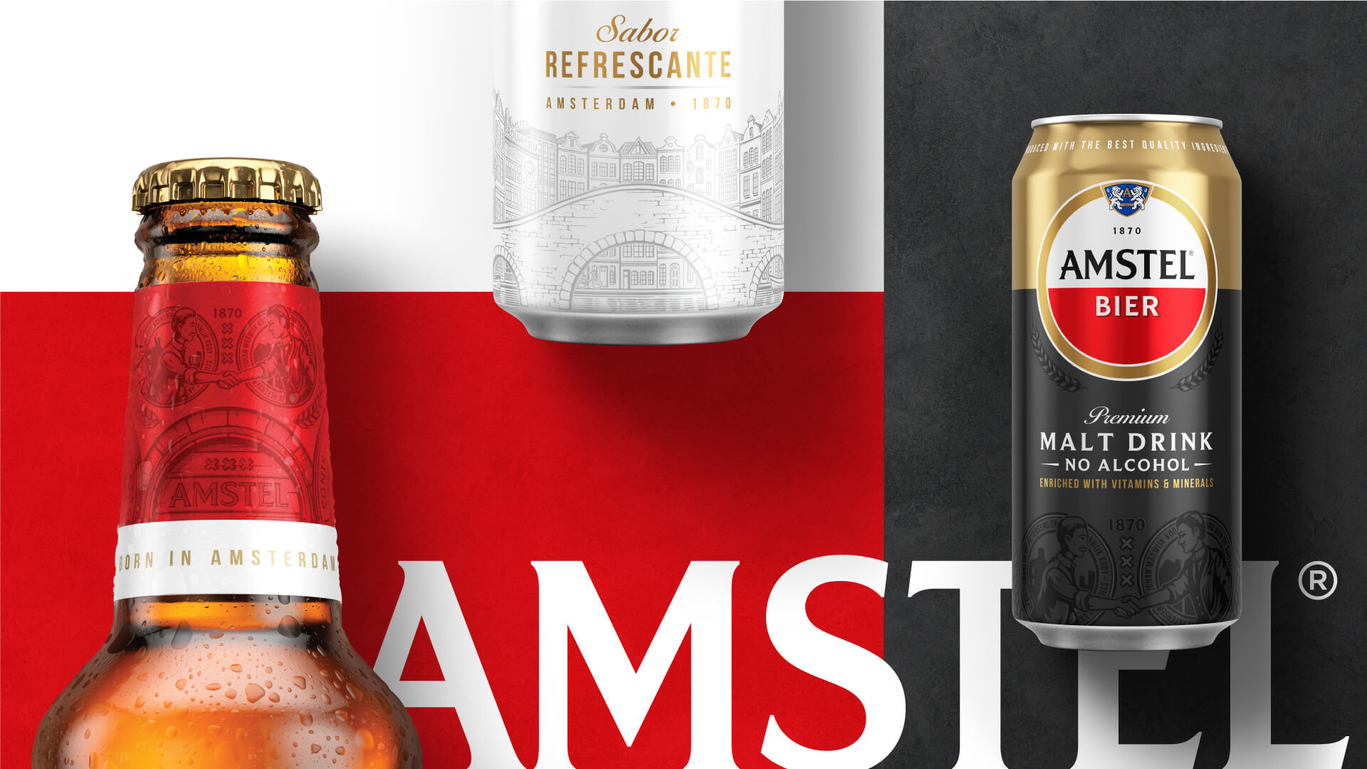
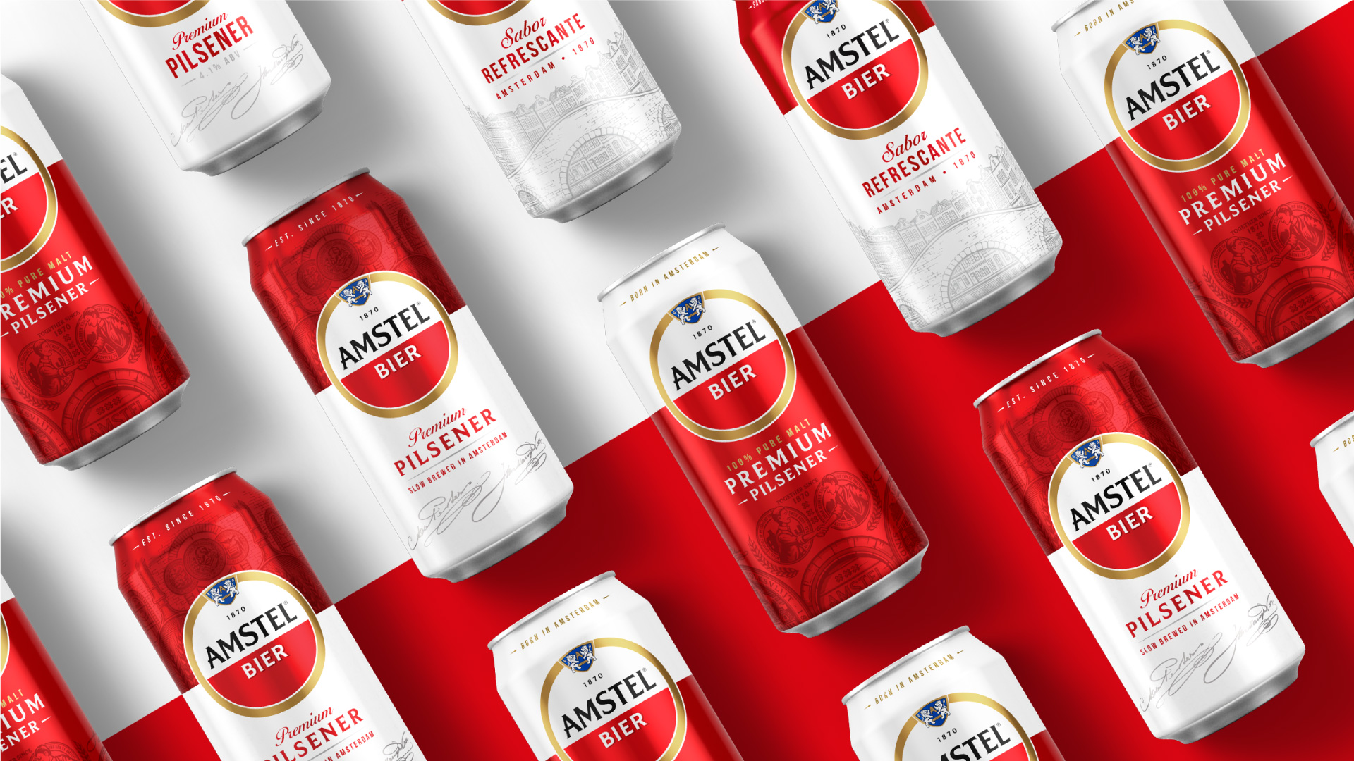
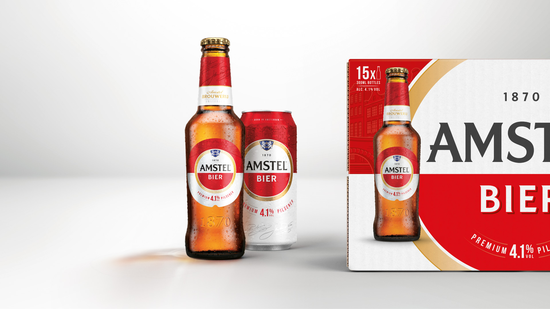
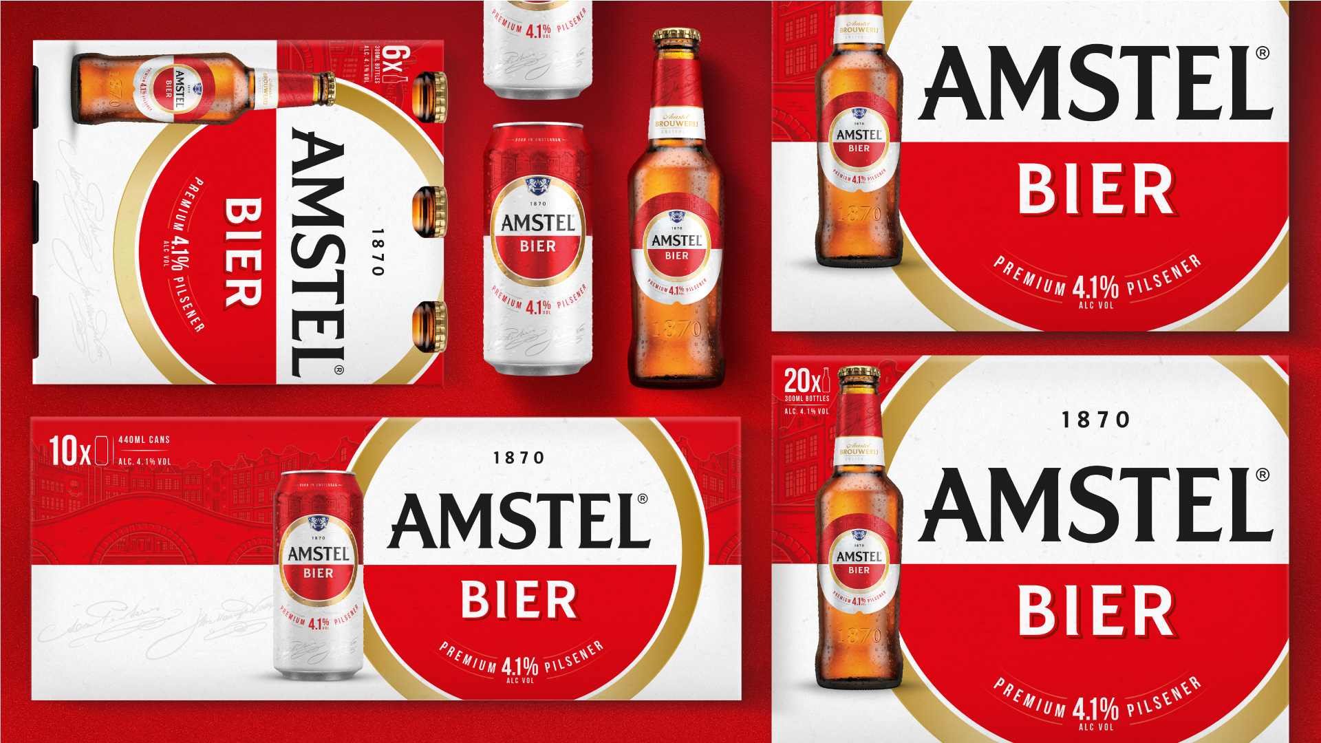
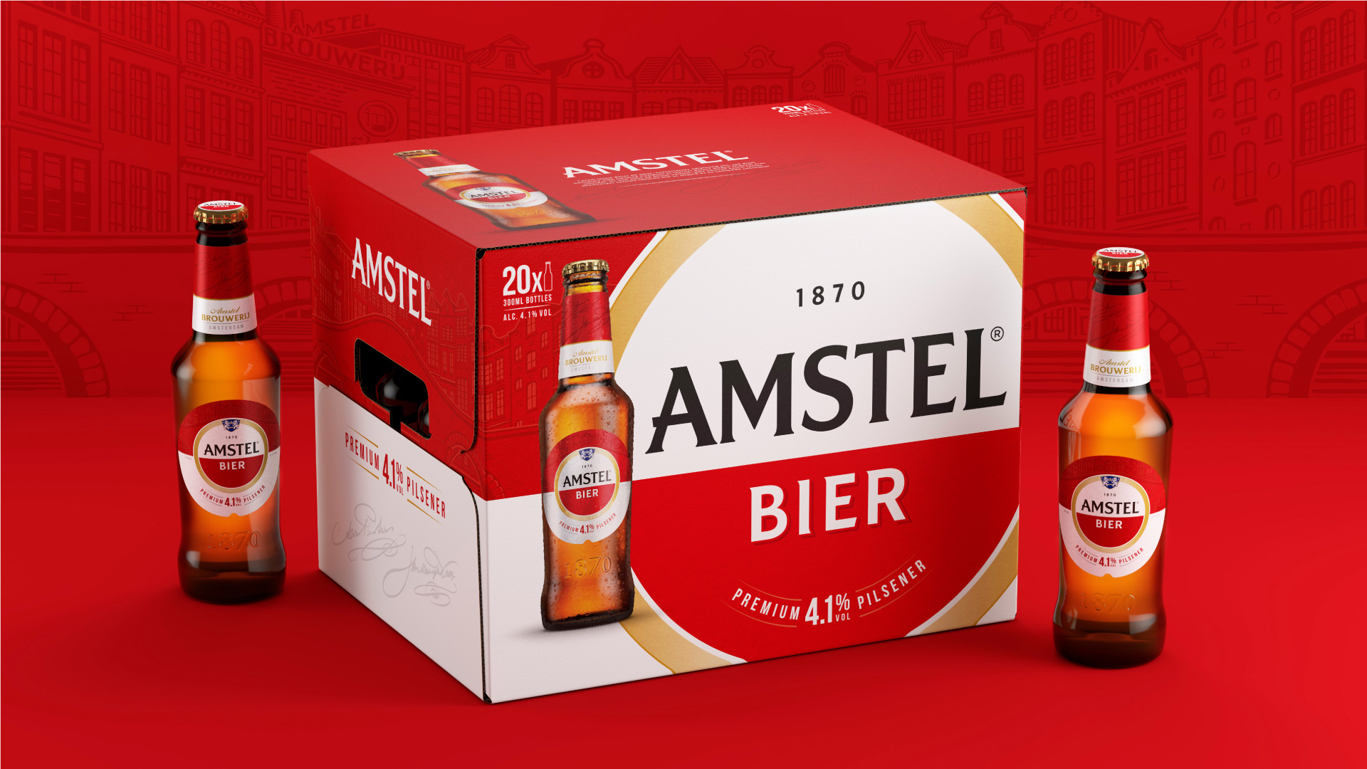
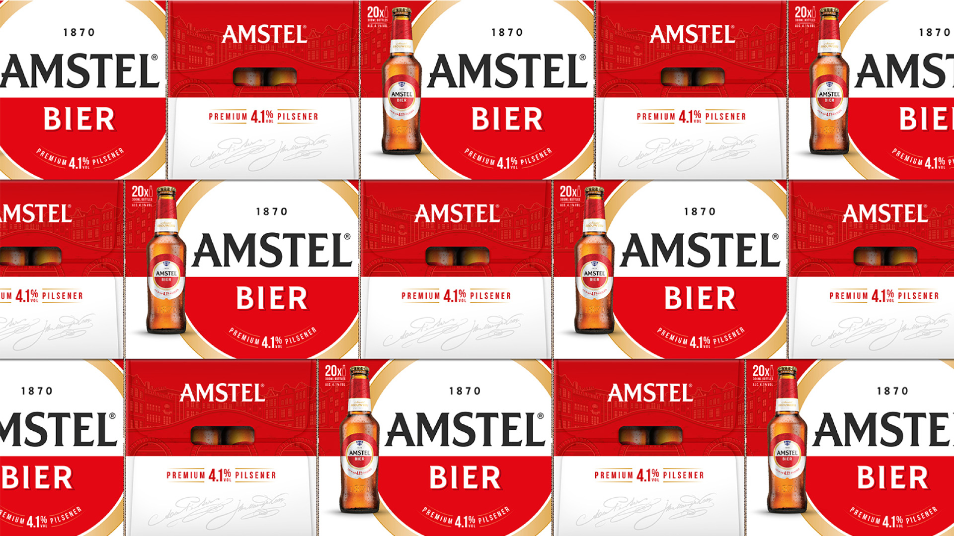
Elmwood London started by diving into Amstel’s story-rich archives to get to the heart of what had historically made the brand distinct. The consultancy focused on Amstel’s iconic logo that features a circle with a red-and-white split and dialed up the shape and color iconicity both on and off pack. Elmwood London then created two master logo options for markets to choose from and use across their local communications.
Greg Taylor, Global Provocation Officer at Elmwood London, said: “We wanted to create a visual identity system that local marketing teams could own and design. Having identified the evergreen assets of the Amstel roundel and its red-and-white split, our job was then to ensure we created a brand world that was forever iconically always new, embracing the beautiful tension between being global and local.”
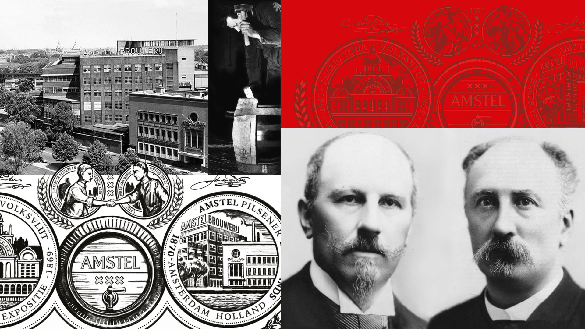
With the new iconic logos in place, Elmwood London then built on Amstel’s position as the world’s local beer by bringing to life three credential stories: “Born from better beer,” “Born in Amsterdam” and “Born from friendship.” The consultancy crafted a series of illustrations that champion the brewing process, the Amstel River with its iconic bridge, and the founders’ signatures to symbolise these respective stories. The result is a new visual identity system that empowers Amstel’s marketers to select their own stories based on their specific local needs.
Mark van Iterson, Global Director of Design, Activation & Sustainability at Heineken International, owner of Amstel, said: “In their work for the Amstel brand, Elmwood proved that they are not only good brand and packaging designers, but also have the capability to develop and co-manage a living, strategic brand-design system. That took next-level creativity, strategy, flexibility and perseverance.”
Amstel’s new brand identity began rolling out globally in April of this year.
CREDIT
- Agency/Creative: Elmwood London
- Article Title: Elmwood London Crafts New Brand Identity for Amstel®
- Organisation/Entity: Agency, Published Commercial Design
- Project Type: Packaging
- Agency/Creative Country: United Kingdom
- Market Region: Global
- Project Deliverables: Brand Architecture, Brand Guidelines, Brand Identity, Brand Redesign, Brand Refinement, Brand Rejuvenation, Brand Strategy, Brand World, Branding, Graphic Design, Identity System, Illustration, Packaging Design, Rebranding, Research
- Keywords: Brand Identity, Rebrand, Visual Identity, Brand World, Beer


