


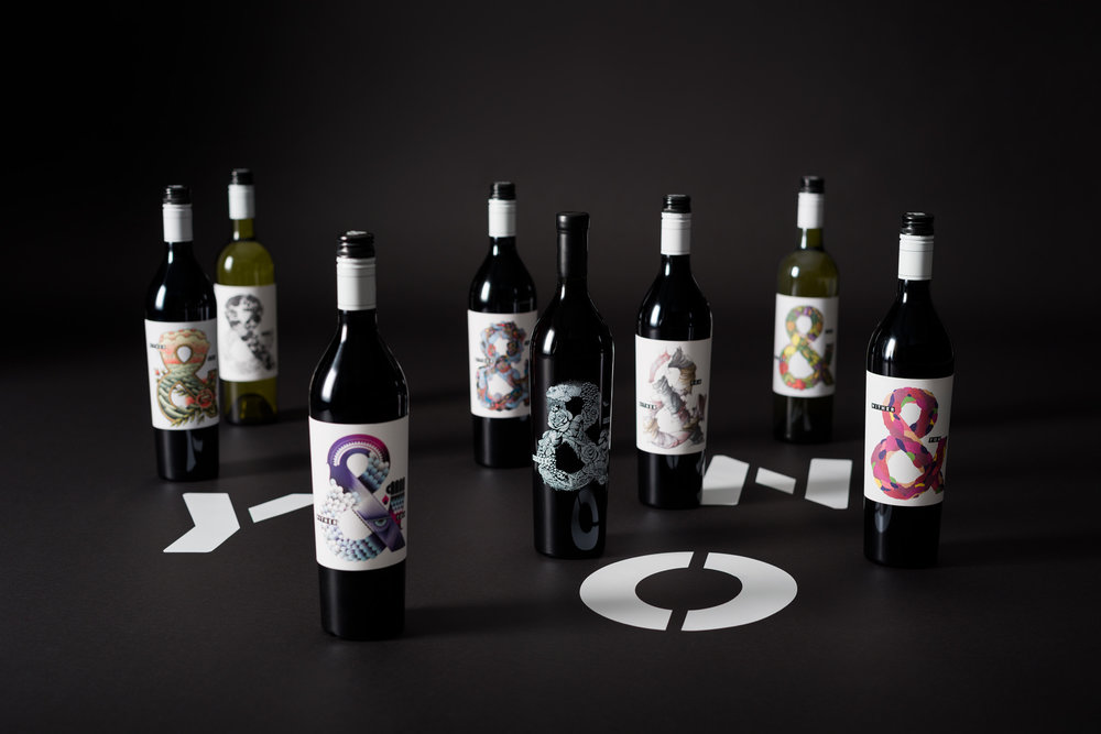
Voice – Hither & Yon
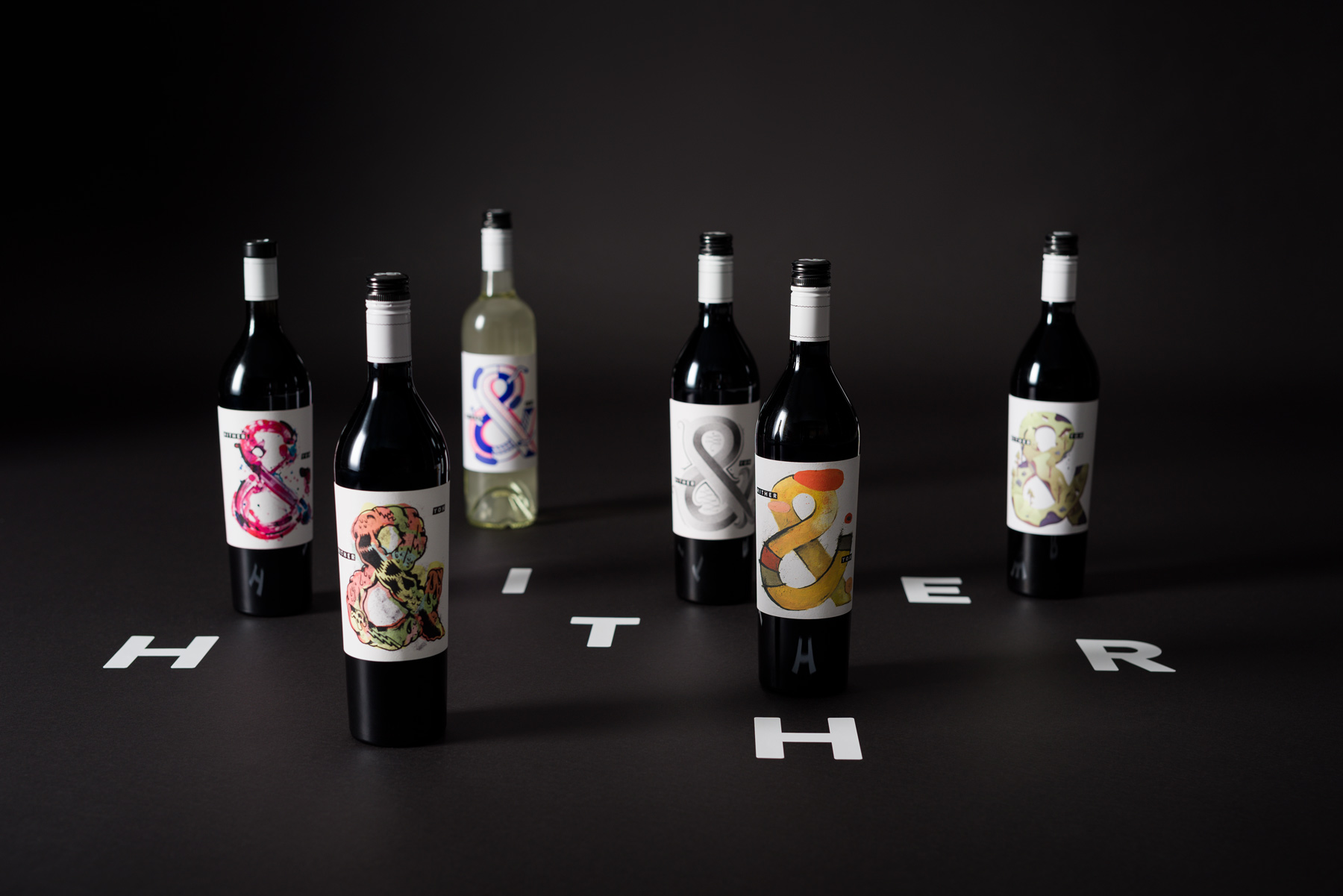
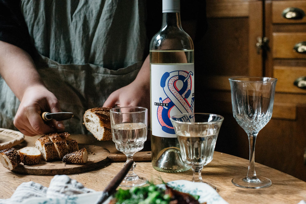
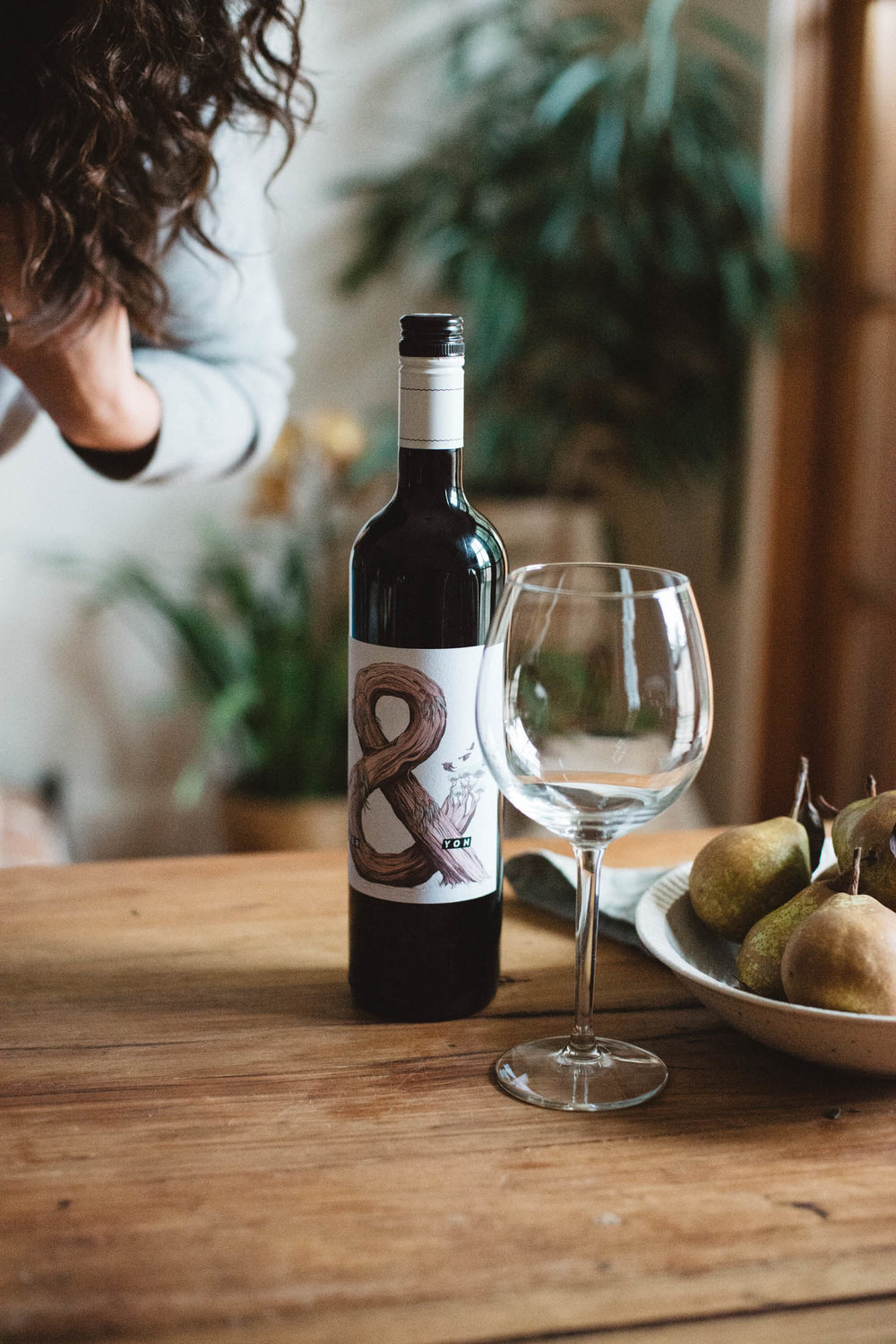
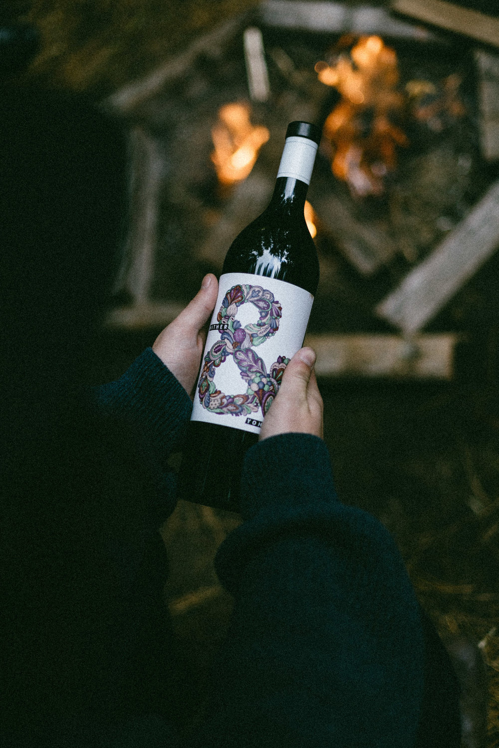
“Hither & Yon means here and there. The fruit for this wine is sourced by searching here and there throughout South Australia’s McLaren Vale wine region; hence the name. It represents that story and led to the use of the symbolic ampersand for the brand and packaging.
A unique ampersand is created to represent the tasting notes of each variety and vintage, expressing colour, nose and palette. As the wine is unique, a single ampersand only exists to express that vintage—it’s never repeated. Type is dynamic to continue the notion of searching here and there.”
CREDIT
FEEDBACK
Relevance: Solution/idea in relation to brand, product or service
Implementation: Attention, detailing and finishing of final solution
Presentation: Text, visualisation and quality of the presentation


