


Established in 2016, HR4C Vietnam is a human resource consulting firm, specialized in sustainable HR practice and talent management. They help clients effectively plan, organize and manage their staff for maximum efficiency and results. They provide clients with superior strategic, creative, and practical expertise.
In 2019, HR4C approached me and Sprint Vietnam to change their brand system to a clear, and memorable style that allows them to stand out in the market, but still kept the logo and colors system. The identity was required to be as simple as possible, with a strong story behind it.
As the solid foundation of the company culture, HR4C Vietnam’s core values reflect what is significant to them as a company and as a group of individuals. By consistently striving to hold the core values, we endeavor to showcase what makes HR4C Vietnam a leading HR firm – a strong and deep commitment to each client who they serve daily and the communities within which we work and live. For the idea, we aimed at transferring this spirit and vision in human solutions to the brand system.
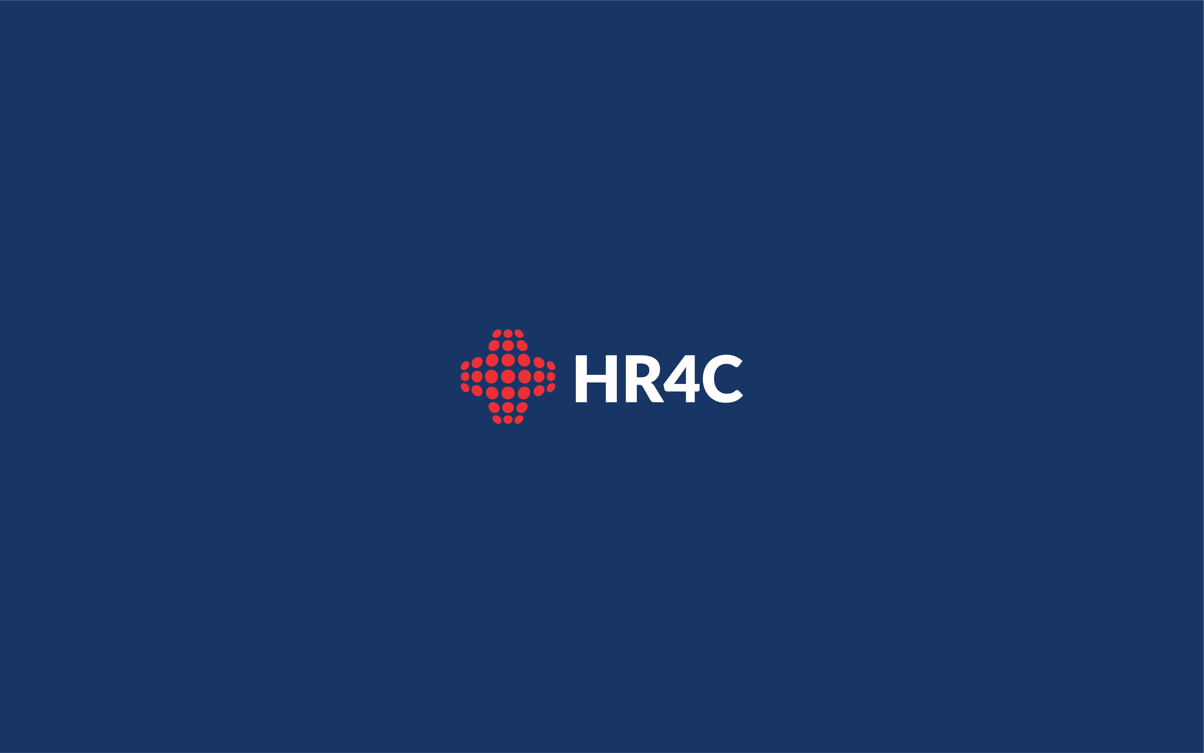
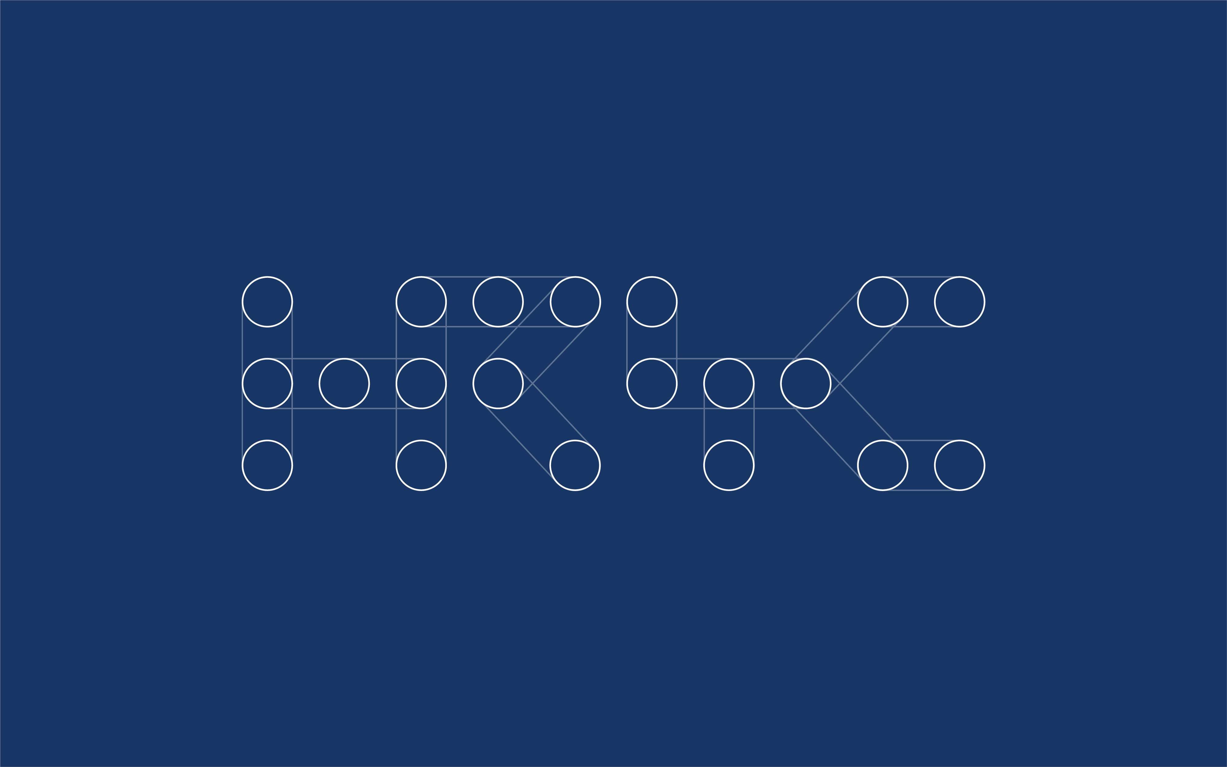
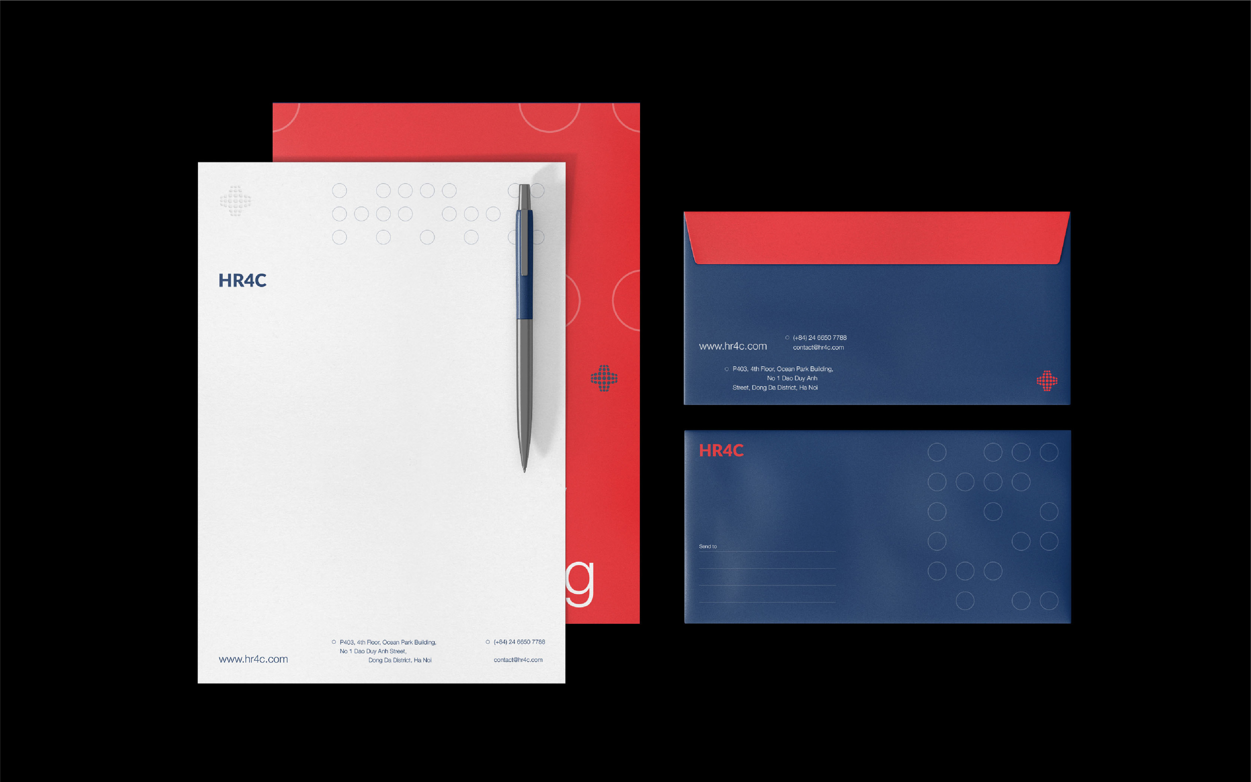
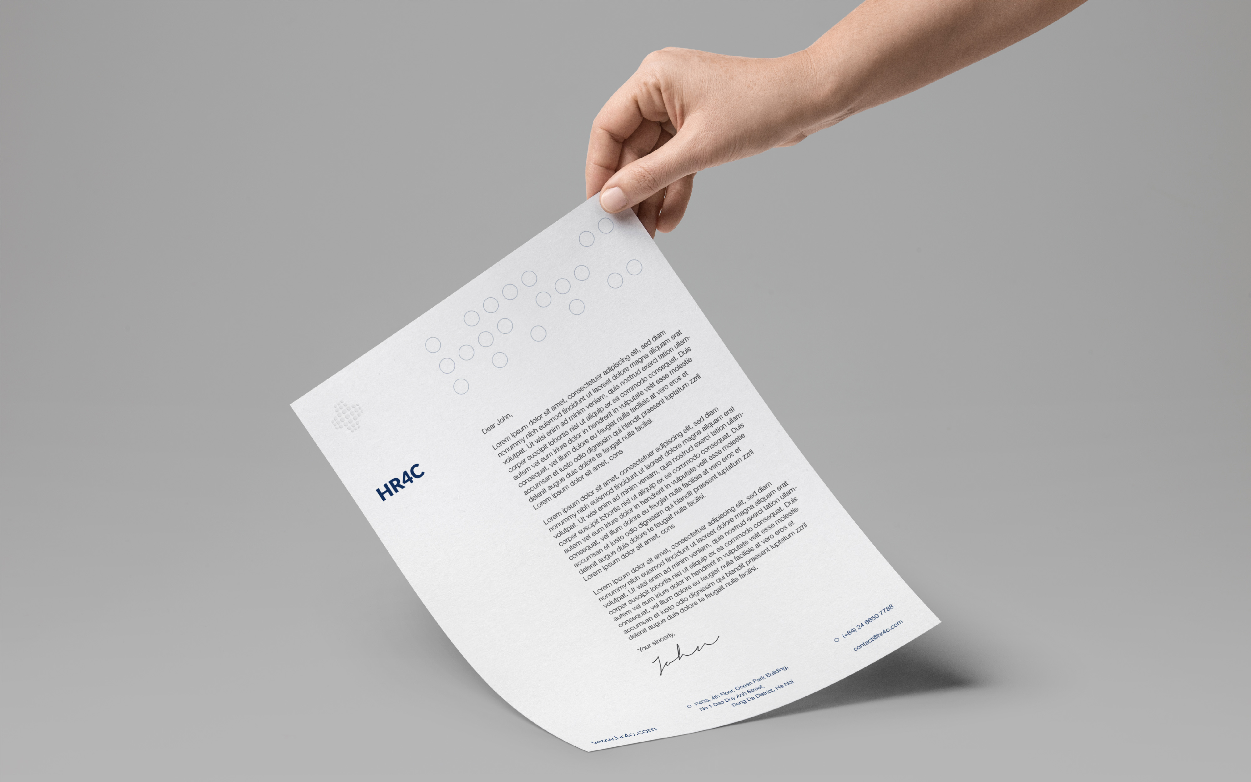
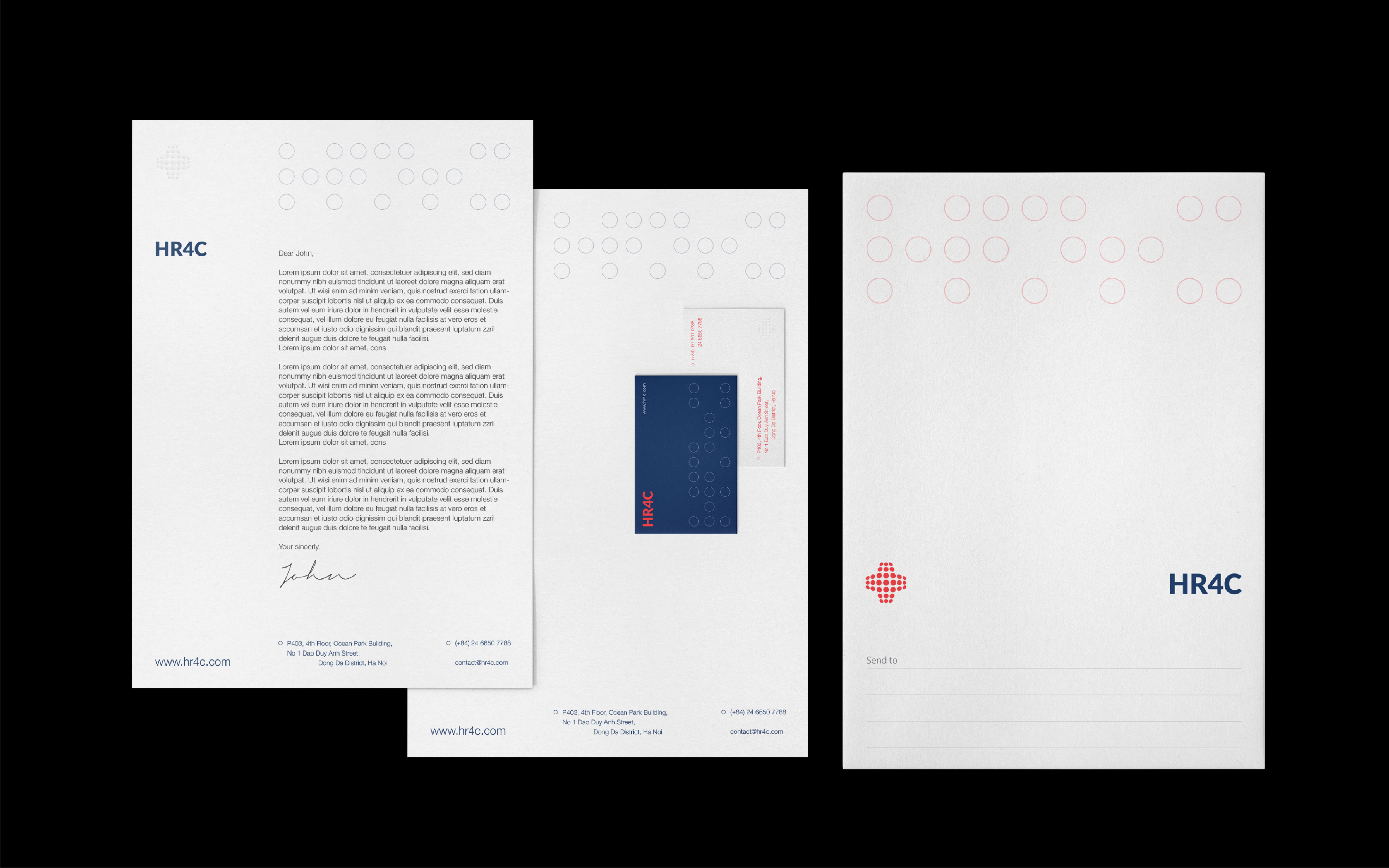
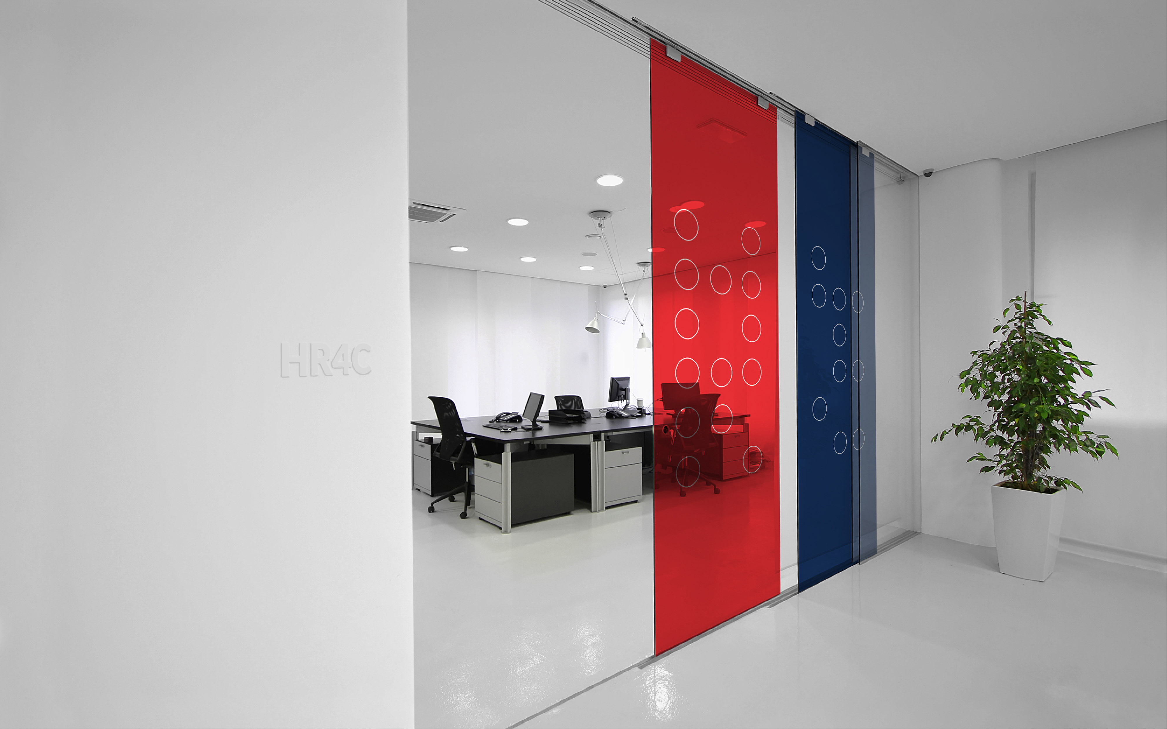
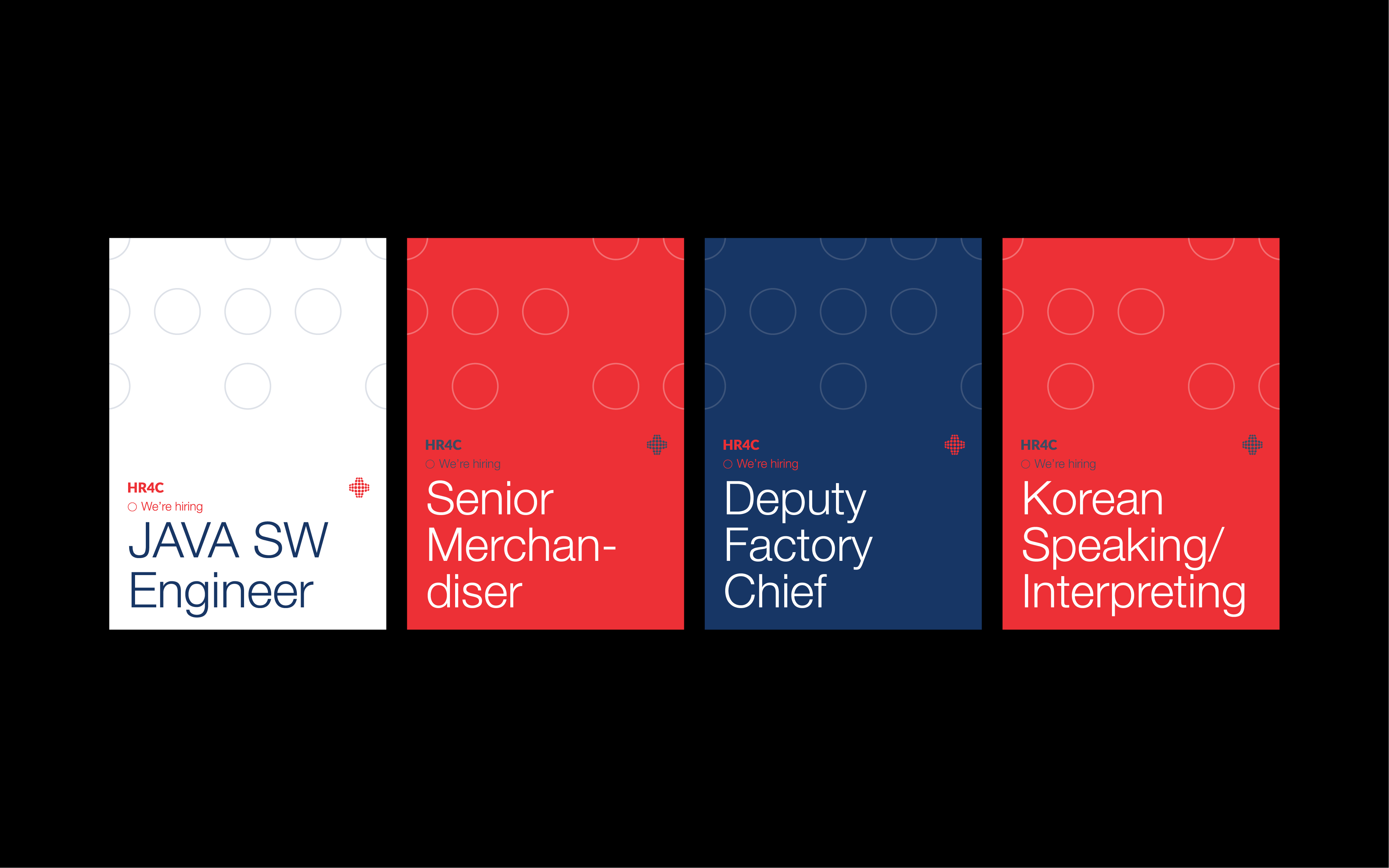
The current logo has the meaning of connecting people and people, formed by a wave of dots. After a long time of research and experiments, the key visual was considered to develop based on those dots. A round dot, or a circle, is a simple but strong graphic element that represents unity, confidence, and completion. Also, it can be the symbol of the human or community, which reflects HR4C’s mission in adding value to clients depending on the quality of the people. As a message, we use multiple outlined dots to create a typographic, ordered pattern based on the brand name itself: “HR4C”, and serve it as the key element.
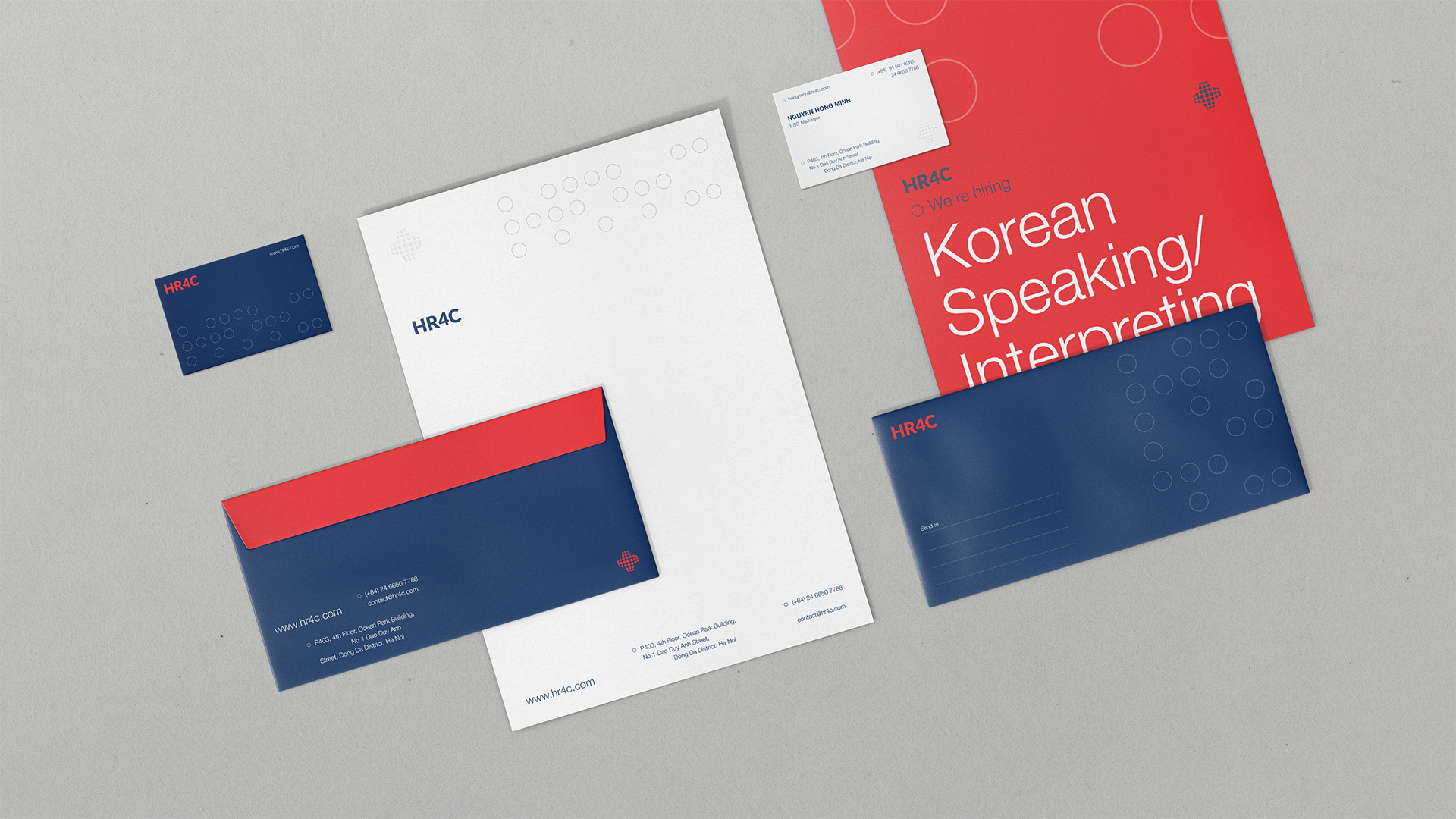
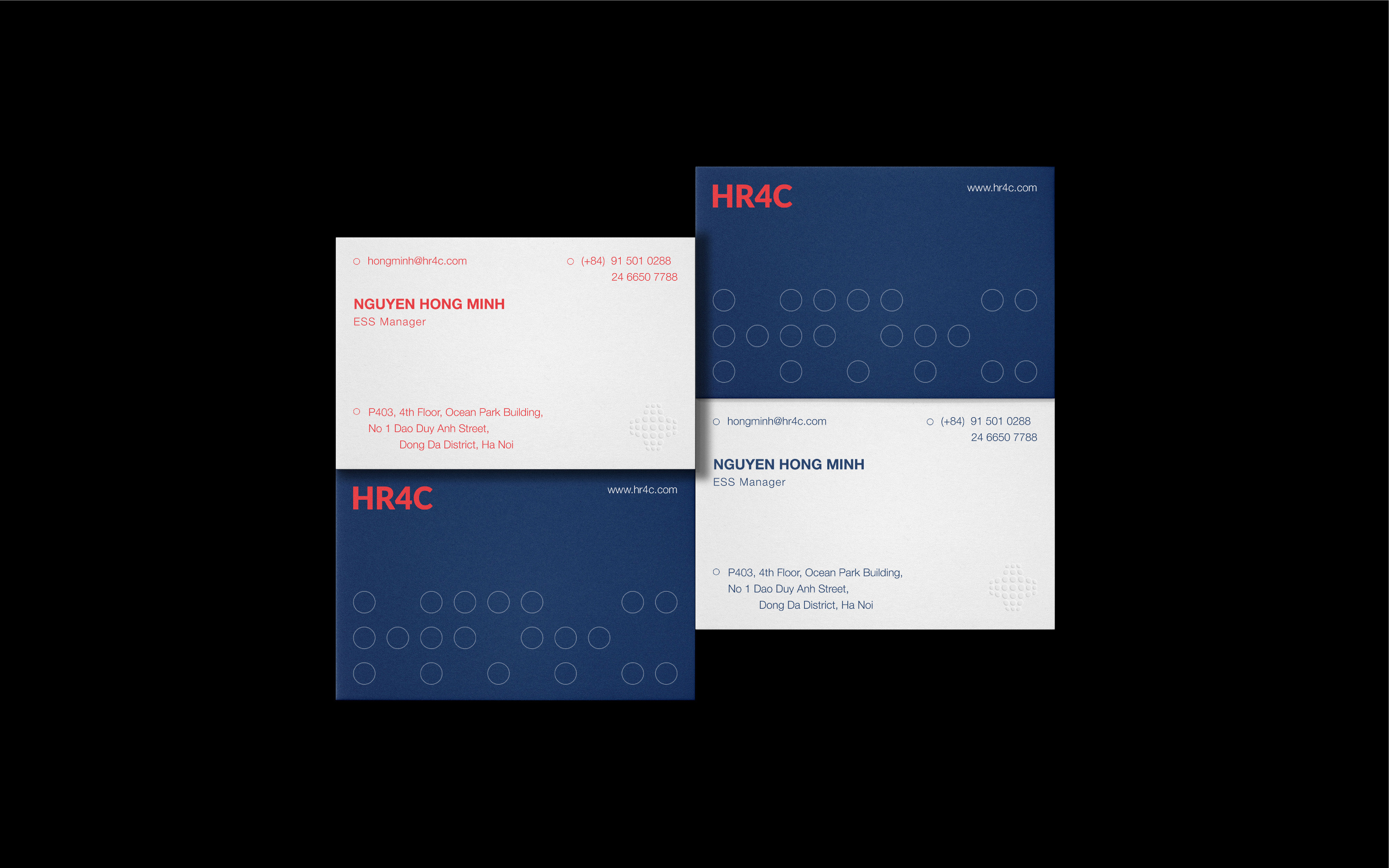
For variable design choices, we created a flexible system that represents the open environment that the company can offer. The mark and logotype can be separated depending on the grids; in some printing circumstances, the logo mark can be embossed. The “dots” key visual has multiple ways of usage on multiple applications. And by keeping simplicity in the color use and type choice for legibility purposes, we achieved minimal, elegant, and effective new whole identity.
CREDIT
- Agency/Creative: Duong Tran
- Article Title: Duong Tran Creates New Brand Identity for HR4C Human Resource Consulting Firm
- Organisation/Entity: Agency, Non Published Concept Design
- Project Type: Identity
- Project Status: Published
- Agency/Creative Country: Vietnam
- Market Region: Asia
- Project Deliverables: Brand Identity, Brand Strategy, Brand World, Branding, Identity System, Rebranding, Research
- Industry: Information
- Keywords: Branding, Visual Identity, Strategy, Brand Design, Brand Identity, Rebranding, Human Resources, HR, Agency


