


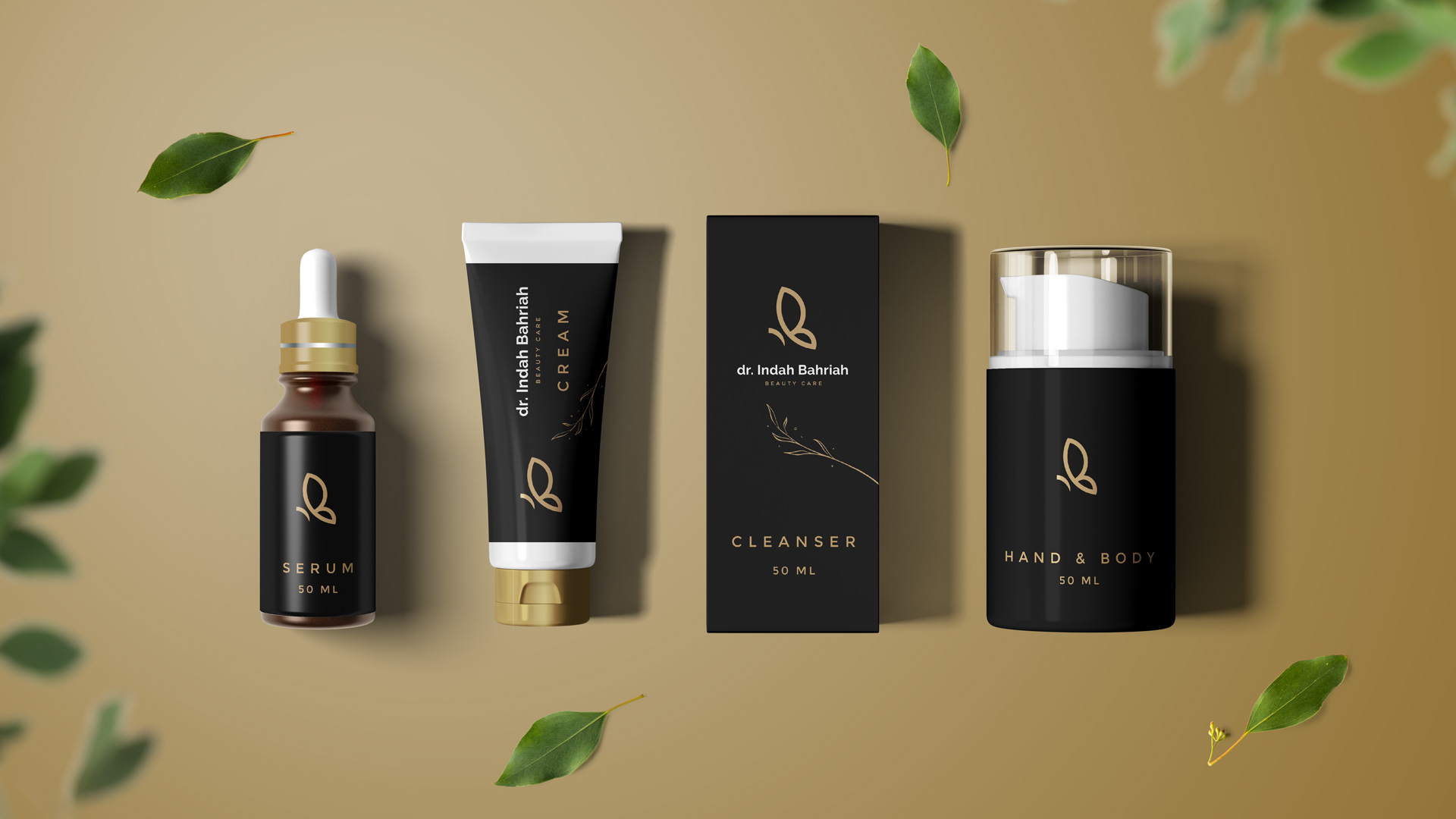
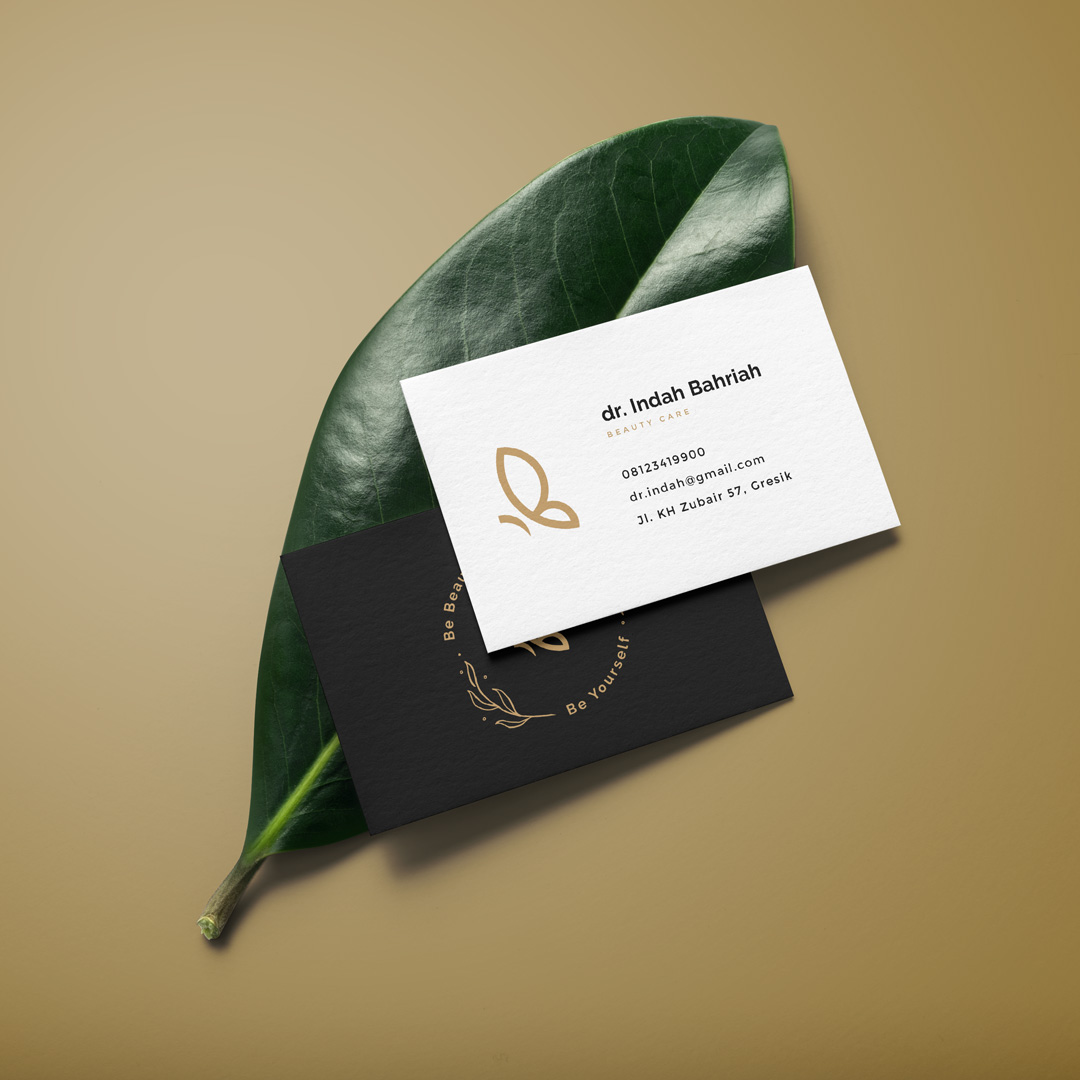
Butterfly as a symbol of beauty and a symbol of transformation, from the metamorphosis of butterflies which became the mission of the beauty clinic of dr. Indah who helps provide the “metamorphosis” for customers and also for the clinic. The branding revolves around the beauty and elegant theme, using a simple shape of the butterfly build from three circles from the golden ratio, the logo also represents the initials (monogram) “IB” from Indah Bahriah.

CREDIT
- Agency/Creative: Kalih Studio
- Article Title: dr. Indah Bahriah Branding and Identity
- Organisation/Entity: Agency, Published Commercial Design
- Project Type: Identity
- Agency/Creative Country: Indonesia
- Market Region: Asia
- Project Deliverables: Brand Architecture, Brand Guidelines, Brand Identity, Brand Strategy, Branding, Identity System, Packaging Design
- Industry: Health Care
- Keywords: branding, logo & identity, logo design, beauty care
FEEDBACK
Relevance: Solution/idea in relation to brand, product or service
Implementation: Attention, detailing and finishing of final solution
Presentation: Text, visualisation and quality of the presentation


