


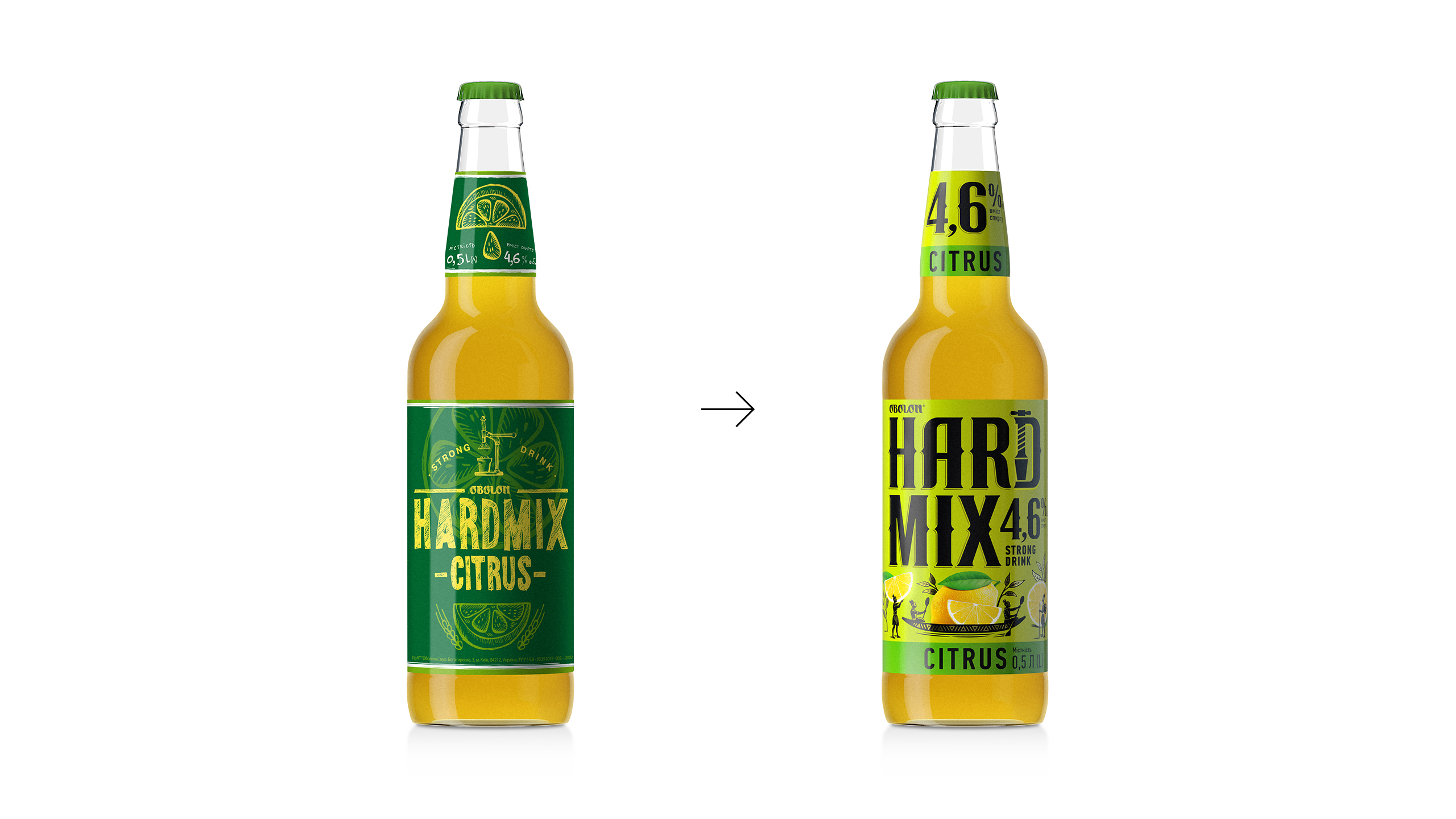
When we started our journey: In the winter of 2020 moving along the route of redesigning obolon’s beer-based hard drink, it was difficult to imagine that for customers, even a routine trip to the nearest supermarket would become a mix of a road-movie and action, because of the lockdown that was about to happen. Actually, the path to the final version of the design was not easy either: the goal was to mix naturalness, alcohol, handmade, vibrancy, taste, and freshness. The spring was just around the corner, so we had to get ready for the summer properly.
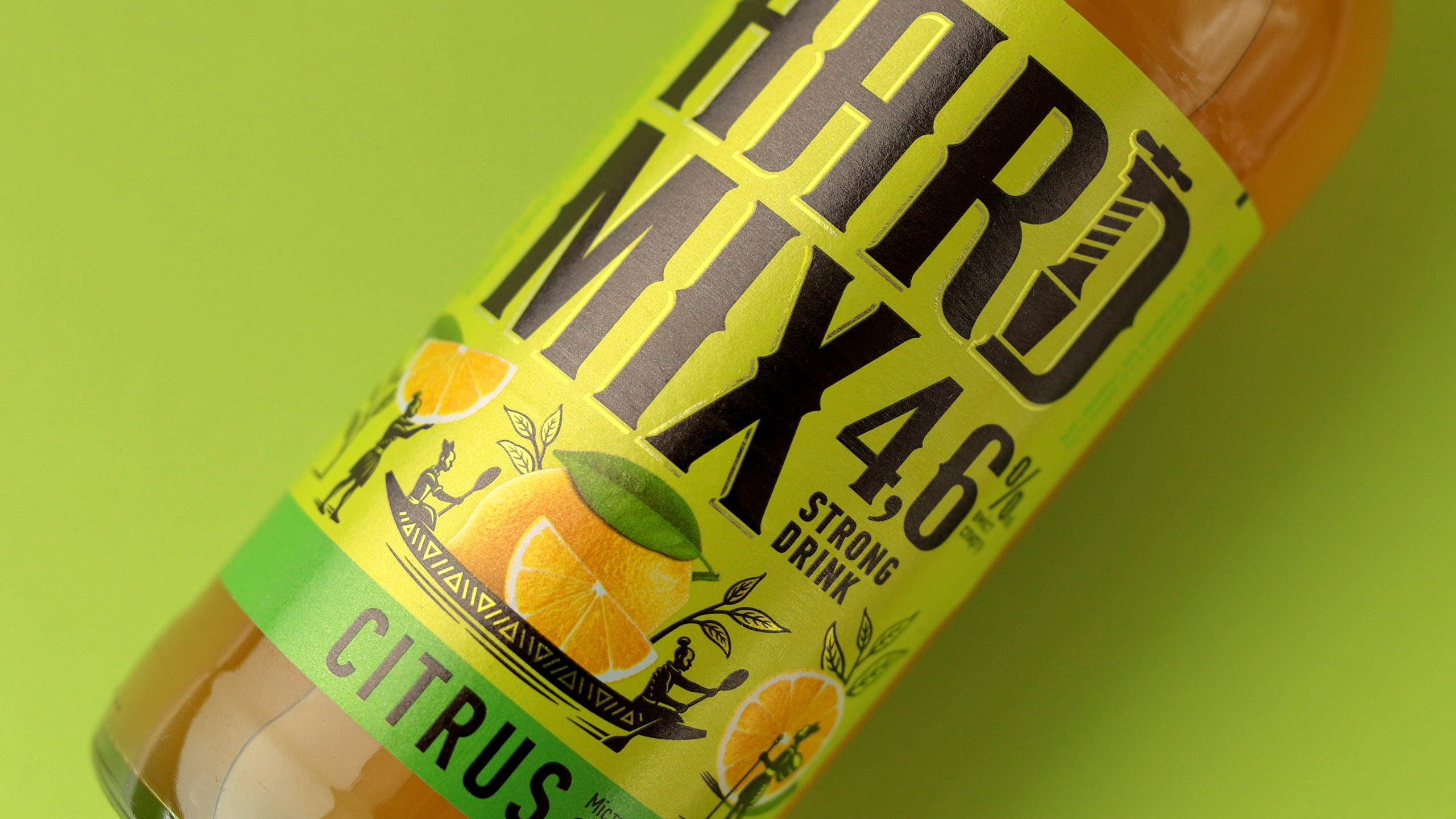
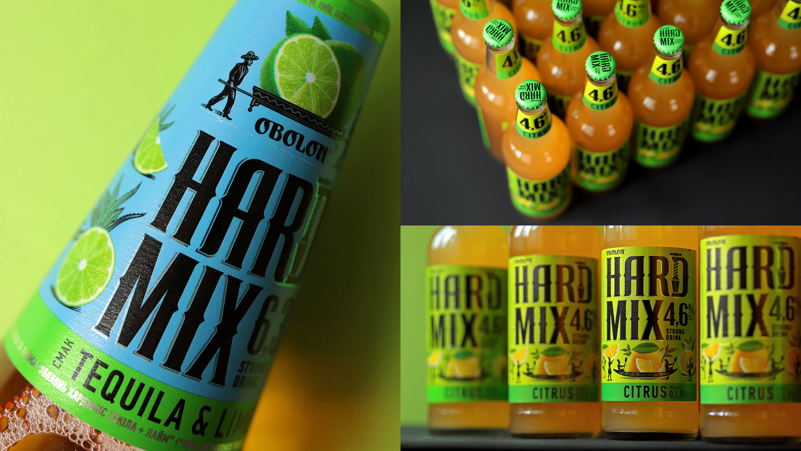
Whatever it is, but we had to: Keep up with the name: we decided to show how hard we can go using the logo. The logo that used to be inversed and too delicate has become a true frontman on the tag: now it is a confident, kinda vintage dandy which can be easily spotted on a shelf. The letter “D” in the word “Hard” has become a symbol that hints about readiness to squeeze all of the juices.
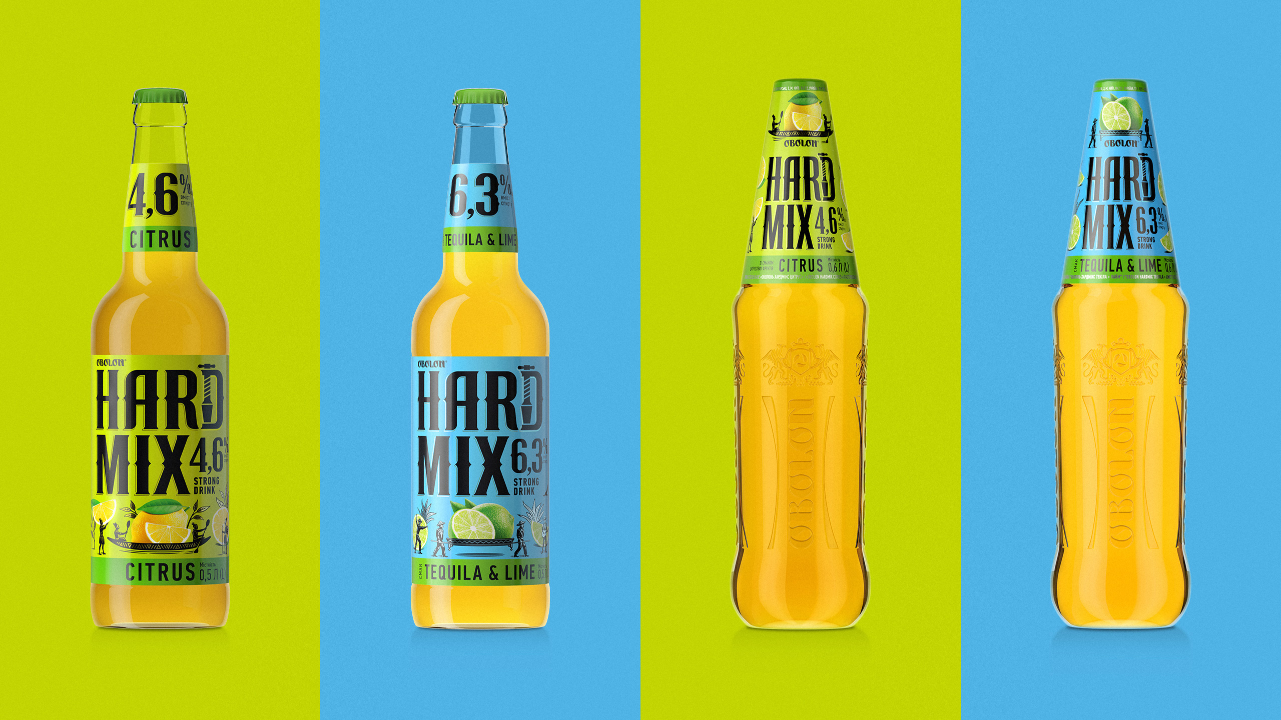
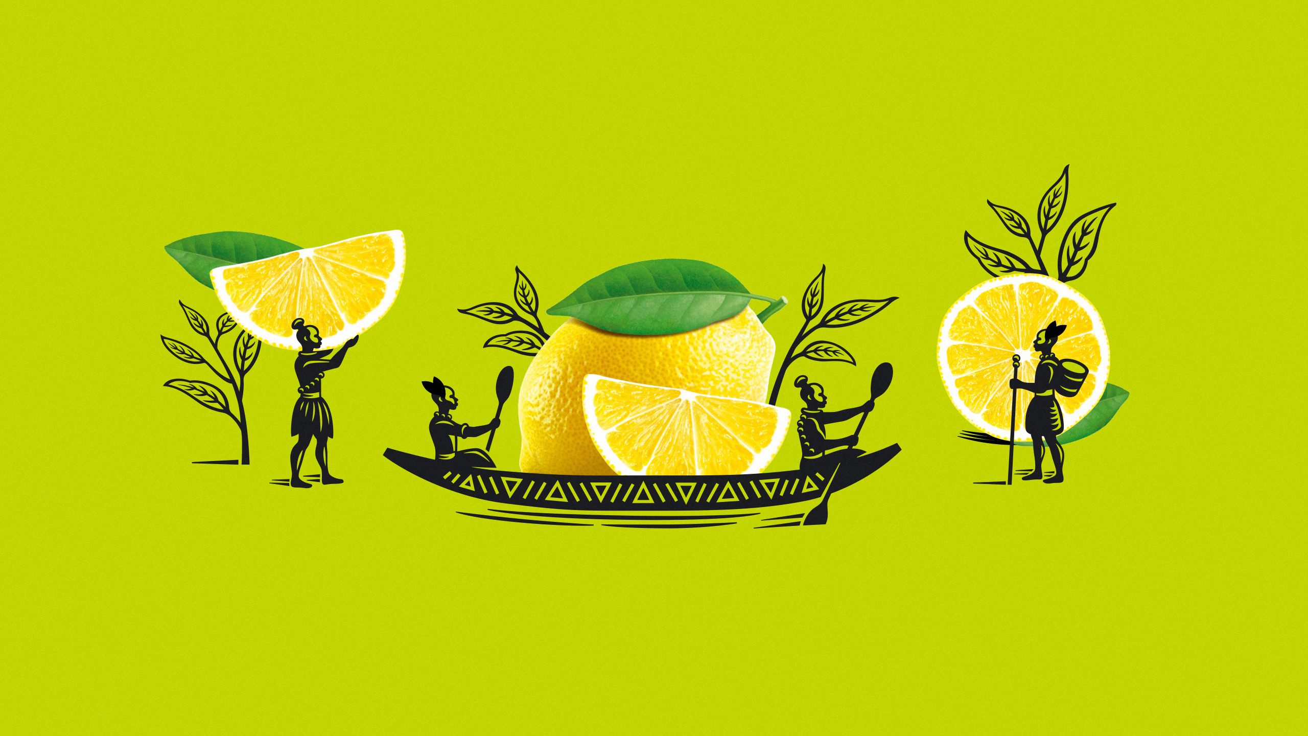
Across the seas: As is known, there is a lemon garden, so, first of all, we reached the tropics of pacific islands, from where islanders deliver lemons right to kyiv in canoes. Since the concept of the design was based not only on hardness but also required it to be mixed with naturalness and motion, we came up with the story about traveling to fruits and plants ranges that correspond to the drink flavors.
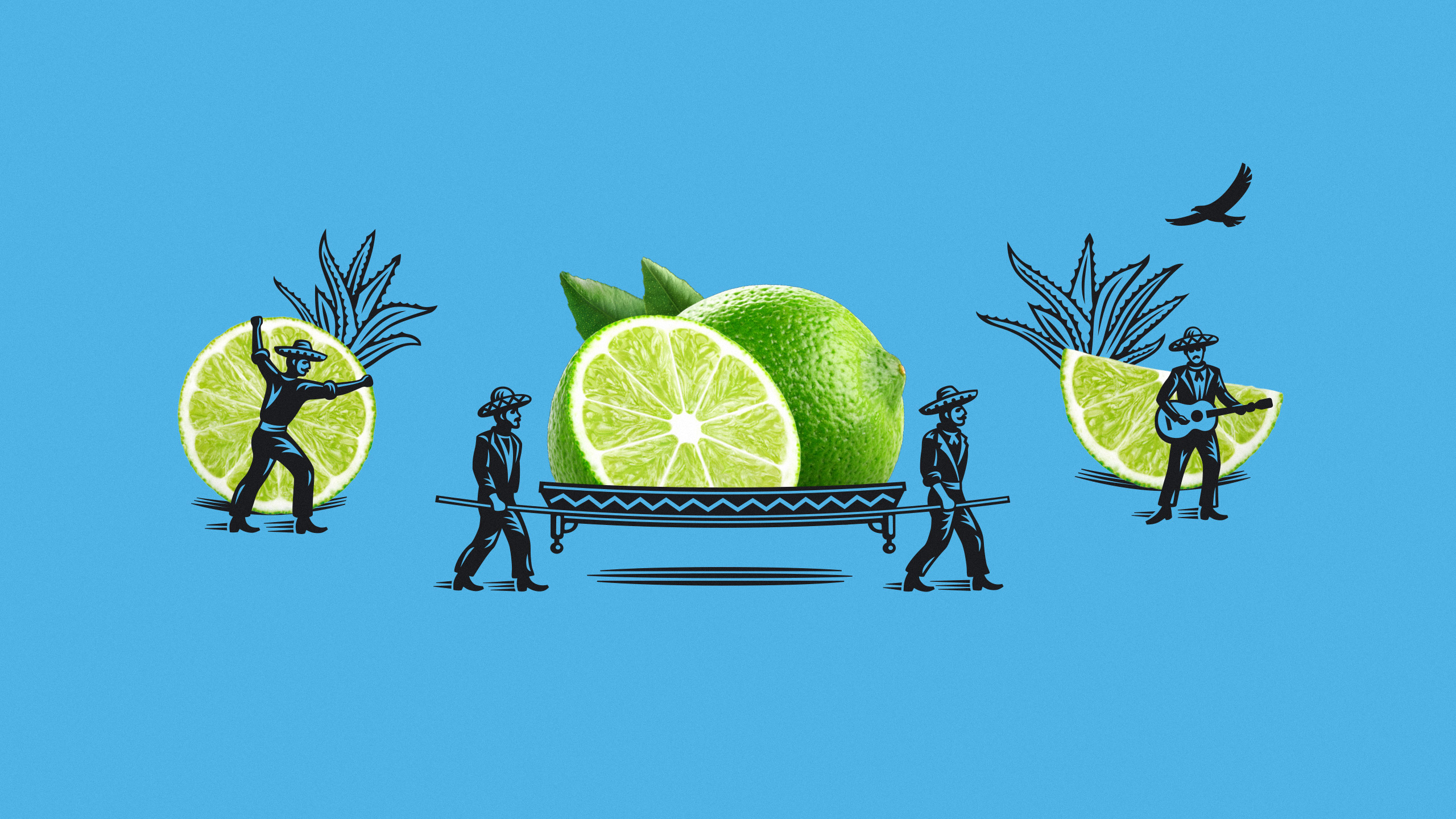
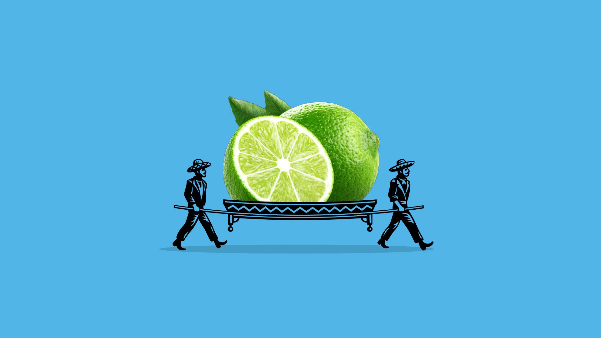
The second destination
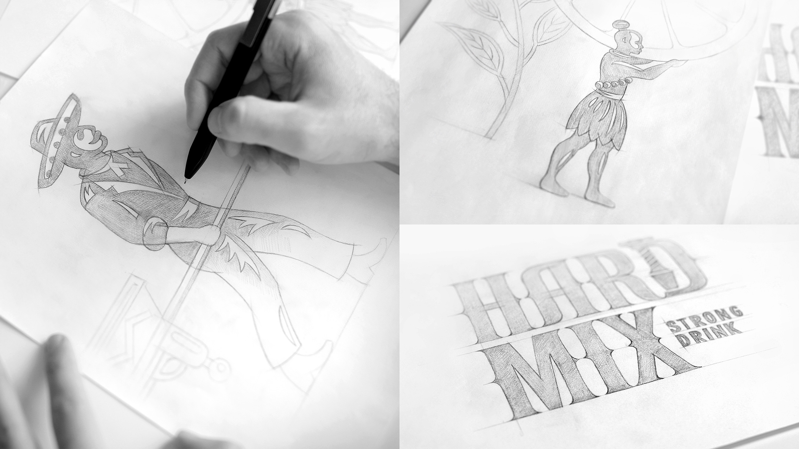
Has become mexico. Hot lads with rolled-up sleeves are pushing limes towards local agaves. The temperature in these parts is higher than average, so the drink should be stronger too. There is not enough space on a neck hanger to tell the whole story, but the high-volume percentage and the logo always remain in the spotlight.
Exotic trips
Have become more than just exotic nowadays. But mixing some good ol’ beer with notes of tropical fruits can help you to imagine yourself somewhere near the equator, with a renewed bottle of hardmix in a hand. All you have to do is to look into these colors: the colors of the sky above mexican highlands and island greenery of the subtropics.

CREDIT
- Agency/Creative: Dozen Agency
- Article Title: Dozen Agency Creates Redesign Obolon’s Beer-Based Bard Drink
- Organisation/Entity: Agency, Published Commercial Design
- Project Type: Packaging
- Agency/Creative Country: Ukraine
- Market Region: Europe
- Project Deliverables: Graphic Design, Illustration, Packaging Design, Rebranding, Research, Tone of Voice
- Format: Bottle
- Substrate: Glass


