


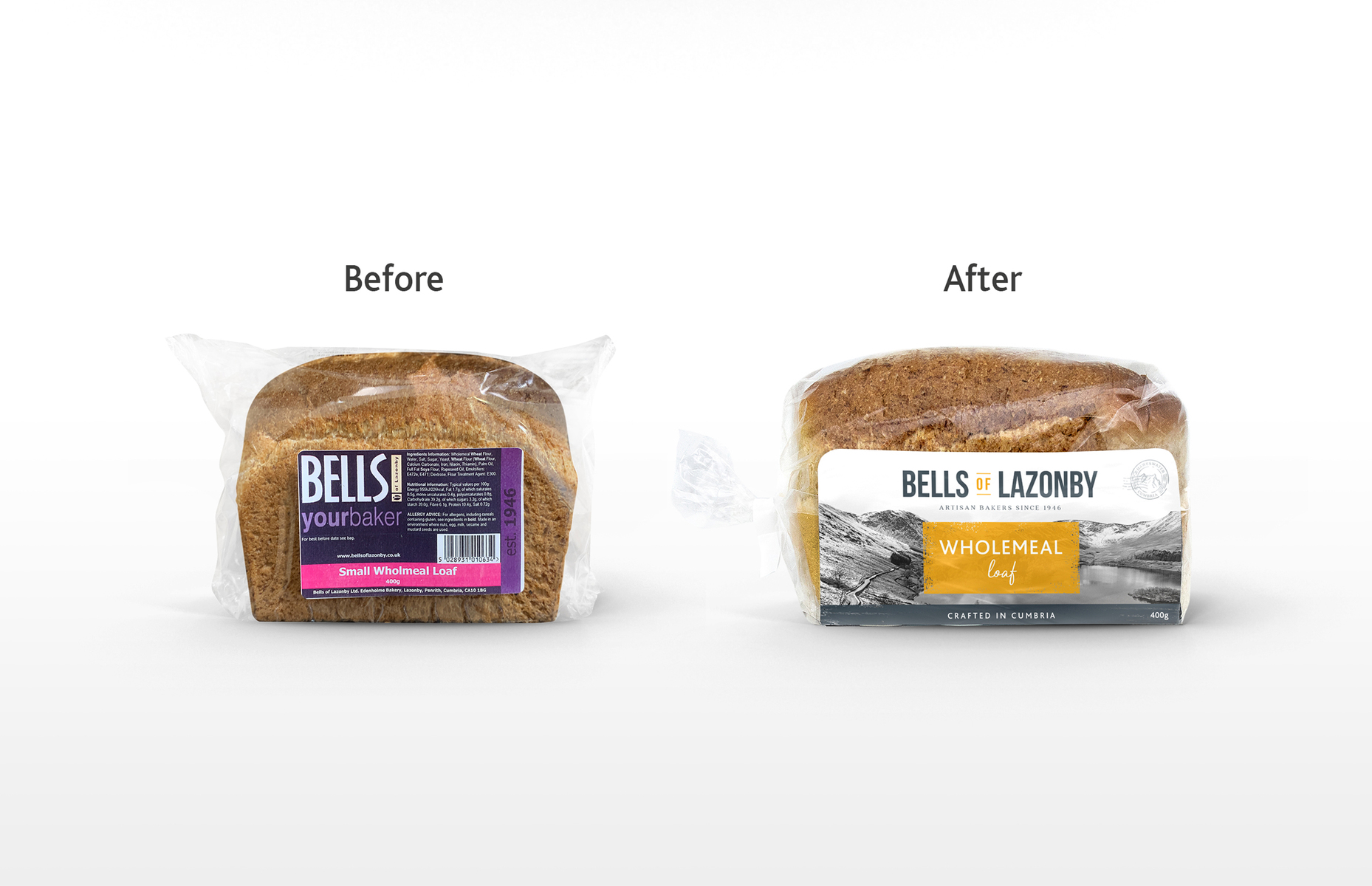
Bells of Lazonby produce a range of premium craft breads that are available to both retail as well as trade. The market is seeing a revival in bread, mainly within premium and private label. The current packaging was very disjointed and inconsistent across the range and so, has little standout on shelf.
Double D Creative was approached to undertake a brand refresh to celebrate the rich heritage of Bells of Lazonby and remind consumers about the quality and great taste of the product. The key challenge was to re-position Bells of Lazonby as the premium bread supplier for Booths.
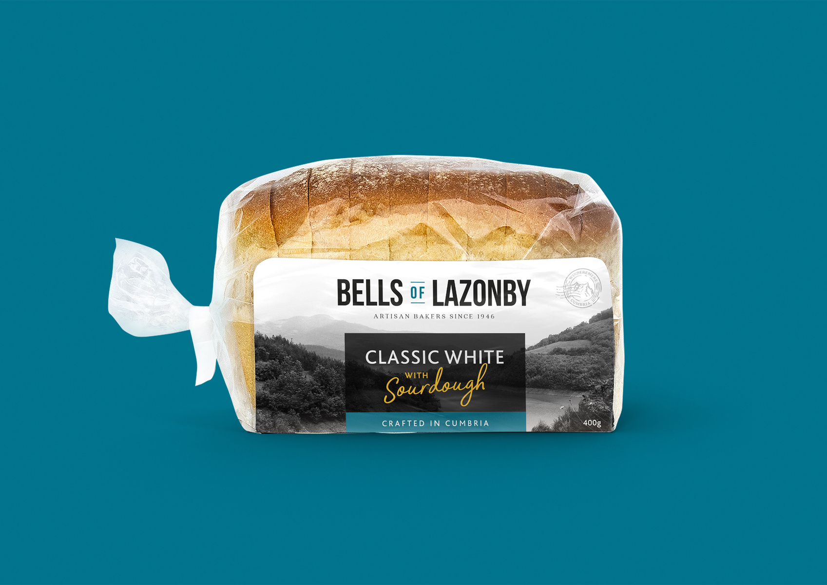
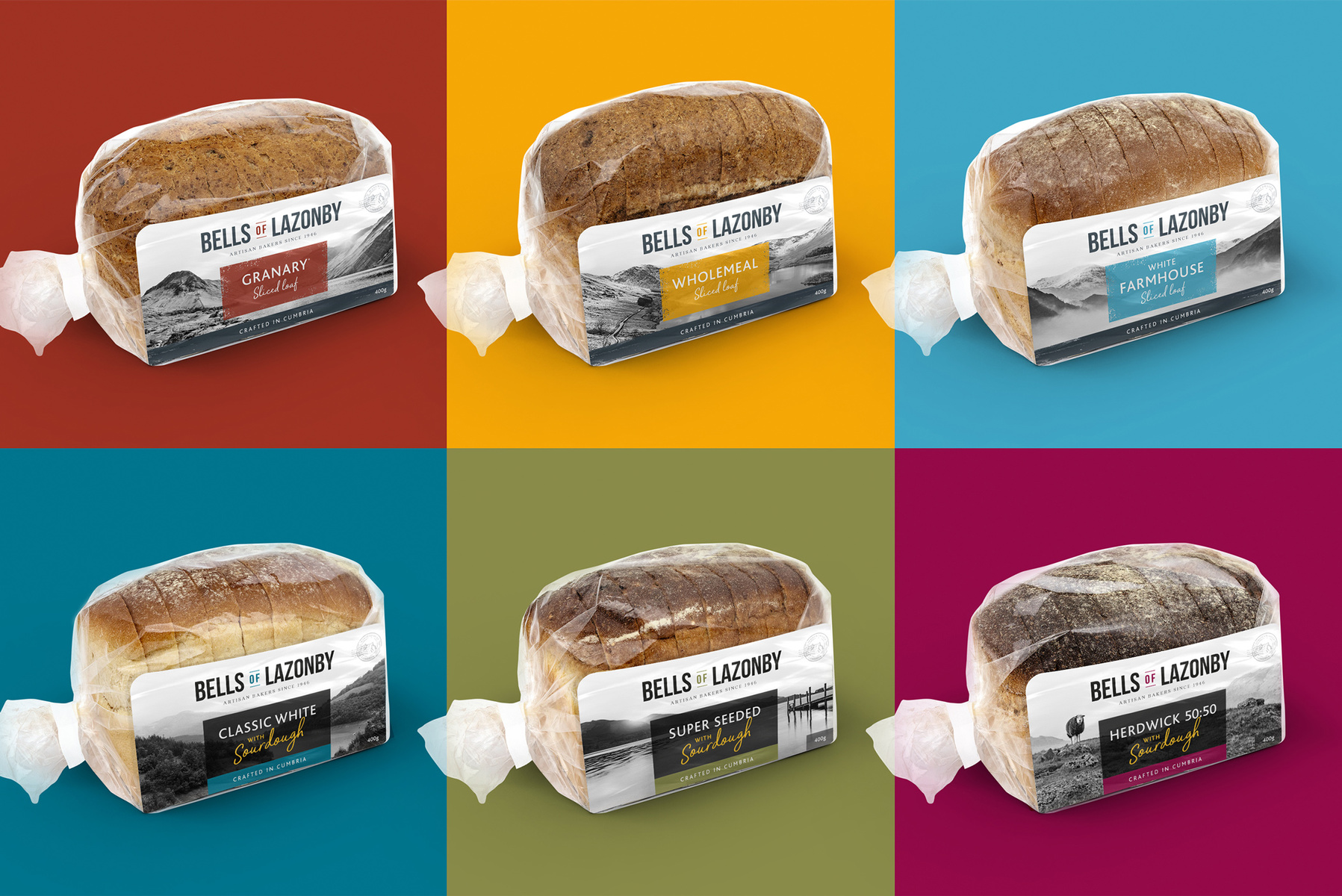
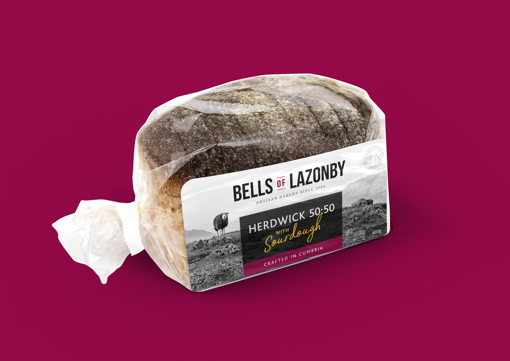
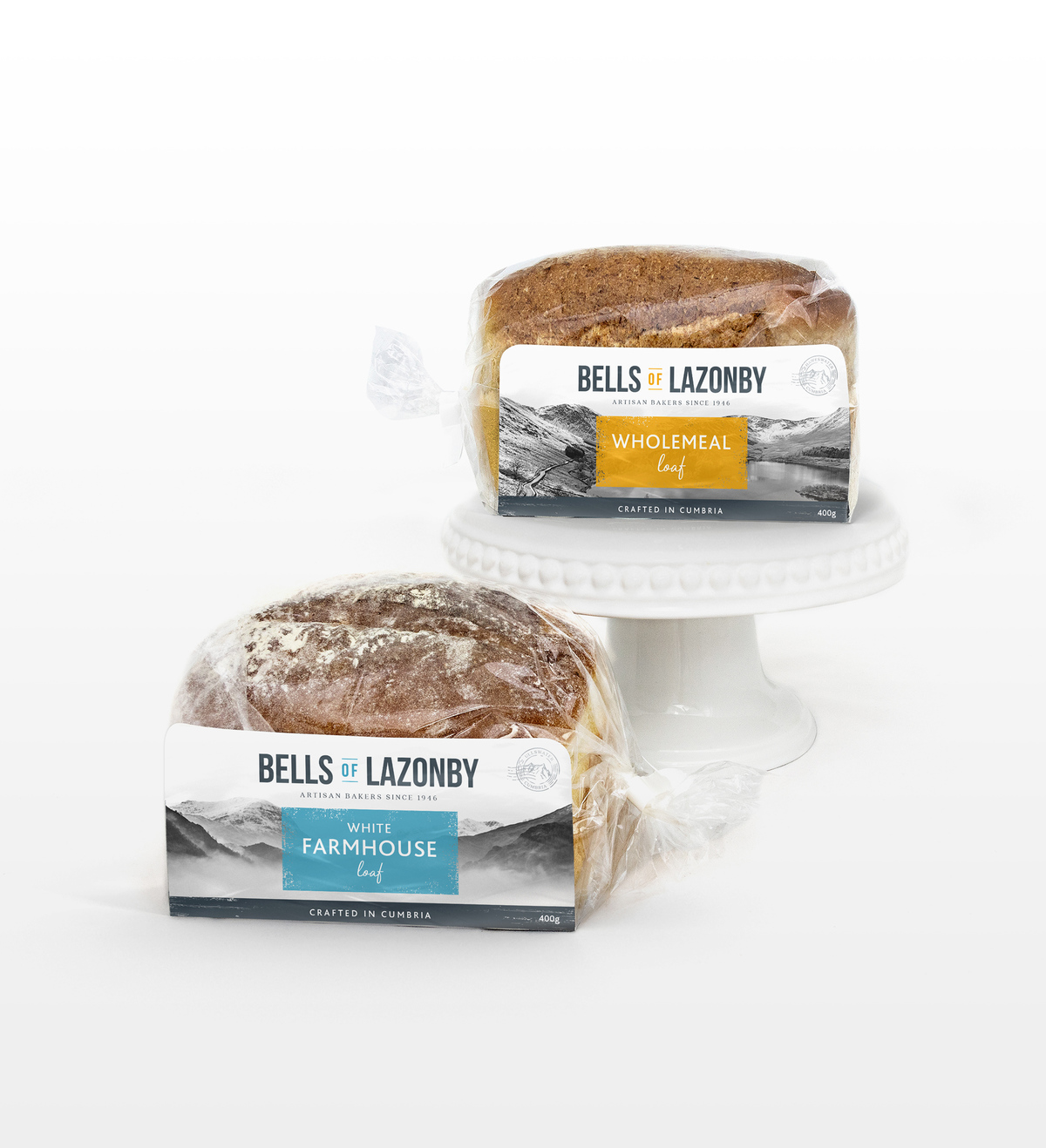
As part of the redesign the range was also consolidated into a more streamlined Everyday and Premium Sourdough offering – all 400g. The packaging also moved away from a single label format to a new U Card that allowed a larger surface area for a design with greater impact.
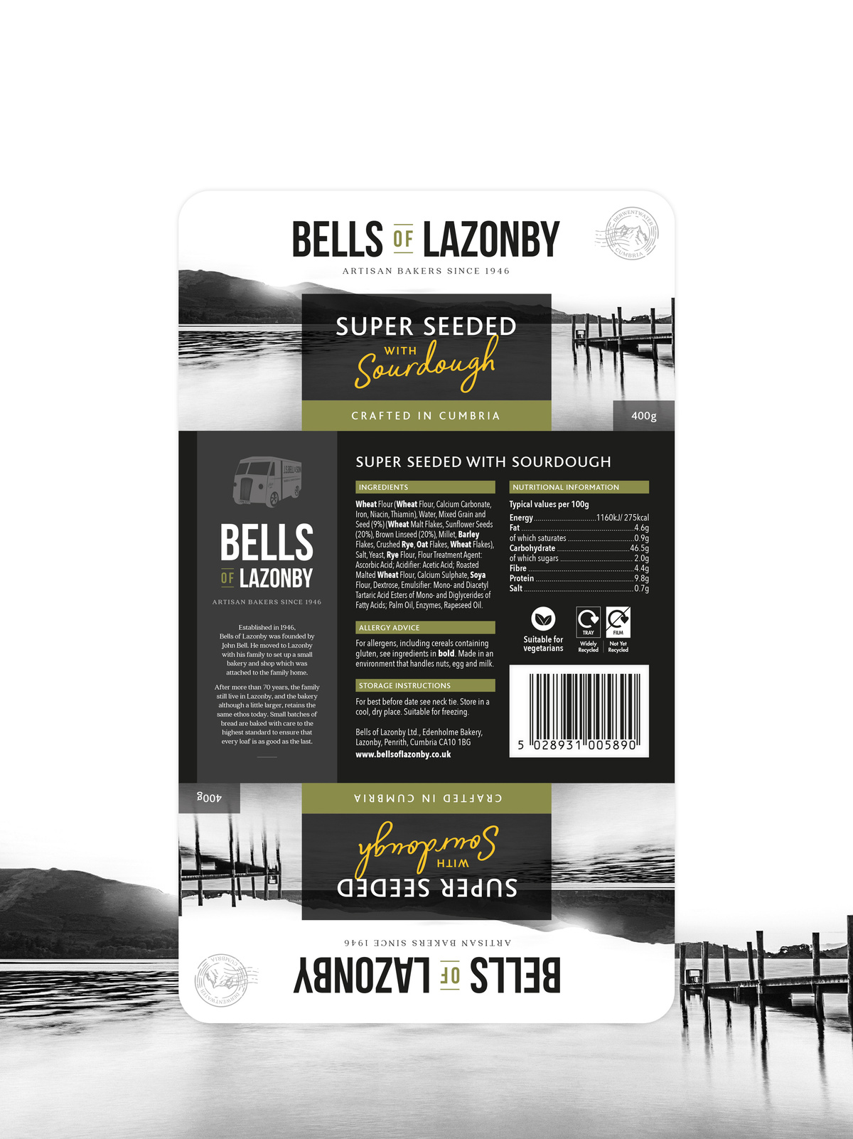
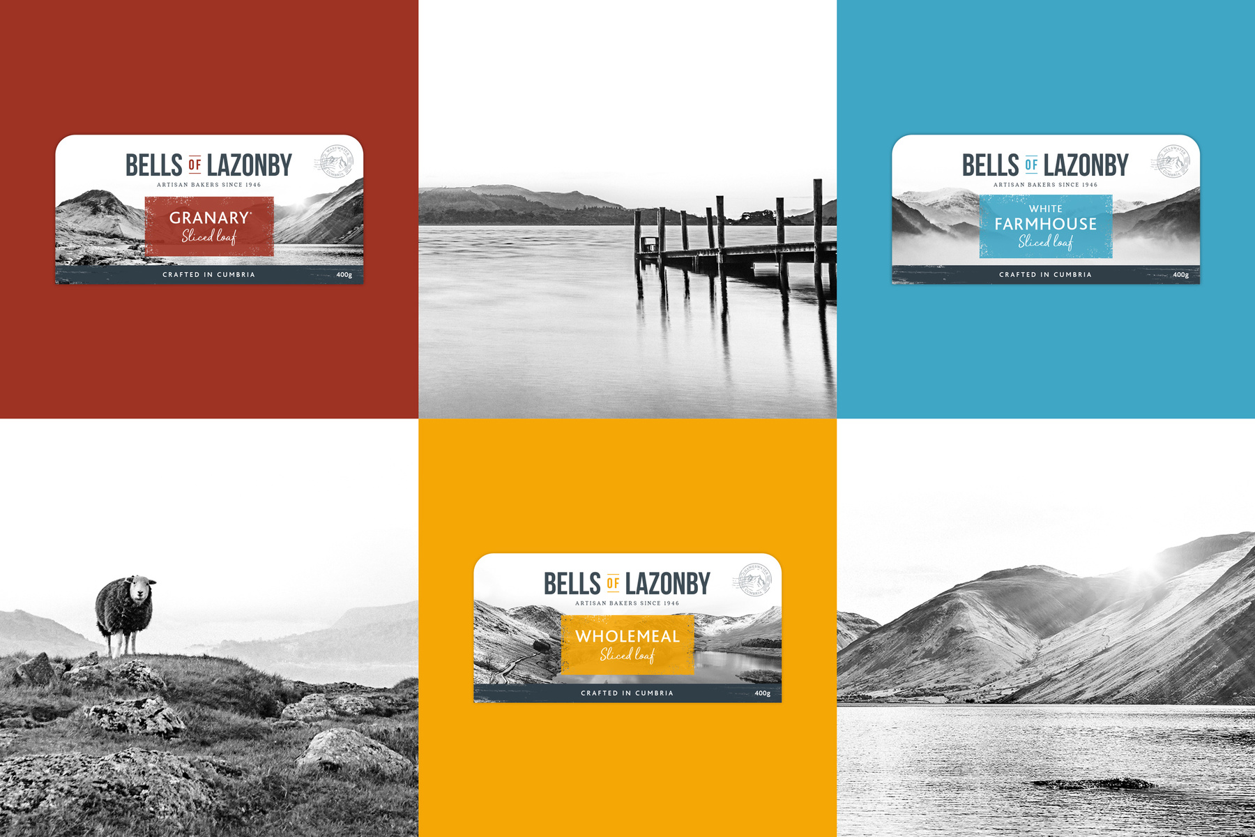
With provenance playing a key role in the consumer decision making process, the main area of focus was rooted in celebrating Cumbria. The packaging draws on iconic landscapes of the Lake District through the use of grainy, atmospheric and alluring greyscale imagery. Each product in the range is assigned an individual landscape with a stamp detailing the location to create added interest and also target the tourist market – particularly for the local Booths in Penrith.
Simplicity is at the heart of the design in order to allow the imagery to shine first and foremost. The variant specific colours create stand out on shelf and promote very clear messaging. The colour scheme focusses on modern, vibrant colours for the Everyday range. In contrast, the Premium Sourdough range is elevated through the use of black and gold and a toned-down colour palette. The main colour block for the Everyday range is given a distressed treatment to complement the rugged landscapes. A decision was made to retain clean lines for the Premium Sourdough range as it was felt that a distressed look was not in keeping with a premium offering.
Part of the process also involved a refresh of the Bells of Lazonby logo. The existing logo is quite traditional and didn’t fit in with the modern look and feel of the new packaging. The format of the U Card also necessitated a landscape orientation too which the logo didn’t provide. A bold, unfussy and condensed font was selected that maintained a synergy with the original logo but, developed to integrate better with the new design.
The provenance message is further emphasised through the inclusion of ‘Artisan bakers since 1946’ beneath the logo. This is carried through to the back of pack where an illustrated image of the original Bells van and brief story about John Bell, the founder of Bells of Lazonby, is included.
CREDIT
- Agency/Creative: Double D Creative
- Article Title: Double D Creative Creates a Fresh New Look for Bells of Lazonby Craft Bread
- Organisation/Entity: Agency, Published Commercial Design
- Project Type: Packaging
- Agency/Creative Country: United Kingdom
- Market Region: Europe
- Project Deliverables: Brand Identity, Brand Redesign, Branding, Graphic Design, Packaging Design, Photography, Rebranding, Research, Tone of Voice
- Format: Bag, Tray, Wrap
- Substrate: Plastic, Pulp Carton


