


We are a Portuguese-Brazilian design studio and we present the Sacramento Craft Cocktail project. Deliverable: Packaging design, Brand refinement, Brand advertising. Sacramento is a bar, located in southern Brazil. Place frequented mainly by young students and university students who identify with the city’s street culture. Strongly influenced by American urban culture, Sacramento keeps the flame of youth alive in a region marked by the strong trace of local traditionalist culture.
During the pandemic, the bar had to close its doors, but regulars called for the sale of the main drinks in the house: cocktails. We were challenged to create a family of canned cocktail labels for the young and urban Brazilian public.
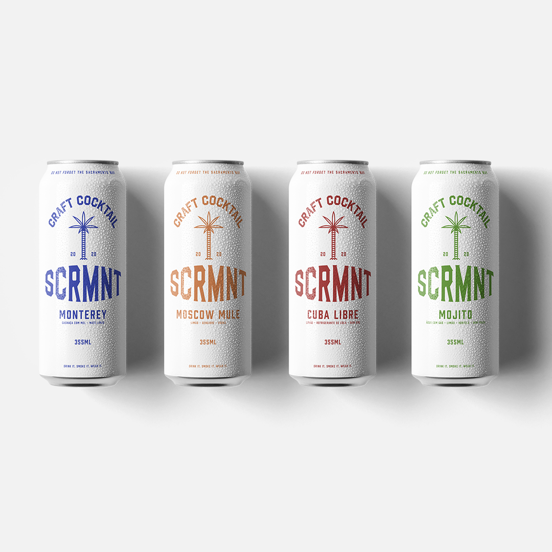
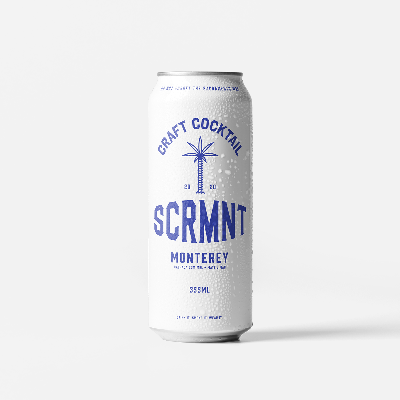
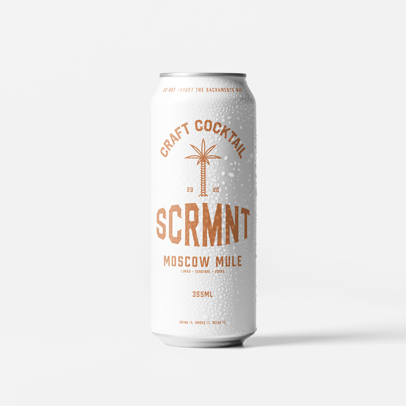
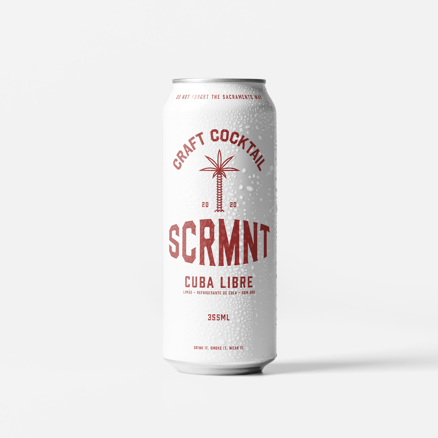
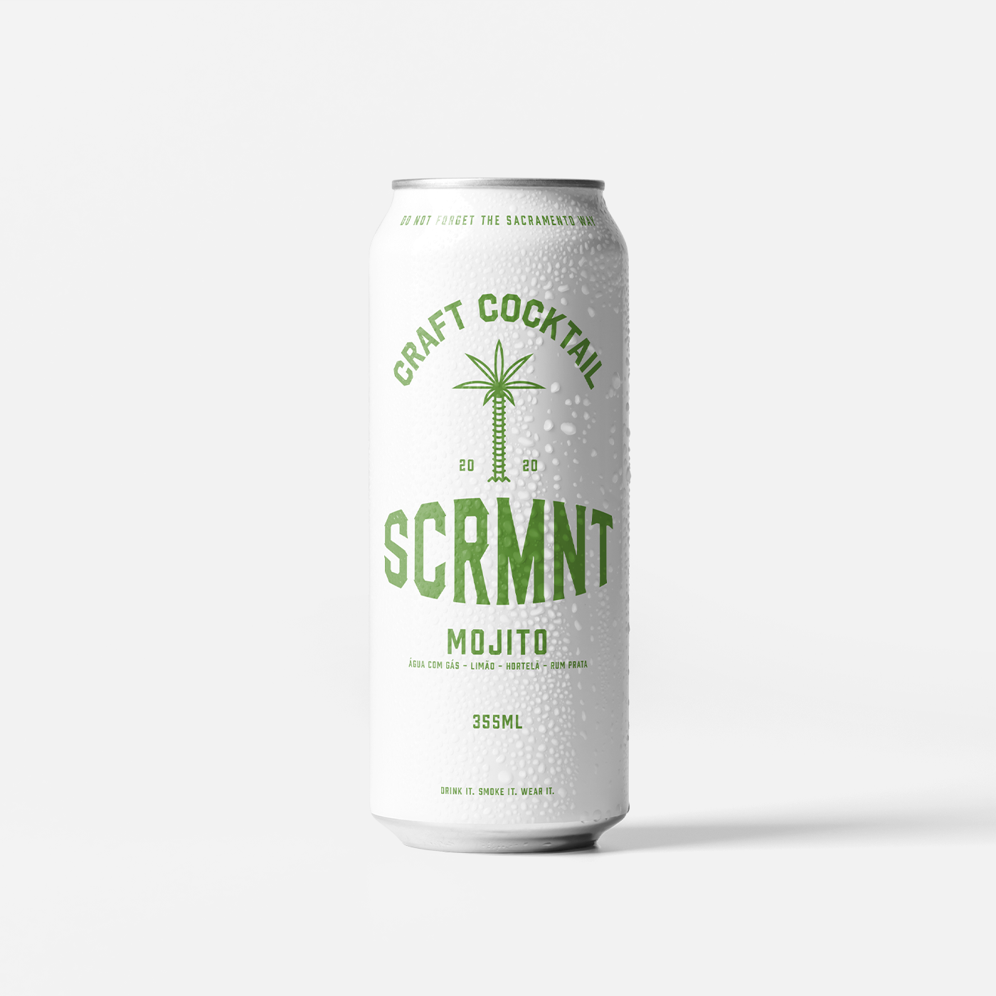
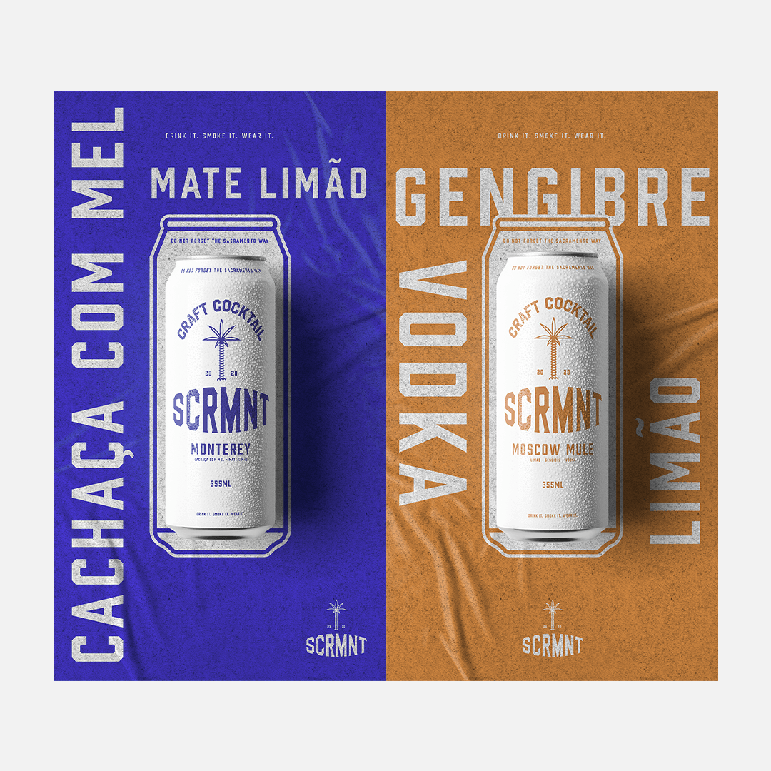
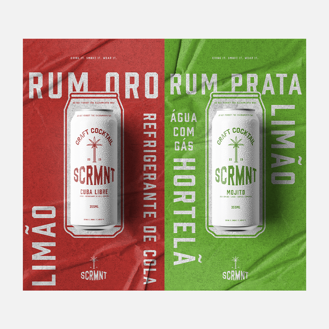
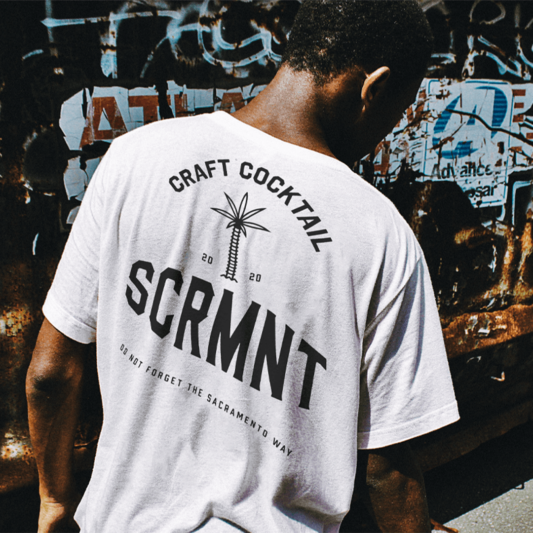
An experimental project, where we explore the use of a straightforward language of what we intend to communicate with the packaging. A choice of typography and clean and classic graphic elements marked the identity of the label family.
The creative process was guided by co-creation sessions, where we mediated the contribution of 3 members of the bar and 5 customers. The choice of customers who participated was essential. We defined 5 personas, with different motivations for purchase and through the responses on the bar’s social networks, we invited them to the process. After 3 sessions and with the help of rapid digital prototyping, we arrived at a strategic result. The main elements of the brand’s visual identity were preserved and celebrated in a clean and classic packaging. The new packaging pleased the 5 customers, however in the satisfaction survey, we identified that those who were older customers, that is, who have a stronger affective relationship with the bar and their identity, were the ones who most evaluated the project the best.
In the color palette we chose the minimalist, each color fulfills the role of communicating the identity of each of the flavors. Use of warm colours like red and orange balanced with colours like blue and green. In the graphic design project, we follow a traditional line of typography and reduce any information noise from the label.
The project that initially had an experimental nature, but due to the results obtained in the process, and the repercussions on Sacramento’s social networks, the project went off the record and you can now order Sacramento Craft Cocktail at your home, safely, and remember the good ones moments you lived in the bar with your favorite drink.
CREDIT
- Agency/Creative: Domo Studio
- Article Title: Domo Studio Creates a New Label Family for Sacramento Craft Cocktail
- Organisation/Entity: In-house, Published Self Promotional Design
- Project Type: Packaging
- Agency/Creative Country: Brazil
- Market Region: South America
- Project Deliverables: Brand Advertising, Brand Refinement, Brand Strategy, Packaging Design
- Format: Can
- Substrate: Metal


