


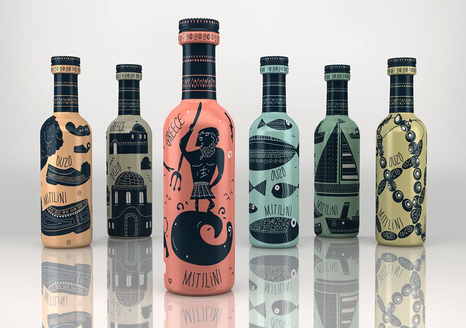
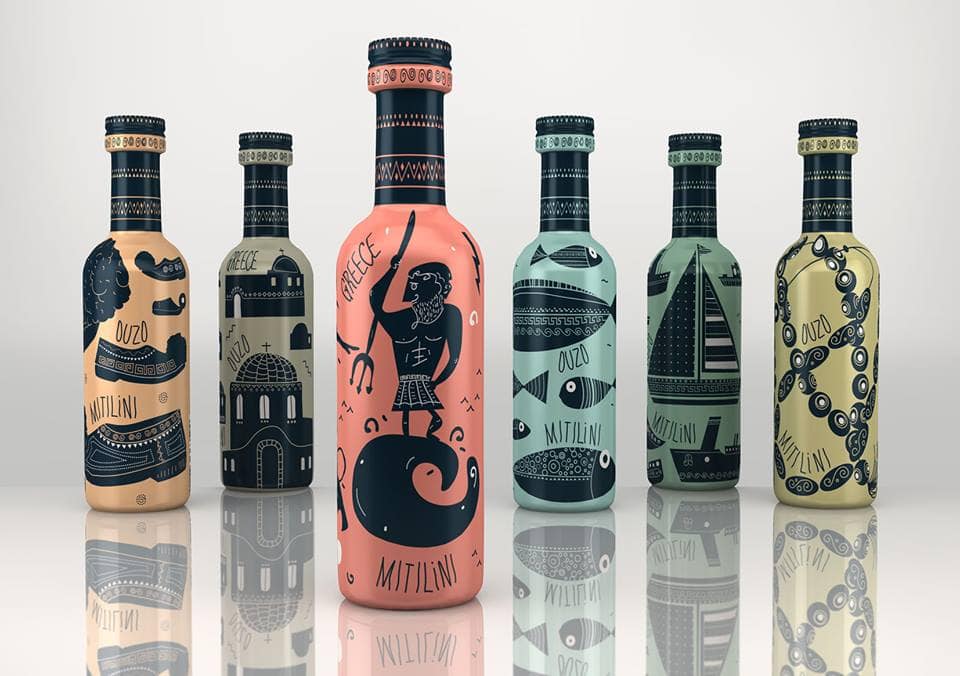
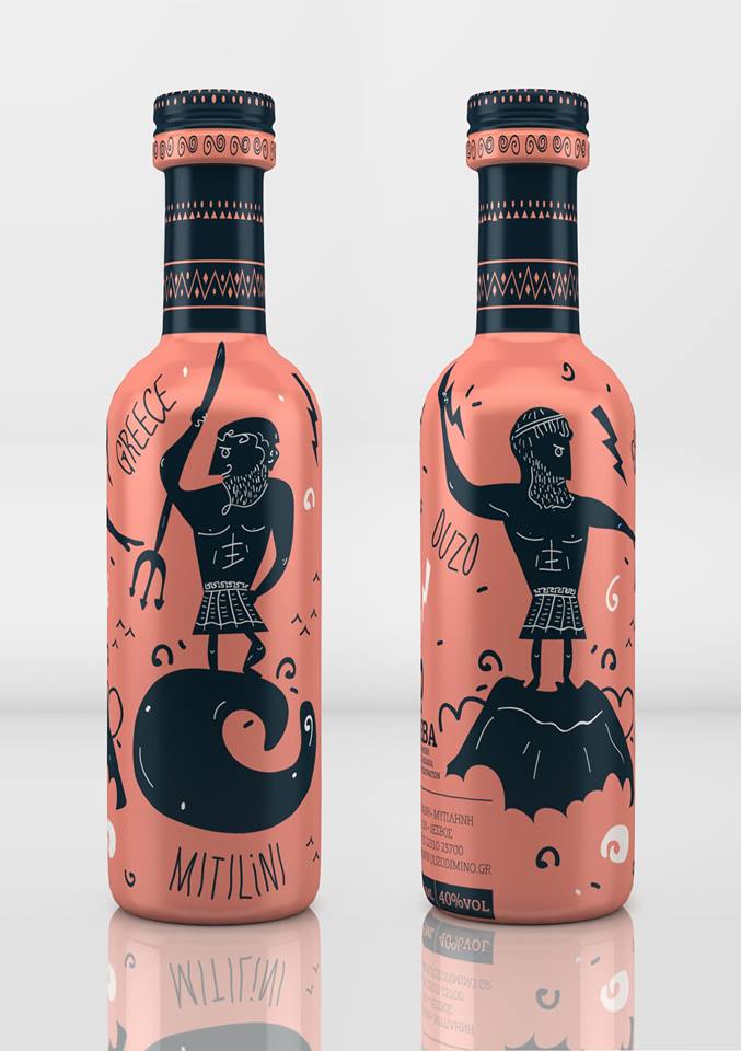
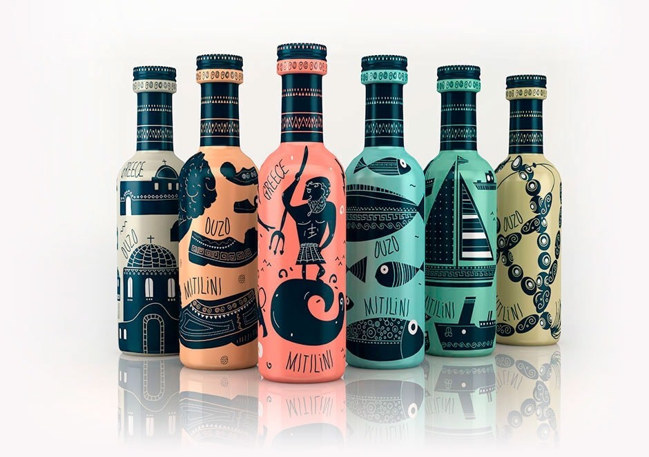
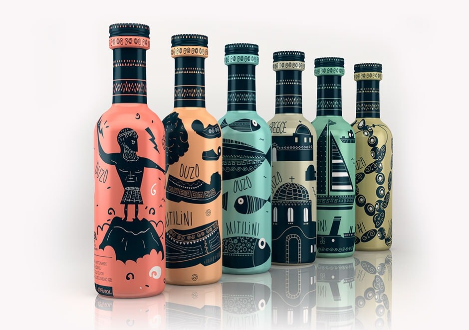
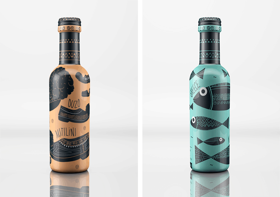
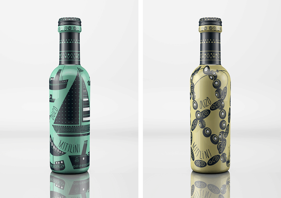
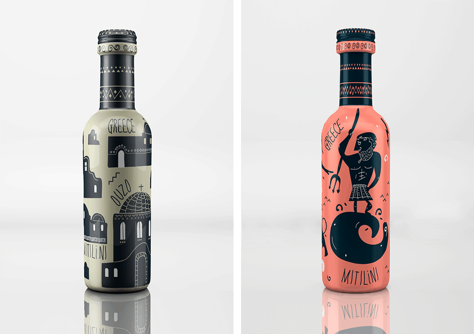
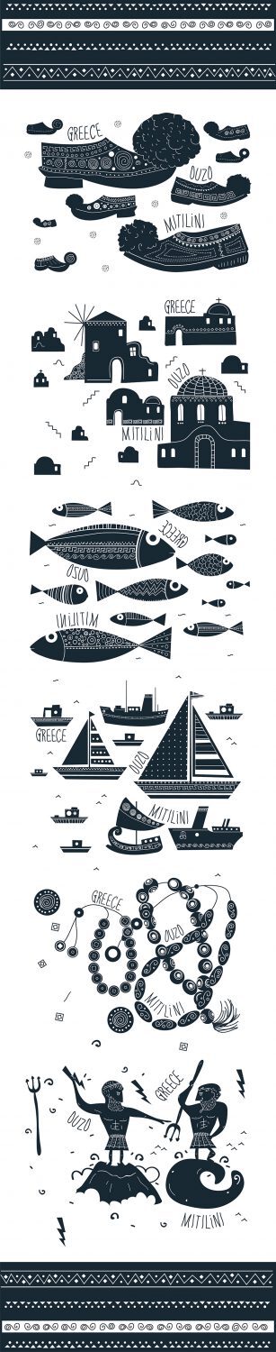
“Το σχέδιο αποσκοπεί στη διαφοροποίηση από τον ανταγωνισμό στον τομέα των σουβενίρ για τους τουρίστες. Το ούζο είναι ένα από τα πιο αντιπροσωπευτικά ποτά στην Ελλάδα, σε σημείο που να θεωρείται μια στερεότυπη επιλογή.Αυτός είναι ο λόγος για τον οποίο χρησιμοποιήθηκαν στερεότυπες εικόνες και σύμβολα, τα οποία είναι στενά συνδεδεμένα με την ελληνική παράδοση και τον πολιτισμό. Το ύφος της εικονογράφησης, είναι μεν εμπνευσμένο από τα αρχαία μελανόμορφα αγγεία, διατηρεί δε έναν εναλλακτικό και ζωντανό κώδικα αισθητικής.”
“The project aims to differentiate from the competition in the field of souvenir for tourists. Ouzo is one of the most representative drinks in Greece, to the point that it is considered a routine epilogi.Aftos is why used stereotyped images and symbols, which are closely connected to the Greek tradition and culture. The style of illustration, although it is inspired by the ancient black-figure vases, does not maintain an alternative and vibrant aesthetic code.”
CREDIT
- Agency/Creative: Dolphins // communication design
- Article Title: Dolphins // communication design – TASTE OF GREECE
- Project Type: Packaging
- Format: Bottle


