


Brief and Background
Long drinks are old-school. They have been around since the 1952 Summer Olympics in Helsinki, Finland. And ever since they have been the go-to traditional alcoholic beverage for many. Especially during the summer months.
So when Sinebrychoff decided to refresh the look of one of the most iconic and known alcoholic product series, it came with a specific challenge. How can we stand out amidst the long drink category and look more modern, while still remaining familiar and true to the Sinebrychoff brand?
The Creative Approach
The key was hidden in the chess pieces that made up the logo. The second equally important part was the nostalgic golden era for long drinks for the target market. The groovy and funky era.
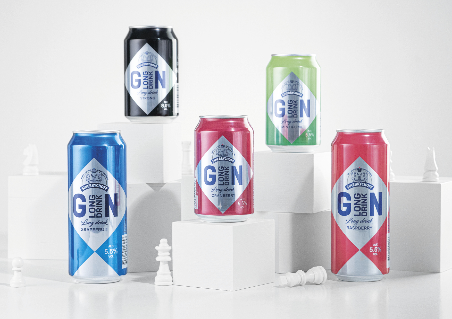
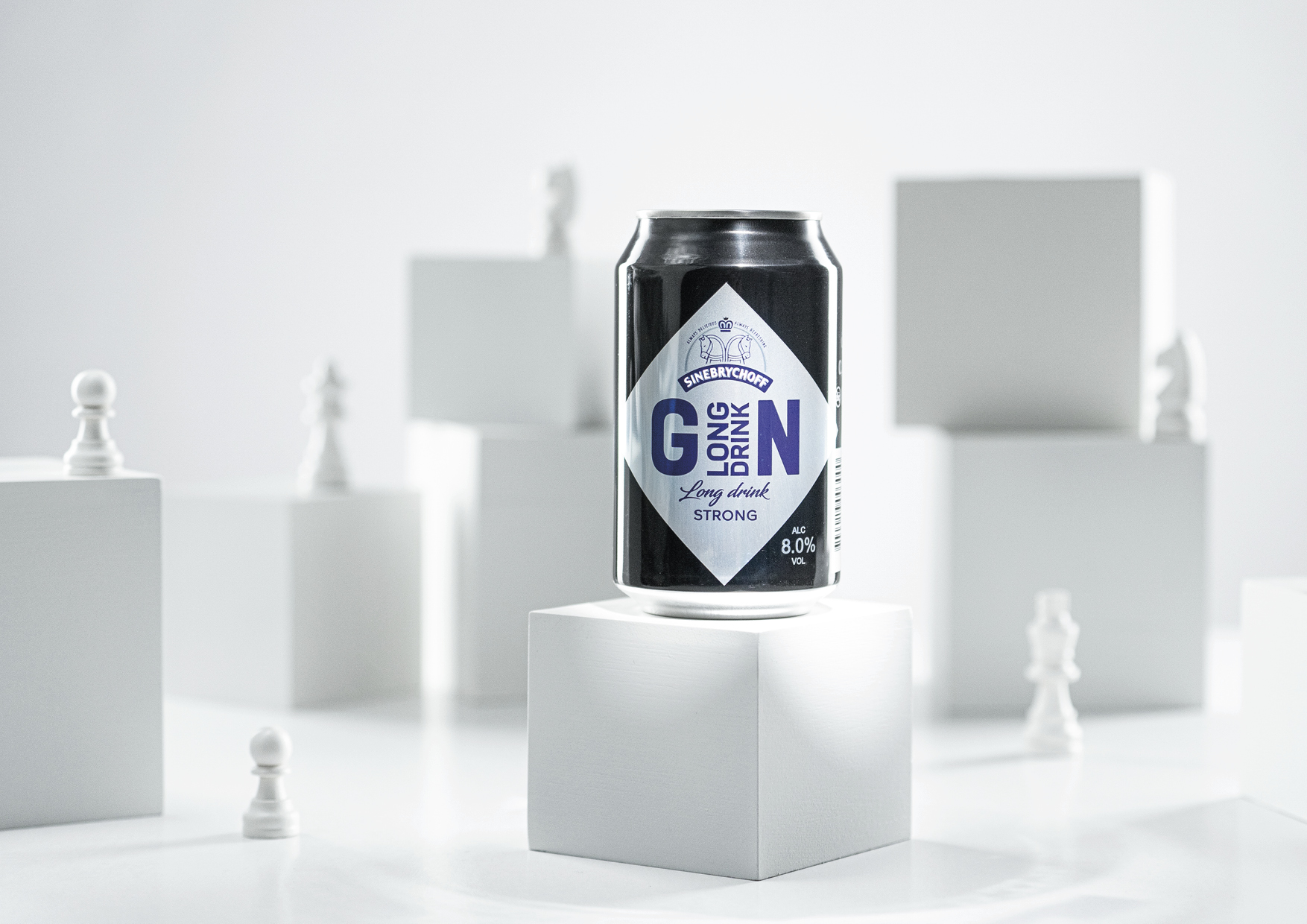
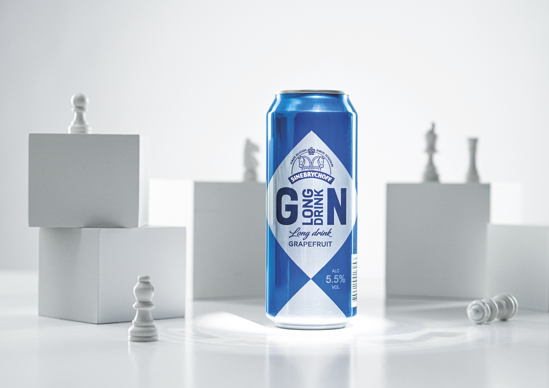
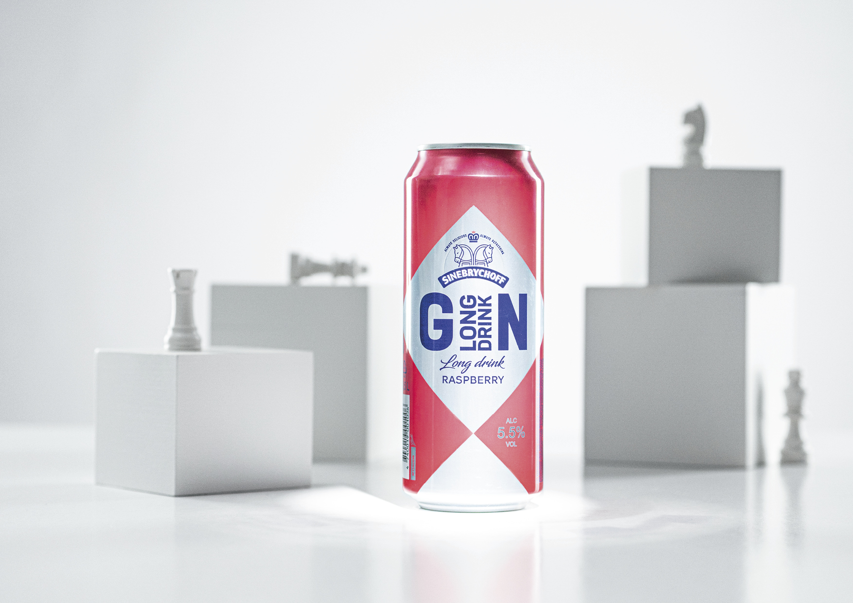
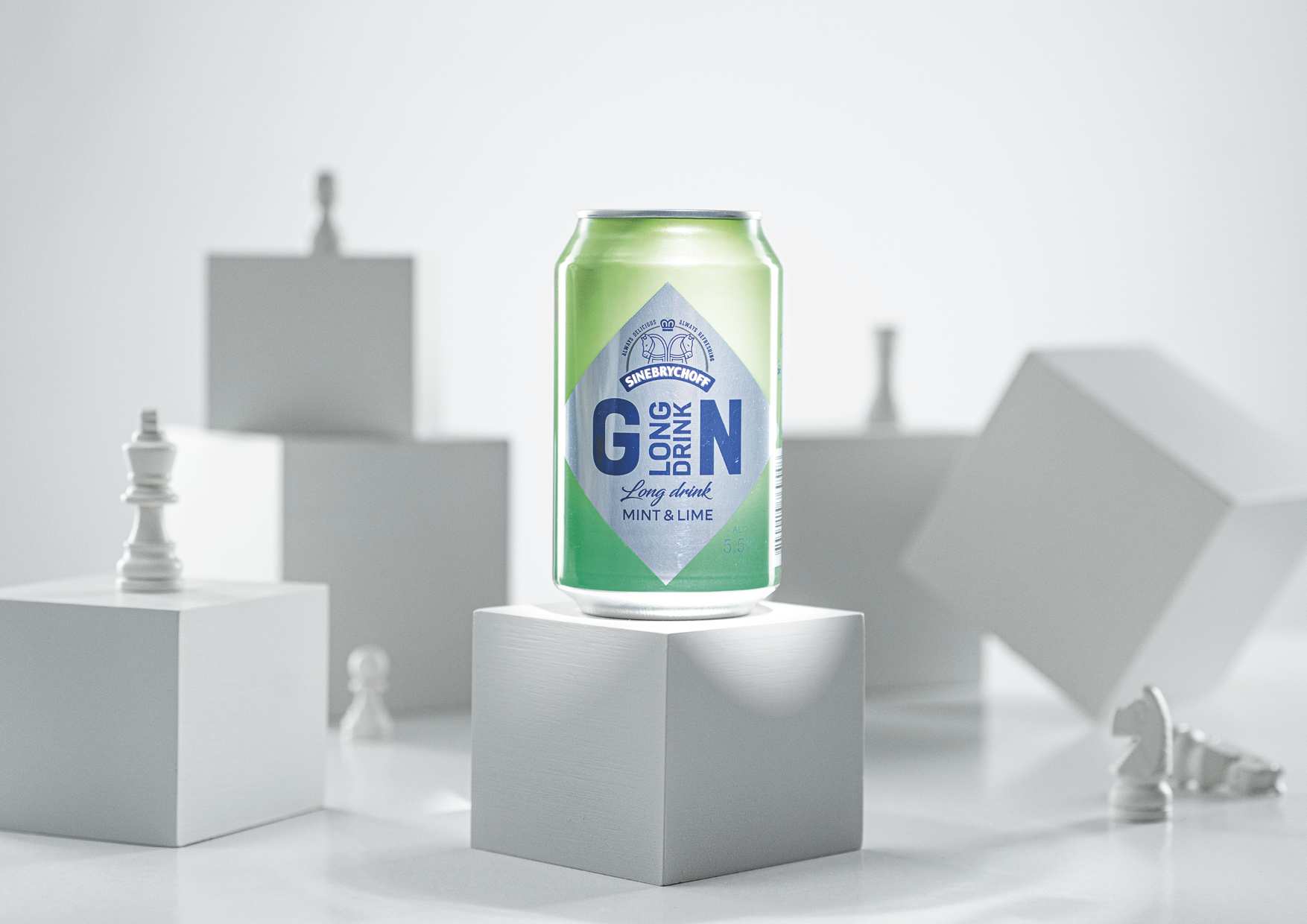
Sinebrychoff decided to embrace the chess imagery, but to evolve and adapt it to a much more modern look with powerful and strong neon colours. Something that would feel fresh but familiar at the same time. And of course – true to brand and product category.
The End Result
Sinebrychoff took to stores with brand new eye-catching packaging that maintained associations to the traditions of Finnish long drinks, while also feeling much fresher with clear-cut geometrical shapes that resemble the checker pattern of a chessboard. Each flavor got its own bold and funky colour to match the taste of the flavor. Together they made up a really vibrant and fun series that will take your mind to the good old times of disco. The new and exciting but still familiar packaging was a welcomed sight for our consumers. Long live lonkero!
CREDIT
- Agency/Creative: Division
- Article Title: Division Created Packaging Refresh Sinebrychoff Long Drink
- Organisation/Entity: Agency
- Project Type: Packaging
- Project Status: Published
- Agency/Creative Country: Estonia
- Agency/Creative City: Tallinn
- Market Region: Europe
- Project Deliverables: Product Design
- Format: Can
- Substrate: Metal
- Industry: Food/Beverage
- Keywords: chess; long drink; alcoholic beverage
-
Credits:
Art director: Taavi Tänav
Creative copy: Daniel Erik Raidjõe
Photographer: Rasmus Laisk
Project manager: Grete Tipp


