NovaBrand – Oops!
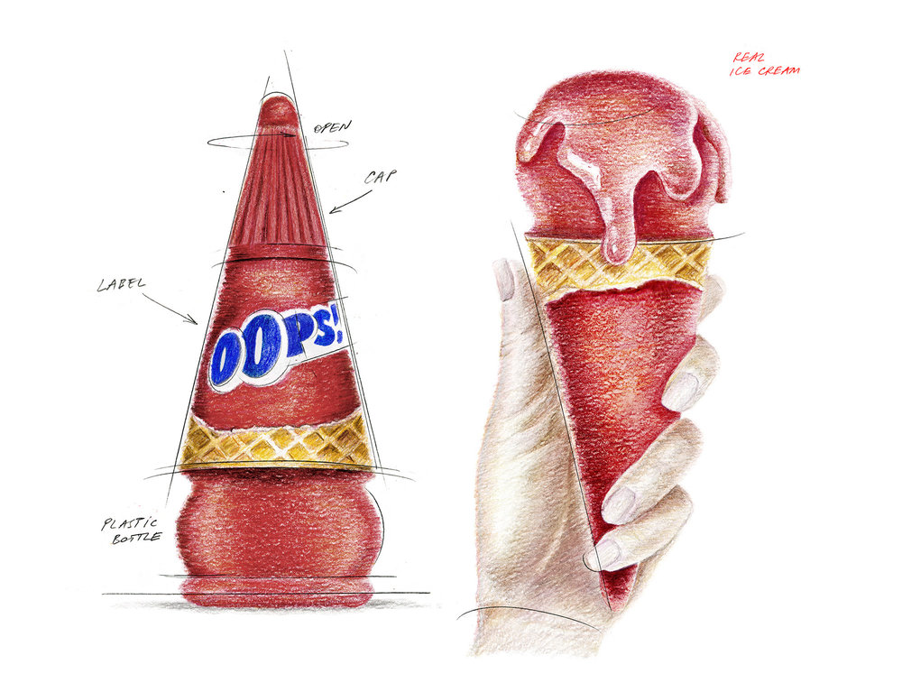
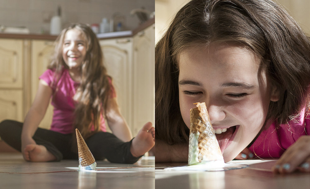
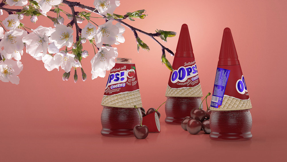
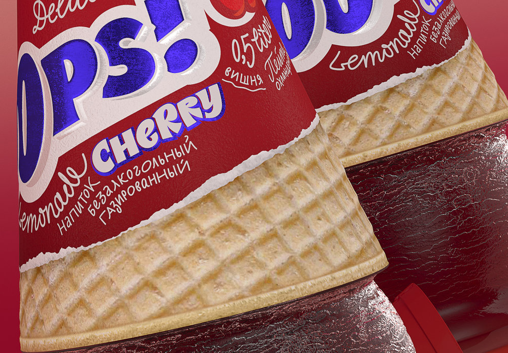
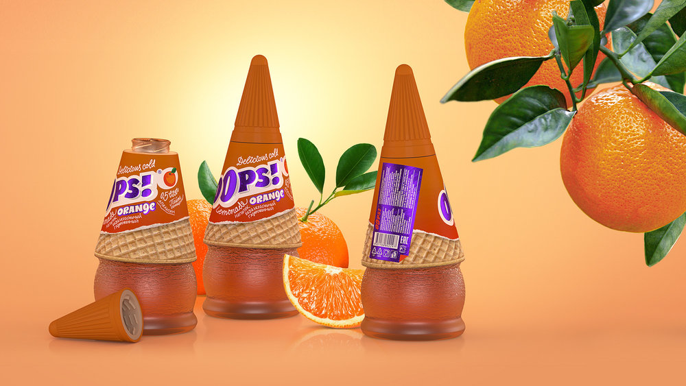
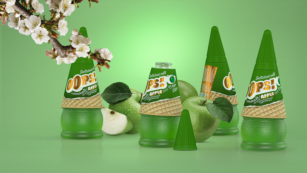
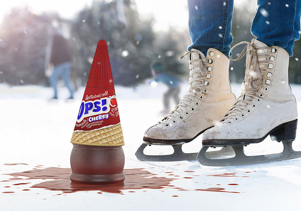
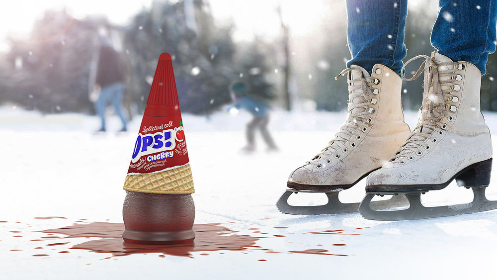
Hour by hour the heat comes. Asphalt melts from the swelter, exhausted passersby hide in the trees shades, but the sun continues to pour its golden rays on the ground. Thereat a breath of coolness becomes a treasure. And it will be a great misstep, if the long-awaited salvation from the summer hell sliped away from the hands. Oops!Oops! is a lemonade, to which the hand of any person dreaming about coolness on a hot summer day stretches. The shape of the bottle and the idea of droped on the ground ice cream (which makes the basis of the design) are unique. Bright and catchy packaging can make you smile, and the playful label design keeps the atmosphere of a light joke. The name of the drink (simultaneously with the exclamation that demonstrates the bitterness of loss) sounds like a hissing sound while opening the bottle.