


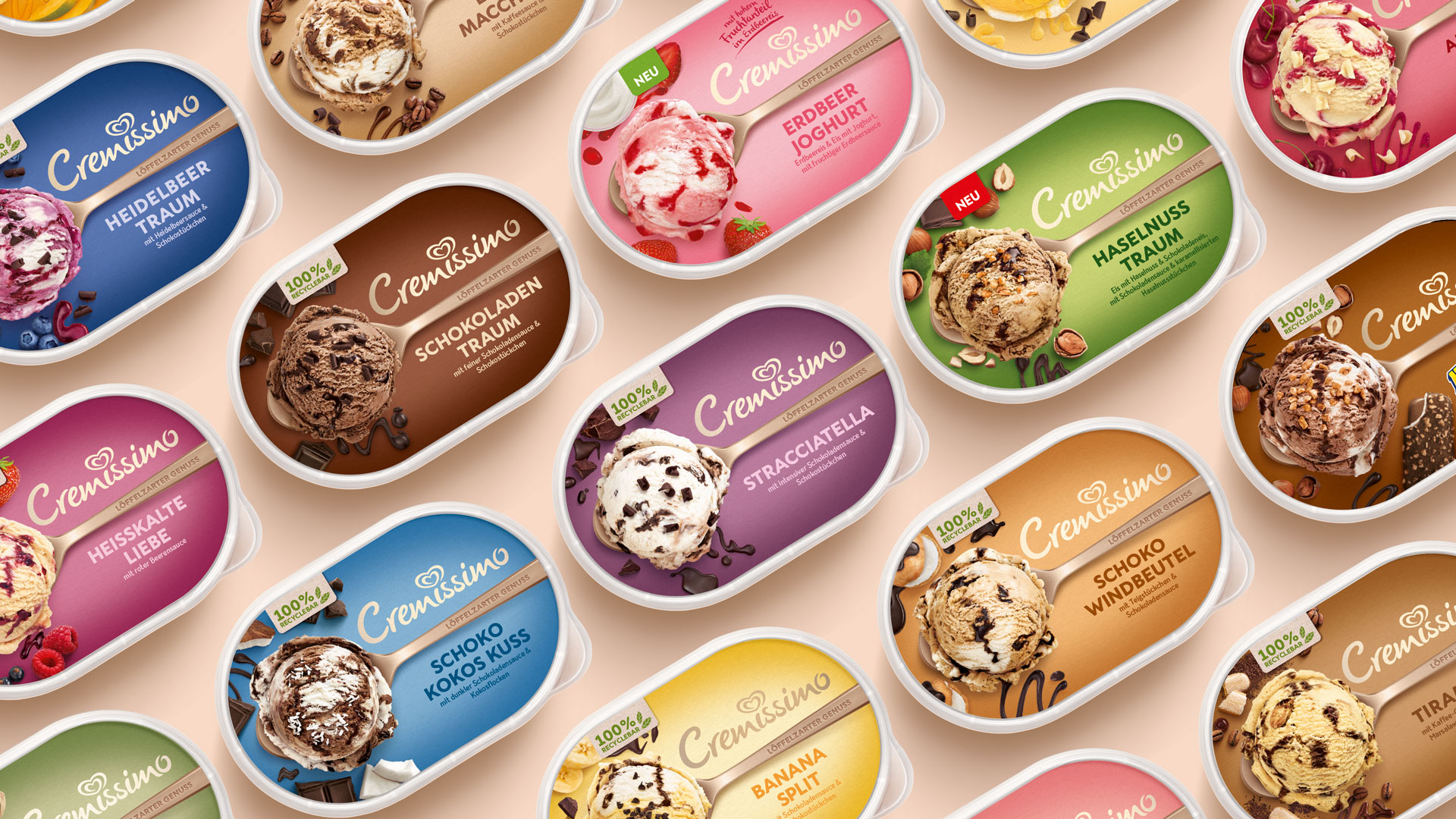
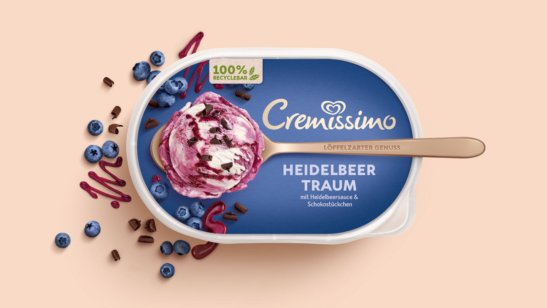
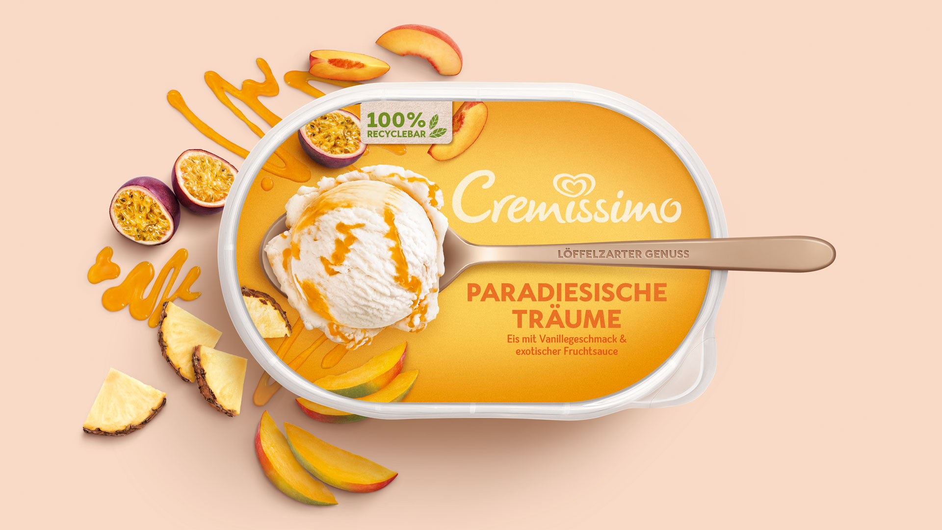
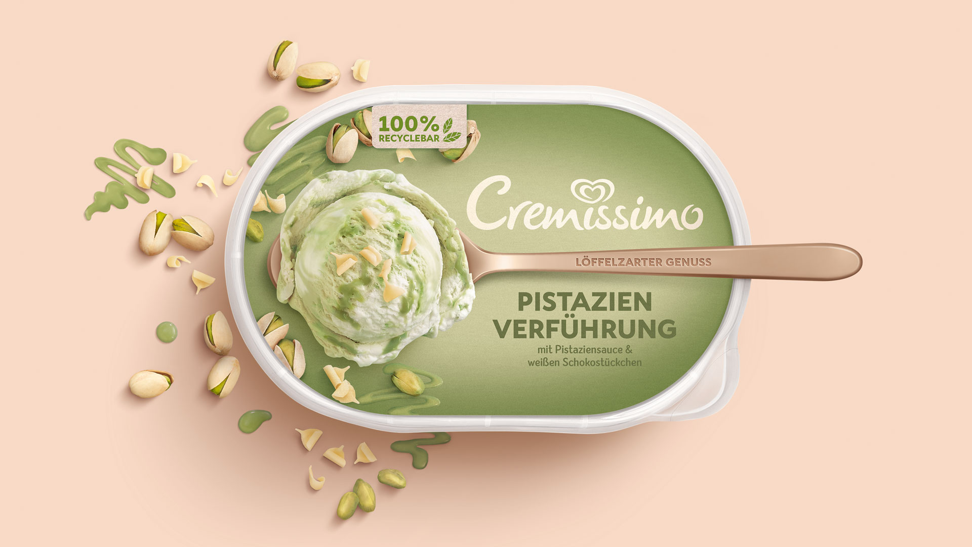
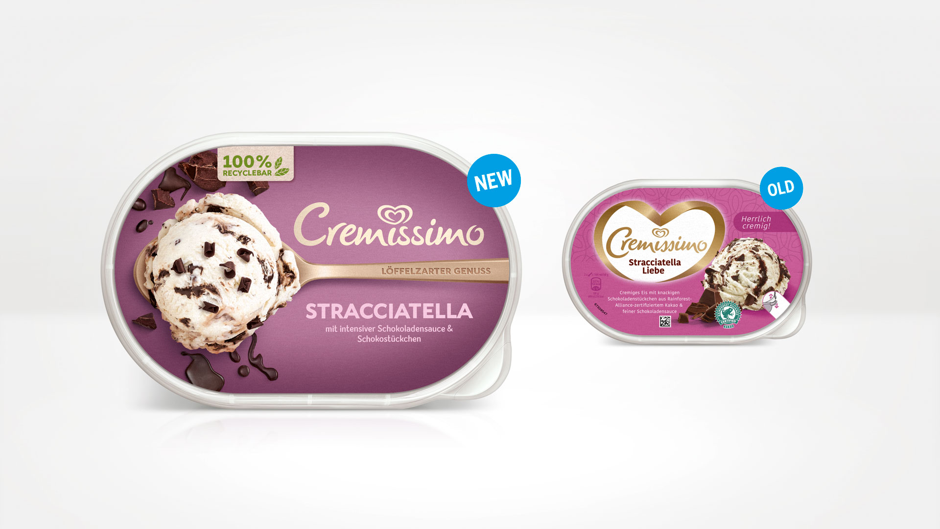
Clear, contemporary and simply yummy – this is the new look for Cremissimo at POS. With a trendy design, HAJOK has put Cremissimo in a completely new light. The logo has been simplified and modernised. The lettering has been removed from the heart-shaped imagery and now interacts with the spoon as a new key visual, placing the soft, spoonable creaminess at the centre of the design. The previously rather artificial colour scheme has given way to a rich range of colours. The sustainability of the pack has gained prominence with a paper-look flash and illustrations. The Cremissimo portfolio appeals with a distinct visual identity, providing more stand-out effect to help quickly find your favourite variety, while really making you want to enjoy some super-smooth ice-cream!
CREDIT
- Agency/Creative: HAJOK Design
- Article Title: Cremissimo Packaging Relaunch
- Organisation/Entity: Agency, Published Commercial Design
- Project Type: Packaging
- Agency/Creative Country: Germany
- Market Region: Europe
- Project Deliverables: Brand Guidelines, Brand Identity, Brand Redesign, Branding, Graphic Design, Packaging Design, Photography, Rebranding, Research
- Format: Pot
- Substrate: Plastic


