


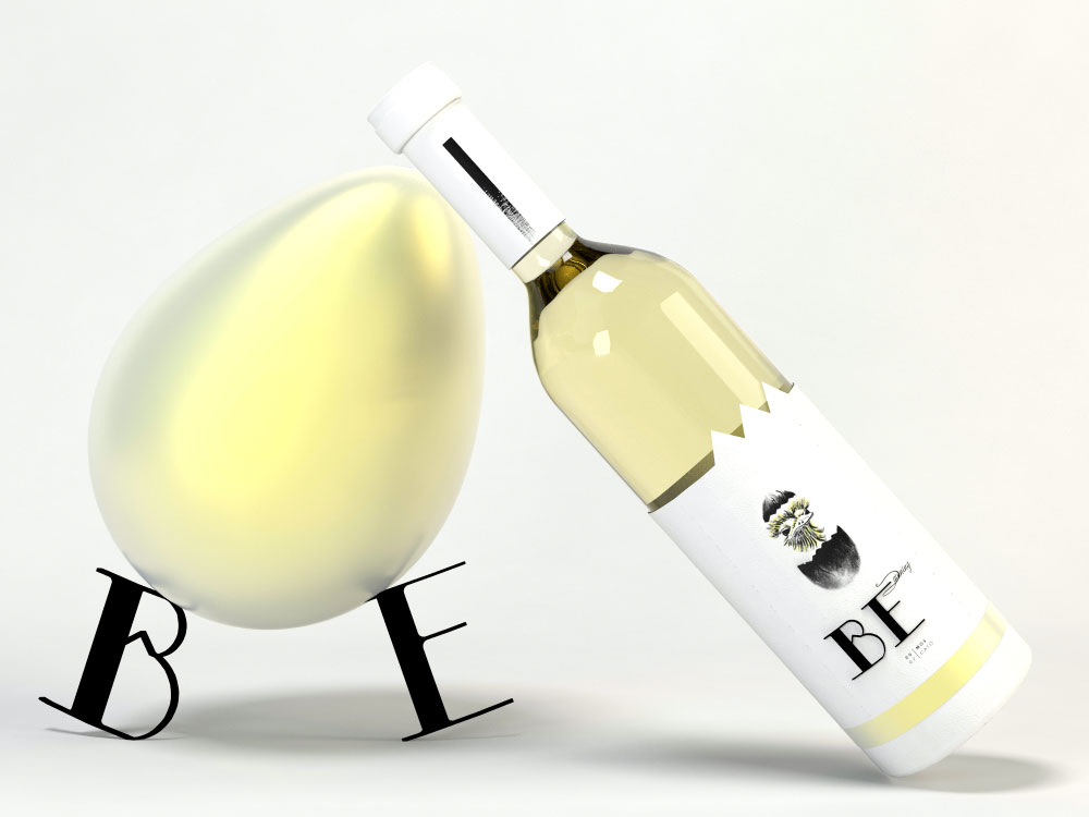

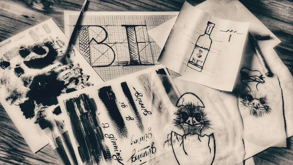
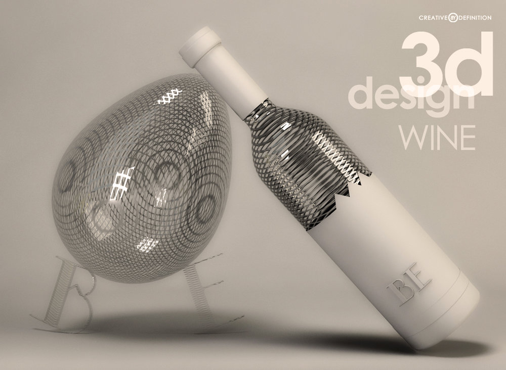
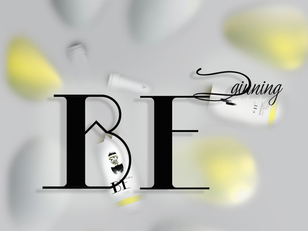
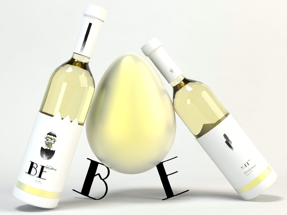
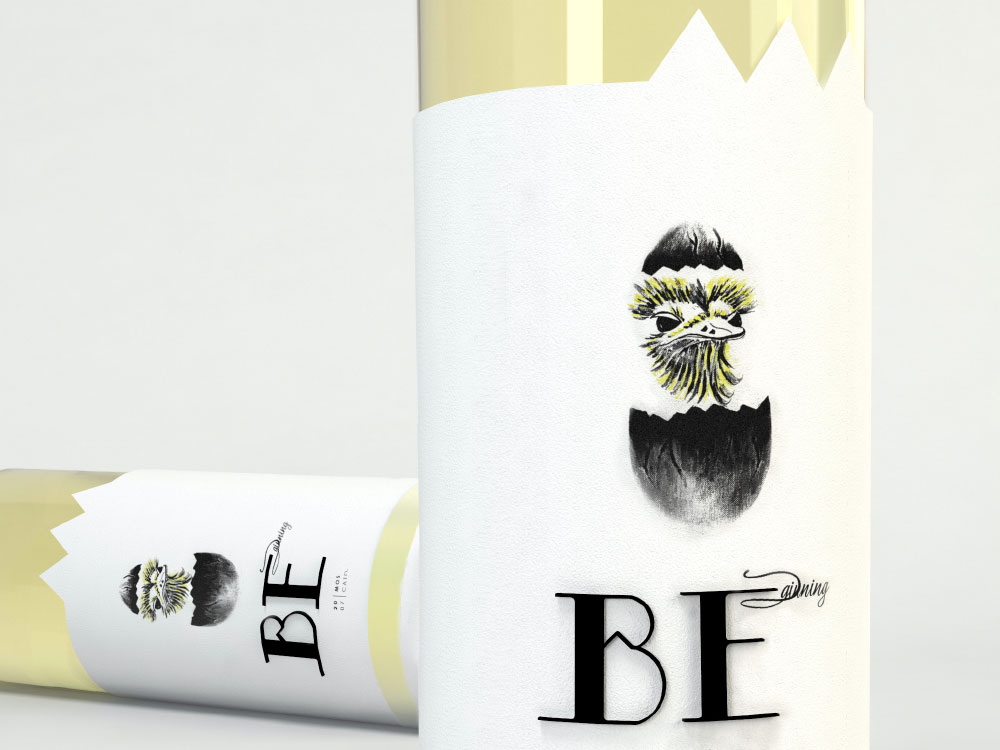
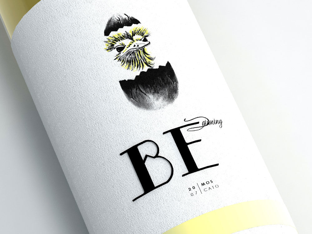
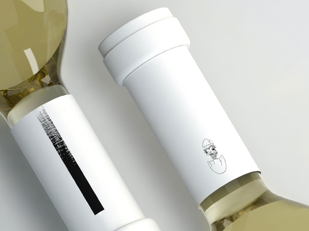
” “Beginning” concept is based on the human fascination with the amazing natural structure of an egg shell and its meaning, offering live and protection.
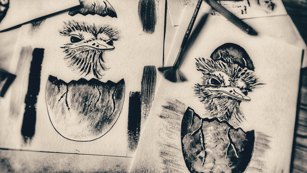
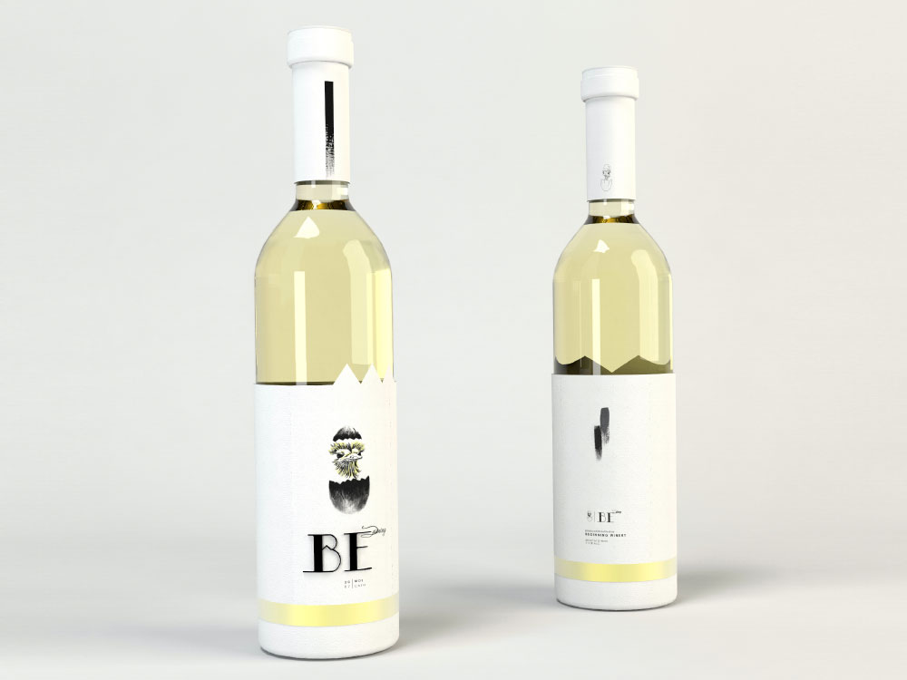
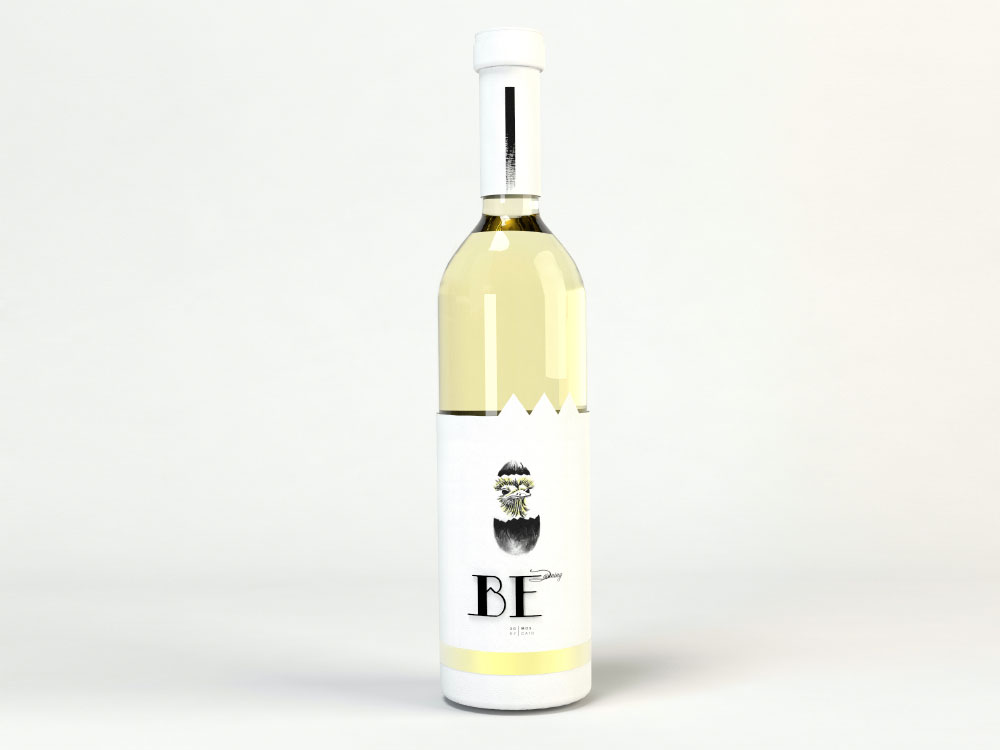
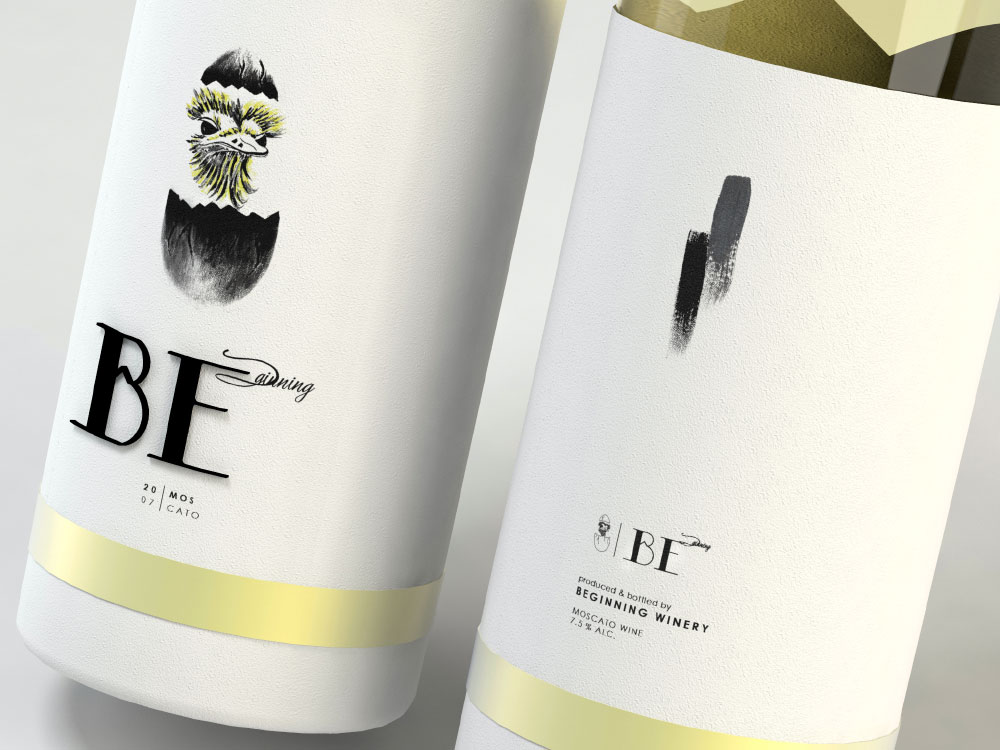
The oil paint illustration adds a funnier note in the visual composition of the label for this white wine packaging.
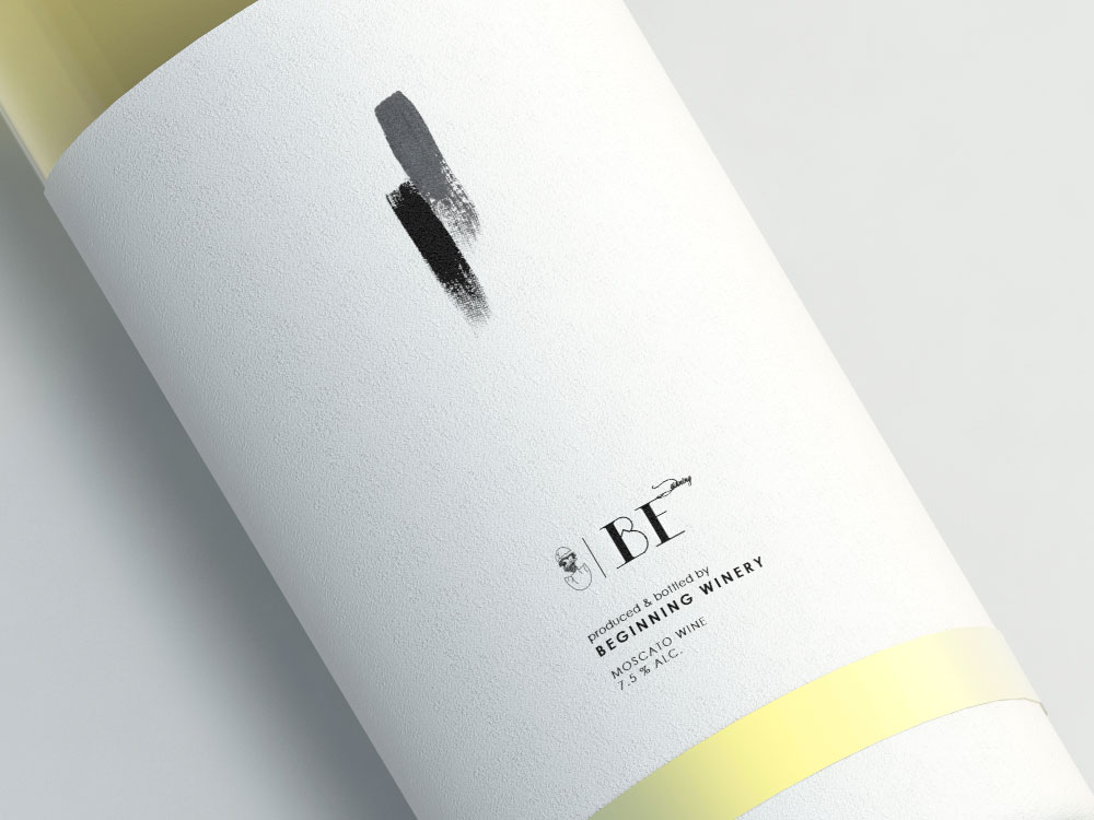
The design uses 3 major color tones: white, black and yellow, bringing a spring aesthetic value to the wine package.
The 3 sharp edges of the label, situated in the left upper part of the label are visually creating the idea of a new beginning, a broken shell, a new life that steps into this world.
“ A good beginning starts with a great wine. ” ”

CREDIT
- Agency/Creative: CreativeByDefinition
- Article Title: CreativeByDefinition – Beginning Wine (Self Published)
- Project Type: Packaging
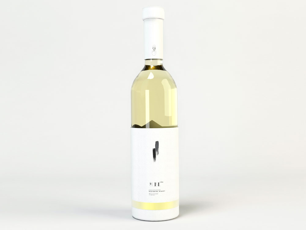
- Format: Bottle
- Substrate: Glass
FEEDBACK
Relevance: Solution/idea in relation to brand, product or service
Implementation: Attention, detailing and finishing of final solution
Presentation: Text, visualisation and quality of the presentation


