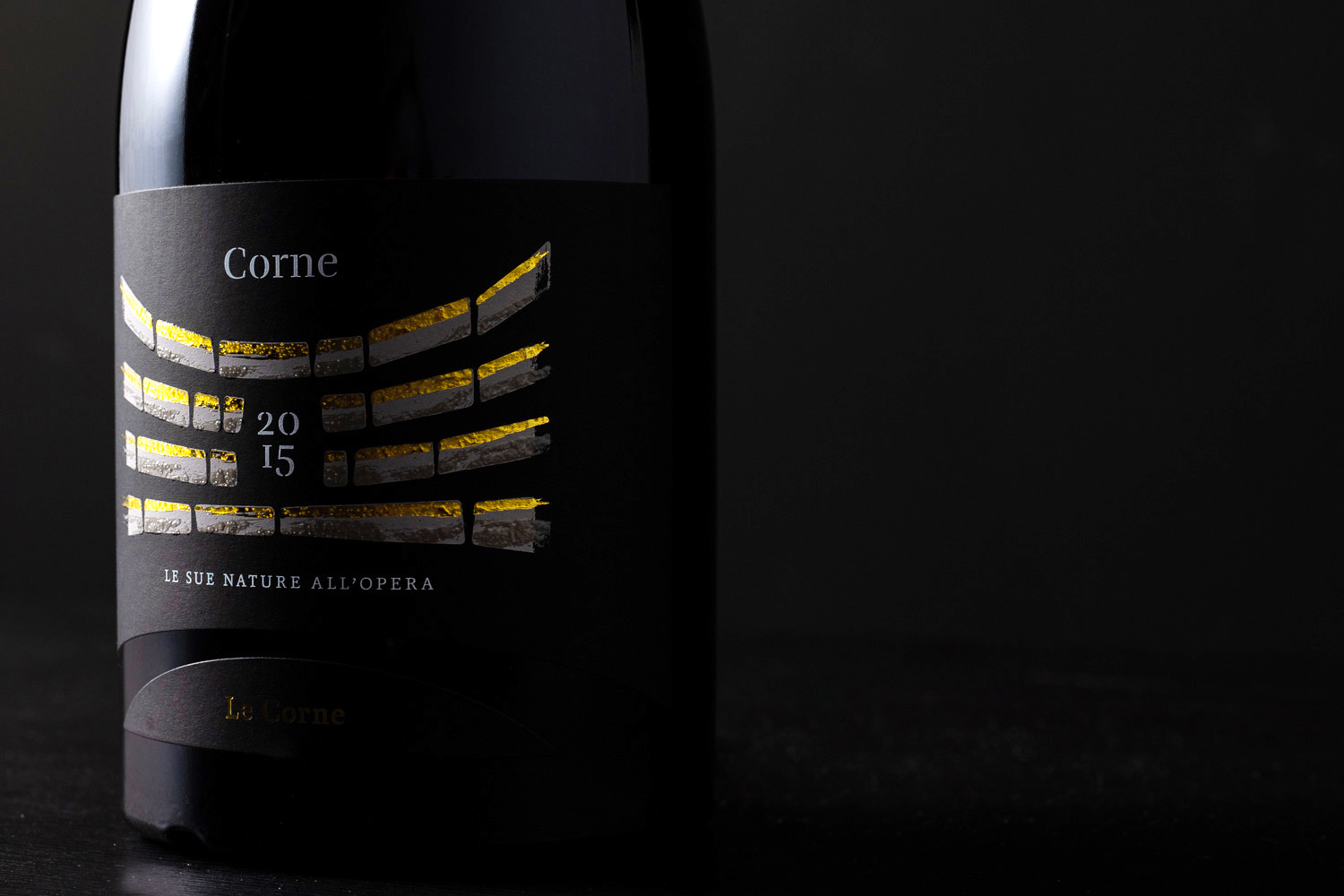
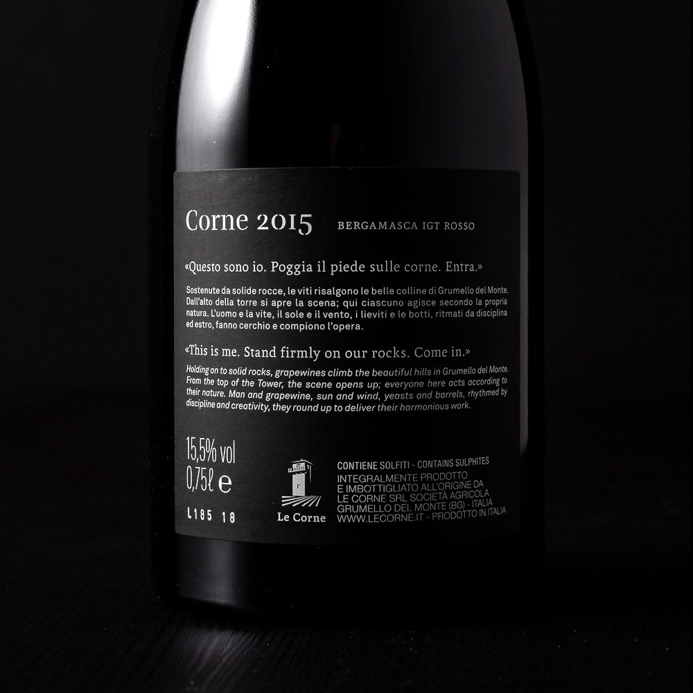
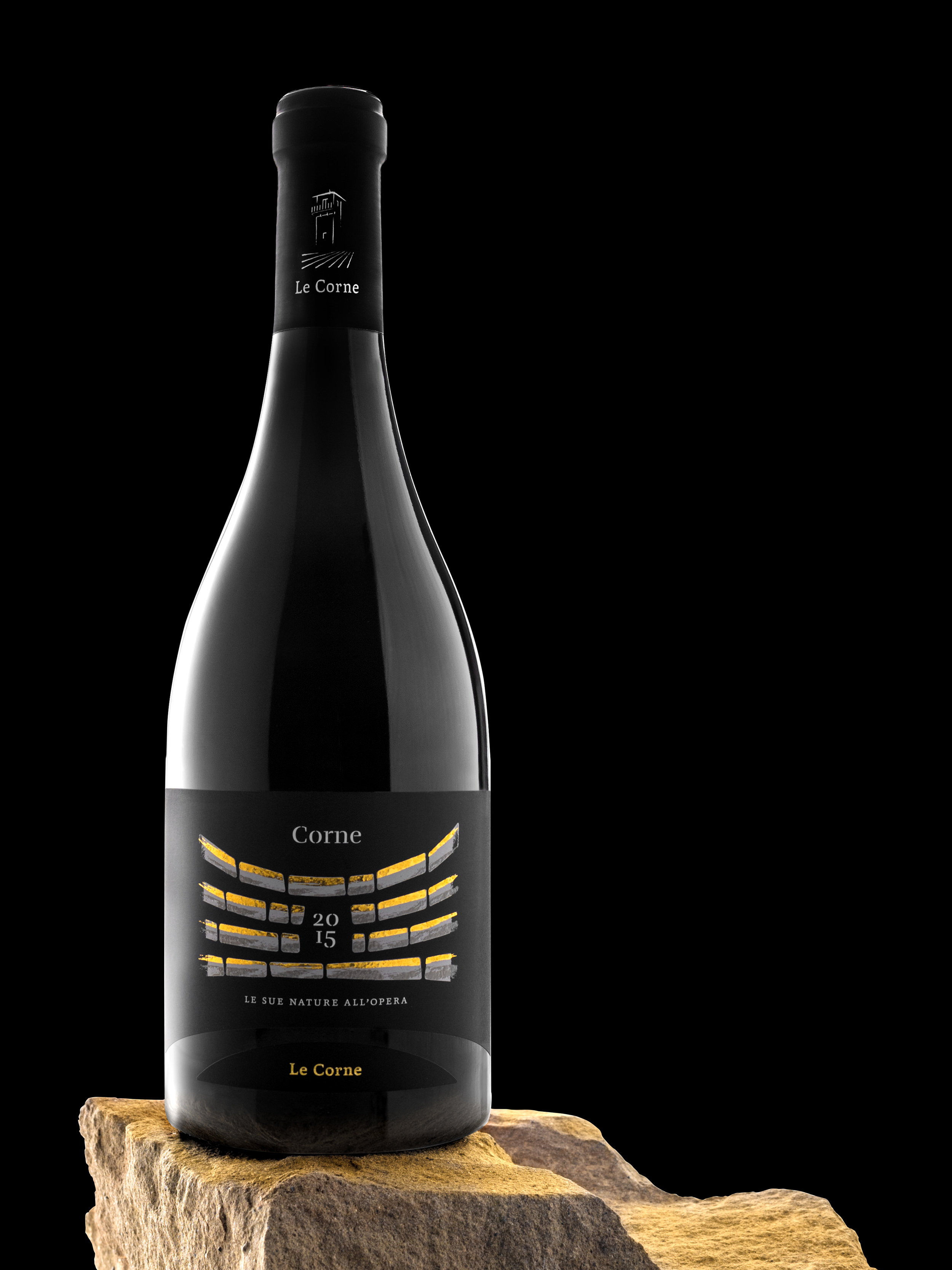
Corne 2015 is the first vintage, bottled at Le Corne. This wine for the winery is like a “premiére” with only two actors on the stage: man and nature.
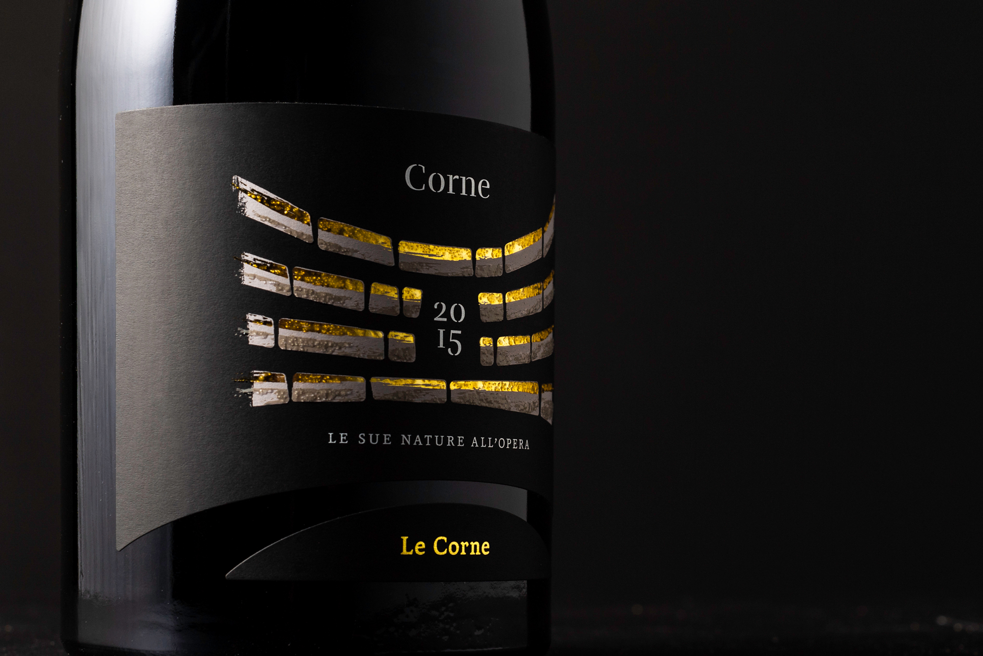
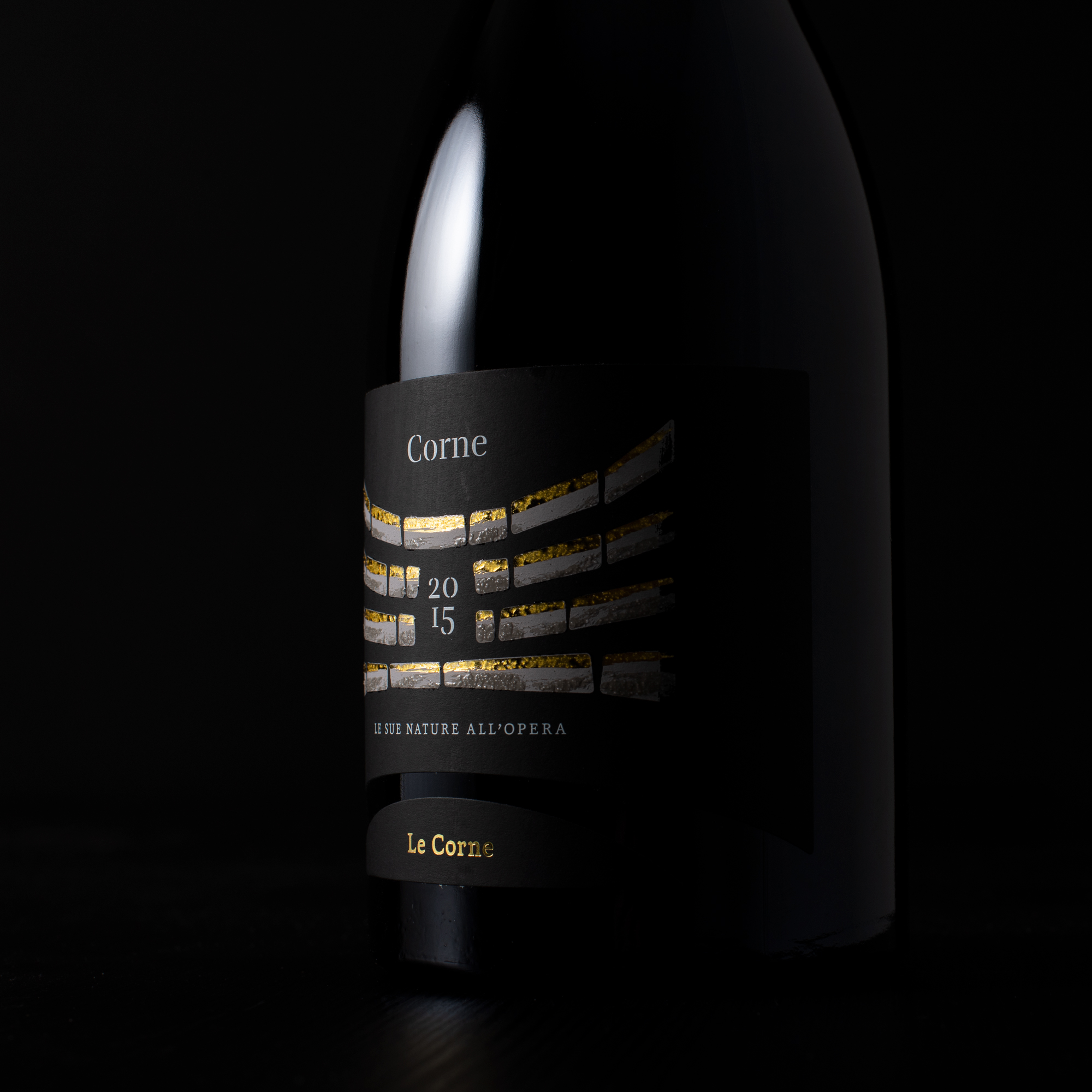
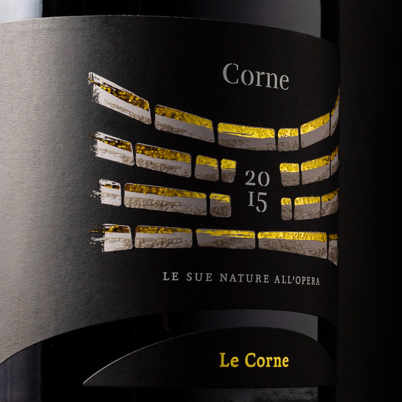
Le Corne is an organic winery near Bergamo. “Corna” is the typical name of the calcareous rock that forms the subsoil of Monte di Grumello. Like a stage, this rock welcomes the vine and man: the two protagonists of this act. The illustration on the label conceptually represents an amphitheater, and it takes its cue from an imposing semi-circular rock wall located at the foot of the vineyard: useful for water drainage, which was built with stones recovered from the reclamation of vineyards.
A Natural amphitheater.
At the foot of the Le Corne vineyard a rock amphitheater was built during the reclamation phase. The rocks, with which it was built (named “Corne”) were recuperated from the tilling of the land.
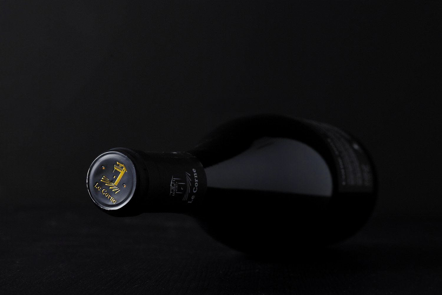
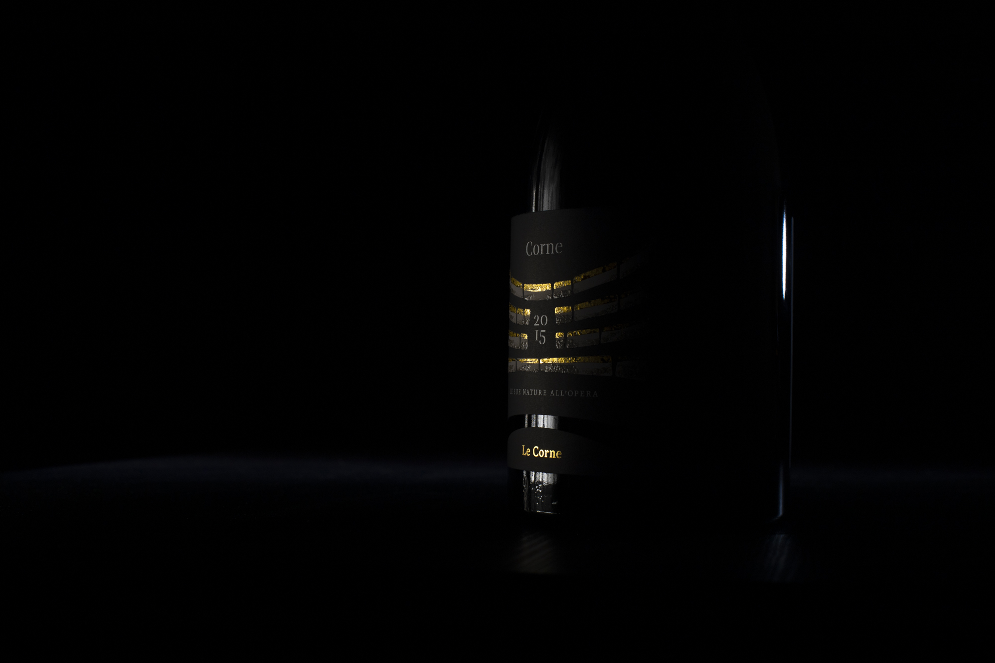
“The perspectives created by the composition and the rounded die cut mean that this bottle is a little hard to miss.”
CREDIT
- Agency/Creative: Salvatore Santaniello
- Article Title: Corne 2015 Premium Red Wine
- Organisation/Entity: Freelance, Published Commercial Design
- Project Type: Packaging
- Agency/Creative Country: Italy
- Market Region: Europe
- Project Deliverables: Brand Identity, Brand Strategy, Branding, Graphic Design, Packaging Design
- Format: Bottle
- Substrate: Glass Bottle


