


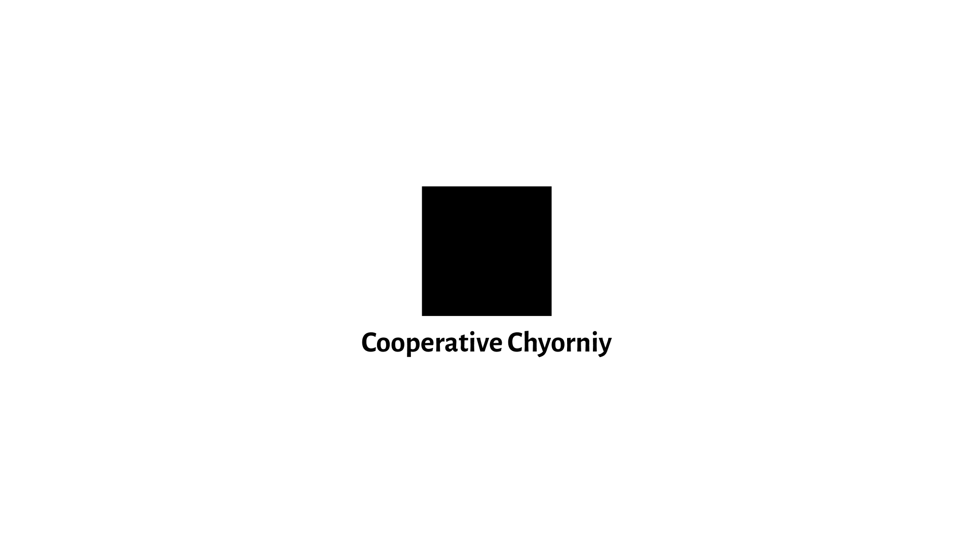
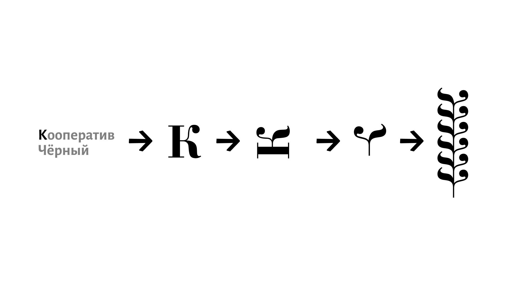
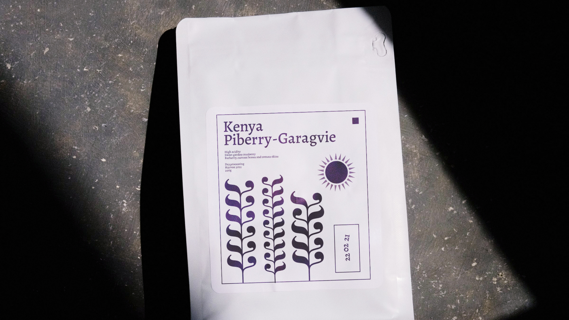
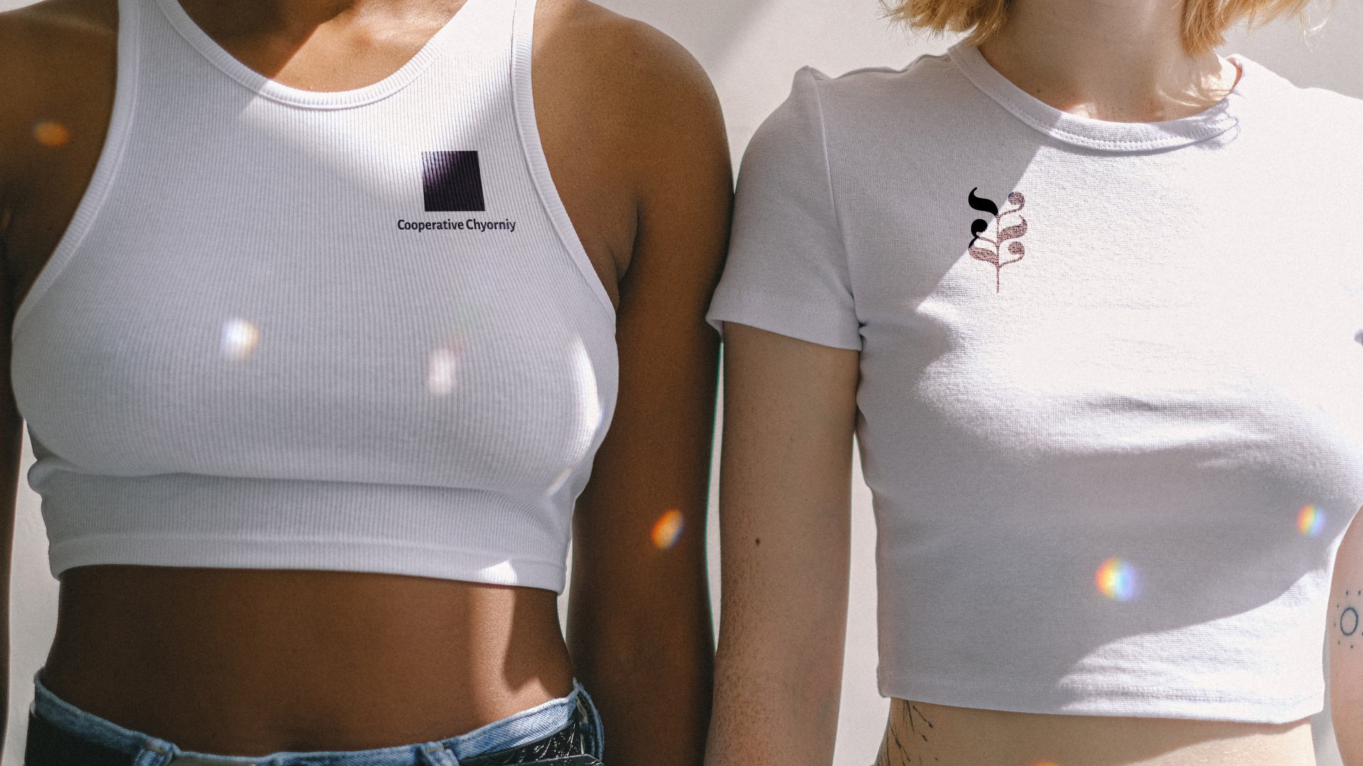
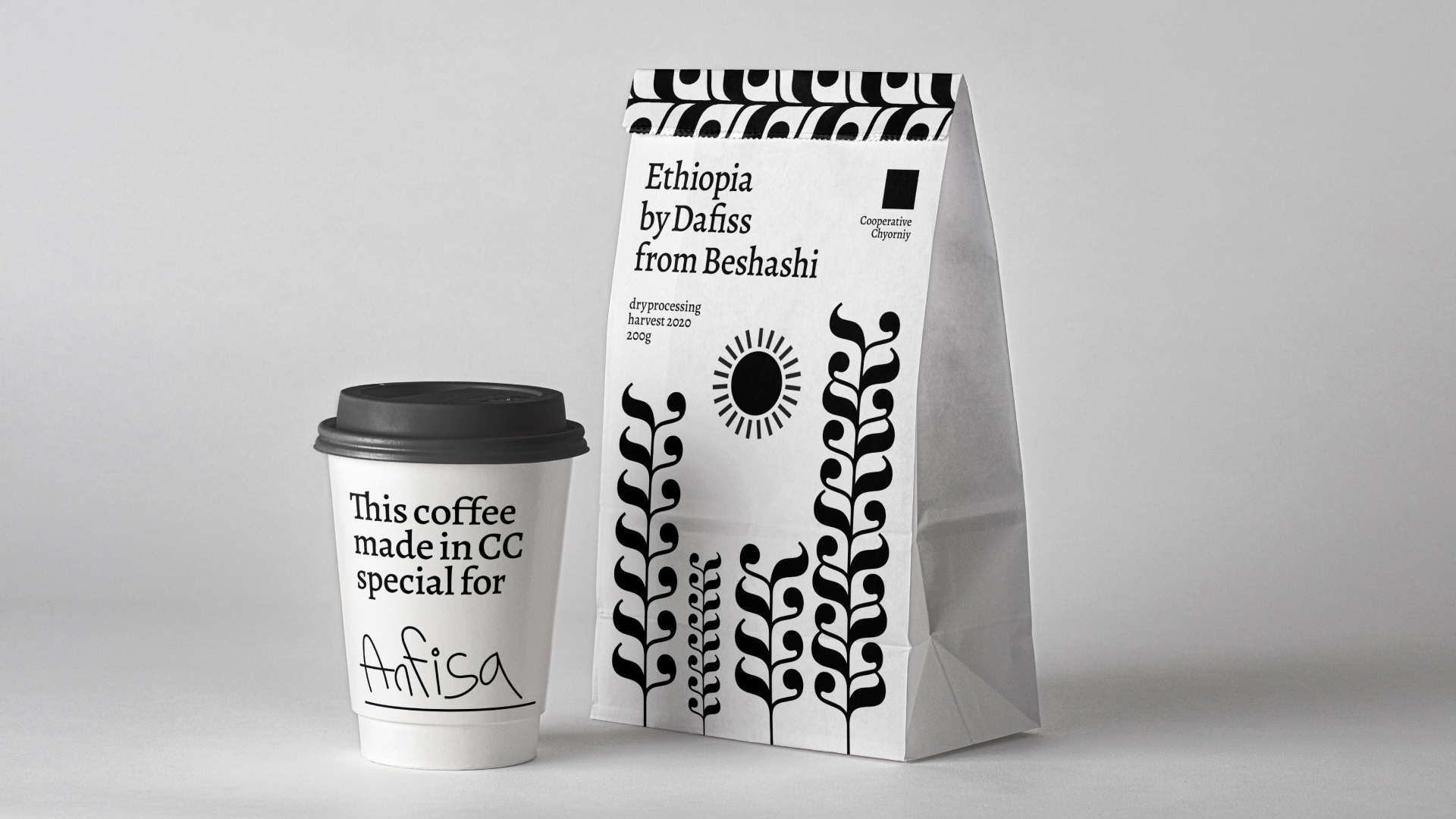
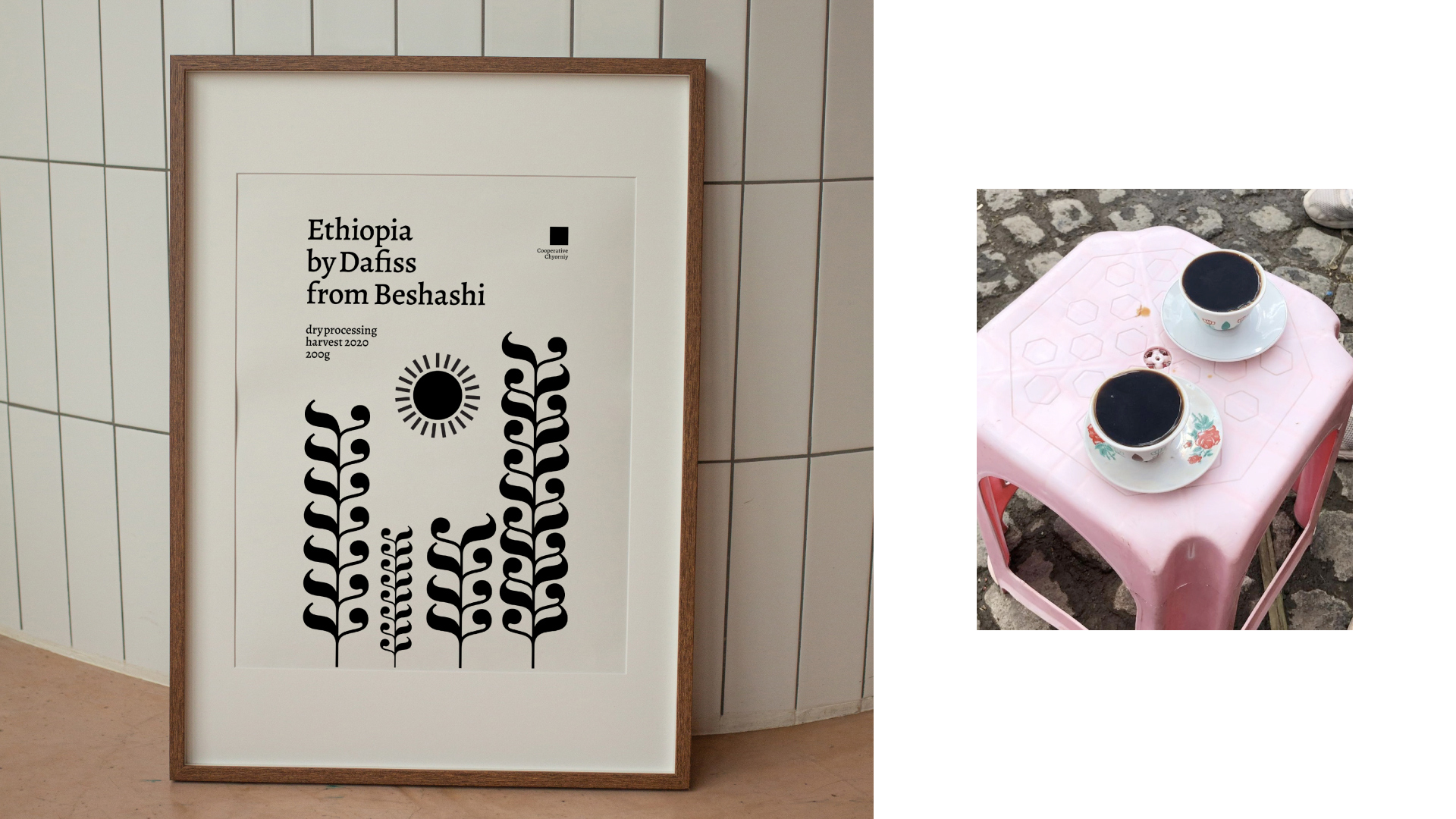
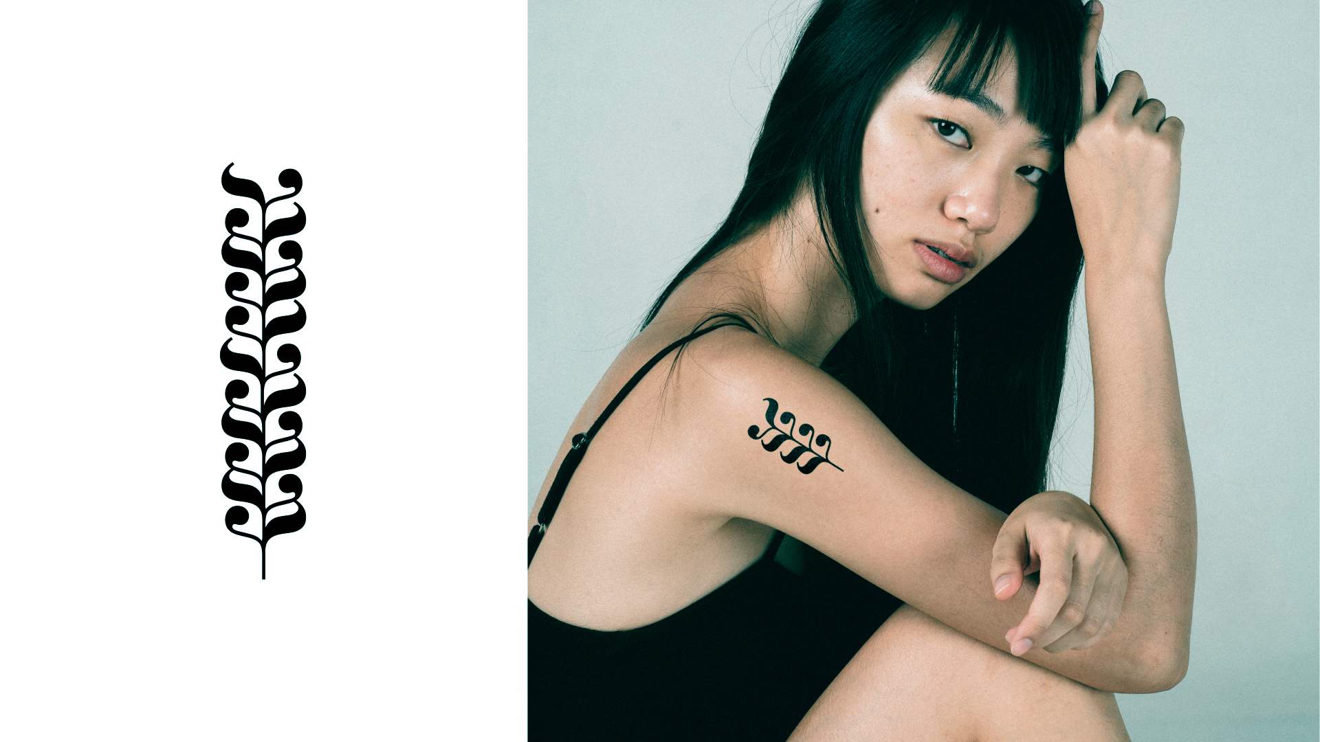
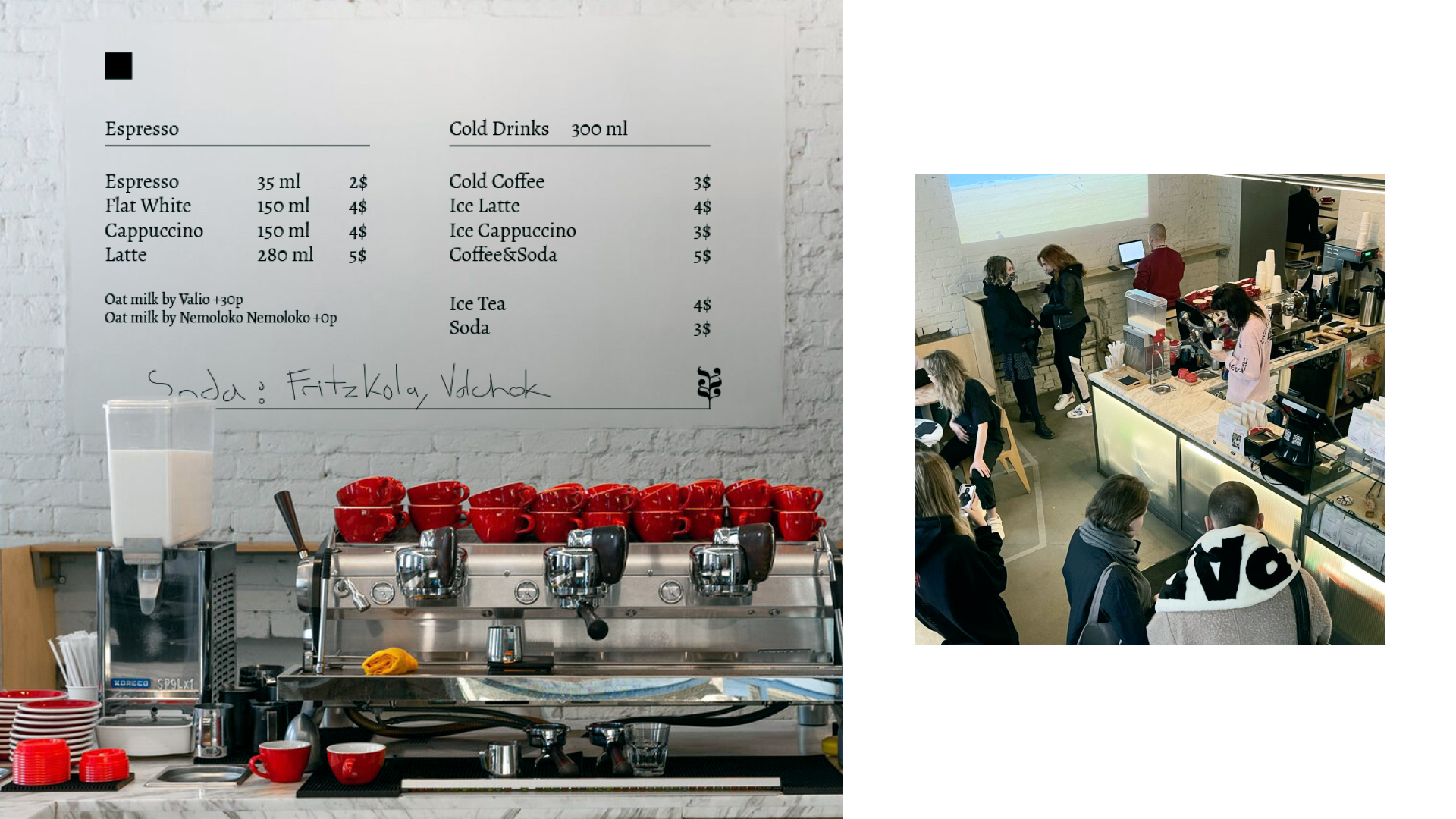
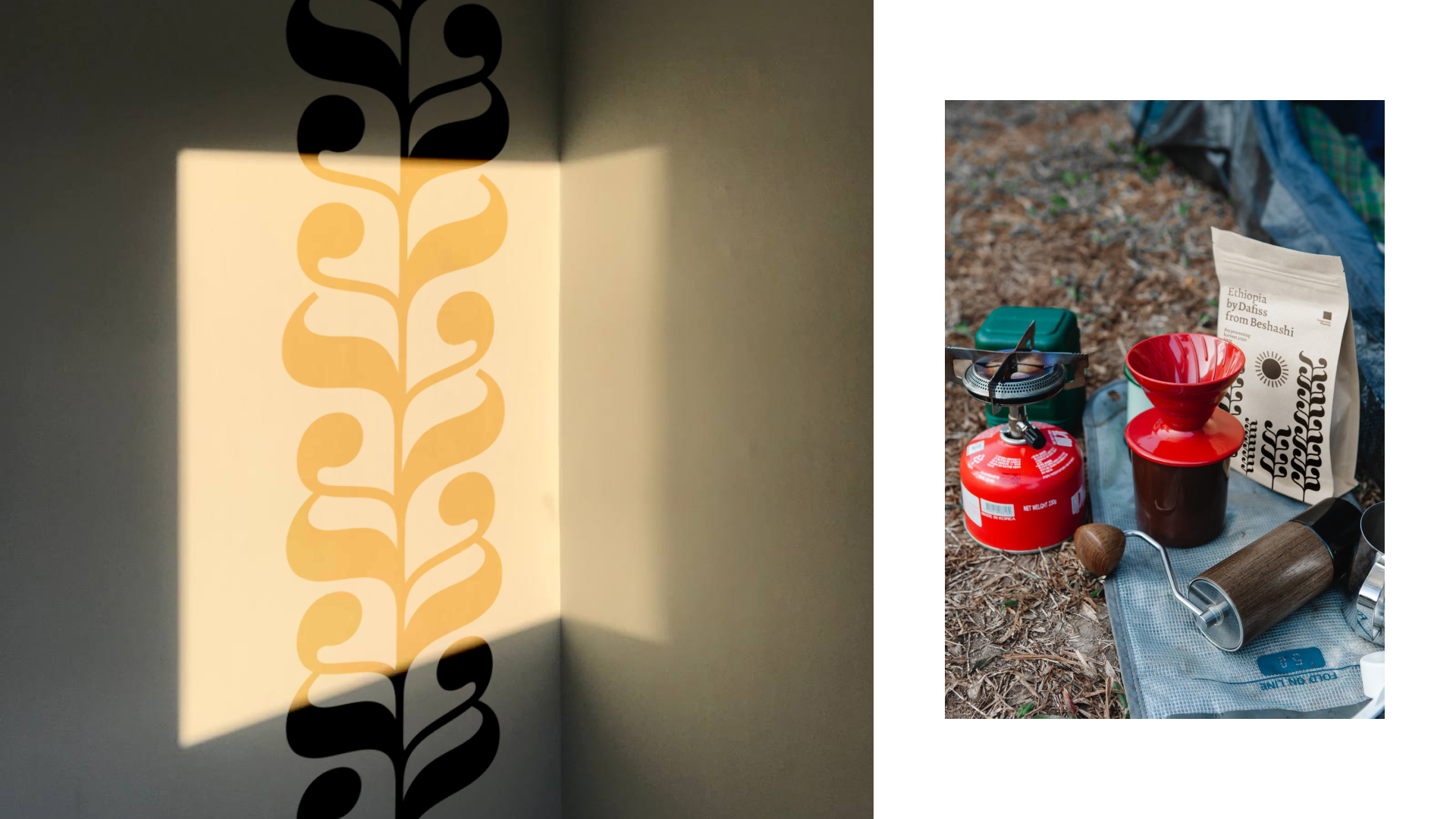
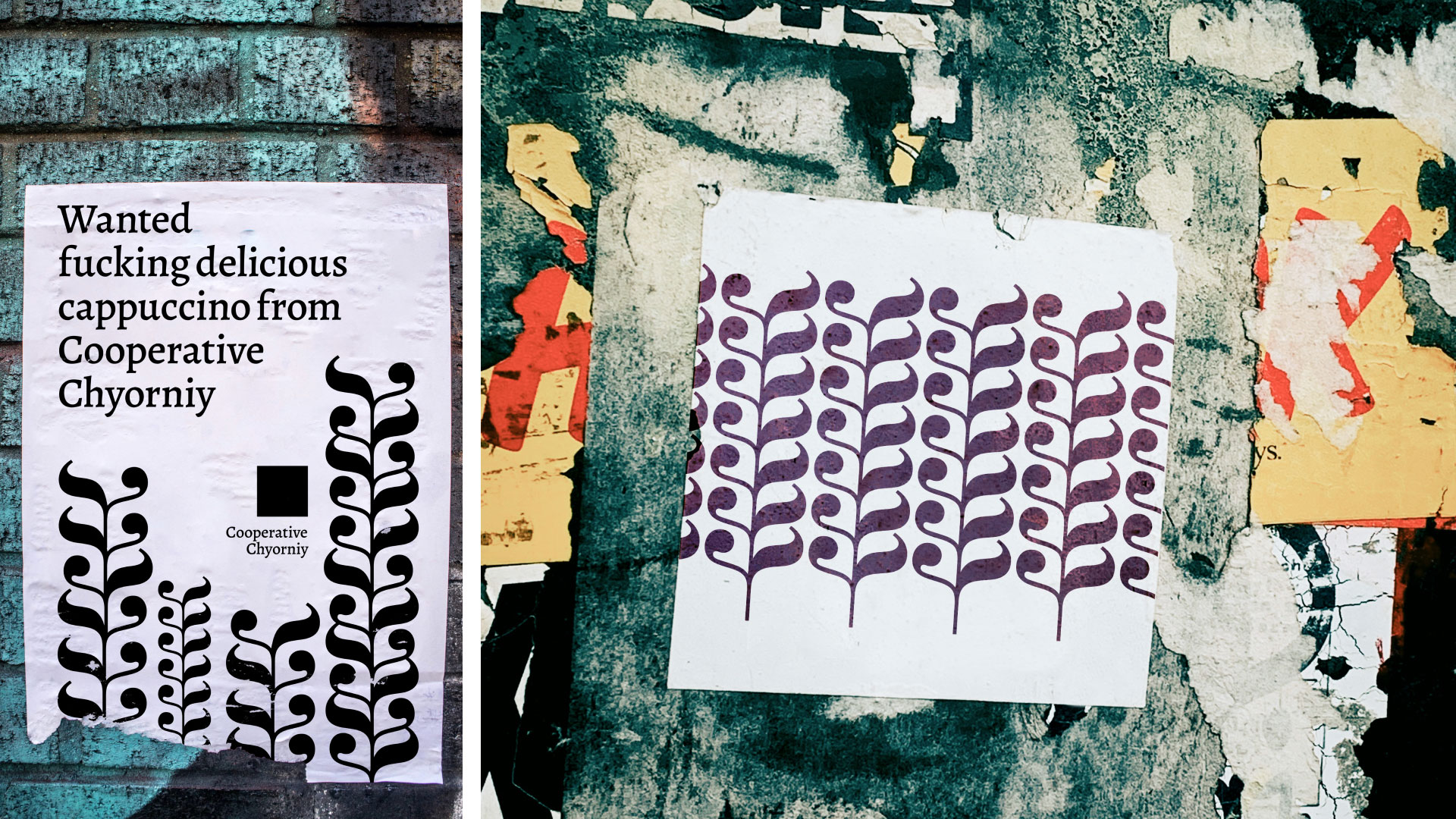
Cooperative Chyorniy (Cooperative Black) is a Moscow specialty coffee shop. In February 2021, they organised a competition for new packaging of their own beans, and at the same time, at the School of Design, they gave me the task to create an identity for the company based only on the font and only on Bodoni. I combined these tasks and made an identity and packaging design for the Cooperative Chyorniy based on the letter K from the Bodoni garniture. I turned it over and cut off the vertical stroke. The result is a piece of floral ornament, from which I assembled the image of coffee fields, where the grains are collected and the sultry “black” sun shines. Cooperative Chyorniy is a young coffee shop that also roasts beans. The grains are delivered to them directly from the collection points, and the roasting takes place already in Moscow. No colors other than black and white were used, since the Сooperative Chyorniy has a black and white palette, in order to maintain the style, I decided to continue this tradition. The resulting style is surprisingly organically blended into the environment of the Cooperative Chyorniy. A minimalist black and white style based on typography only! The Bodoni font remained only in the style of ornaments, and I took the Alegreya typeface as the main font of the project, since it organically continues the theme of vegetation. Also, everything was translated into English, because the center of Moscow is a tourist place, and it is impossible to find people in the Black Cooperative who do not understand English. In addition, it removes the barrier to expansion to other countries.
CREDIT
- Agency/Creative: Sasha Korshenyuk
- Article Title: Cooperative Chyorniy Coffee Hoyse Brand Identity Concept by Sasha Korshenyuk
- Organisation/Entity: Student
- Project Type: Identity
- Project Status: Non Published
- Agency/Creative Country: Russia
- Agency/Creative City: Moscow
- Market Region: Europe
- Project Deliverables: 2D Design, Brand Identity, Type Design, Typography
- Industry: Food/Beverage
- Keywords: WBDS Student Design Awards 2021/22
-
Credits:
Designer: Sasha Korshenyuk


