


Red Saké is a conceptual craft canned saké spirits focused on the tech world niche. On one hand, it’s no secret that the consumption of sake in Japan has been in steady decline for the last few decades, with domestic sales hovering at just a third of the peak levels reached in 1973. Once the younger generation moved on to wine, beer and whisky, sake got stuck with a lacklustre image of a drink “brewed by the old men for the old men”.
On the other hand, Japan tends to be seen as a nation of workaholics. A long commute, followed by a regular 8-hour day, followed by multiple hours of overtime, and finally and a company drinking party to top it off. The country is slowly moving towards a new system called “job-based employment” where efficiency and skills are valued higher than loyalty to the company or seniority. The trend is strongest in the IT/tech industry.
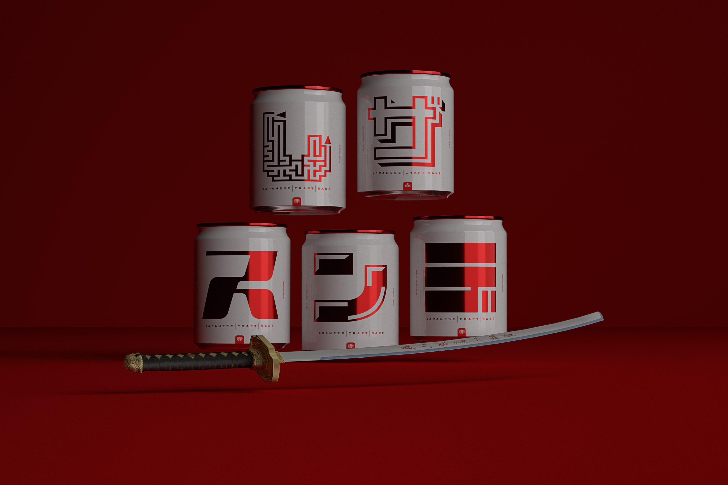
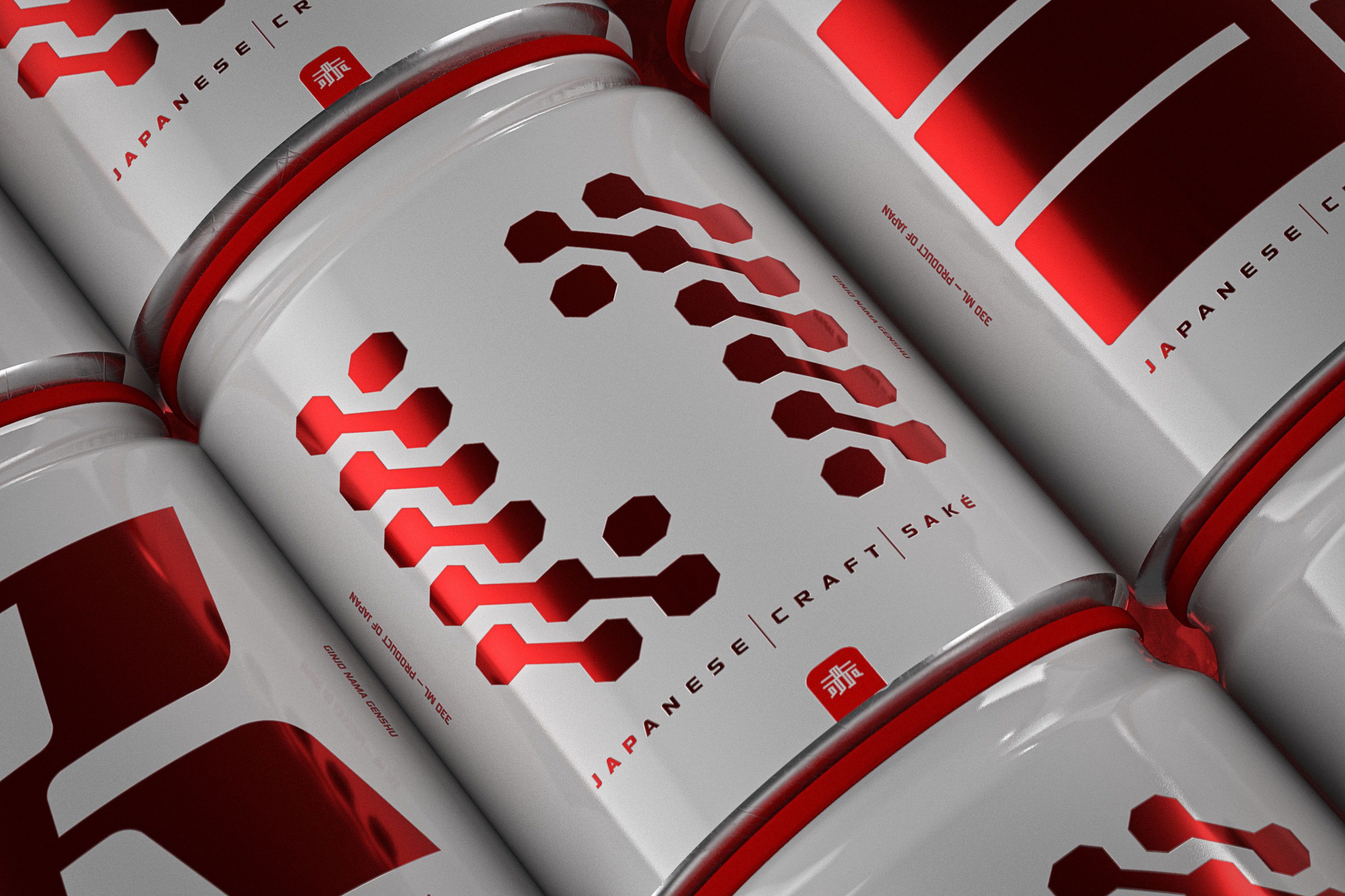
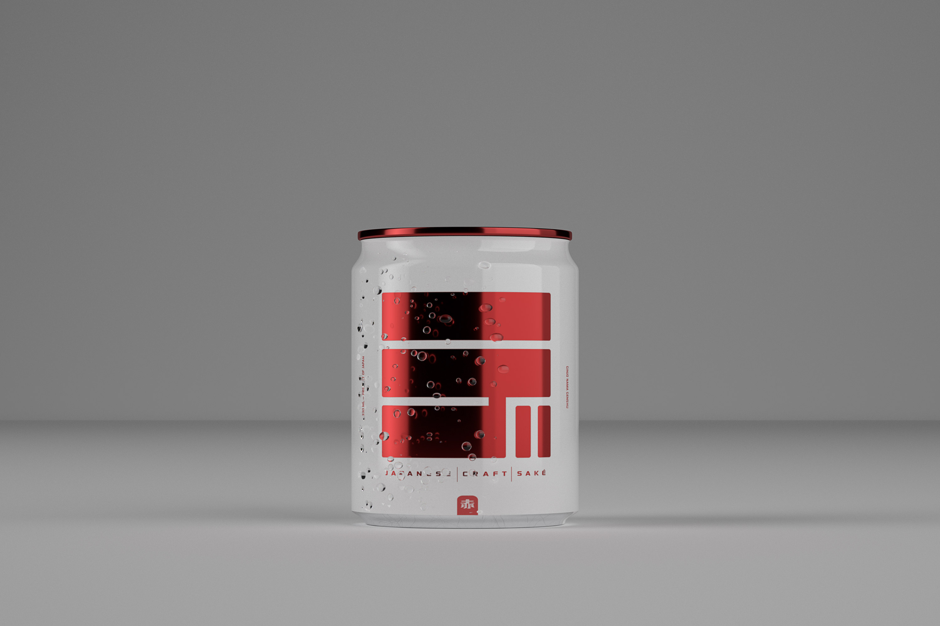
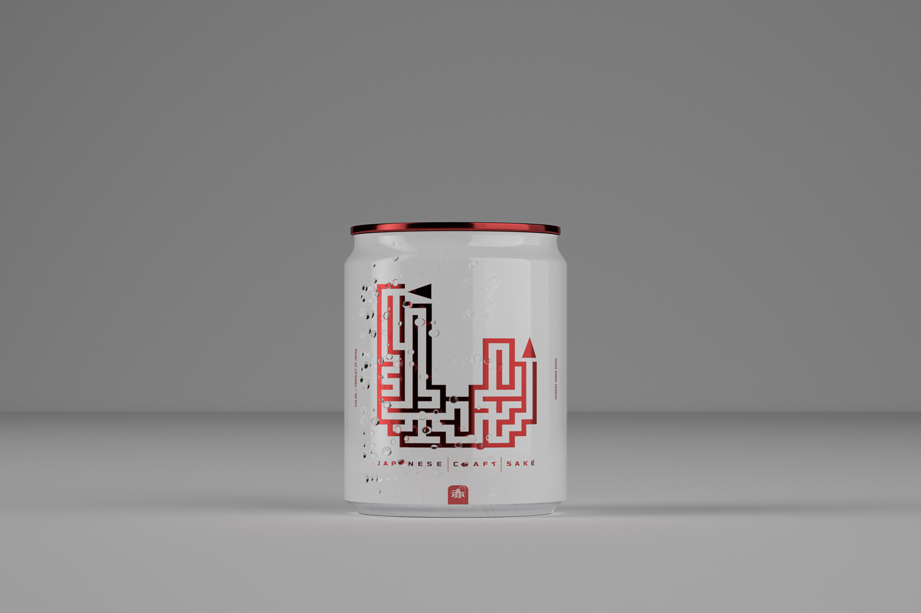
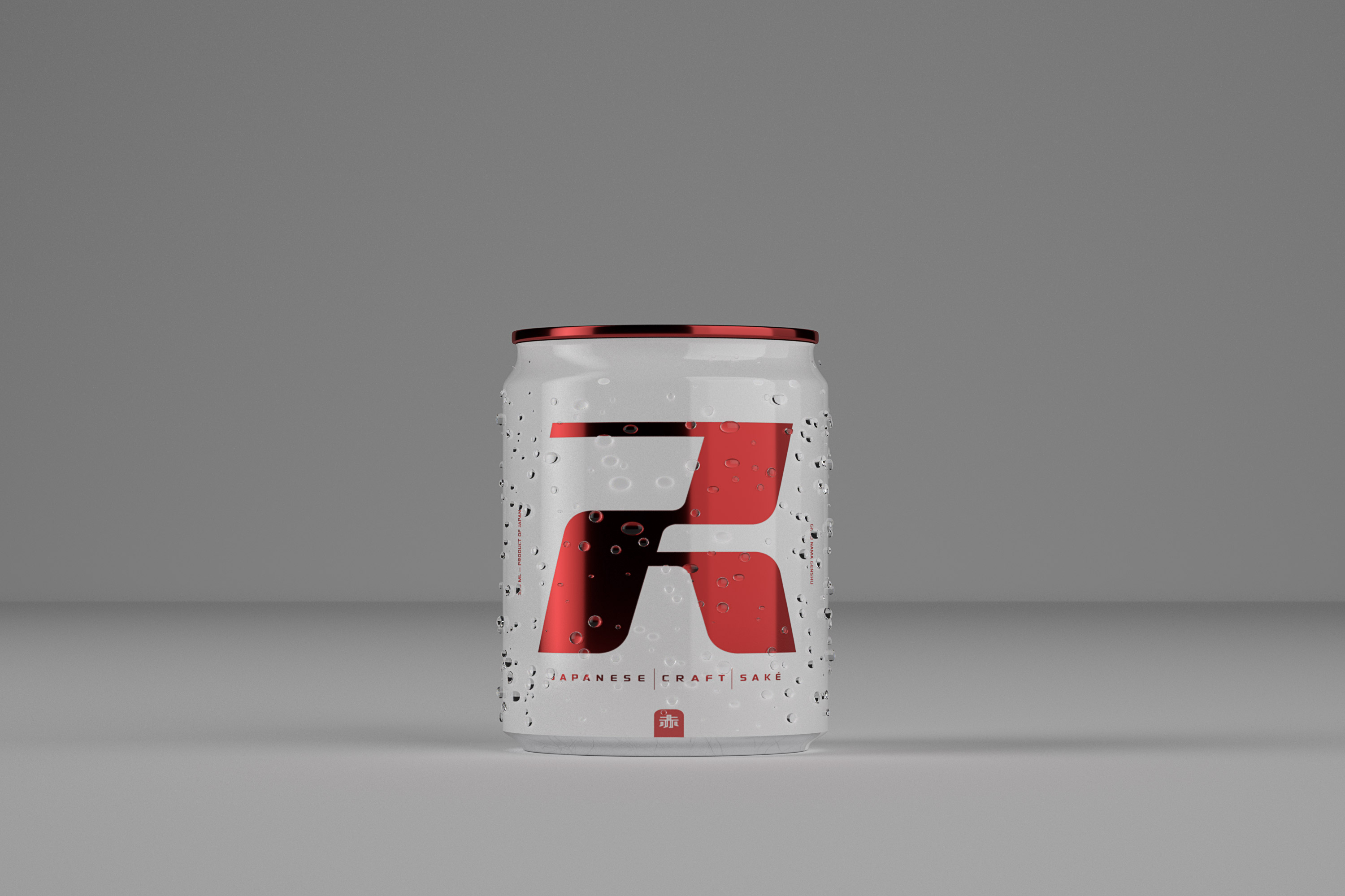
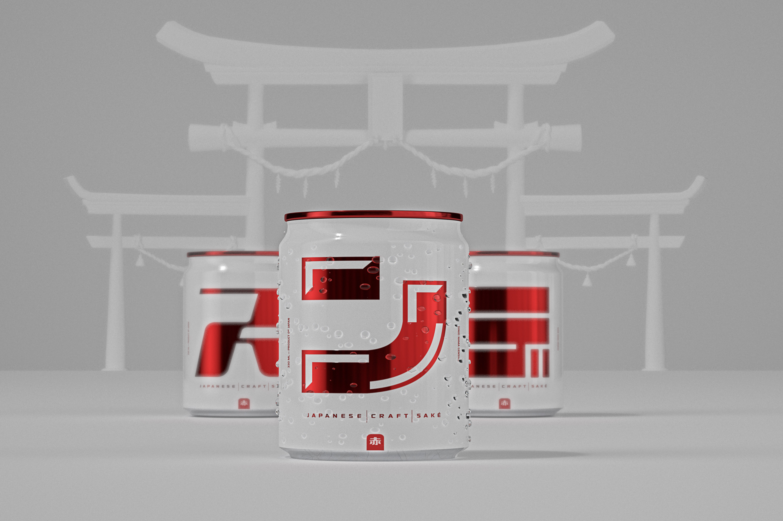
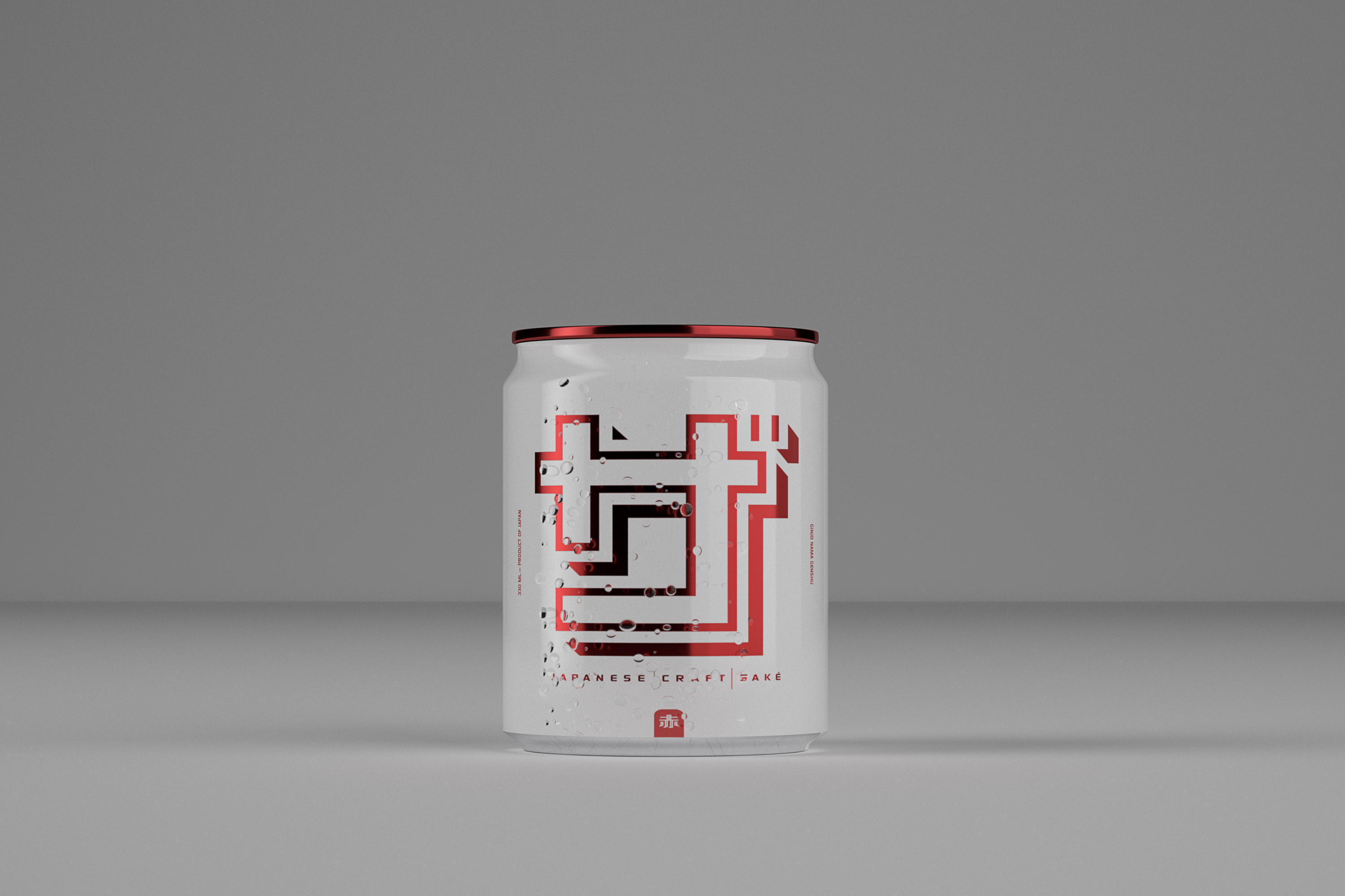
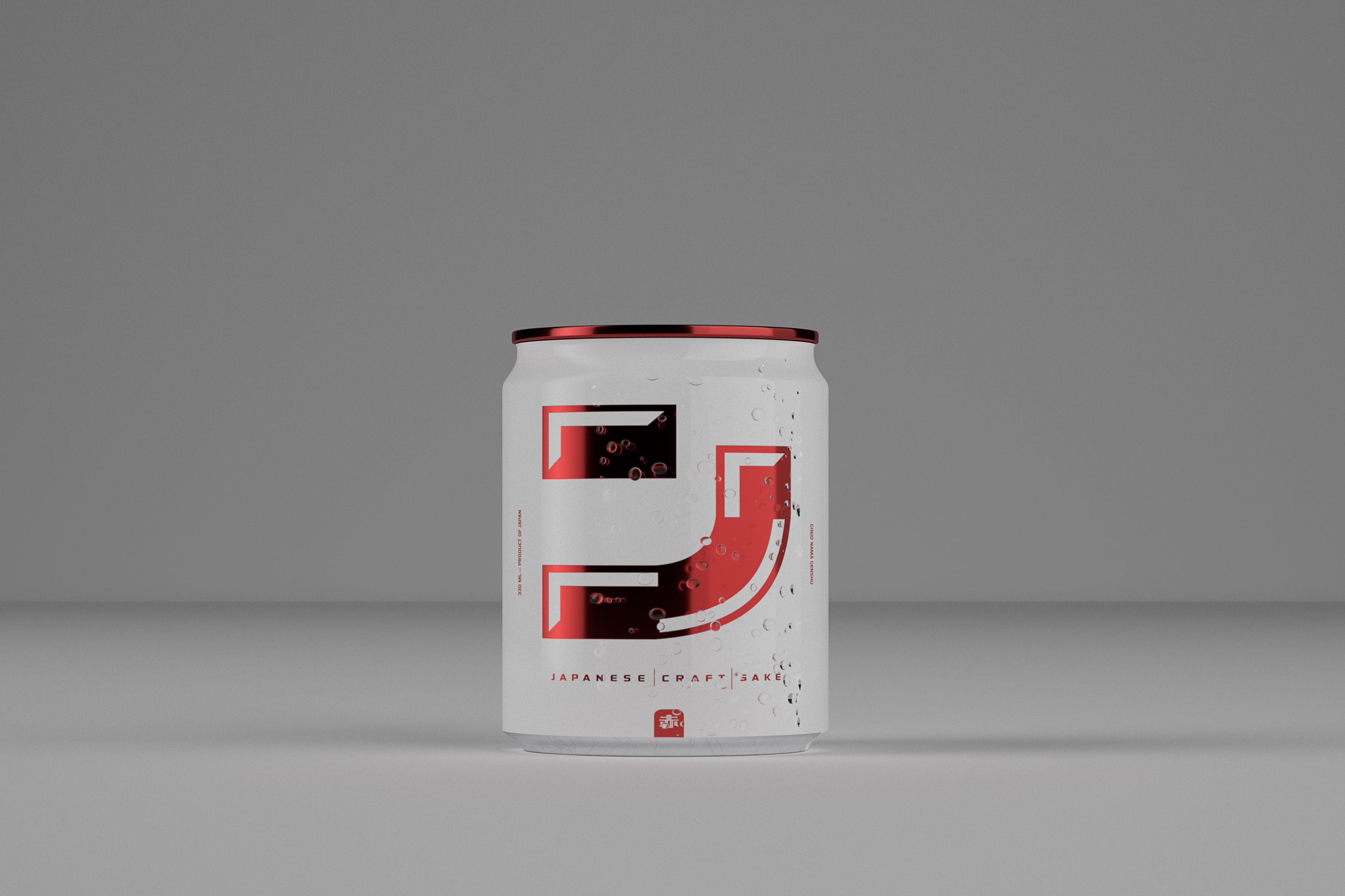
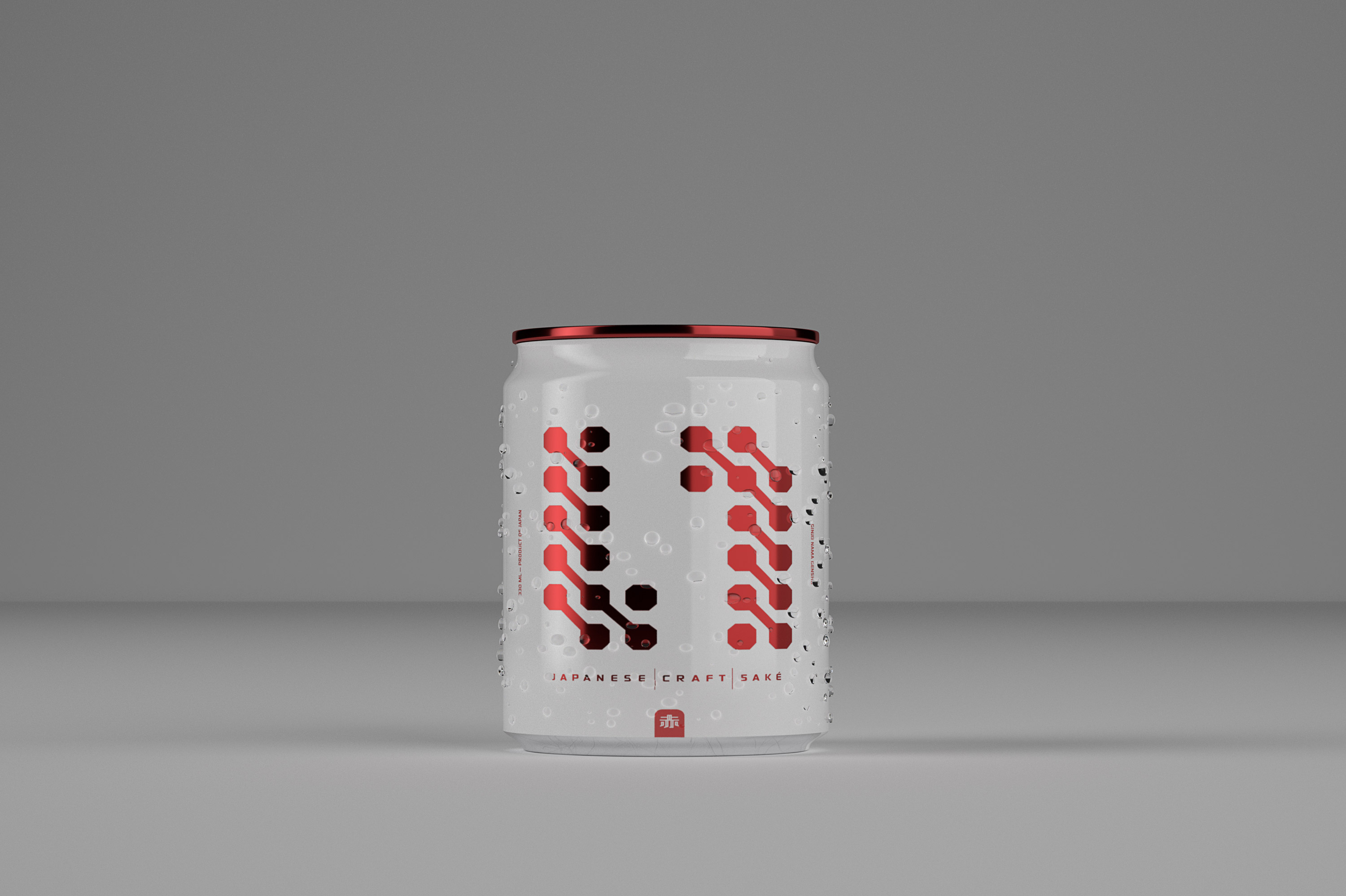
Red Saké’s brand identity system conveys Japanese root culture and modern digital assets in order to speak to their customers and tell them that they understand what it’s like to live in the new world. The French studio designed 6 different tiny square-shaped cans and played with colours, symbols and typography to create a bold identity. Concerned about Japanese IT workers, Red Saké’s core mission is to “Rethink tradition”. They aspire to bring enjoyment, chill and hope to the Japanese working culture by reshaping the Japanese work environment and extreme work weeks.
CREDIT
- Agency/Creative: Studio Blackthorns
- Article Title: Concept Packaging Design for Red Saké, Japanese Craft Spirits in Square-Shaped Aluminium Cans
- Organisation/Entity: Agency
- Project Type: Packaging
- Project Status: Non Published
- Agency/Creative Country: France
- Agency/Creative City: Lyon
- Market Region: Asia
- Project Deliverables: 3D Design, Art Direction, Brand Creation, Brand Identity, Product Design
- Format: Can
- Substrate: Metal
- Industry: Food/Beverage
- Keywords: Can, Japan, Japanese, Spirits, Saké, Sake, Red, White, IT Workers, Tech Design, Digital, Typography, Asia, Asian Culture
-
Credits:
Brand Startegist: Ludovic Mornand


