


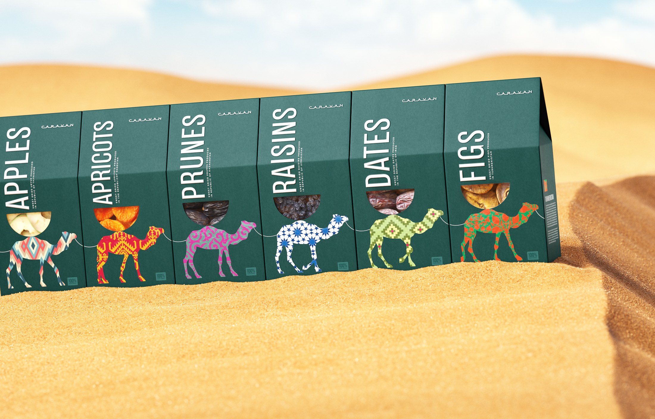
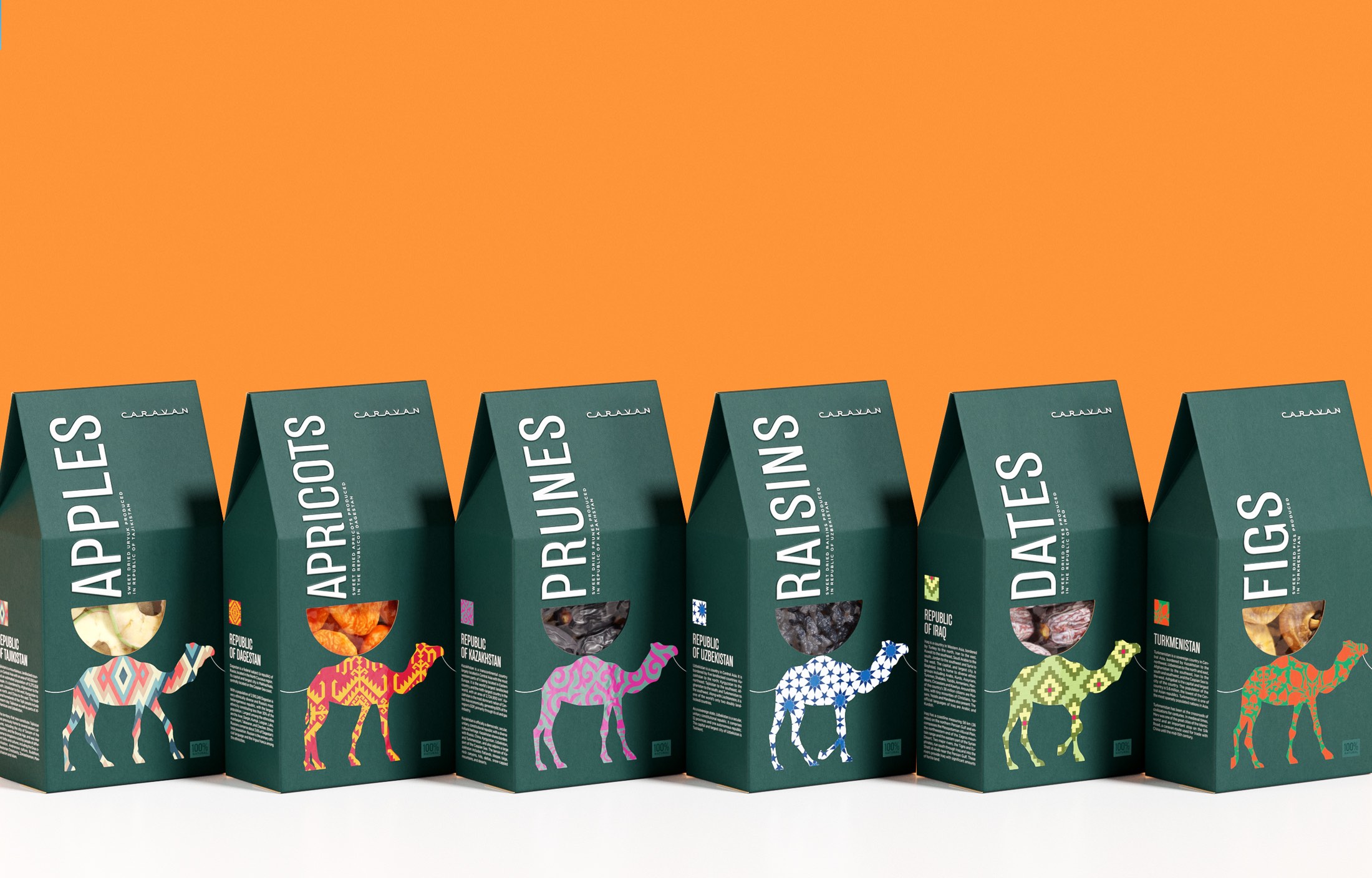
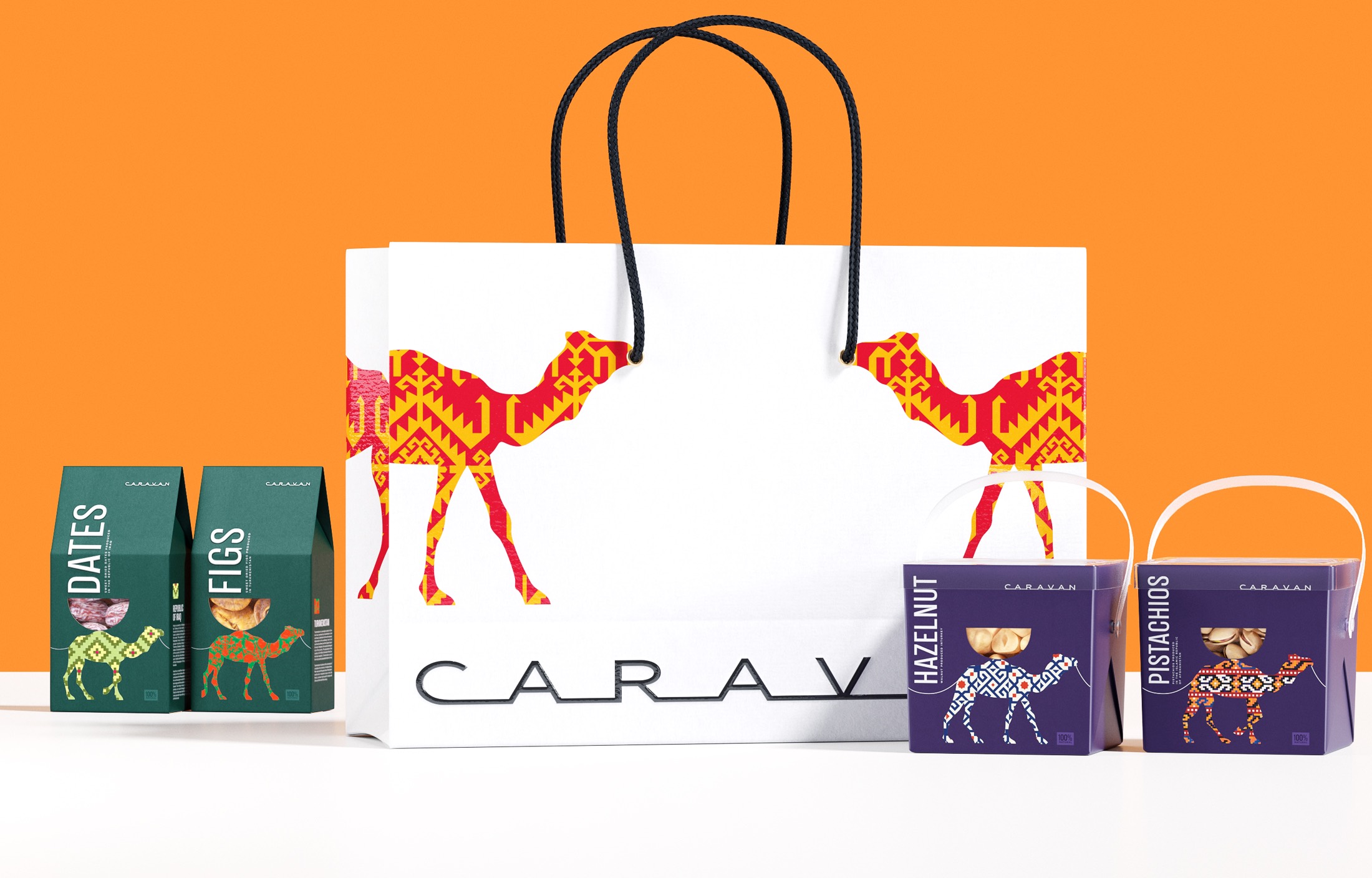
The Ohmybrand agency team has developed the packaging concept and illustrations for Caravan – a brand of nuts and dried fruit. The packs put in a row on the store shelf turn into a caravan of camels loaded with wonderful gifts of the East.
The goal of the project was to develop a brand that could visually stand out among competitors, form a corporate spot on the supermarket shelf, could be perceived as premium and would help to differentiate products by category.
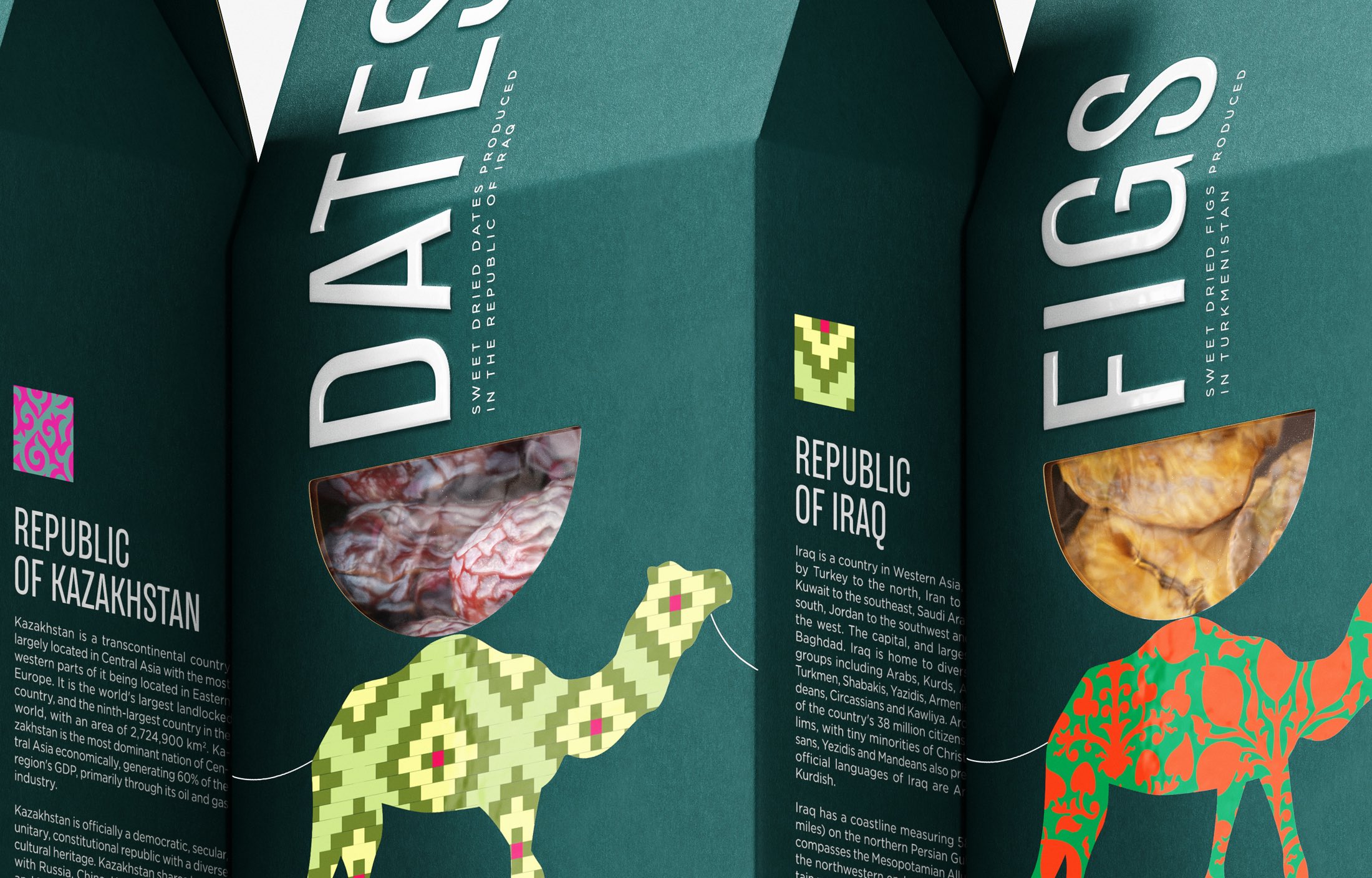
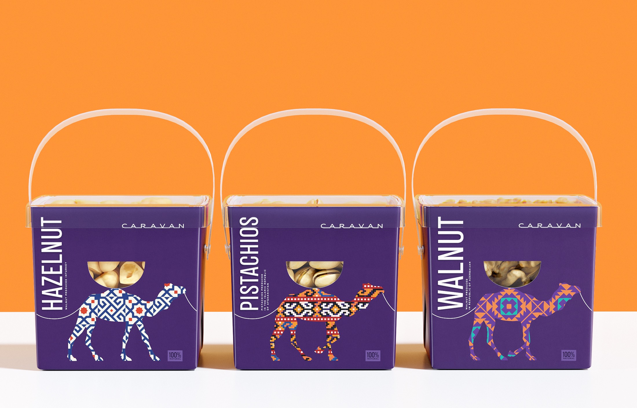
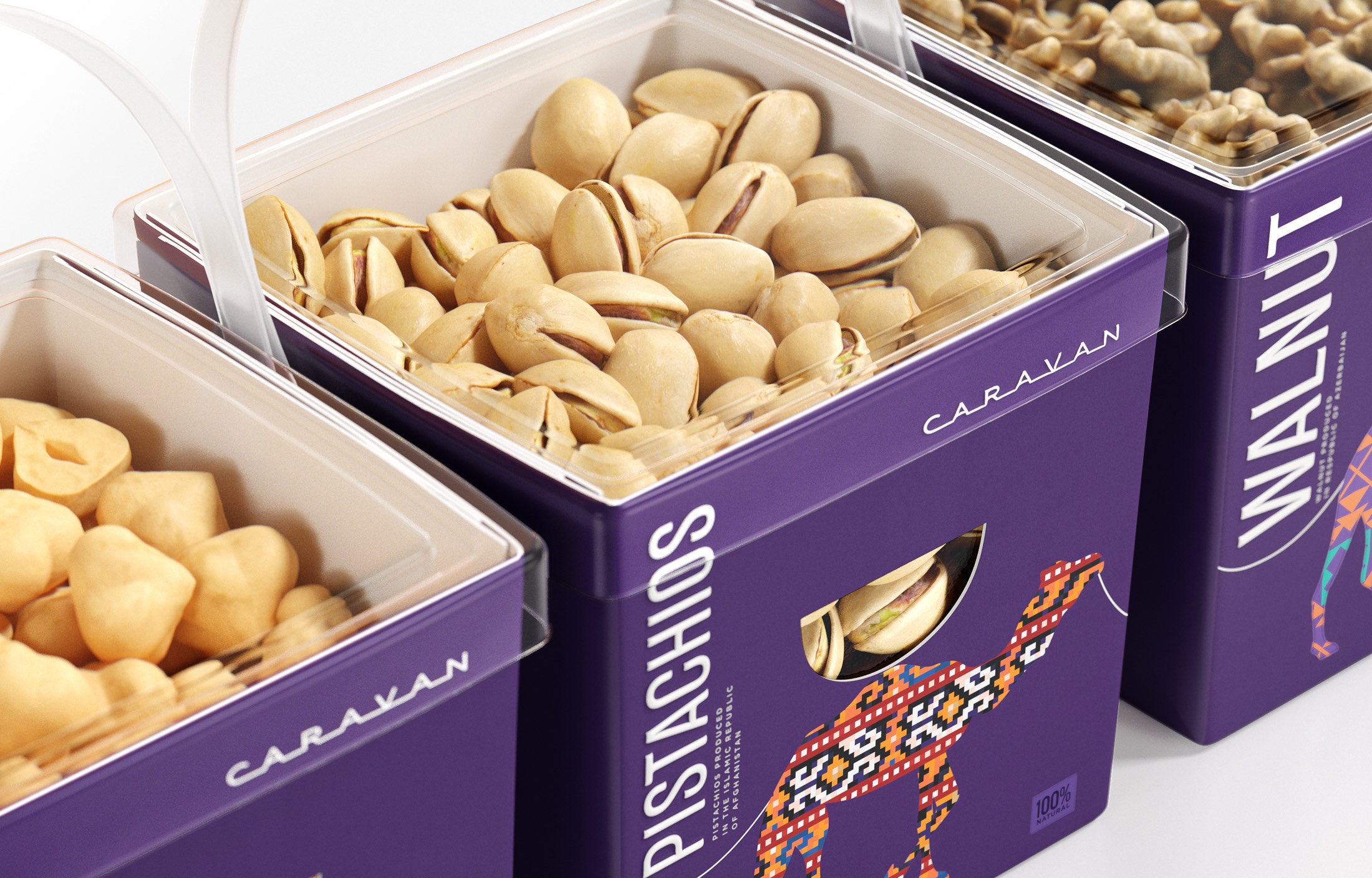
Our concept is based on the image of a camel. This “ship of the desert” is a real symbol of the East and its riches. Everyone is familiar with these associations: an oasis, treasures of the sultan, generous gifts, the Great Silk Road, camel caravans with spices, nuts and silks…
Each pack of our snacks depicts a camel with the “baggage” that is visible through a cut-out window of an original shape. The camels themselves are painted in the patterns of the countries where nuts and dried fruits were traditionally brought from. With the help of these patterns the products within the line are easily differentiated.
If the display on the store shelf allows to put several packs of our products next to each other, they form a camel caravan. This solution elegantly plays with the name of the line – “Caravan”.
We have proposed a very clean packaging concept with lots of air. Despite the fact that nuts and dried fruits are a segment where traditional visual codes are very strong, our brand speaks to the consumer in a modern language.
CREDIT
- Agency/Creative: Ohmybrand
- Article Title: Concept of Packaging for Nuts and Dried Fruit Designed by Ohmybrand
- Organisation/Entity: Agency
- Project Type: Packaging
- Project Status: Non Published
- Agency/Creative Country: Russia
- Agency/Creative City: Moscow
- Market Region: Europe
- Project Deliverables: Brand Design, Brand Naming, Identity System, Packaging Design
- Format: Box
- Substrate: Pulp Carton
- Industry: Food/Beverage
- Keywords: snacks, nuts, dried fruit, packaging
-
Credits:
Creative director: Nadezhda Parshina
Art director: Anna Rufova


