


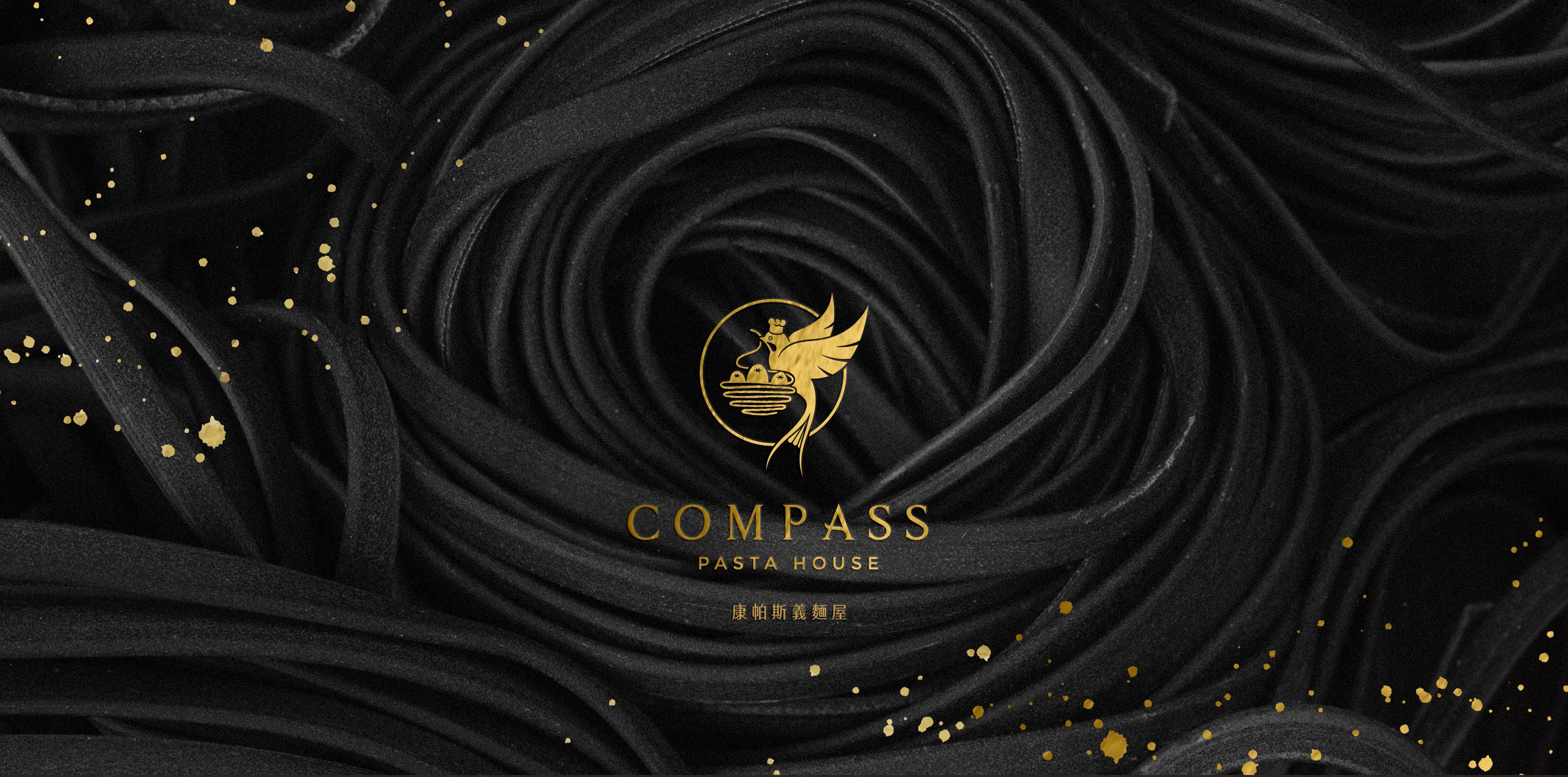
Local ingredients from Taiwan, to create every Italian cuisine with heart.
Taiwan’s swallows are the closest to people and the most memorable birds in their homes. No matter how far they fly, they can return to their hometown with their amazing memory; therefore, the brand uses the concept of Taiwan’s “swallow ” to create a brand image: “Building a nest” symbolizes that each meal is made with the hospitality of the family. “Homecoming” symbolizes beautiful and delicious cuisine, so that everyone who comes to eat at Compass can return to the nest like a swallow.


CREDIT
- Agency/Creative: Lansid Design Studio, Tw
- Article Title: Compass Pasta | Branding
- Organisation/Entity: Agency, Published Commercial Design
- Project Type: Identity
- Agency/Creative Country: Taiwan
- Market Region: Asia
- Project Deliverables: Brand Architecture, Brand Creation, Brand Identity, Brand Naming, Brand Strategy, Brand World, Branding, Graphic Design, Identity System, Illustration, Photography, Research
- Industry: Food/Beverage
- Keywords: BRANDING, DESIGN, IDENTITY, LOGO ,PASTA ,TAIWAN, TYPOGRAPHY, VISUAL ,BAR, RESTAURANT
FEEDBACK
Relevance: Solution/idea in relation to brand, product or service
Implementation: Attention, detailing and finishing of final solution
Presentation: Text, visualisation and quality of the presentation


