


Colegio Lincoln is an educational institution in Aguascalientes, Mexico, with more than 30 years of experience in the education of children and young people, from kindergarten to high school. Its aim is to provide education with a holistic philosophy, focusing on human development, academic performance, physical health and learning, considering its students’ emotional development as well.
The school was established for parents who grasp the importance of a comprehensive education for their children without the constraints of traditional practices. Thanks to this educational vision, Colegio Lincoln has consolidated itself as one of the most important private schools in the city of Aguascalientes. Its vision and visible results being an outgrowth of its learning experiences and human values.
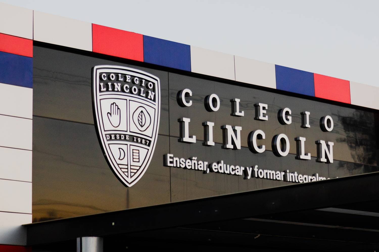
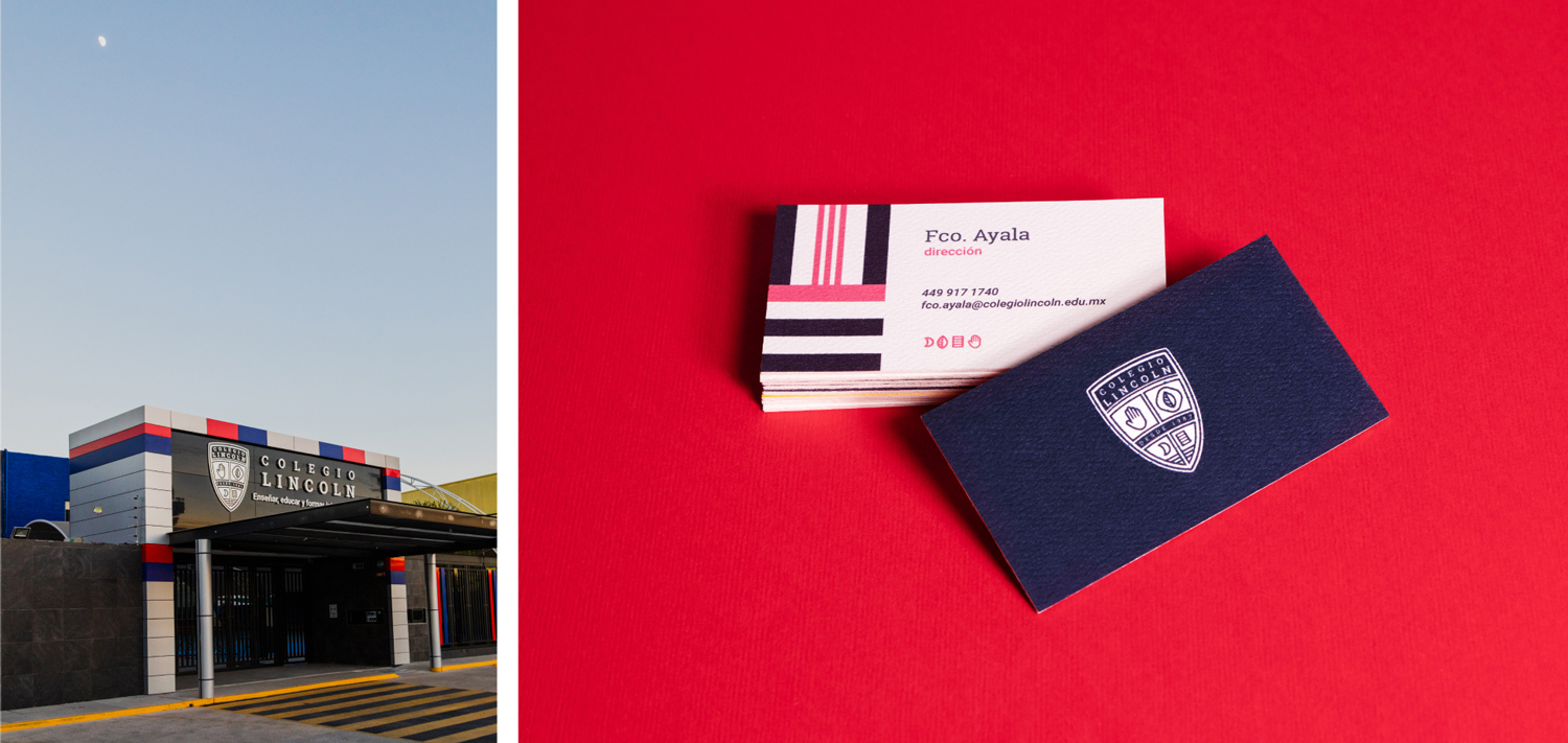
Colegio Lincoln had not renovated its original image for many years and had two main problems: the story it told and its aesthetic resolution.
As for history, we had before us a coat of arms that gave explicit expression to one of its most important selling points with regards to its students’ capabilities: learning the English language. Although this was an important selling point in the beginning, the school had achieved an organic positioning in this regard, and there was ample competition around it now, publicizing along the same lines.
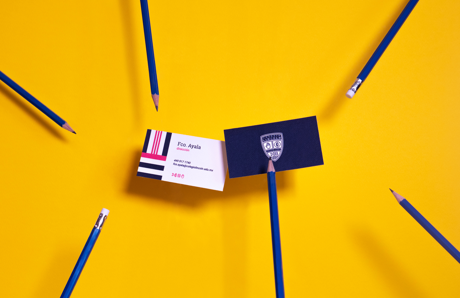
Another consideration was its brand image, which had become completely outdated. It had dozens of versions with variations in outlines and complements, as well as a personality that did not truly express the work being done with students in the institution.
We found a fundamental element for the evolution of the school’s graphic identity in an interview with its founders when we addressed their philosophy of education. They put it this way: “teach, educate and prepare comprehensively.”
When we undertook the process of understanding exactly what they meant by this, the brand history came about naturally, since the landing gear for their educational philosophy had four axes: body, spirit, mind and emotions.
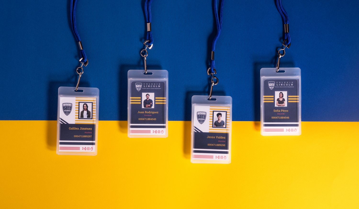
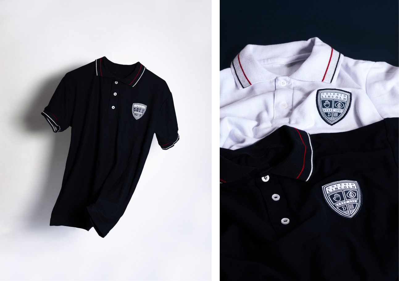
Understanding this and other essential aspects of the Lincoln Educational Model, we retrieved certain basic aspects from the previous coat of arms, such as its shape and style, and we outlined a new proposal to address its philosophy and history through symbols.
So it was that we represented the body with a hand, the spirit with a leaf (which speaks in turn of the connection with one’s inner and outer nature), emotions with a moon (culturally understood as a symbol with great influence on what we feel), and a sheet of paper to represent the mind and ways of acquiring knowledge.
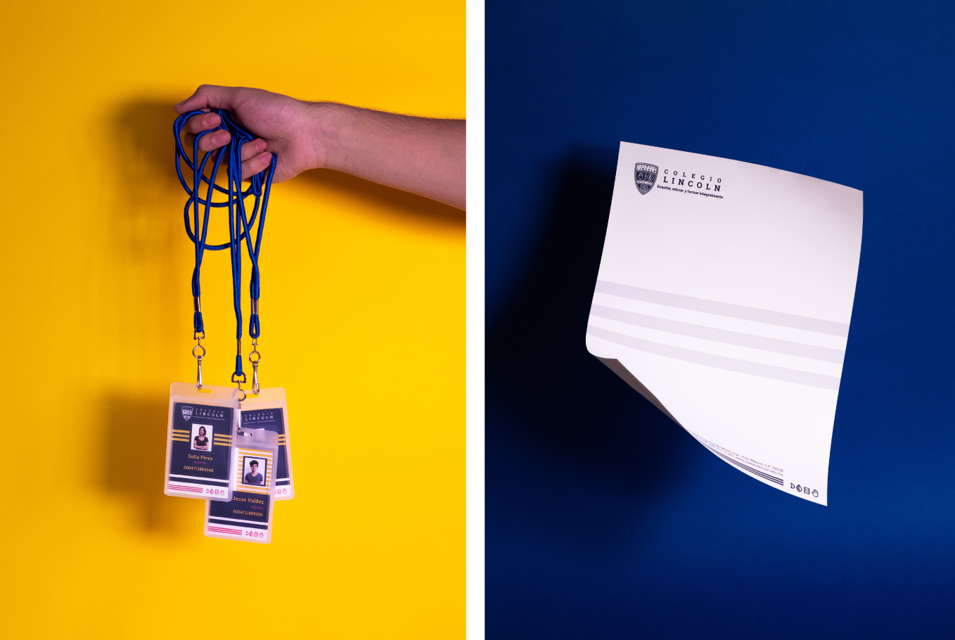
Each of these four axes also corresponds to a set of extracurricular activities that make their existence tangible in Colegio Lincoln’s educational methodology. In parallel to this, we developed a visual system to communicate the great extracurricular offerings that are available, just from forming part of the student body.
To present the transition between the previous identity and the new one, we developed a slogan based on an essential aspect that involves both students and the institution itself: growth.
We developed the phrase “Nos encanta crecer contigo” (we love to grow with you) to express the joy experienced by the institution in growing along with its students while also undergoing an evolutionary process of its own.
A secondary problem facing the institution was directly linked to an important stage in the lives of its students: adolescence.
Colegio Lincoln had been a concept that accompanied its students from kindergarten through high school. The situation to be addressed was that the largest number of dropouts occurred in the transition between middle school and high school, which we directly related to the emergence of a new facet in the lives of young people between the ages of 14 and 16: decision making.
The school to which they had belonged since they were very young had been imposed upon them by their families, and the jump between middle school and high school was usually one of the first critical moments of decision for their future, and many decided not to continue there because they perceived it as more of the same.
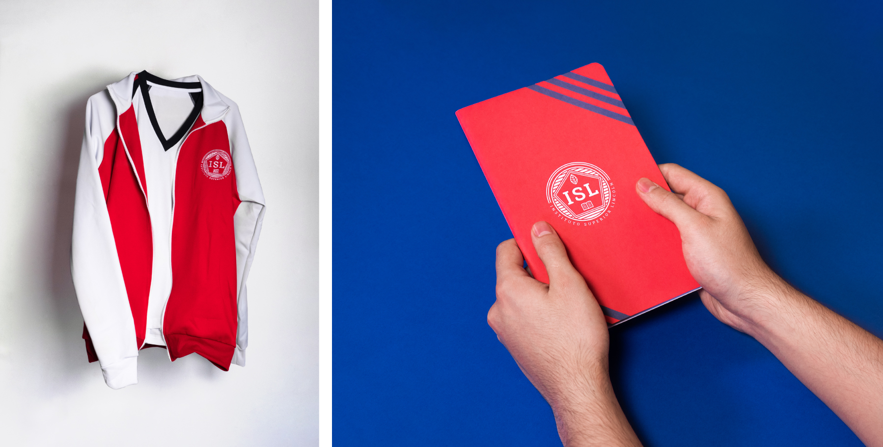
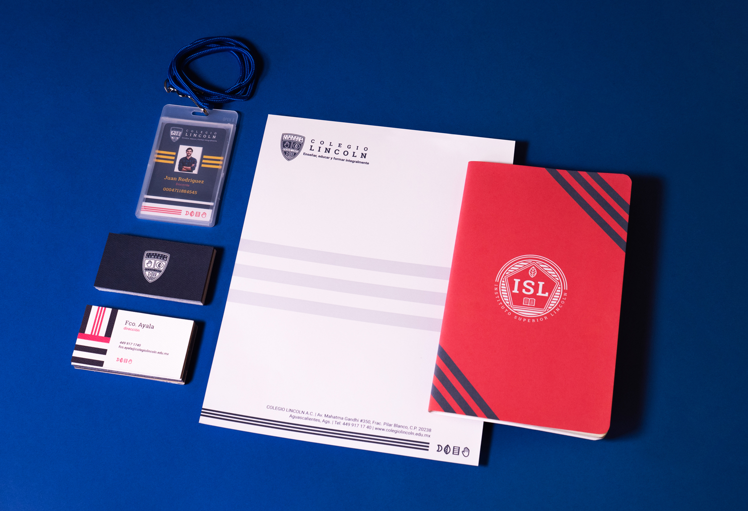
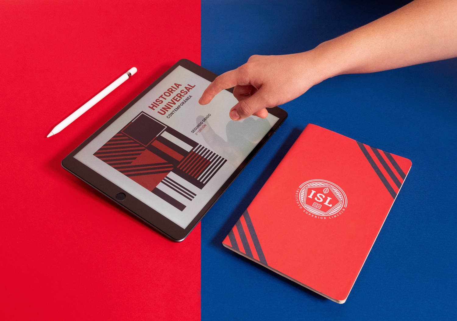
For this reason, we changed the brand architecture and developed a secondary brand called Instituto Superior Lincoln (Lincoln High School), detached from the identity of Colegio Lincoln, with a more adult personality, based on the same guiding concept.
This change was easy to implement, as the physical spaces of the different educational grades are clearly separated in the school.
We kept the initial concept for Lincoln High School’s secondary brand, and we represented the main elements—body, spirit, emotions and mind—with new symbols.
Thanks to this change, we were able to increase the retention rate between middle school and high school from 19% to 34% in just two years.
For web development we opted for an informative and emotional site that expresses the values stated in the school’s graphic identity: the large number of extracurricular activities, the difference between Colegio Lincoln and Lincoln High School, as well as clarity in all the information and ways to make contact and start the enrollment process.
This transformation in Colegio Lincoln’s identity allowed the institution to increase its enrollment significantly, communicate its values more effectively, recover the emotion of its educational philosophy by representing it tangibly in its coat of arms and, finally, present itself with full authority as one of the most important schools in the area.
CREDIT
- Agency/Creative: Mínimo Estudio
- Article Title: Colegio Lincoln School Rebranding by Mínimo Estudio
- Organisation/Entity: Agency
- Project Type: Graphic
- Project Status: Published
- Agency/Creative Country: Mexico
- Agency/Creative City: Guadalajara
- Market Region: South America
- Project Deliverables: Advertising, Advertising Photography, Art Direction, Brand Architecture, Brand Redesign, Branding
- Industry: Education
- Keywords: college, school, colegio lincoln, aguascalientes, branding, logo
-
Credits:
Campus photography: Anaissa Zenteno


