


The Client
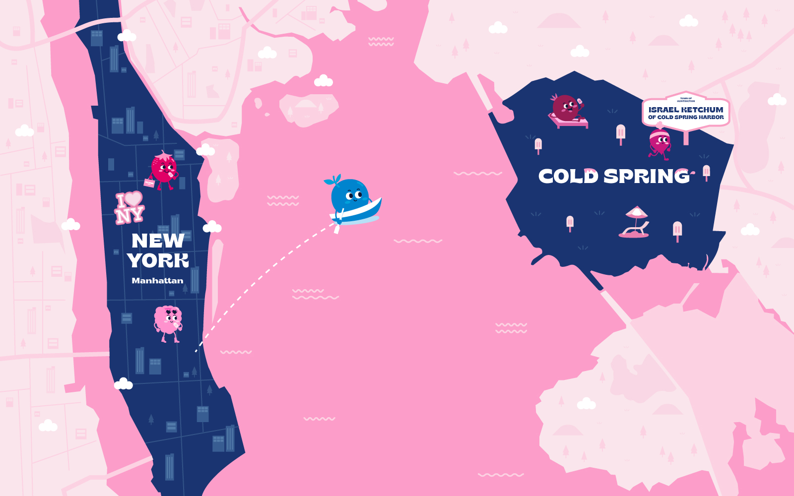
Cold Spring Organic is a popsicle brand made with 100% organic and safe ingredients that our children can trust and enjoy. Our client, who has lived quite a time in New York, was inspired by the natural area of Cold Spring, located in the suburb of New York, loved by New Yorkers. It is a place to relax with a dramatic view that symbolizes cleanliness and beauty. Cold Spring Organic offers customers relaxation and enjoyment through authentic products made with natural ingredients like a relaxing and comfortable getaway to Cold Spring.
Objective
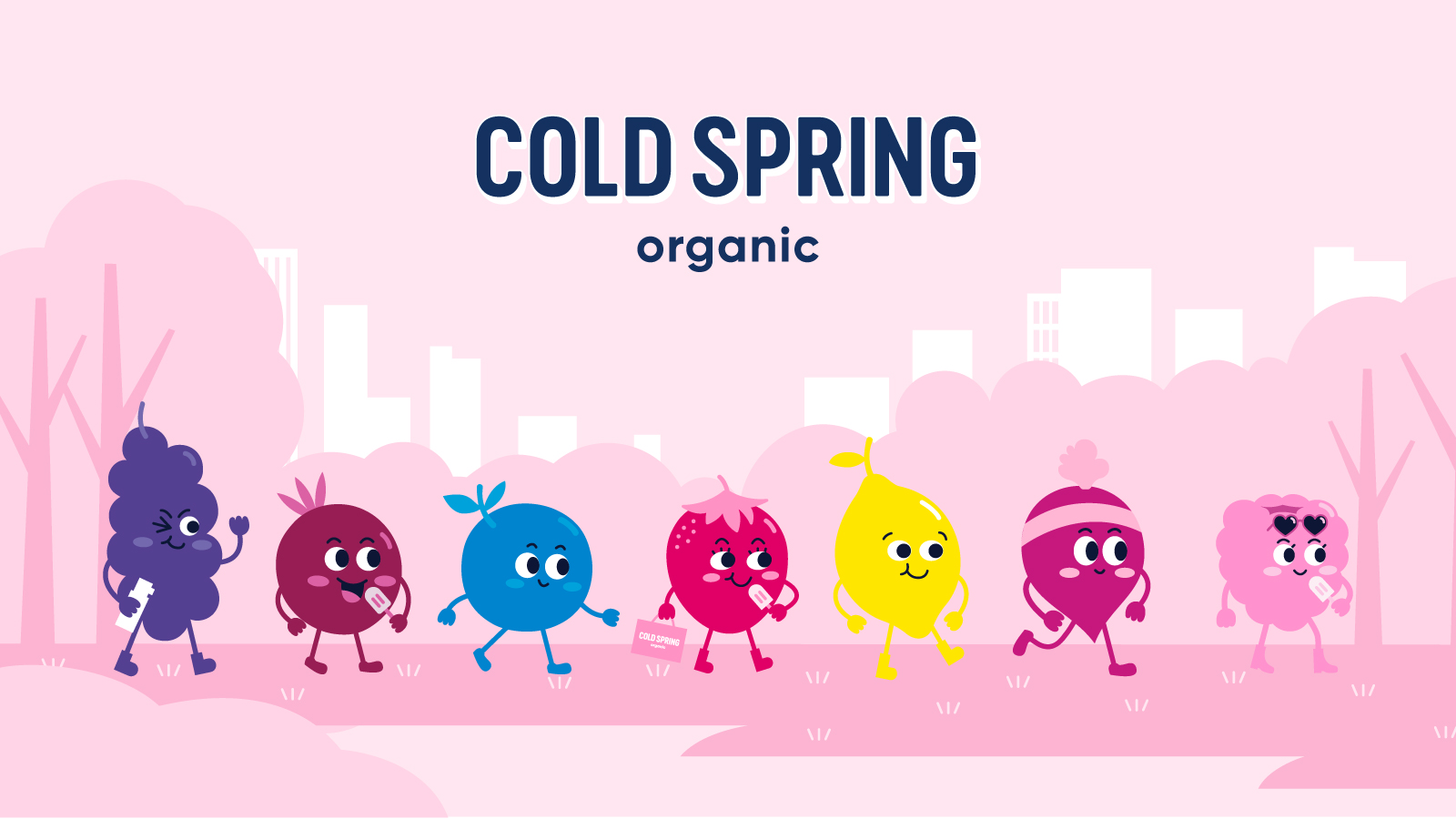
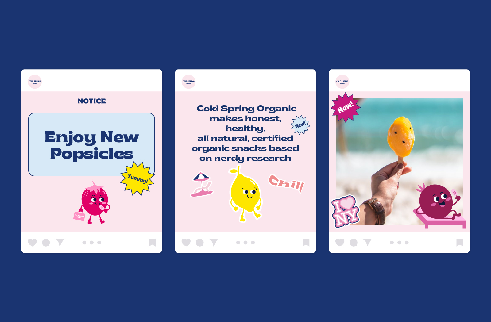
We have developed a young and fun popsicle brand identity and package by incorporating the 100% organic concept and the client’s New York background into the brand image and story. Also, we have expressed a professional and honest image through a modern logotype. Cold Spring Organic introduces a friendly and approachable image to people through the development of adorable fruit characters.
The Solution
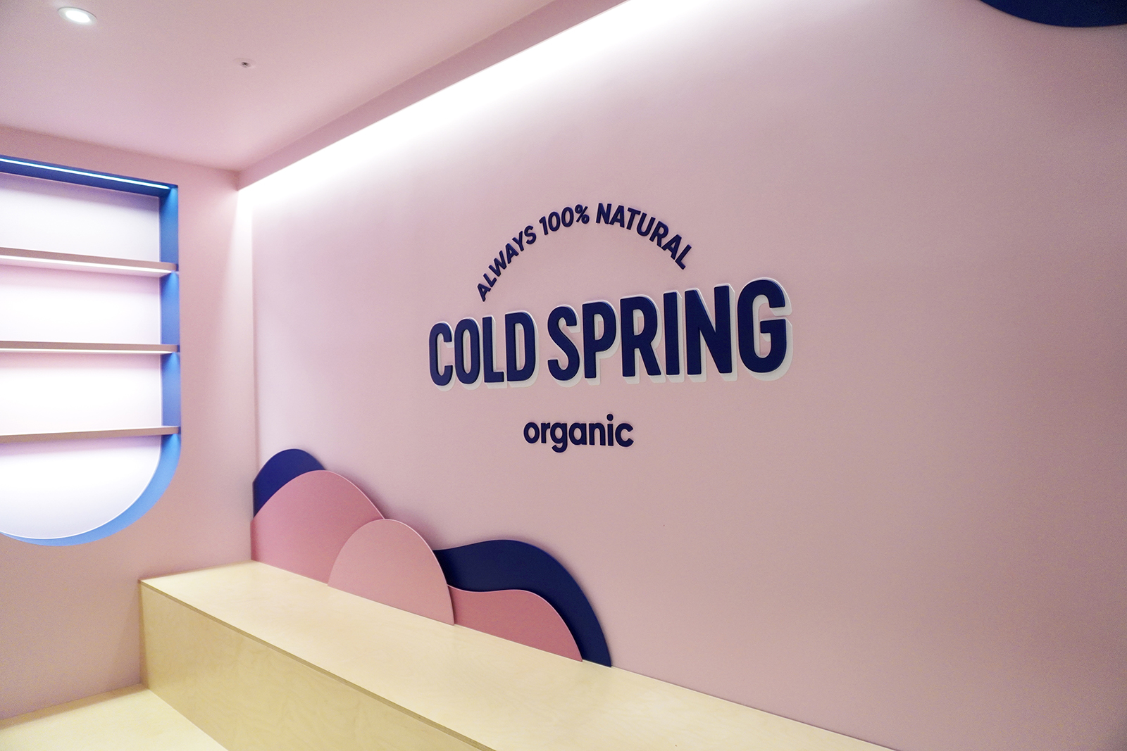
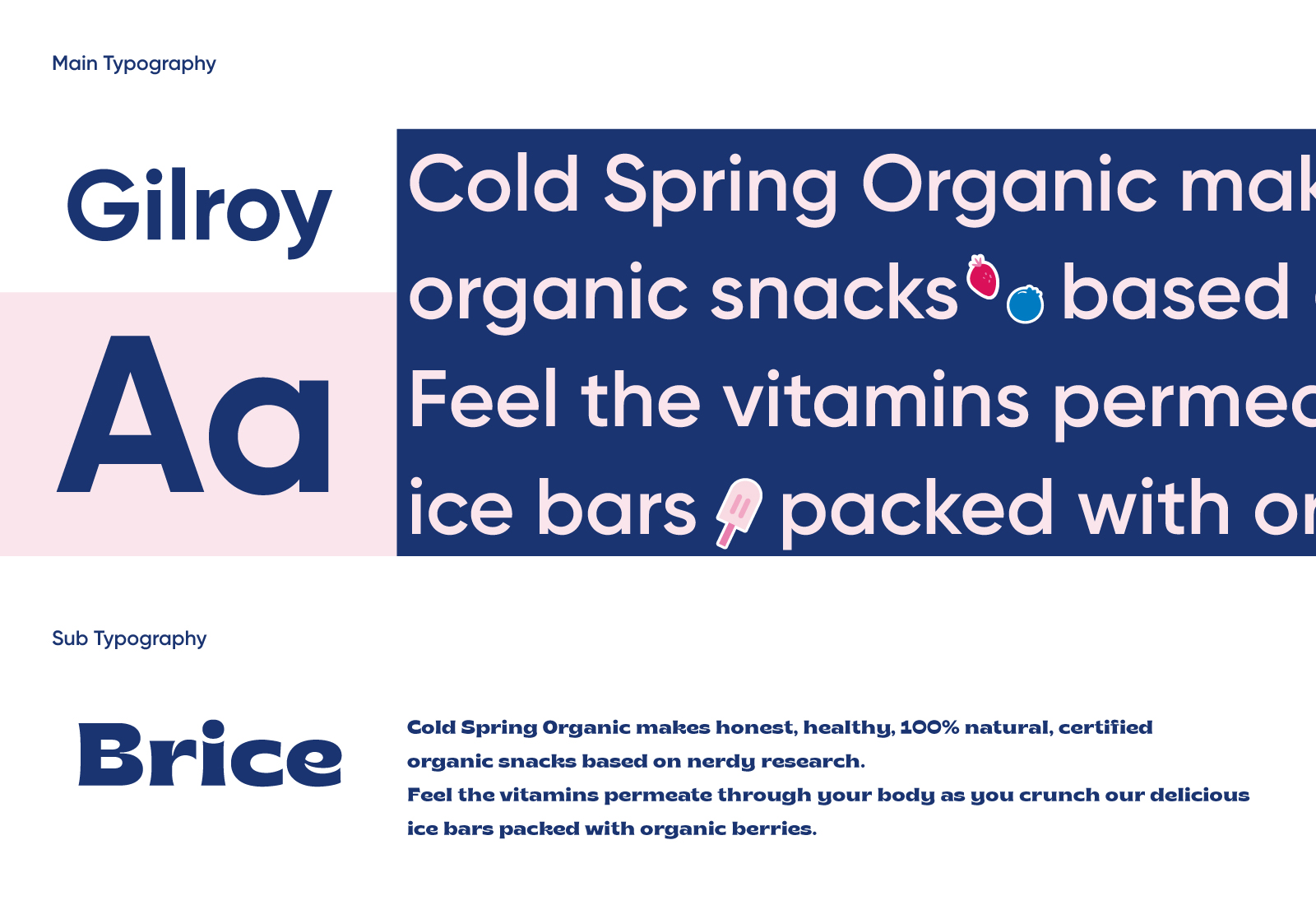
We have developed the brand logo inspired by the compelling typography found on various signage, posters, and more in downtown New York. It delivers a playful and modern look and feel using a relatively thin and narrow font and shadow graphics that make the logo stand out.
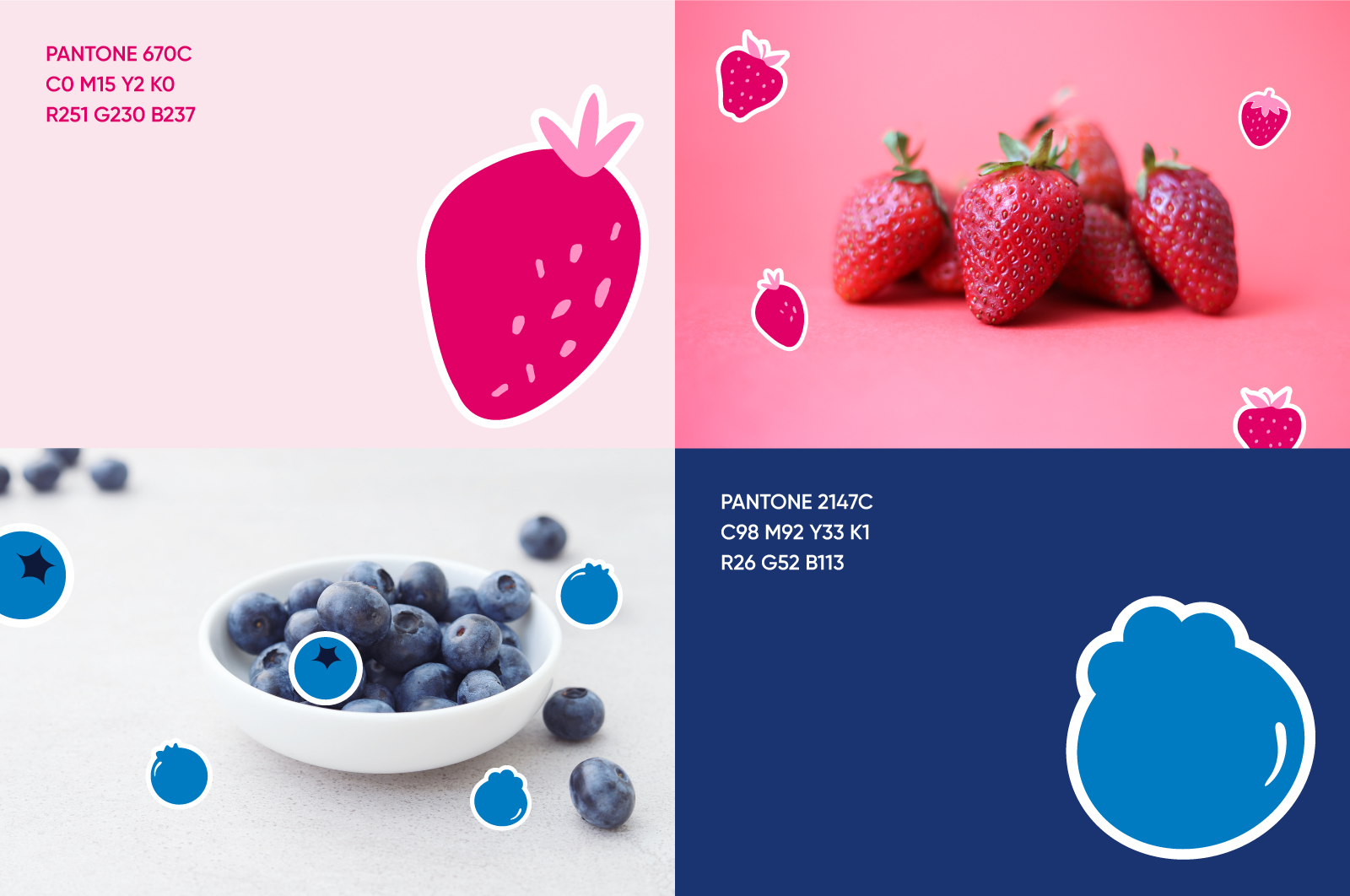
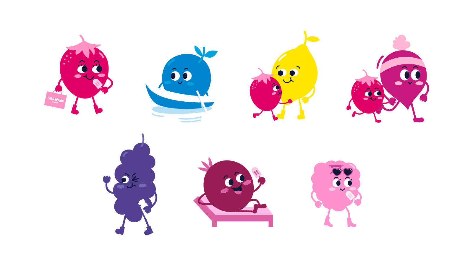
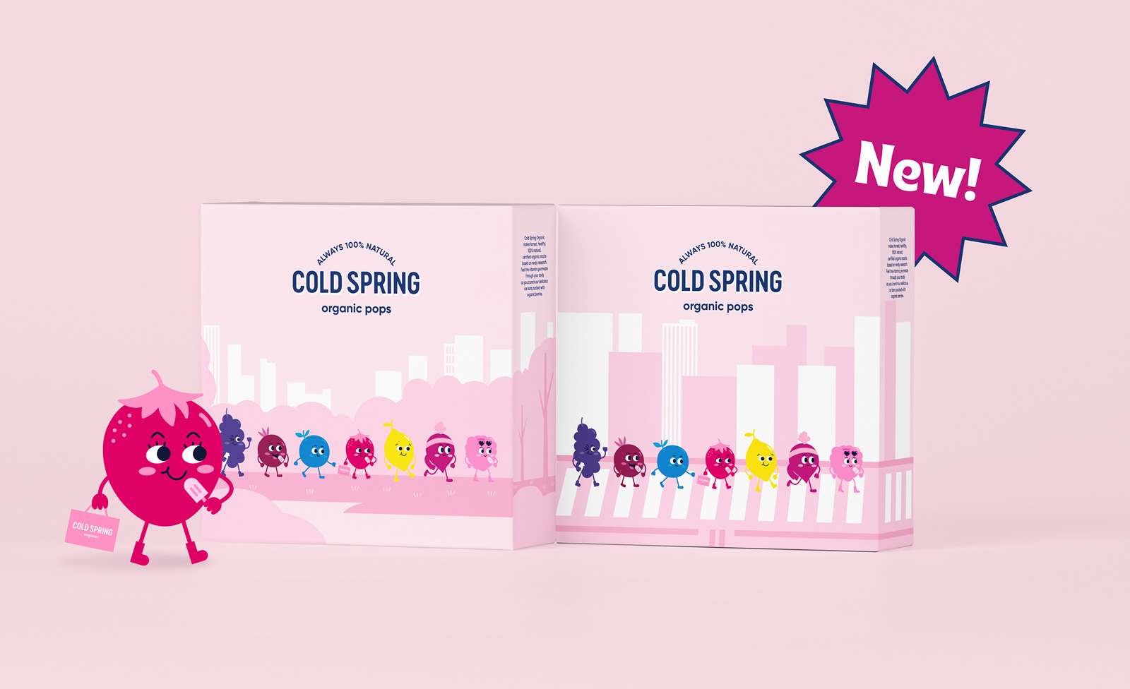
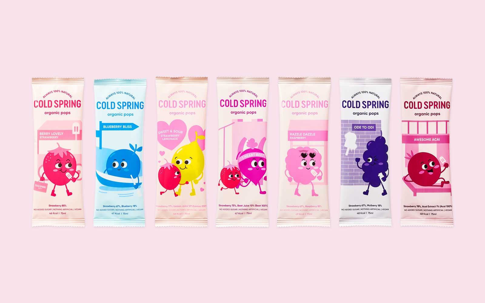
Unlike conventional organic ice cream brands that emphasize the features and images of ingredients, we have developed iconic characters so that people can enjoy organic products. The character’s motif is 100% organic ingredients, expressing the diverse tastes of cold spring popsicles. It entertains people through the catchword and product name representing the witty characters such as ‘You are Berry Lovely!,’ ‘Time to Razzle Dazzle!’ and more. The package color uses bright and vivid colors to show the confident brand image related to each fruits’ characteristics and reliable ingredients.
Chatacter Design
Cold Spring Organic’s characters are consist of 7 different fruits: strawberry, blueberry, lemon, mulberry, acai berry, beet, and raspberry. The characters symbolize the 100% organic ingredients used in Cold Spring Organic and represent products that are faithful to the essence of the ingredients. By using characters in organic products, everyone, regardless of age or gender, can enjoy the product in a friendly, casual way. In addition, catchy product names and expressions make it easier to memorize and recall.
CREDIT
- Agency/Creative: Ynl Design
- Article Title: Cold Spring Organic Popsicle Brand Identity and Packaging Design
- Organisation/Entity: Agency
- Project Type: Identity
- Project Status: Published
- Agency/Creative Country: South Korea
- Agency/Creative City: seou;
- Market Region: Asia, Global
- Project Deliverables: Brand Design, Brand Guidelines, Brand Identity, Brand Strategy, Illustration, Packaging Design
- Industry: Food/Beverage
- Keywords: Ice-cream, Popcicle, Brand Identity, Identity Design, Packaging Design, Organic
-
Credits:
Creative Director : Liz Yoo Na Lee


