Plenum – Toppar — top of coffee expertise
“Context
The Russian coffee market is rapidly growing and regarded as an attractive field for business development. Every year, number and variety of companies producing coffee expand significantly. In the wake of increased demand in the category, a coffee company decided to launch production of coffee beans for sales in specialised retail from 2016 onwards. The company set a task to ensure stable growth of its market share in the coming 3 to 5 years.
Task
The company came to us with the task to formulate a unique market positioning for a new coffee beans brand so that it stands out among its prominent foreign and Russian competitors. We were also to develop a name, logo and visual system for packaging and other branded items. Working on the task, it was important to take into account the possibility that the brand might enter a broad retail market.
Results
We conducted a series of interviews with the top management of the company and analysed structure of the market. We also analysed key competitors of the company in both specialised and broad chain retail segments, their approach to providing services and communication strategies on B2B and B2C markets. Through express customer research, we identified key segments of the target audience at different points of the sales chain: from buyers to end-customers, coffee connoisseurs.
Based on the analytical data, we developed a brand platform for the new brand and a strategy of its development. The new brand’s key message is ‘invariably best coffee’. Due to the high quality of roasting and a short way from roasting to brewing a cup of coffee, coffee preserves its aroma and flavour nuances. This is coffee of the best quality created for true connoisseurs.
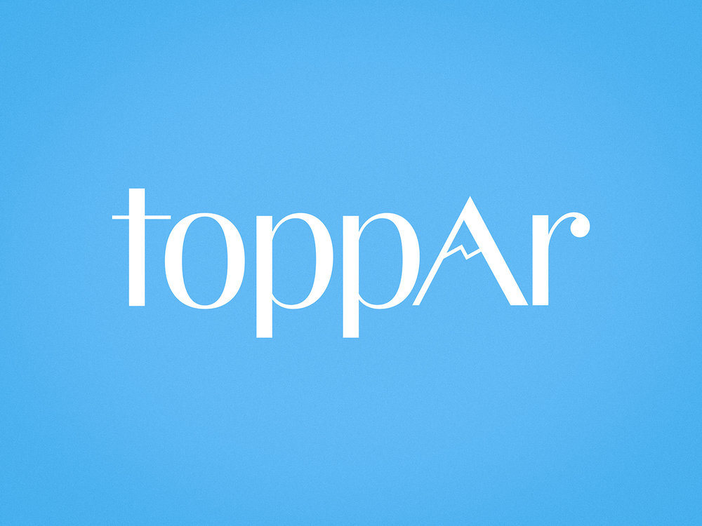
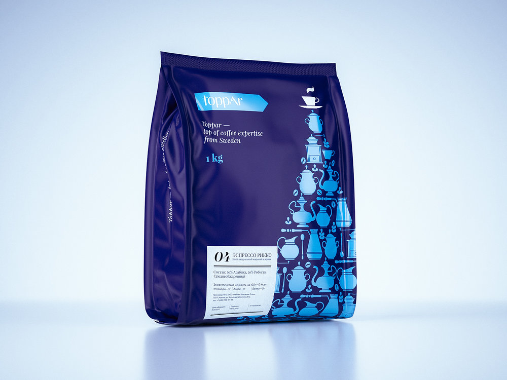
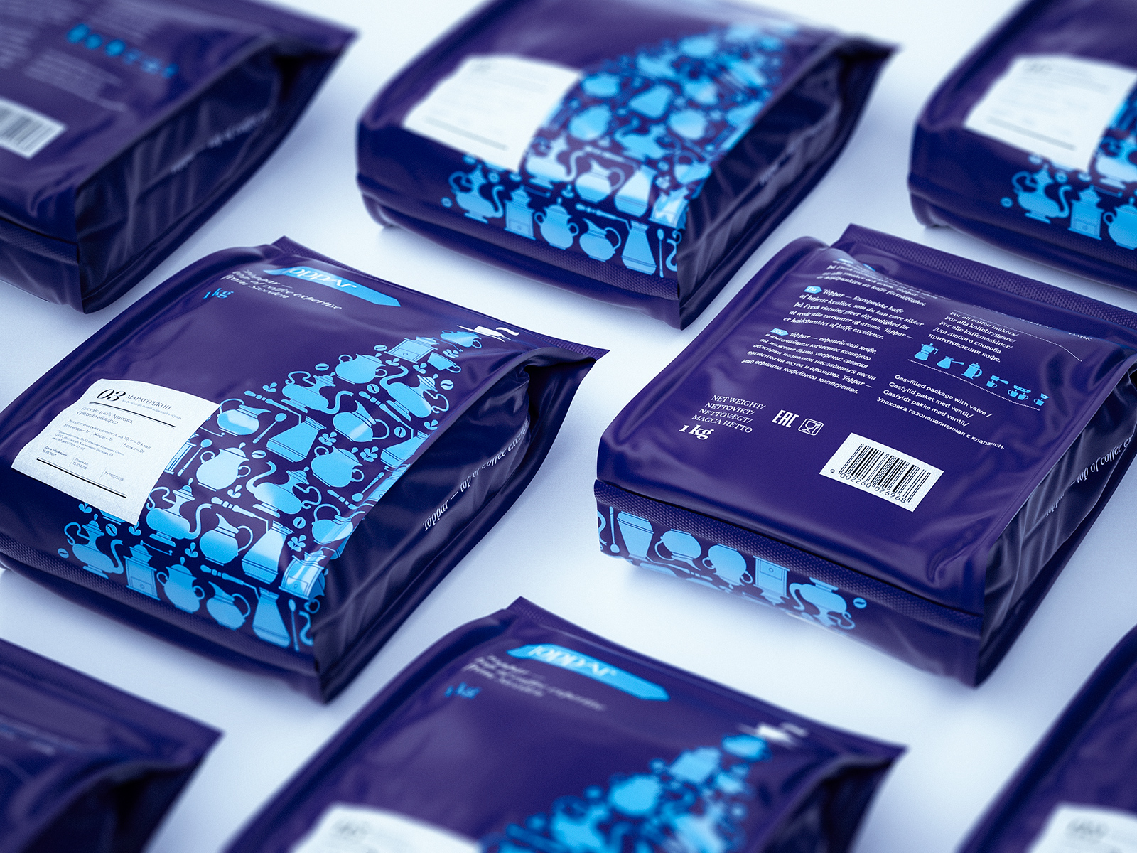
We created the name ‘Toppar’, which reflects expert and classical side of the brand as well as its friendly nature. We also designed packaging, visual system and identity for the brand.
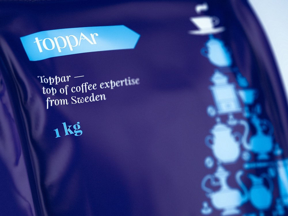
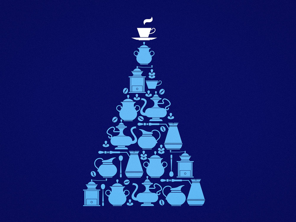
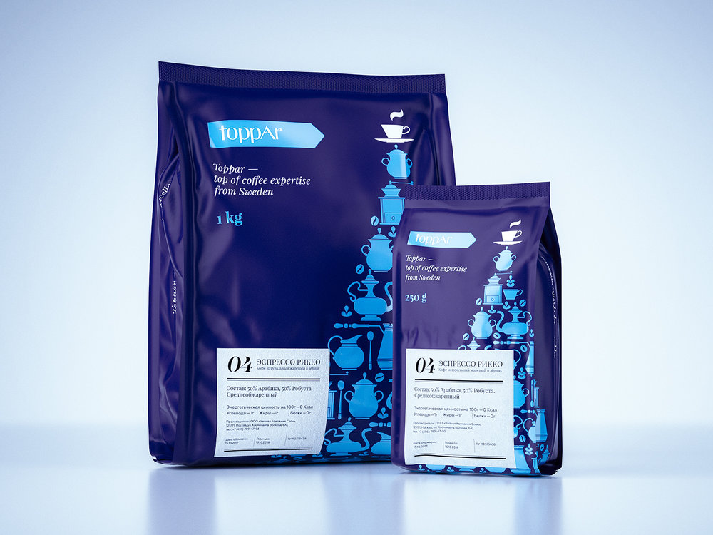
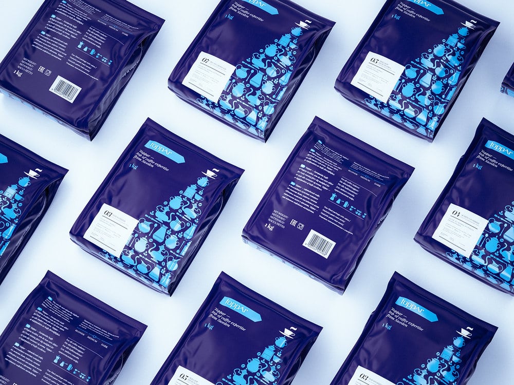
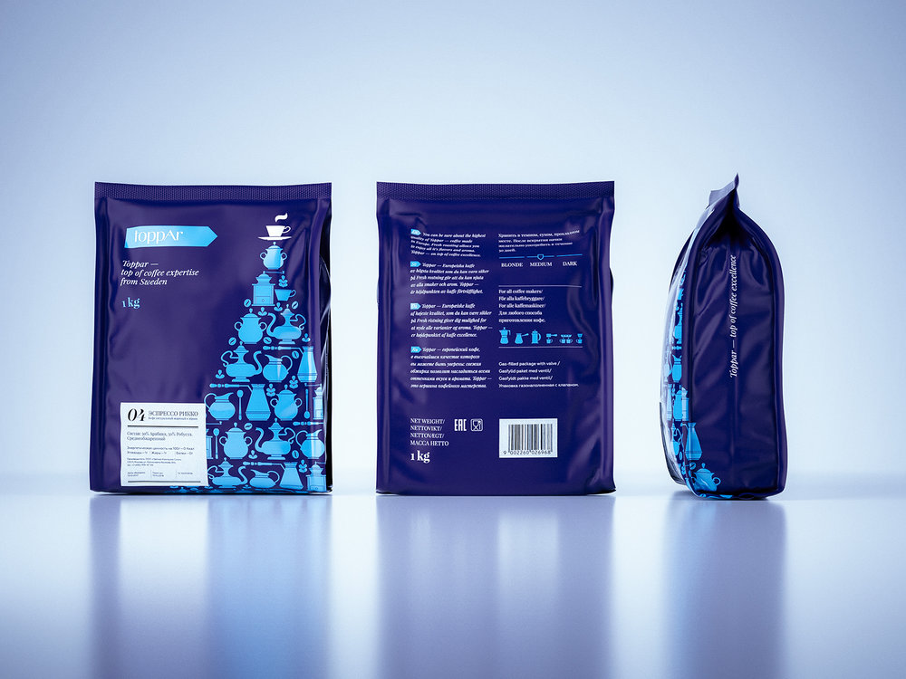
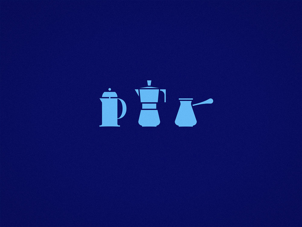
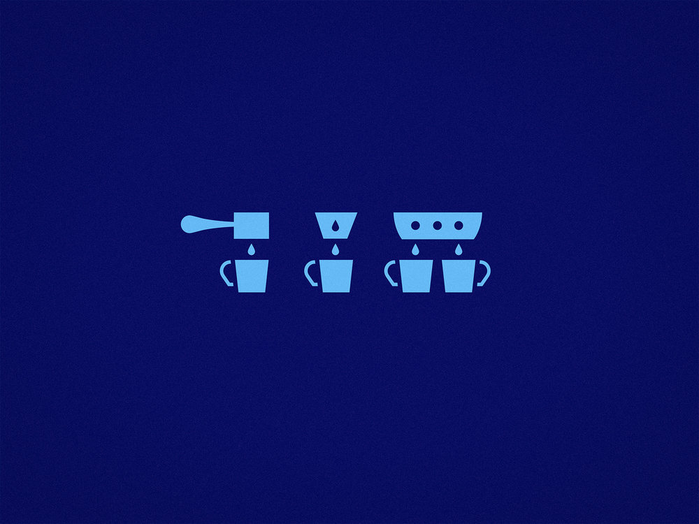
Main elements of the graphic system and packaging are based on visual metaphor of the slogan ‘Top of coffee expertise’. One can spot a snowy mountain peak in the logo as well as an underlying sign-shaped colour plate, which is aimed to guide connoisseurs to the very top of coffee quality. Graphics are faithful to Scandinavian style of graphic design, with its simplicity and a minimalistic colour palette. The front of the packaging features a mountain peak composed of coffee utensils and accessories, on top of which sits the very same ideal cup of coffee. Maintaining its fragile balance, the cup is a visual reminder that finding and following an ideal coffee recipe is an art in itself.
The packaging set includes packages of two sizes, 1 kg and 250 g, and two design variations. To differentiate among blends, a sticker is added to the front side of the package indicating a number of the coffee blend from Toppar collection and its flavour characteristics. This design decision allows the company to reduce production costs as well as promptly respond to changing conditions of the market.”