The Background
It is the ideal situation when you have a product, which is answering the actual market trends. Consumers’ refocusing on naturalness, honest production and low ABV beverages was the perfect milieu for Becherovka Lemond to be relaunched, boosting sales and winning new consumers.
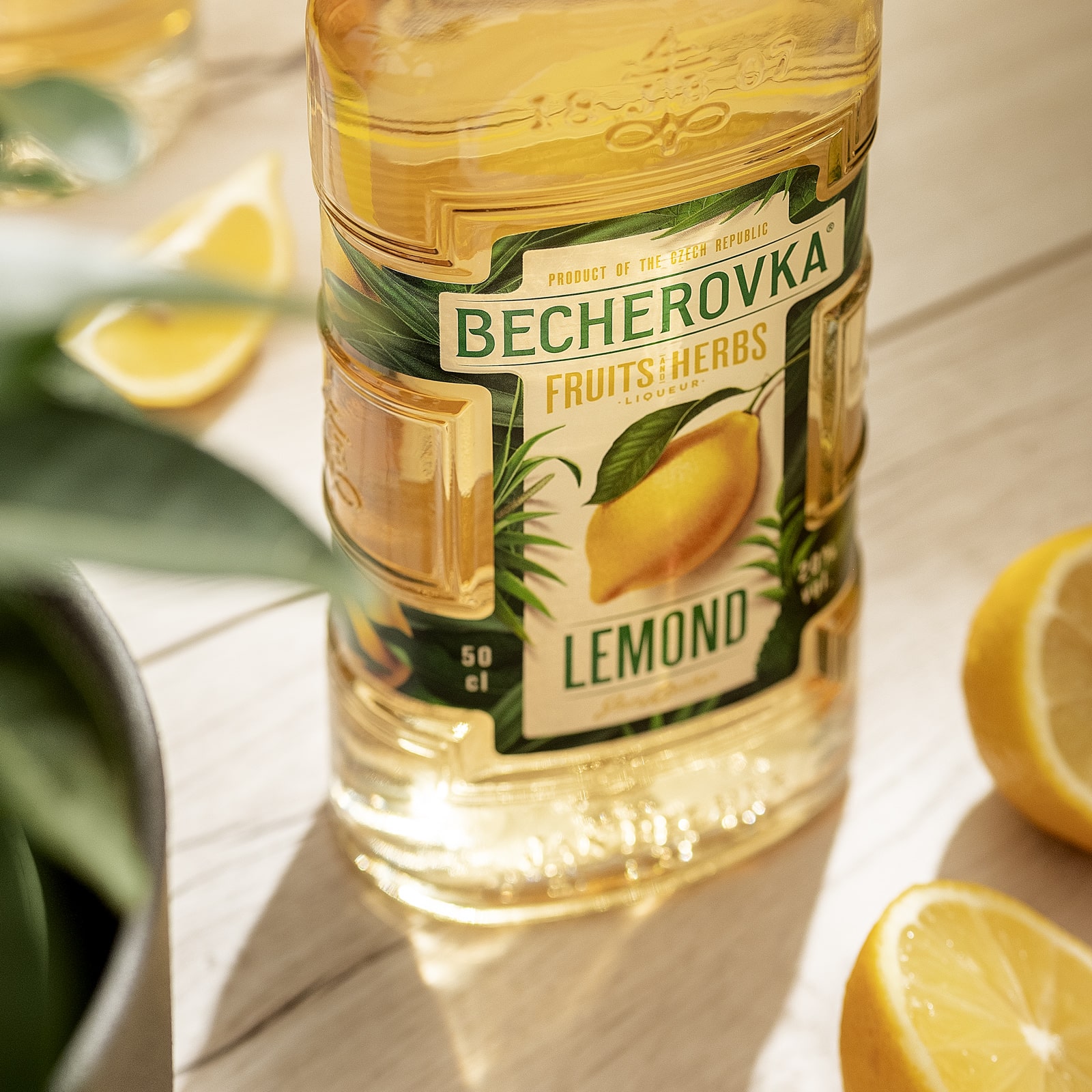
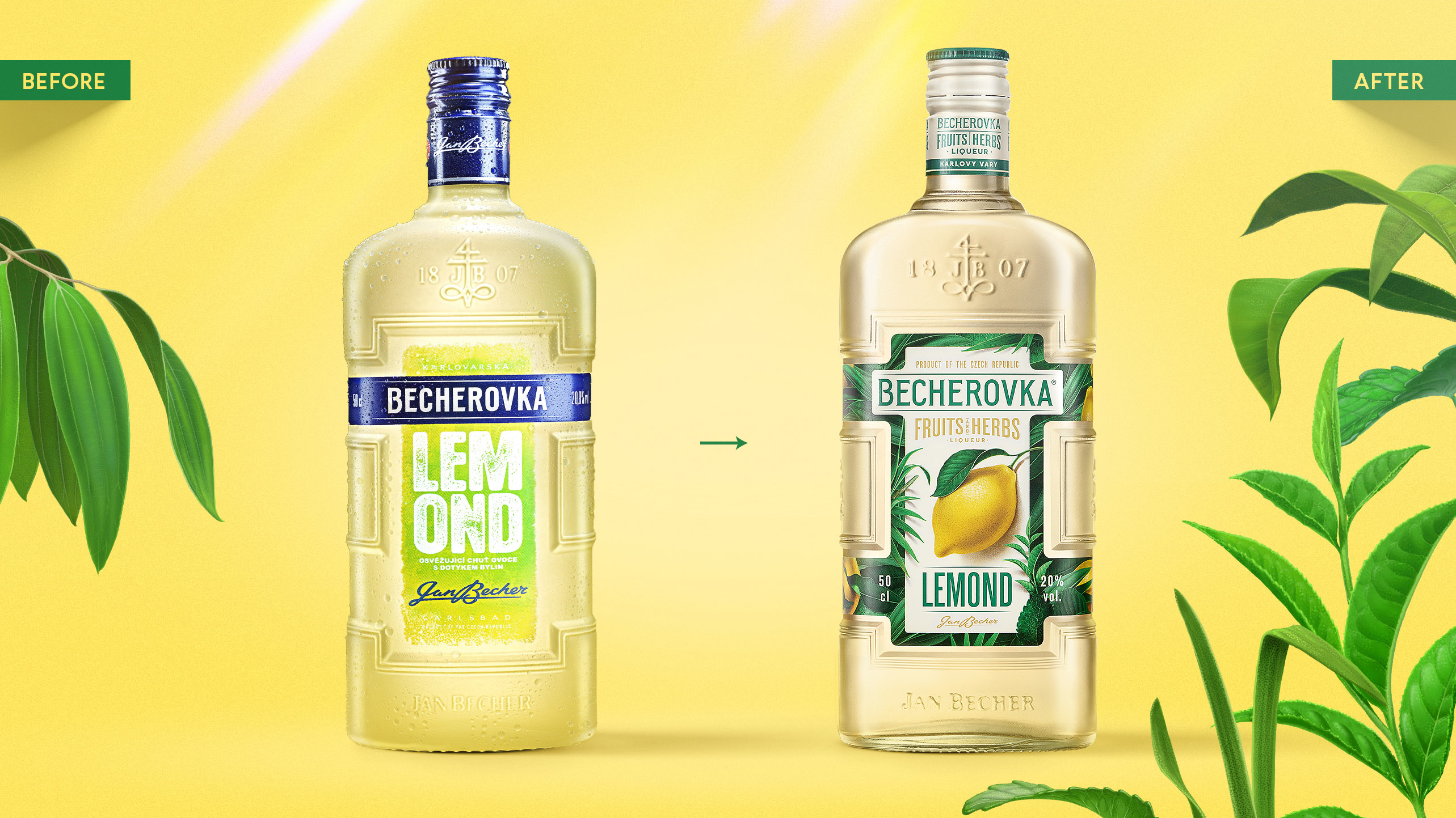
Becherovka Lemond – the well-established “younger daughter” in the Becherovka portfolio – is a 100% natural product combining the famous herbal liqueur with real fruit and spice flavours. However, the design did not reflect this, and as it became outdated, it was no longer appealing to consumers. Then, the bottle and identity were redesigned – quite a brave step. Or shall we say steps…
The Solution
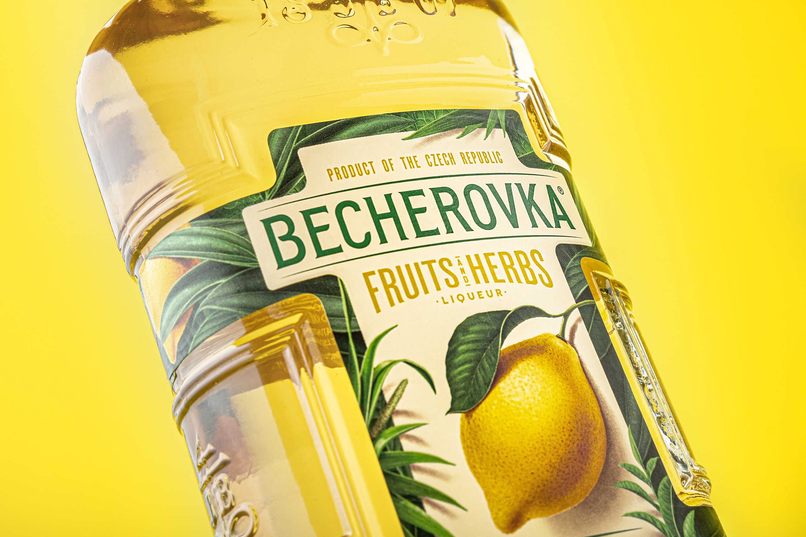
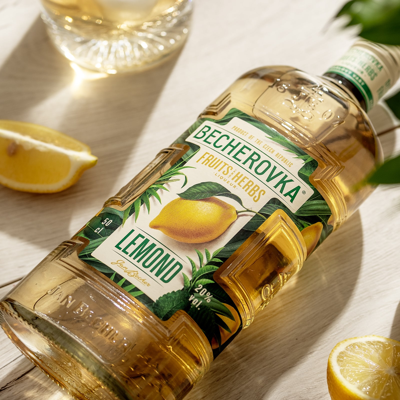
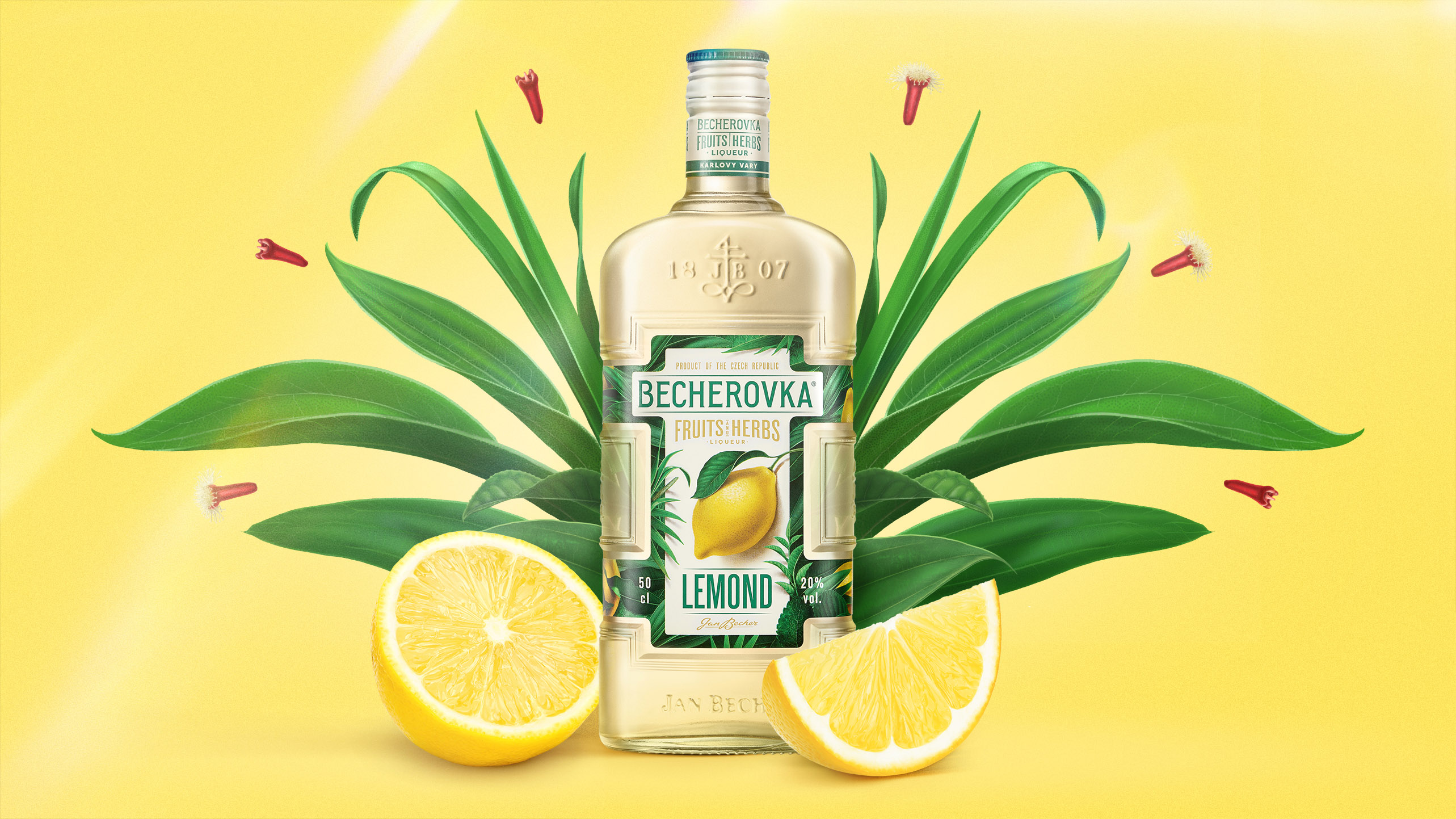
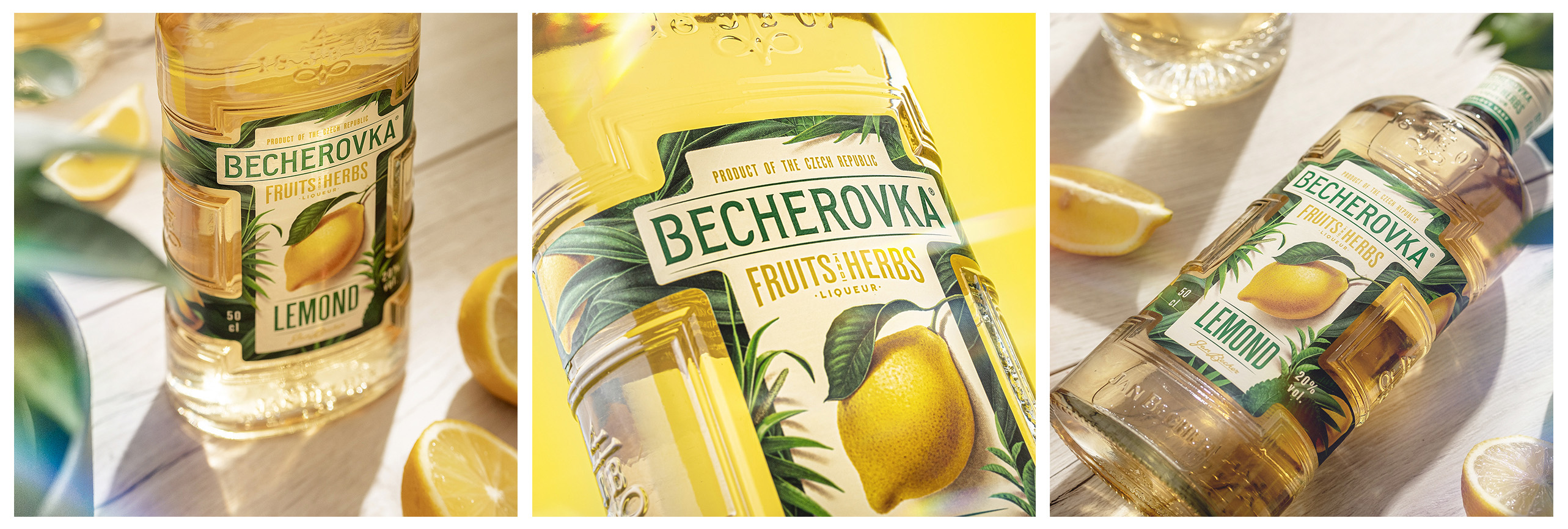
Step one: introduction of a fully transparent bottle. This was a challenge as technical obstacles stood in the way. In order to assure the quality stability of this natural product and to secure the desired shelf-life, tests had to be taken and the right producer found. This gain was worth the pain. By replacing the original Lemond sand-coated glass with a clear glass bottle the true colour and appearance of the liquid were exposed. It now proudly presents quality, enhances taste-appeal and most of all, underlines the message of honesty which this reborn brand decided to send. Step two: packaging redesign. The desired shift was towards naturalness, while maintaining a modern visual language. The iconic bottle and label shape were kept, but the look was changed completely. Any references to “artificiality” have been removed – starting with the vibrant green and blue.
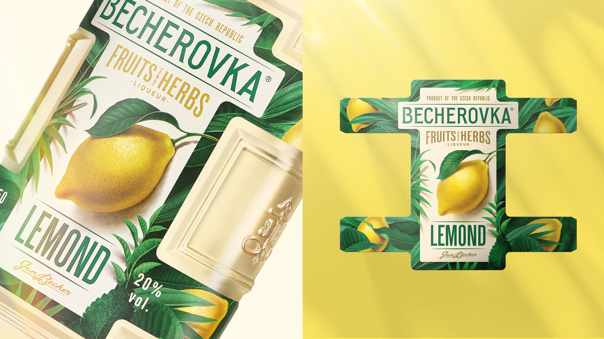
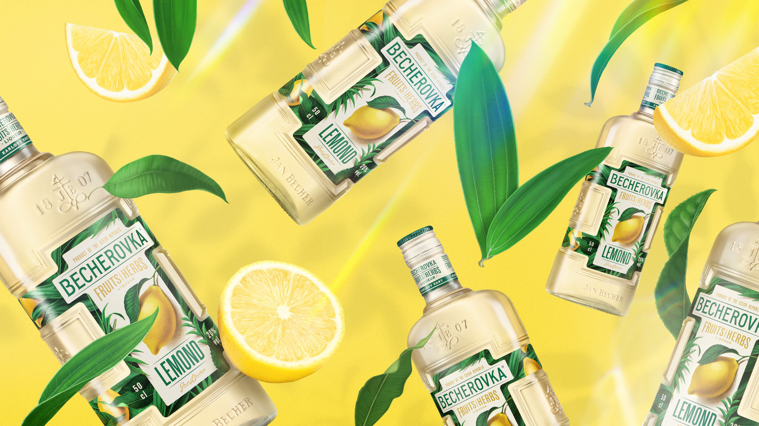
A soft, yet full beige colour was selected as the base. Focus on flavour and juiciness was the reason the zesty lemon became the hero of the label. It also helps navigation on the shelf. Yellow brings freshness, neutral green tones represent the herbal aspect and help create label contrast. The illustration style was a carefully selected tool to express naturalness with modern look and feel. A large amount of fruit and herbs were digitally crafted to help compose a frame-like composition on the label and allow playful and flexible identity in off-pack solutions.
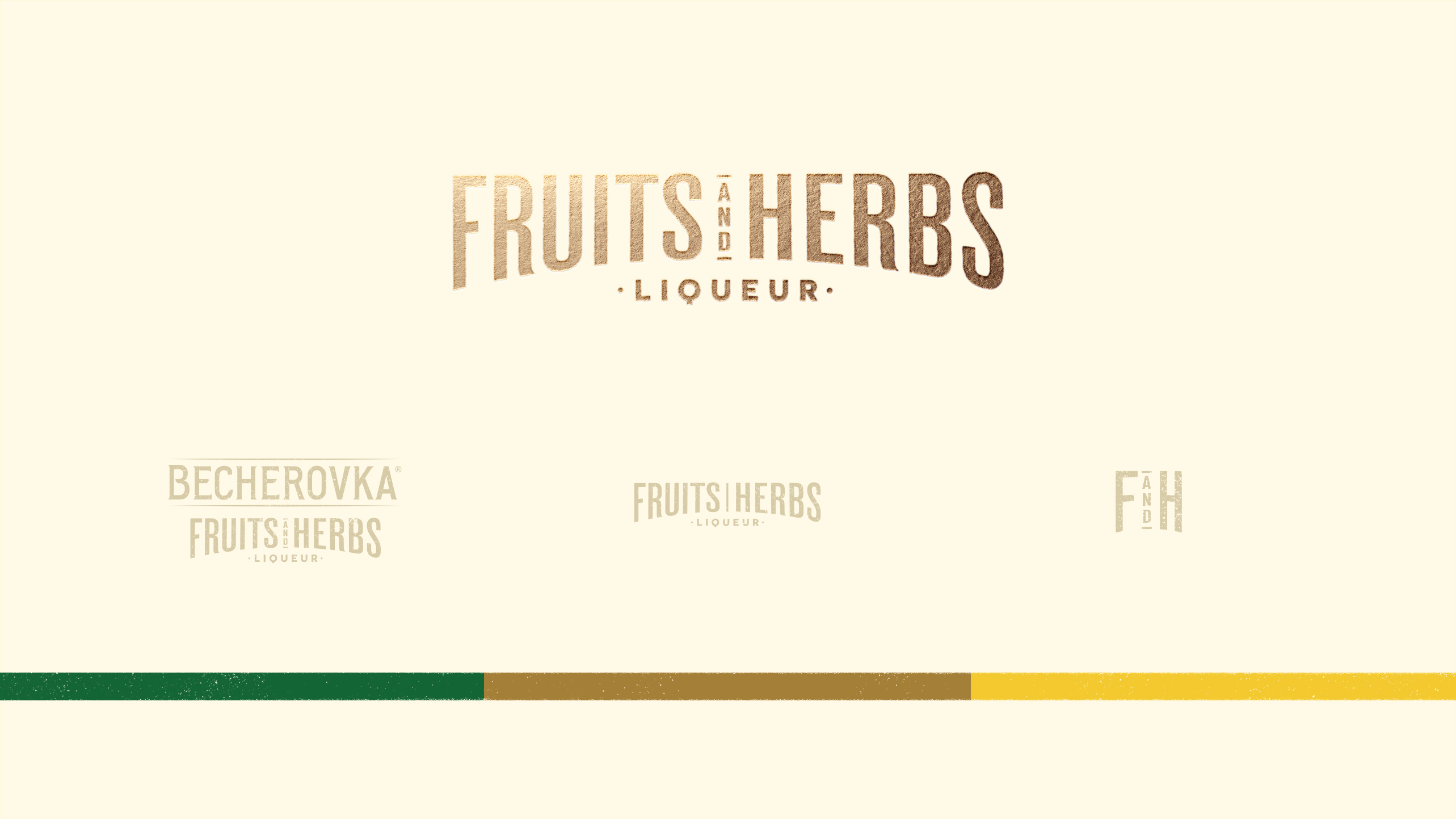
Most of all, a new architecture was designed. This brings us back to step zero: in line with the brand strategy, the Becherovka Pernod Ricard team made the decision to introduce a new portfolio architecture for Lemond. By establishing a whole family of naturally-flavoured Becherovka low ABVs, called Becherovka Fruits&Herbs – with the vision of other flavour SKUs to follow soon.
Therefore, new architecture and sub-brand wordmark have been designed. The Lemond name was kept for consistency and reassurance, but it received less prominence on the label of the newly crowned Becherovka Fruits&Herbs range logo. The golden pantone used for the details and the making of the lid was part of the premium, yet approachable visual intention.
But the cherry – or actually the lemon – on top was the advantage taken of the fully transparent bottle, see-through liquid and double-sided label printing: an extra lemon was added “inside” the bottle. As a result, we have achieved a younger, fresher, zestier, yet very natural-looking new F&H Lemond.
CREDIT
- Agency/Creative: Cocoon Prague
- Article Title: Cocoon Prague Rejuvenation of Becherovka Fruits and Herbs Liqueur
- Organisation/Entity: Agency, Published Commercial Design
- Project Type: Packaging
- Project Status: Published
- Agency/Creative Country: Czech Republic
- Market Region: Multiple Regions
- Project Deliverables: Brand Architecture, Brand Identity, Brand Redesign, Brand Rejuvenation, Graphic Design, Illustration, Packaging Design, Photography, Product Architecture, Rebranding, Tone of Voice
- Format: Bottle
- Substrate: Glass Bottle
- Keywords: WBDS Agency Design Awards 2021/22
-
Credits:
Designer : Sasha Sharavarau, Andreea Bora
Creative Director: Karolina Belohlavkova
Account Manager: Marketa Nema, Cigdem Cevrim
Account Director: Ana Maselli
Artworker: Robert Specian, Jana Klimentova
3D Visualizer: Petr Ludvik
Photographer: Jose Sabino Jr.
Client : Jan Becher, Pernod Ricard


