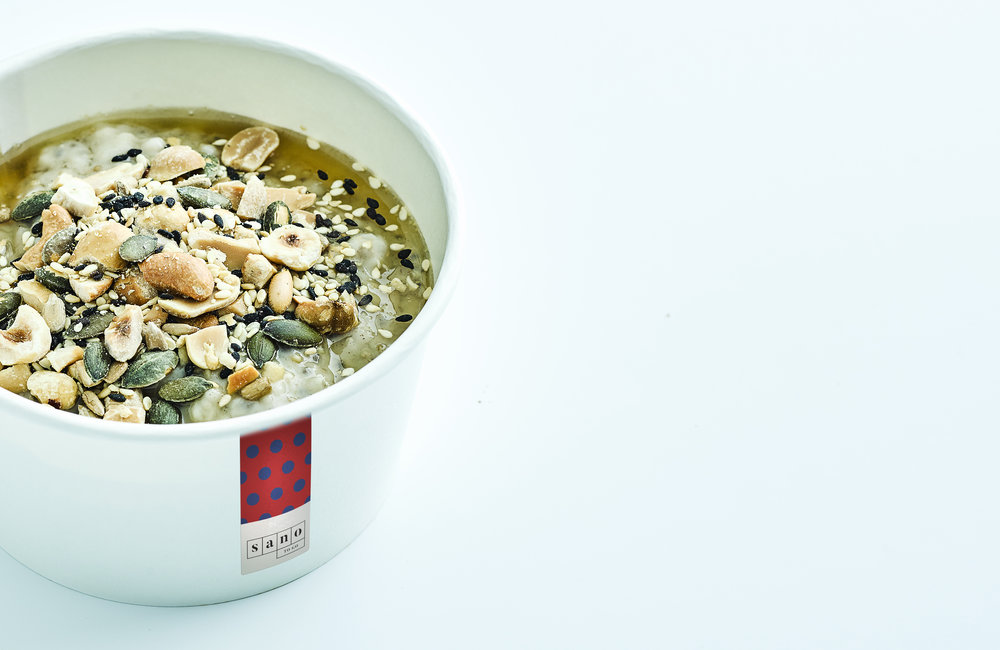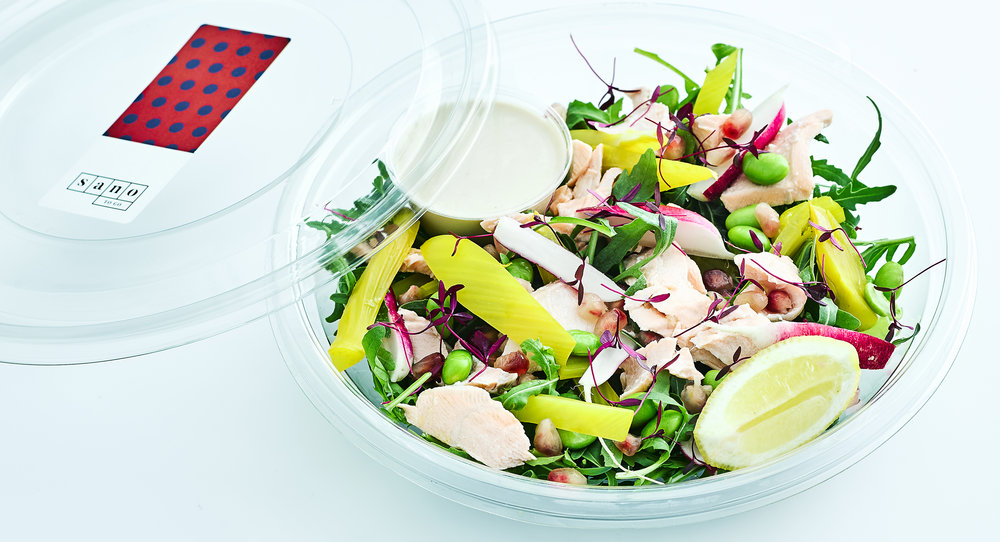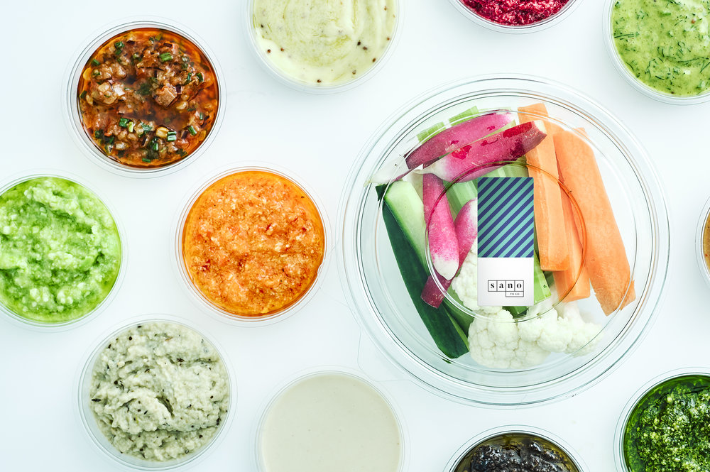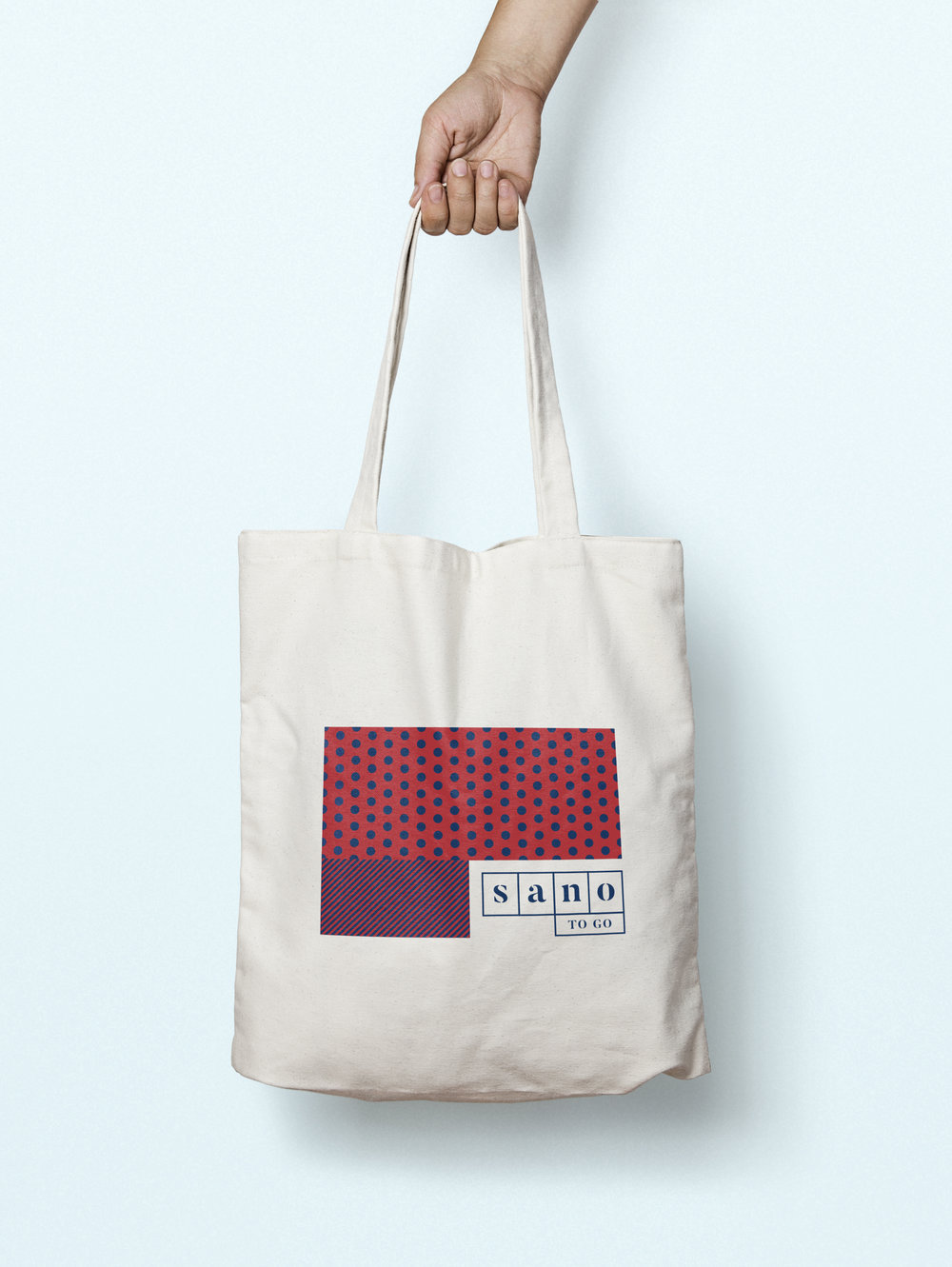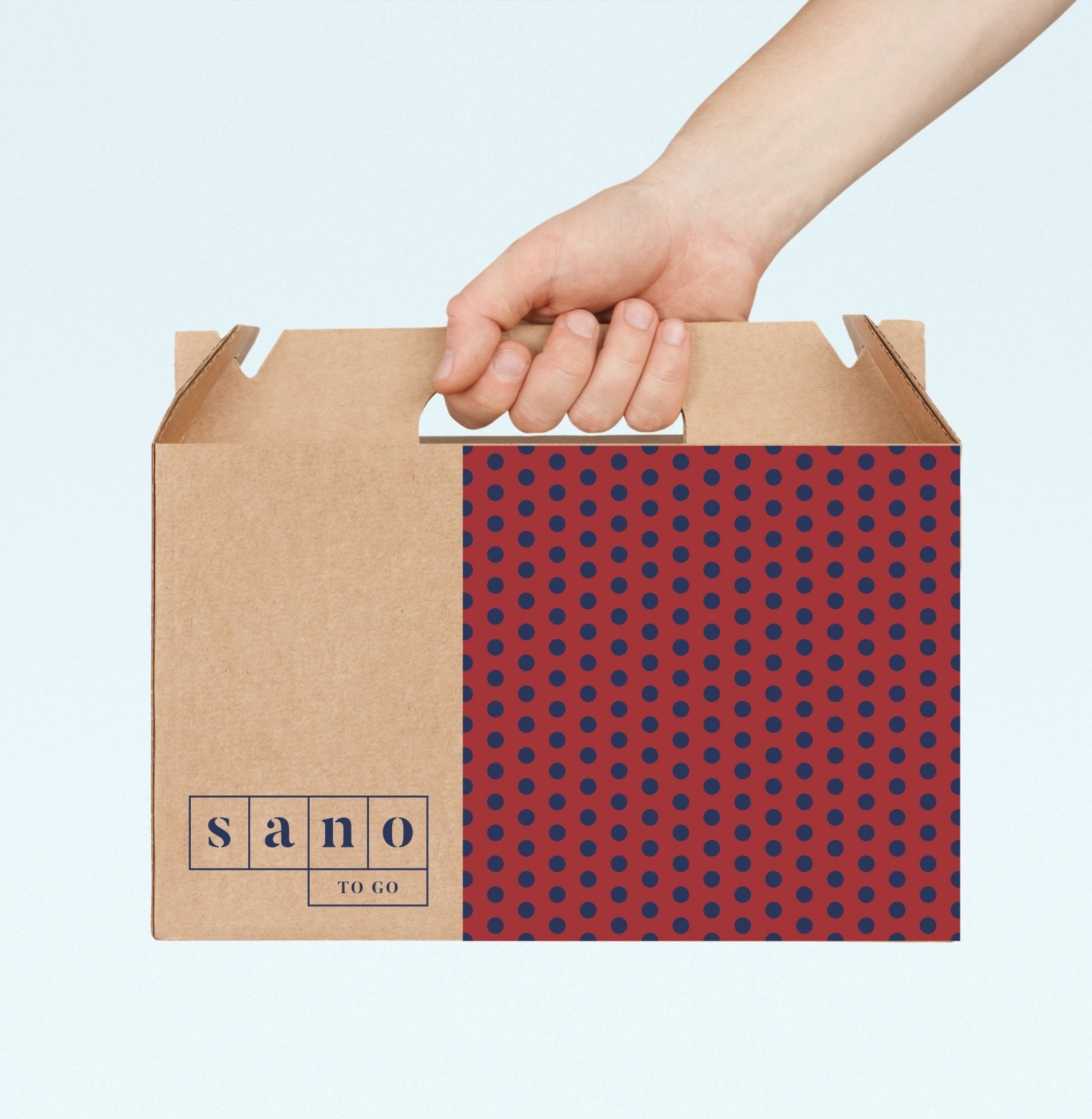

” Clinic create branding and visual identity for Sano: a fad-free, new food brand using nutritional science to change the way we eat.Branding and identity brings together the founders’ passion for delicious food and their mission to empower people to eat and live better lives with evidence-based nutritional science.Sano’s first ‘food-to-go’ outlet launches in London this week, with further sites planned.Recipes are created by food writer and nutritional science expert, Dale Pinnock – aka The Medicinal Chef – to be not only tasty but also scientifically and nutritionally balanced.London, July 26th 2017: Creative agency Clinic today announce details of their work creating the branding and identity for Sano: an exciting new food brand which aims to empower people to make the best nutritional and wellbeing decisions in their everyday life. The founders are passionate about evidence-based nutritional science and both Dale Pinnock and Heather Richards, being nutritional experts, ensure every aspect of the brand is based on scientific facts not transient health fads. Sano are launching their first ‘food-to-go’ shop this week (w/c 24th July) on London’s Gray’s Inn Road.In creating the brand for Sano from scratch, Clinic’s main challenge was to communicate the brand’s real point of difference – seriously tasty food based on sound nutritional science – in a saturated ‘healthy eating’ market.Matt Gelder, Creative Director at Clinic commented, “We began by doing a creative audit of the ‘health and wellbeing’ space and quickly realised how bland and ‘me too’ most of the brands look like: greens, browns, pastels and hand-drawn illustration and typography. We wanted to position Sano in the complete opposite direction by using vibrant colours, bold patterns, and striking visual cues. This reflects Sano’s fresh way of thinking and their ‘facts not fads’ approach of sticking to real nutritional science and staying clear of transient health trends.”Clinic created a logo inspired by the grid of a periodic table, referencing the precision, thought and science that has gone into considering the qualities of all Sano’s ingredients and how they work together. This grid system has in-built flexibility that accommodates Sano’s ambitions to grow and can emphasise either the ‘Sano’ name or name of the sub-brand, such as ‘To-Go’ or ‘School of Culinary Medicine’. Meanwhile, typography is inspired by the founders’ mission to start a ‘nutritional revolution’ and subtly references the stenciled typography seen on revolutionary posters and artwork.Matt Gelder at Clinic continued, “Along with the logo we created a wider visual identity for the brand to express the meeting of two worlds: nutritional science and a real passion for great-tasting food. Across all signage and digital platforms, the logo sits on a backdrop of two distinct halves: close-ups of Sano’s delicious, mouth-watering food versus precise geometric patterns, such a hexagons and lines that reflect the scientific aspect of the brand. This combination creates a clean, contemporary and premium feeling brand that appeals to the busy city target audience.”Clinic then rolled out the visual identity across all of Sano’s touchpoints, creating a brand architecture for Sano and its sub-brands to be communicated as clearly as possible; website guidelines, digital architecture and UX; tone of voice; photographic guidelines; ‘food-to-go’ interior in conjunction with interior design studio DesignLSM and exterior retail signage; packaging concepts; and print and digital advertising and marketing assets.Sano’s first ‘food-to-go’ shop opens this week (w/c 24th July) on London’s Gray’s Inn Road offering breakfasts, lunches and all-day takeaway meals, all designed to be the perfect fuel for strong, healthy bodies. It joins their existing online Sano School of Culinary Medicine which aims to make every-day nutritional science more accessible via an easy-to-follow online diploma course. This launch coincides with co-founder Dale’s new TV series – Eat, Shop, Save – which airs on ITV from 13th July and helps families to get fitter, eat better and save money on their shopping over an eight-week period.Doug Richards, co – founder and CEO of Sano commented: “Sano is a labour of love for so many of us and so we wanted the design to communicate our message in a vibrant and accessible way. When we road-tested our food at the Balance Festival in May, we were so popular that we sold out – we know we have something special. Clinic have understood our passion from day one and have created brand designs which help to bring Sano to life for our customers.” ”