


43oz.com – Design Studio – Horse Rider
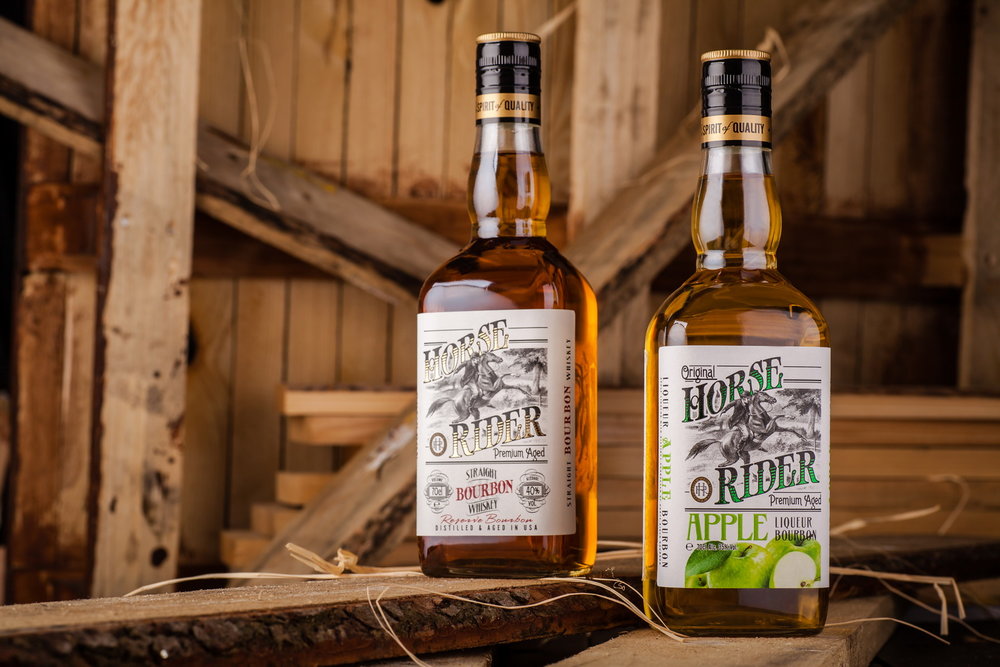
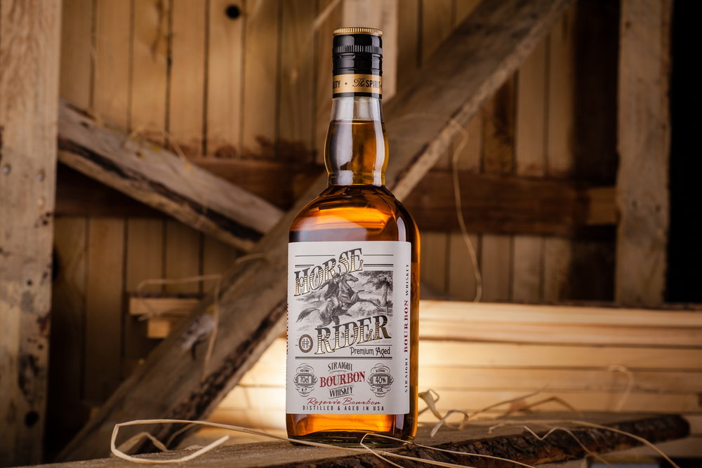
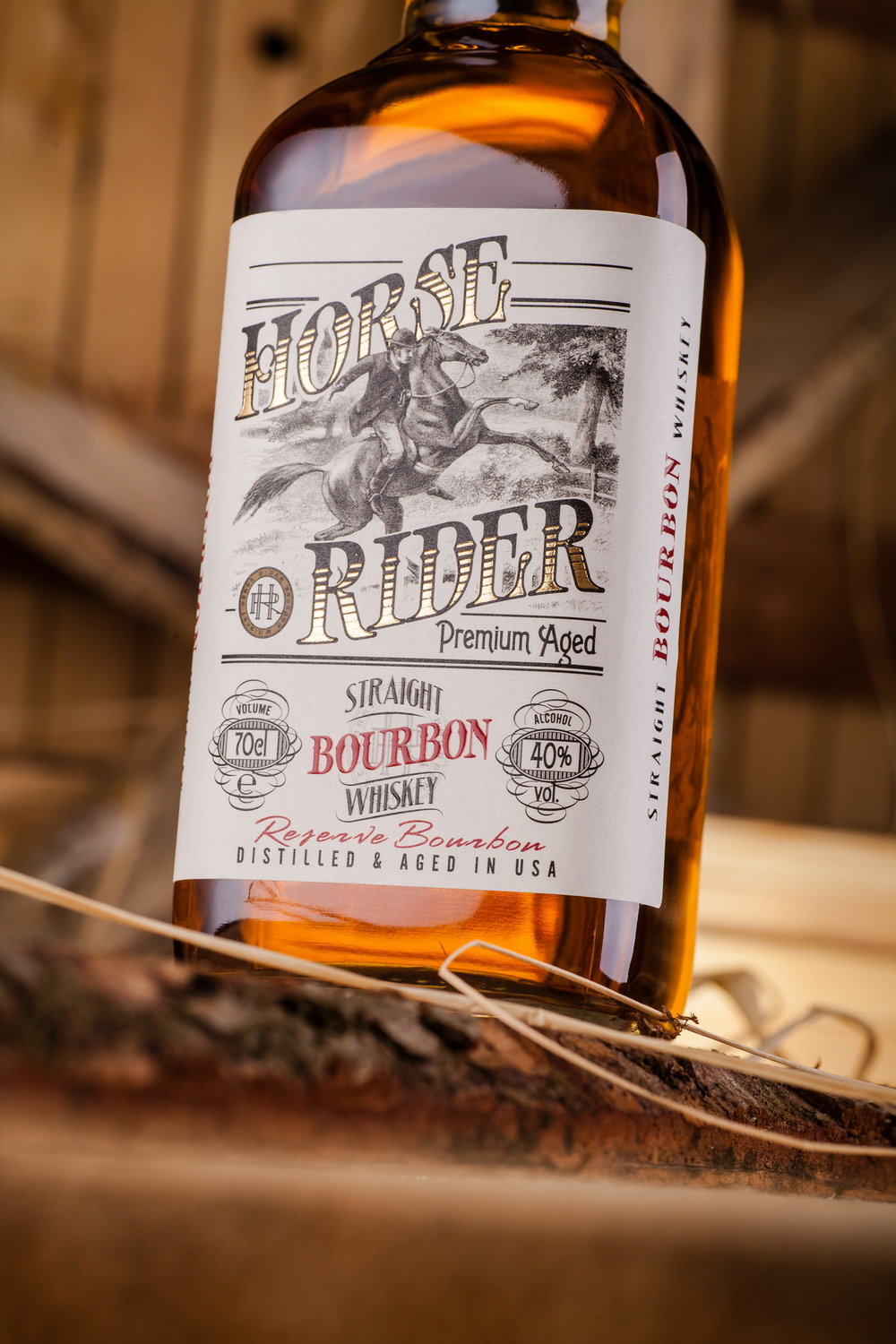
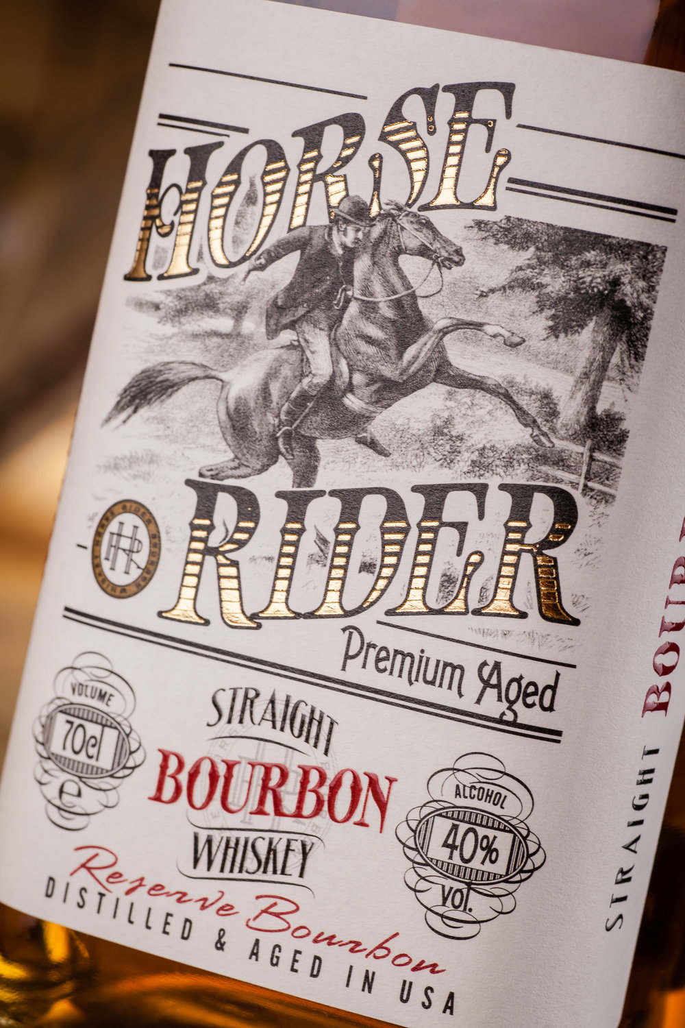
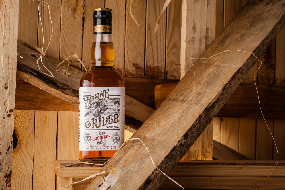
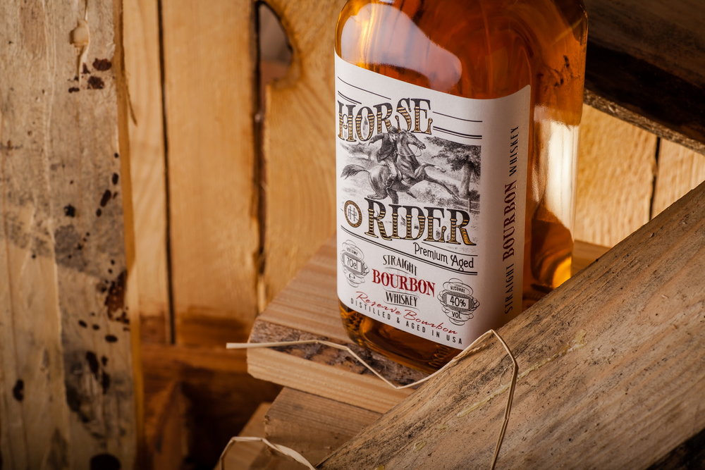
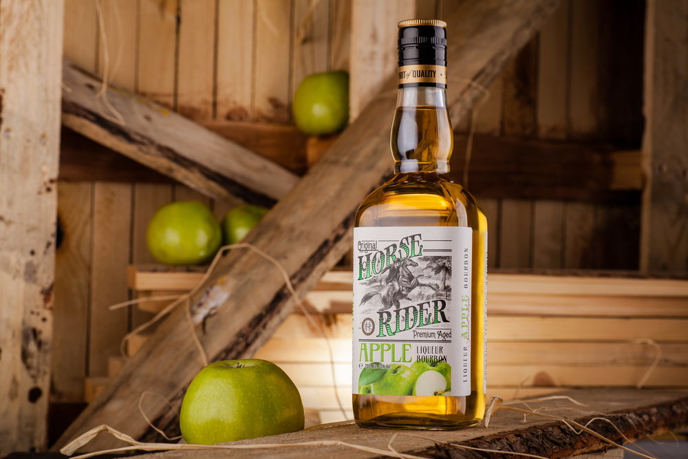
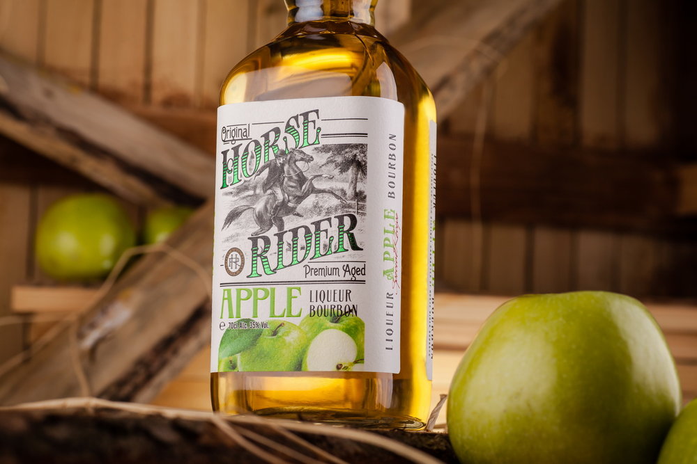
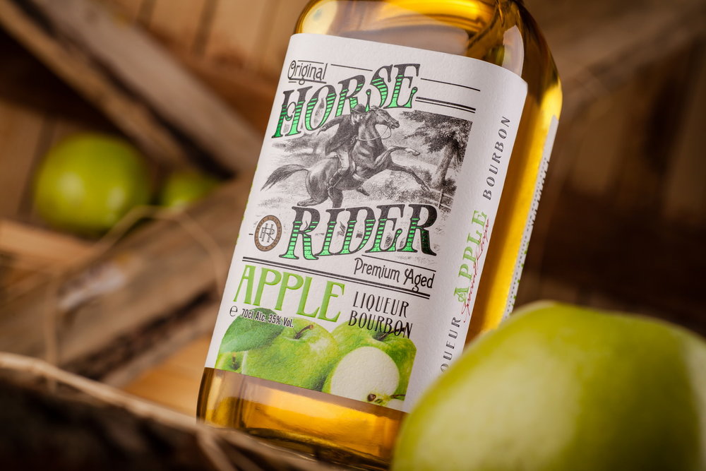
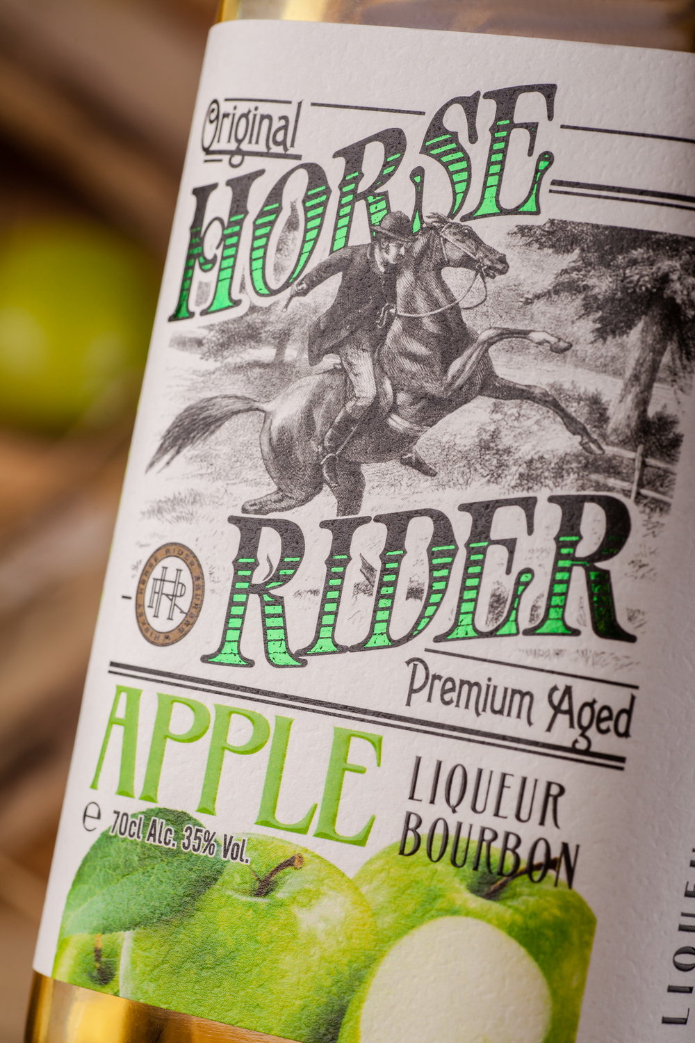
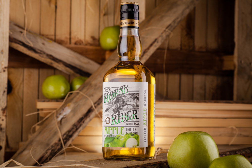
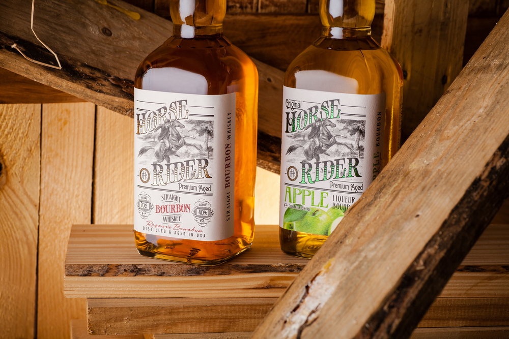
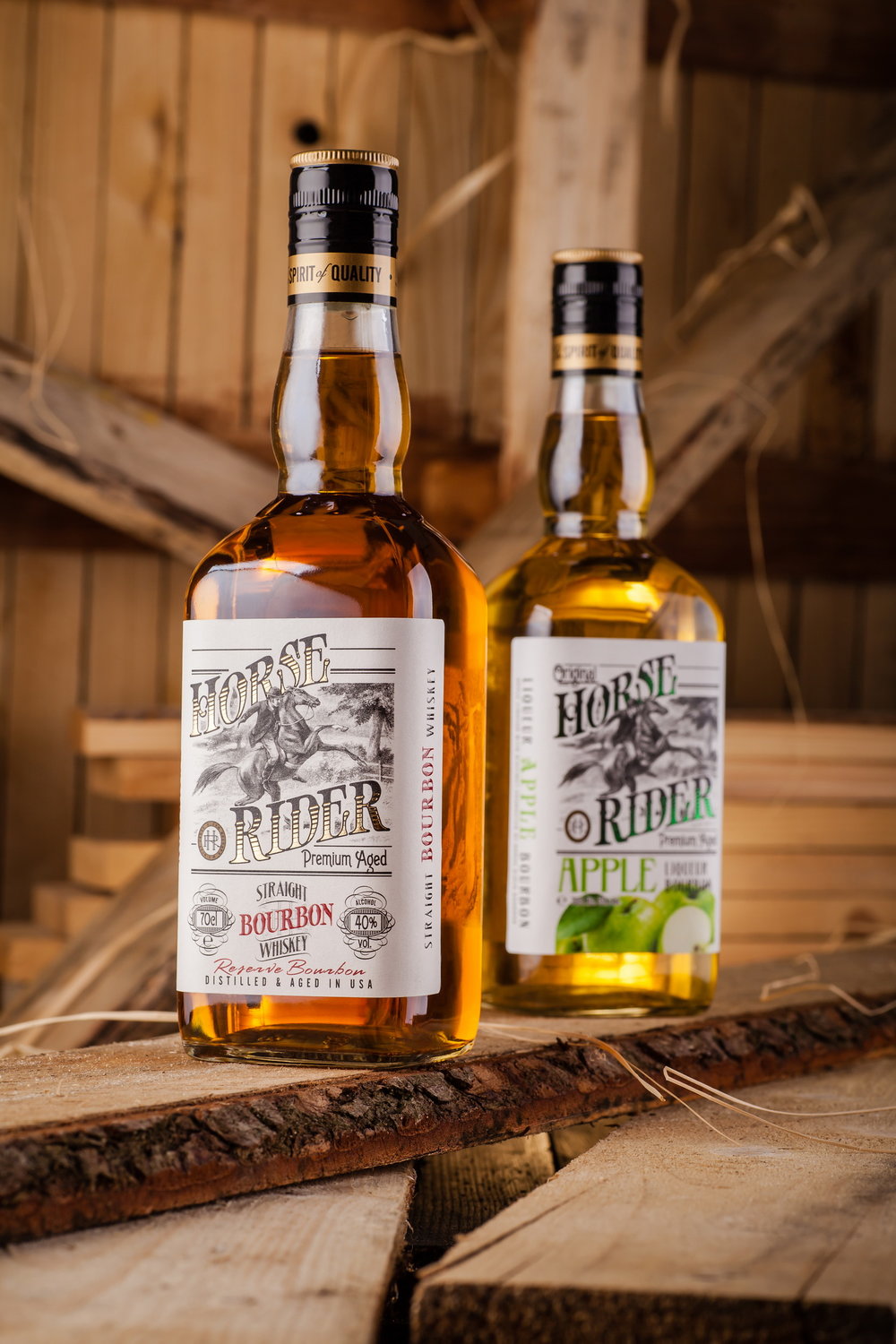
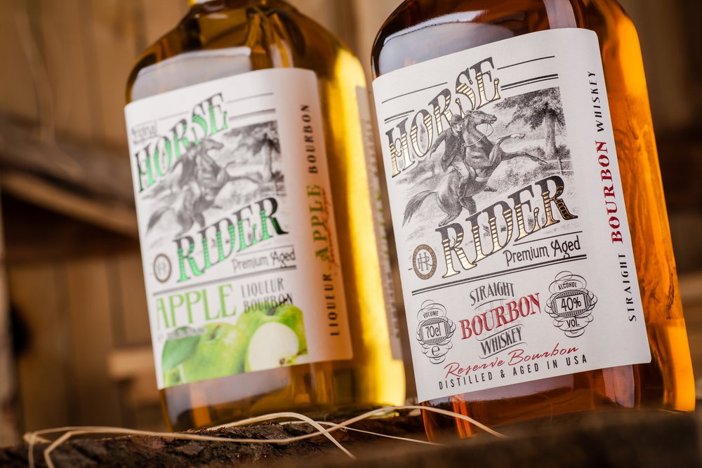
“Horse Rider is a classic bourbon produced by the Belgian company Sodiko for the European market. The main requirement for the packaging design for this product was creating a vintage style, which would emphasize the classic production technique of the drink. At the same time, the packaging had to be memorable and attractive in order to make the product stand out from the competition on the market shelf.
The label design for Horse Rider bourbons features a style that can be characterized as modern vintage. Detailed typography work, characteristic graphic elements, and a stylized illustration of a horse rider all together create an image that is easily identified by the consumer as classic, matured, respecting traditions. Meanwhile the apple version of the drink also features large illustrations of apples, which makes it easier to set it apart from the ordinary version of the bourbon. It’s also worth to mention the use of foil and tactile varnish in certain graphic elements of the label, which make the overall composition more attractive and voluminous.”
CREDIT
- Agency/Creative: 43oz.com - Design Studio
- Article Title: Classic Bourbon Packaging Design for Belgian Brand
- Organisation/Entity: Agency Commercial / Published
- Project Type: Packaging
- Agency/Creative Country: Moldova
- Market Region: Europe
- Format: Bottle
- Substrate: Glass


