


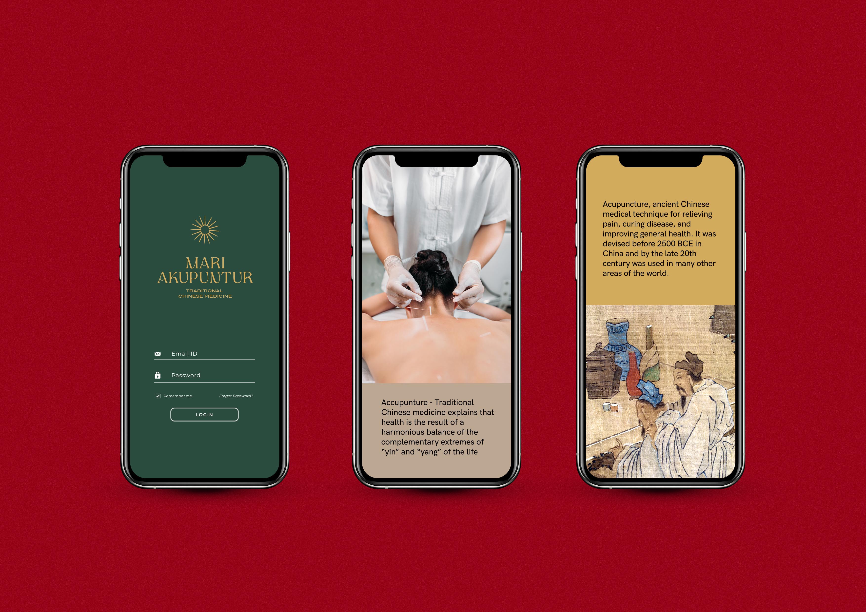
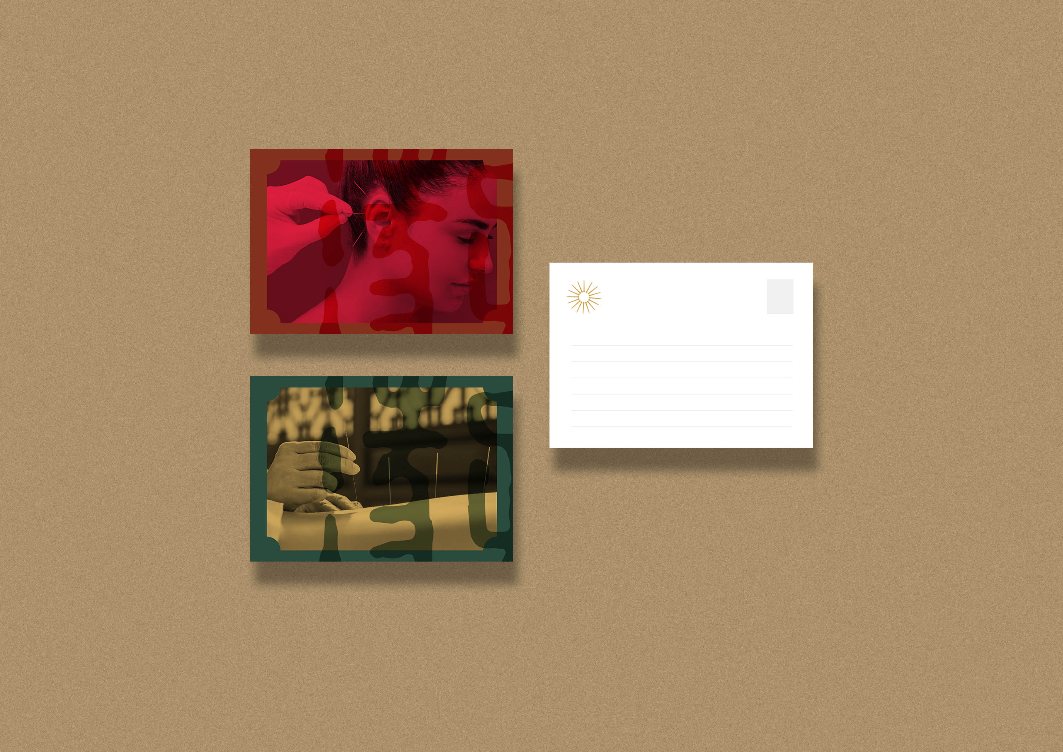
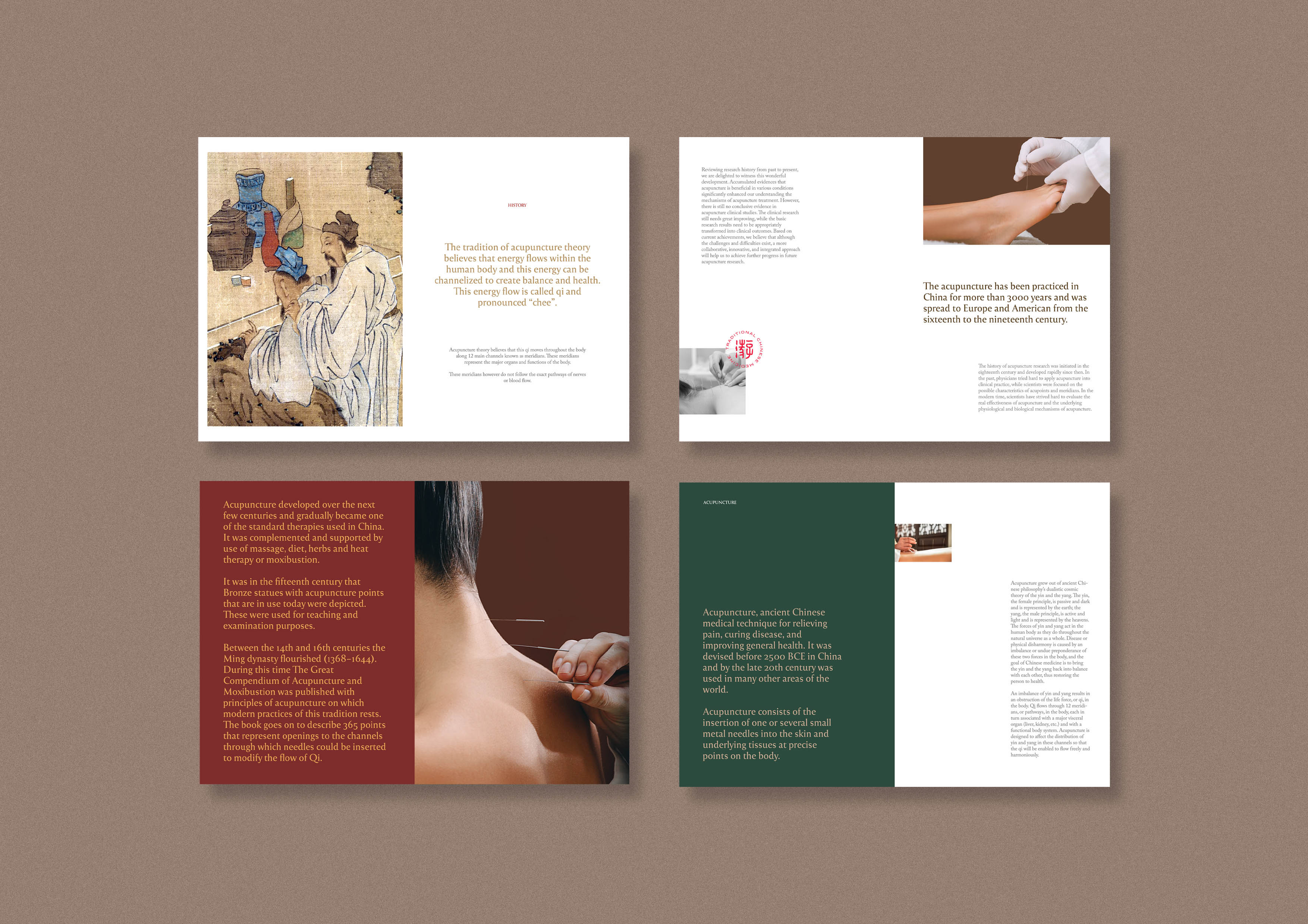
Acupuncture, ancient Chinese medical technique for relieving pain, curing disease, and improving general health. It was devised before 2500 BCE in China and by the late 20th century was used in many other areas of the world. Acupuncture consists of the insertion of one or several small metal needles into the skin and underlying tissues at precise points on the body.
Acupuncture grew out of ancient Chinese philosophy’s dualistic cosmic theory of the yin and the yang. The yin, the female principle, is passive and dark and is represented by the earth; the yang, the male principle, is active and light and is represented by the heavens. The forces of yin and yang act in the human body as they do throughout the natural universe as a whole. Disease or physical disharmony is caused by an imbalance or undue preponderance of these two forces in the body, and the goal of Chinese medicine is to bring the yin and the yang back into balance with each other, thus restoring the person to health. An imbalance of yin and yang results in an obstruction of the life force, or qi, in the body. Qi flows through 12 meridians, or pathways, in the body, each in turn associated with a major visceral organ (liver, kidney, etc.) and with a functional body system. Acupuncture is designed to affect the distribution of yin and yang in these channels so that the qi will be enabled to flow freely and harmoniously.
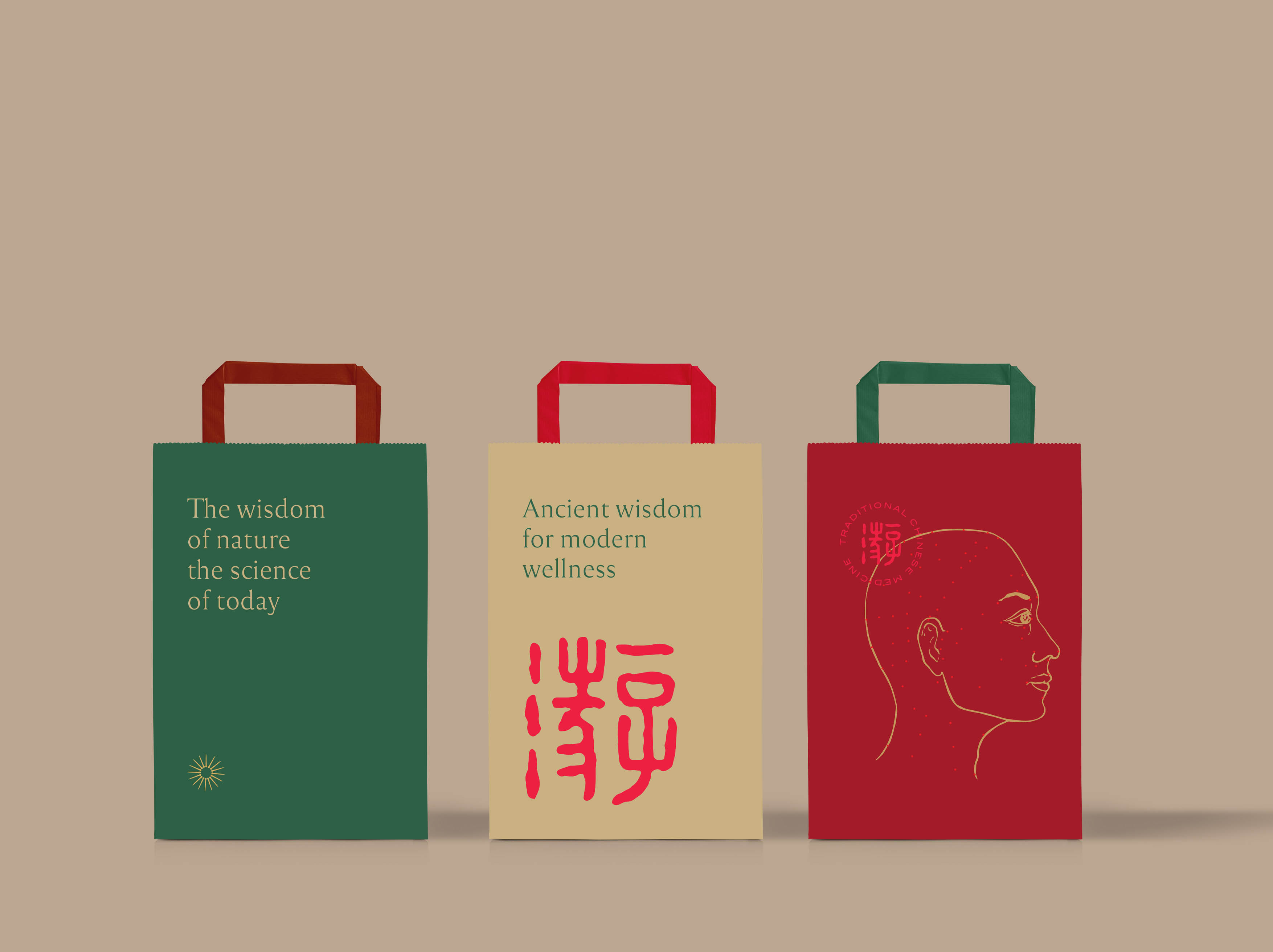
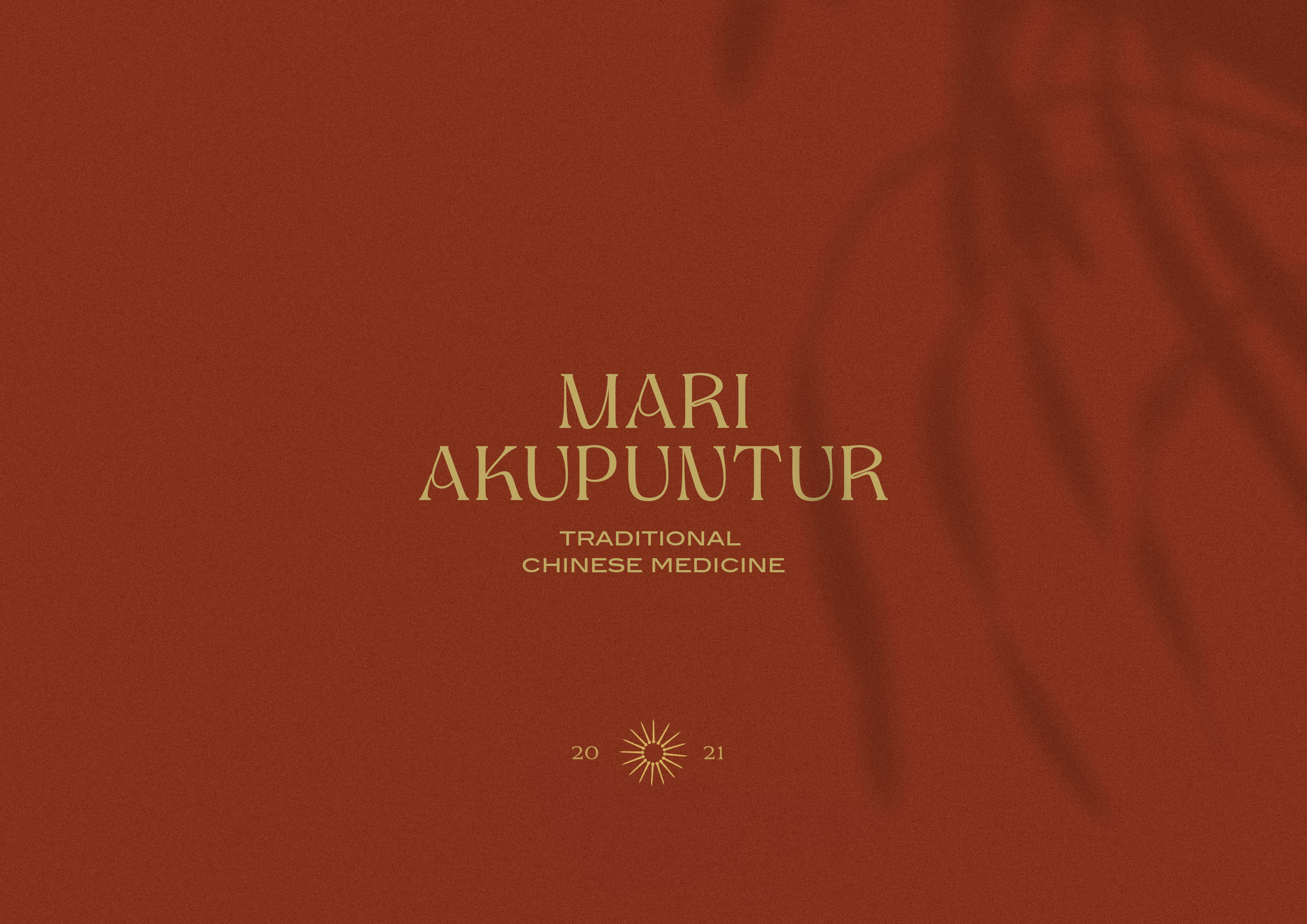
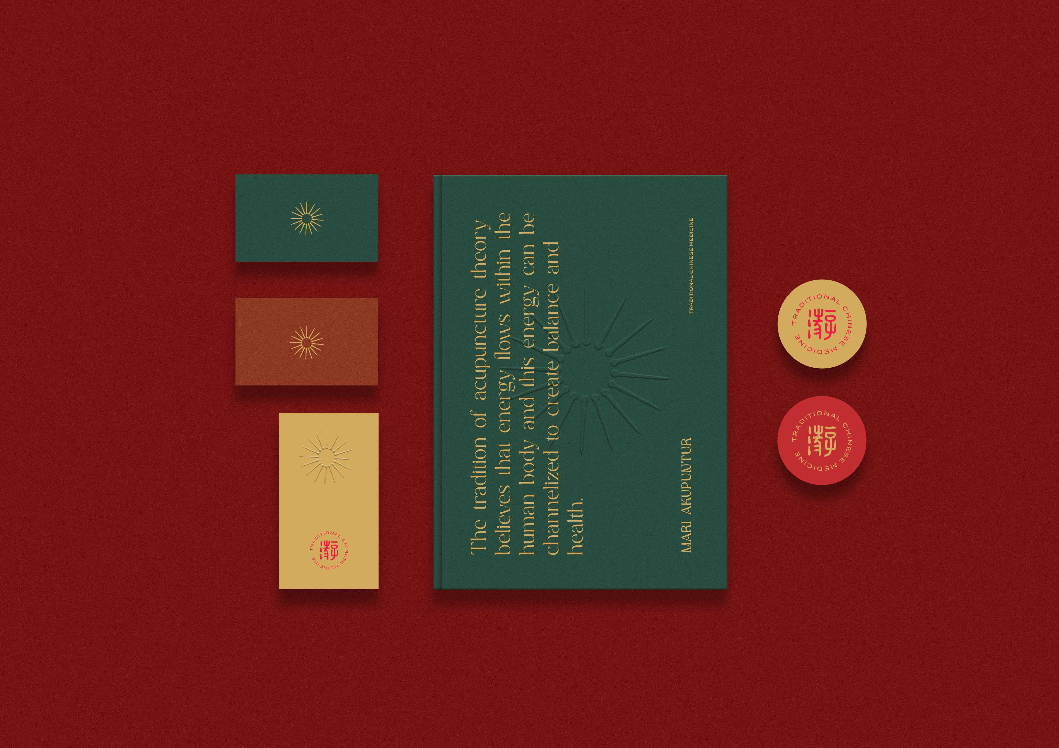
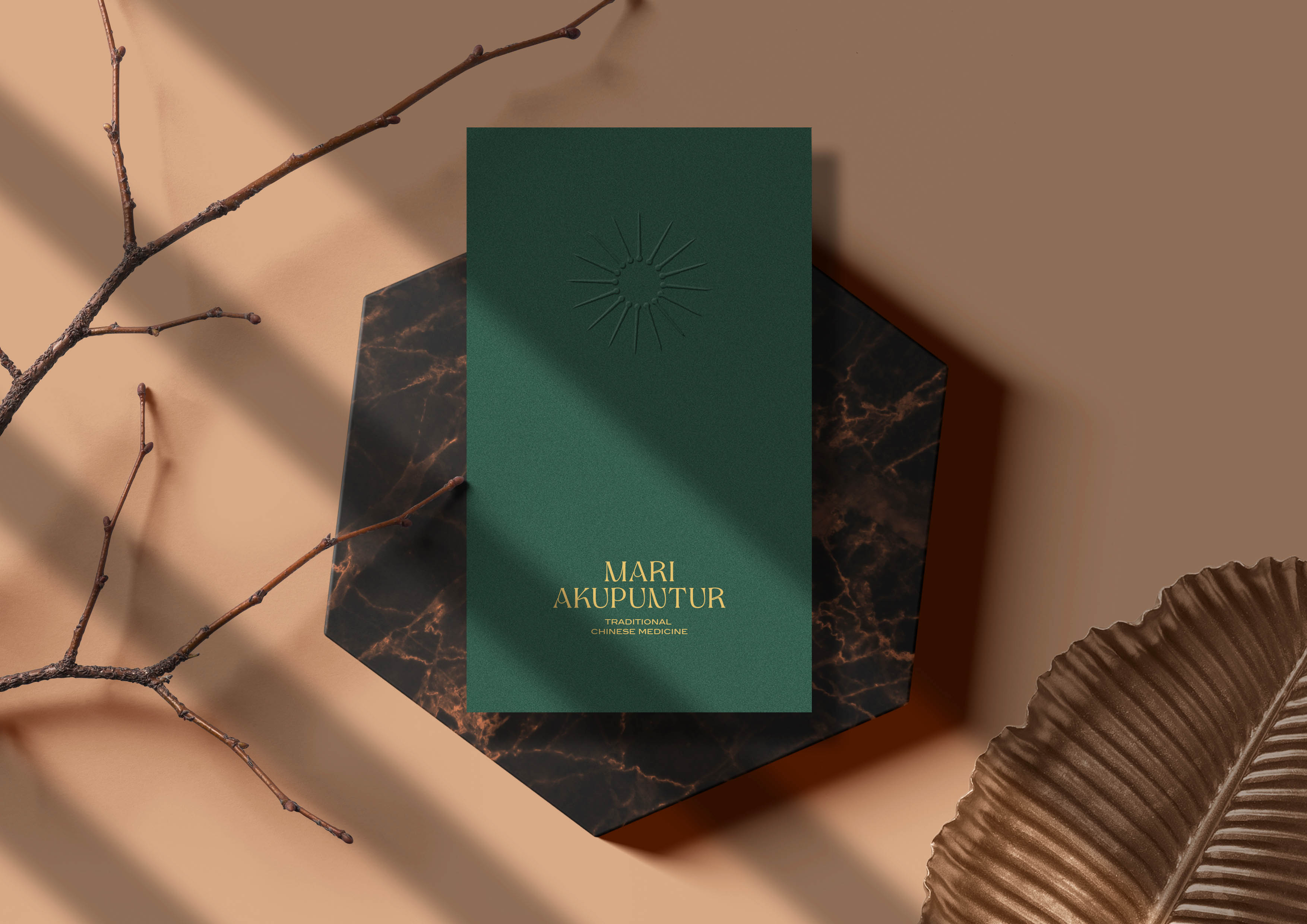
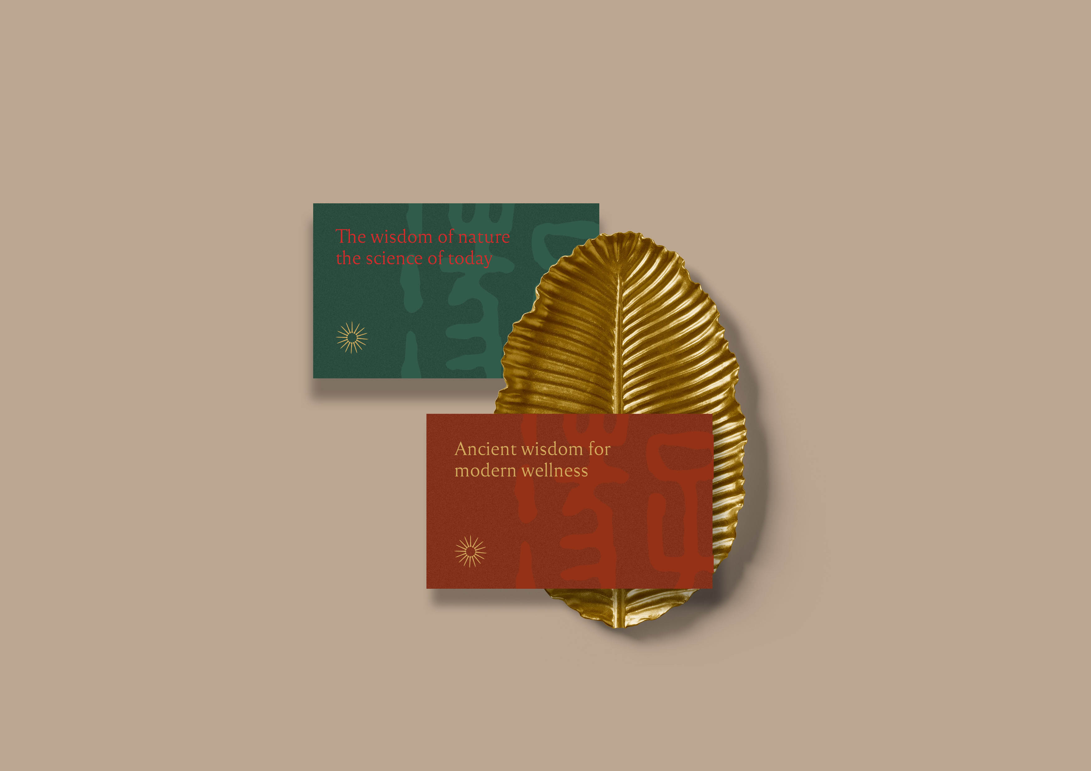
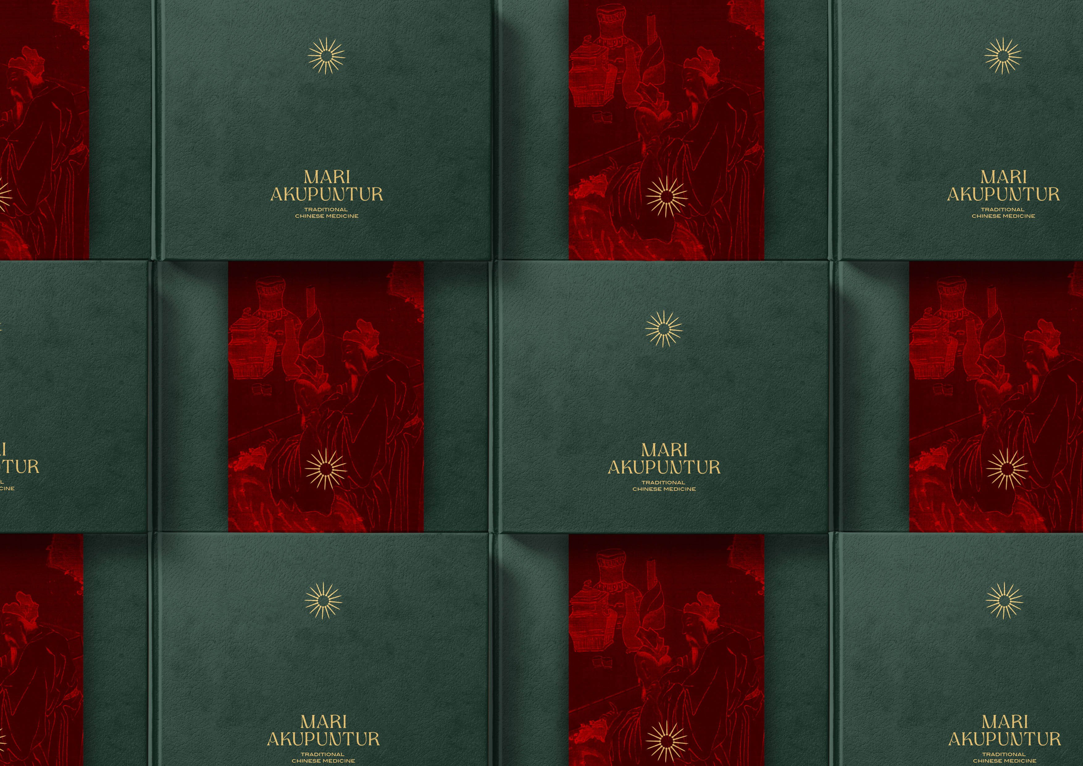
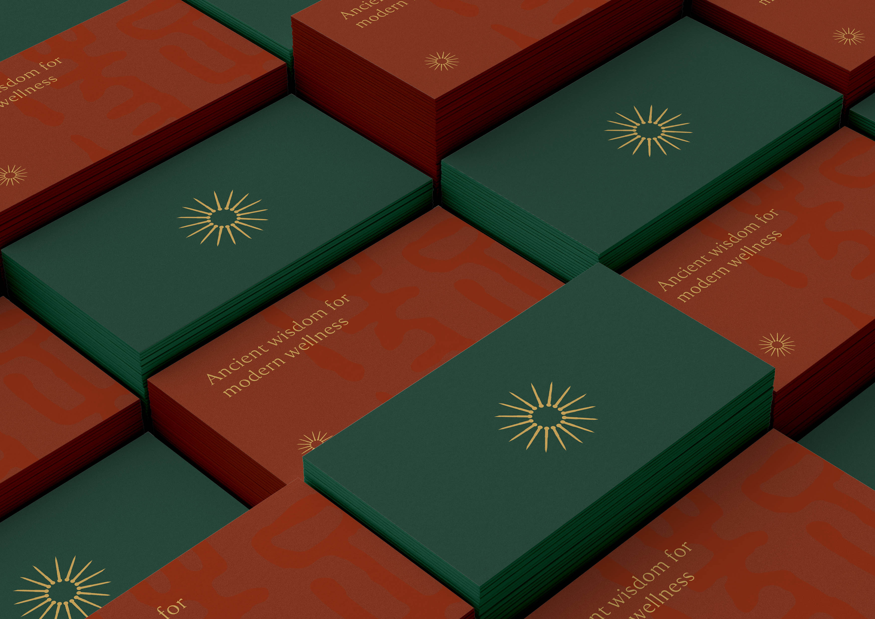
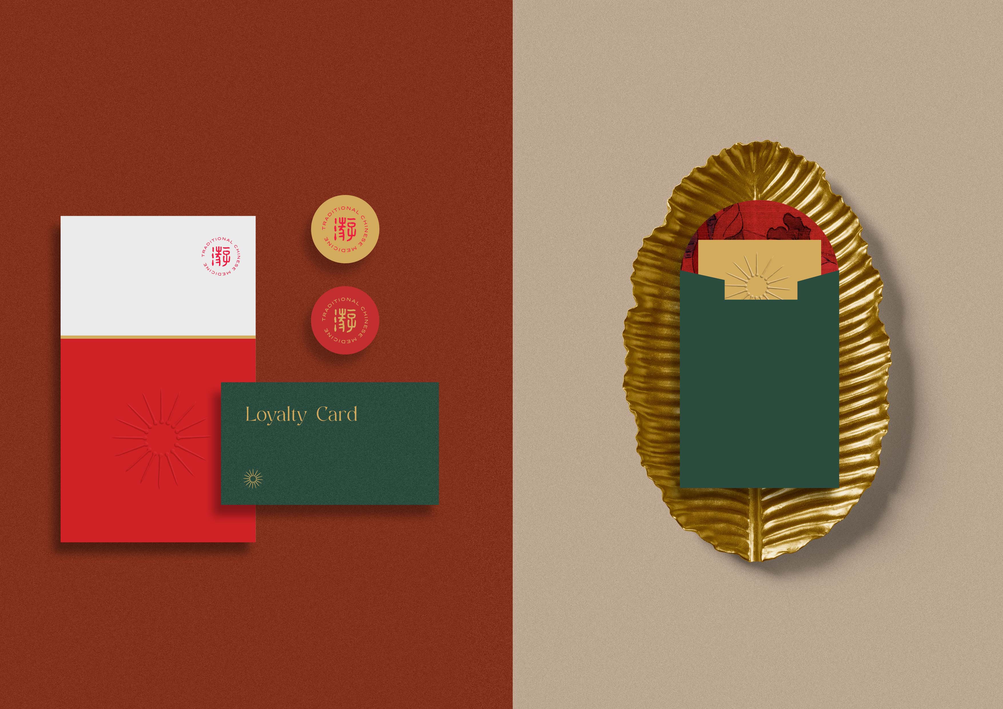
Mari Acupuncture is an acupuncture clinic that promotes traditional Chinese medicine as its method. And we also help Mari Acupuncture to have a brand & identity that is well integrated, classy, contrast and strong. Inspired by the collection of 16 acupuncture needles that make up the sun. 16 was chosen to symbolize wisdom, intuitive and the sun is symbolized as the center of life, healing, energy. The sun will give off light and bring about life. With the use of green which is more defined as growth, healing and the color terracotta & red to show the main identity of acupuncture as the only traditional healing method originating from China.
The use of ancient Chinese writing is also part of the visual identity – and is taken from the family clan “Jioe” as the sole owner of this acupuncture business.
CREDIT
- Agency/Creative: Nero Atelier
- Article Title: Chinese Acupunture Clinic Mari Akupuntur Branding Designed by Nero Atelier
- Organisation/Entity: Agency, Published Commercial Design
- Project Type: Identity
- Project Status: Published
- Agency/Creative Country: Indonesia
- Market Region: Asia
- Project Deliverables: Brand Experience, Brand Guidelines, Brand Identity, Brand World, Branding, Graphic Design, Packaging Design, Research
- Industry: Health Care
- Keywords: acupunture, china, traditional china medicine, acupunture, clinic, medical, minimalism, elegant


