


Cevisama had a specific goal: to update itself and obtain a consolidated, powerful and distinctive corporate identity. How? Creating a visual universe of its own in which identity is the main element of communication.
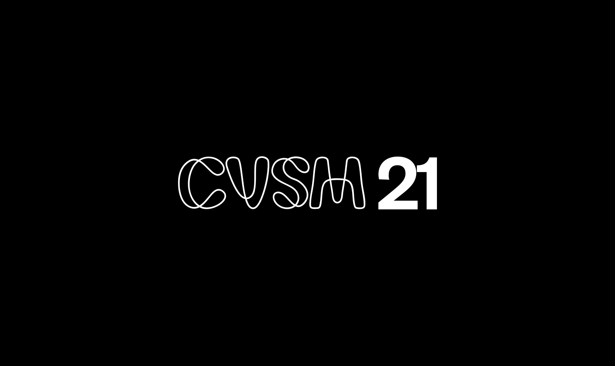
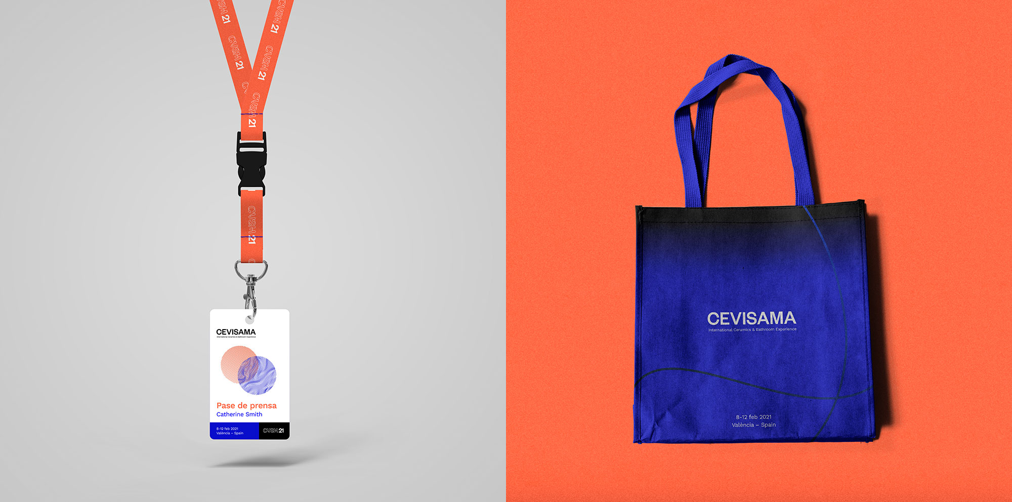
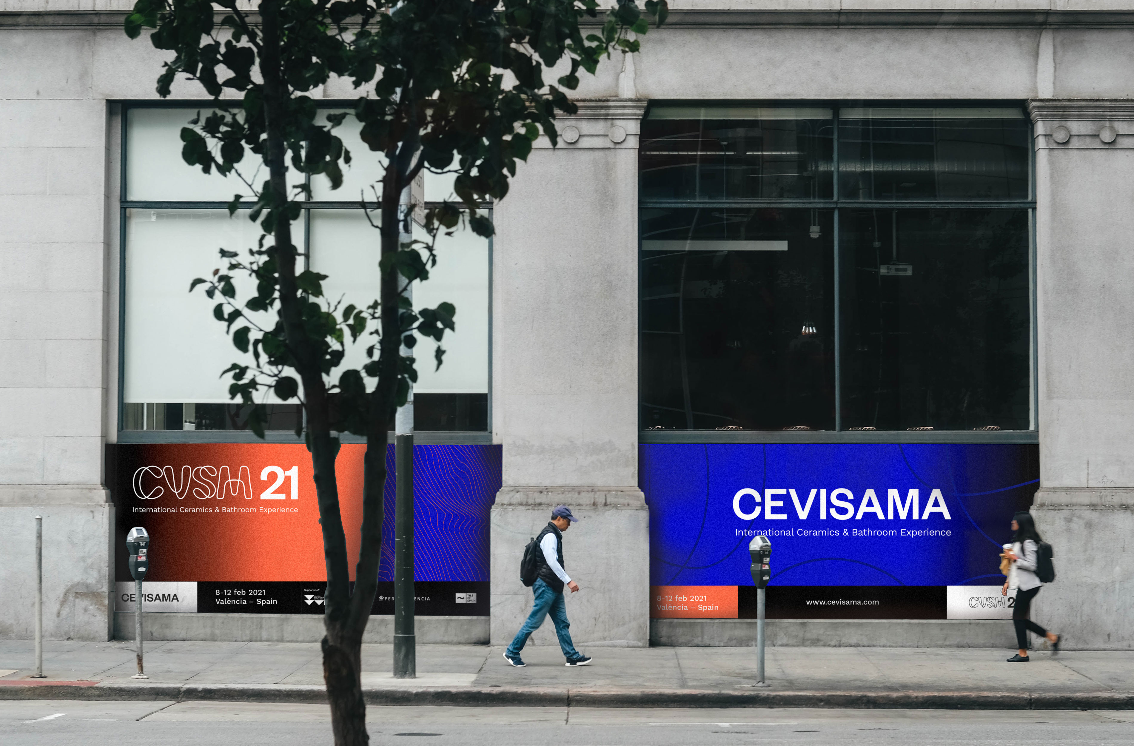
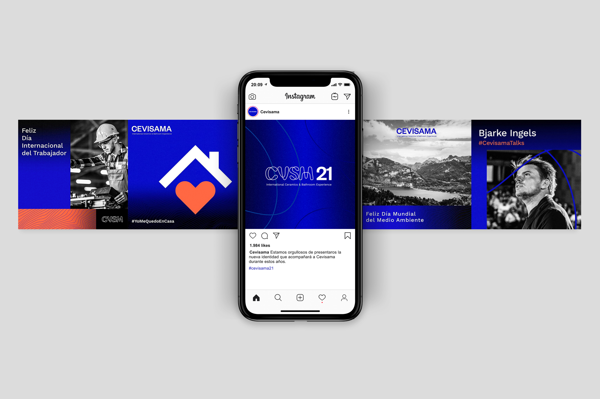
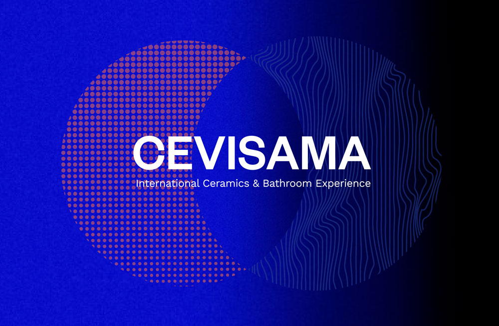
The whole new visual universe of Cevisama is composed of different graphic elements that compose the new identity. The new logo is created from a contemporary typography with timeless patterns that perfectly complements the secondary typography. The result is a powerful logo, with personality and easy to identify. Complementary to the logo, the isotope responds to the new parameters of branding. It adds a contemporary style to the identity, is applied to the diverse supports and allows to keep the brand present in another way than with the wording.
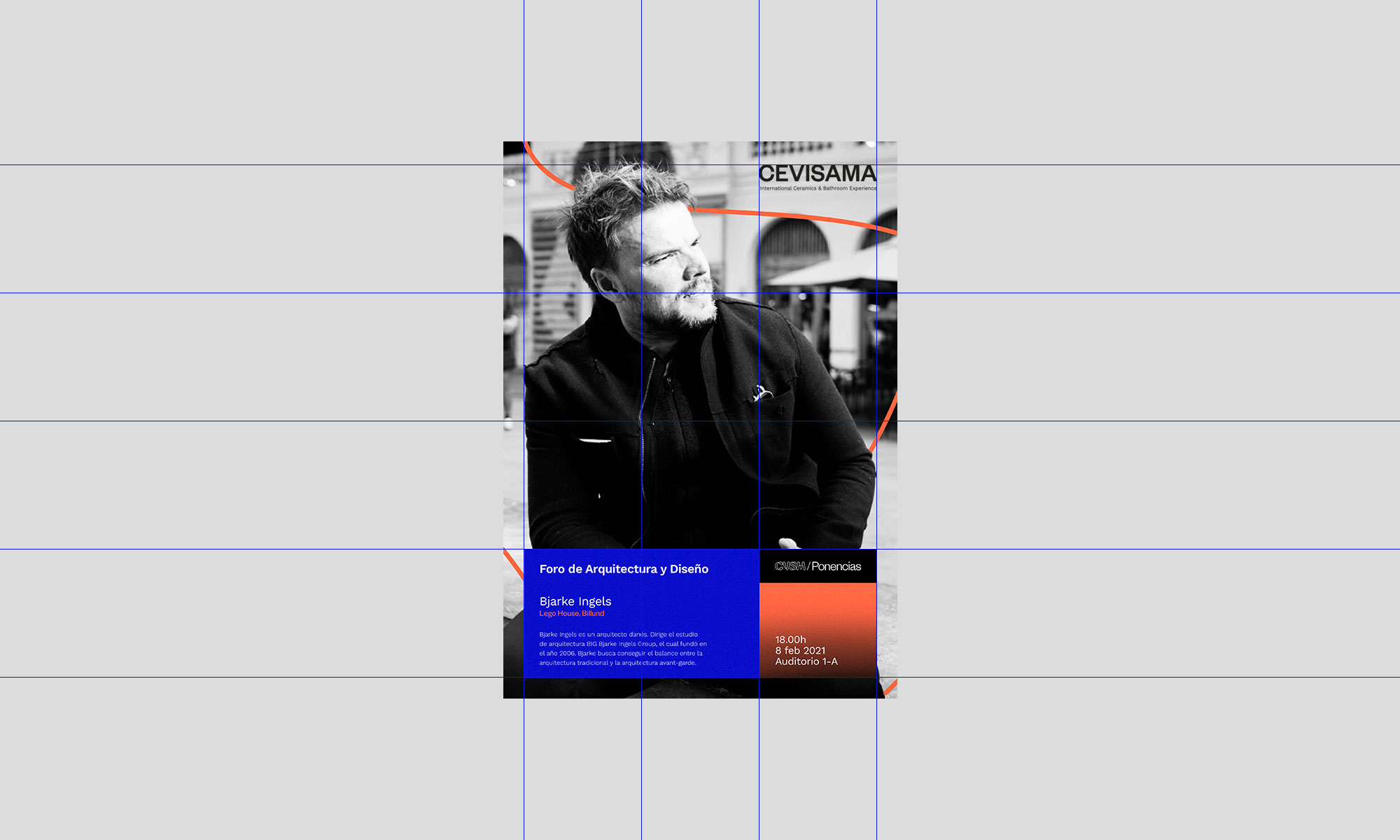
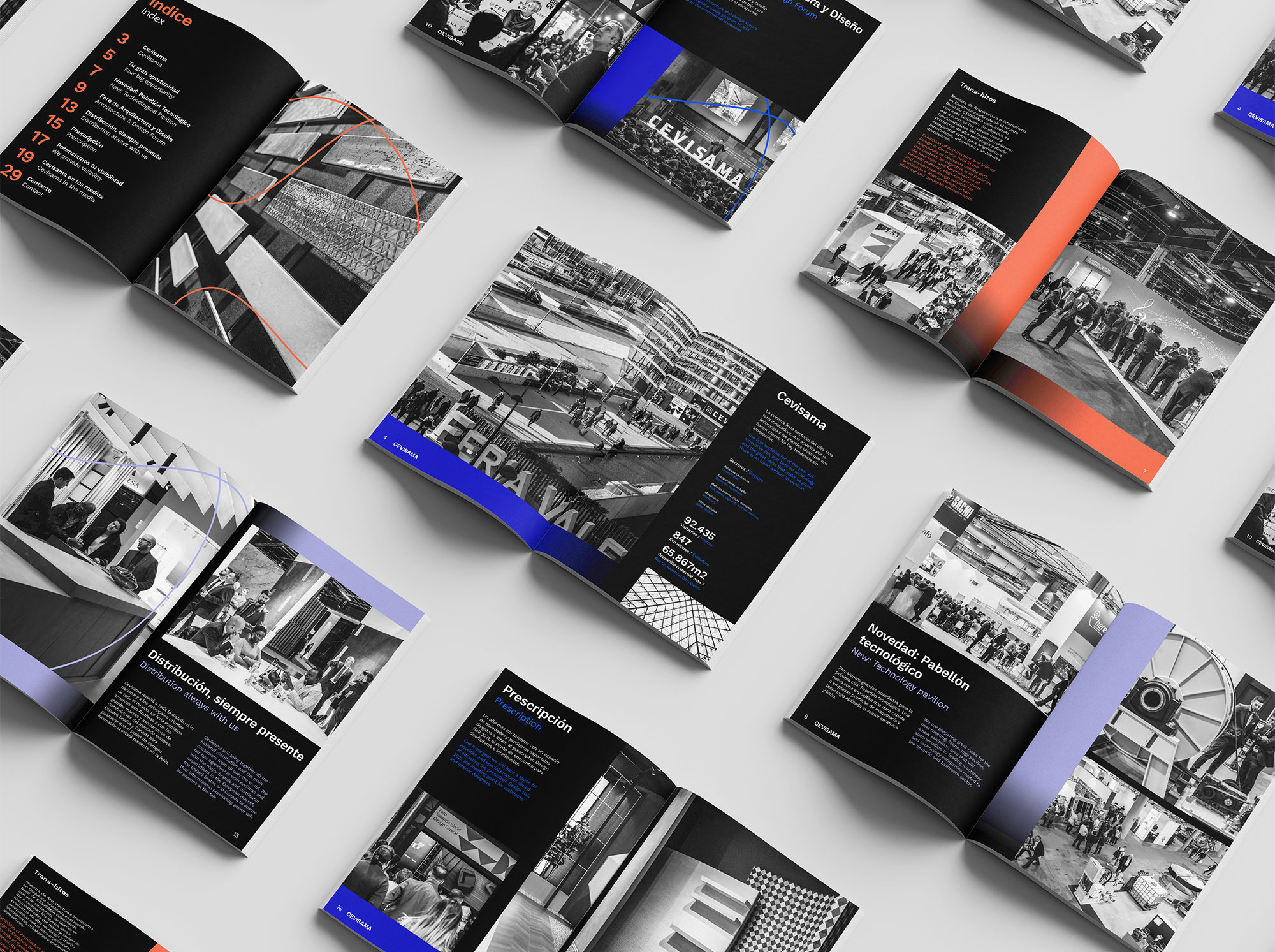
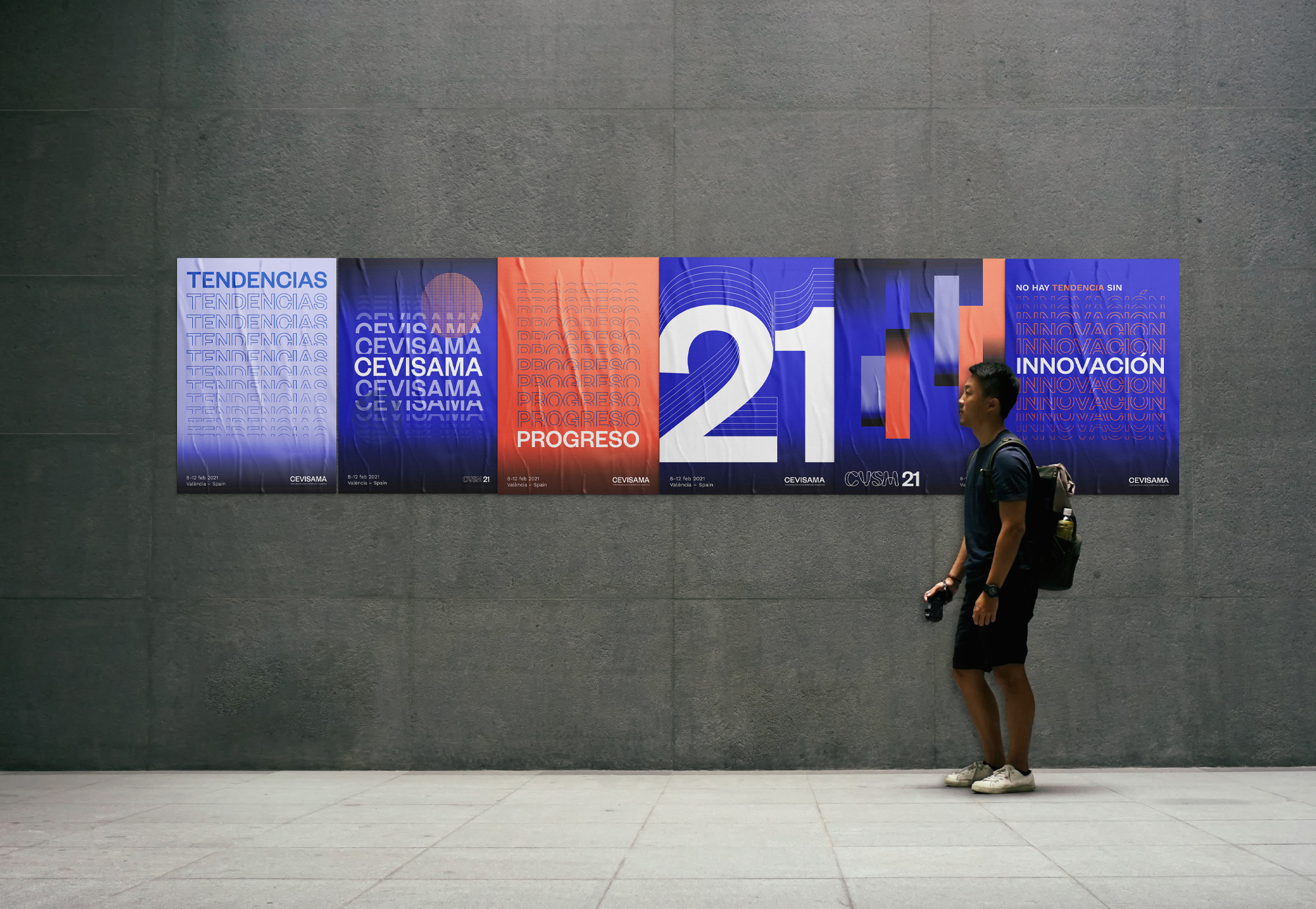
One of the main axes in the construction of Cevisama’s new identity is the reticular system. In this structural system, where visual balance is the most important, the identity and information will be distributed generating order, coherence and flexibility. In addition, the black and white images together with the colours and the order of the identity provide harmony to the applications.
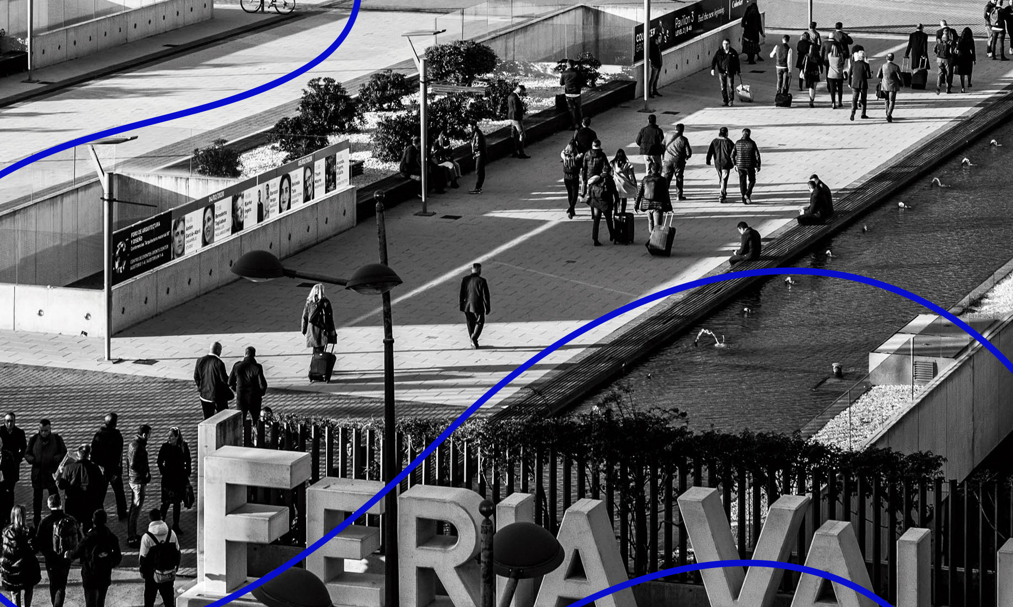
The identity is completed with the use of powerful and vibrant colors that relate us to technology and innovation. We add both geometric and organic gradients and textures with the aim of making the identity more flexible, contemporary and stunning.
CREDIT
- Agency/Creative: VXLAB | Branding & design direction
- Article Title: Cevisama Visual Identity for Cevisama by VXLAB
- Organisation/Entity: Agency, Published Commercial Design
- Project Type: Identity
- Agency/Creative Country: Spain
- Market Region: Europe
- Project Deliverables: Brand Architecture, Brand Creation, Brand Identity, Brand Naming, Brand Redesign, Brand Strategy, Brand World, Branding, Identity System, Product Naming, Rebranding
- Industry: Public Utility
- Keywords: Visual identity innovation reticular system typography


