


Cantina dei Colli Ripani, founded in 1969 in Ripatransone, is one of the most productive cooperative wineries in the Marche region (Italy). The communication of the brand lacked a strategic vision and a convincing and coherent content that was capable of making the company shine among its competitors.
Both the new strategic positioning and new brand visual identity focuses on the absolute uniqueness of the winery’s terroir as a founding value, elevating both its technical and emotional aspects. The brand’s new focus is the unique qualities of the land, a place whose particularity lies in its morphology and location – a series of hills that follows the river valleys that lead to the Adriatic Sea at an altitude of 508 m. above sea level and which is incredibly close to the coast.
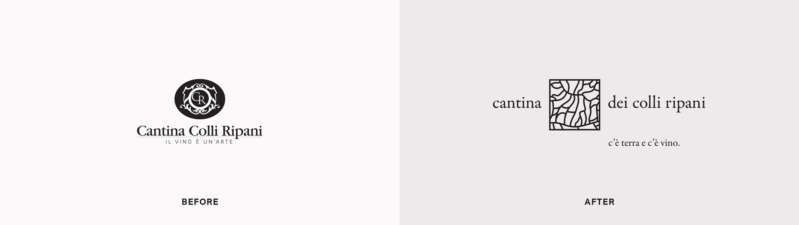
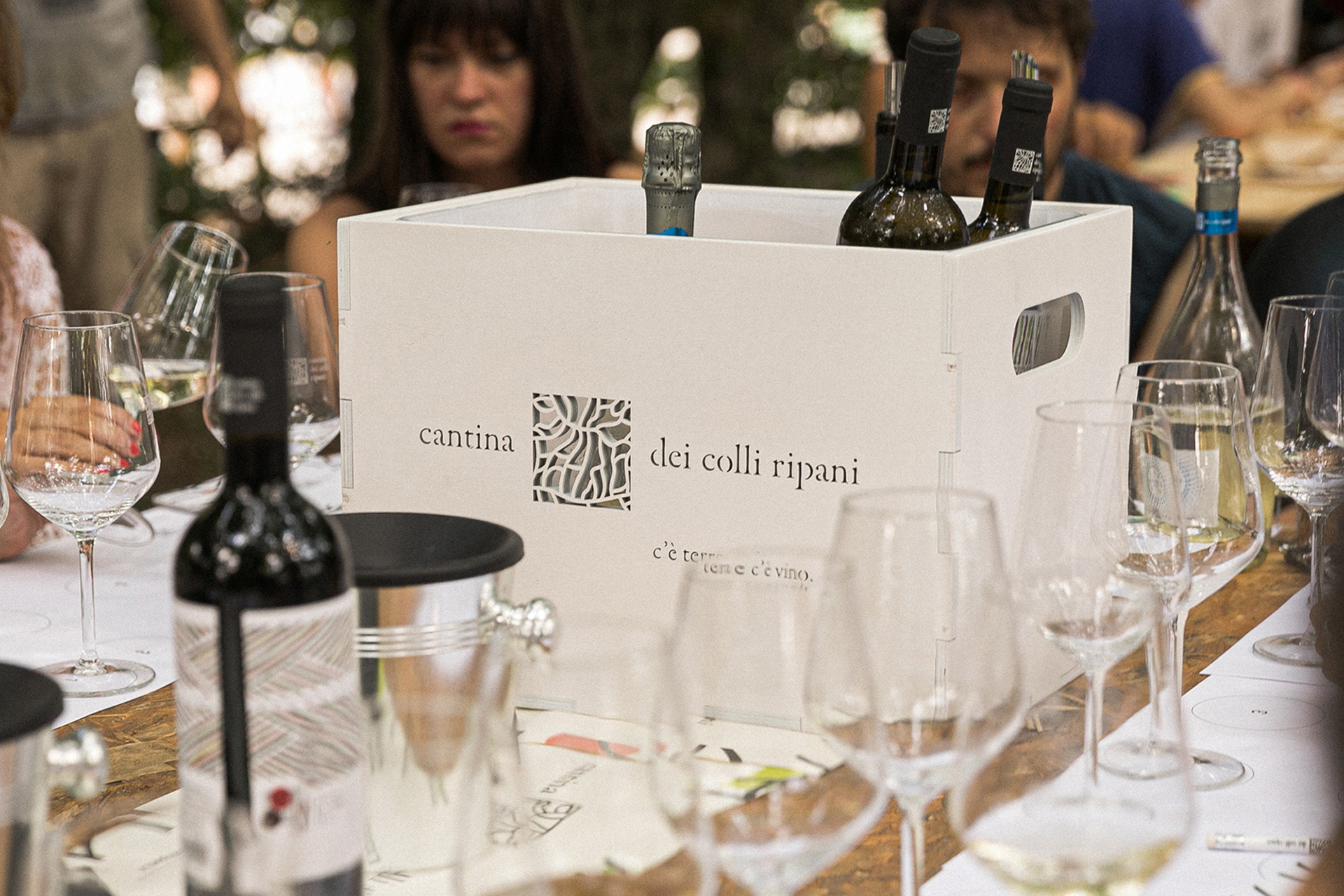
The rebranding project began with the addition of the preposition of possession “dei” to the previous name of the brand, which was “Cantina Colli Ripani”. In fact within the new strategic vision, it was of paramount importance to always and only speak of a specific winery, the one of the Ripane hills (Colli Ripani), and not of a generic winery located in Ripatransone. We are talking about the winery of the Colli Ripani, and this aspect is exactly its true strength.
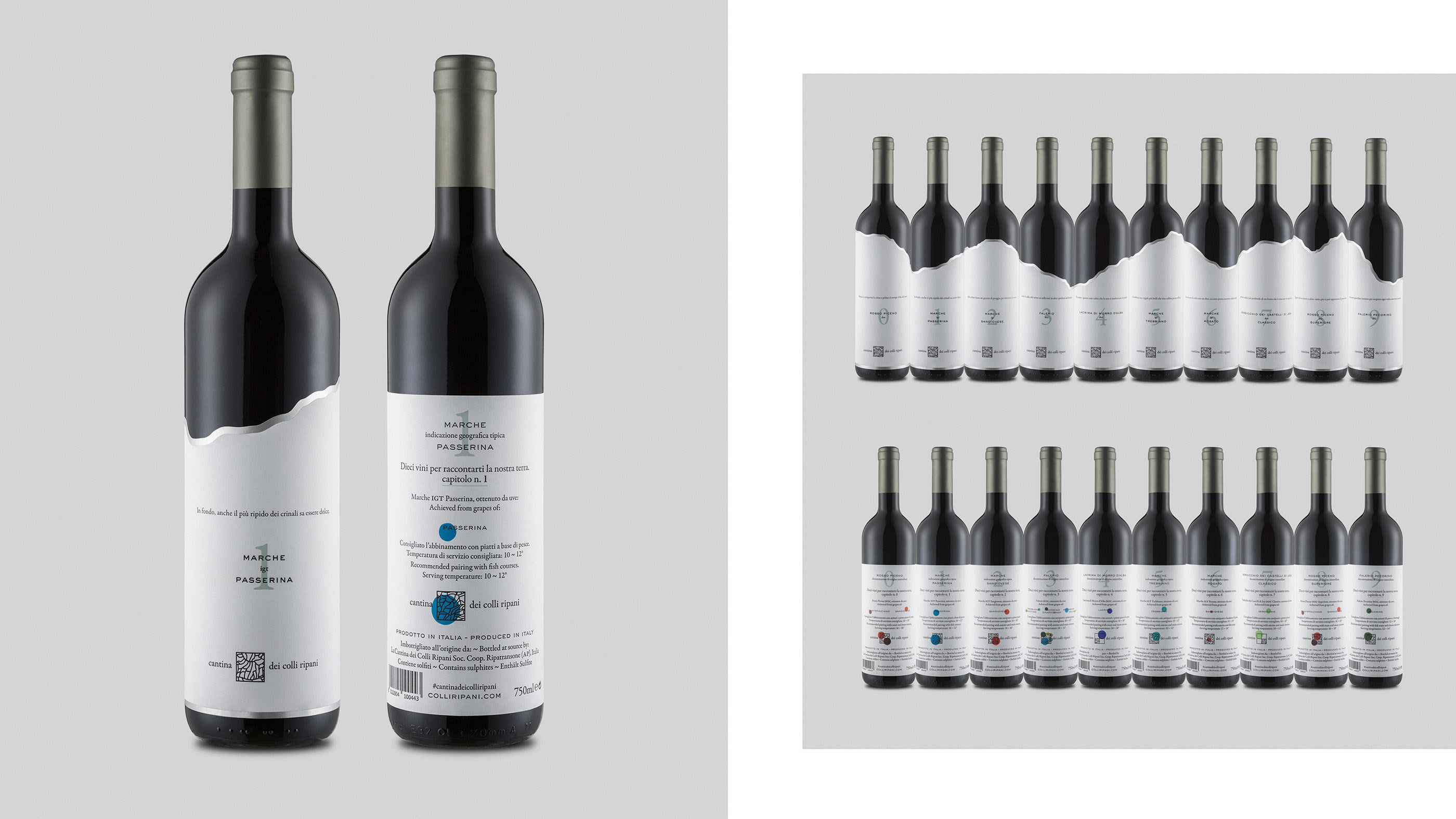
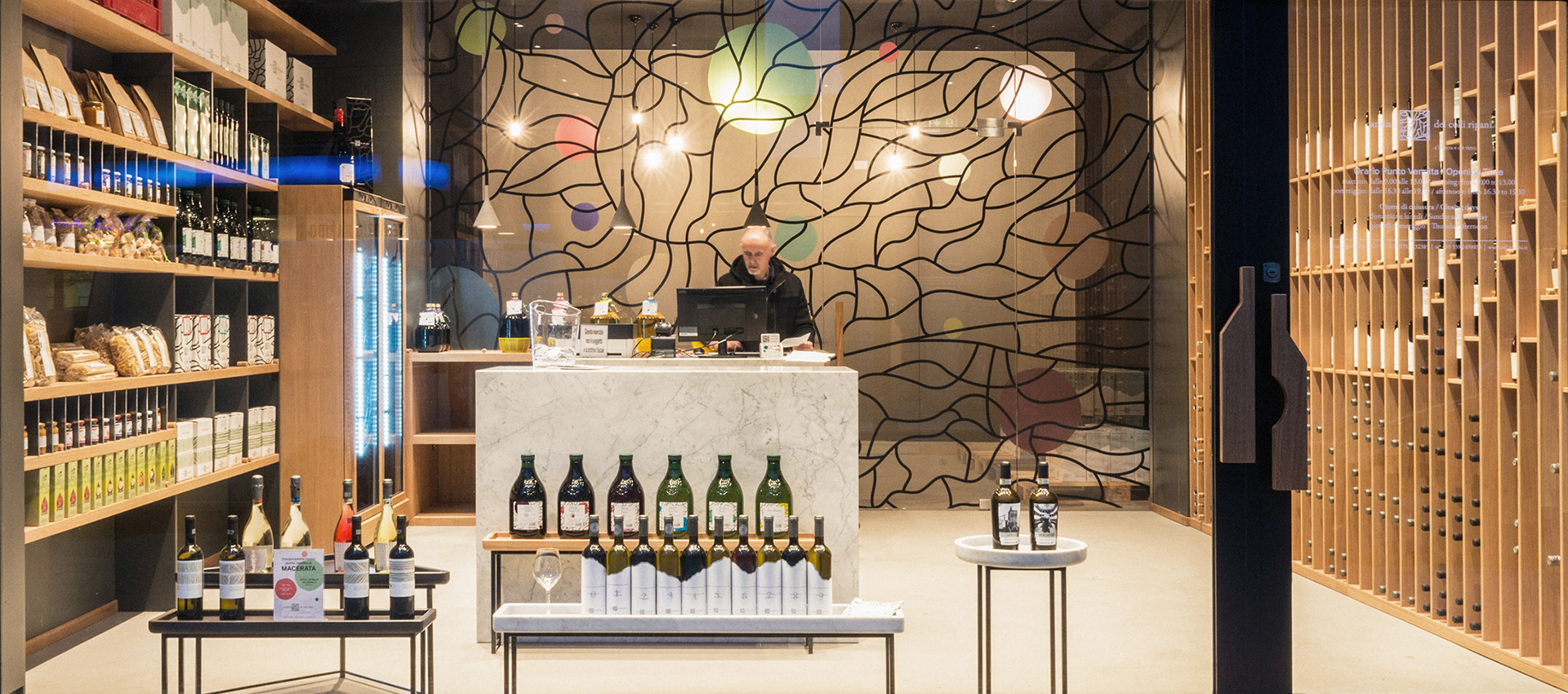
Moreover, the previous image of the brand was characterized by a heraldic-like iconography that did not correctly identify and position the company, while the new image speaks of what the winery and its members know best – the land. Its goal now is its celebration.
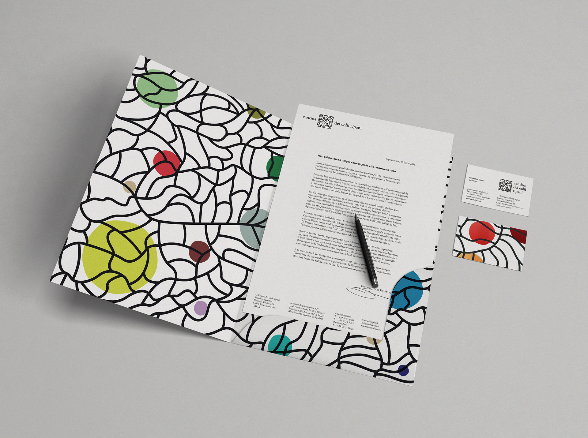
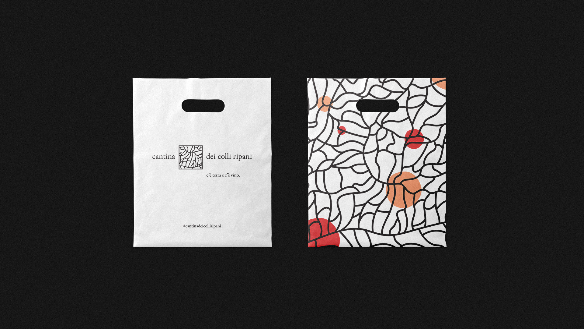
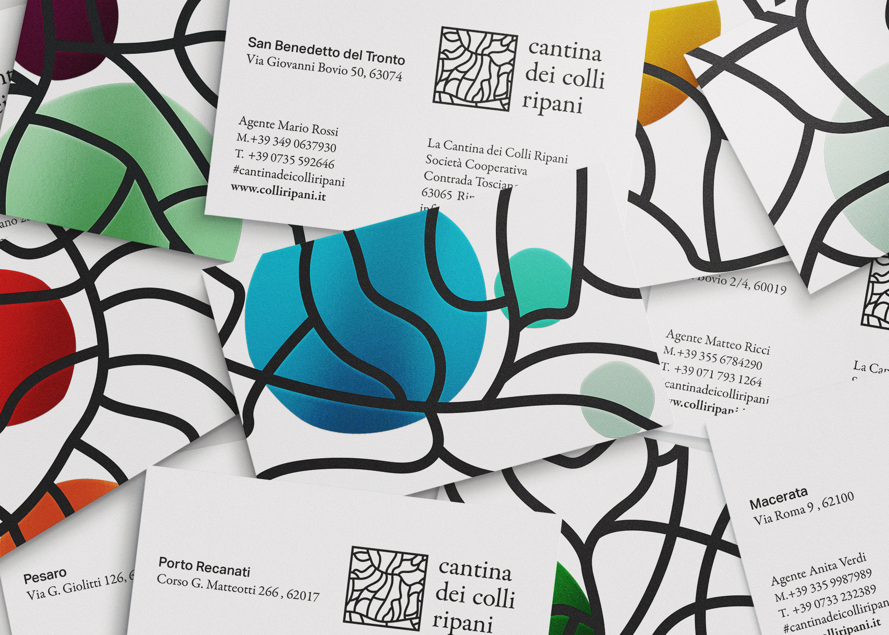
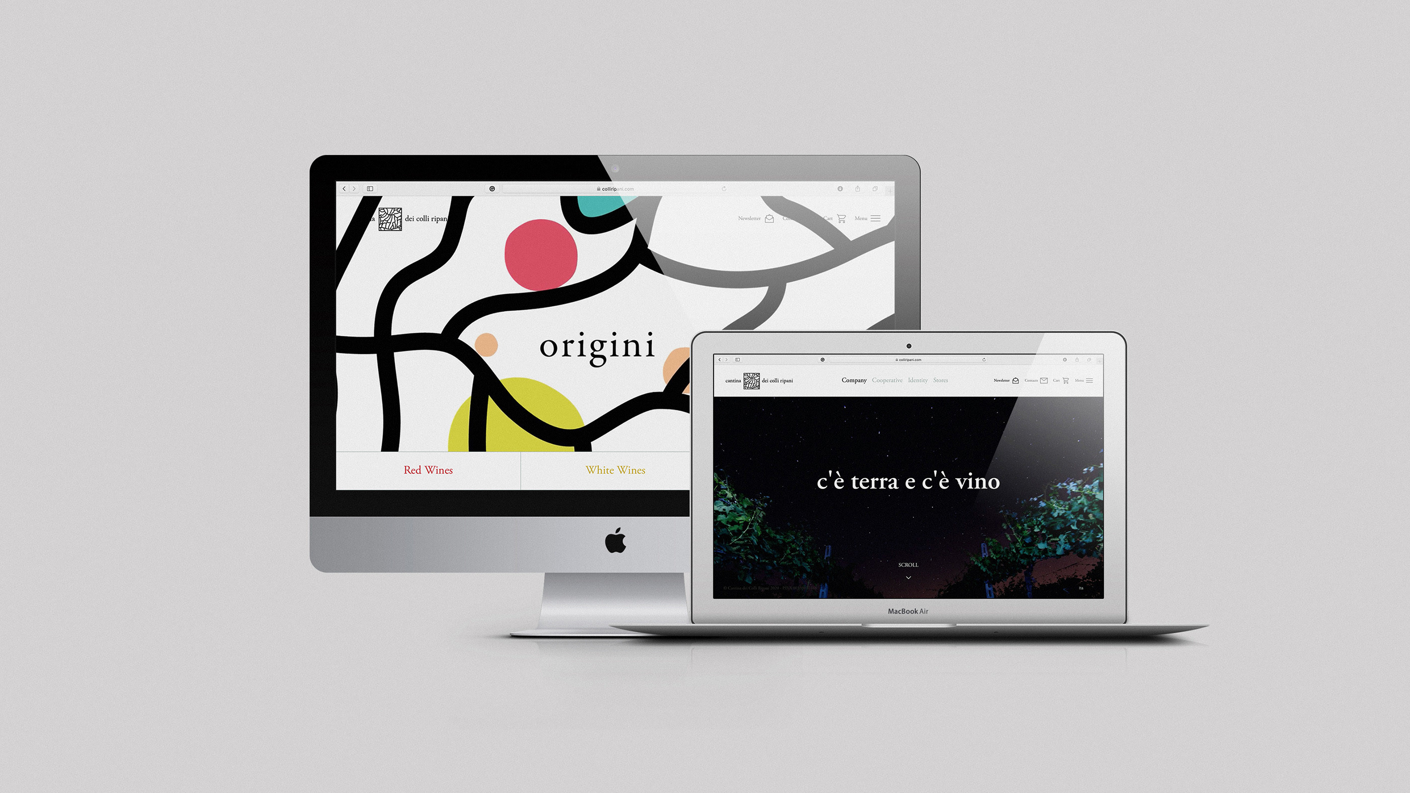
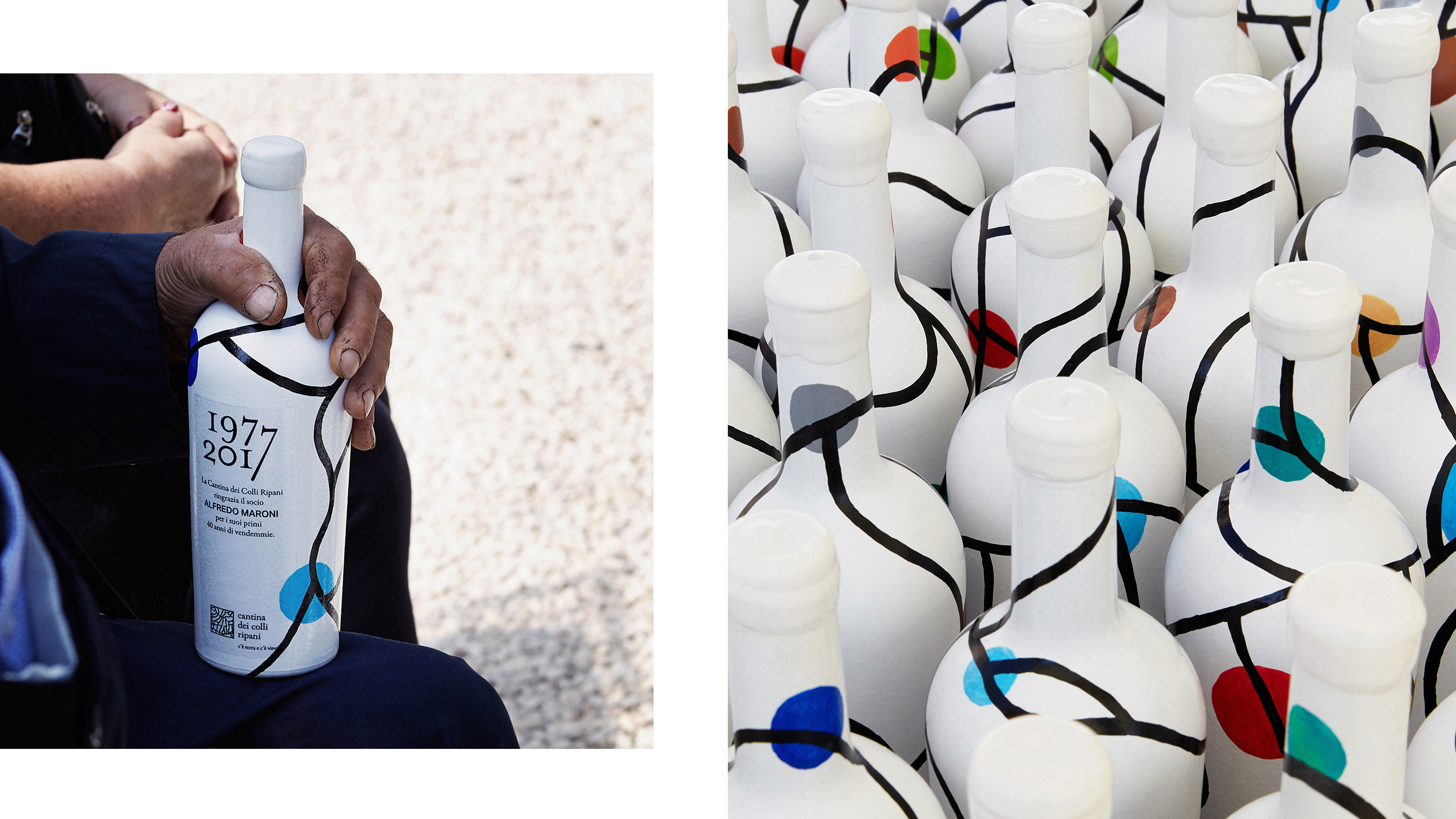
In the corporate version, the new logo represents the heart of Ripatransone – the town. A synthesis that identifies the area in its entirety. From a technical point of view, the territory expressed through the lines that characterize its morphology, it is nestled in a static frame. Within this frame, the land expresses itself in a different way each time.
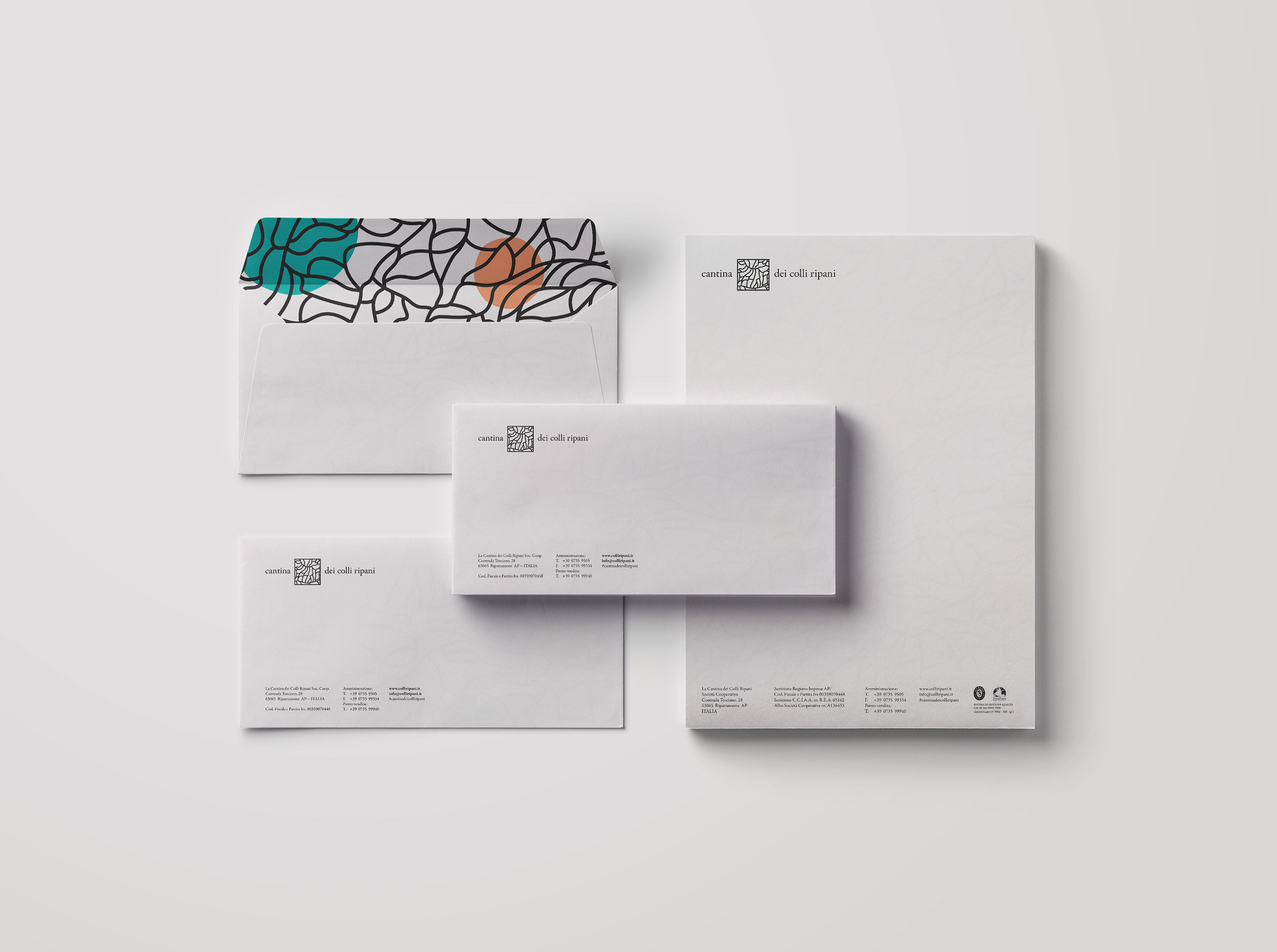
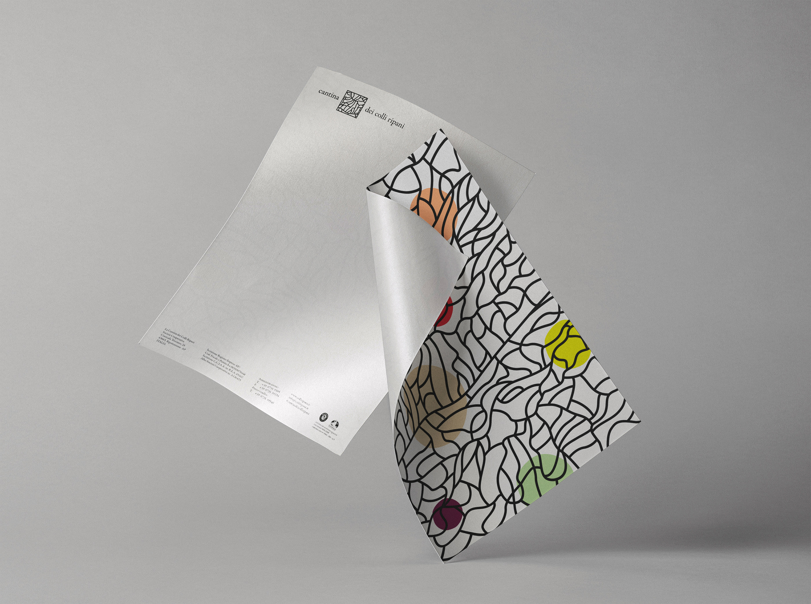
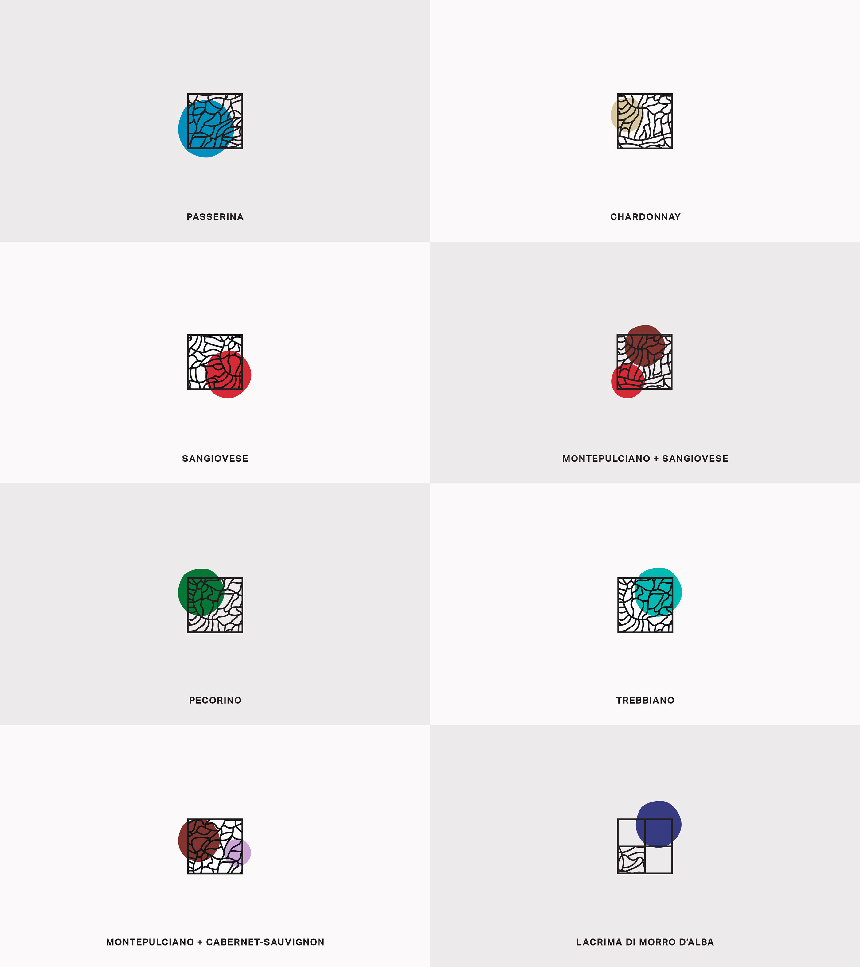
The new identity of the winery was conceived with the aim of giving communication a versatile scalability. “Zooming in” and moving in and around the territory, we focus on a specific area of Ripatransone and neighboring territory to create a visual and conceptual tool that allows a strategic use of the brand elements according to the type of communication intended and its destination.
A color palette highlights the areas of cultivation of the individual vines in the logo/map, creating various combo through the combination of the territory + selected varieties.
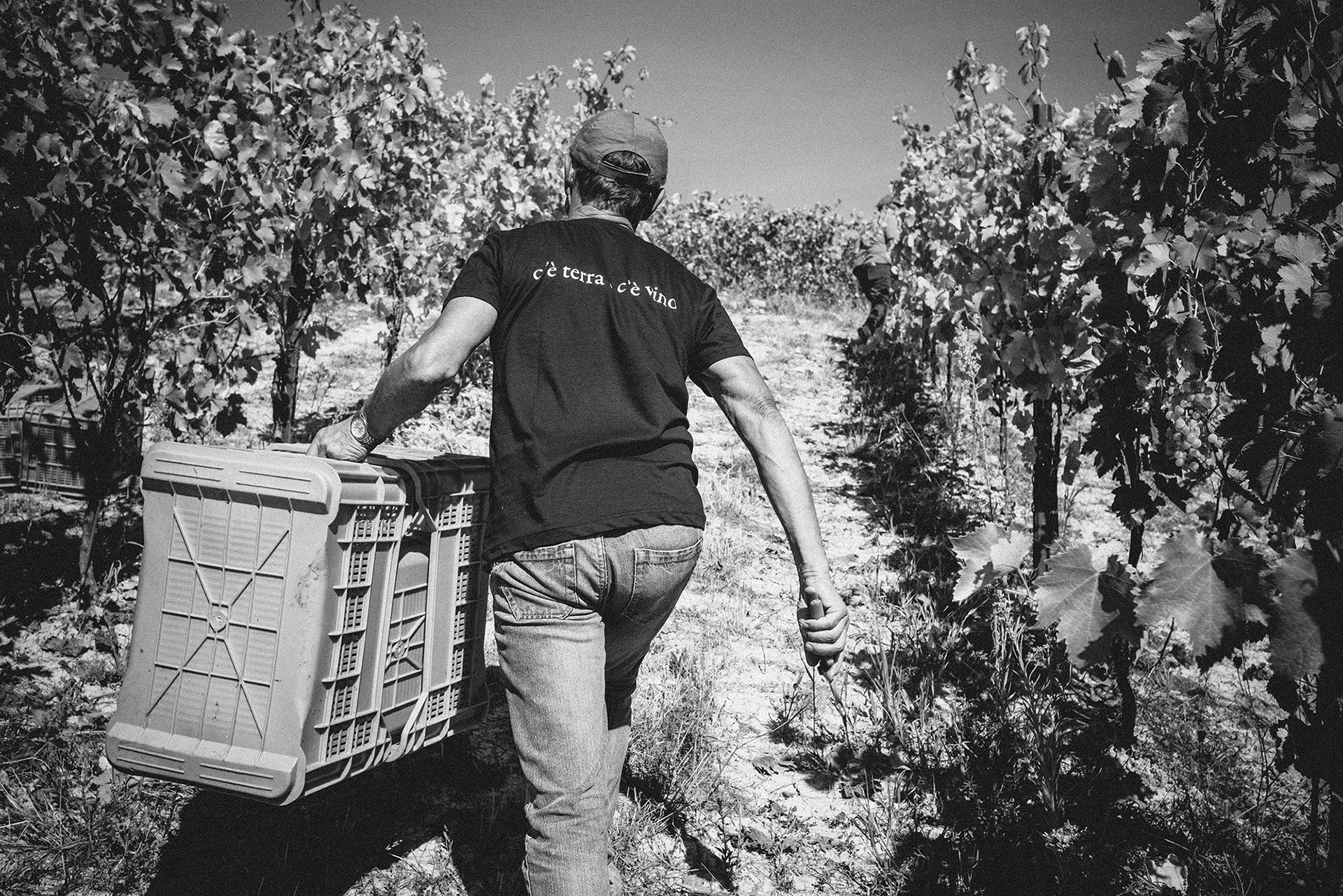
We’ve completed the rebranding project with a new payoff: c’è terra e c’è vino —> there’s land and there’s wine.
Previously, the company positioning presented the claim/payoff: “Wine is an art”. The “wine/art” association while correct in itself (even among the most inflated comparisons), it did not do justice to the depth of what the Cantina has to offer.
Cantina dei Colli Ripani is land and wine in a variety of offerings that will fully satisfy the consumer from top to bottom. That’s why we believe the literal nature of the new payoff promises reality as it is: Cantina dei Colli Ripani, (where) there’s land and there’s wine.


CREDIT
- Agency/Creative: Andrea Castelletti
- Article Title: Cantina dei Colli Ripani | Rebranding
- Organisation/Entity: Agency, Published Commercial Design
- Project Type: Identity
- Agency/Creative Country: Italy
- Market Region: Europe
- Project Deliverables: Brand Identity, Brand Redesign, Brand Strategy, Graphic Design, Identity System, Packaging Design, Rebranding
- Industry: Food/Beverage
- Keywords: Wine, Winery, Design, Motion Design,


