Real Sparkling Fermented Tea is the no-alcohol premium alternative to champagne and sparkling wines. Since our redesign, Real has experienced strong growth, which has only been accelerated by the pandemic and sober curious movement. Iron Goddess is the first seasonal edition to sit alongside that core range.
Real first came to Butterfly Cannon for a redesign. We were challenged to balance the brand’s raw, radical and disruptive positioning with the refinement of its beautifully crafted products and the gourmet world in which it is consumed. We quickly identified the ‘primal artistic’ quality of the brand to be our leading inspiration. Inspired by the Founder, David Begg’s love of contemporary street art, we decided to use this visual aesthetic as our bridge.
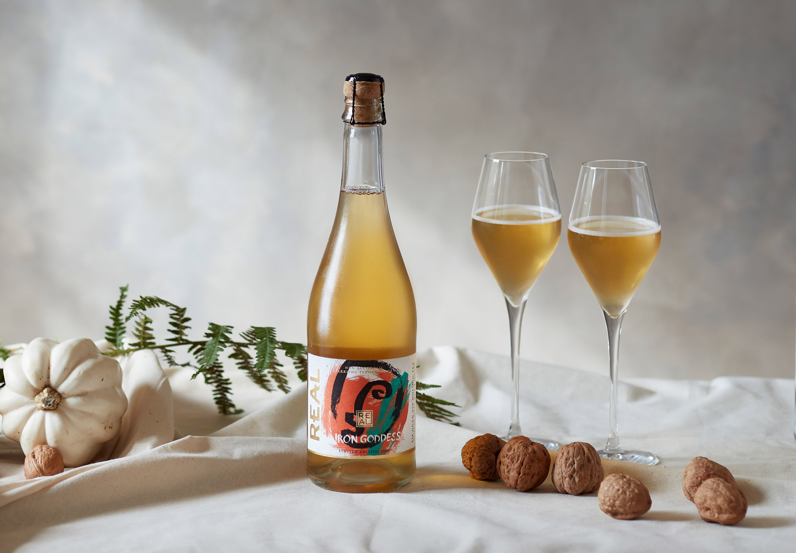
Iron Goddess is the latest release to hit the streets. The seasonal special is a first for Real, with a limited release. Iron Goddess is authentically autumnal. Made from ‘Tin Guan Yin’ tea (which translates to Iron Goddess of Mercy) which has been harvested in Autumn for a rich and luxurious golden flavour.
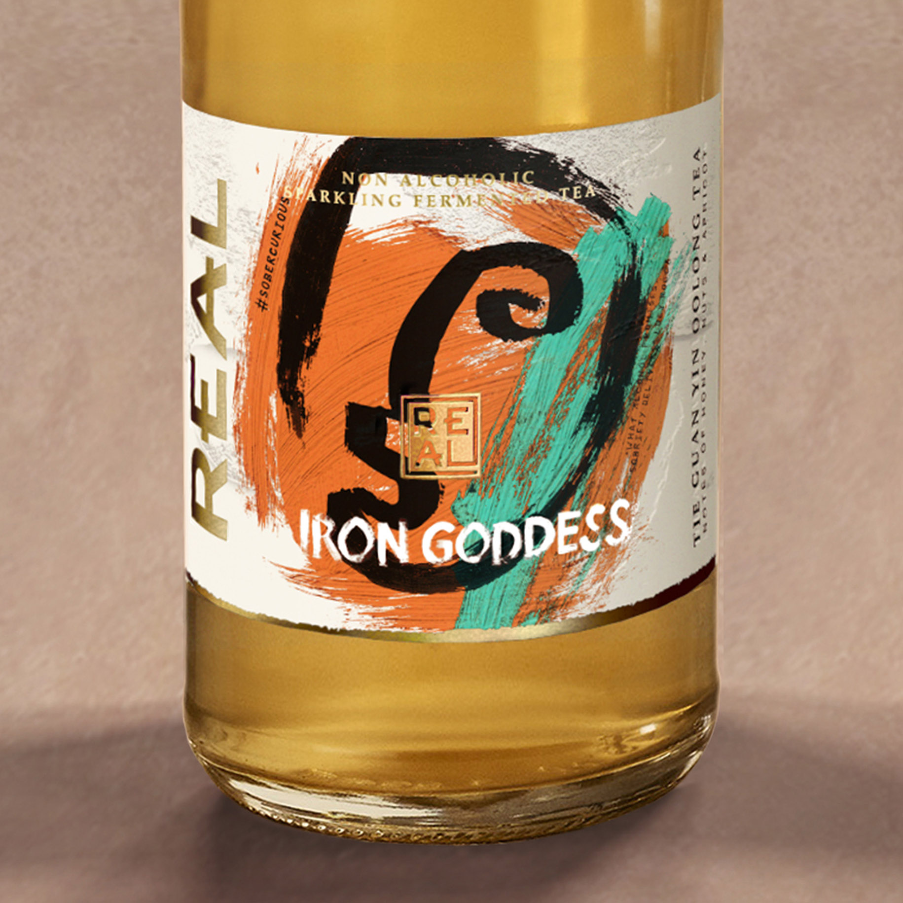
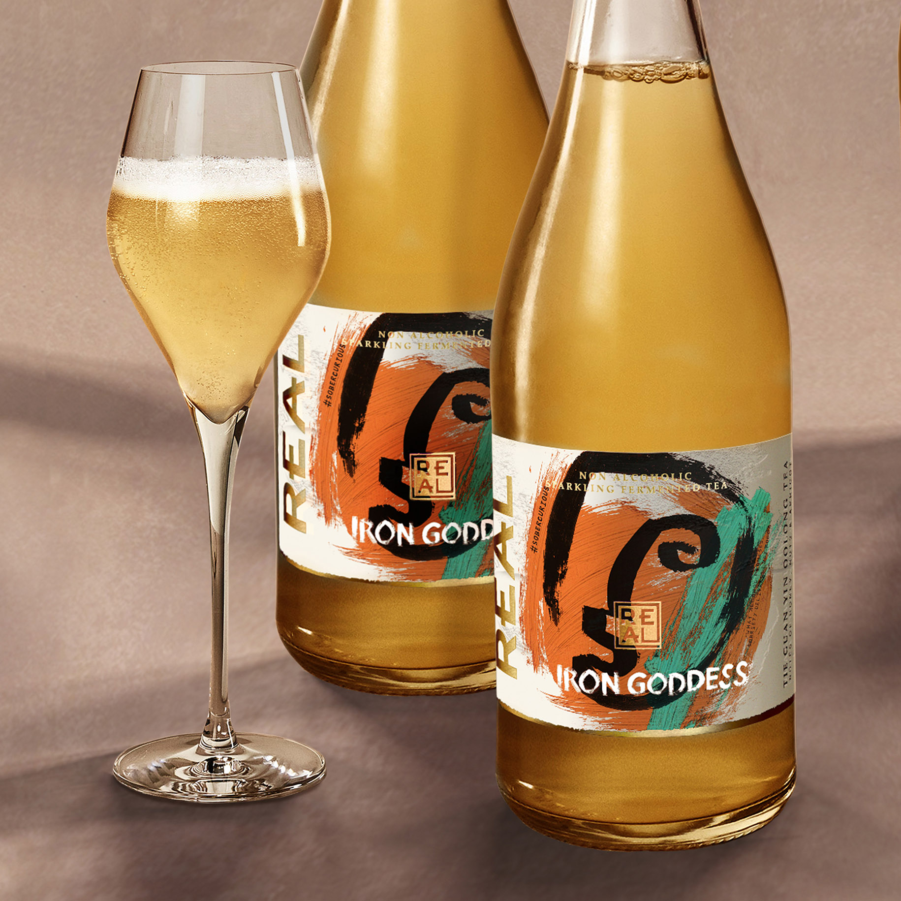
Like on the core range we treated the bottle label more like our canvas, articulating the character of Iron Goddess through a single brush stroke. The Goddess stands out in black, emblazoned over clashing textural colours capturing the flavour and provenance of the liquid. The Tie Guan Yin Oolong tea sourced from the Fujian province in China inspiring our rich orange and cooling teal. Contrasting with the soft amber kombucha inside.
The Real brand mark is inspired by Japanese Inkans and Chinese Chops. The artistic signature seals pay respect to the origin of some of its tea and the individualist nature of the brand. Gold foil is overlaid sparingly over the primal icons as a seal of quality. The heavy canvas-like embossed paper is a signifier of authenticity and craftsmanship.
Our design for Iron Goddess balances the brand’s disruptive, primal character with its refined ‘champagne reinvented’ high-end offer. Real is a brand with something to say, intertwined with the design in a bespoke hand scratched typeface are updateable and topical messages, to reflect the brand’s activist mentality. Such as “What alcohol promises sobriety delivers”* and ‘#Sobercurious.’
Iron Goddess is set to build on the Real results of the redesign; 170% vol. increase, 700% online sales uplift. And with new listings in Whole Foods, Waitrose, and most recently, Sainsbury’s. Sales outperform the no/low alc. category.
Norway, Belgium & Holland are now also ‘keeping it Real.’
“Once again, Butterfly Cannon has got to the heart of Real. Their exceptional work for Iron Goddess, our first seasonal special, reflects our own unique personality, speaks to our origins and approach to life and stands us in good stead for our future innovations.”
David Begg, Founder of Real Kombucha
(* quote by Lucy Rocca, founder of www.soberistas.com)


CREDIT
- Agency/Creative: Butterfly Cannon
- Article Title: Butterfly Cannon Blends Art and Attitude for Real Kombucha’s Autumnal Special, Iron Goddess
- Organisation/Entity: Agency
- Project Type: Packaging
- Project Status: Published
- Agency/Creative Country: United Kingdom
- Agency/Creative City: London
- Market Region: Europe
- Project Deliverables: 2D Design, Graphic Design, Packaging Design
- Format: Bottle
- Substrate: Glass Bottle
- Industry: Food/Beverage
- Keywords: Kombucha, no-alcohol, sparkling wine
-
Credits:
Marketing Manager: Chris Joscelyne


