


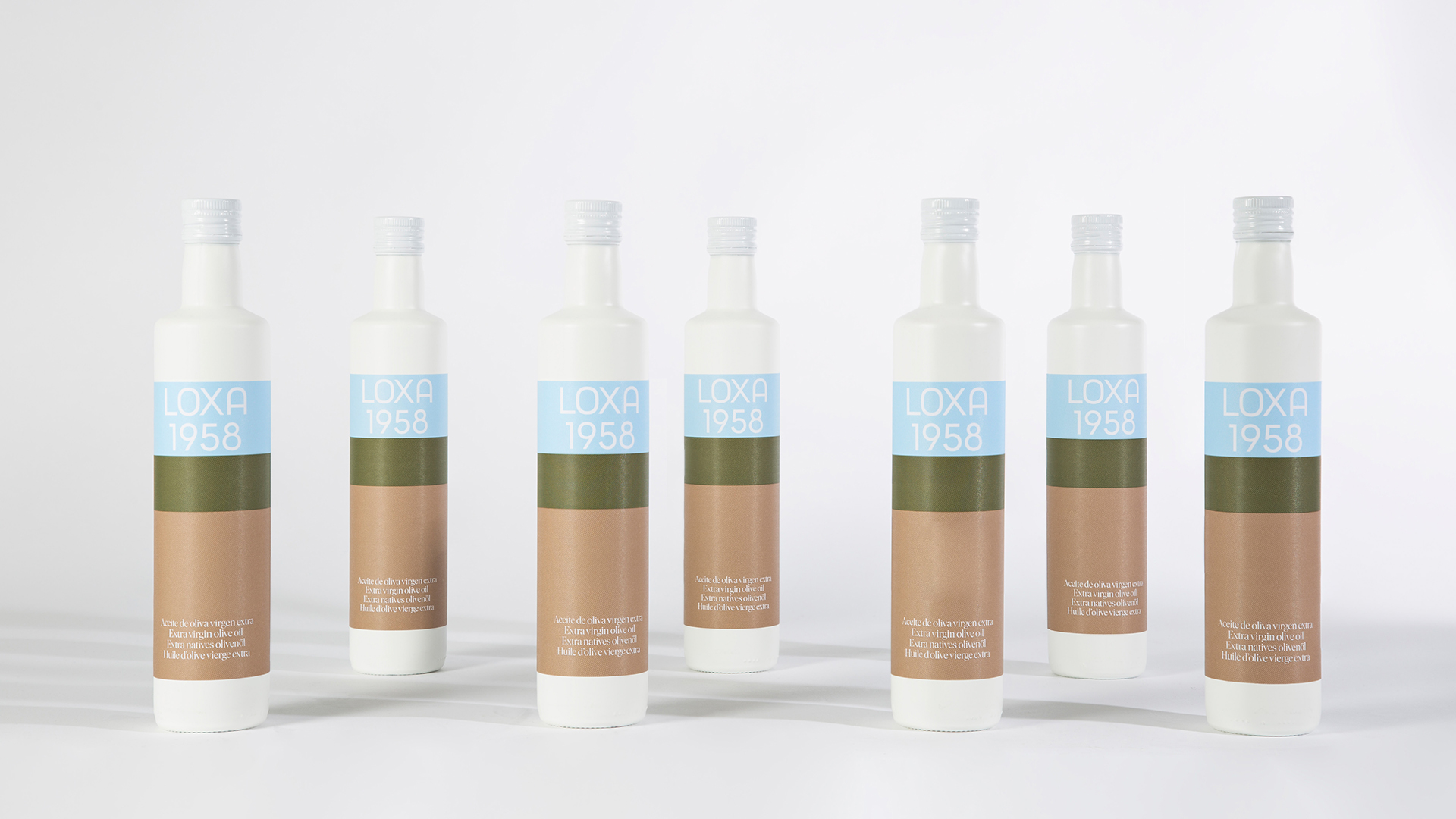
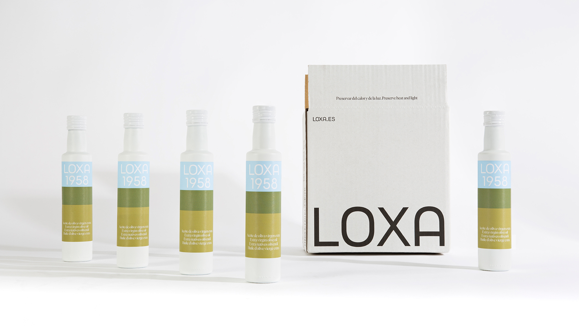
Natural chromatism: 1958, our history in color
If you have ever had the opportunity to travel through the landscapes of the Poniente Granada, between its olive groves, farmland and holm oaks, surely, its colors will never escape your memories. Greens, browns, blues. That connection with nature and with a past that was always in color, undoubtedly, was presented to us as the perfect base on which to anchor Loxa’s history on a graphic level, along with its own typography.
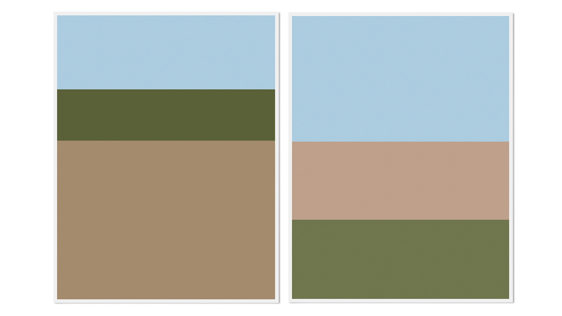
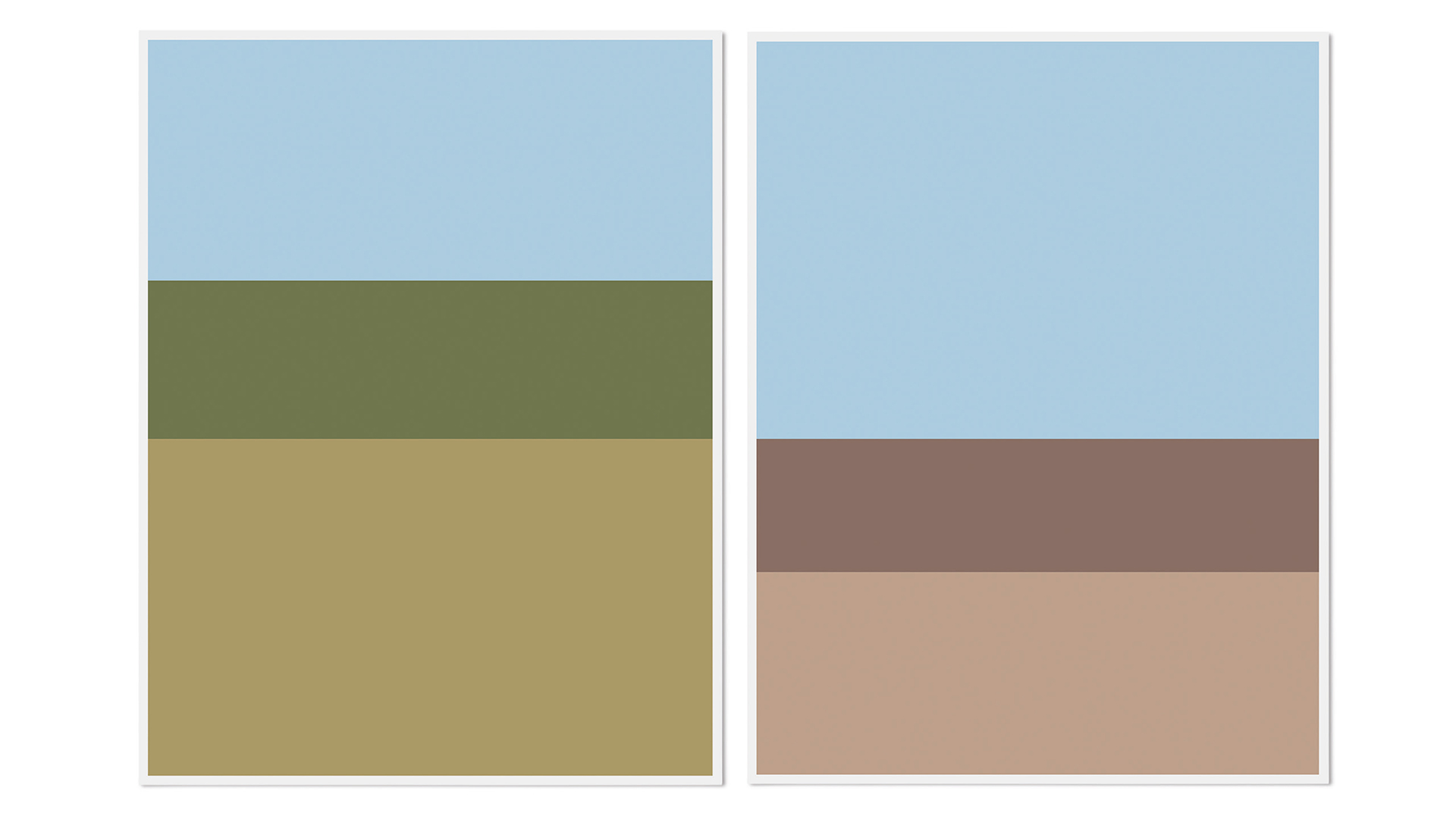
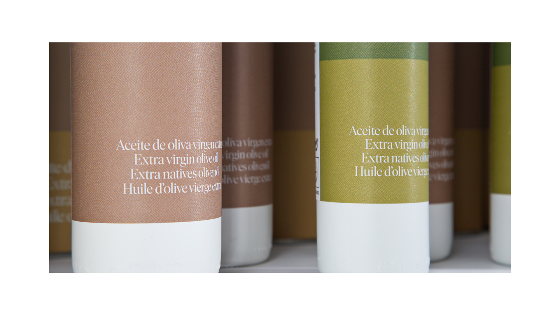
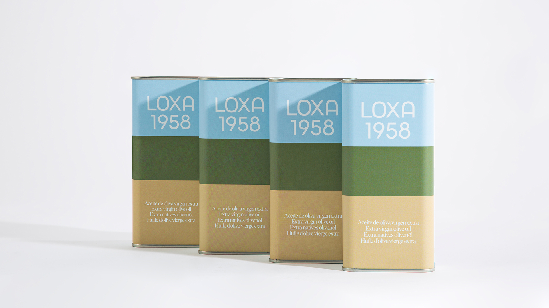
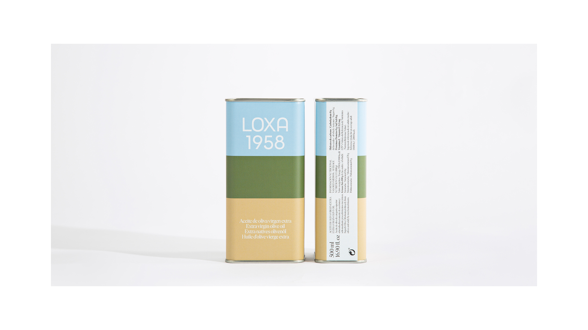
In an exercise of synthesis, in Buenaventura we choose those elements of the nature of the Andalusian countryside to describe our landscape chromatically and create our own color code; a palette that could also grow according to the needs of the range.
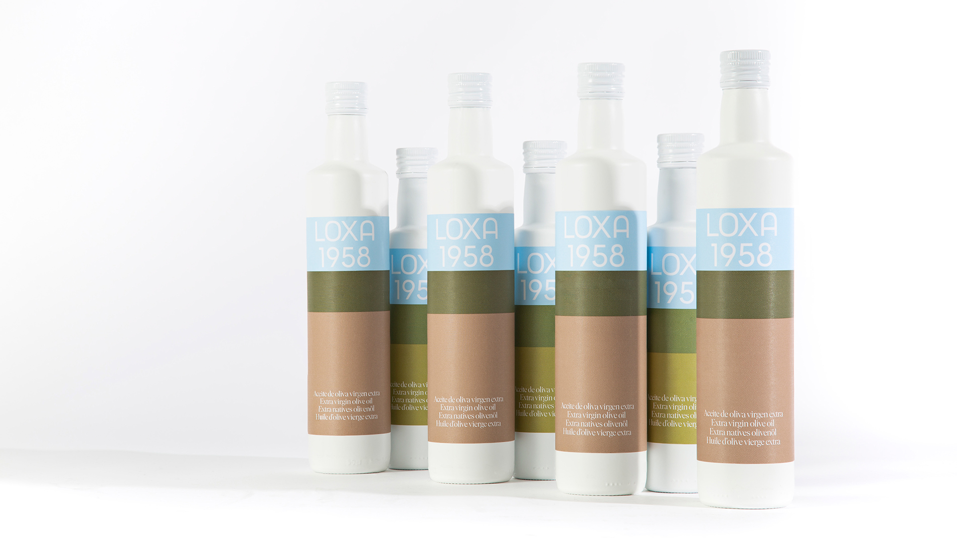
This is how Loxa’s color palette takes the colors of that landscape to transform them into a flexible and dynamic visual system. A unique game of color, full of symbolism, that connects with nature.
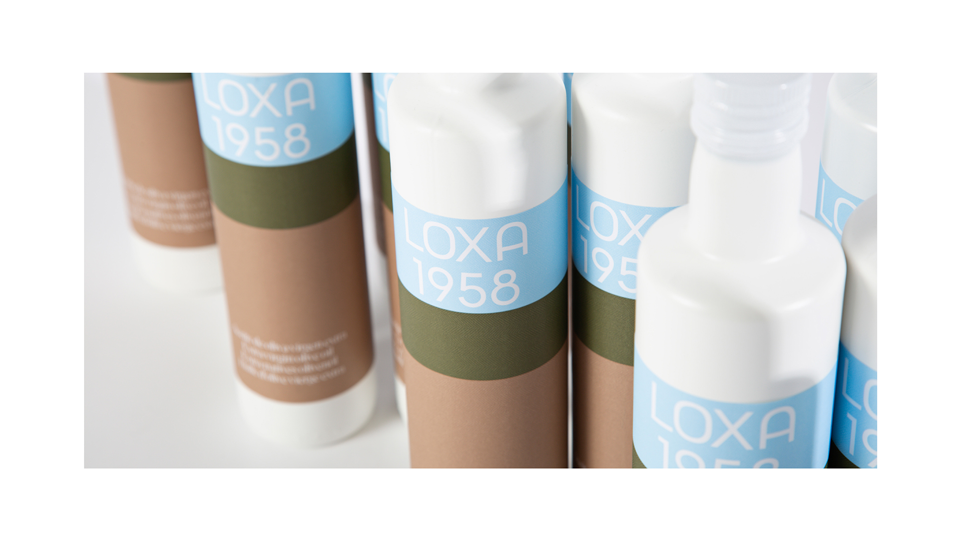
If we look at the whole project together, we discover that Loxa is not a logo. The brand is a sum of many factors that enrich this visual system, to give it a unique and non-transferable character.
Loxa is a language of broad formal coherence, flexible and adaptable to different formats, which uses the codes of the field and which maintains its historical legacy from its roots.
From the Buenaventura team we want to underline the importance of this project for us. It is an immense pleasure to see how Loxa’s visual identity grows in the wide range of products and joins the founding principles of this cooperative. This is not just a brand identity project. It is a fusion of design, culture, nature and business as part of that great network that is Loxa. A network that generates an important positive impact for society.
CREDIT
- Agency/Creative: Buenaventura Studio
- Article Title: Buenaventura Studio Design Packaging for Loxa 1958 Extra Virgin Oil
- Organisation/Entity: Agency
- Project Type: Packaging
- Project Status: Published
- Agency/Creative Country: Spain
- Agency/Creative City: Loja
- Market Region: Europe
- Project Deliverables: Advertising Photography
- Format: Bottle
- Substrate: Glass
- Industry: Agriculture
- Keywords: #identity #packaging #tipography
-
Credits:
Creative Director: Ramón Soler
Production Director: Rafa Mateos
Tipography: Ana Moliz
Photo: Cristina Beltrán


