


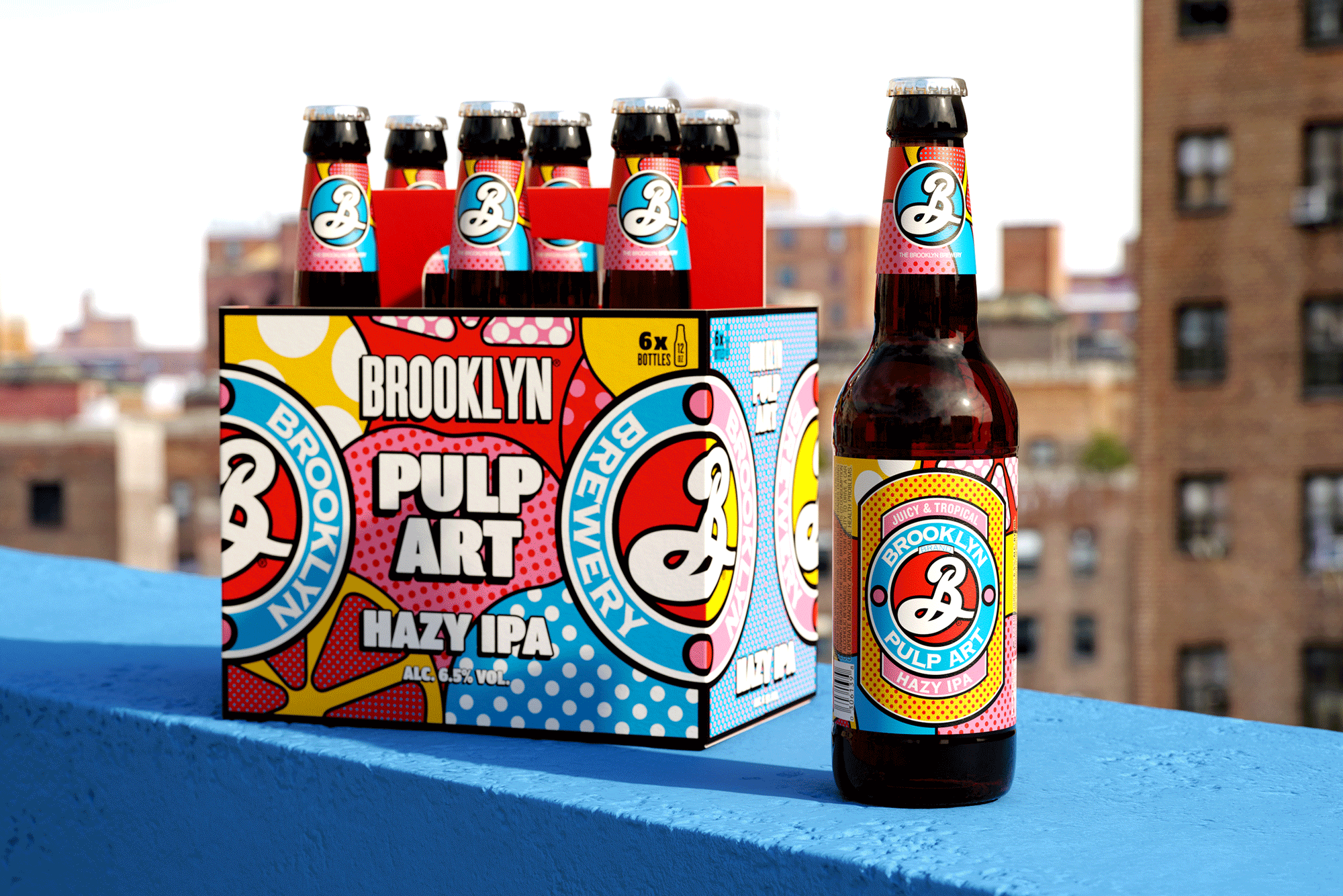
World famous Brooklyn Brewery wanted to bring the IPA haze craze into their neighborhood. While well established in America, in other global markets Hazy IPAs have a less mainstream status, often only enjoyed by craft beer connoisseurs. Brooklyn Brewery’s mission was simple: take juicy, tropical, deliciously Hazy IPA to the masses.
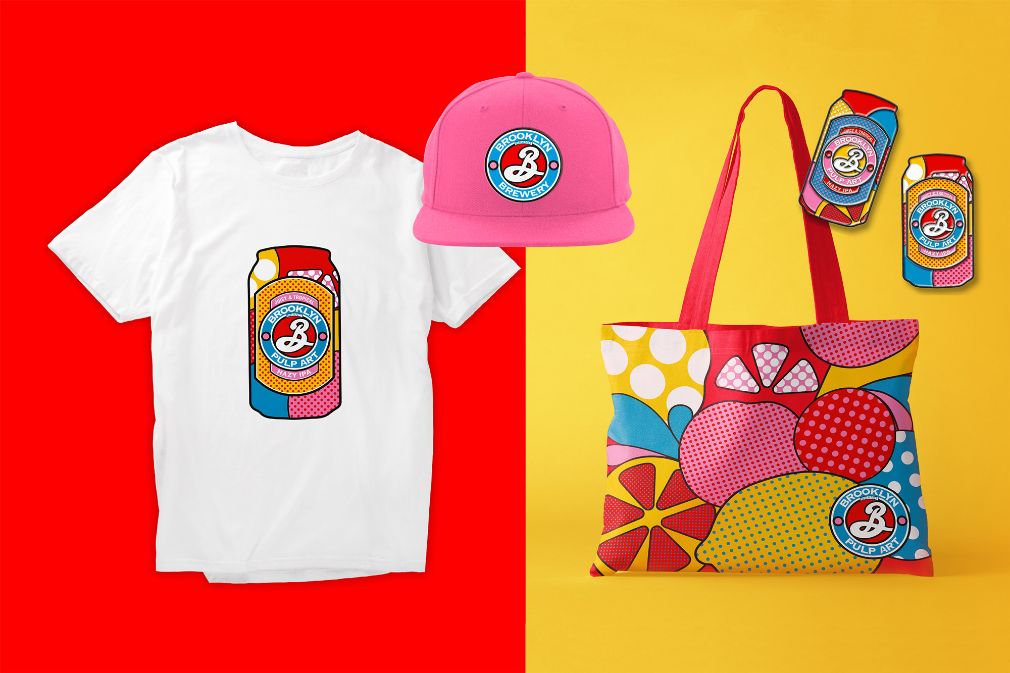
Inspired by Pop Art – the New York movement spearheaded by Warhol and Lichtenstein to make art accessible to all – our concept was born. We combined the worlds of art and beer to create Brooklyn Pulp Art: Hazy IPA for the people.
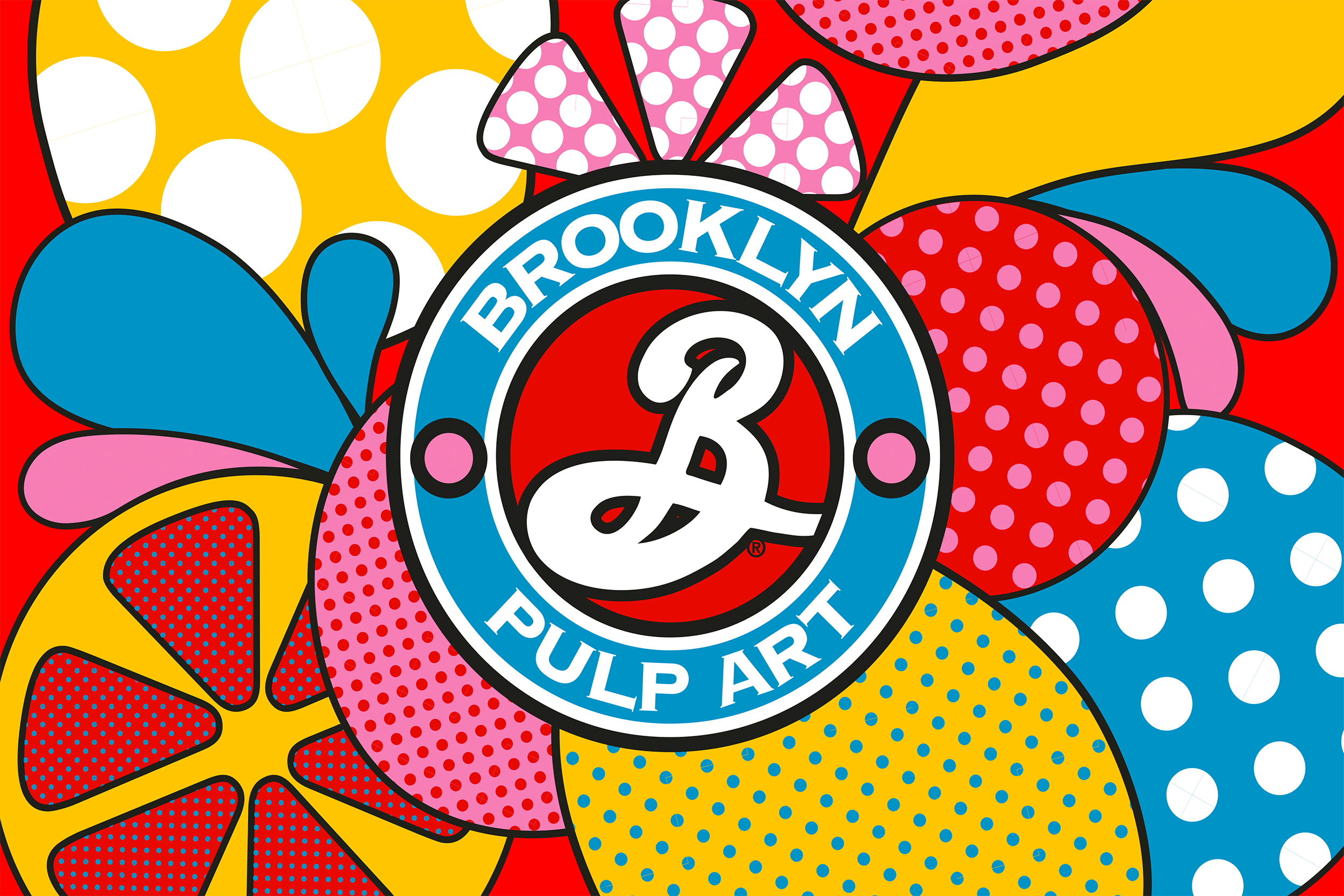
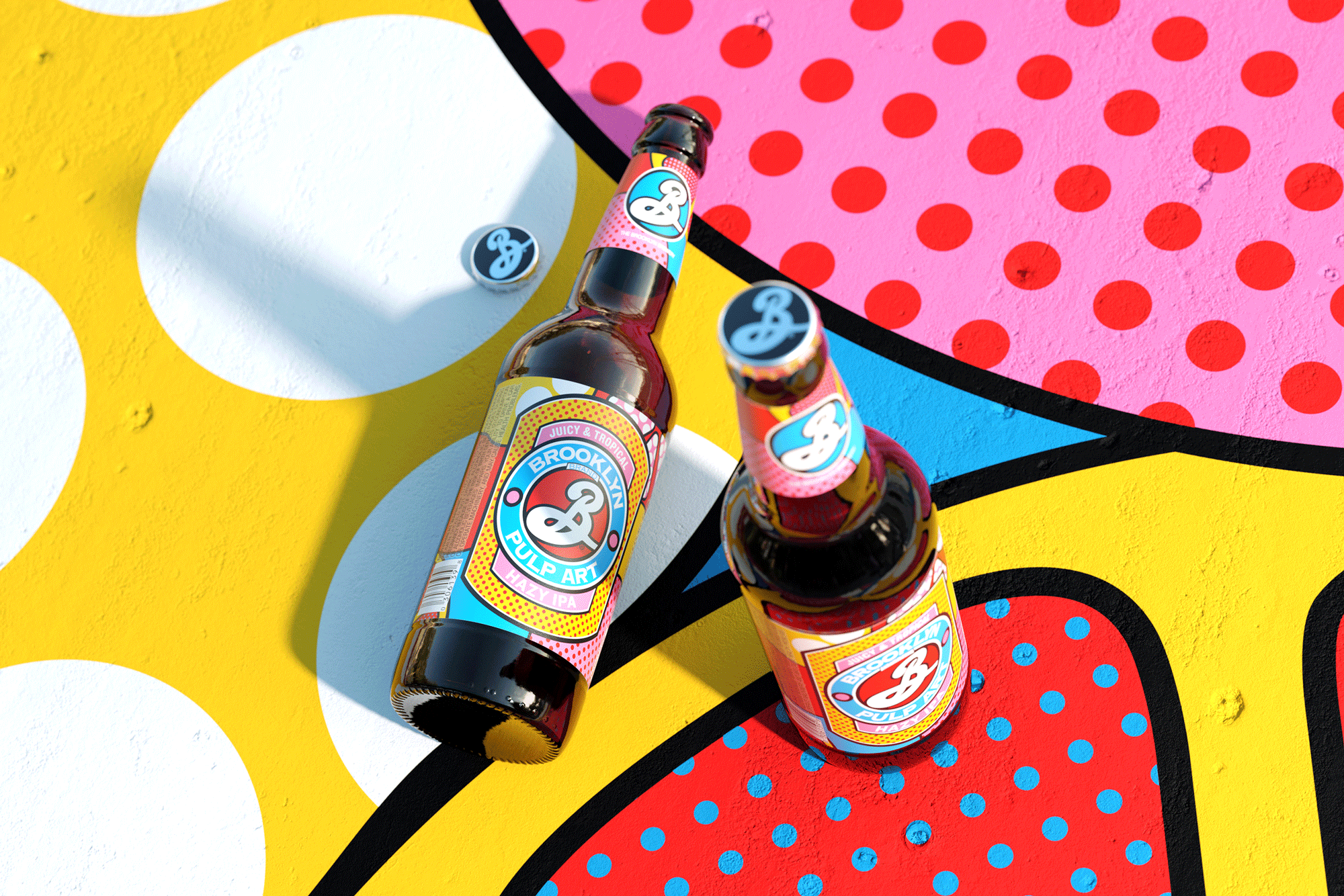
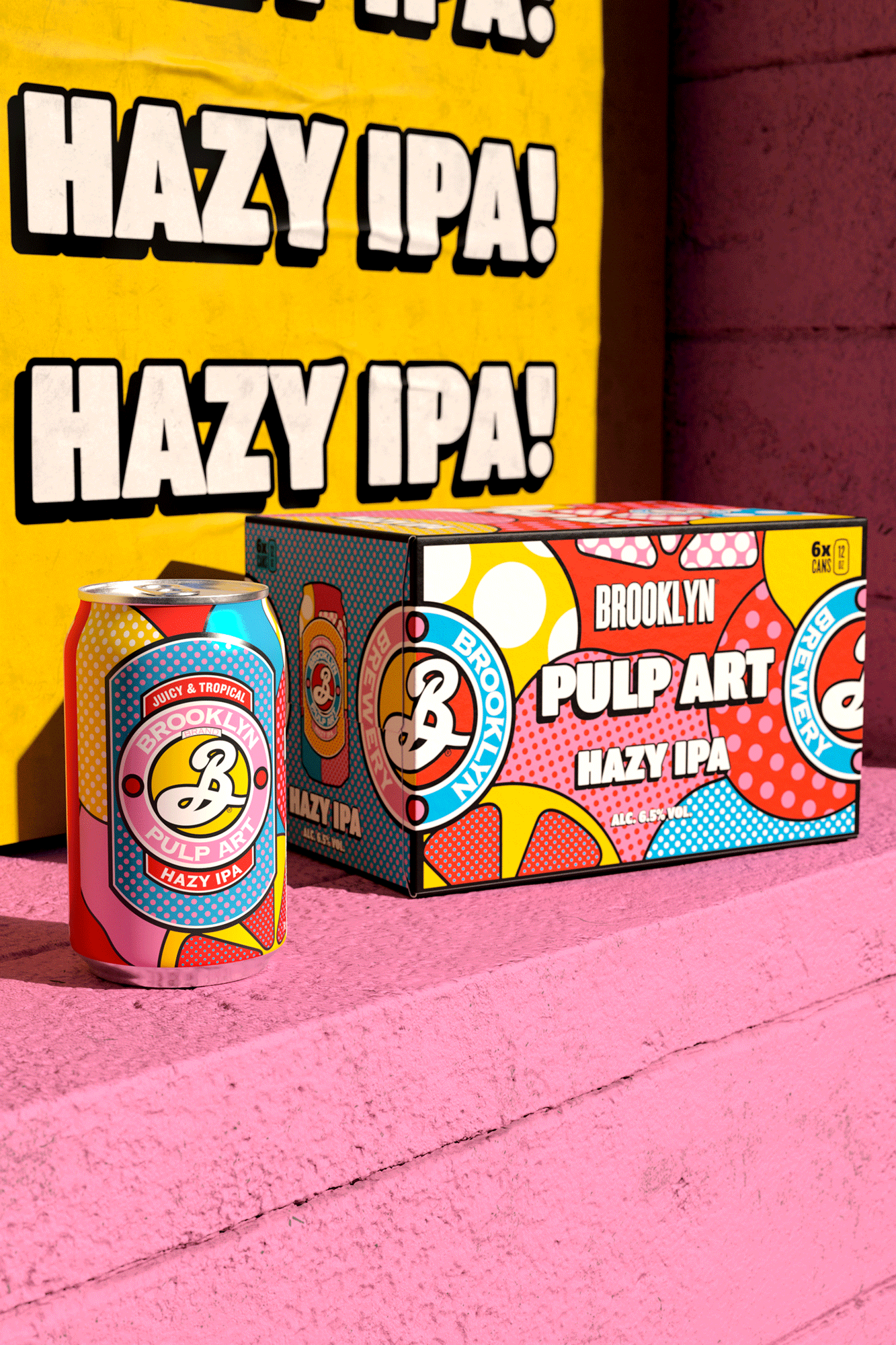
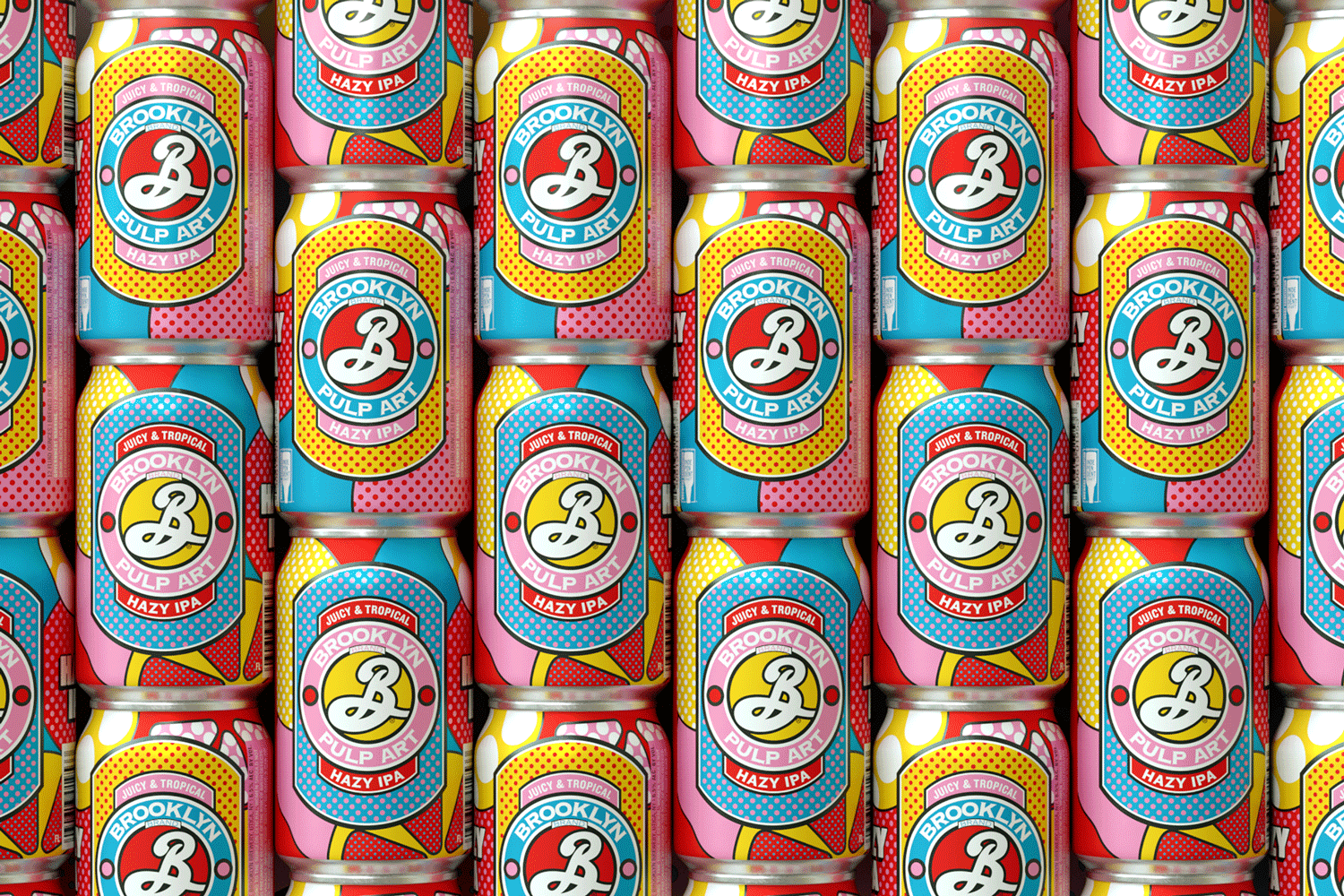
Mashing up two New York icons, we gave the Brooklyn badge a pop art makeover. Using Lichenstein’s signature style of thick black lines, clashing colours and a healthy number of polka dots (or Ben-day dots to use their official title), Pulp Art started to pop with its fun and fruity new look.
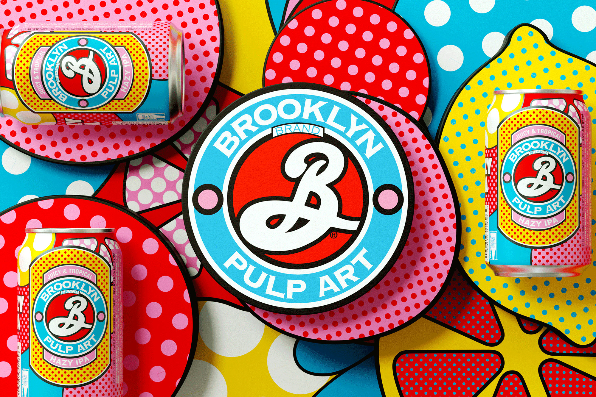
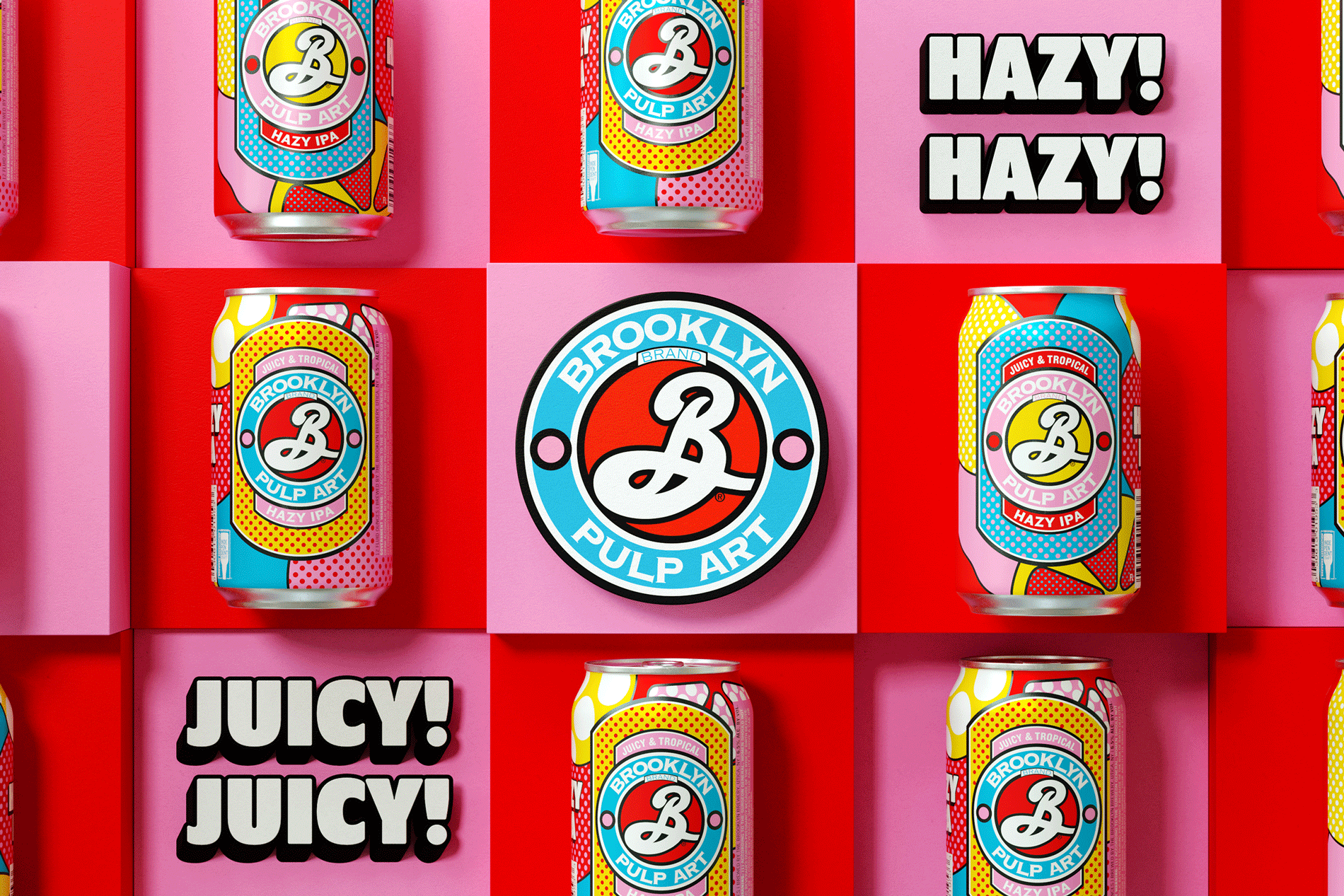
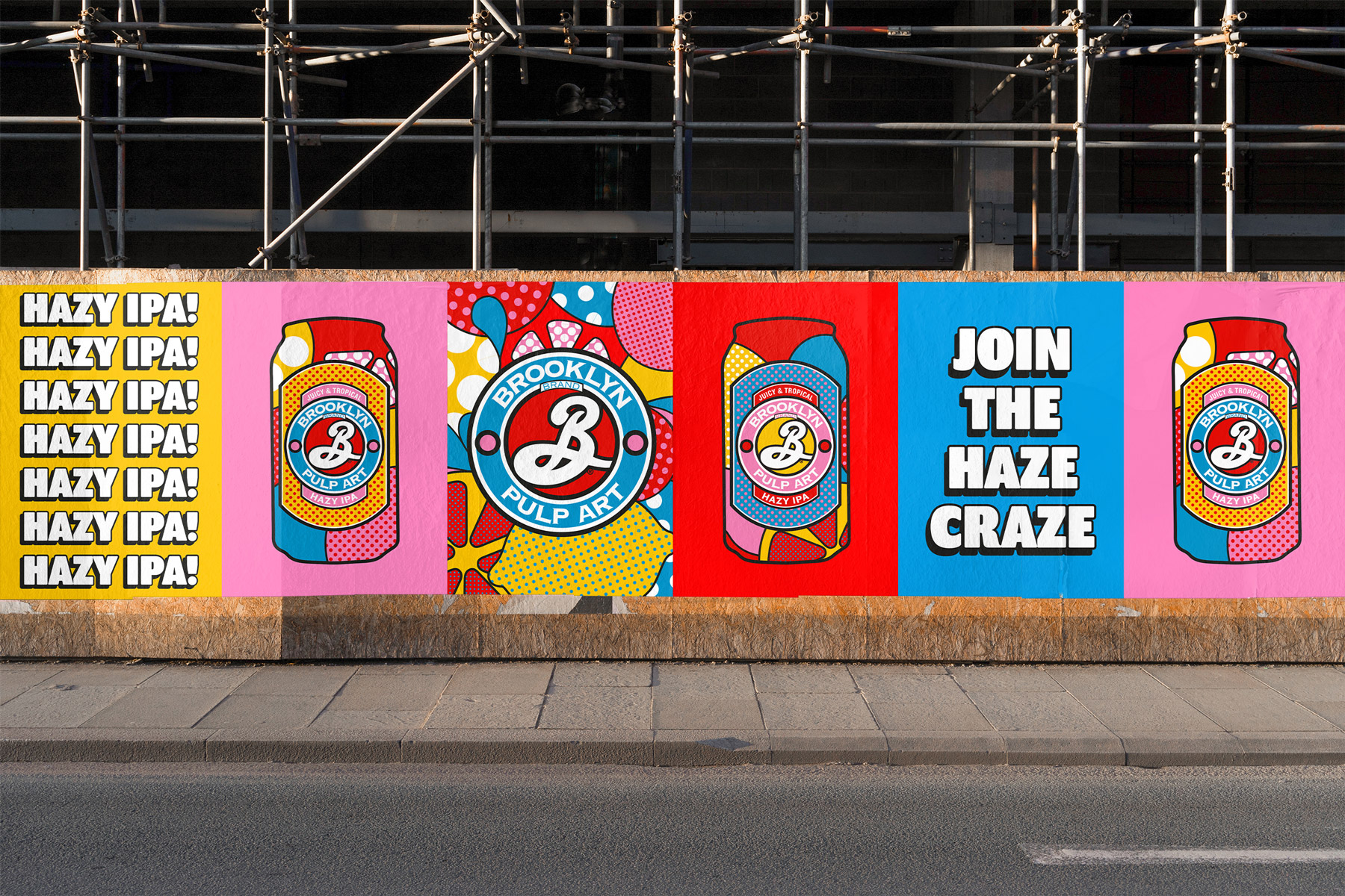
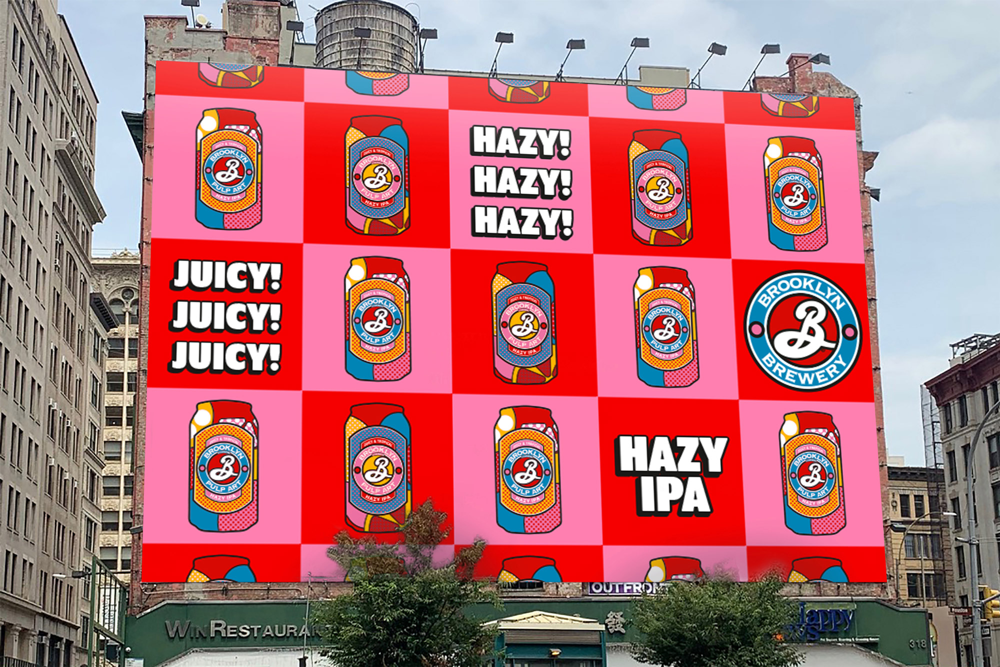
Our bold background pattern matches the beer’s bold flavour palette with juicy crops of stylised fruit. Striking secondary patterns, in-your-face typography and a liberal use of exclamation points puts Pulp Art’s tropical, juicy refreshment on repeat again and again and again across advertising.
Environmental spaces let you step straight into Brooklyn’s Pulp Art world. Super-sized fruit segments with bold graphics create fun and invitingly interactive spaces. While contrasting textures, vibrant poster walls and playful patterns see the versatile spaces almost become art installations themselves.
Blurring the lines between beer and art, there’s no doubt about it: Brooklyn Pulp Art is a modern day masterpiece.
“To us and the world, Brooklyn has never been just another brewery,” added Matt Burns, Thirst Creative Director and Founder. “It’s a true product of its neighbourhood: spirited, creative, authentic. So we knew when we got this brief, it could never be ‘just another’ hazy IPA. We needed to give it the Brooklyn twist. When we landed on the name ‘Pulp Art’, we saw the opportunity to mash up two New York icons. One wanted to democratise art, the other wanted to democratise Hazy IPAs, it was a perfect match. With such a strong core idea, we could have so much fun with the brand. And we did.”
CREDIT
- Agency/Creative: Thirst Craft
- Article Title: Brooklyn Brewery Pulp Art Hazy IPA Brand and Packaging Design by Thirst Craft
- Organisation/Entity: Agency, Published Commercial Design
- Project Type: Packaging
- Project Status: Published
- Agency/Creative Country: United Kingdom
- Market Region: Global
- Project Deliverables: Brand Advertising, Brand Creation, Brand Experience, Brand Guidelines, Brand Identity, Brand Strategy, Brand World, Branding, Graphic Design, Packaging Design, Photography, Product Naming
- Format: Bottle, Box, Can
- Substrate: Glass Bottle, Metal
- Keywords: WBDS Agency Design Awards 2021/22


