


formascope design – Gastropolis Food Market
Challenge
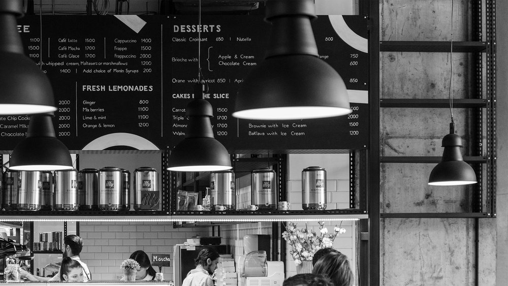
Gastropolis is a modern gourmet food market offering different culinary corners in one location. Our challenge was to develop brand concept and visual identity for such a diversified place.
Idea/solution
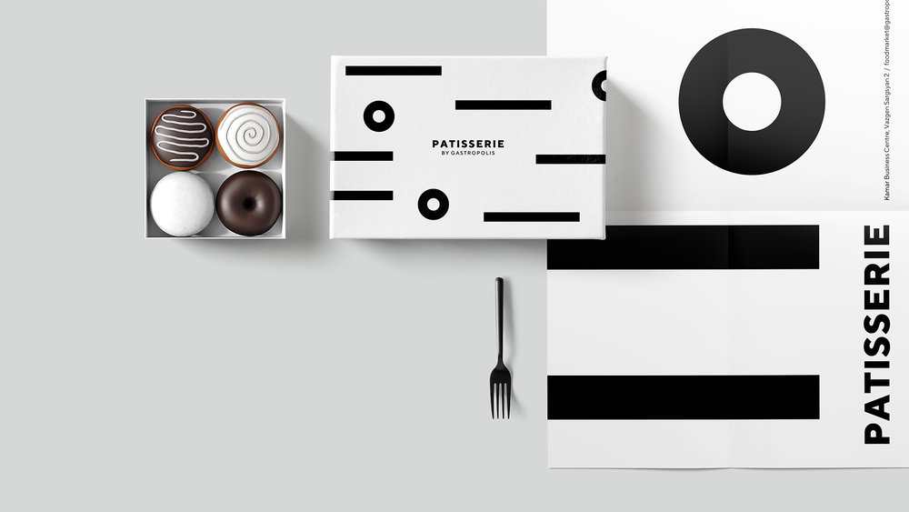
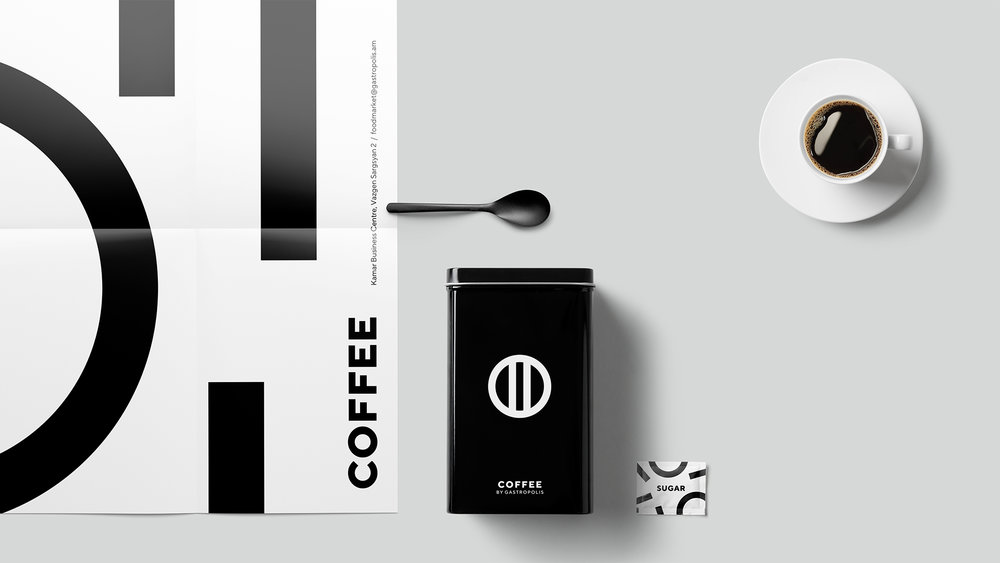
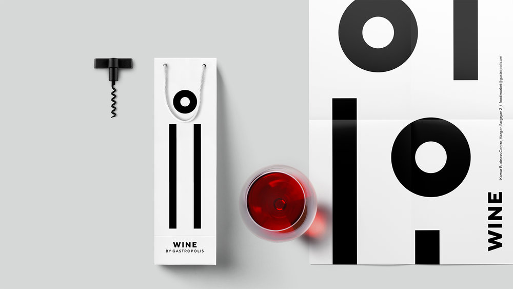
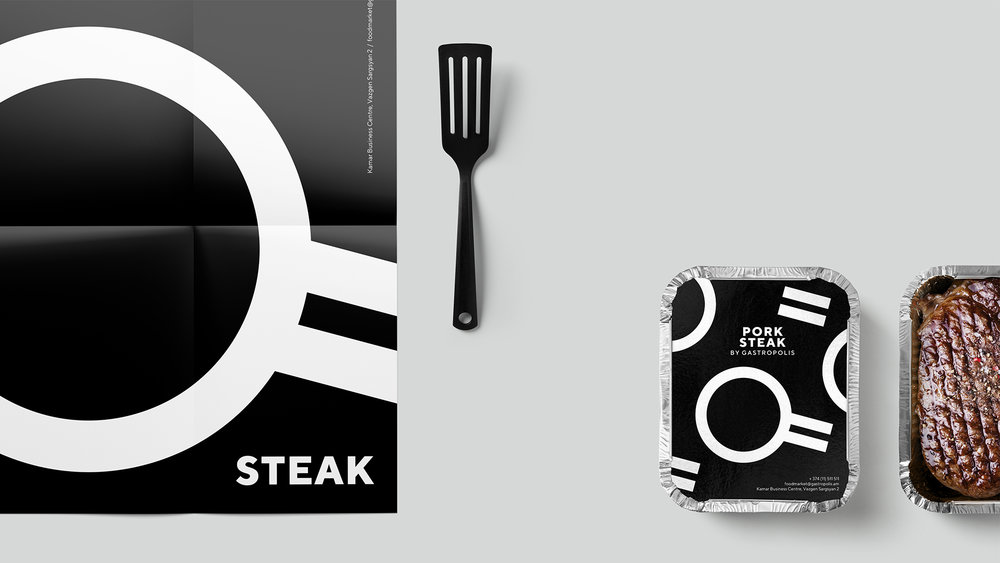
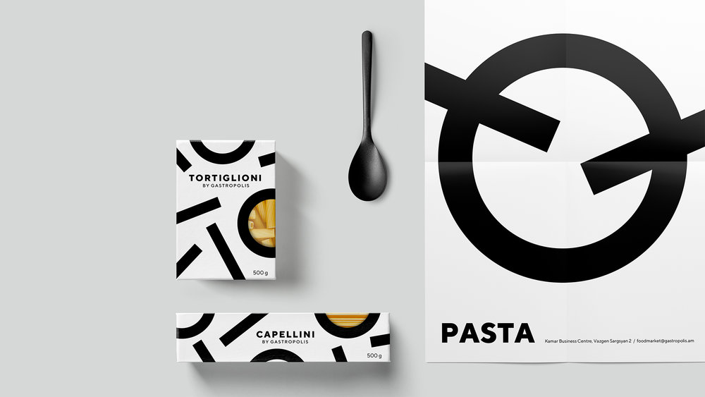
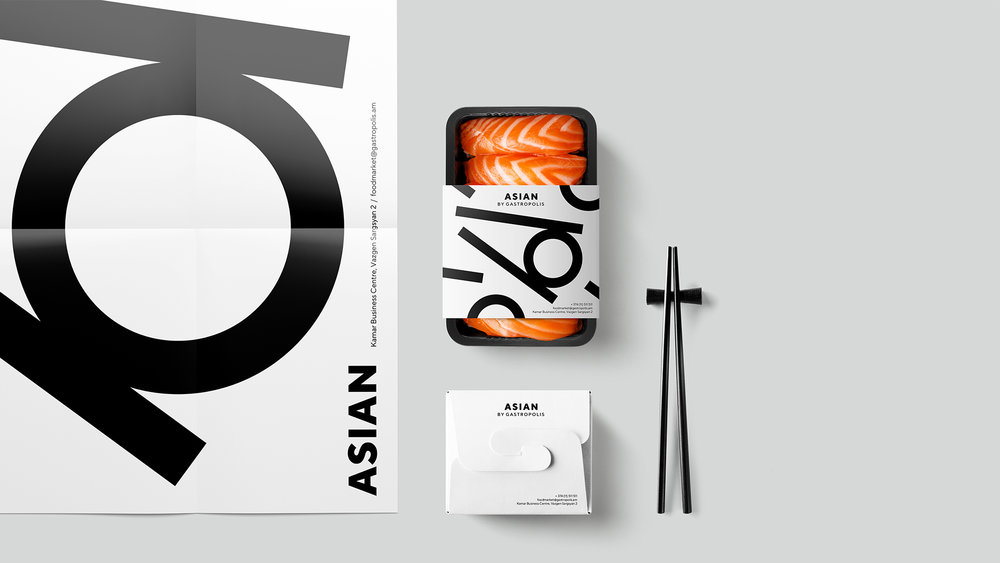
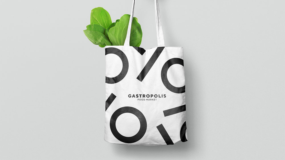
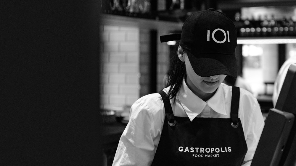
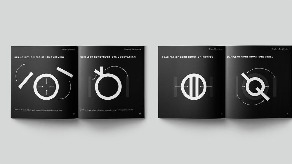
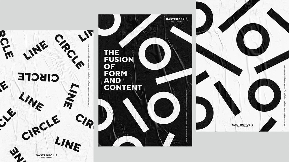
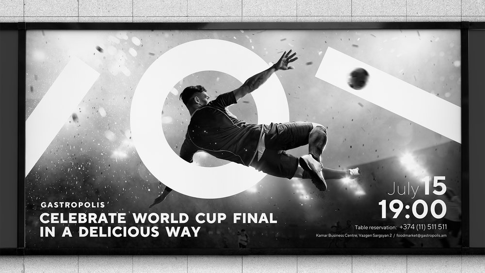
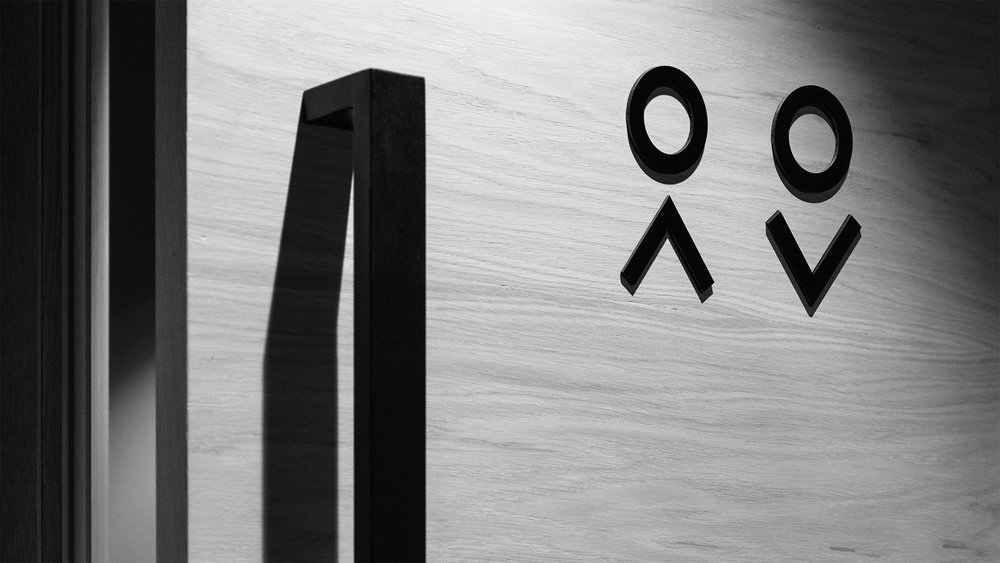
The branding of Gastropolis is based on the idea of “form as a language of communication”. It’s a simple concept based on human relationship with food. This relationship begins with a “plate-cutlery” motion, which is also viewed as a formal embodiment of Gastropolis corporate style.
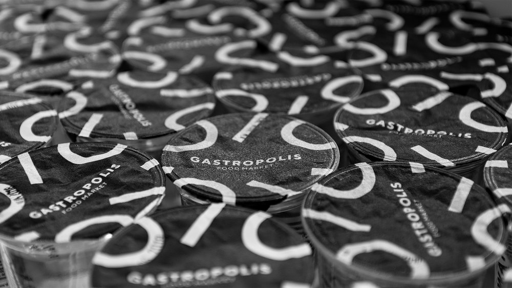
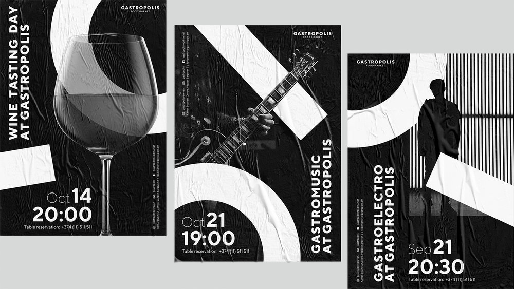
We set a challenge to create a brand identity using simple shapes and content, so the brand style of Gastropolis has been built in combination of two forms and three elements (one circle, two lines). The logo “a circle and two lines” with the same “plate- cutlery” became the origin of the brand-style language. The logo constantly transforms by dynamic principle and creates radically different culinary corners using the same shapes/forms, that in fact become the part of the corporate style of Gastropolis.
CREDIT
- Agency/Creative: formascope design
- Article Title: Branding with Lines and Circles for Gastropolis Food Market
- Organisation/Entity: Agency Commercial, Published
- Project Type: Identity
- Agency/Creative Country: Armenia
- Market Region: Europe
- Industry: Food/Beverage


