


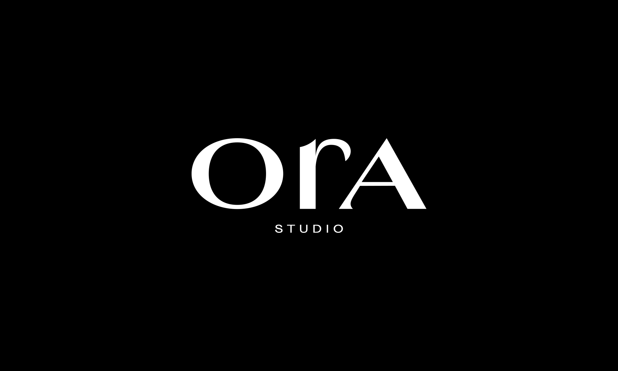
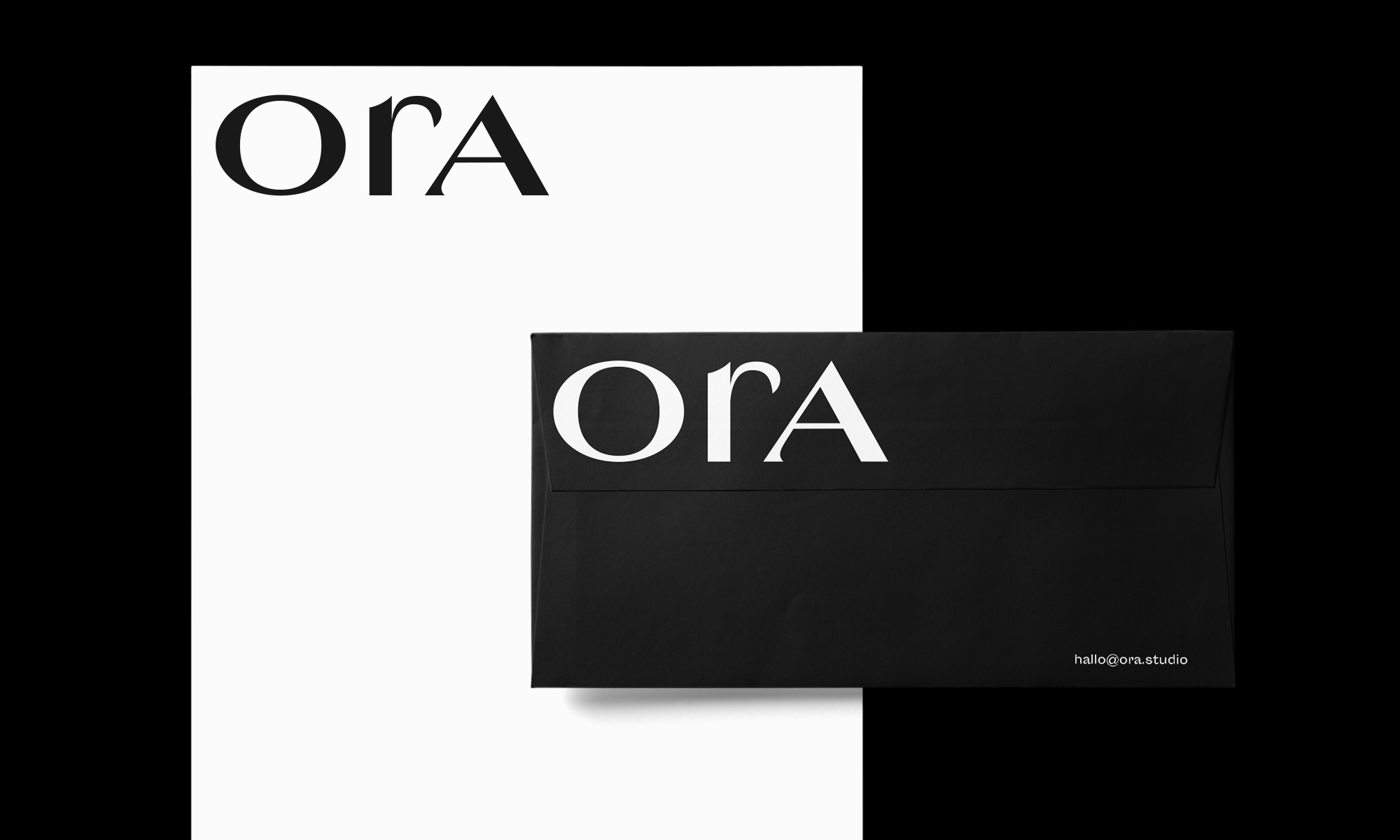
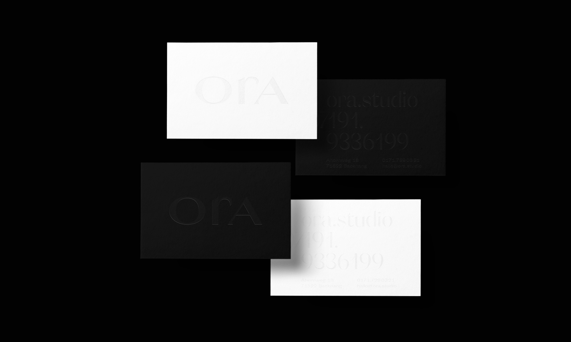
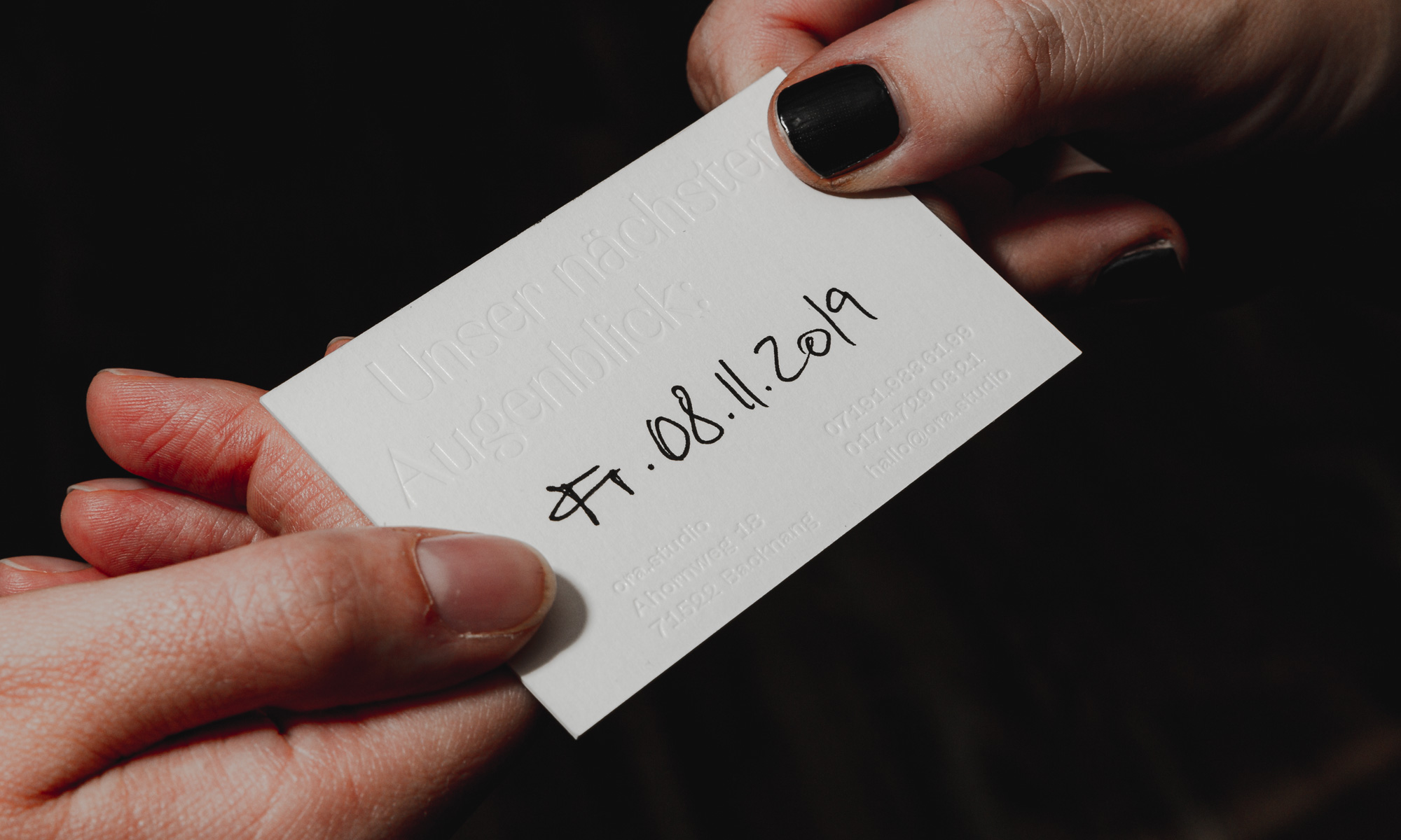
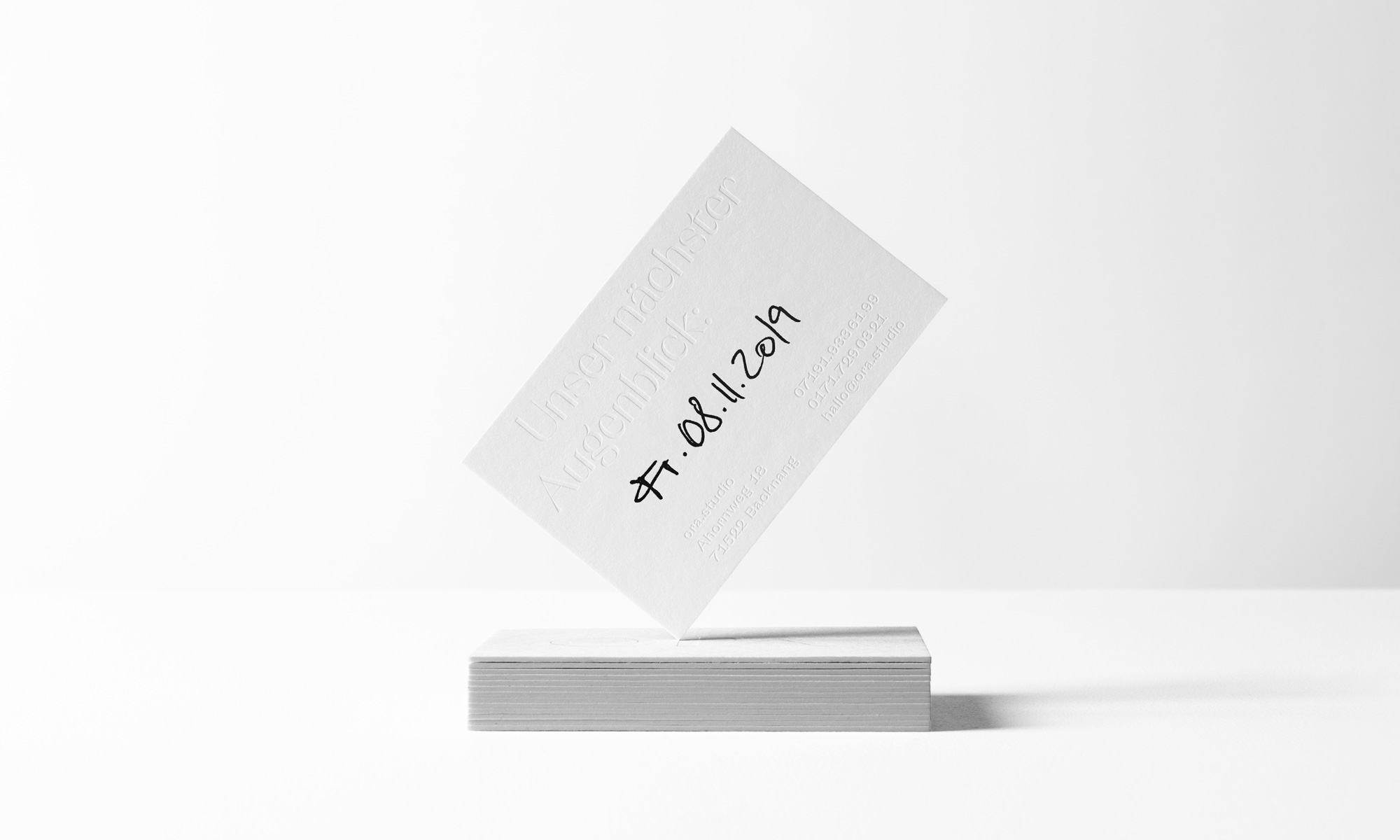
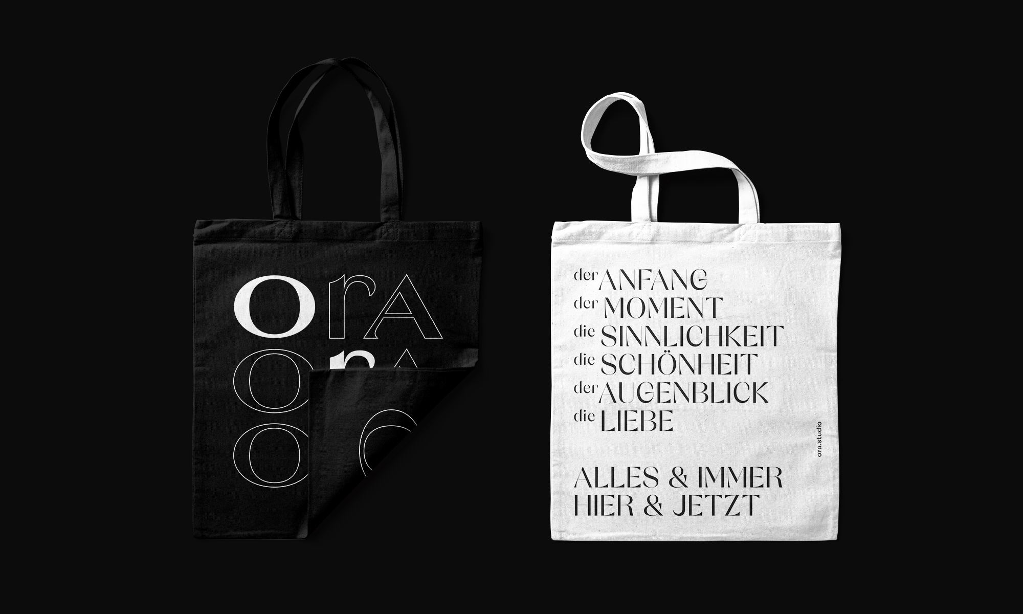
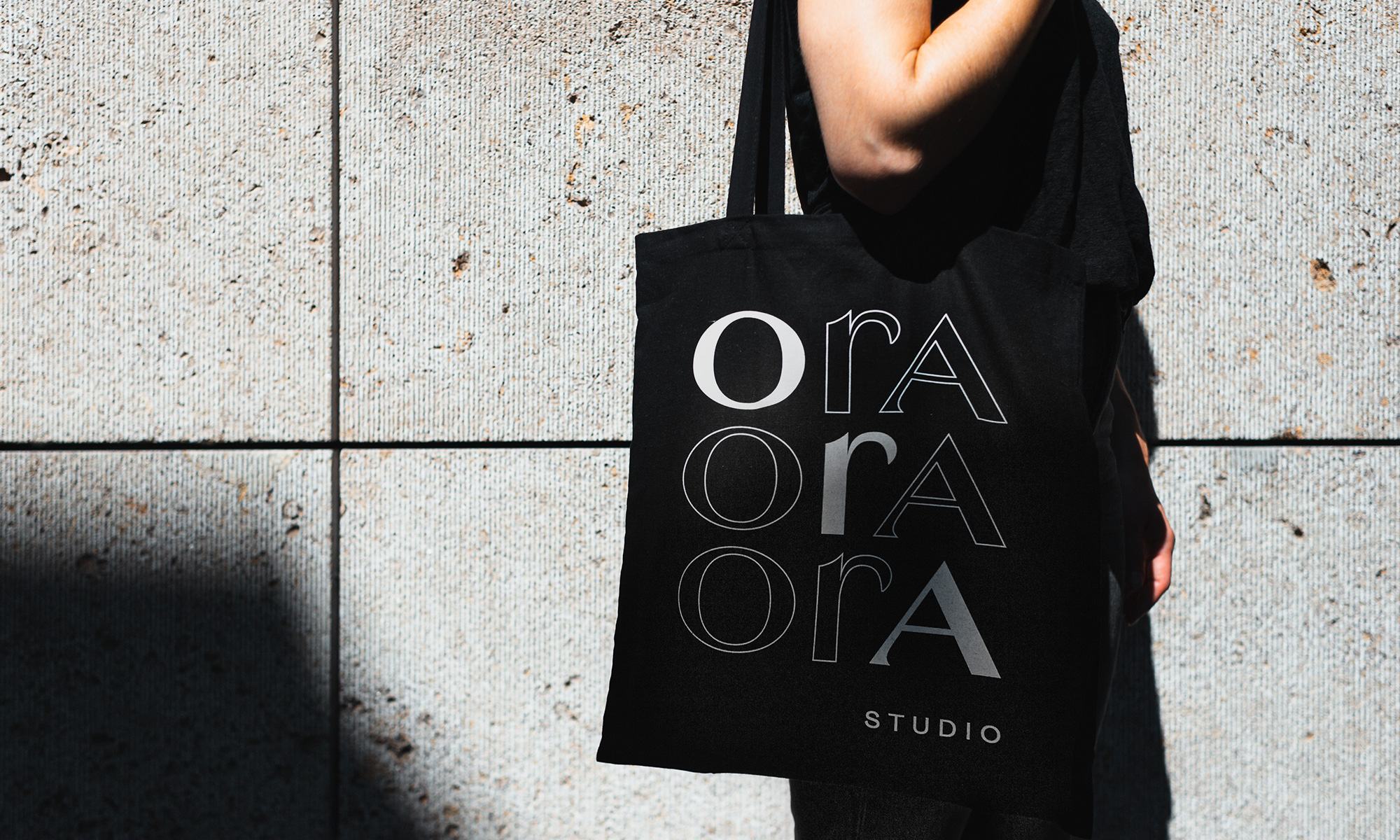
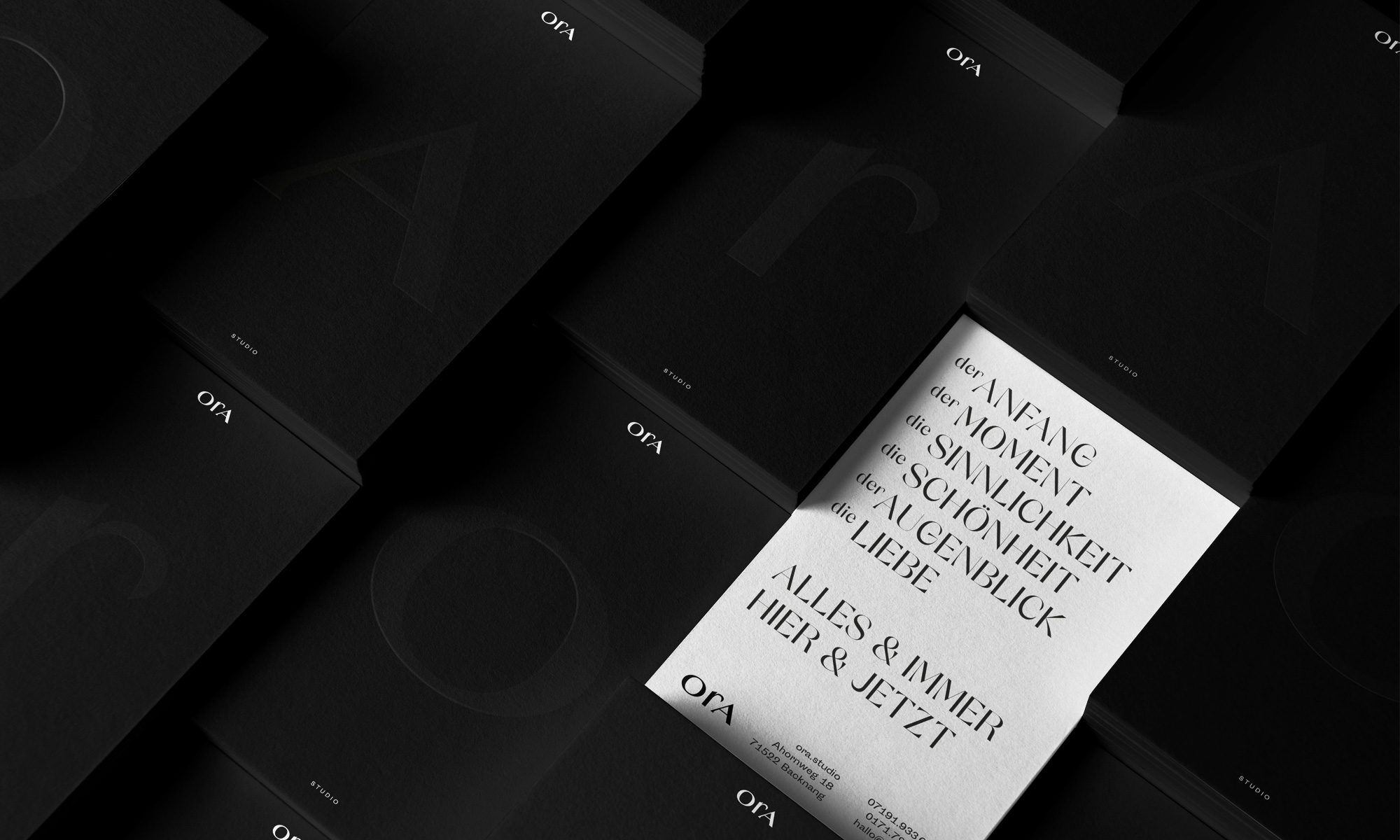
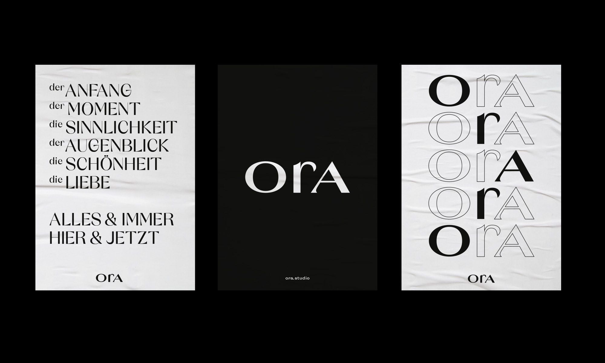
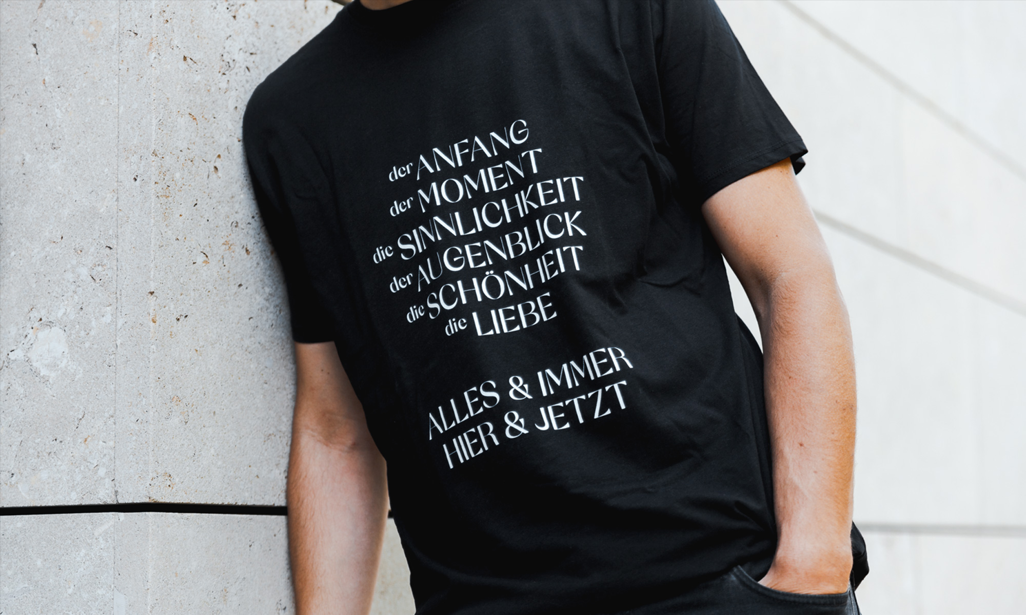
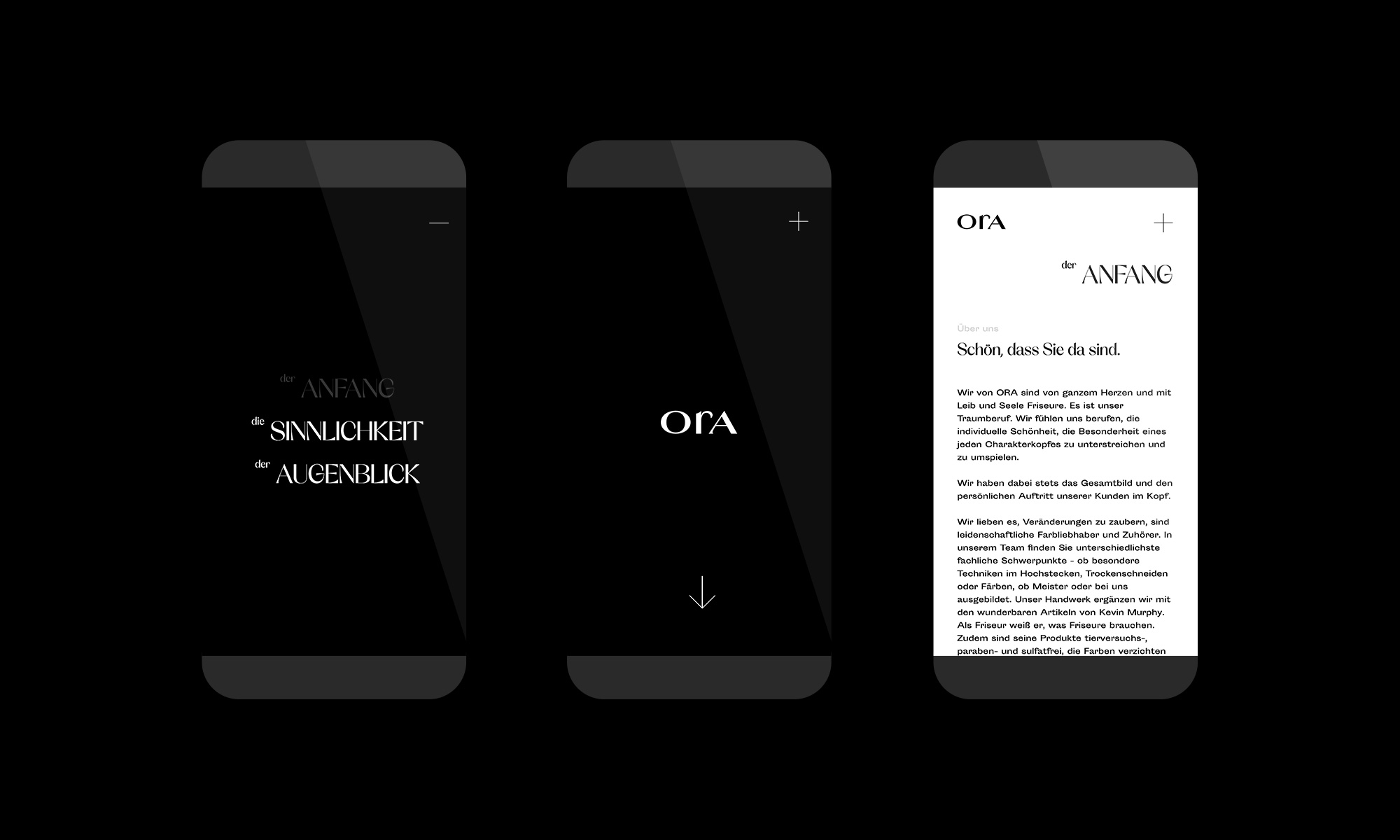
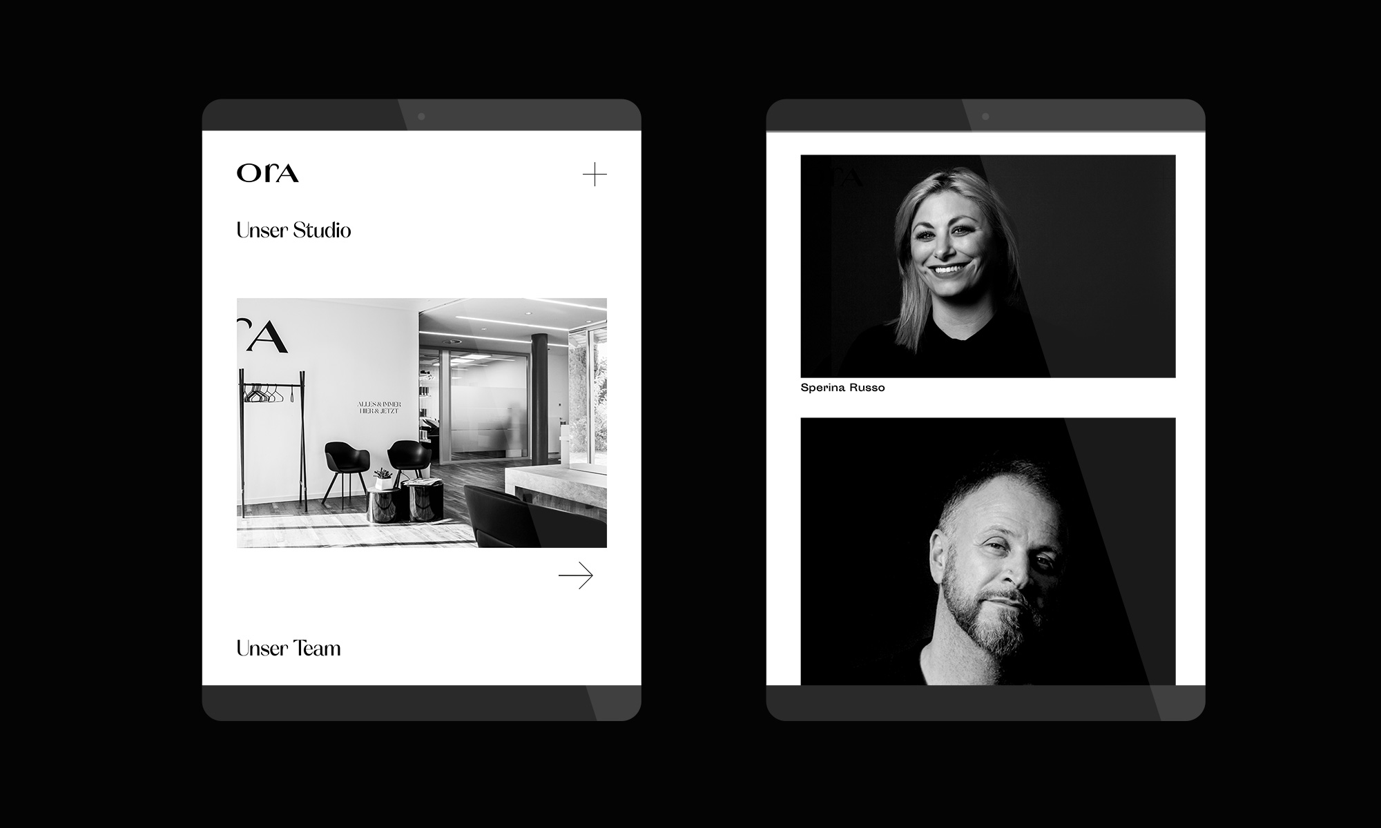
ORA stands for hour in Italian, but also for the moment, the here and now. Hairdressers from ORA take their time and always give customers their full attention. They live their craft – their vocation – with heart and hand. They love to bring expression to the personality and beauty of their clients, to strengthen their self-esteem and their zest for life. No frills.
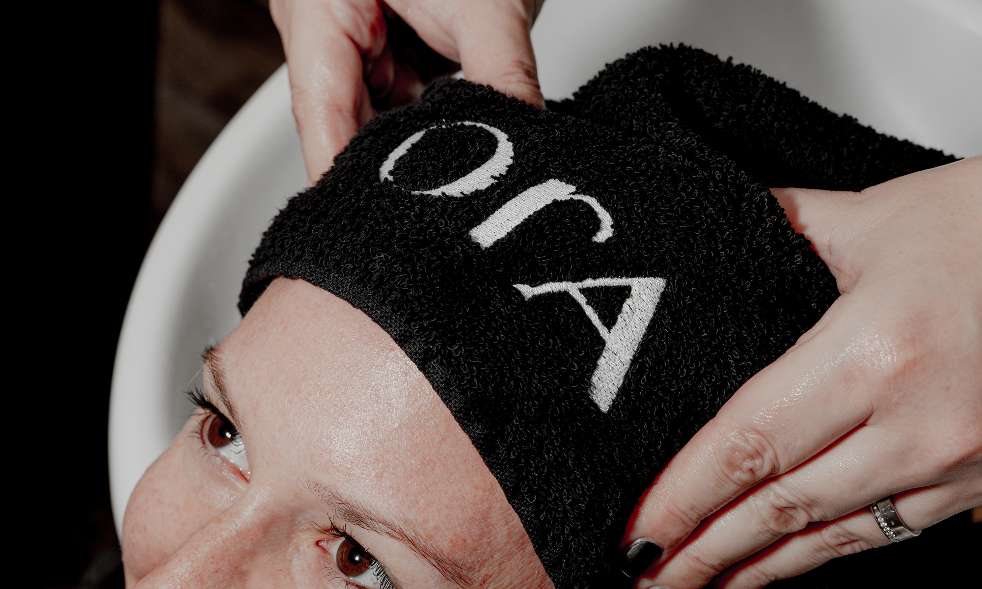
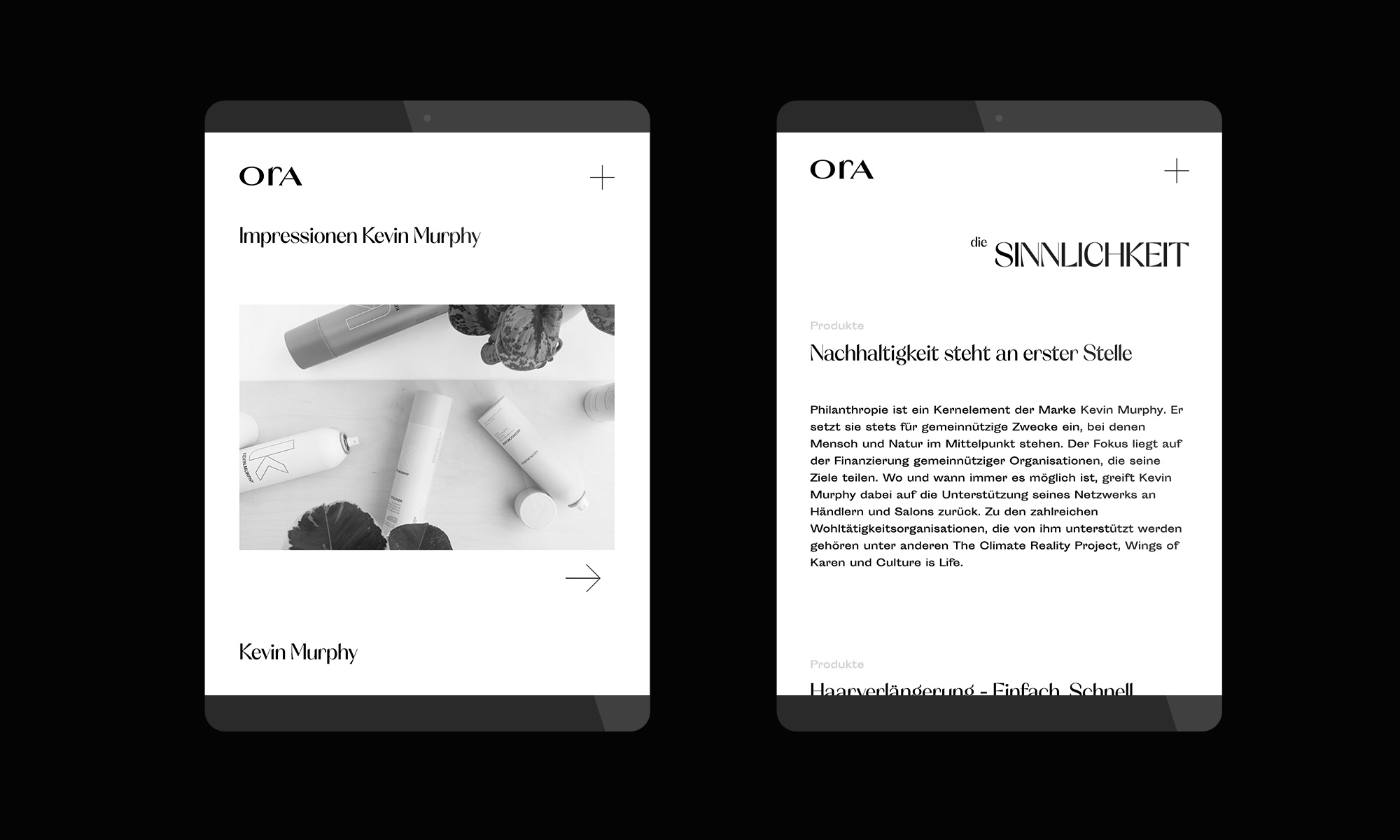
The straightforward and concise branding lives from timeless Italian lightness, which is expressed in particular in the chosen typography – the Orelo. Clarity, calmness and focus characterize the high-quality appearance in print and also online.
CREDIT
- Agency/Creative: papa tom
- Article Title: Branding for Studio Ora
- Organisation/Entity: Agency, Published Commercial Design
- Project Type: Identity
- Agency/Creative Country: Germany
- Market Region: Europe
- Project Deliverables: Brand Design, Brand Identity, Brand Naming, Brand World, Branding, Graphic Design, Tone of Voice
- Industry: Fashion
- Keywords: hairdresser, stationery, studio products, brand identity, website, business cards, towels, tote bag, t-shirt
FEEDBACK
Relevance: Solution/idea in relation to brand, product or service
Implementation: Attention, detailing and finishing of final solution
Presentation: Text, visualisation and quality of the presentation


