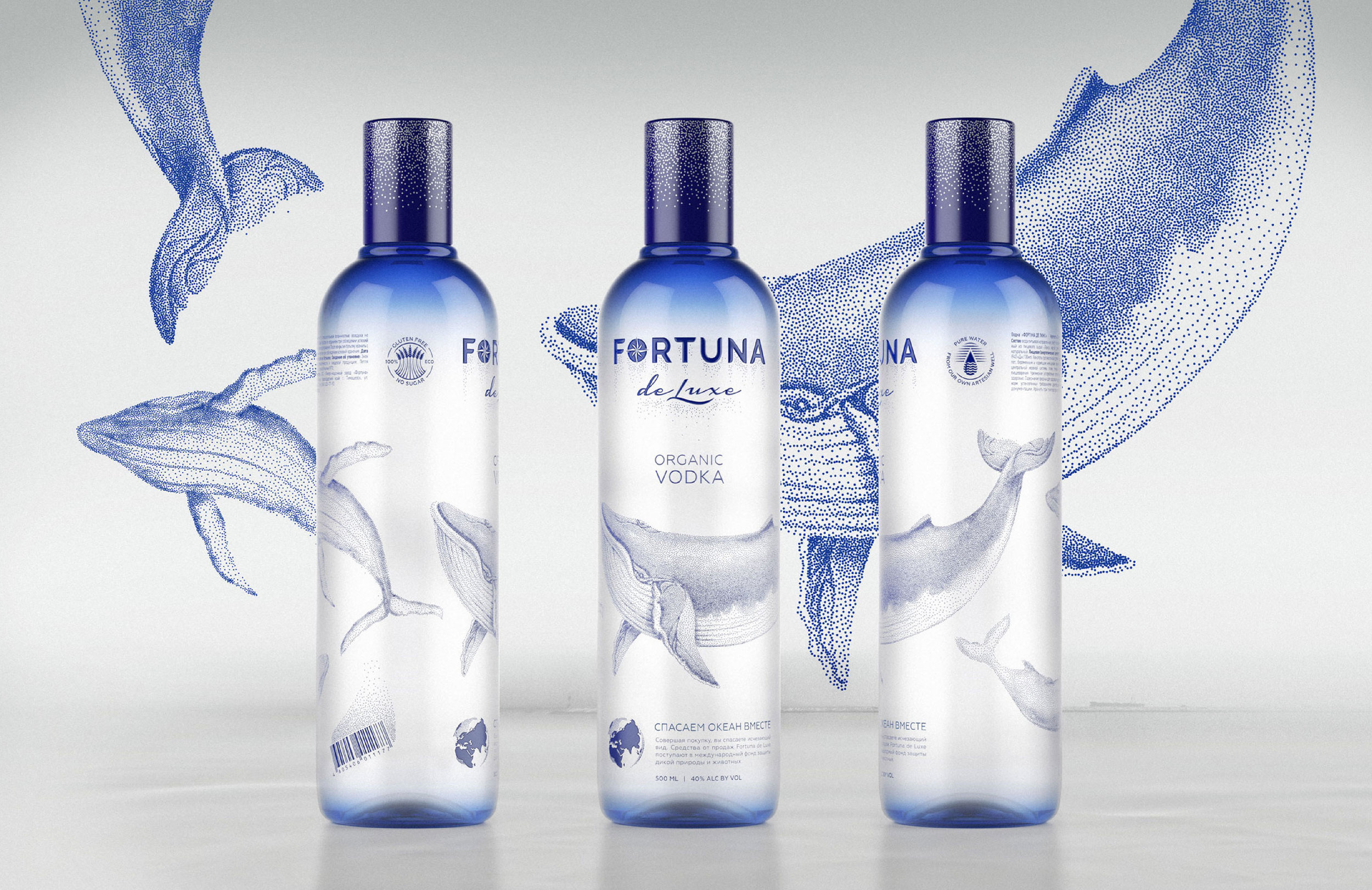
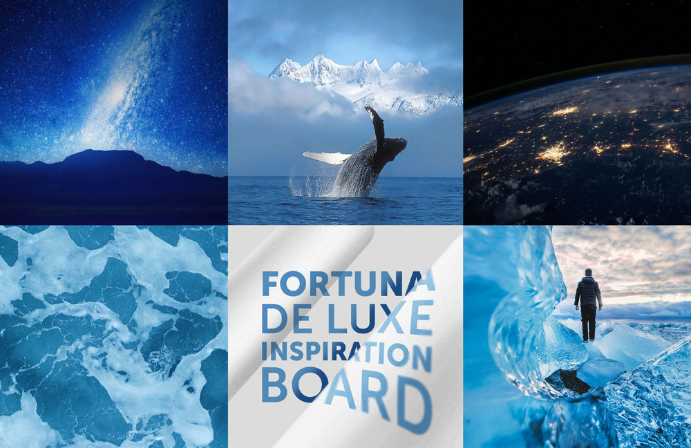
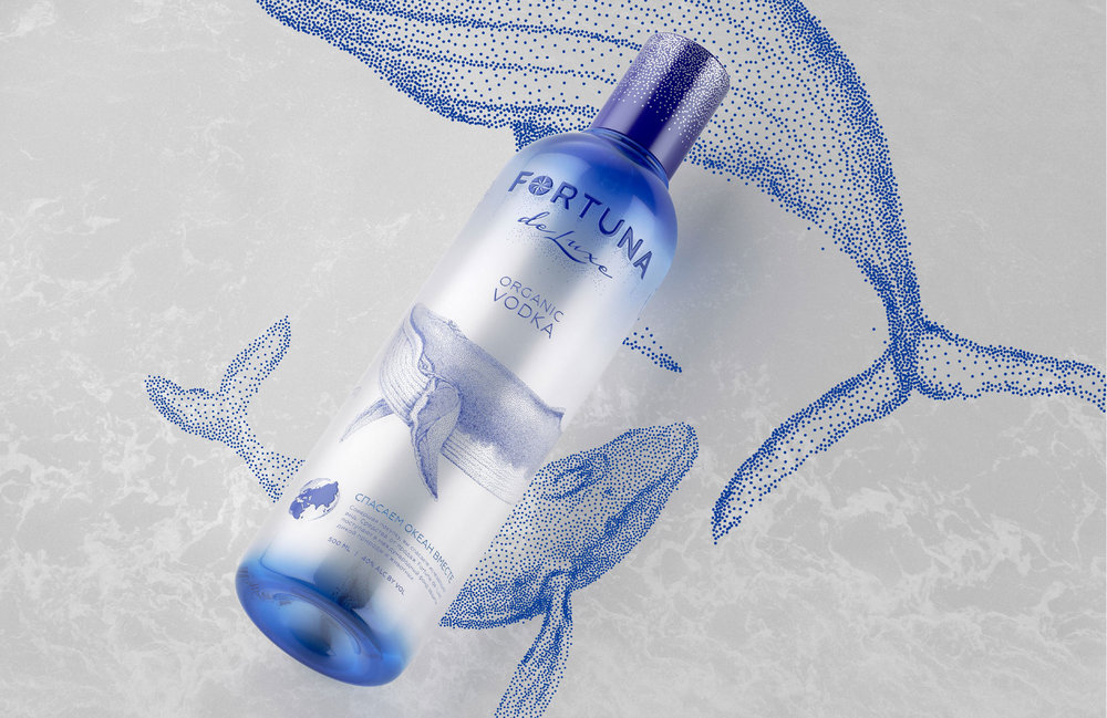
” Superiority concept is the best one to clearly express the essence of power. Main characters of project are huge whales. In the animal world, because of their size, they have an inherent superiority, and it needs no confirmation. Whales show no aggression. They slowly and majestically move into cold waters, embodying wisdom and significance.
Main idea is to create a friendly premium image of the beverage, full of dignity with focus on the people, who calmly and confidently move through their life and reach the goals.
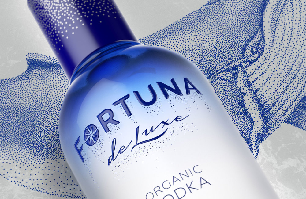
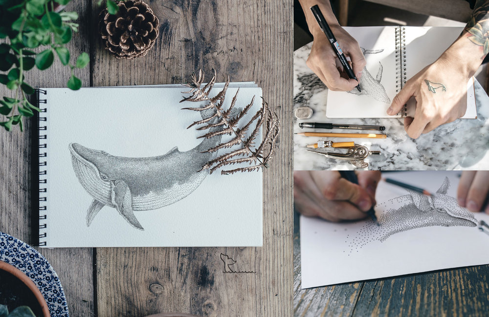
General style contains the idea of starry sky – the visual elements are illustrated with puantel technique. The stars stand here as a symbol of success and achievements, and connected to the brand name Fortuna de Luxe.
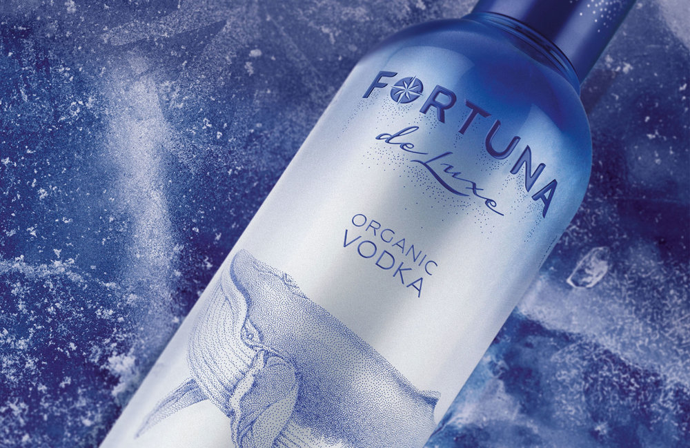
Background color completes the image of the underwater world – the bottle is made of glass using the technology of matt gradient.
Fortuna de Luxe is the brand with a social message: whales don’t have an internal hierarchy, they care about each other and are protected by common efforts. That is why the project was complement by sponsoring – a part of sales revenue will be donated to wild life and nature protection.”
CREDIT
- Agency/Creative: Branding agency DDC.Lab
- Article Title: Branding agency DDC.Lab – Fortuna de Luxe. ORGANIC VODKA
- Project Type: Packaging
- Format: Bottle
- Substrate: Glass


