


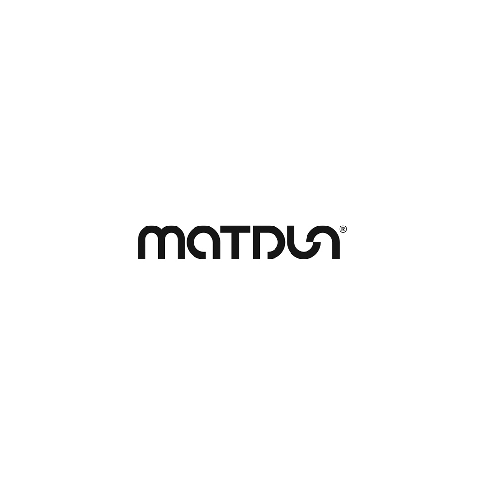
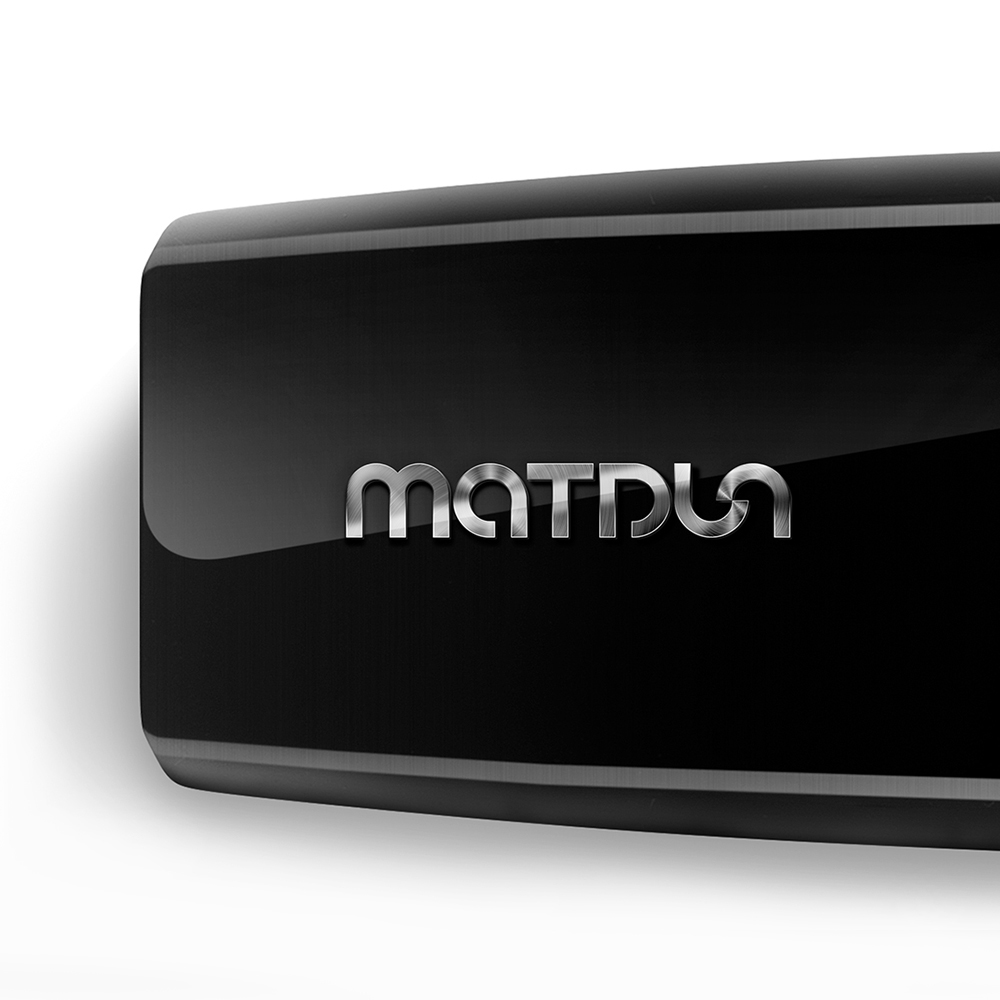
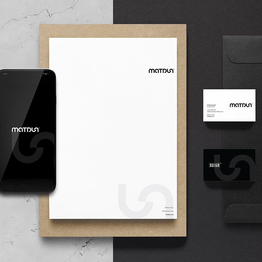
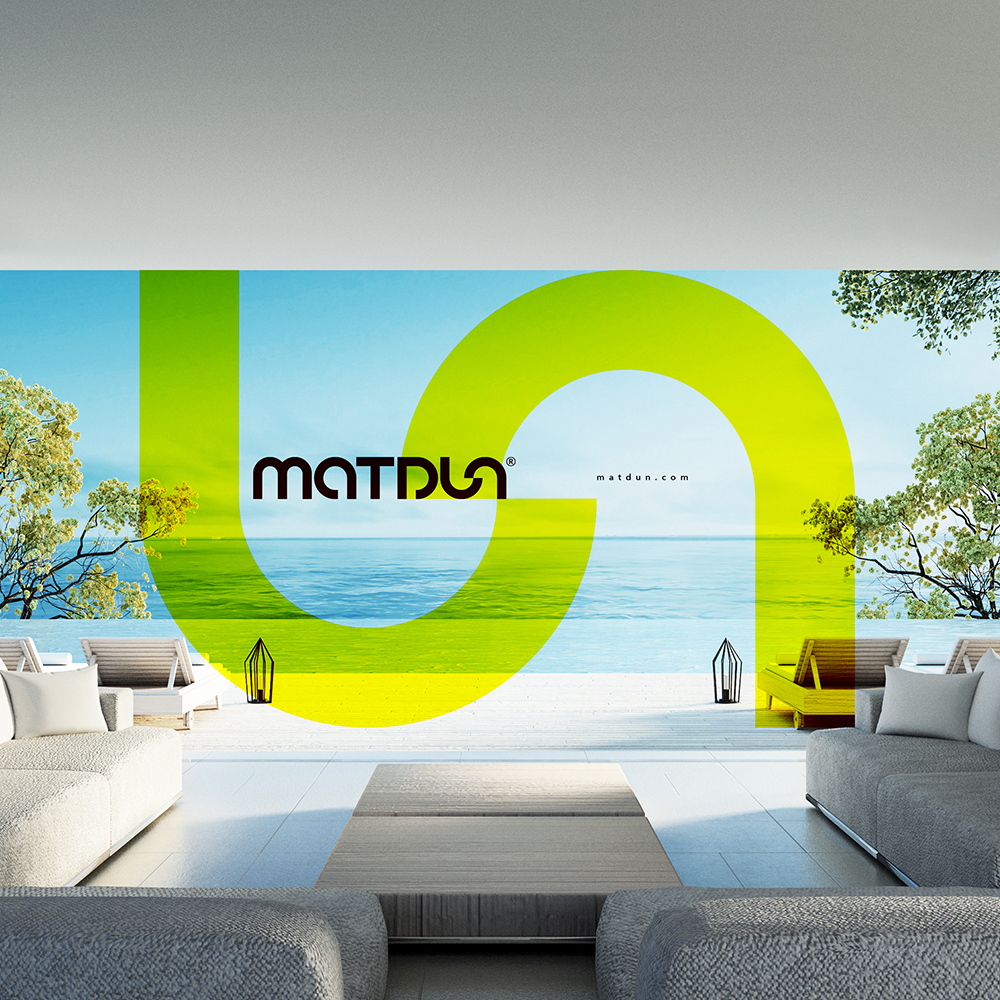
A new vision was taking birth at Matdun. This super tech consumer goods company was aiming to redefine the segment with its superior, next level offering. The task was to shape this aspiring global brand and give it a distinct expression. A confident, sure yet understated rendition that would indicate a unique persona being built for the brand. The identity focused on the name while giving a subtle hint of lifestyle. The roundness of the created typeface further indicated the holistic approach and service orientation of the brand. The identity showcased a dominant play with the letters ‘U’ and ‘N’ to represent the act of unlocking, setting free in order to reflect the spirit of innovation that formed the vertical core of this enterprise. A clean and dynamic brand identity that went well with the futuristic product range the brand is gearing up to offer. An identity with the ease of application to any surface and texture ensuring legibility to the smallest size reproduction. The uniformity and subtleness of the identity was well extended to its brand collaterals.
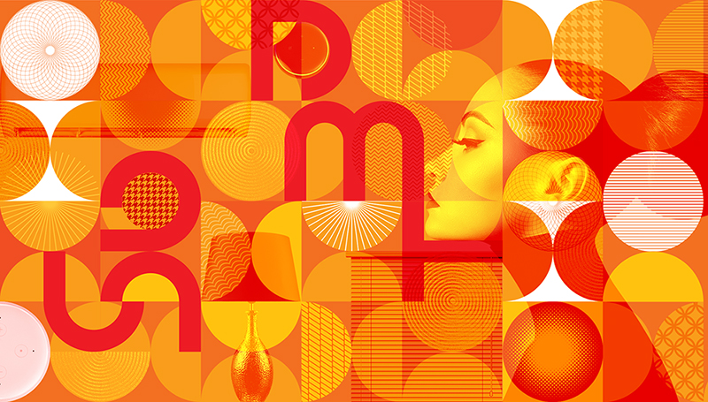
Technology could very well be serious but its outcome could have a lot of vibrance. Being a consumer tech company, Matdun intended to add the shades of comfort and convenience to its customer’s life at all times through its offering. The colourful graphic style complimenting the identity made for an interesting design language for the brand which had strong potential to be extendable into various applications such as space branding, packaging and a lot more. The graphics further took the consumer interpretation of the brand forward, allowing individual interpretation to creep in. It lent vital flexibility to the brand wherein multiple colours could be used to represent its vibrance.
The brand website ‘matdun.com’ was also designed to create the appropriate context and provide the relevant visualisation for the company. It very clearly drew the operating space of the brand and highlighted the kind of organisation that was being built. Communication played a key role going forward and the brand is now gearing up to expand its vibrant reach via multiple channels of print, film and digital with focus on its key markets to begin with.
The branding exercise was meant to create an impression and generate curiosity and from what we hear, looks like it is doing its job!
CREDIT
- Agency/Creative: Tricycle Brand Solutions LLP
- Article Title: Branding a New Global Consumer Company Designed by Tricycle Brand Solutions
- Organisation/Entity: Agency, Published Commercial Design
- Project Type: Identity
- Project Status: Published
- Agency/Creative Country: India
- Market Region: North America
- Project Deliverables: Brand Creation, Brand Experience, Brand Identity, Brand Strategy, Branding, Research / Insight, Tone of Voice
- Keywords: Branding, Brand Identity, Identity Design, Brand Creation, Brand Design, Branding Agency, Brand Consultancy, Design, Visual Identity Design, Visual Identity


