


ButterflyCannon – CUT RUM
“CUT RUM is a range of quality, authentic liquids using only natural ingredients; with a
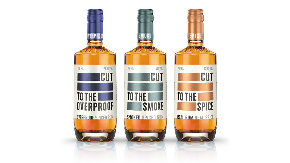
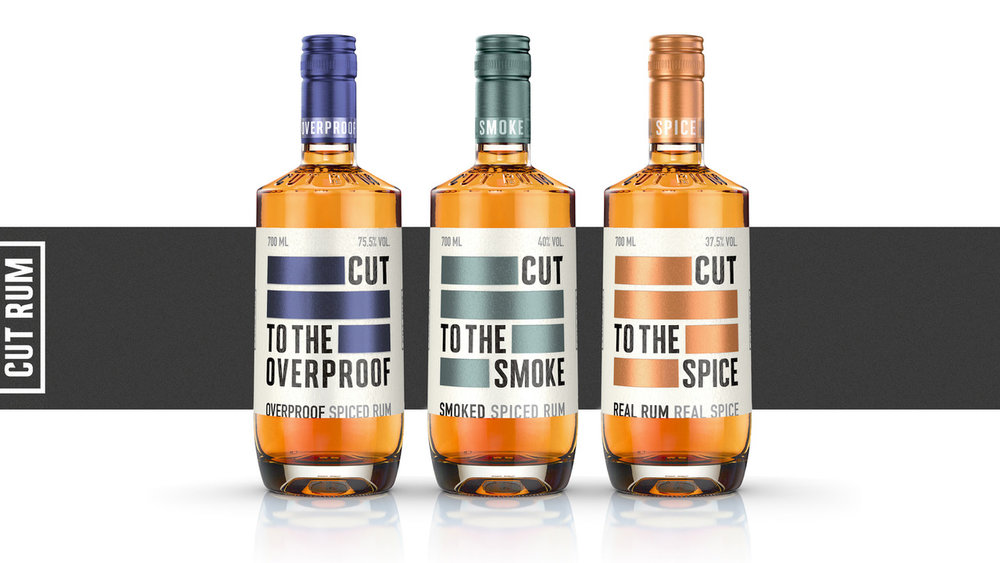
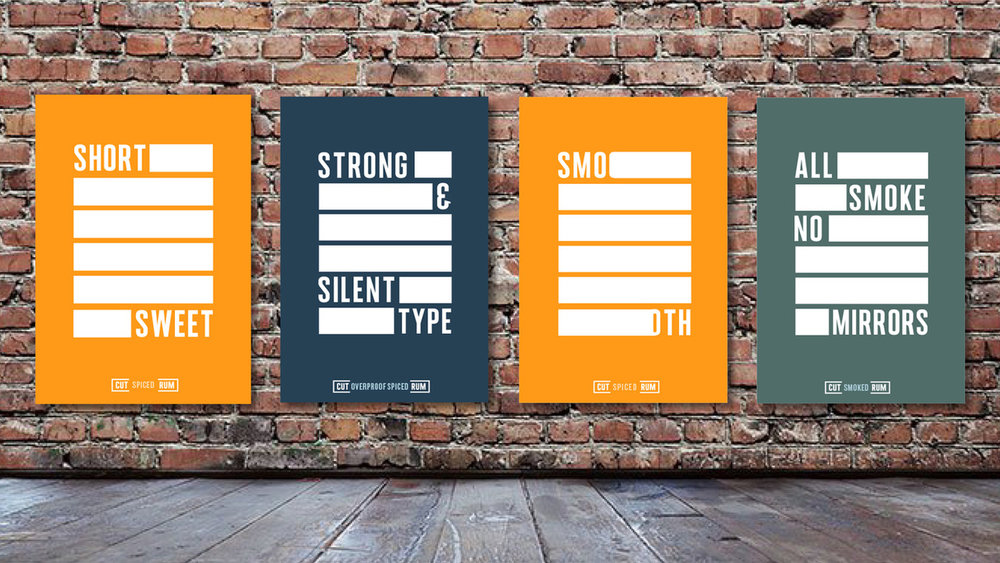
portfolio that includes amazingly delicious rums: a sensational Spiced, a far too smooth
Overproof and a knockout Smoked.
It was clear from the start that the liquids were the centre of attention here. This wasn’t a
brand that was going to eulogize about its provenance, its history, its master distiller’s vision or a quirky brand myth. The co-founders Paul and James, were straight-to-the-point, no-nonsense personalities and knew they had great products and simply wanted to ‘cut the c**p’ to focus on what was important. Their only brief was to be disruptive and do the things the others don’t so people would see it, try it and enjoy it.
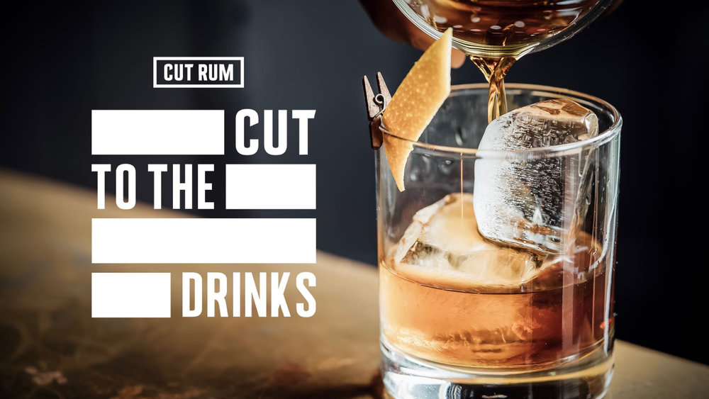
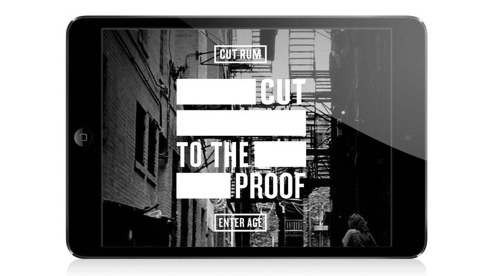
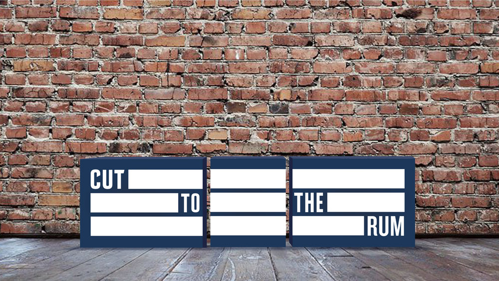
This attitude informed everything we created from the bold and punchy pack design with its grounded custom bottle design, through the brand’s tone of voice that runs through all its communications (All Smoke, No Mirrors, #CutToTheChase #CutToTheRum) to the look and feel for both its digital and real-world experiences. Nothing fluffy, nothing unnecessary, no smoke and mirrors; this was just a simply cut story about 3 great and distinct products.
This attitude even informed the substrates and finishes we chose: raw and natural stock paper contrasted by solid metallic bands, that grab your attention at bar and in-store whilst signifying the editing of the unnecessary jargon you usually get on pack.
CUT RUM has already created a buzz across the on trade and independent retail, with national retail distribution planned from September.
Paul Ferguson & James McDermott, Co-founders of CUT RUM comment: “All rum brands are about the sea – pirates, rebellion, sea creatures, treasure, Caribbean clichés…we wanted to create something that stands out and was edgier and bolder than the competition and their daft stories. We were so excited when we first saw ButterflyCannon’s work on CUT RUM, their design oozes the confidence and attitude that we wanted”.
Jon Davies, Co-Founder of ButterflyCannon adds: “We love this work for CUT RUM; it’s great that Paul and James had the vision and confidence to allow us to create such a straight-talking, no-nonsense brand that doesn’t bang on about its provenance, craftsmanship or process in an overly romantic way. We are thrilled with the end result – big, bold and ballsy”.
CREDIT
- Agency/Creative: ButterflyCannon
- Article Title: Brand Positioning, Identity and Packaging Design for a Disruptive New Rum Brand
- Project Type: Packaging
- Agency/Creative Country: United Kingdom
- Format: Bottle
- Substrate: Glass


