


Visual identity project developed for Instituto Urbes, a professional training company that conducts training courses, training and events aimed at the public and private sector, all professionals and scholars in the area of biddings with a legal and management theme.
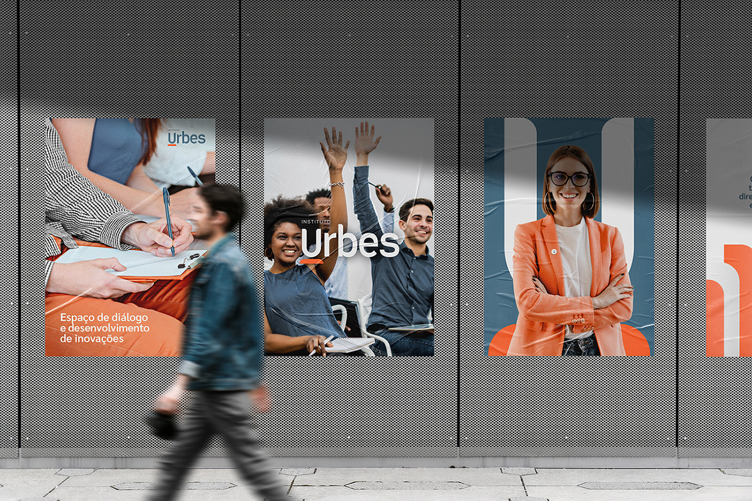
Instituto Urbes is a professional training company that conducts training courses, training and events aimed at the public and private sector, professionals and scholars in the area of public tenders with a legal and management theme. The Institute aims to build a space for dialogue and the development of innovations aimed at improving public management and the relationship with the private sector. Its activities are governed by ethics, professionalism, commitment, quality and transparency, with trust and responsibility as the basis for a solid and committed relationship.
Challenges: Identify the main characteristics that make Instituto Urbes who it is. Develop a clear, modern and innovative personality, and transform these main attributes into visual elements, which are in accordance with the target audience and the brand’s contact points. Use the minimalist aesthetic without losing the emotional intensity of the brand. Create a standardised visual language that facilitates the identification of the Institute, use and applications at the brand’s contact points.
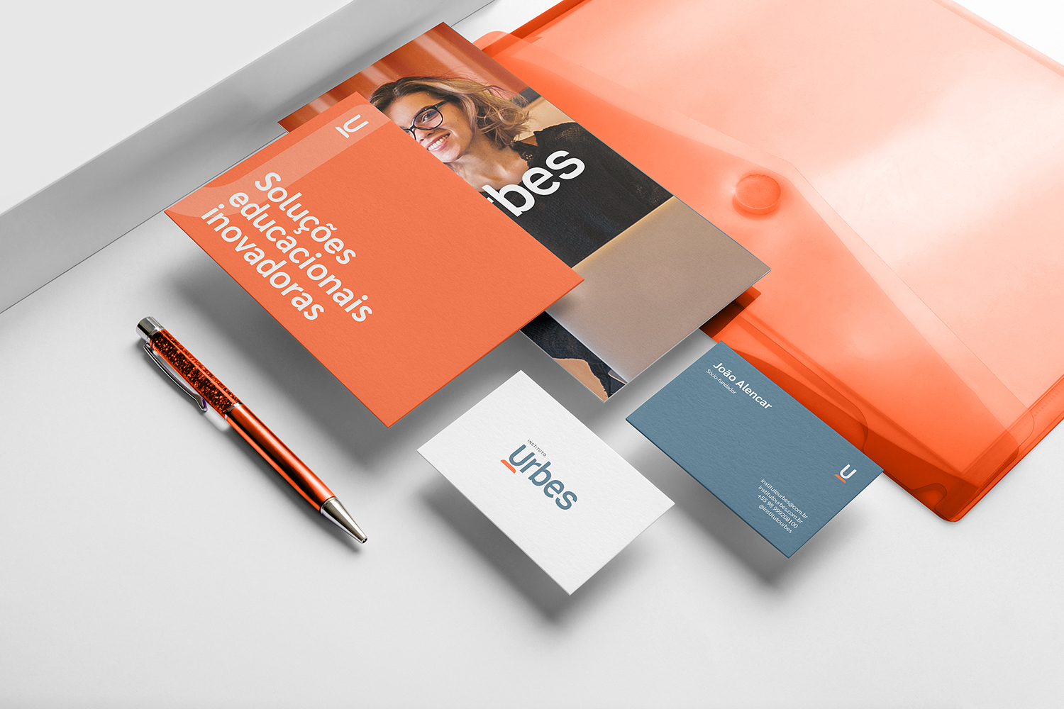
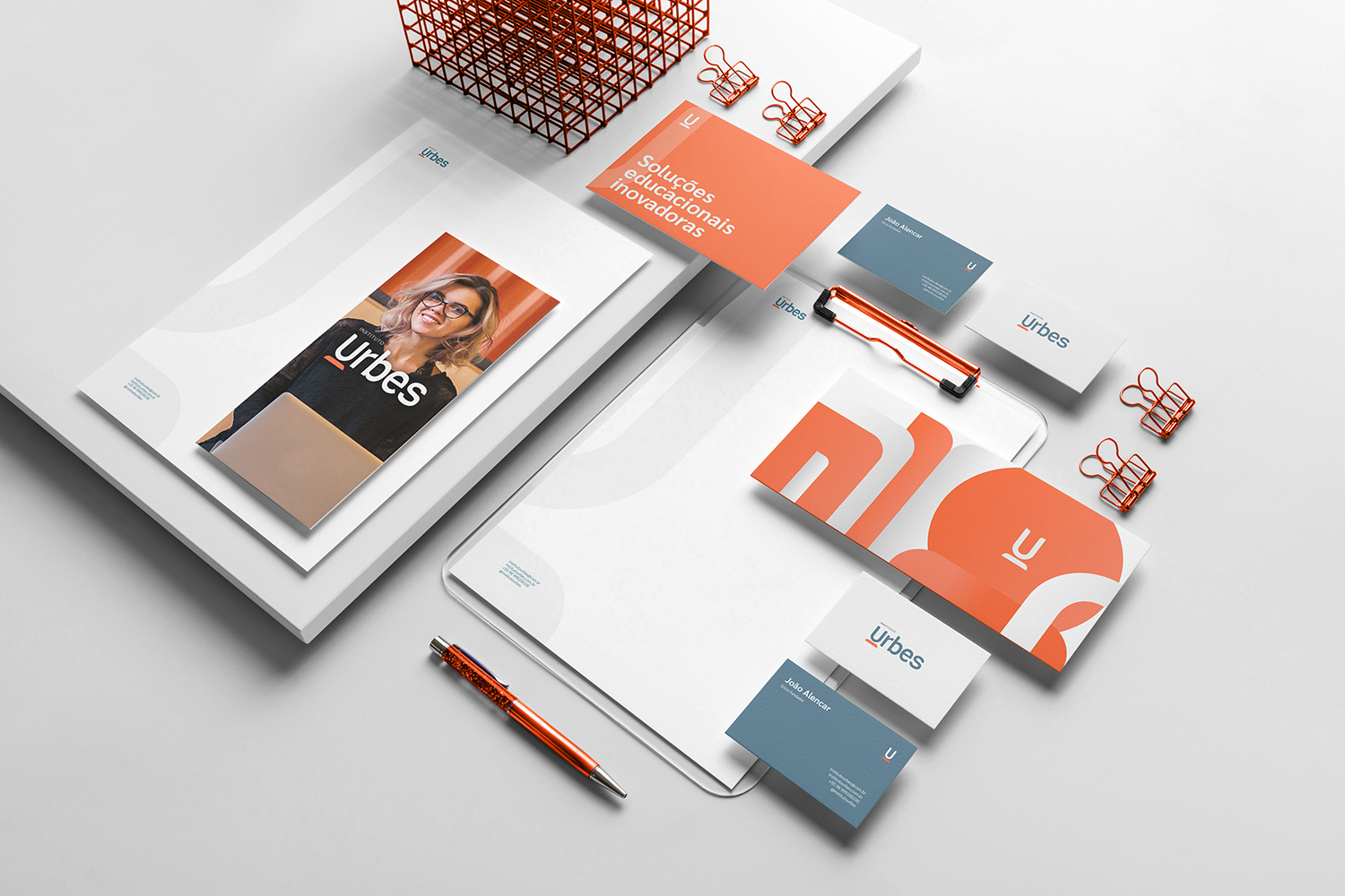
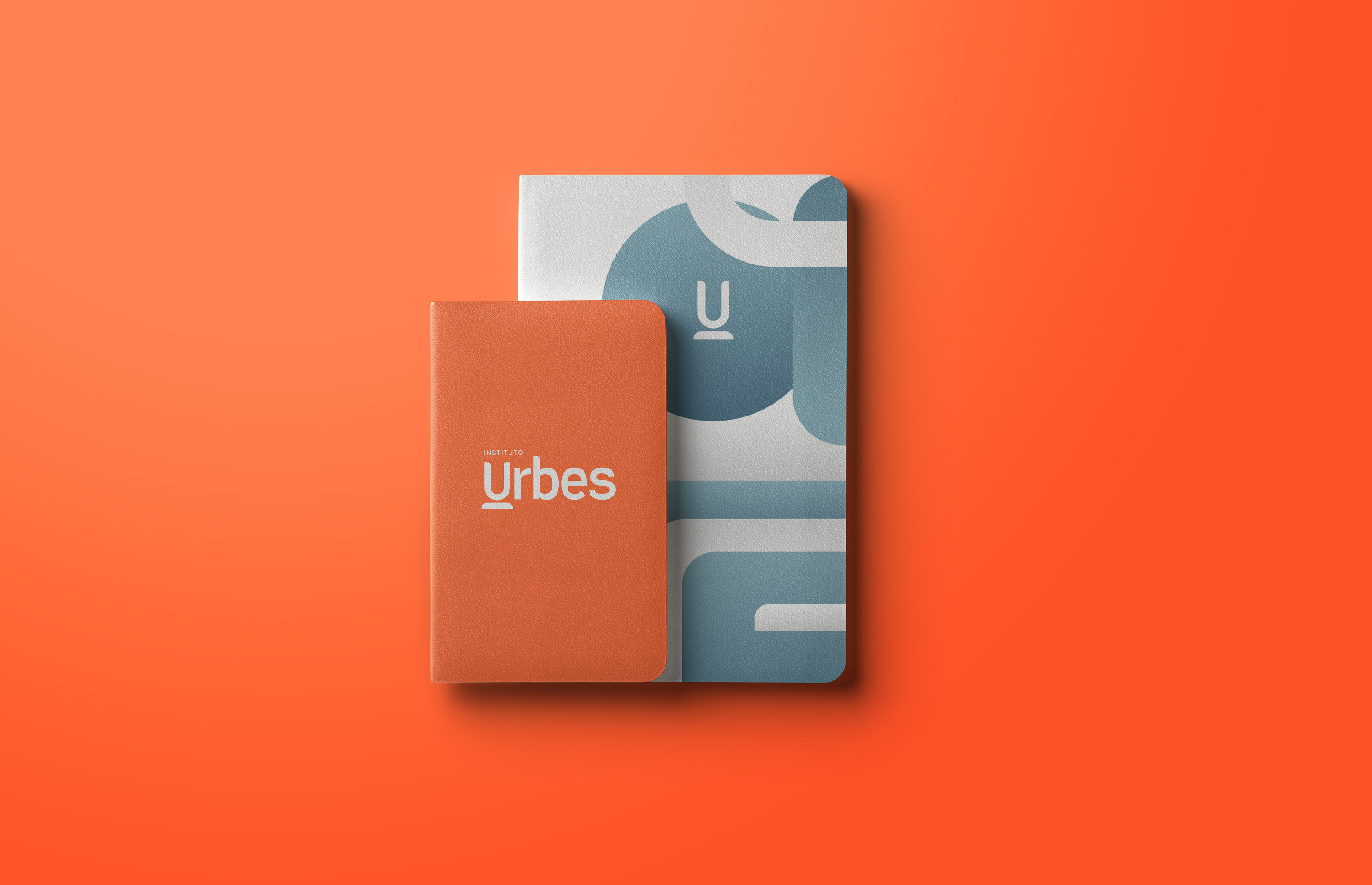
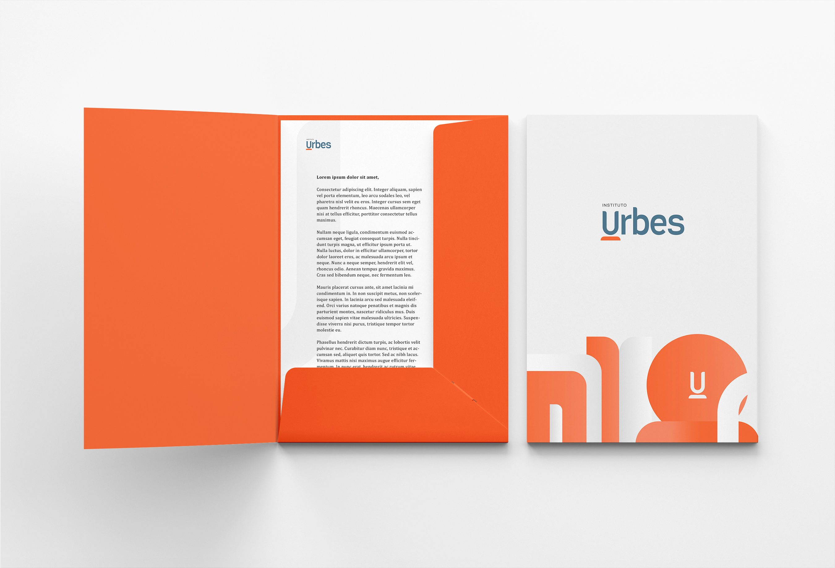
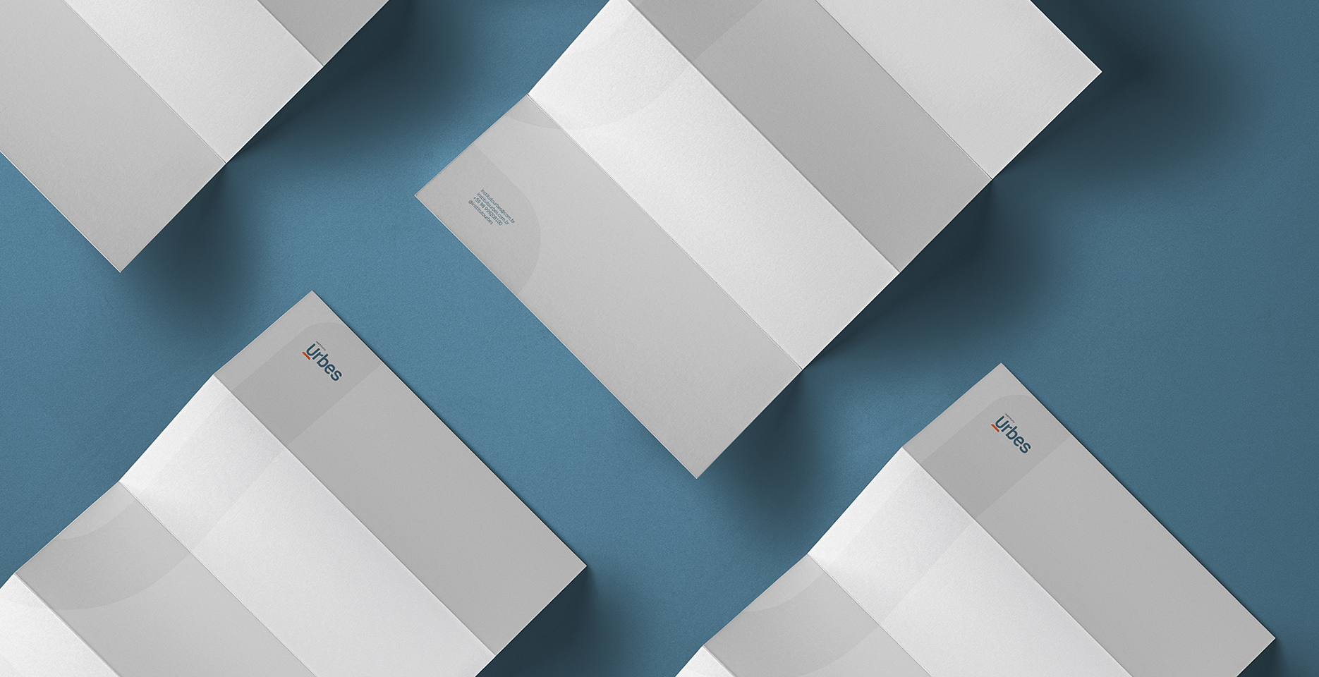
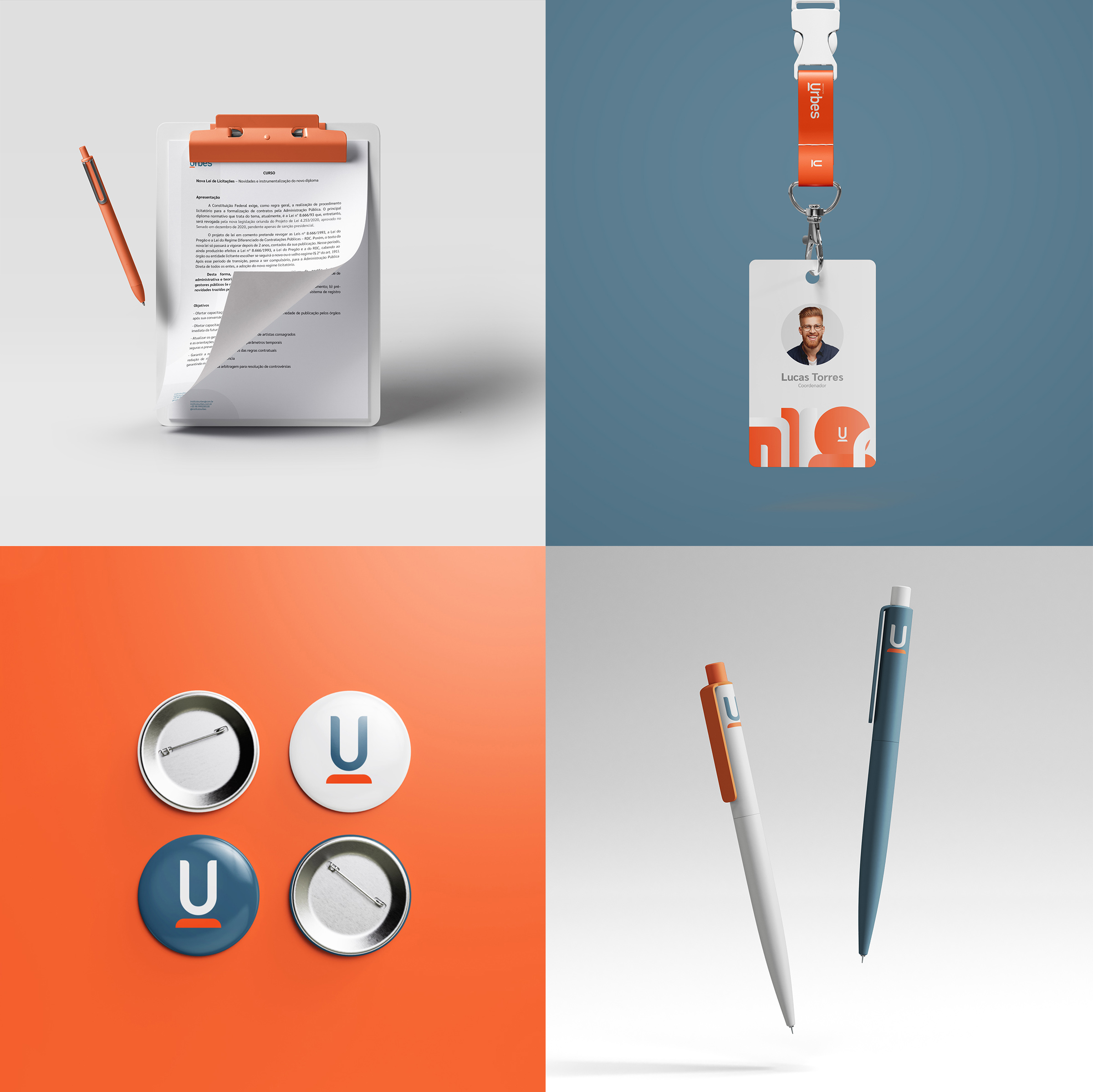
Solution: In order to create the new brand, it was necessary to represent the essence and purpose of the Institute, an analysis was made of the attributes and characteristics that the company wanted to transmit, and based on the information collected, to develop the visual elements. The visual identity unites modernity and lightness to a very conservative area, and becomes closer to the public, through clean visual language, thus generating a more humane brand. In a minimalist and modern way, all the visual elements have been carried out effectively to create a brand where aesthetics and functionality go hand in hand.
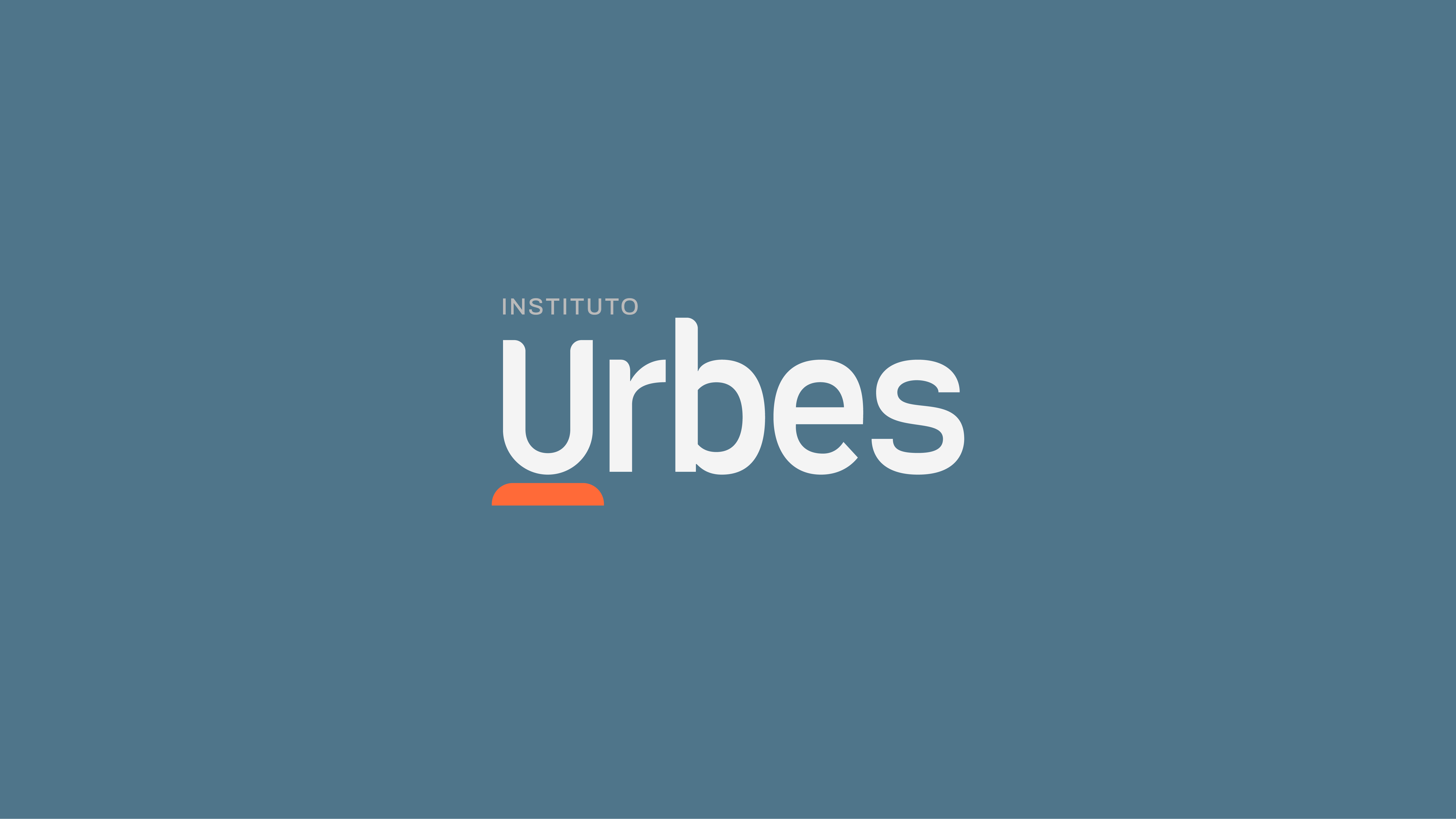
Concept: The concept arose from keywords that are part of the institution’s universe. Knowledge, training, professional development, innovation, approximation We seek inspiration from the figurative sense of the magnet, something that causes attraction. Therefore, the symbol consists of the letter U, which represents the magnet and a base, which represents all the attributes that are part of the professional competence. The symbol is incorporated into the logo, which was designed exclusively for this project, expressing uniqueness and originality. In addition, its readability, clarity and minimalist aesthetics perfectly match the typographic style of the logo.

CREDIT
- Agency/Creative: Yuri Rodrigues
- Article Title: Brand Identity for Instituto Urbes by Yuri Rodrigues
- Organisation/Entity: Freelance, Published Commercial Design
- Project Type: Identity
- Agency/Creative Country: Brazil
- Market Region: South America
- Project Deliverables: Brand Architecture, Brand Identity, Brand Strategy, Branding, Graphic Design, Research
- Industry: Education
- Keywords: Visual Identity, Institute, Logo, Branding, Instituto Urbes, minimalist, Yuri Rodrigues design


