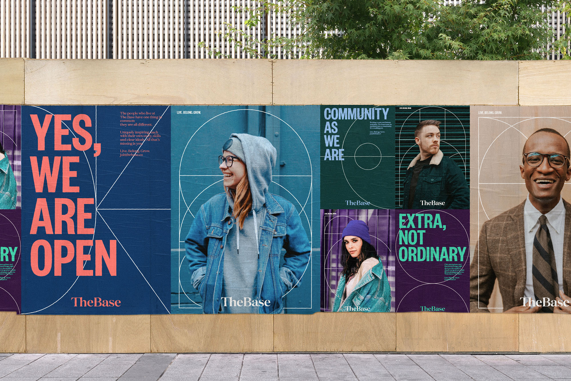
Frankfurt-based design studio Arndt Benedikt has developed the corporate design for The Base – a co-living provider headquartered in Berlin – and rolled it out across all digital and analogue touchpoints. The Base aims to provide co-living services at urban locations throughout Germany and in various European cities. Alongside its stylish apartments, the company provides community co-working, kitchen, restaurant, gym, meditation and cinema facilities. The Base is planning to open at least 15 complexes by 2025, with the first set to open in Berlin later this year.
Connecting the dots
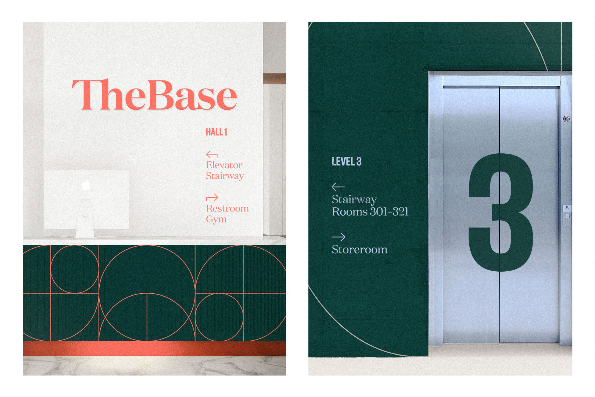
Arndt Benedikt’s first step was to workshop a suitable brand strategy that reflected the vision, mission and values of The Base. Based on the co-living provider’s vision of “creating unique locations worldwide that inspire, connect and redefine urban living”, Arndt Benedikt brought its full range of services to bear on the task: from positioning and defining the brand identity to developing the corporate design – including digital and analogue applications and interior design aspects. The concept behind the overall corporate design is based around the core values jointly identified by Arndt Benedikt and The Base: openness, diversity, a community-centric focus and a stylish yet functional living concept. The overall design framework revolves around the principle of “connection” in that it incorporates all the individual contrasting elements into a whole.
A visual system aligned with the brand essence
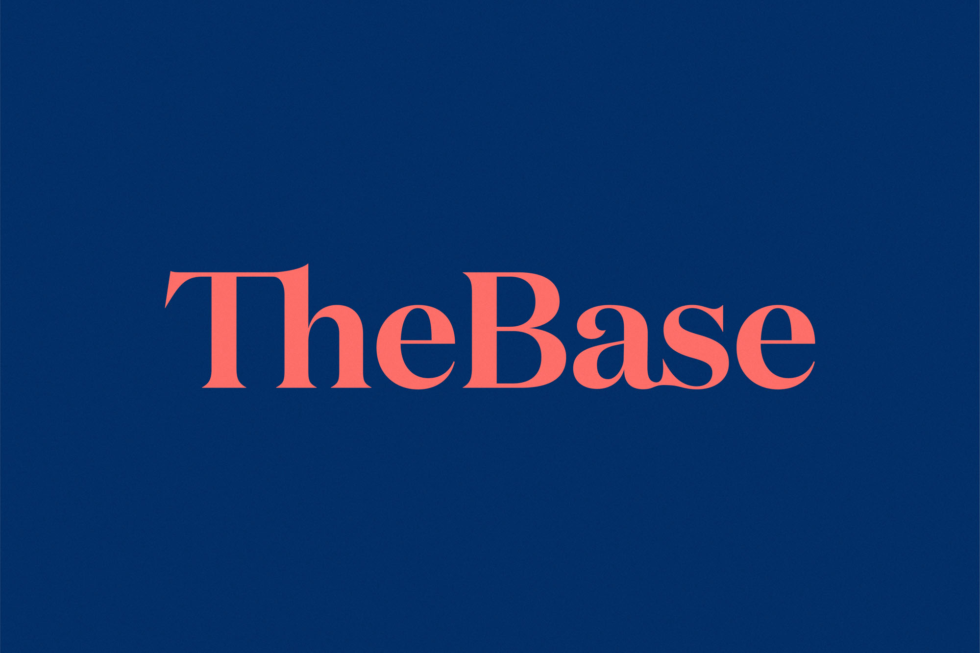
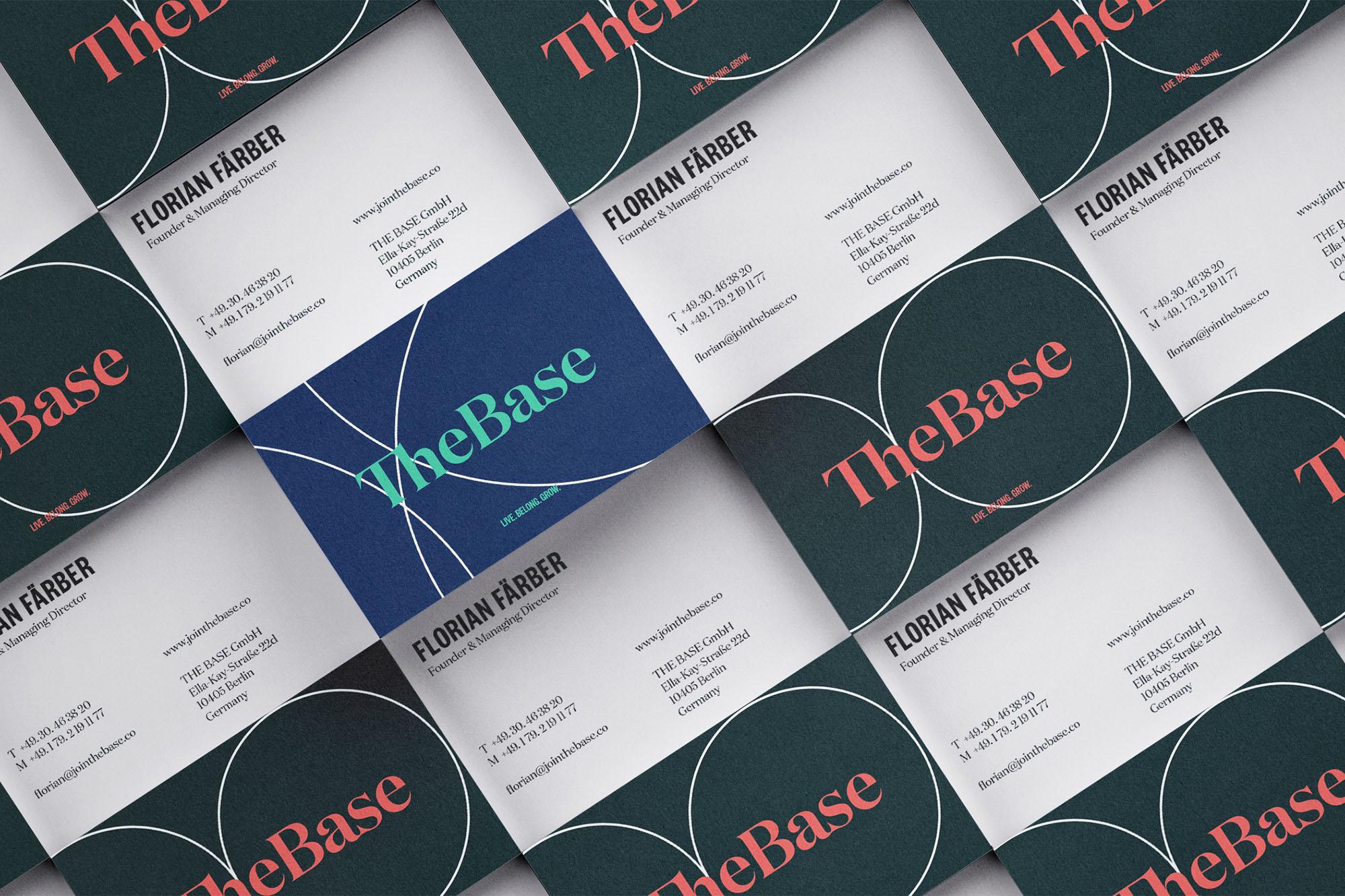
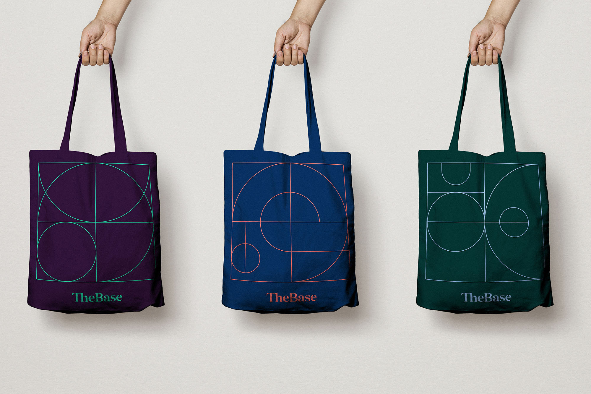
The Base’s unique logotype consists of converging ligatures to emphasize the themes of “connection” and “community”. Recurring patterns that vary slightly in different contexts form the core element of the resulting design language. The shapes that arise and the creative interplay between these patterns are an expression of unity and diversity. When combined with bold, contrasting colors, these patterns become aesthetically pleasing, visually arresting and striking all at the same time.
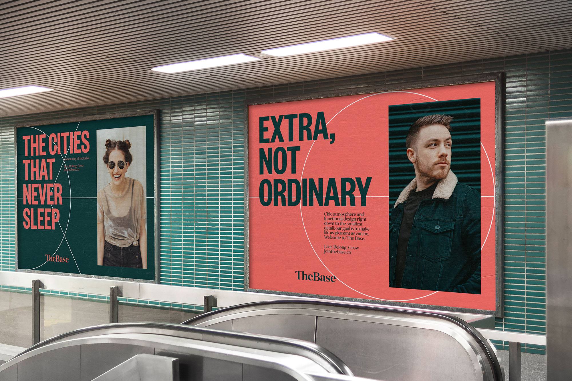
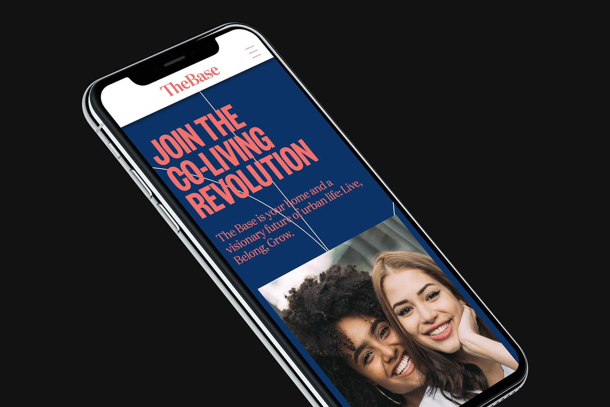
Arndt Benedikt drew on a mix of fonts and imagery to visually reinforce the notion of diversity, and contrasted Antiqua Canela with the narrow typeface Founders Grotesk Condensed for maximum effect. For the photos, the focus was on the future residents, all of whom embody the open-minded, vibrant attitude inherent to The Base.
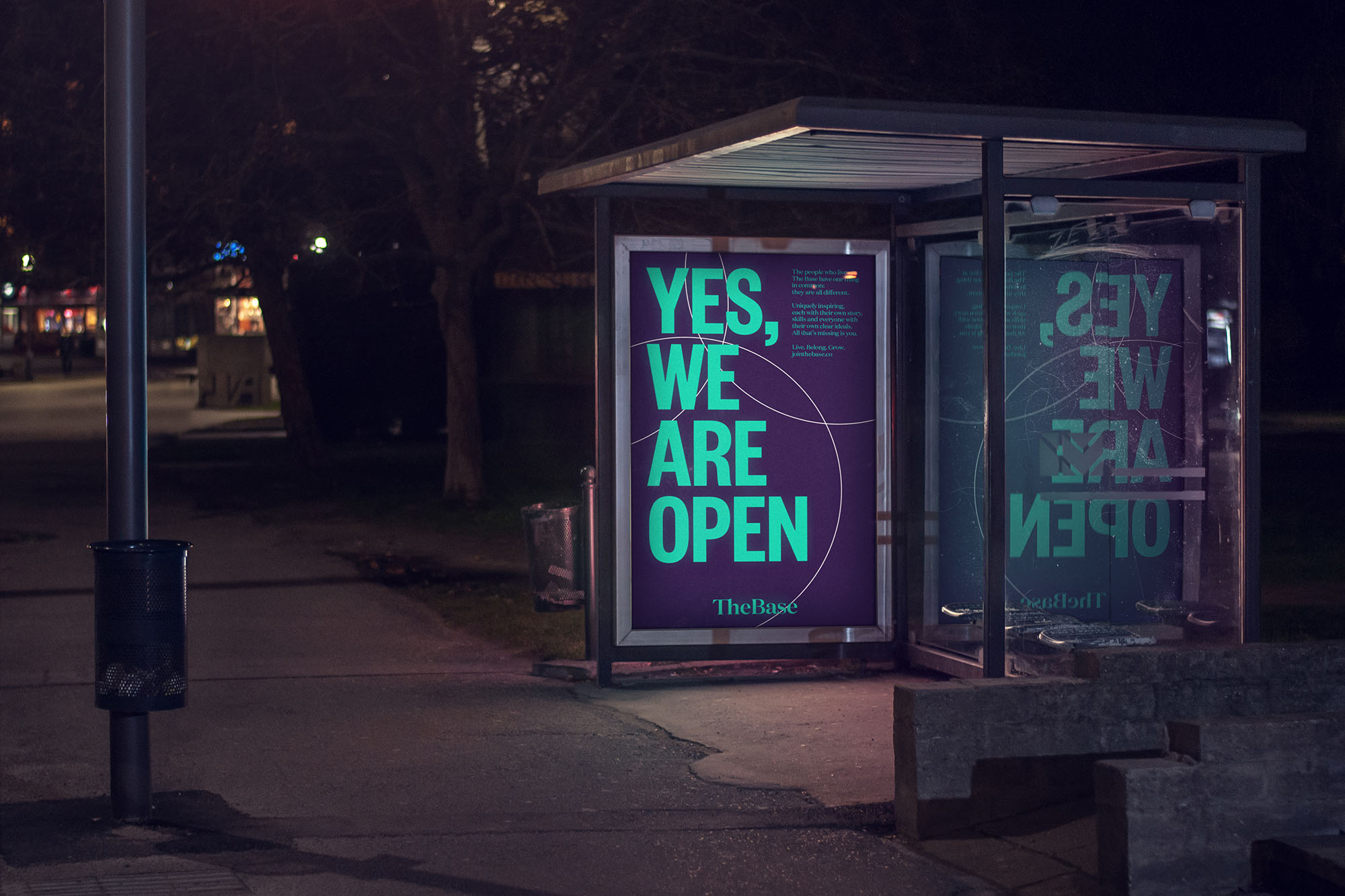
This is an assertive visual system that is flexible and easy to use, and can be carried across to all touchpoints: from print publications to websites, bus billboards to online banners and booking apps to wall decorations. The result is a dynamic, powerful visual identity at the intersection of information and inspiration which places people firmly at its center.
Guidelines for a consistent tone of voice
To further reinforce the brand’s identity, Arndt Benedikt also settled on a tonality to be used when writing texts for target groups and specific occasions. This ensures consistent communication across all channels for optimum community management. Arndt Benedikt oversaw the creation, editing and design of the initial texts (including the website and various ad materials).
“All applications are a direct reflection of what The Base stands for: connection, community and diversity. This is why the fundamental elements – including the logo, fonts, color palette, shapes and design system – are based around these values. Our priority was to take the brand essence, convert it into a visual concept and create a consistent brand experience,” explains Falko Ohlmer, one of the two managing directors of Arndt Benedikt.
CREDIT
- Agency/Creative: Arndt Benedikt
- Article Title: Brand Identity for Co-Living Space The Base by Arndt Benedikt
- Organisation/Entity: Agency
- Project Type: Identity
- Project Status: Published
- Agency/Creative Country: Germany
- Agency/Creative City: Frankfurt am Main
- Market Region: Europe
- Project Deliverables: 2D Design, Brand Design, Brand Experience, Brand Guidelines, Brand Identity, Brand Naming, Brand Strategy, Brand Tone of Voice, Creative Direction, Film, Web Design
- Industry: Real Estate
- Keywords: co-living, space, branding, young professionals,
-
Credits:
Creative: Arndt Benedikt


