


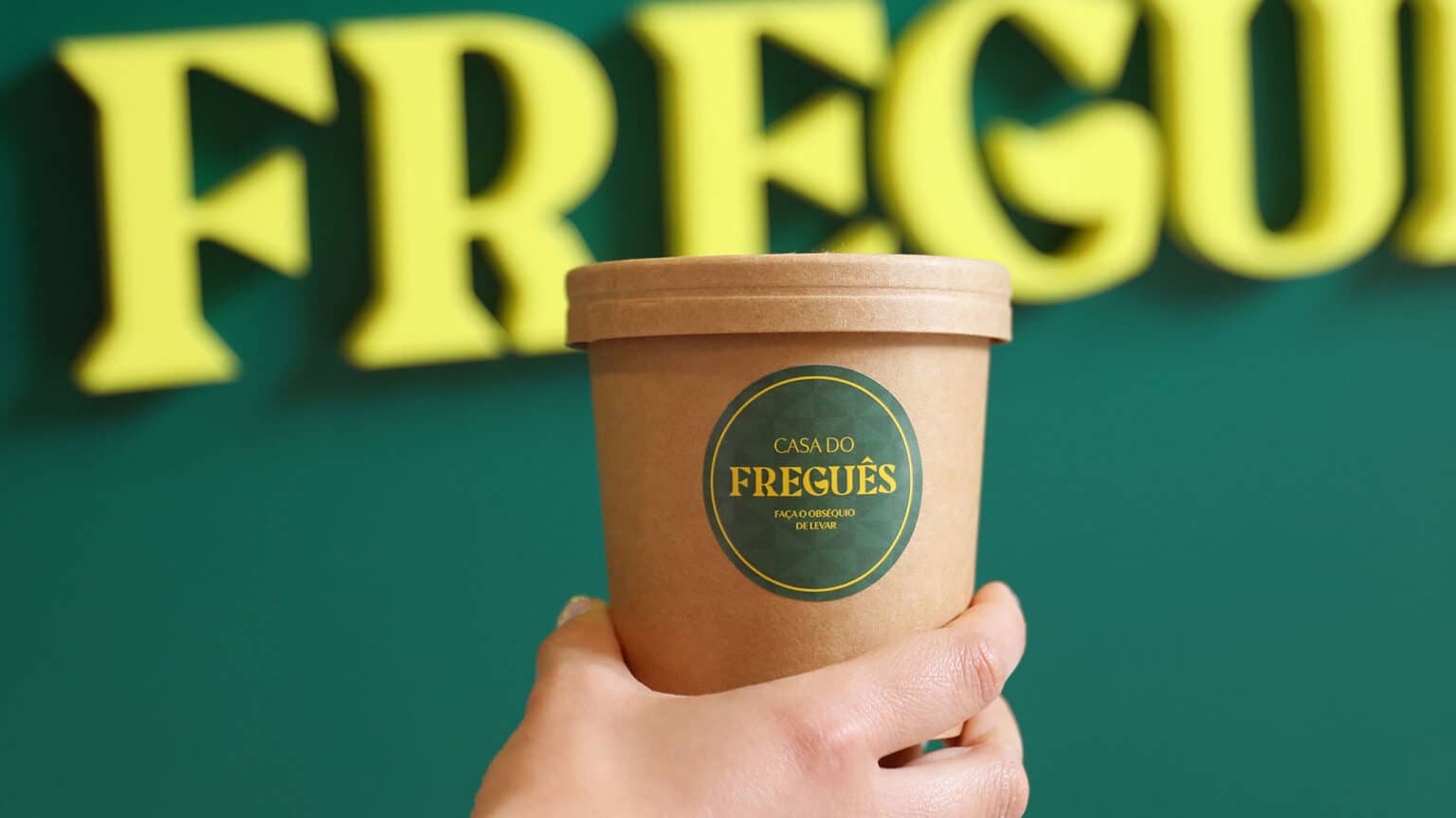
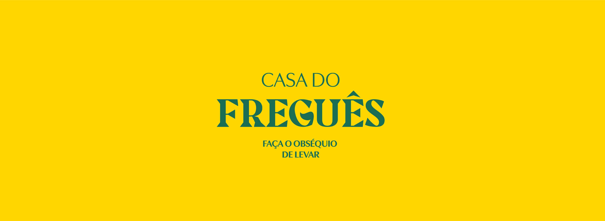
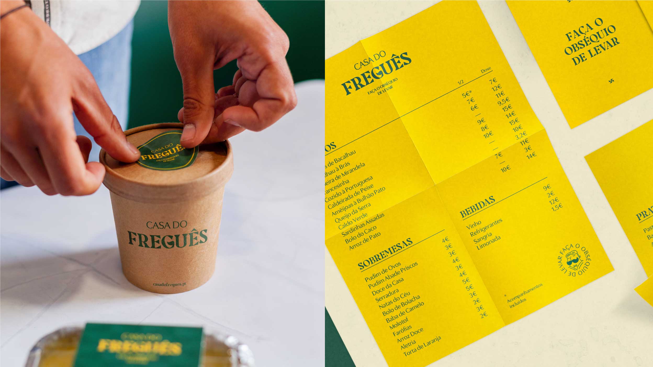
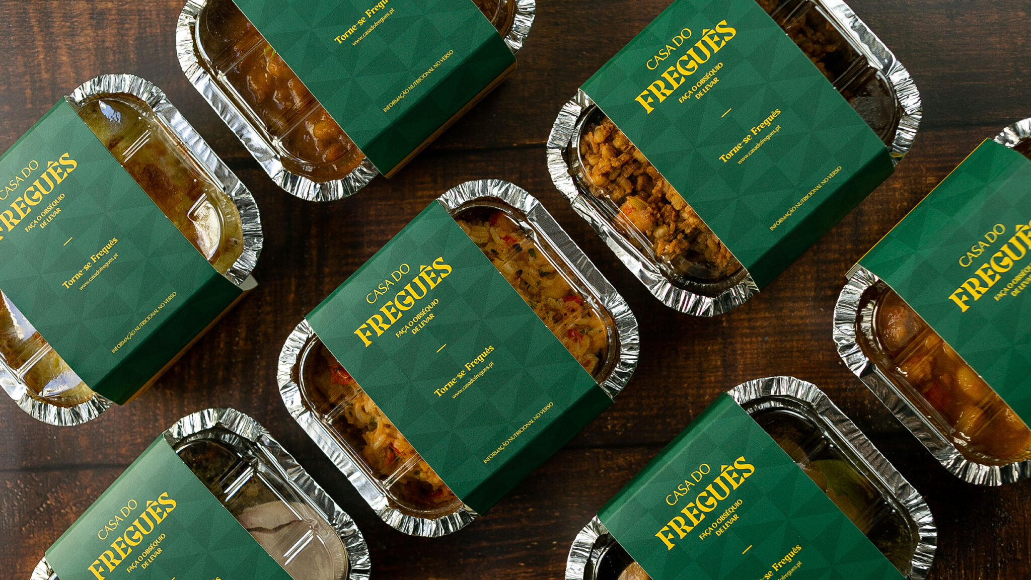
Casa do Freguês, with means “customer’s house” is a take away and delivery restaurant serving traditional Portuguese dishes with a modern twist. The brand creates a calling for the “Fregueses” witch is an old saying word for the local classic old same customers.
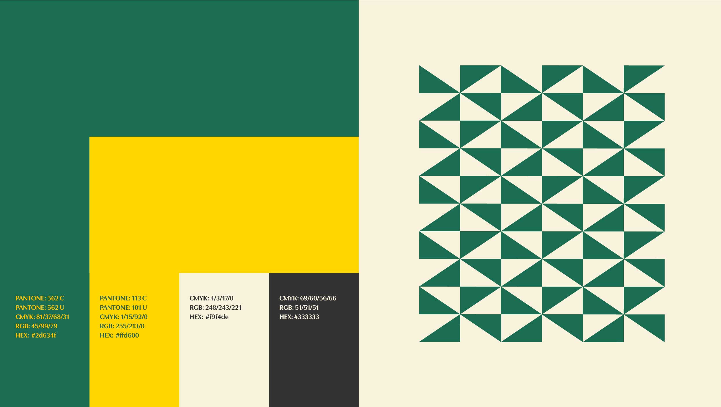
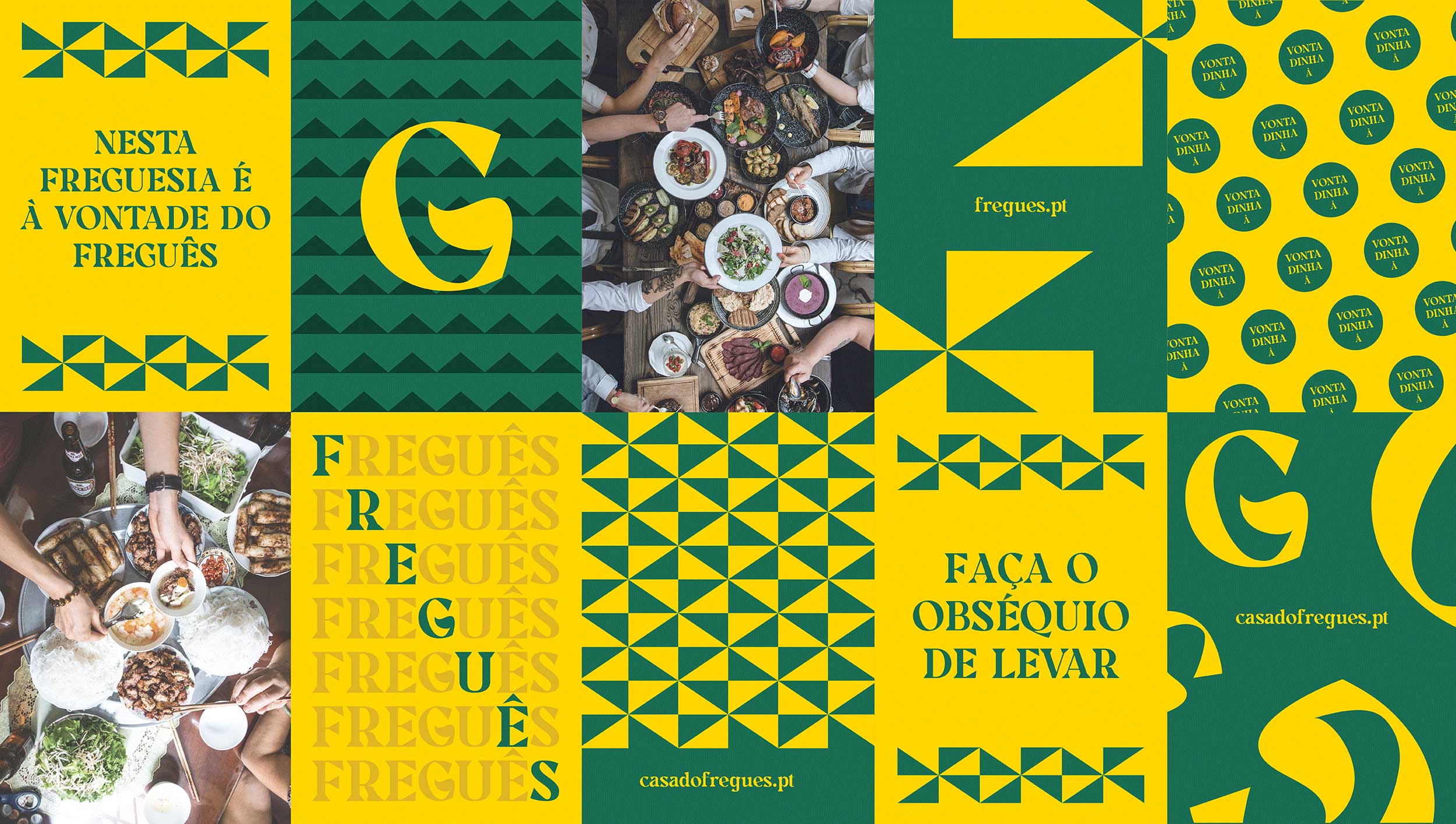
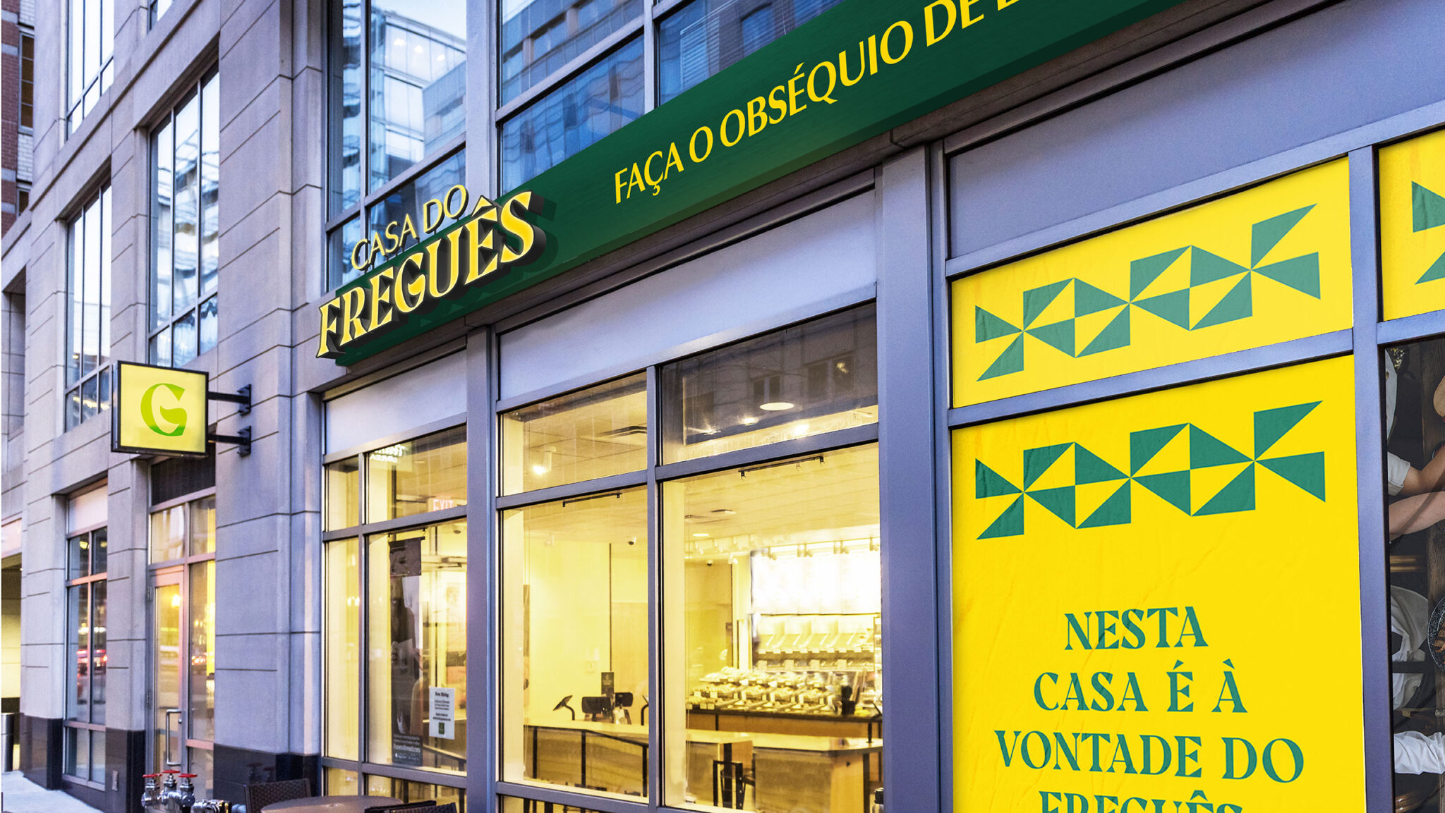
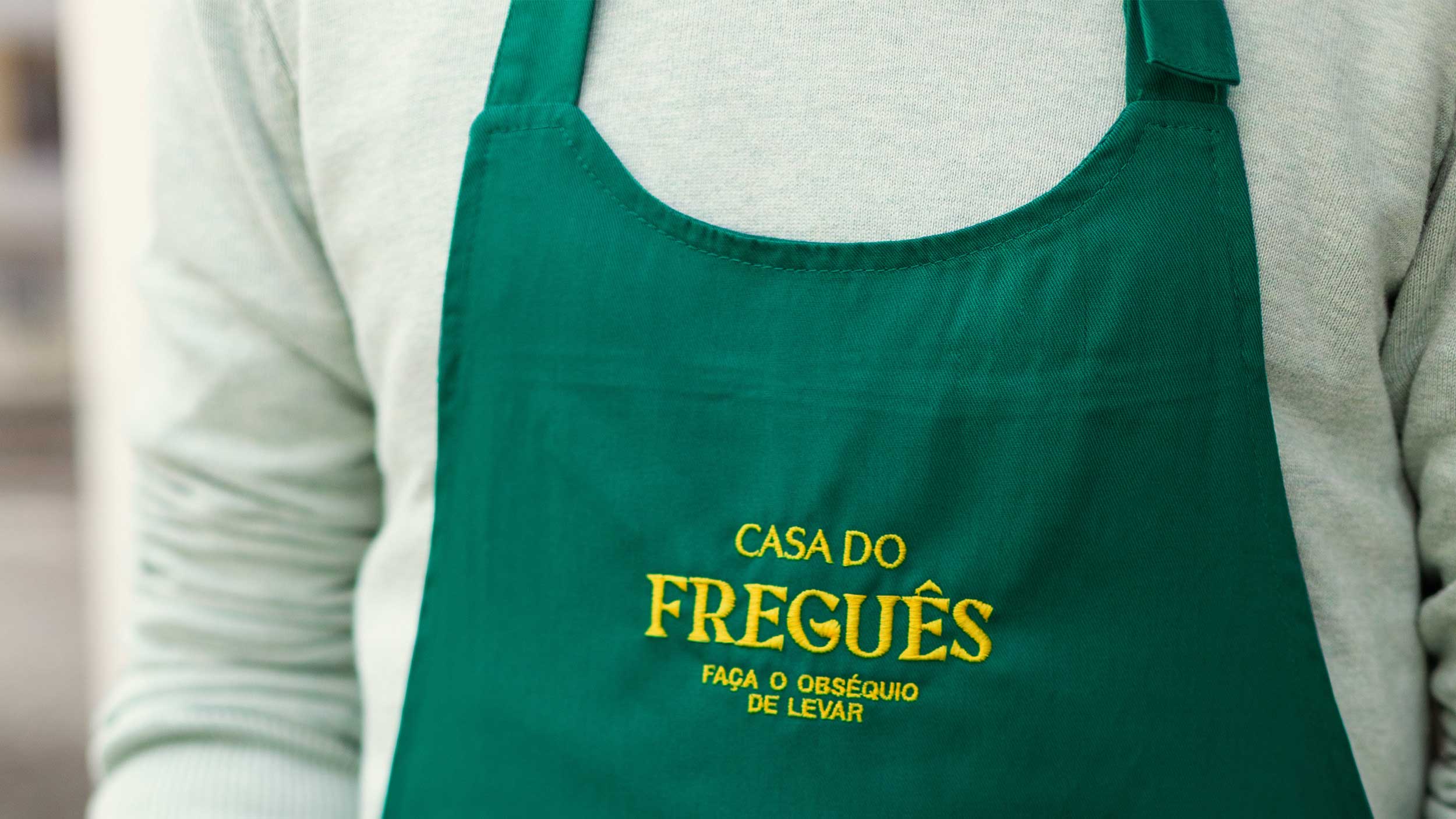
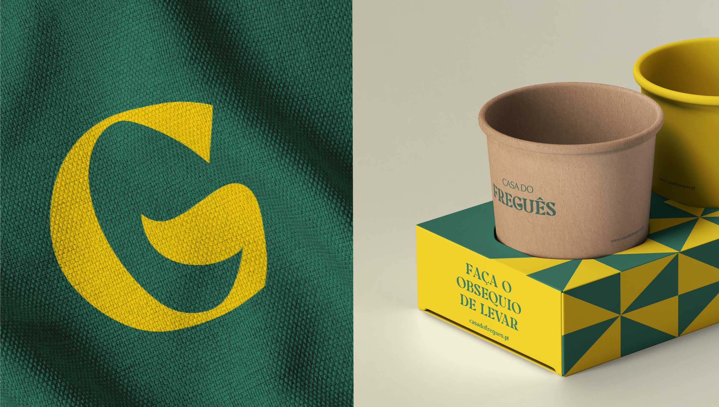
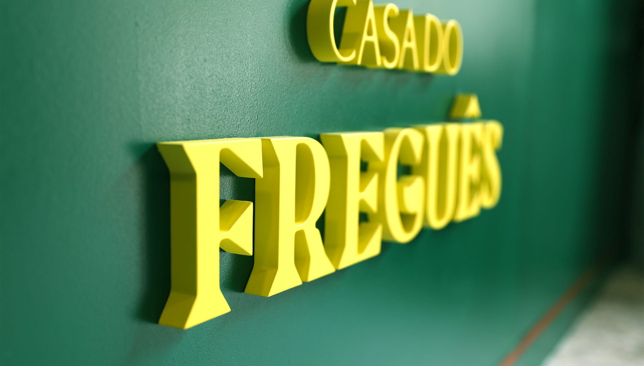
The Challenge: Create a takeaway brand that serves its food in Lisbon that favours strong and old relationships with costumers. With the aim of recovering the sense and community spirit of yesteryear, our main inspiration came from the authenticity of Lisbon’s typical neighborhoods with its old classic green windows and arcades and yellow local trams. Since the brand will only be working in Lisbon, we used Lisbon’s flag geometric triangles to enrich and support the visual identity. The logo was created with a mustache of a “freguês” — and old loyal customers. These customers were warmly nicknamed “freguês” (a typical old way of saying “customer” in Portuguese), which expresses a feeling of loyalty to the regular customers. They used to be represented as a small and “strong” man with a very charismatic mustache.
The brand messaging is friendly and inviting as the “the jester” architype which is a call to regular costumers to check in for a take away in their everyday store in their neighborhood. It uses fun and playful jokes on its social media communication to empathize the close and authentic relationship it desires to have with its close costumers. Casa do Freguês is the ideal place to order tasty Portuguese food and celebrate what it is like to be a true local Portuguese.
CREDIT
- Agency/Creative: d'front
- Article Title: Brand Identity for Casa do Freguês
- Organisation/Entity: Agency
- Project Type: Identity
- Project Status: Published
- Agency/Creative Country: Portugal
- Agency/Creative City: Cascais
- Market Region: Europe
- Project Deliverables: Brand Design, Brand Guidelines, Brand Identity, Brand Strategy, Creative Direction, Design, Logo Design, Web Design
- Industry: Food/Beverage
- Keywords: Take Away, Food, Branding
-
Credits:
Art Director and Designer: Sebastiao Seguro
Designer: Ana Rita Velho
Copy and Designer: Maria Inês Pinheiro


