


London based design agency Free The Birds has created a new brand identity and positioning for FFS, the UK’s first and biggest direct-to-consumer women’s shaving brand. The new identity will be rolled out across the brand’s assets through July 2020.
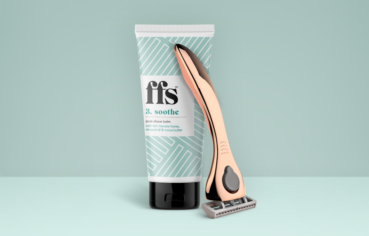
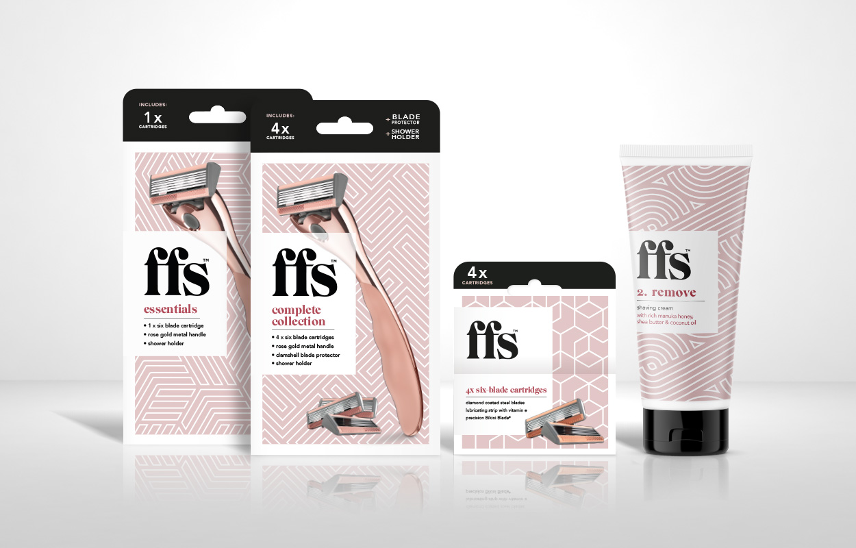
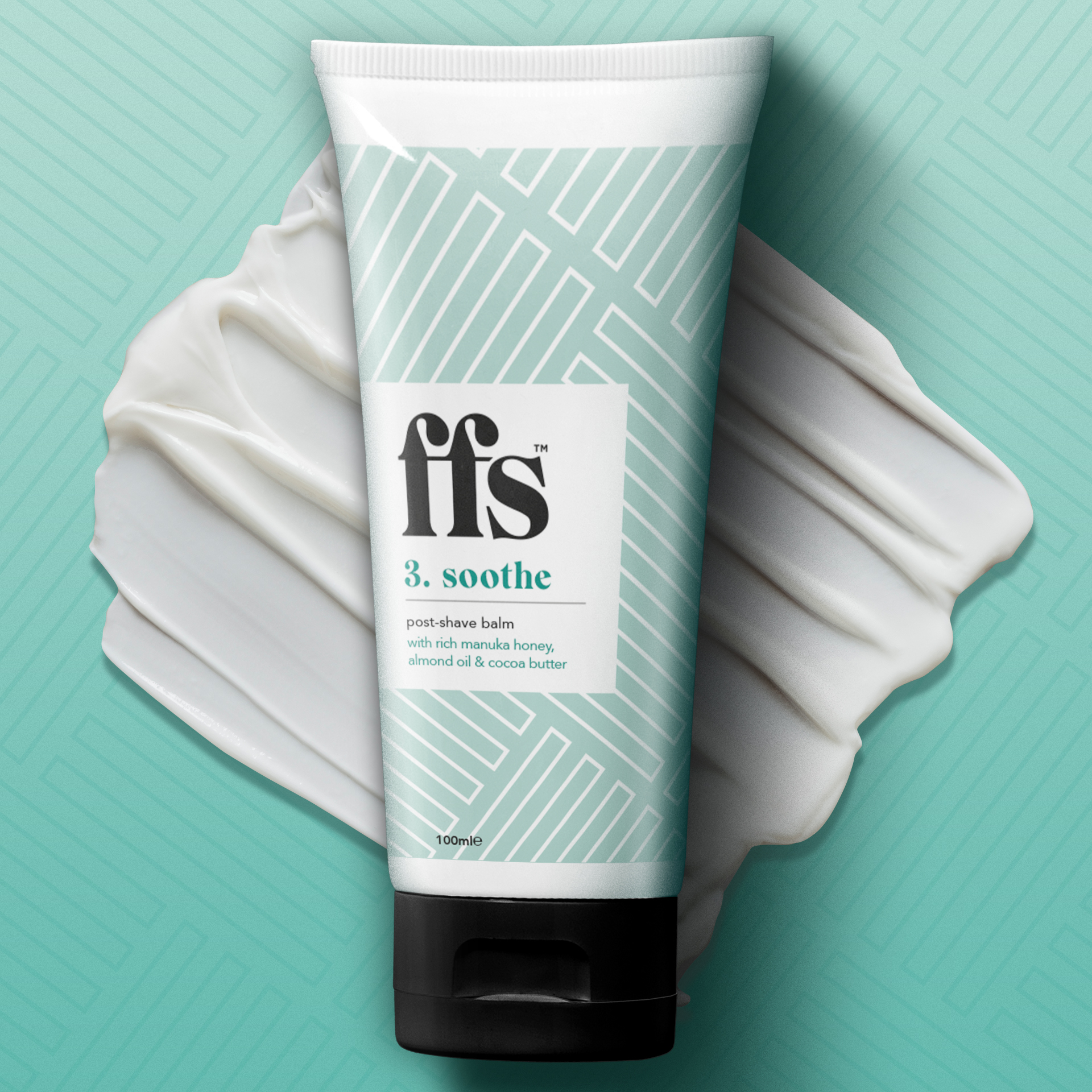
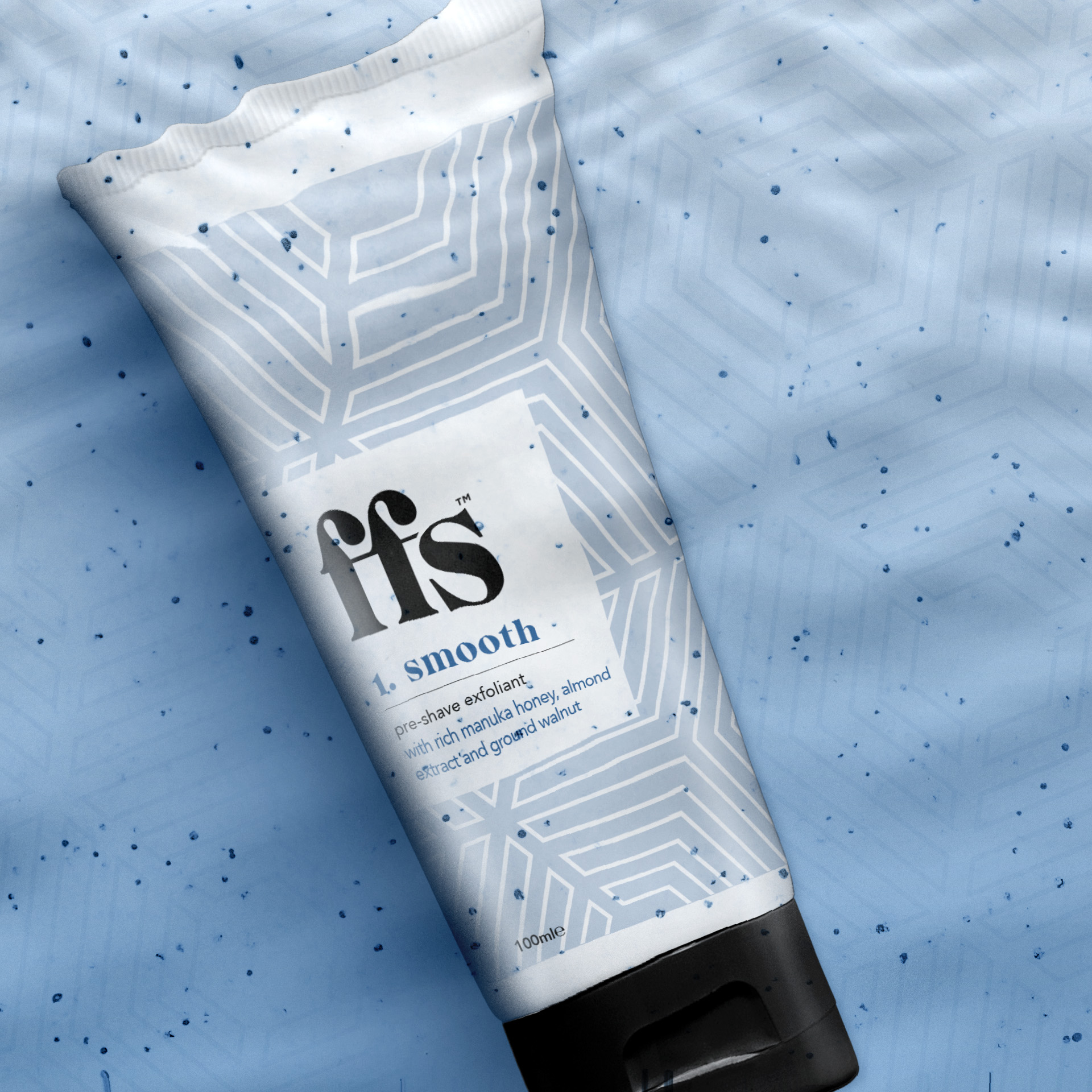
Free the Birds has updated the FFS logo and introduced a new, premium aesthetic using a distinctive white geometric pattern on a pastel colour palette, enhanced by an accent of a darker, richer colour. A new tagline, “Beauty should be effortless,” reflects the brand’s ethos: to make beauty routines and purchases easier through a subscription service delivering quality products.
The FFS brand name, which originally stood for “Friction Free Shaving,” has been evolved to unlock visual and verbal twists on the acronym. As part of the identity, Free The Birds came up with modern-day alternative meanings to resonate with its audience – to include everything from “For fun’s sake,” and “For fabulousness’s sake” to “For fairness sake” and “For future’s sake.” The new design will launch across the brand’s social media content and web design also during July.
FFS Beauty designed the first ever metal-handled razor for the female market which won Product of the Year 2019 for its iconic rose gold finish. The razor handle is manufactured in the UK, along with all FFS shaving and beauty products (excluding the blades which are made in Germany) making it one of if not the most carbon-neutral shaving brands in the country. It has also created a range of bespoke, supporting and cruelty free products, keeps plastic to a minimum and runs the UK’s first blade recycling scheme – something that has proved a huge hit with its customers.
CREDIT
- Agency/Creative: Free The Birds
- Article Title: Brand Identity and Positioning for FFS The UK’s First And Biggest DTC Women’s Shaving Brand
- Organisation/Entity: Agency, Published Commercial Design
- Project Type: Identity
- Agency/Creative Country: United Kingdom
- Market Region: Europe
- Project Deliverables: Brand Advertising, Brand Architecture, Brand Creation, Brand Design, Brand Experience, Brand Guidelines, Brand Identity, Brand Redesign, Brand Refinement, Brand Rejuvenation, Brand Strategy, Brand World, Branding, Identity System, Packaging Design, Rebranding, Retail Brand Design, Tone of Voice
- Industry: Health Care
- Keywords: Brand Identity, Brand World, Packaging


