


Background: Motta has always been standing out as a House of Brand built on product brands that have been confirmed over time as real hero products, range progenitors. The Girella brand is one of these and research carried out shows that there is excellent awareness of the brand, giving Girella great potential with positioning centred on the sweet-tooth area of the market.
Strategy: By nature, Girella is ‘honestly proud of being delicious’, unique, extravagant, proudly ‘indulgent’ and with a tone of voice that is always ‘irreverent, funny and playful’. The playful irreverence of Girella is the key to making the product still modern, intriguing, engaging and relevant for the reference public.
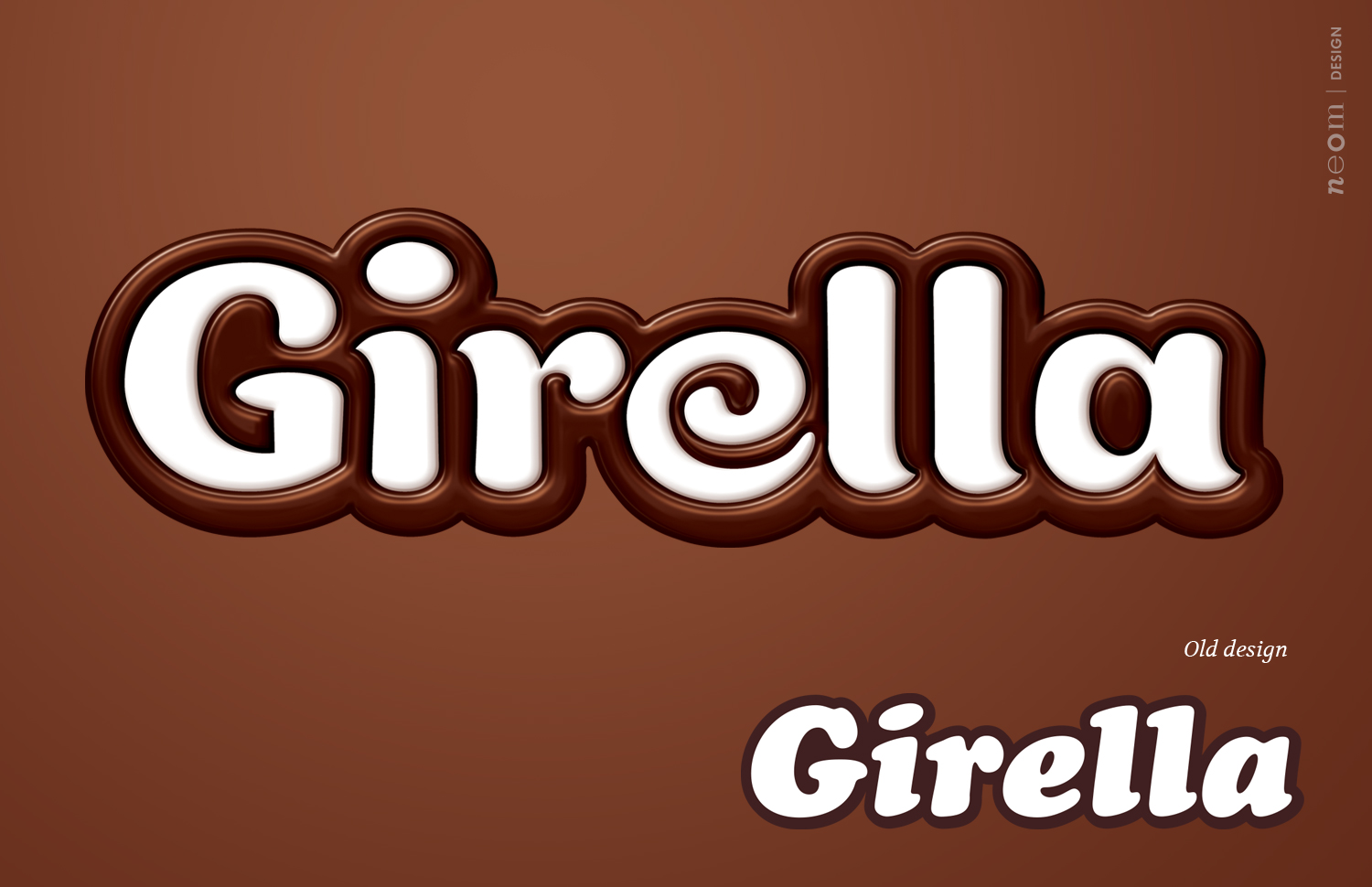
Project: The project has been developed to bring out the essence of Girella, exactly specified by the new positioning. In effect, during the cathartic time of evolution, two key questions come to mind – how much to hold back, and how much to dare? This project is an excellent example of where the desire to dare has been balanced by wisdom; a completely new logo which leaves behind the old one but, at the same time, is able to enhance the originality of the brand and the product. Now, it displays the dizzily delicious essence of the brand at one glance.
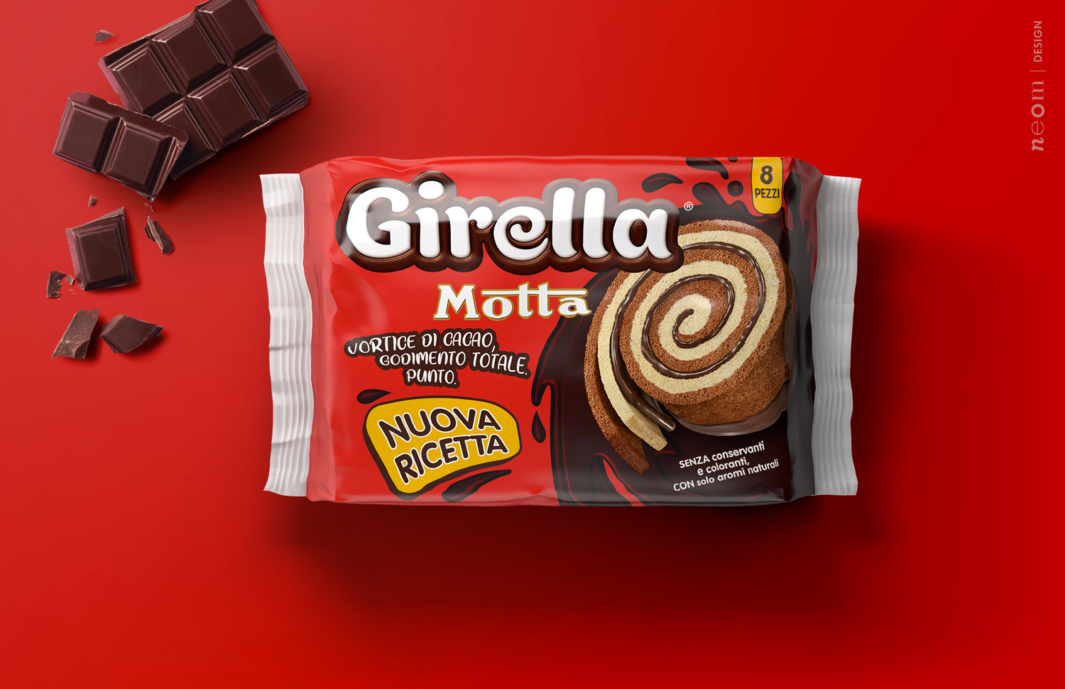
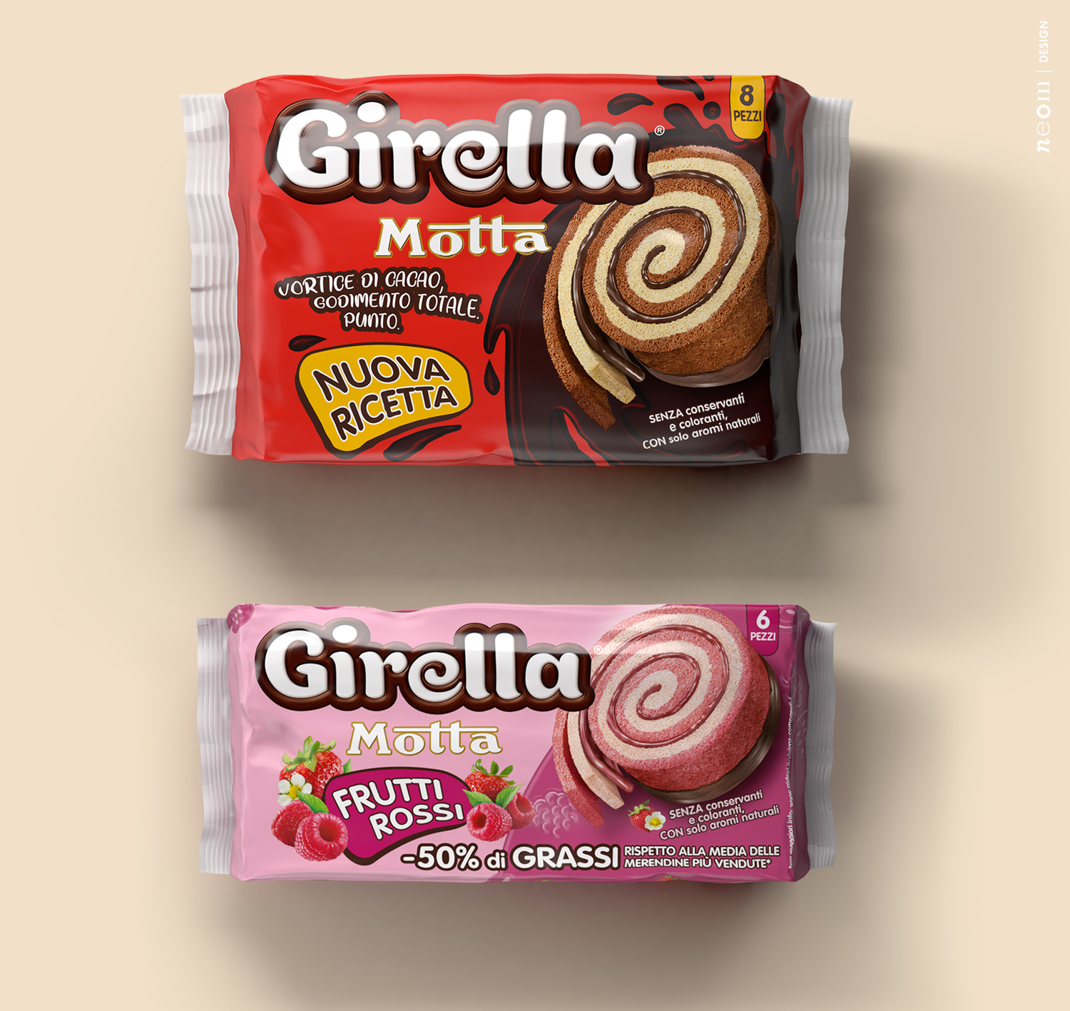
At the same time, the layout, which broadly maintains the historic chromatic impact, will be revolutionised to enhance the uniqueness of the product. The three-layer structure, seen almost in its entirety, shows the desire for a contact with the public. The backdrop, purposely playful and chocolatey, stays in the background so that the product can be the key player while leaving enough space for the claims to explain that the new Girella is without colourants and preservatives.
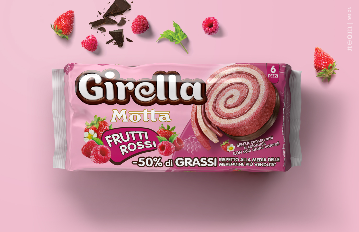
Alongside the traditional chocolate, there will also be the new Girella ai Frutti Rossi (Girella with Red Fruit) whose very nature, while maintaining the promise of tastiness and enjoyment, will send a clear invitation to a public wanting a fruitfully involving alternative. The new proposal was especially liked by the reference target and ‘Instagram people’ in particular as it’s an ideal product for taking photos.
CREDIT
- Agency/Creative: NEOM
- Article Title: Brand and Packaging System Identity Redesign
- Organisation/Entity: Agency, Published Commercial Design
- Project Type: Packaging
- Agency/Creative Country: Italy
- Market Region: Europe
- Project Deliverables: Brand Redesign, Brand Strategy, Graphic Design, Identity System, Illustration, Packaging Design, Rebranding, Tone of Voice
- Format: Flow-Pack
- Substrate: Plastic


