


Sophia Georgopoulou | Design – Meet Sweet
“Meet Sweet – a small-scale brand of hand-crafted, high-quality biscuits originating in China.
The Concept
It all started from a man’s inspiration. Chen Xiaoyu, the father of brand had a certain vision – He wanted to shine against the clutter of an endless number of run-of-the-mill biscuit options in China. The way to do this? Giving life to a line of biscuits that are as close as possible to the homemade ones – and the high quality that goes along. Through the biscuits, he wanted to recreate the warm, positive feelings associated with childhood and home-baking. The familiar environment of one’s first home, the captivating smells that fill the rooms, the eagerness until your mother gives the ‘go-ahead’ to go for the biscuits – all these constitute a happy, welcoming universe that all would gladly revisit.
Brand Logo & the Mascots
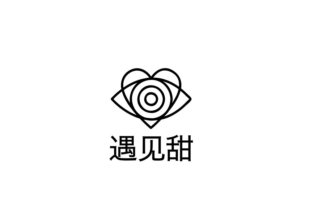
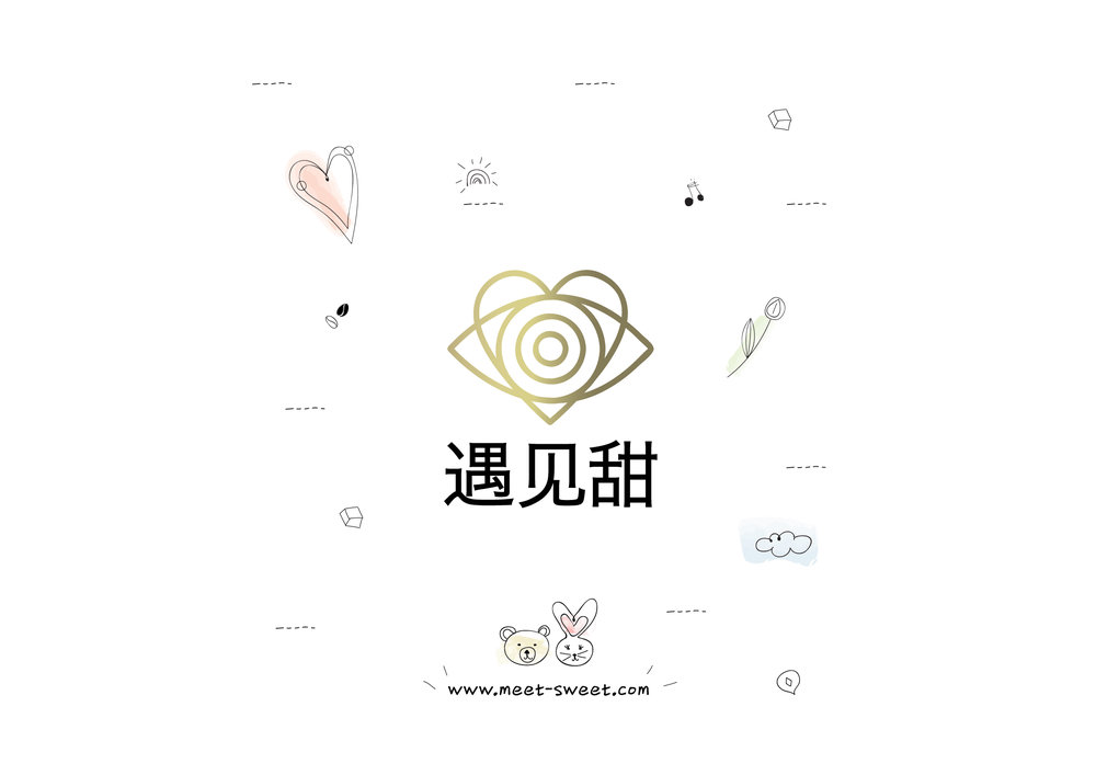
Naturally, design was called in to play a vital role in order to bring this vision and these feelings to life. The starting point is naturally the logo itself. The feelings that the brand had to evoke were clear from the start, and equally clear was the need to use a visual language that was simple and direct, yet emotional enough.
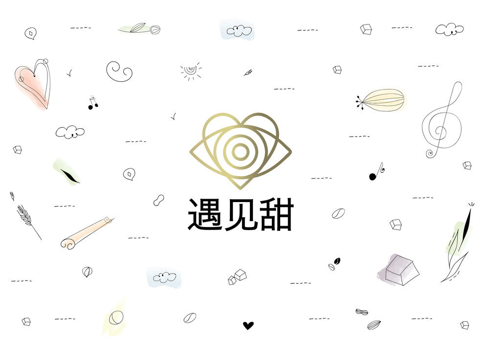
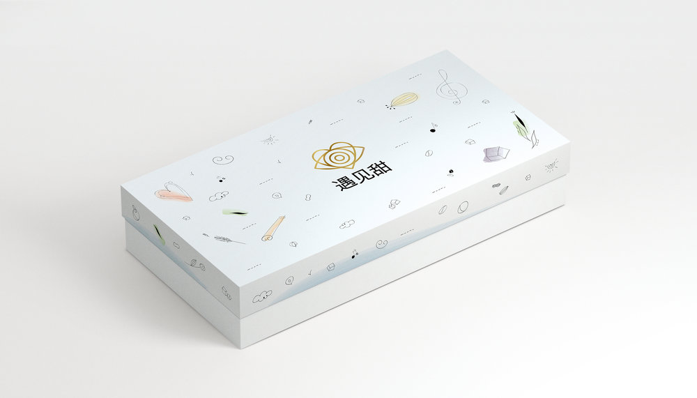
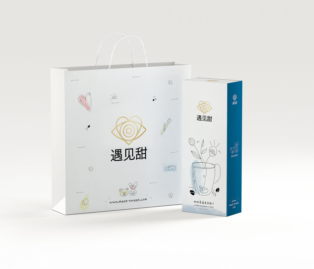
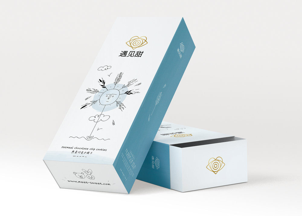
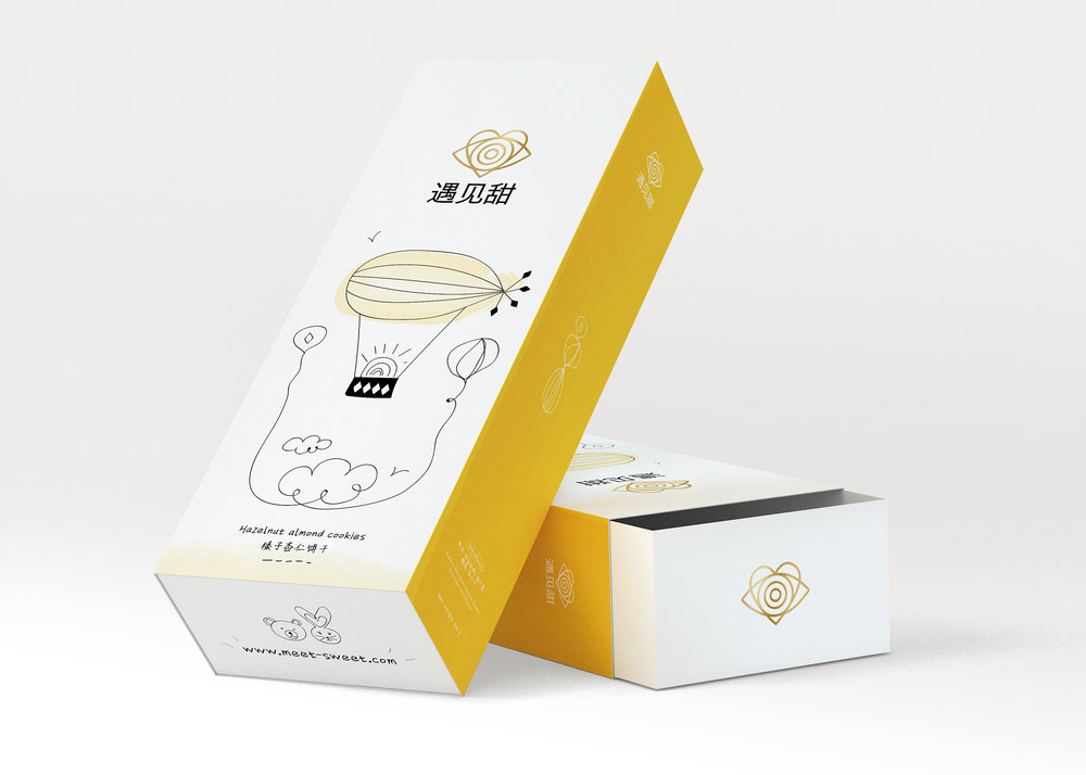
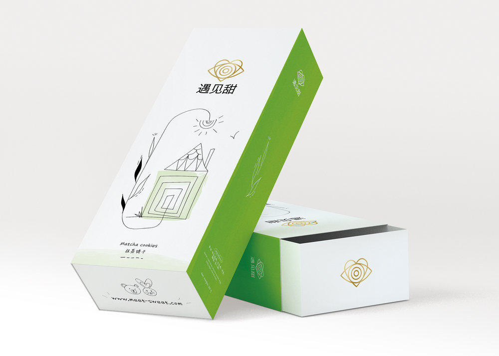
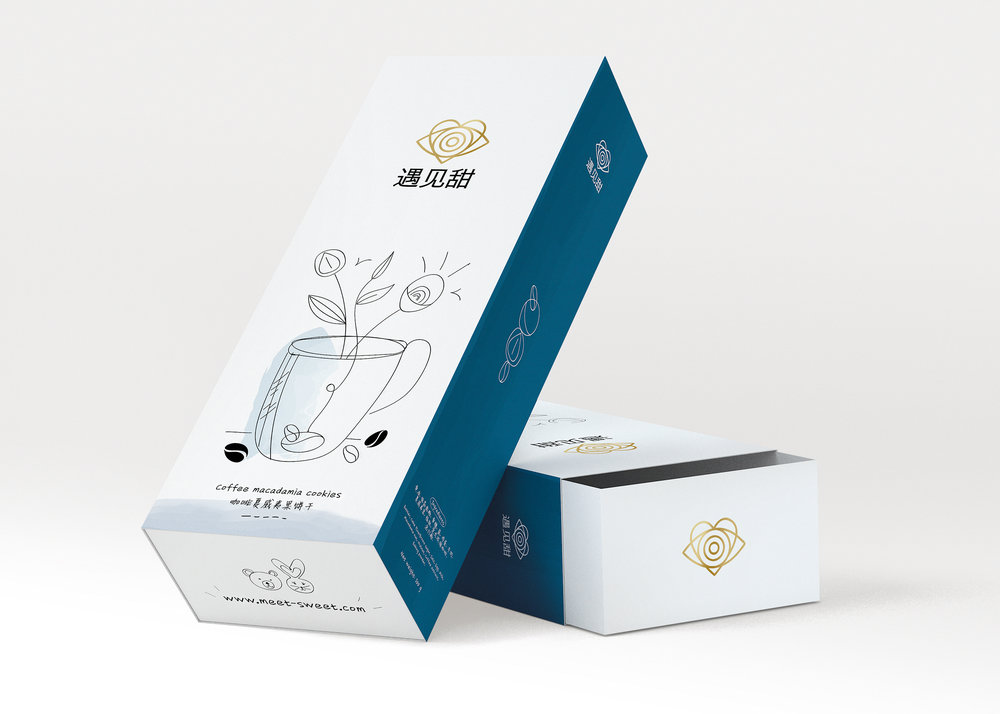
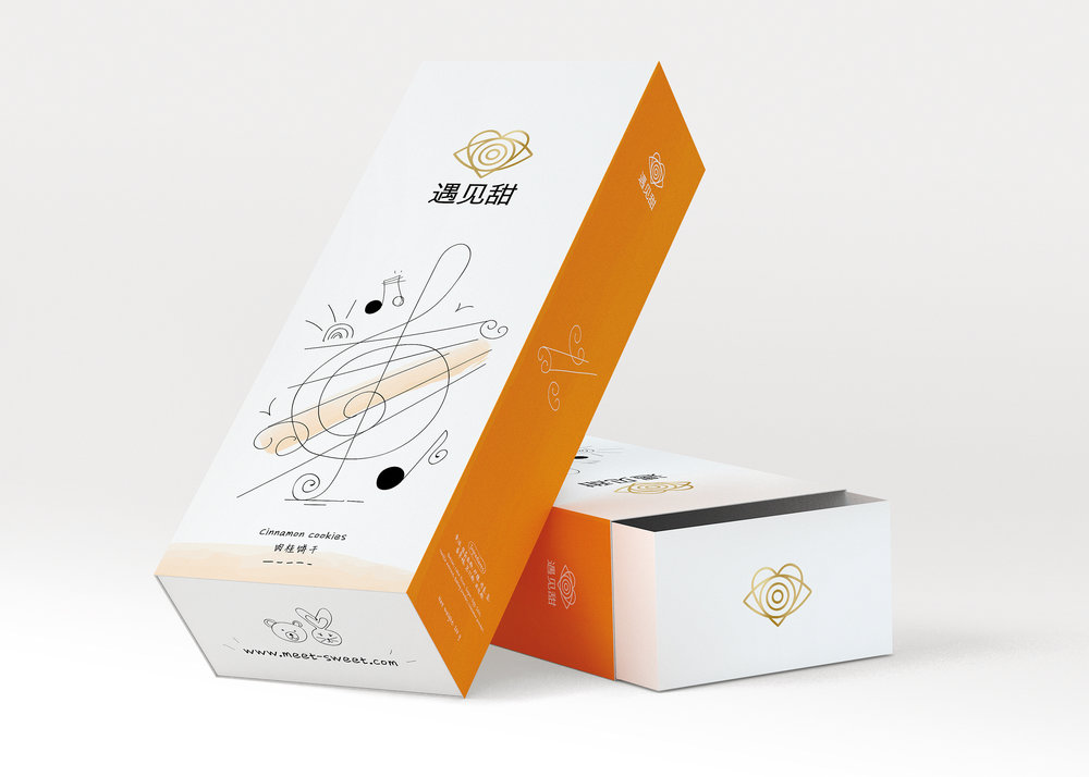
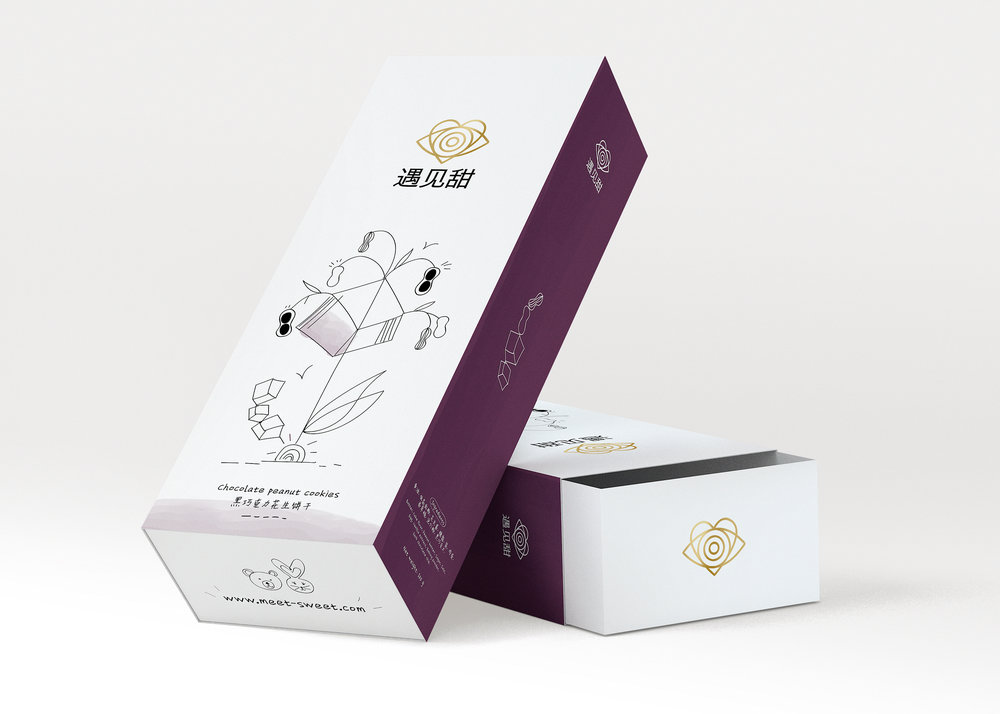
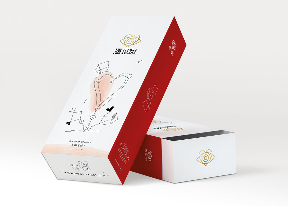
On the basis of this, we conceived a combination of a minimalistic eye (the eye stands for the process of ‘meeting’, ‘being introduced’) and a heart (that represents the “sweetness”) , drawn around concentric circles.
Complementing the identity elements, we introduced two brand mascots – a Bunny and a Bear. Drawn in the same intentionally simplistic and child-like manner as the main logo, the mascots reflect in their own way the spirit of the brand, while providing a useful platform for various variant- level applications and other brand expressions.
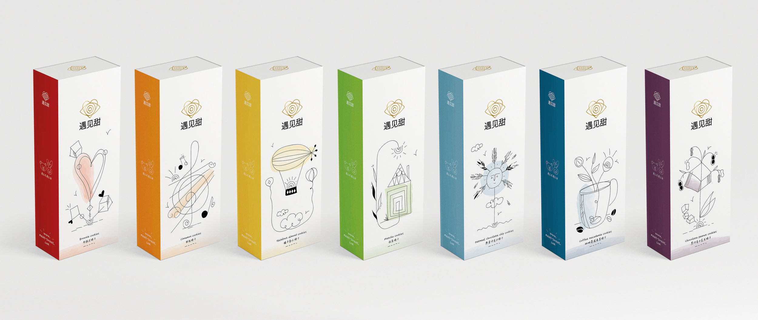
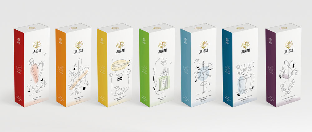
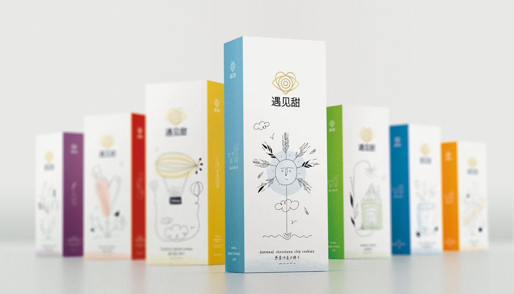
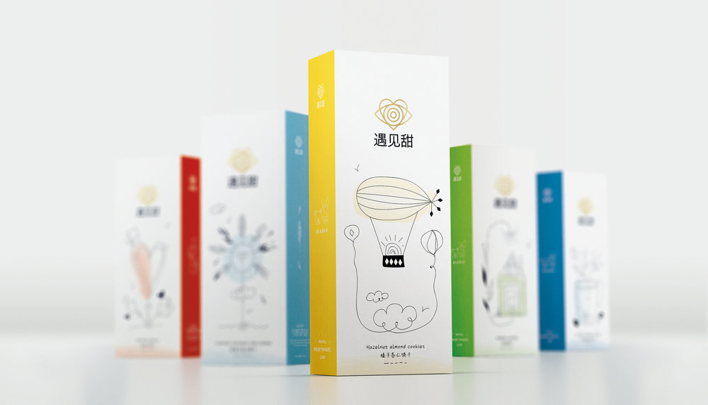
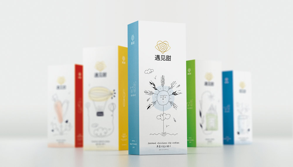
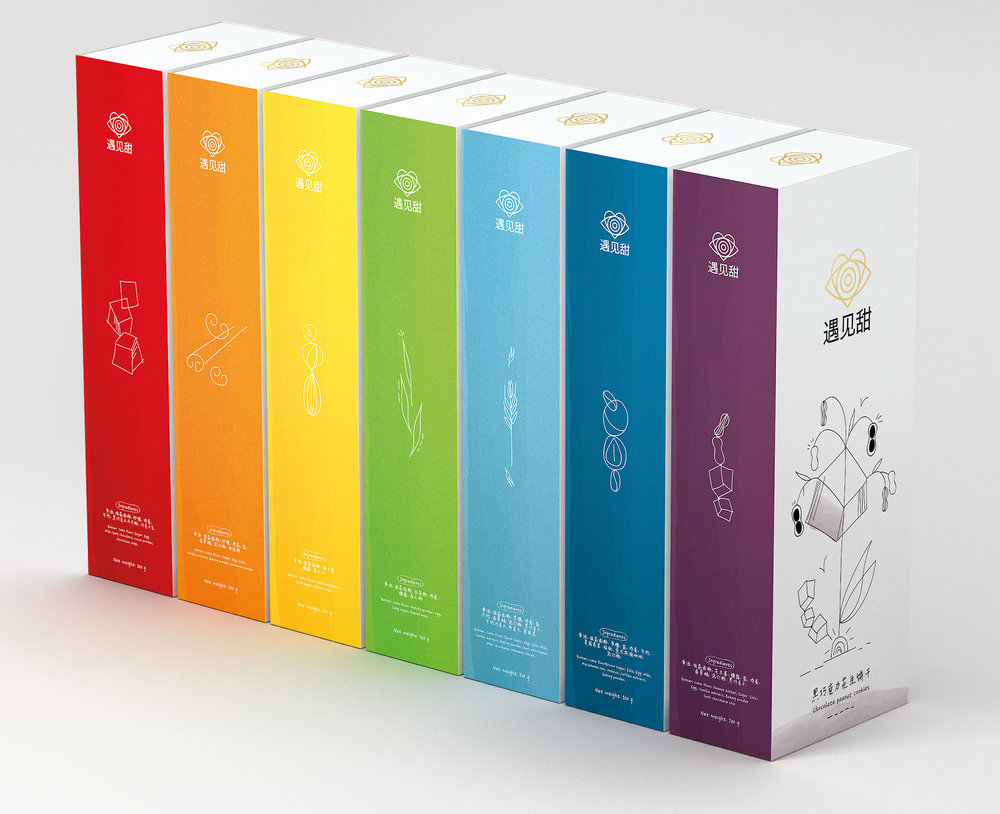
Classic Range
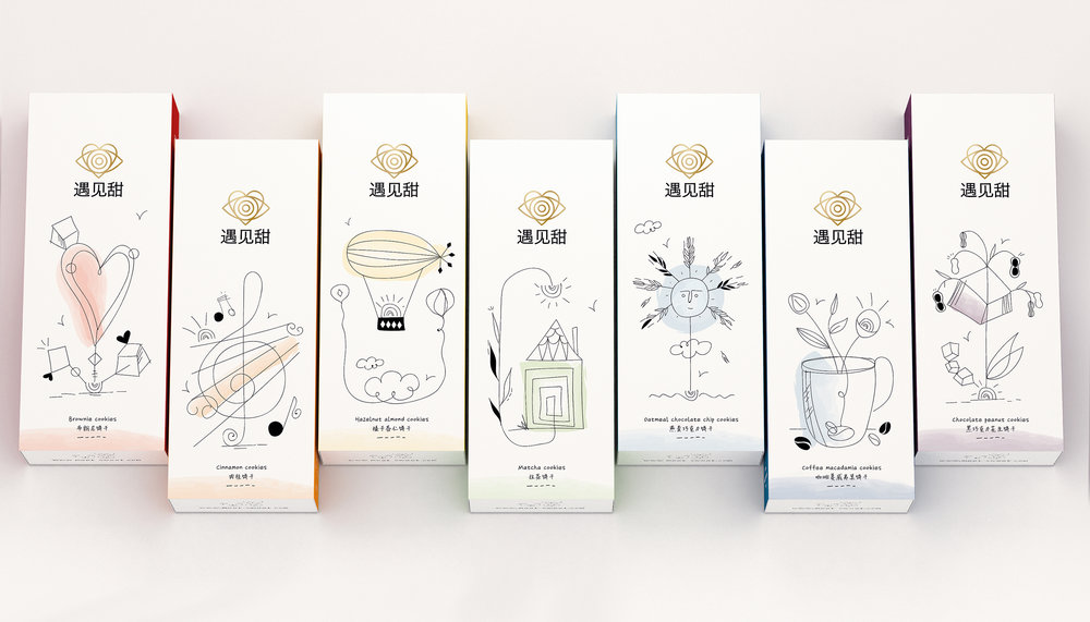
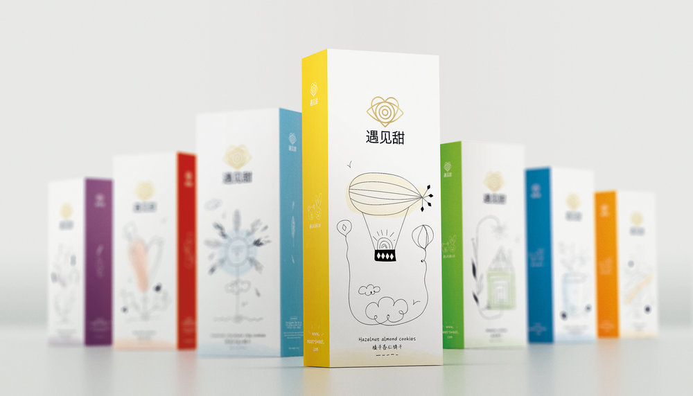
The Brand’s Classic Range comprises a total of 7 flavors.
The key ingredients of each variant is denoted by a series of purposefully innocent-looking, hand drawings. On the top of that, each variant is colour-coded, creating a rainbow (when stacked side by side) – an extra nod to the simple, child-like cheerfulness that is so central to what the brand is all about.
Meet Sweet brings to life the cheerful, delicious and heart-warming moments we all crave.”
CREDIT
- Agency/Creative: Sophia Georgopoulou | Design
- Article Title: Brand and Packaging Design for Hand-Crafted High Quality Biscuits
- Organisation/Entity: Agency Promotional / Self Published
- Project Type: Packaging
- Agency/Creative Country: Greece
- Market Region: Asia
- Format: Box
- Substrate: Pulp Paper


