


Last year during Covid, after about a year in development, we launched a snack brand: Being. We concepted, created and designed everything from scratch – Identity, colours, boards, packaging, an entire brand ecosystem. We had our friend Nareg Taioriman produced the campaign scenes with direction from us.
Launching during covid was tough but we did well out of the gate, securing a dozen high quality retailers in LA, won some design awards for the packaging work and it showed a lot of promise – BUT covid wasn’t to be beaten and we’re now in a bit of a holding pattern until we get more funding. Read on through these posts to learn about the brand we built and how we did it.
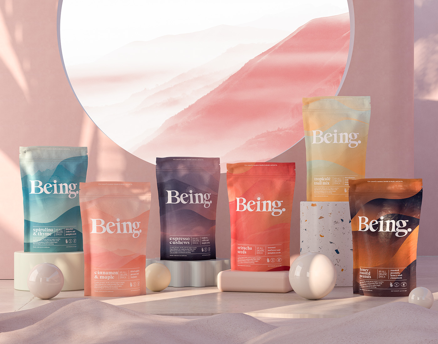
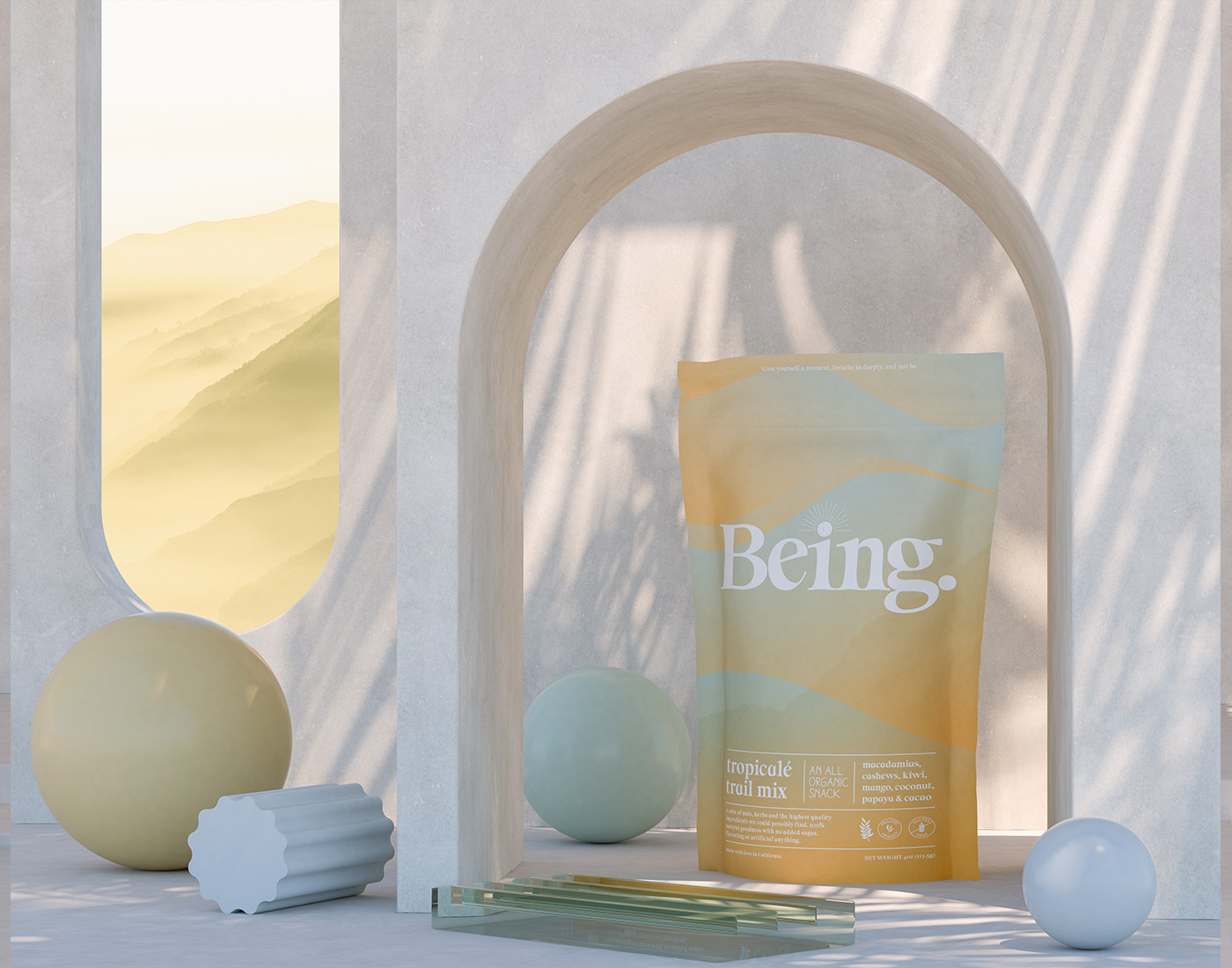
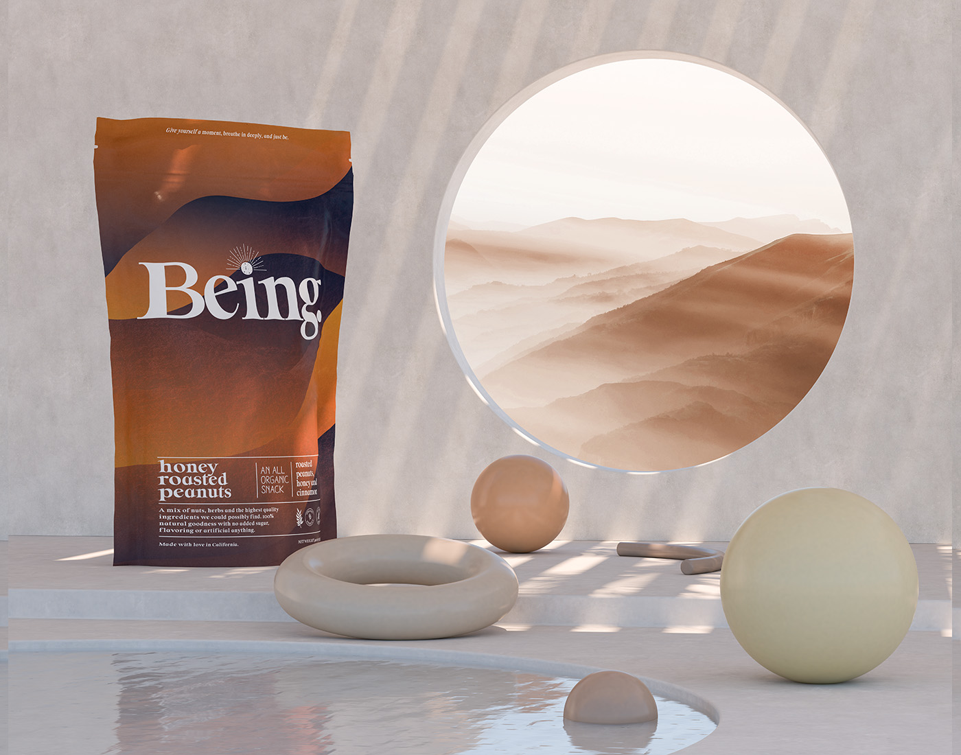
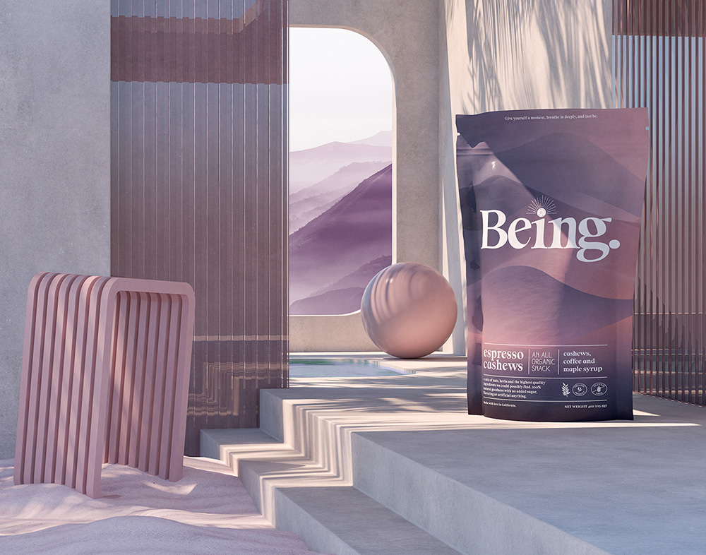
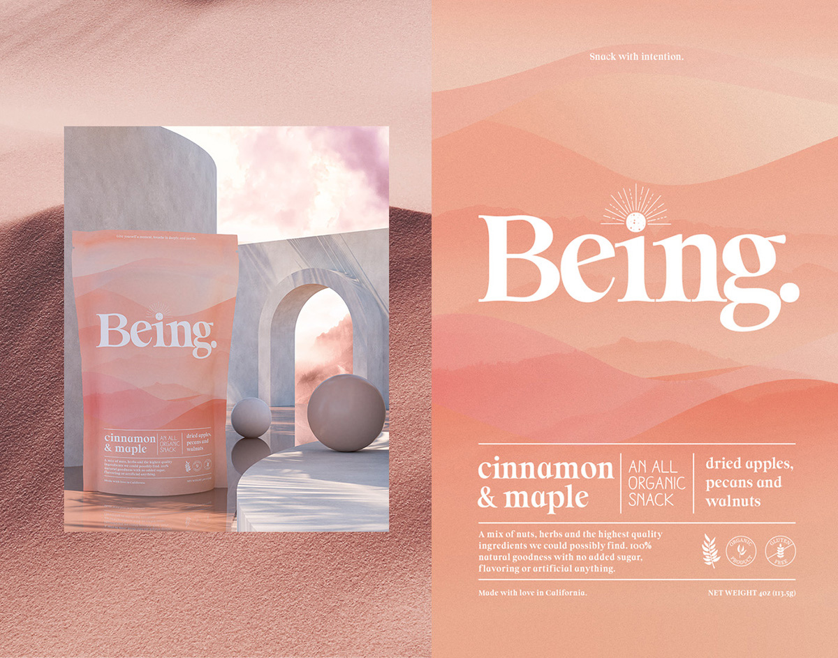
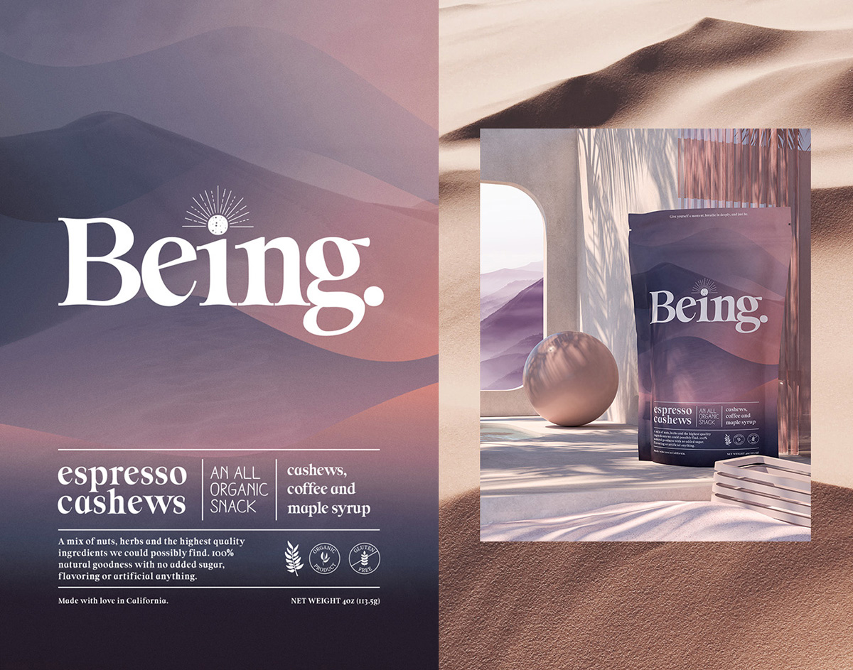
Being is at heart, a brand with a purpose. Dedicated to bringing a little peace to your day, the idea behind the brand is to take a little break from your day, sit quietly, and enjoy a small moment of peace – to just be. The snacks we produce are from the earth, organic and provide the excuse and vehicle to give yourself this little moment.
We wanted the package design to reflect this, through and through. Especially in a crowded category filled with clear windows, pictures of nuts and fruits, and all manner of sweets, preservatives and “natural” colors, we took an approach that was brand and mission-forward.
The solution was to visualize the feeling and calm one receives from peace, quiet and meditation, and bring that through the subtle imagery, color and typography.
How we designed:
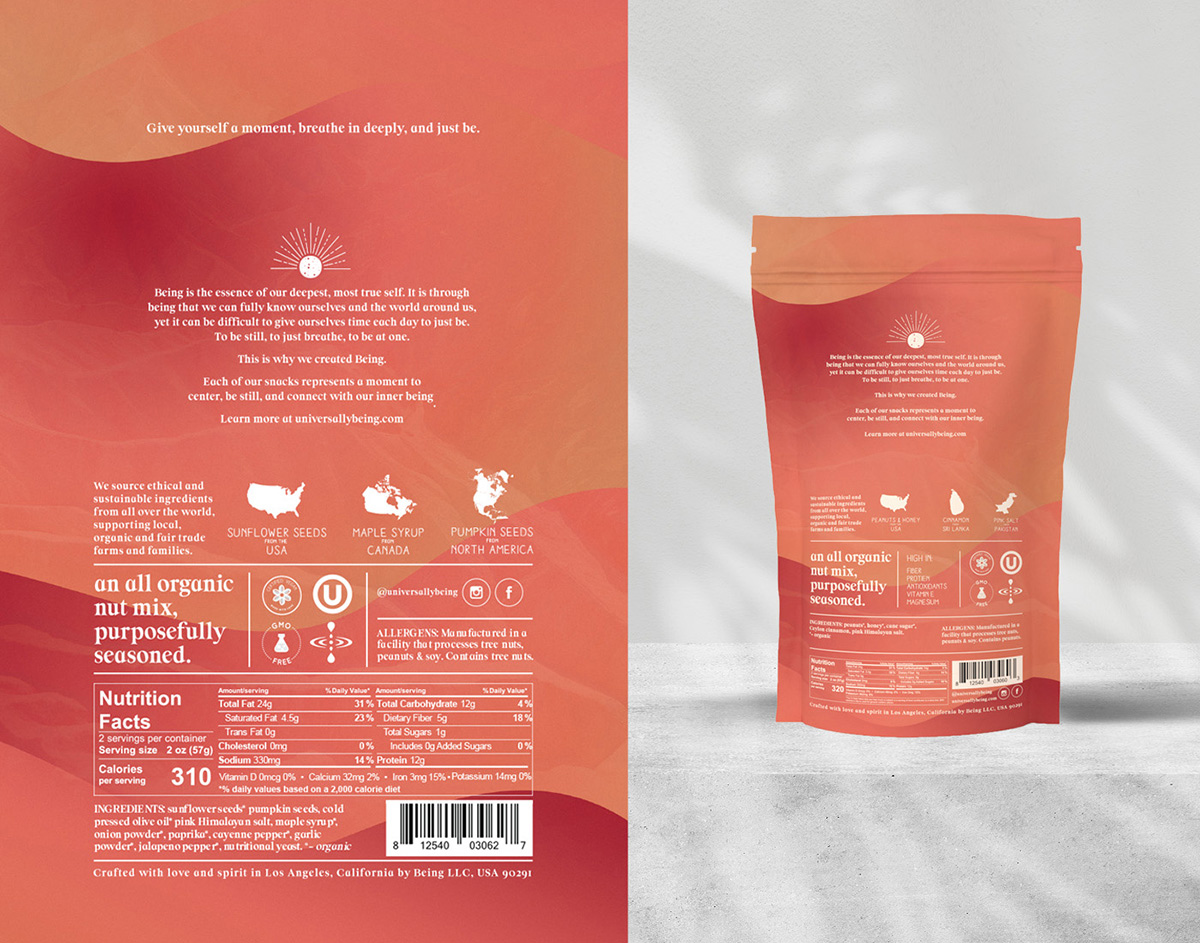
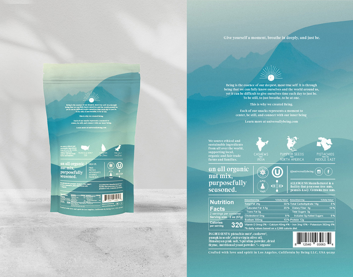
Colors: We were inspired by nature for each SKU color, gathering hundreds of images of sunsets and sunrises from all over the globe and layered the gradients on top of each other. Peaceful landscapes were overlayed onto each pack to bring out the natural elements and sources of the ingredients.
Texture: We chose a soft-touch, textured stock and applied a small amount of grain to the final artwork, further strengthening the tangible, natural feeling and aesthetic of the packs. We want you to have an emotive response to the pack before you ever taste the product.
Minimalism: Looking at the market and category, we found very few products competing in the arena of seasoned mixed nuts and wanted the entire pack to reflect that this was not your regular nut-based snack. We aimed for something pleasing to the eye, calming to the mind, with only the essential information that perfectly represents the product itself: no additives, no hype, nothing but basic ingredients from nature.
Typography: We designed a layout that made great use of negative space, and a hierarchy which communicated the key information quickly and quietly. We used two brand fonts – the second hand-feel type font sparingly – only to accentuate the organic, natural, ingredients and health benefits.
6/6 All in all, we aimed to create an Experience out of what is usually a simple product vehicle. We made sure the empty space on top of the nuts in each bag had a nitrogen flush ensuring as one opens the bag, you Smell the product first off.
By the time you taste the snack, you’ve seen, touched, read (heard) and smelled the brand and its essence – creating an experience for all 5 senses.
We carried this theme through the campaign imagery, creating custom spaces and slightly otherworldly, ethereal spaces which are scale and location ambivalent – but calm and beautiful no matter what you take from them.
CREDIT
- Agency/Creative: We Are Handsome Brand
- Article Title: Brand and Packaging Design for Being Snacks Created by Handsome Branding
- Organisation/Entity: Agency
- Project Type: Product
- Project Status: Published
- Agency/Creative Country: United States
- Agency/Creative City: Los Angeles
- Market Region: North America
- Project Deliverables: Advertising, Art Direction, Brand Creation, Brand Design, Brand Identity, Identity System, Illustration, Packaging Design
- Industry: Food/Beverage
- Keywords: snacks, nuts, food, cpg, healthy
-
Credits:
Creative Director: Jeremy Somers


