


This new brand of wine is produced with the active participation of the Armenian National Agrarian University students, faculty of winemaking. The brand intended to successfully enter the wine market and be displayed in specialized wine shops. To resolve this challenge, the group of winemakers presented us with the task of creating a label design for two types of wine: an ordinary red dry wine and the reserve red dry wine.
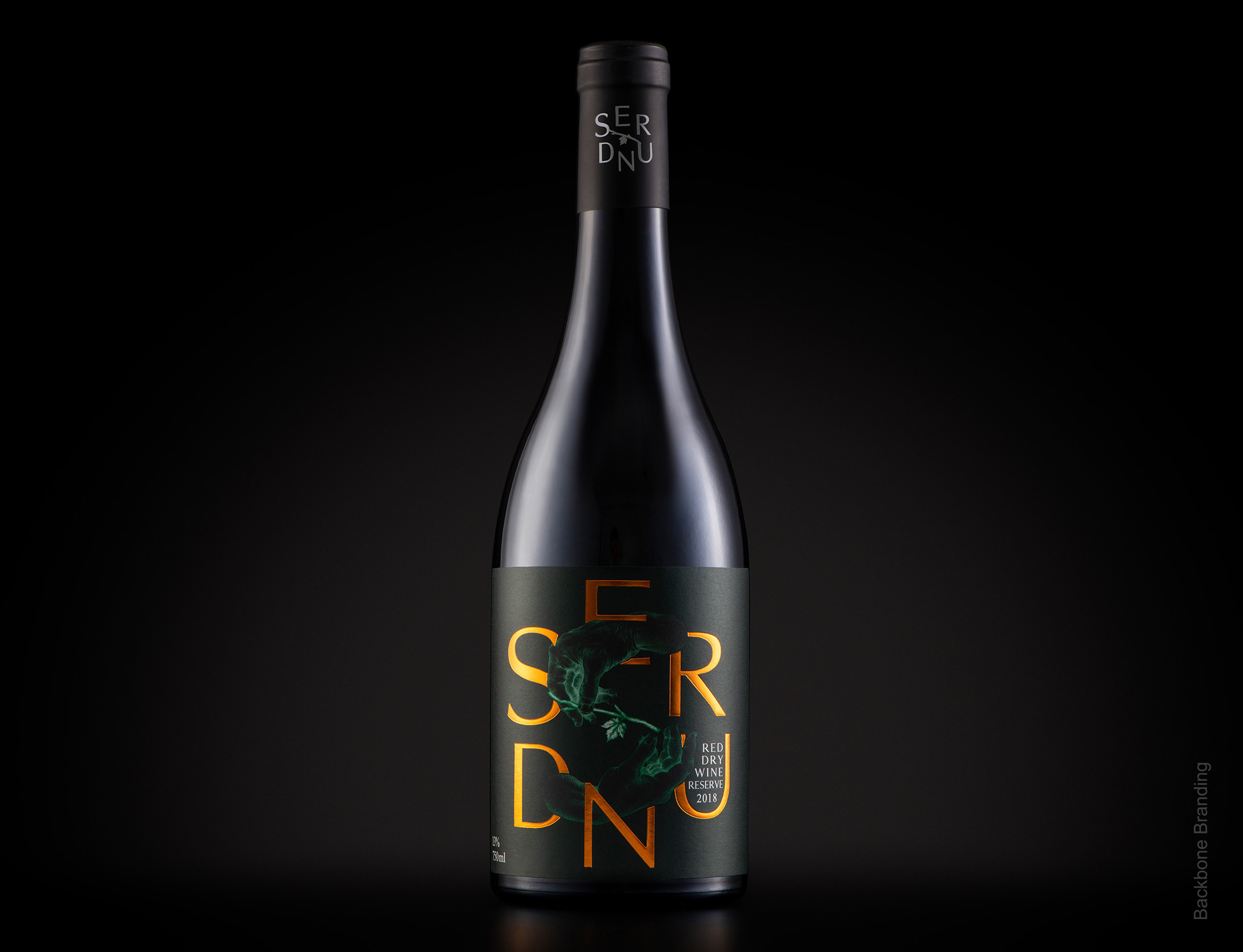
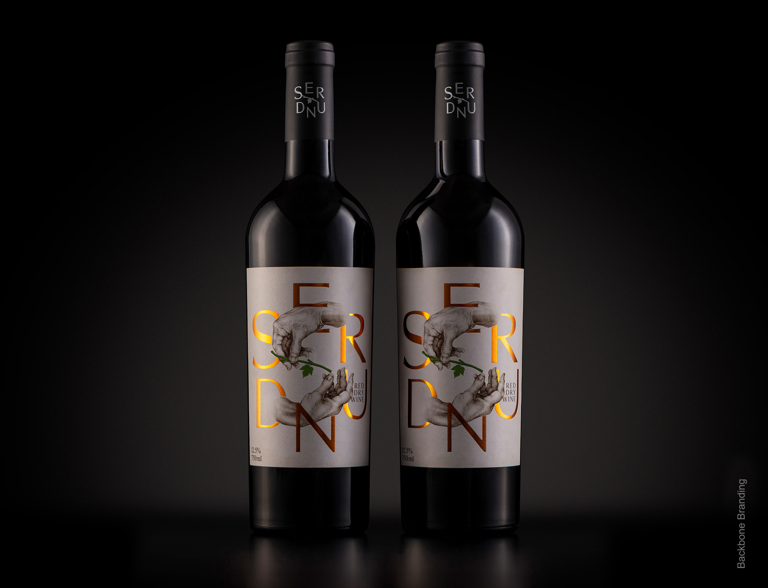
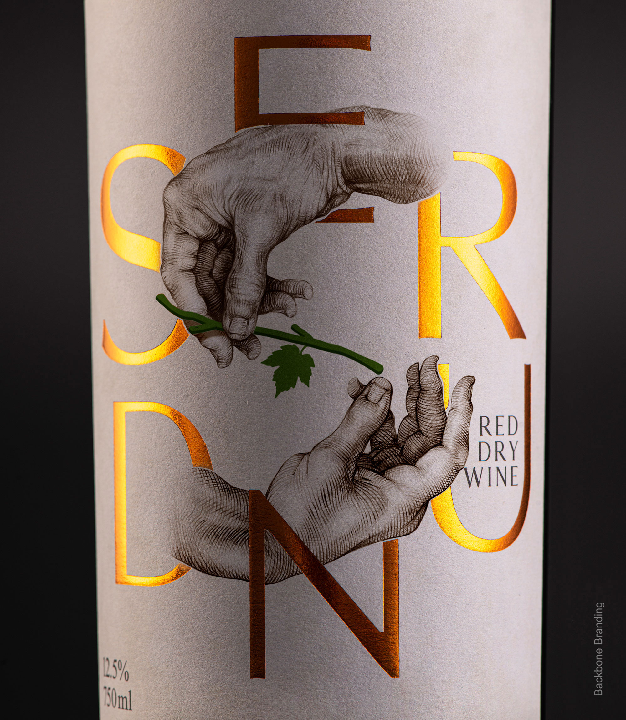
During discussions with the founders and taking into account that the winemakers are students from different generations, we have come up with a brand name, “SERUND,” which is translated as “Generation.” This brand concept is based on the idea of transmission, where the knowledge and skills are passed from one generation to another. The inspiration for this design was Michelangelo’s “The Creation of Adam” fresco painting.
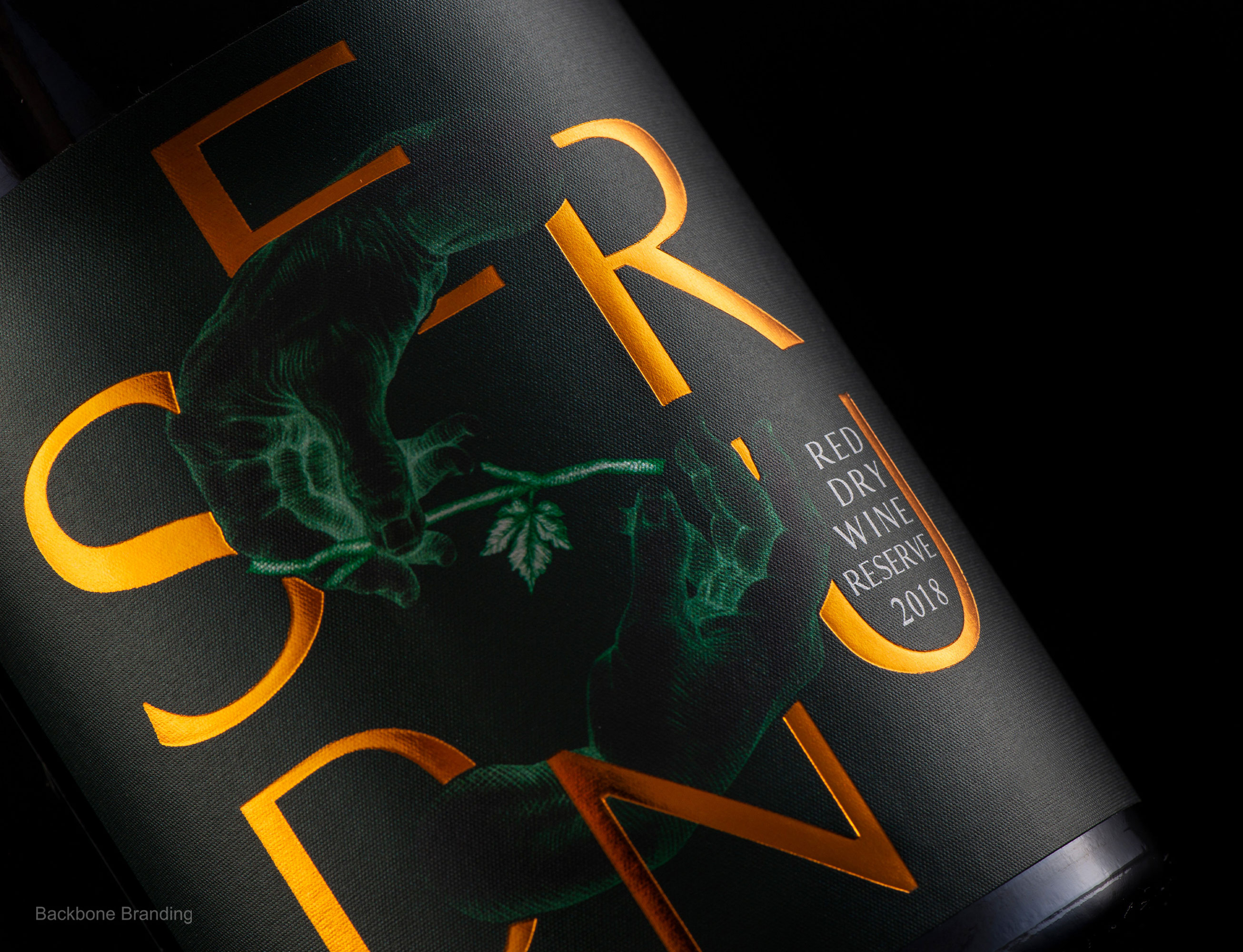
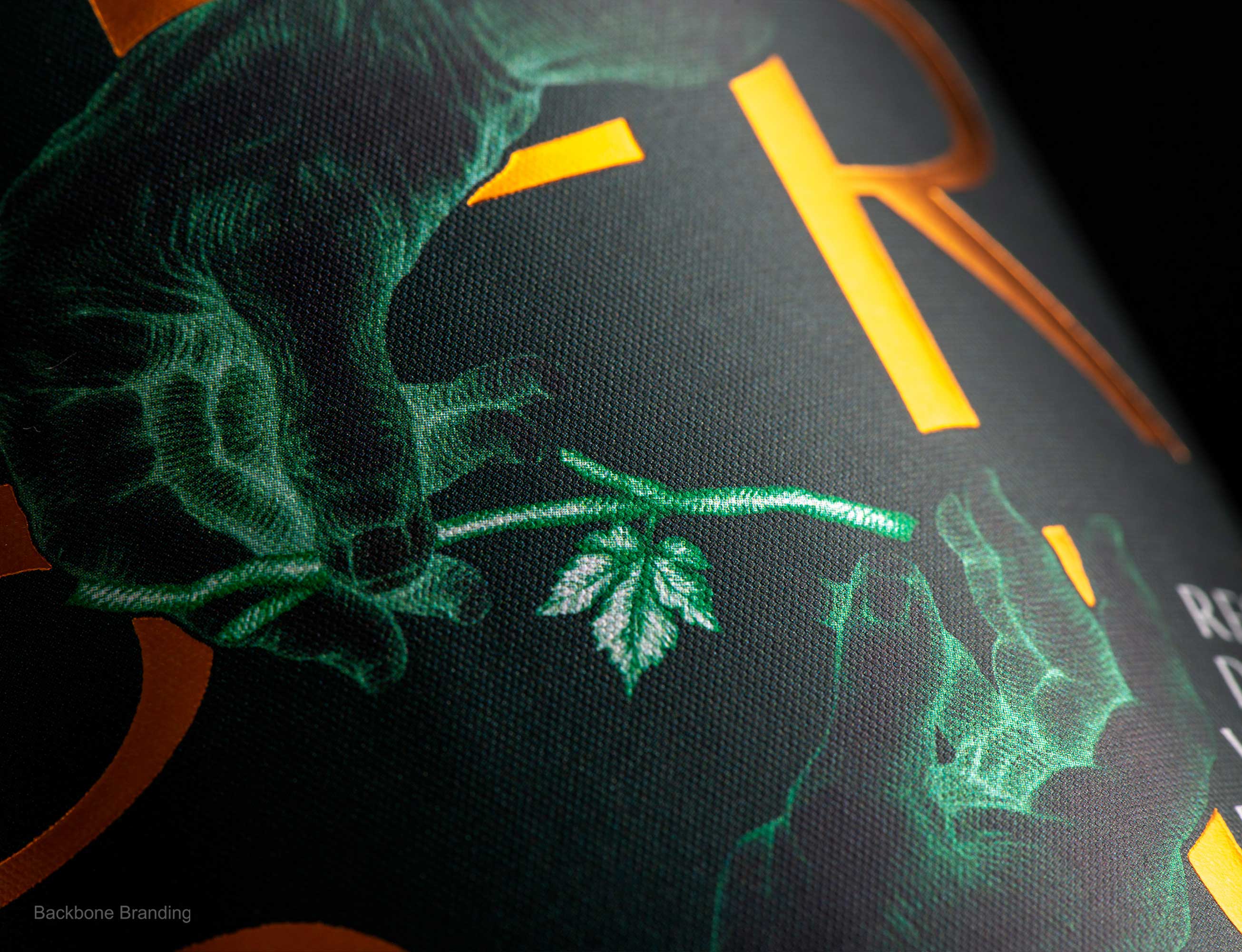
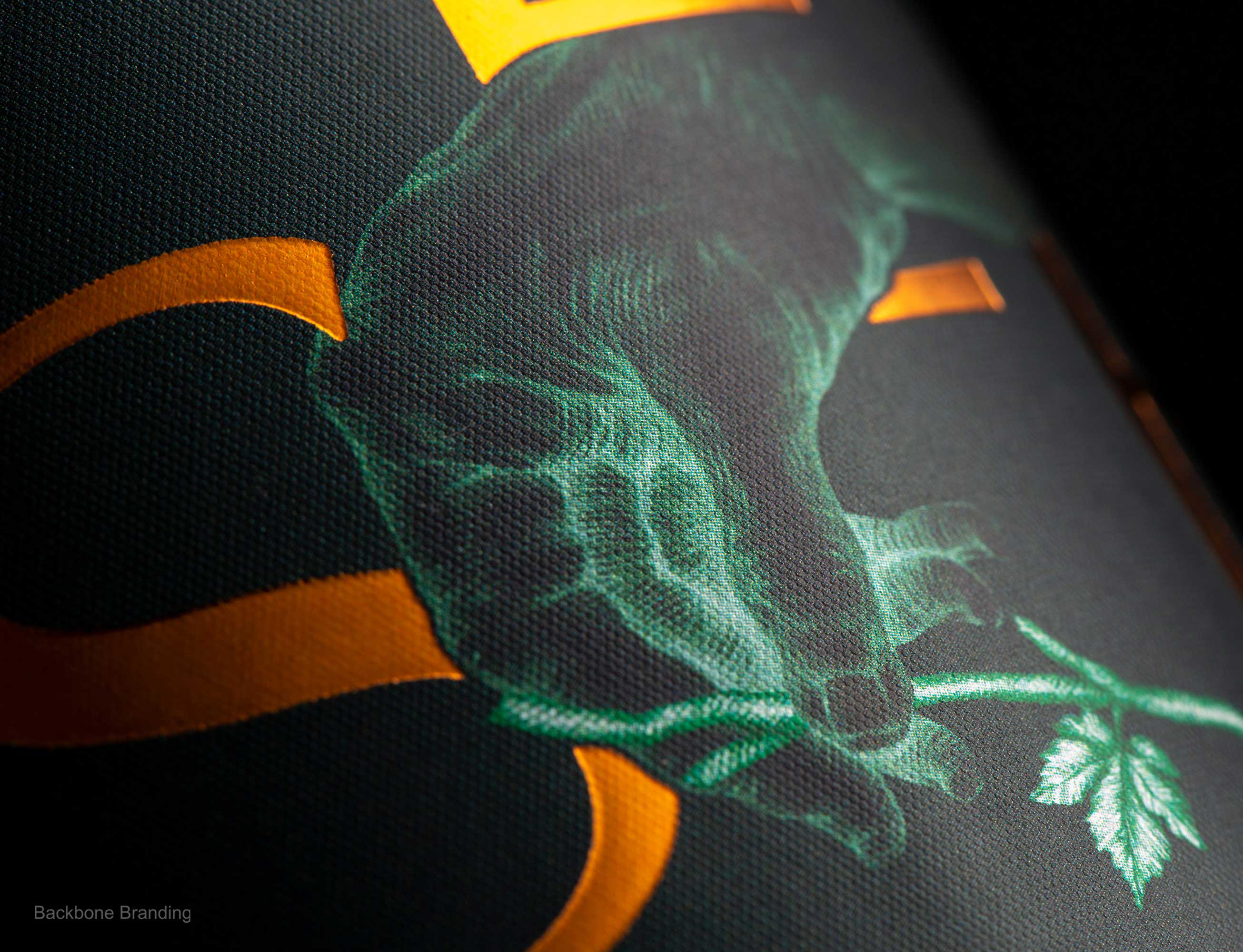
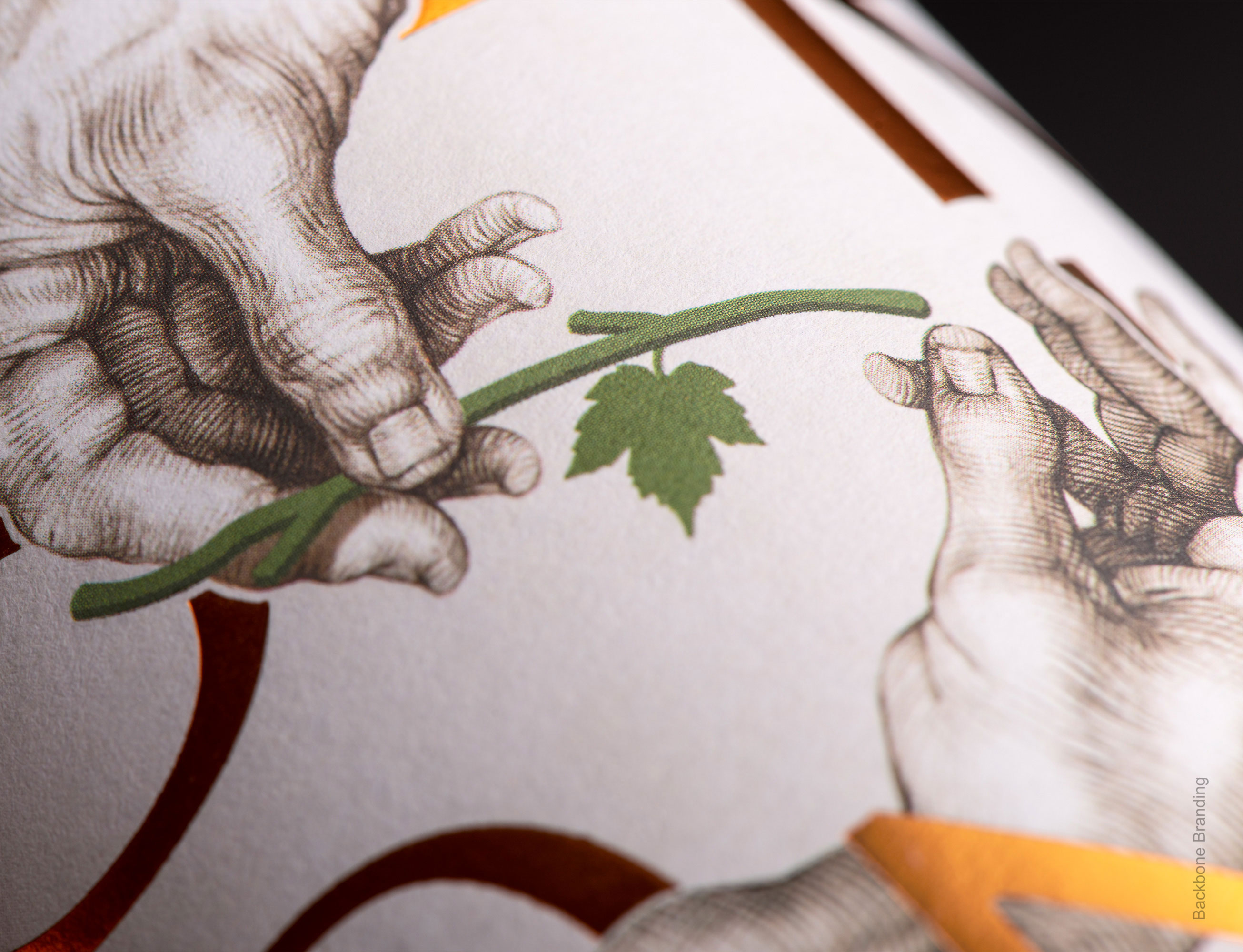
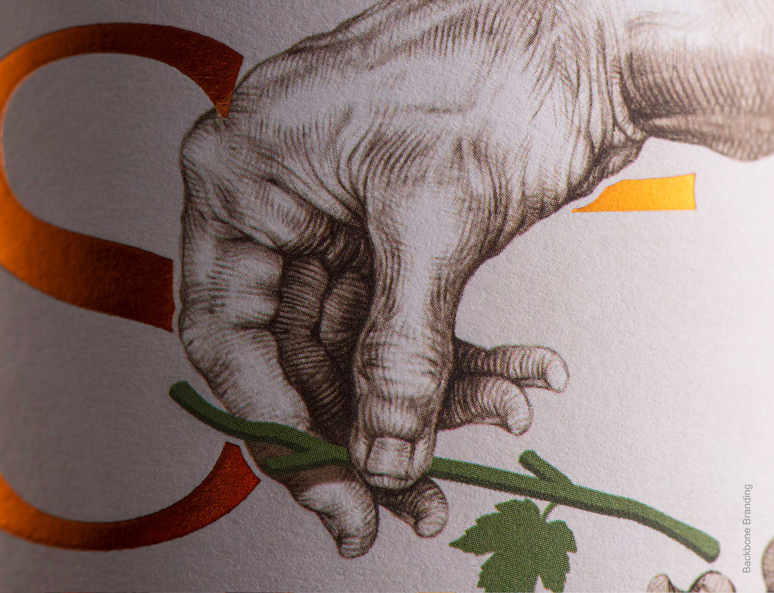
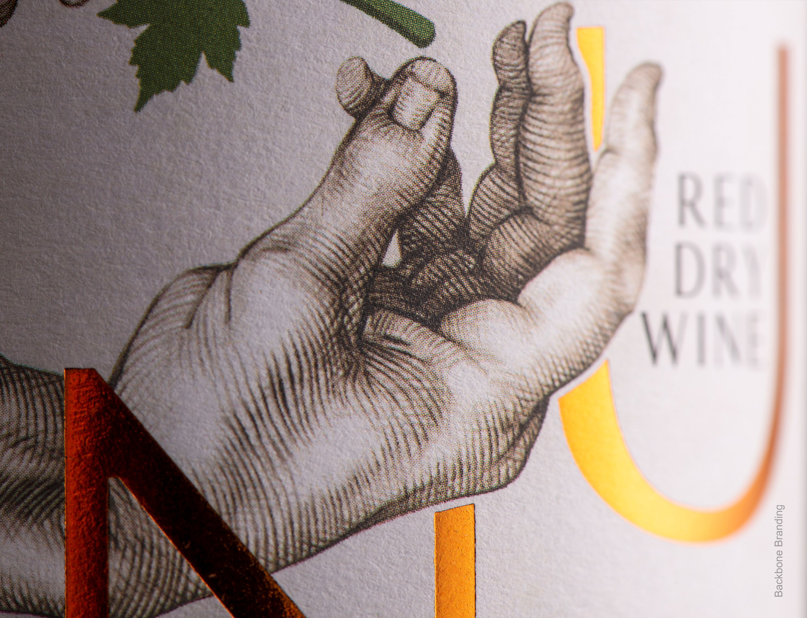
The second stage of the concept is visualization. According to the concept, we have selected three key elements: hands, a bunch of grapes, and a grape leaf. The illustration at the center of the label portrays the bunch and the leaf getting passed from one hand to another which symbolizes the knowledge and skills passed from generation to generation to the next one, from the expert to the apprentice, from the master to the knowledge seeker. The hand of the transmitter is the hand of an elderly person, and the recipient’s hand is the hand of a young man. We have surrounded this illustration with the letters that make up the word “SERUND” in a clockwise direction. The letters of the name, which are in continuous rotation, symbolize the cycle of life and the idea that transmission is a constant part of the mechanism of human existence. Moreover, the two illustrated hands passing the bunch form the visual shape of the letter “S” – the initial letter of “SERUND.”
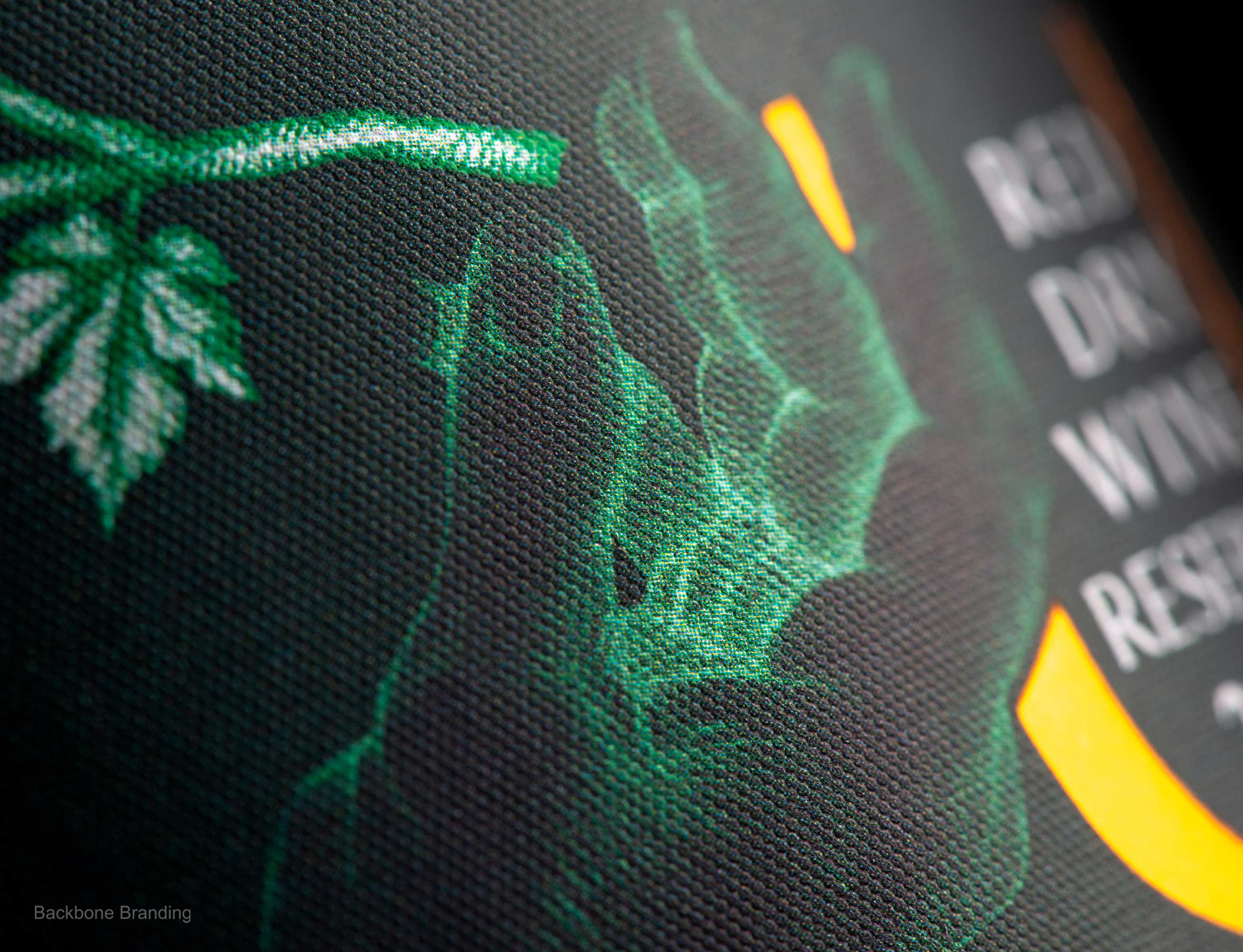
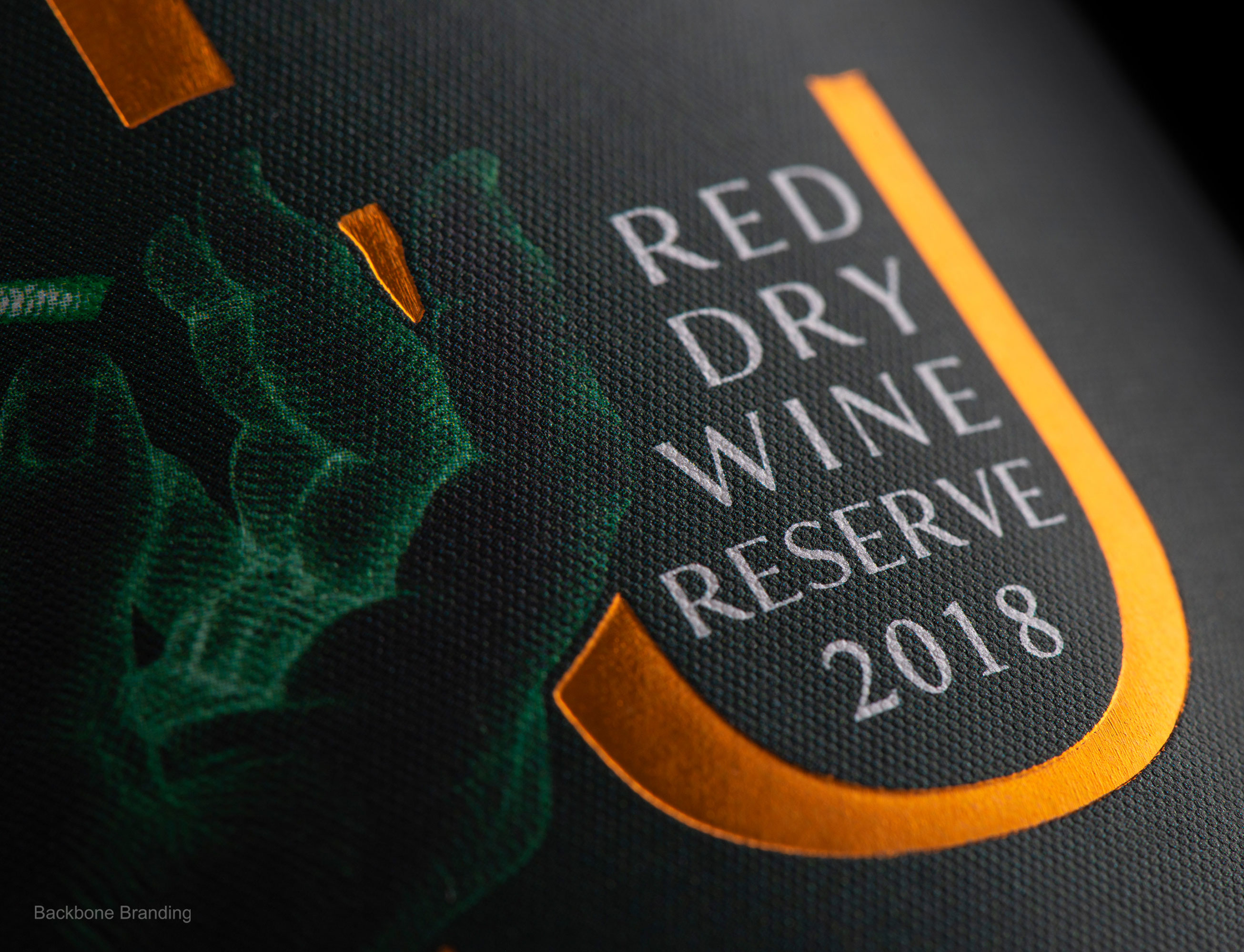
We chose a pure white-colored label for the ordinary wine and an elegant dark green colored label for the reserved wine line. The dark green label with its mystery conveys the oldness and high quality of the wine, and the copper-colored letters become more expressive in contrast with the dark green.
CREDIT
- Agency/Creative: Backbone Branding
- Article Title: Brand and Packaging Design for Serund Wine by Backbone Branding
- Organisation/Entity: Agency
- Project Type: Packaging
- Project Status: Published
- Agency/Creative Country: Armenia
- Agency/Creative City: Yerevan
- Market Region: Asia, Europe
- Project Deliverables: Label Design
- Format: Bottle
- Substrate: Glass
- Industry: Food/Beverage
- Keywords: WBDS Agency Design Awards 2022/23
-
Credits:
Creative Director: Stepan Azaryan
Illustrator: Elina Barseghyan
Photos by: Backbone Branding, Suren Manvelyan


