


The French know a thing or two about the good things in life. Just think of their wine, fashion, food, and cars. Even their language is famous. With the new design universe from Danone Fjørd, we wanted to promote a message of calm inspired by Scandinavian nature.
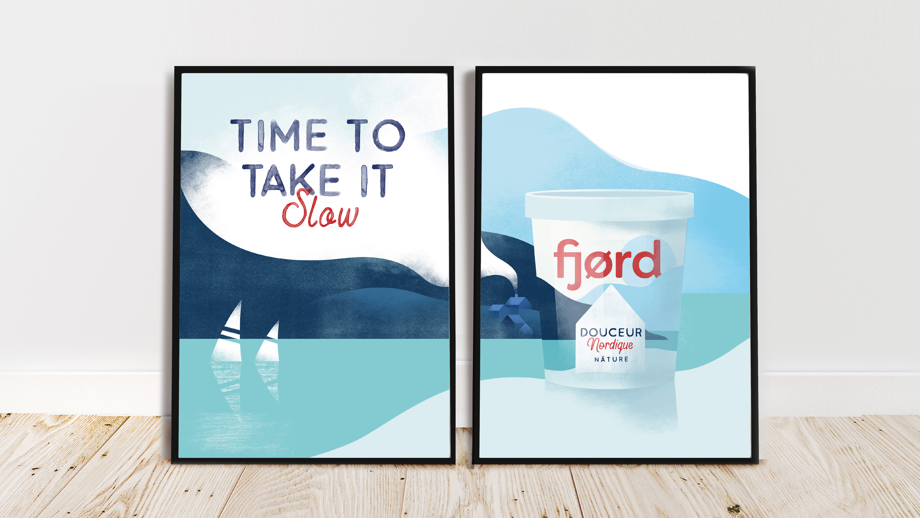
Time to Take It Slow
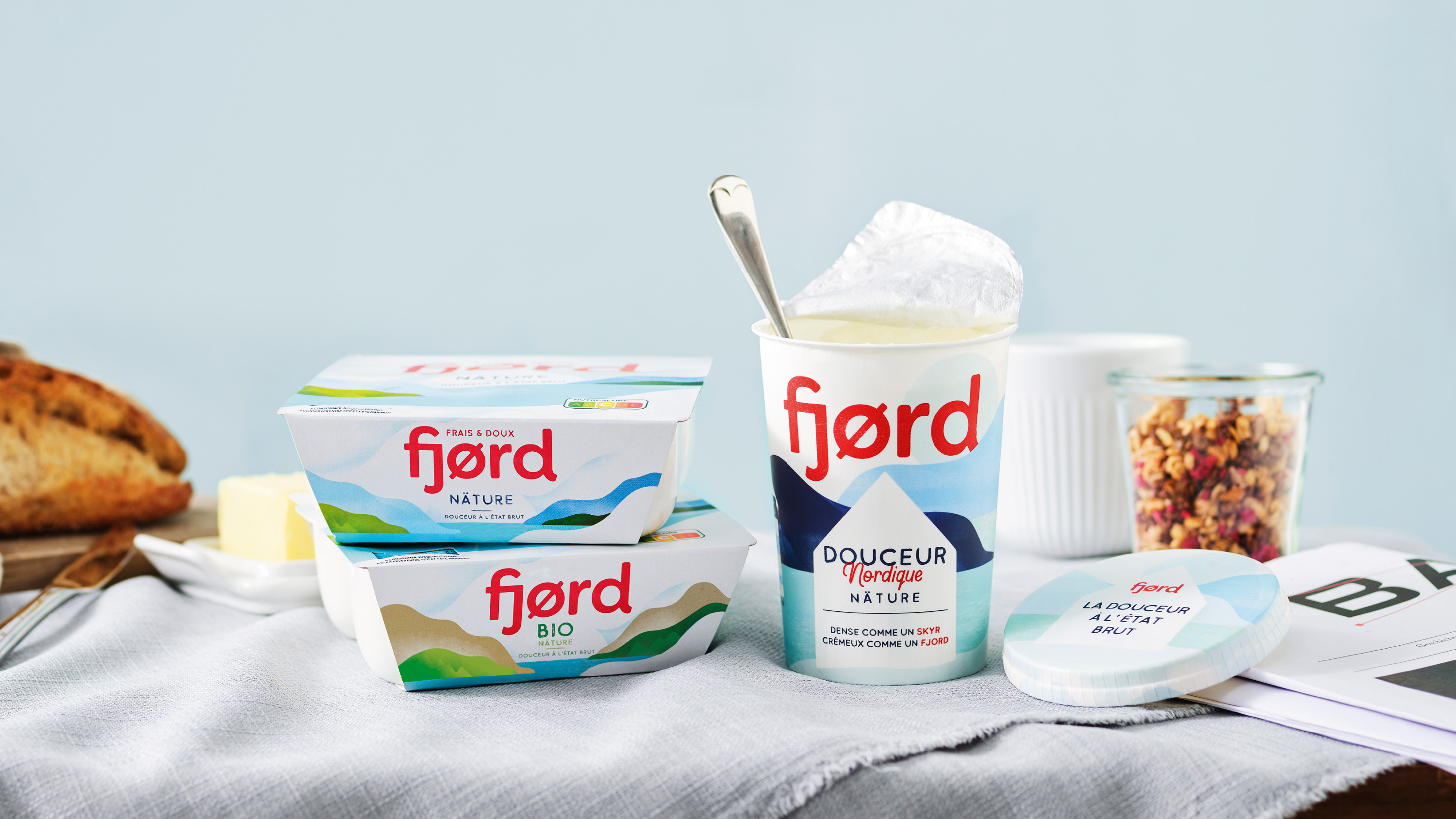
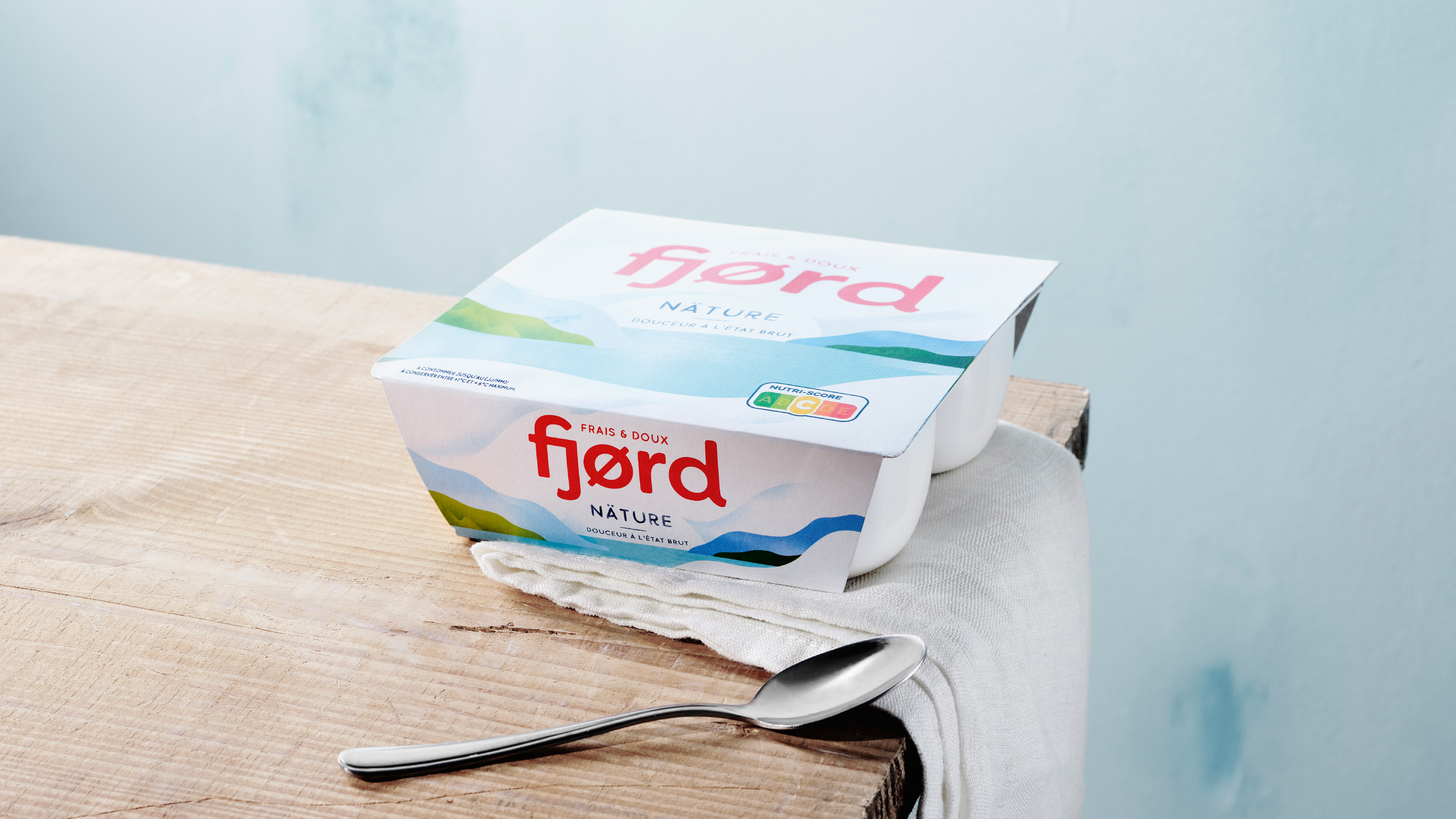
Every year, millions of Fjørd products are purchased by passionate yoghurt lovers. So, it was with great care that Danone France and Everland approached the task of rejuvenating the already beloved Fjørd. A brand that for 50 years has brought creamy and delicious yoghurt to cuisines all over France.
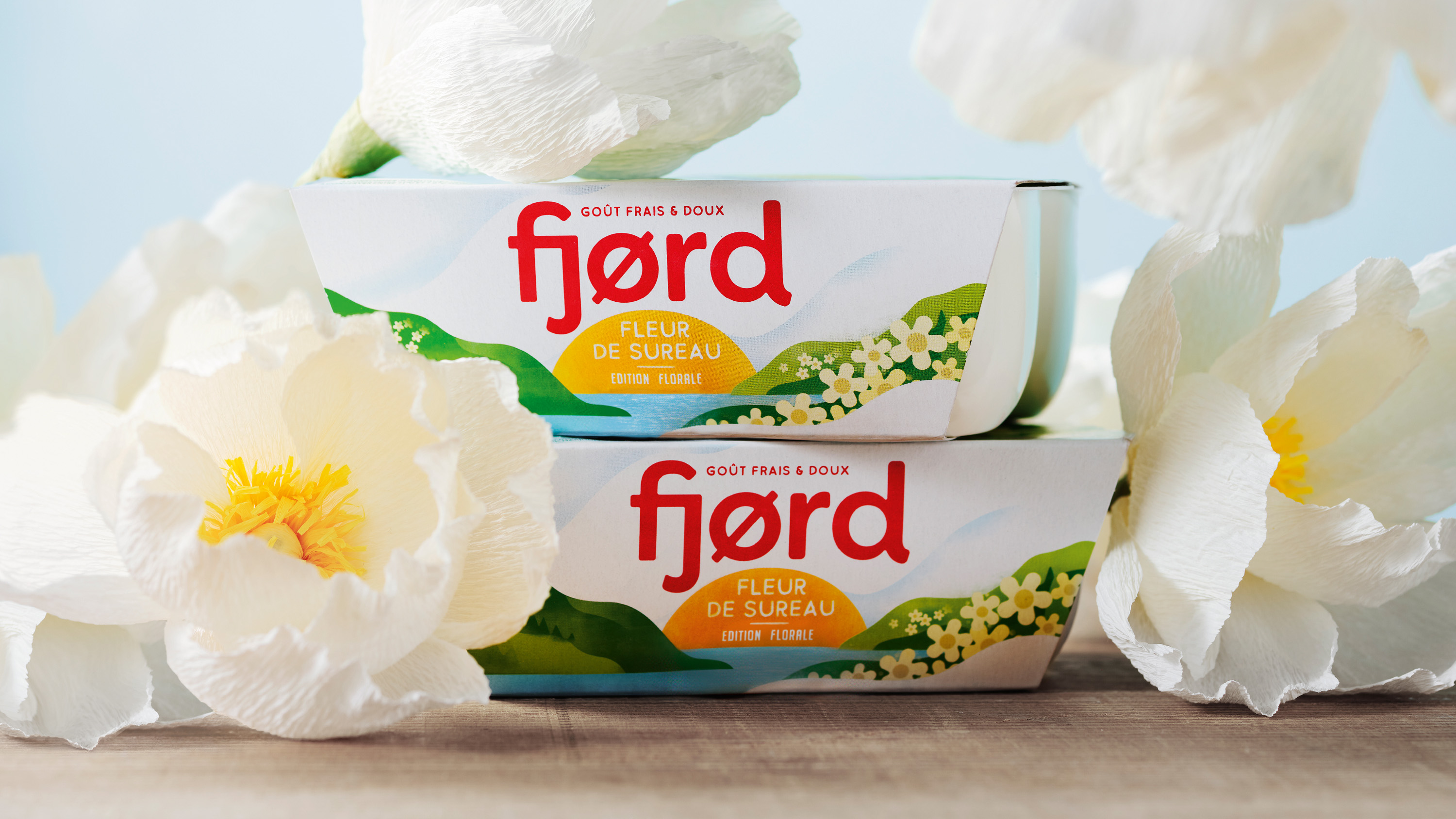
The task was to translate the new brand platform into a concept and design that would be the foundation for both classics and upcoming launches, like the charming elderflower version and a more skyr-inspired version.
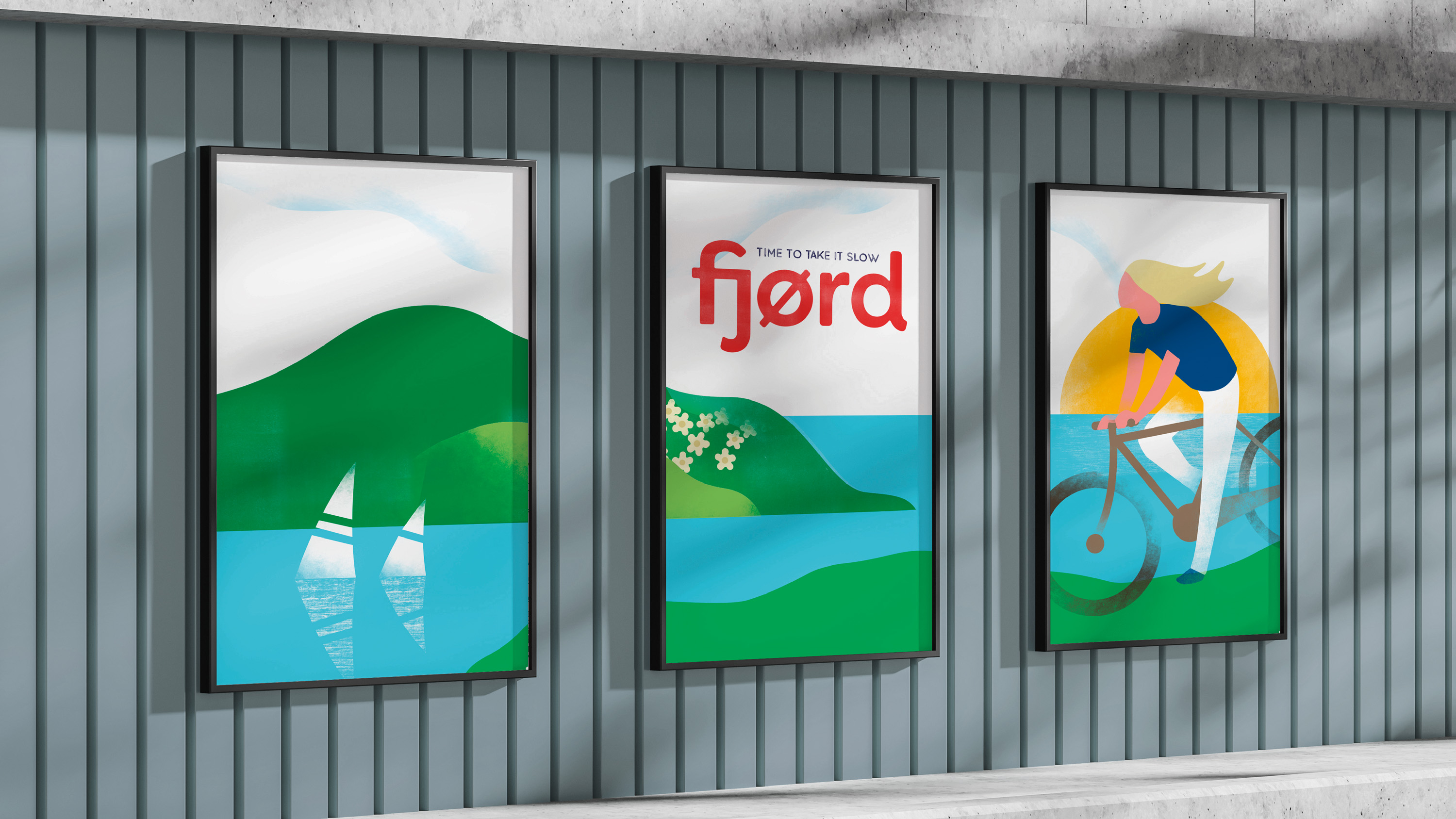
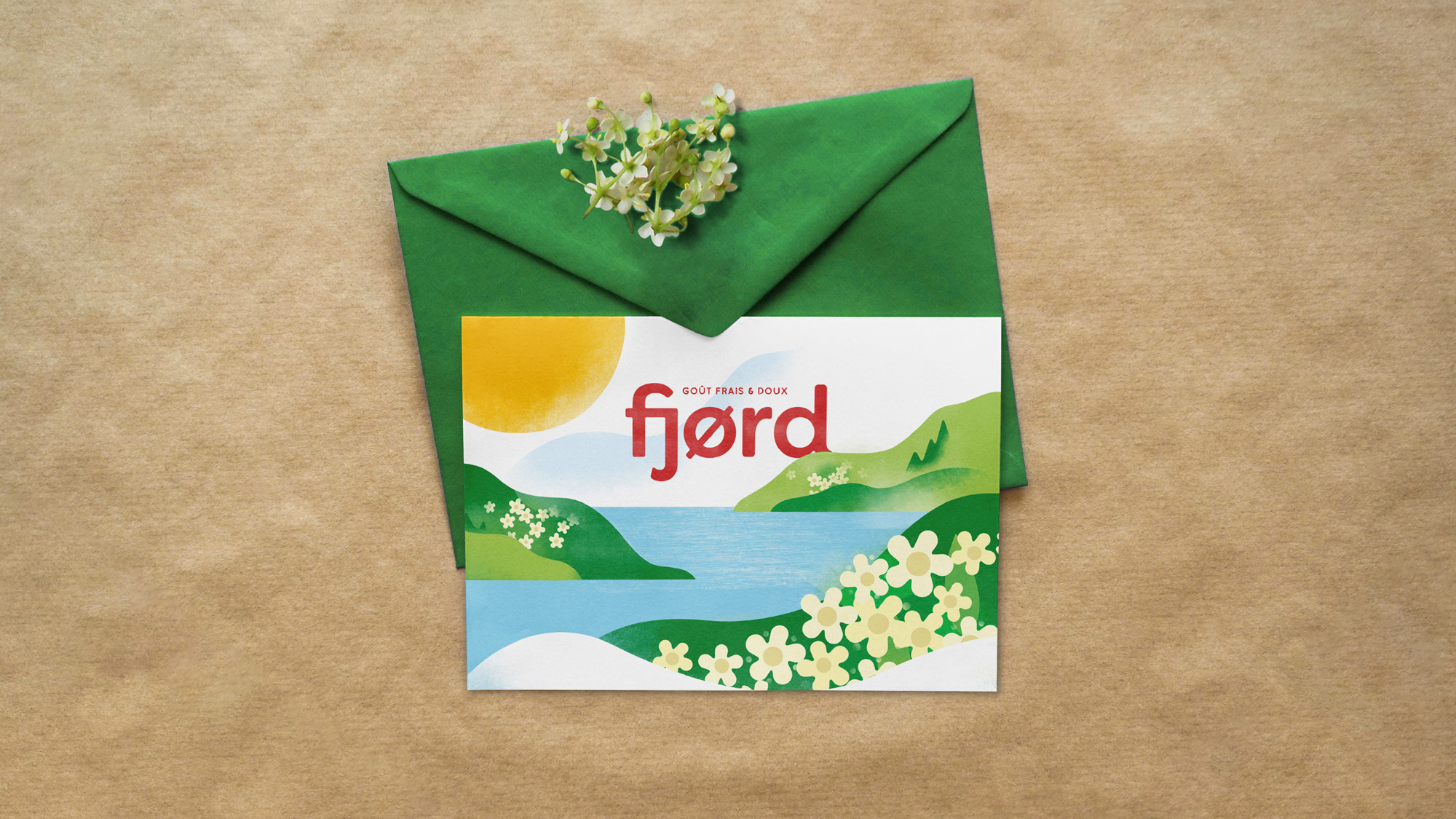
The new Fjørd design universe revolves around the concept of “time to take it slow”. It springs from nature and encapsulates the whole essence of the brand. Quite naturally, the serene and rugged countryside of Scandinavia became the inspiration for the entire brand.
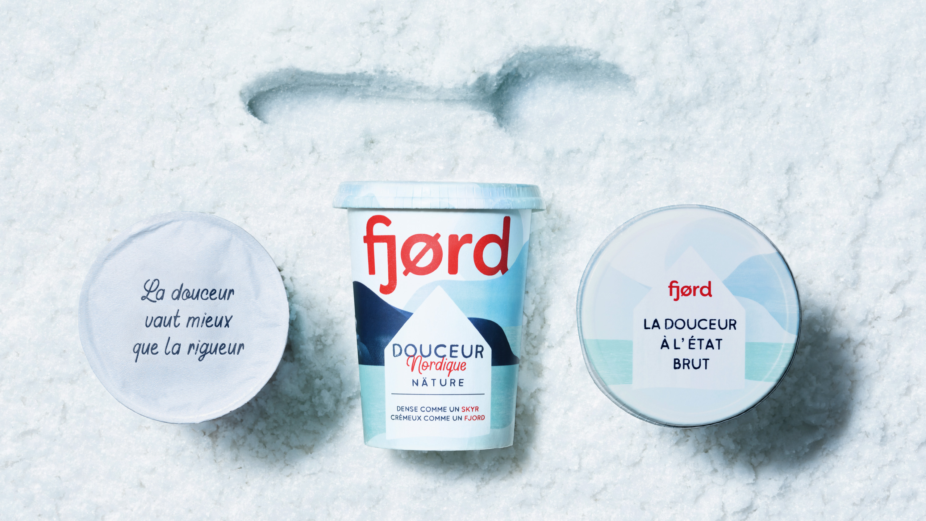
“We wanted to encourage people to take a moment of ‘hygge’ and simply slow down. We kept the design clean and simple, basing it on the majestic and dramatic Norwegian fjords.
Now everyone can enjoy a delightful scoop of nature.”
Carl Johan Larsson, Creative Director & Partner at Everland
Based in Copenhagen, Everland could easily tap into the vibe of ‘hygge’. Especially since yoghurt is an essential part of every Scandinavian breakfast, and skyr has been around since forever. Consequently, the look and feel of this new design universe are heavily inspired by Nordic values, taste and heritage.
In true Scandinavian style, the packaging is kept smooth and uncomplicated, just like nature. Lots of white space gives each design element room to ‘breathe’ properly. The universe’s deep roots in nature are evident in the illustrations made in collaboration with Danish illustrator Mads Berg.
“Fjørd is an old brand in France with a Nordic territory in its DNA. We chose Everland as they immediately understood our brand world as much as our business stakes. They delivered a wonderful evolution of our design with a strong consistency among our ranges. Their attention to detail was clearly an asset to get a simple, clear & beautiful design.” – Amandine Roux, Senior Brand Manager, White Indulgence, Danone
The new Danone Fjørd design is on the shelves right now across France.


CREDIT
- Agency/Creative: Everland
- Article Title: Born in Scandinavia Perfected in France – The New Design for Danone Fjørd by Everland
- Organisation/Entity: Agency, Published Commercial Design
- Project Type: Packaging
- Project Status: Published
- Agency/Creative Country: Denmark
- Market Region: Europe
- Project Deliverables: Brand Identity, Brand Redesign, Brand Rejuvenation, Branding, Graphic Design, Illustration, Packaging Design, Rebranding, Research / Insight
- Format: Cup, Pot
- Substrate: Plastic, Pulp Paper


