


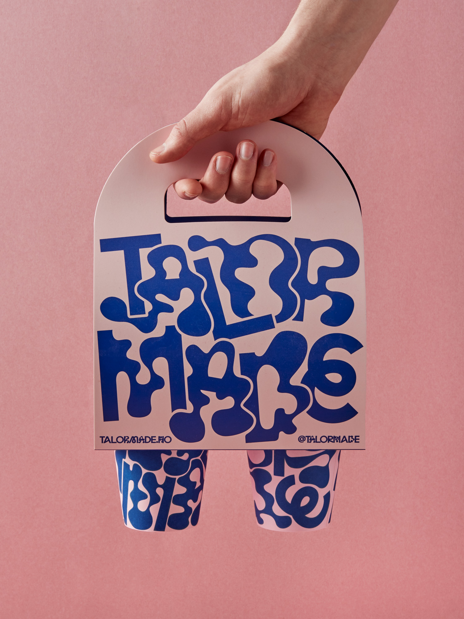
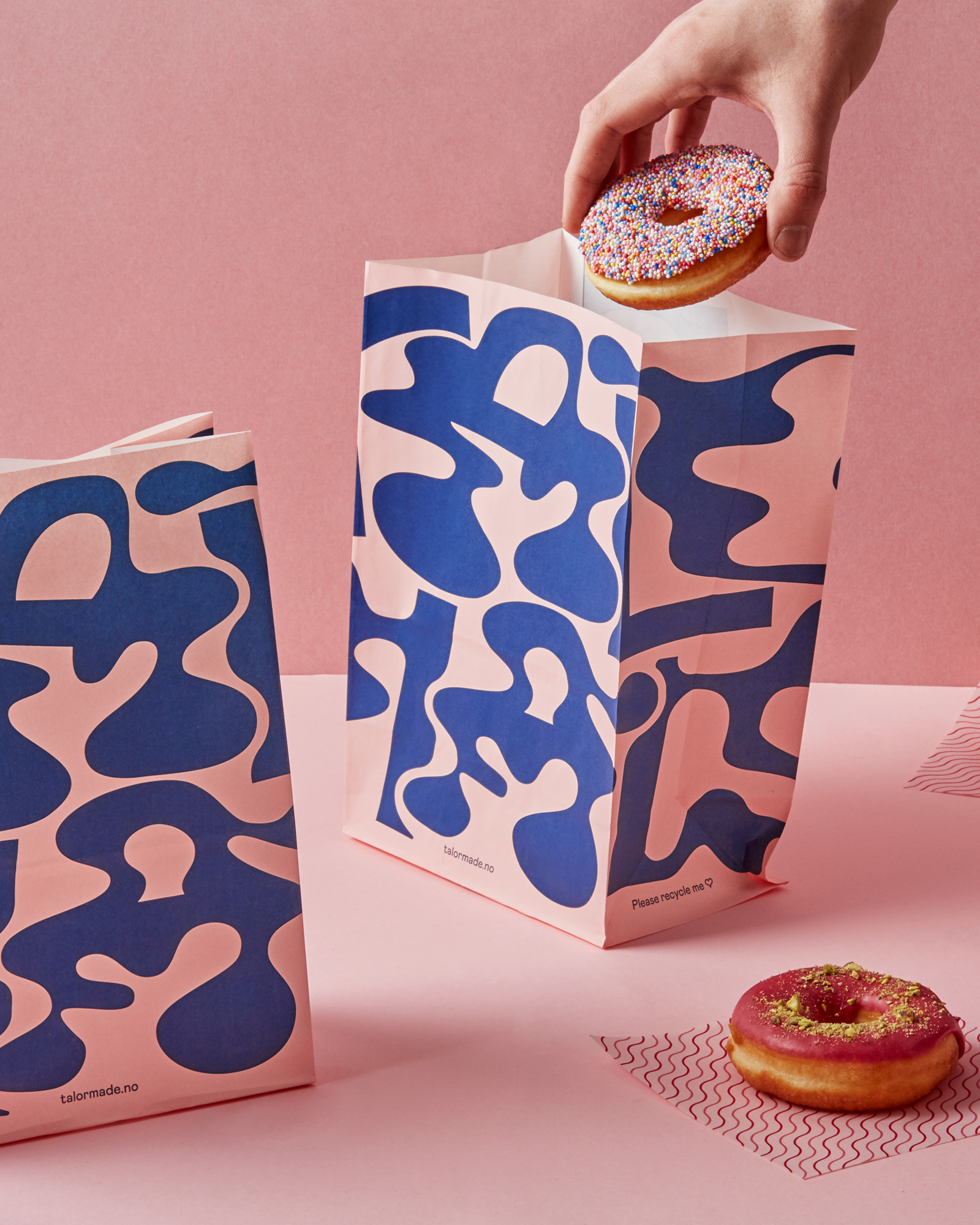
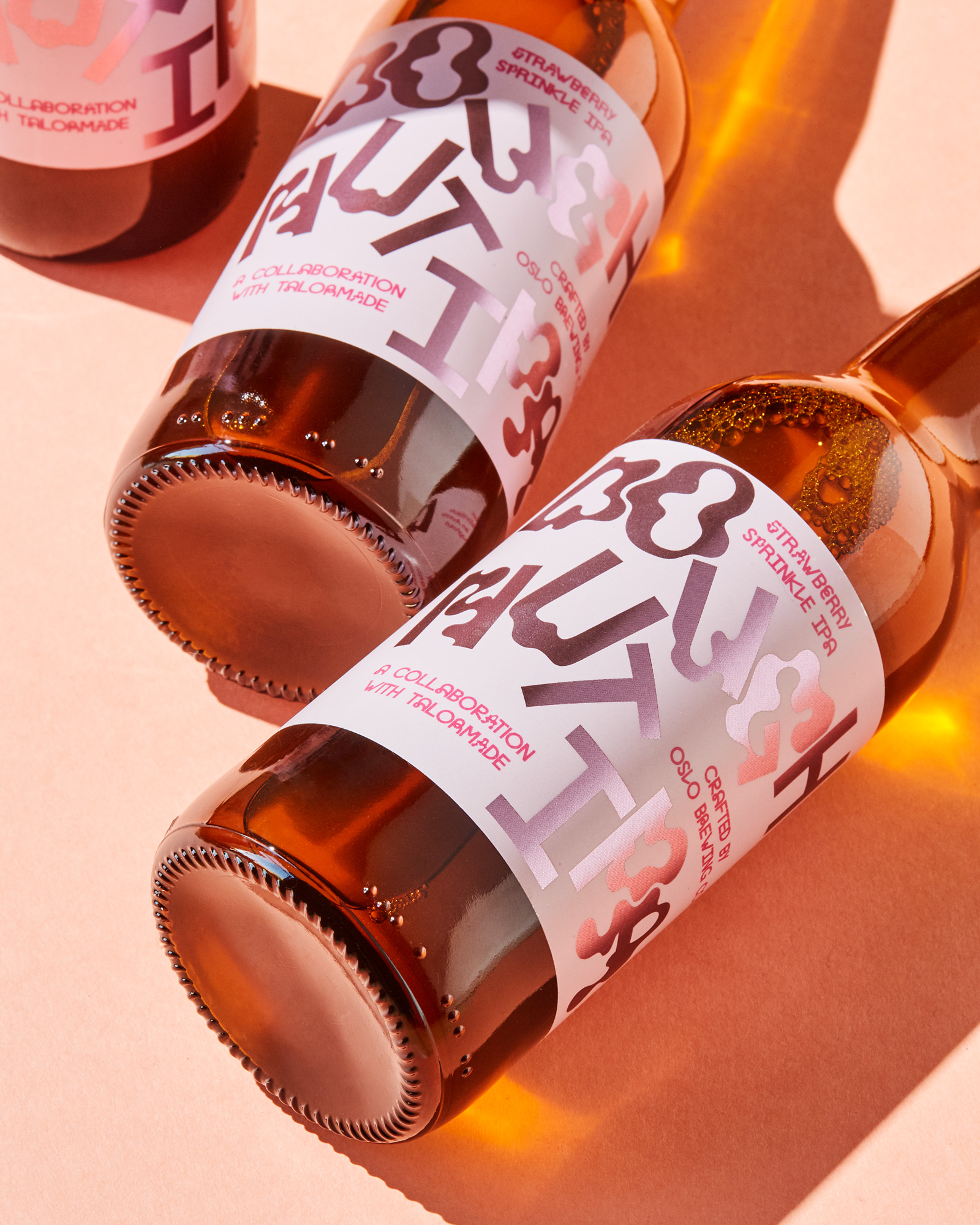
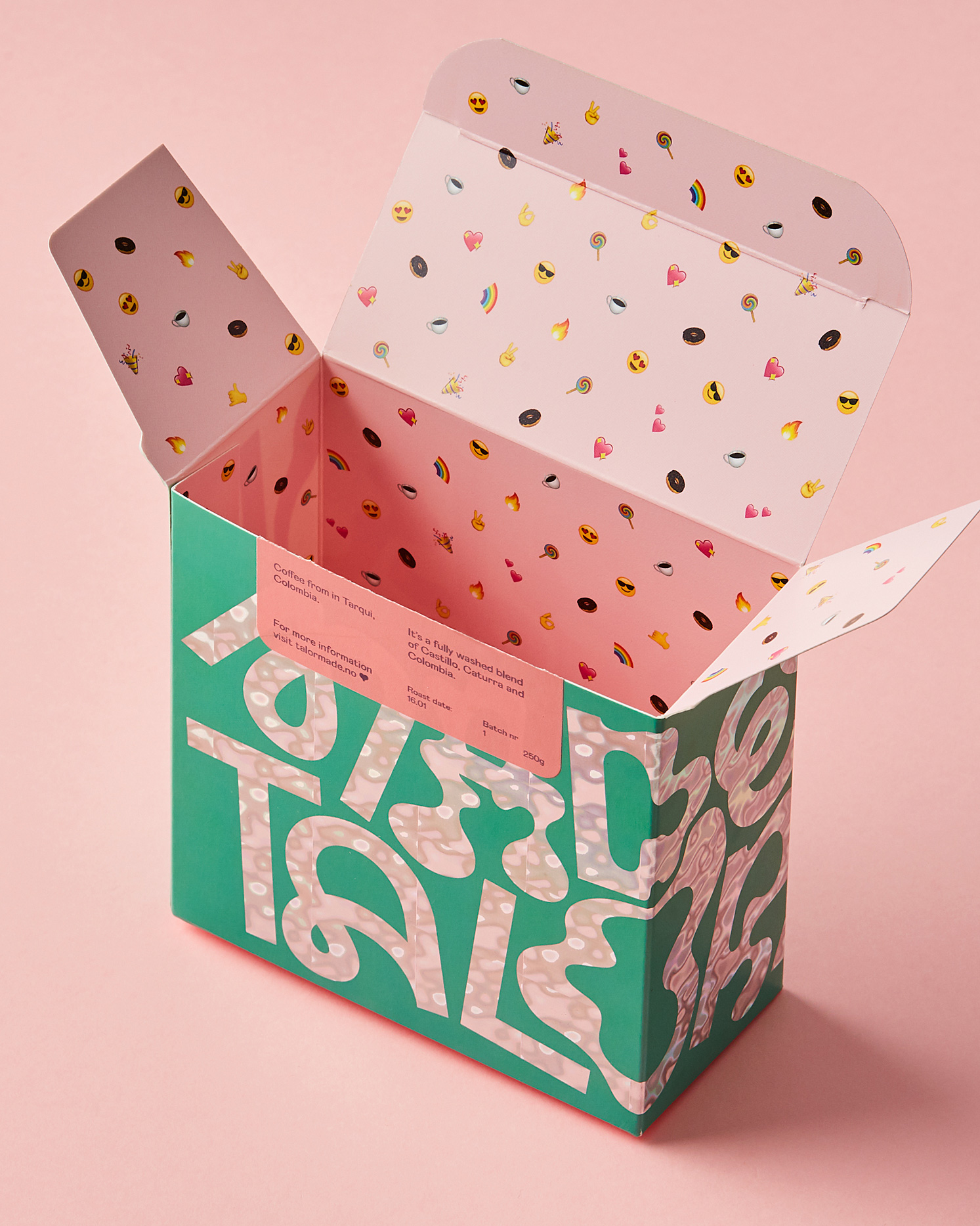
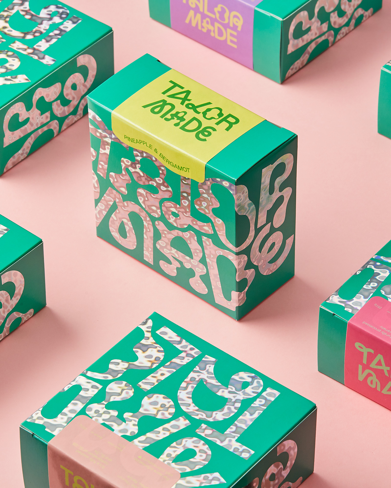
Talormade Identity
After having worked for 20 years in the coffee industry, Talor thought to herself: Wouldn’t it be nice to have super high-quality coffee but without all the attitude? Talormade is the story of Talor doing her own thing, resulting in fans all over the globe. Today, she makes coffee, doughnuts and is opening stores across Oslo as well as shipping to customers worldwide.
By combining hard work, creativity, and a competent team, Talor has created something completely new. Thereby, she has challenged the norms and conventions within her segment.
We wanted to create an identity that reflected Talor’s unique personality and project. Since Talor has paved the way for women in a segment dominated by men, we looked to historic women’s rights material for inspiration. Talor refuses to be told what she can do and not do, we wanted Talormade’s new identity to reflect this, to stand out, just as much as she does herself.
Through close collaboration with Talor, we have brought this personality through at every opportunity. Whether that is a 10M wide neon sign, special foils on the packaging, or a glitter wall, it’s all about creating safe inclusive spaces where people can enjoy delicious doughnuts and coffee but most of all, have fun!
Talormade Website
After having worked for 20 years in the coffee industry, Talor thought to herself: Wouldn’t it be nice to have super high-quality coffee but without all the attitude? Talormade is the story of Talor doing her own thing, resulting in fans all over the globe. These fans, of course, had to be given the possibility to order Talormade to their homes. The launching of the new webshop at the beginning of March 2020 turned out to be right on time.
As with Talormades visual identity, we wanted her webshop to reflect her personality. We wanted to make room for both fun and inspiration, at the same time as you easily can find the products that suit you. The goal was to recreate the colourful universe that you enter when you walk into one of Talormades physical shops.
With a coffee guide in a survey format, the visitors can get help to choose the coffee that is right for them. You can easily adjust the amount, the flavours, and how the coffee should be ground. A rich colour palette and a playful tone of voice are used to describe the different flavours, and the emojis and general playfulness reflect Talor herself and her way of talking to her more than 30 000 followers on social media. As a logged-in user, you can see your membership and orders. In this mode, we toned the playfulness down, to give the user a full and easy-to-understand overview.
CREDIT
- Agency/Creative: Bielke&Yang
- Article Title: Bielke&Yang Creates a Playful Brand Identity for Talormade
- Organisation/Entity: Agency, Published Commercial Design
- Project Type: Packaging
- Agency/Creative Country: Norway
- Market Region: Multiple Regions
- Project Deliverables: Brand Design, Brand Identity, Branding, Graphic Design, Packaging Design, Research
- Format: Bag, Box, Cup, Tray
- Substrate: Glass, Pulp Paper


