


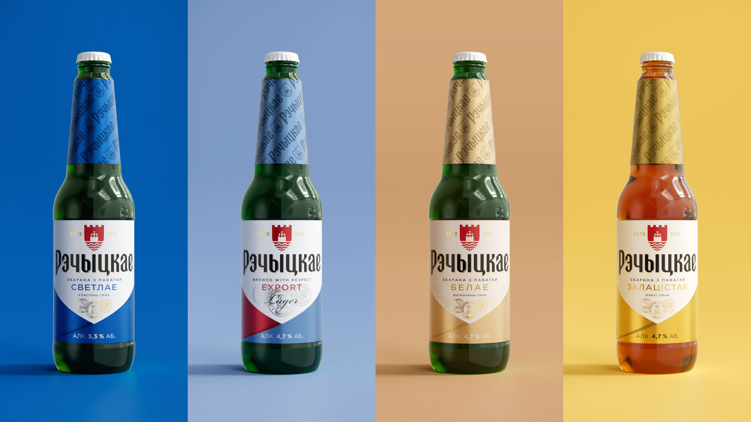
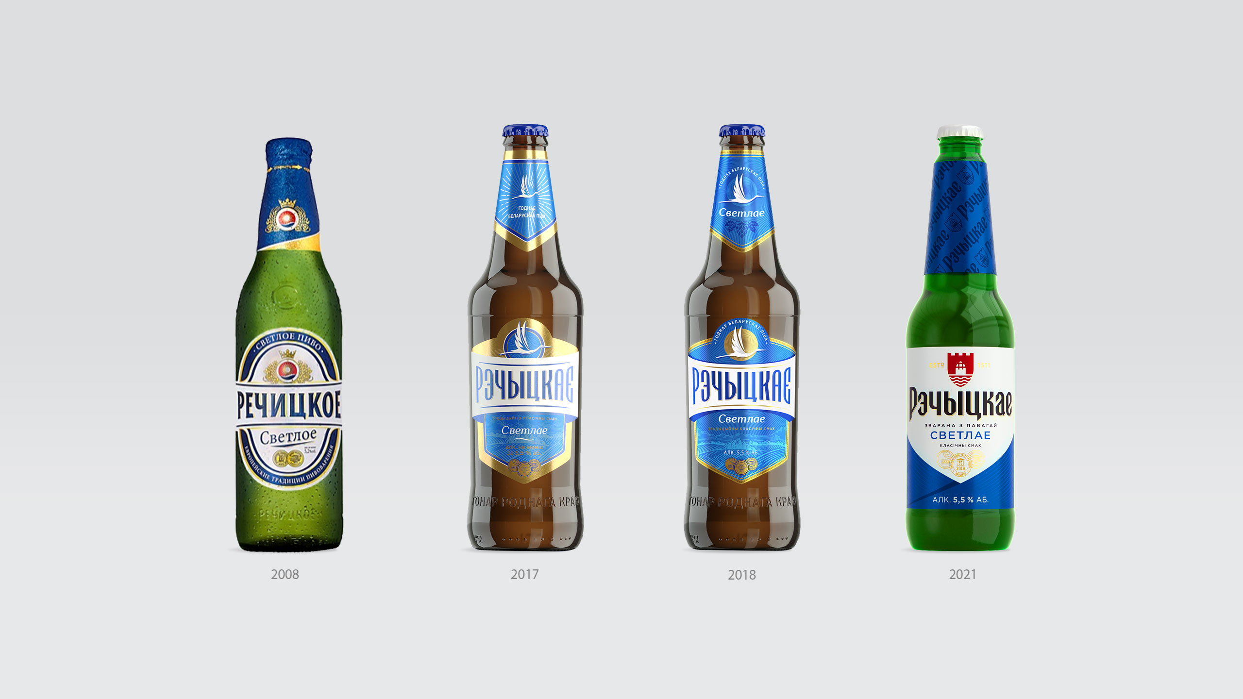
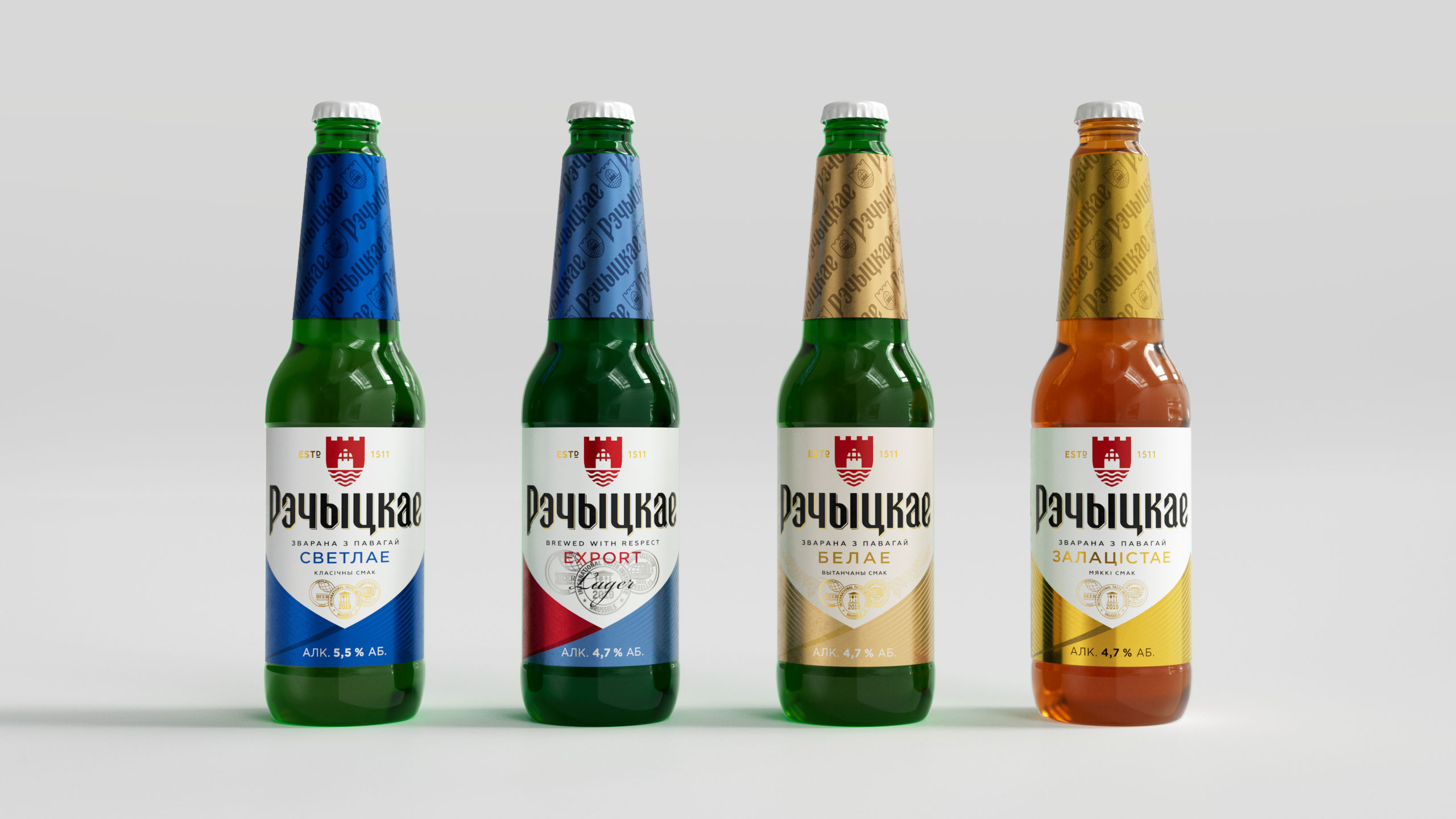
Belarusian consumers express interest in their roots as well as varieties and brands that have history. On the other hand, they put hope in an innovative future. The Bobrujsk Brewery team has made a bet on a modern and more vivid look of the Rechickoe brand. We wanted to preserve the values that are important to people but convey them in a new way. Therefore, it was a total update: a new bottle, label, and identity.
We are happy to have co-created the latest pages of Rechickoe’s visual history. It has evolved from a regional manufacturer to one of the leaders in the national market. For us, the new redesign was a significant challenge. As in a historical reenactment, we wanted to find vital national and brand codes to fit them into the current context.
“Brewed with respect” is the key brand value. Rechytsa is a small town with an esteemed ancient history. The first mentions of it appeared in the 13th century. We established echoes of the Middle Ages and allusions to knightly armour, symbolising power and dignity, in the letter character for the logo in the Gothic style.
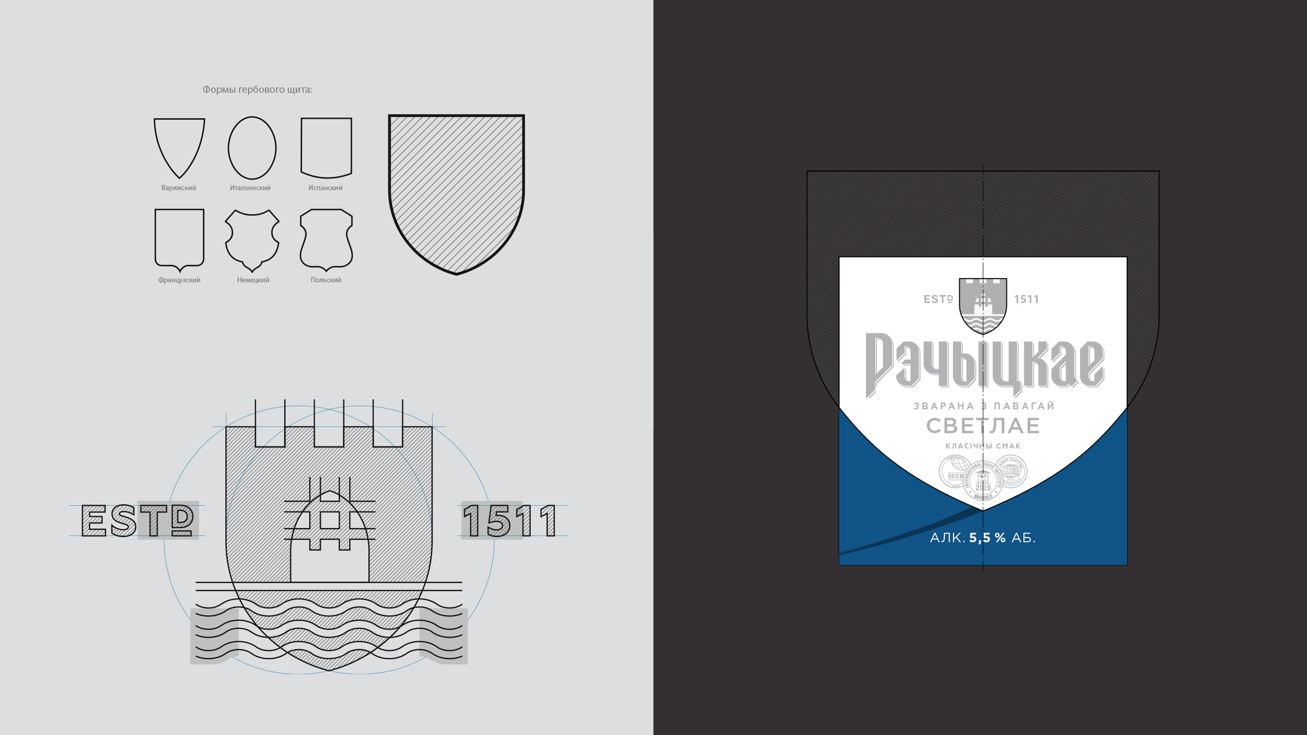
Cross-cutting Visual Aesthetics is based on the frame of the shield-shaped coat of arms. In 1511, Rechytsa was one of the first Belarusian towns that received the Magdeburg rights. We wanted to create a logo that would represent the Rechickoe brand name through the symbol of the river. Therefore, we picked a stylized guard tower of a medieval fortress with a gate located on the banks of the Dnieper for our logo. The desire for freedom and self-government has long been inherent in these lands.
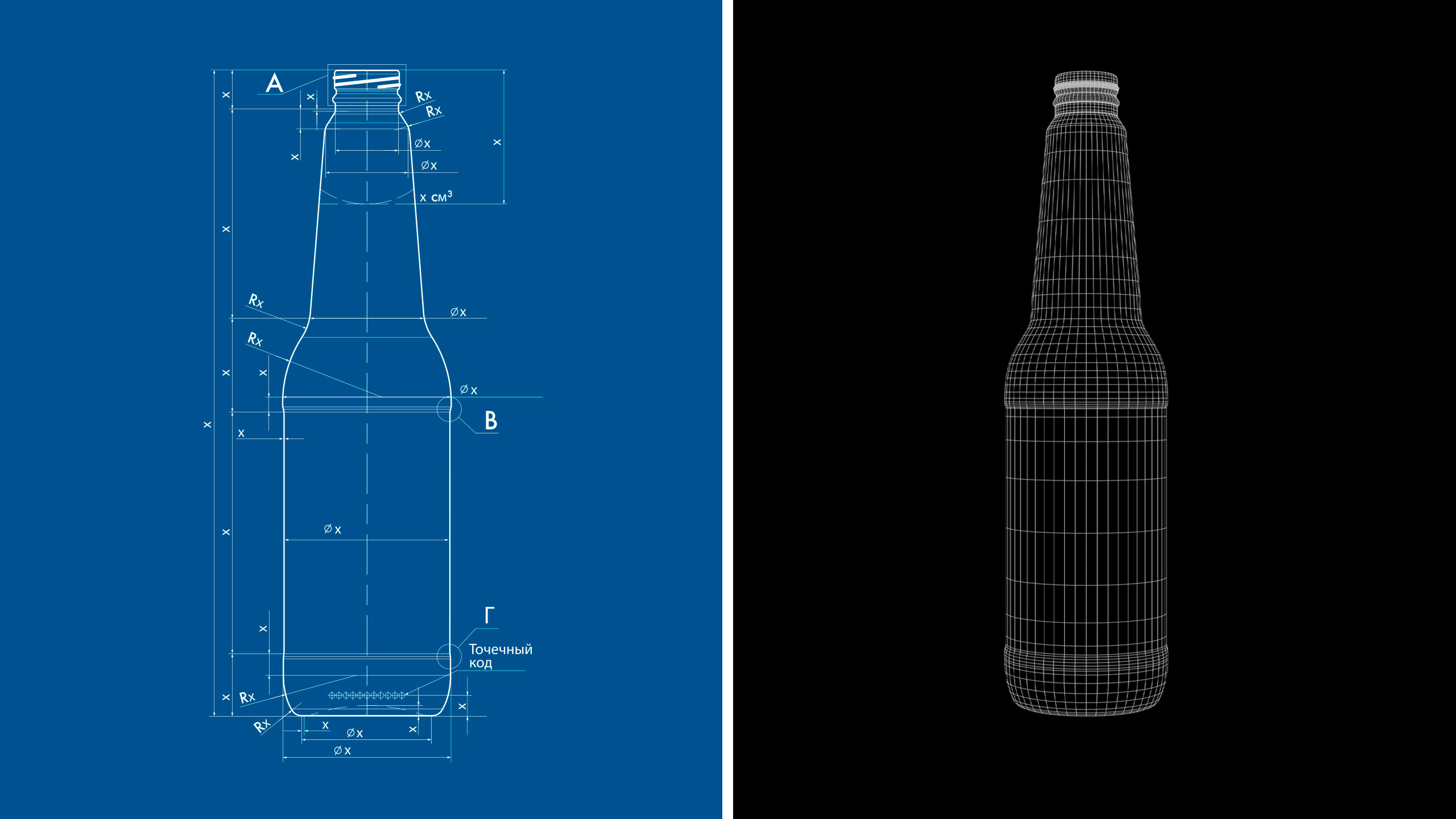
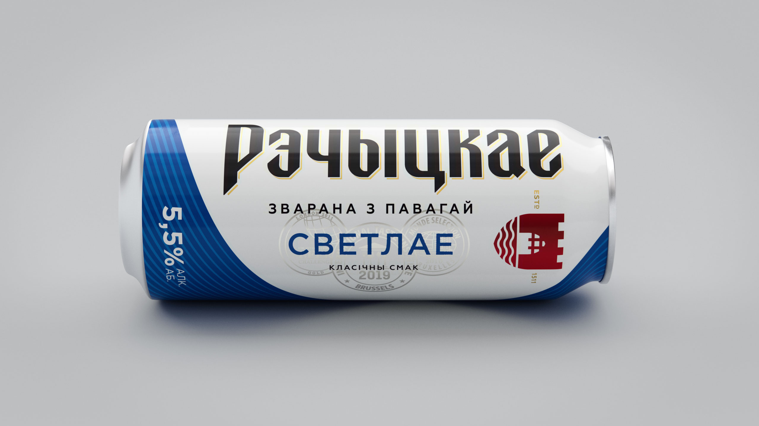
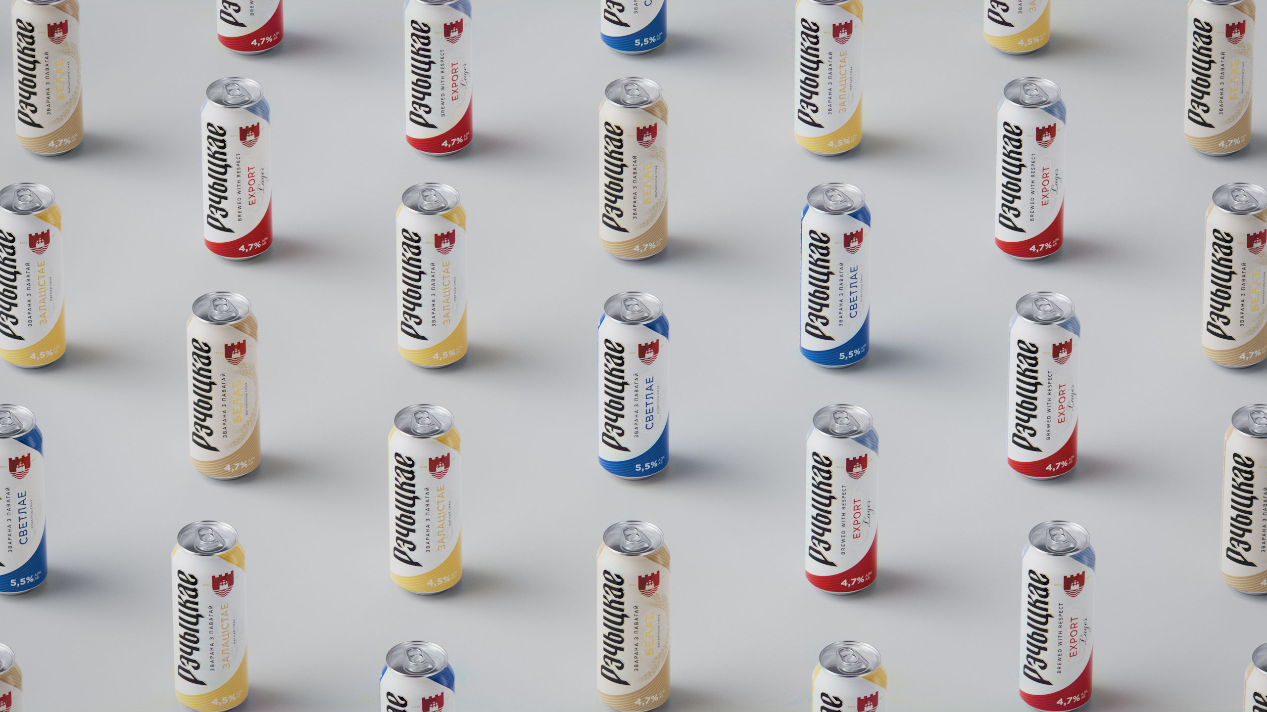
The bottle shapewas designed specifically for the renewed brand. Up-to-date in essence, with a tall and thick neck, it offers a minimalist style with the claim to perfect simplicity and power. Its modernity emphasizes the historicity of the label, which gives the brand a relevant look. The core aspect of it is an allusion to the shape of a shield: from the concise logo to the visual plane of the brand zone. Also, we kept the color-coding of flavors of the previous line.
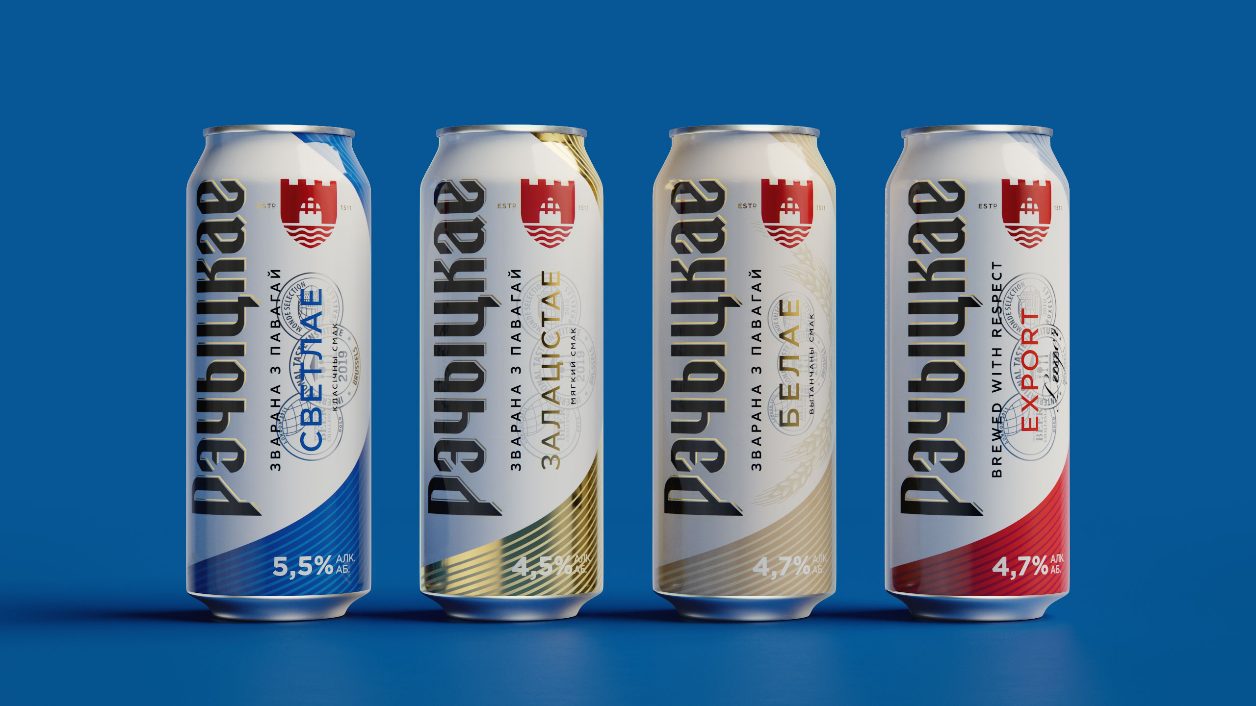
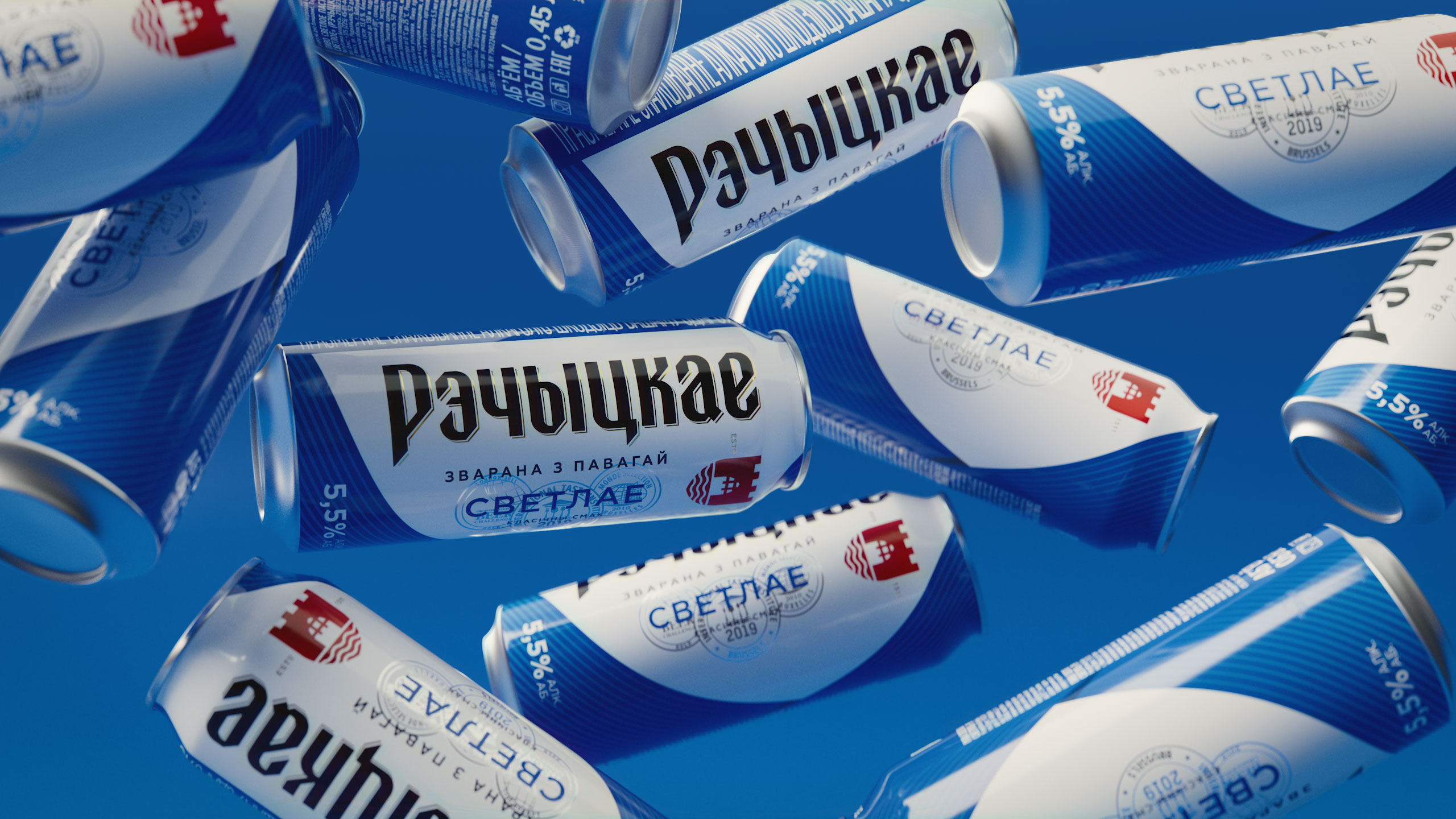
Can—it’s close-up of the label we redefined, inverted, and zoomed in. We built the composition using familiar details, but it looks unique, dynamic, and modern due to asymmetry and a large logo. The design unfolds simultaneously in two directions— vertical and horizontal—and harmoniously unites all elements within neoclassical imagery.
CREDIT
- Agency/Creative: Dozen Agency
- Article Title: Belarusian Rechickoe Beer Bottle and Brand Design by Dozen Agency
- Organisation/Entity: Agency
- Project Type: Packaging
- Project Status: Published
- Agency/Creative Country: Ukraine
- Agency/Creative City: Kyiv
- Market Region: Europe
- Project Deliverables: Label Design, Logo Design, Packaging Design
- Format: Bottle, Can
- Substrate: Glass Bottle, Metal
- Industry: Food/Beverage
- Keywords: Design, Logo, Label, Beer Design, Beverage, Kyiv, Ukraine, Dozen
-
Credits:
designer: Роман Мельник


