


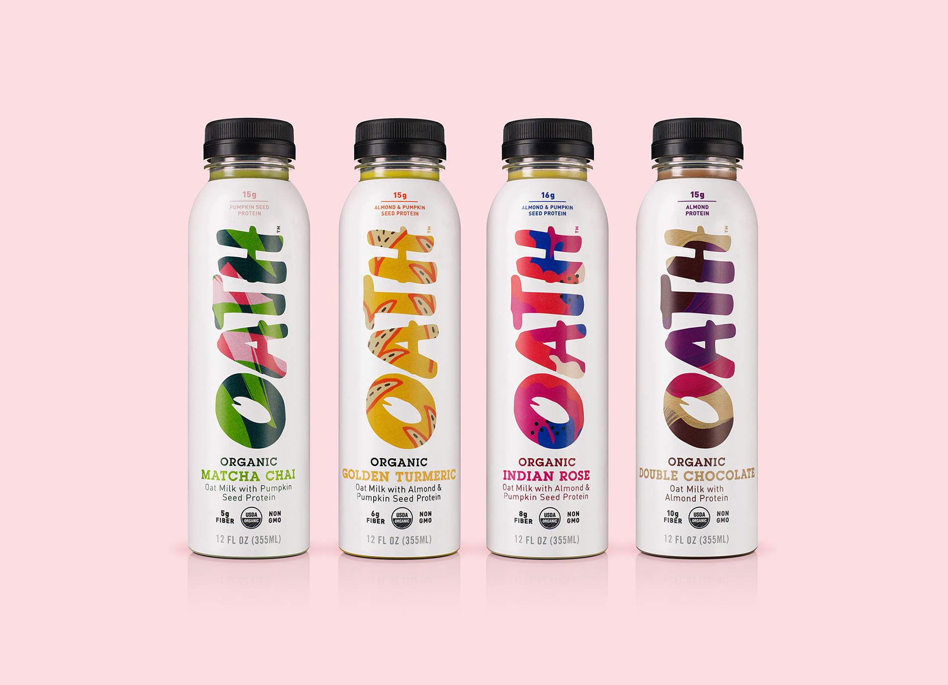
Functional drinks brand OATH has launched in the US with a bold visual identity by London-based B&B studio. The new brand creation has been released as a range of four ready-to-drink flavours, with organic ingredients carefully selected for their health and wellness benefits.
B&B studio has created the brand strategy, naming and visual identity design for OATH, which has been expressed across the bottle design and brand world.
Each 355ml bottle contains an organic, vegan oat milk designed to harness the true promise of plants, from protein-rich oats, nuts and seeds to spices and botanicals such as matcha and turmeric, expertly balanced to ensure powerful flavours and functional benefits.
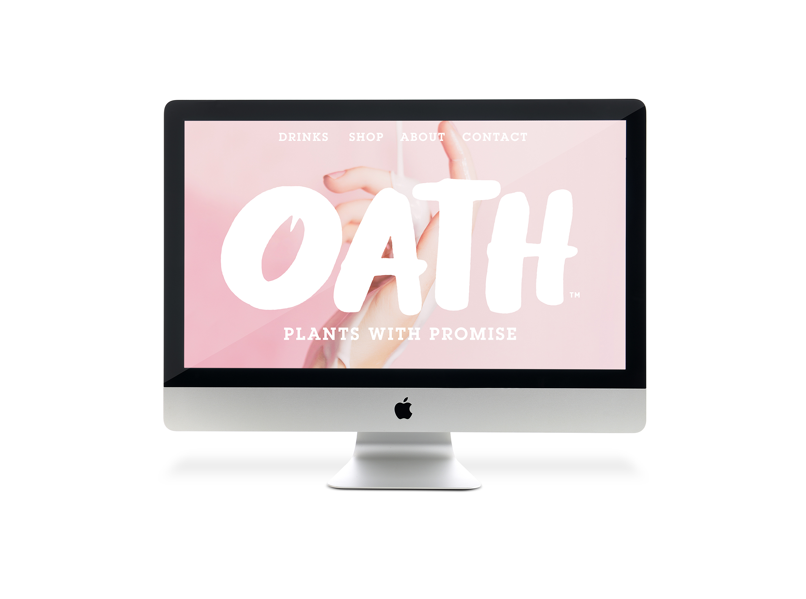
Feed your body. Free your mind.
OATH’s brand positioning is underpinned by the fact that physical and mental health are inextricably linked and plays to the desire for creative self-expression found among its millennial and Gen Z consumers. Encapsulated in the line ‘Feed your body, free your mind’, the brand promises to deliver you the nutrition you need so that your mind is free to play and create.
The name OATH is coupled with the line ‘Plants with promise’ to highlight the many nutritional benefits delivered by each ingredient. It is also a reminder that by pledging a promise to stay healthy through the power of plants, we are also working towards a healthier planet.
Royce Pinkwater, Founder and CEO says: “Modern lifestyles can be draining, and consumers often seek quick fixes for an energy boost. Crafted with organic plant ingredients – and with at least 15g of protein in each bottle – OATH is a delicious, convenient and healthy alternative to sugary snacks and drinks.”
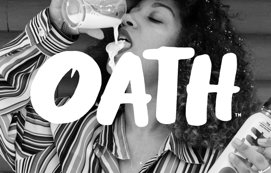
The emotional functional brand
OATH’s brand design goes against the traditional codes of the functional product category, which often focus on a product’s impact on physical health. Instead, OATH’s visual identity reflects the creative freedom that is unleashed through optimum nutrition.
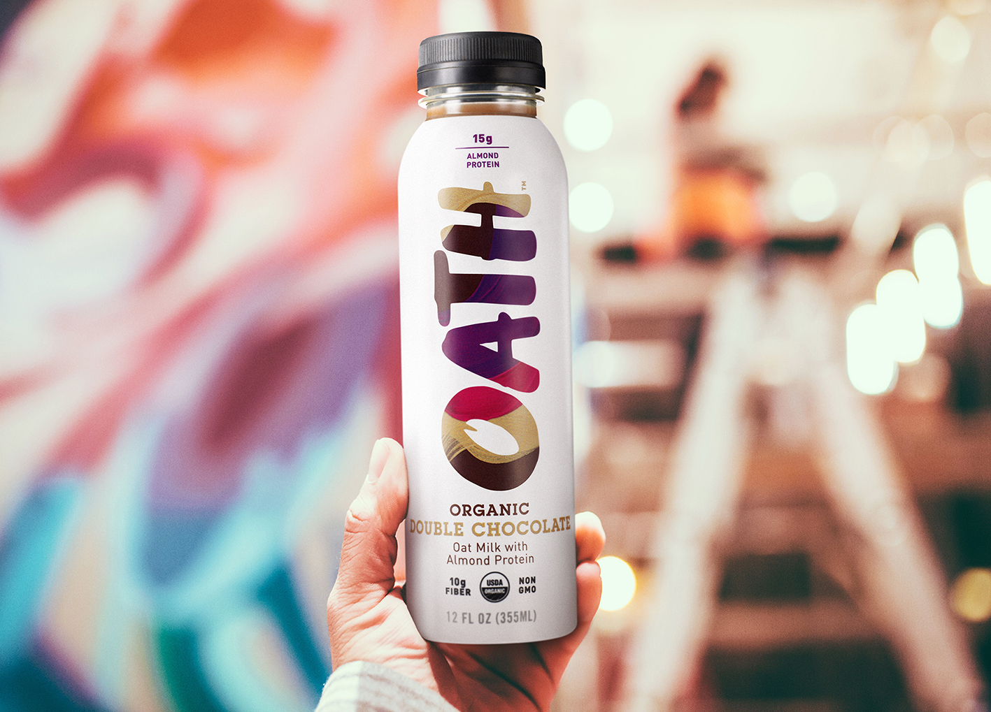
B&B has designed a range of bespoke patterns to be used across all brand touch-points. Each flavour in the range, from Indian Rose to Golden Turmeric and Double Chocolate, is finished with a unique illustrative graphic, illustrated in-house, with colour combinations denoting the taste profile.
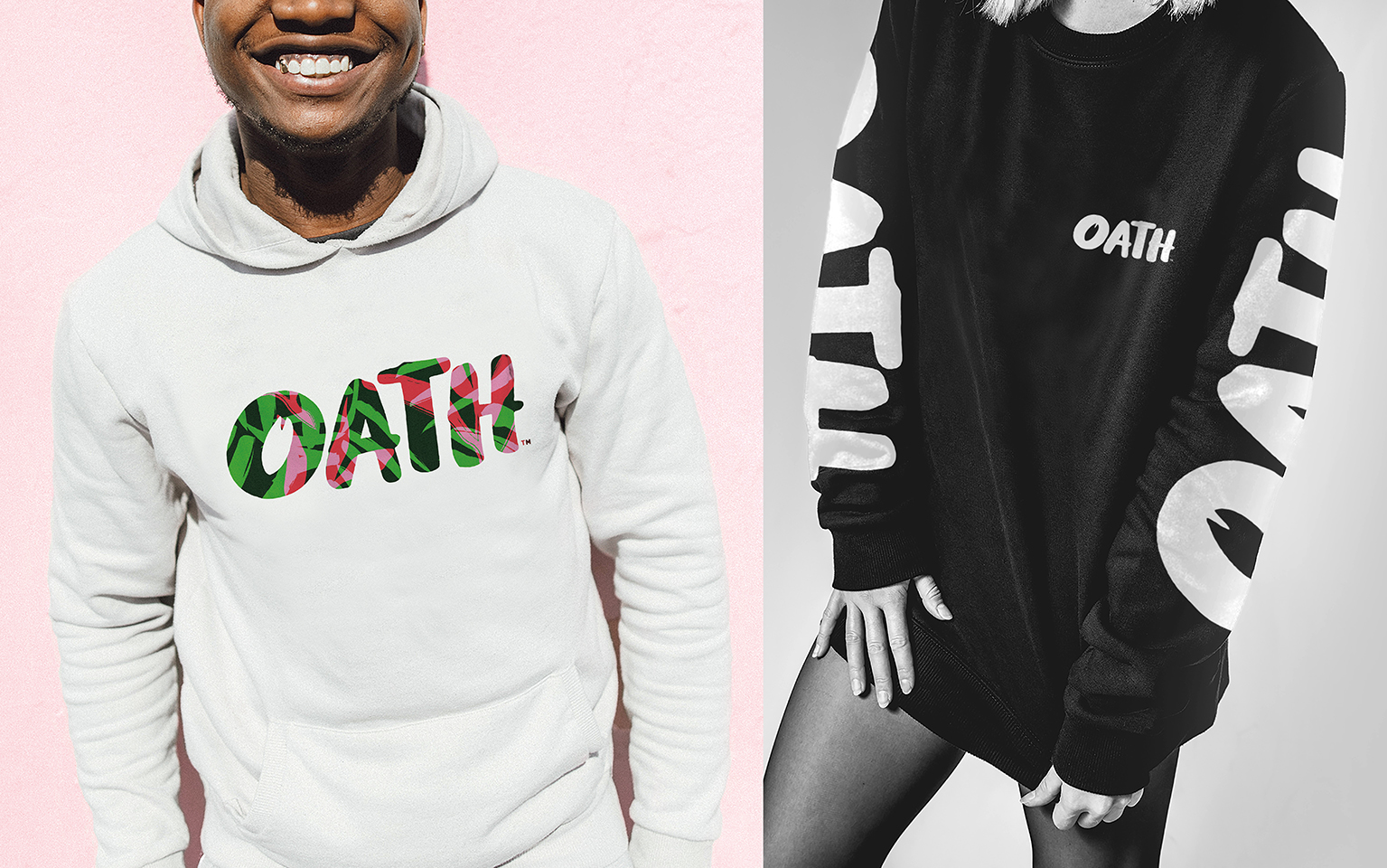
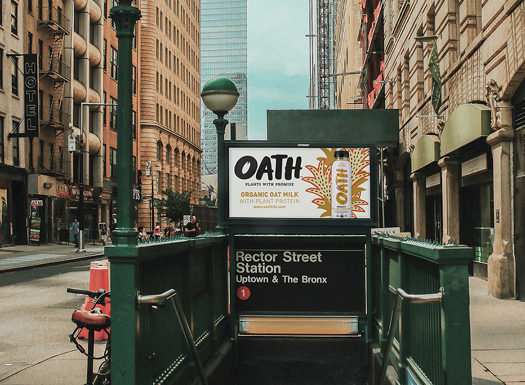
These illustrations are seen on each bottle, encased within the vertical OATH logo which features a graphic of a single oat within the ‘O’. The visual identity comes to life across the complete brand world, reflecting the ‘OATH life’ of empowered mental wellbeing. The bespoke patterns encase delivery vans and give added energy to influencer boxes, stickers, posters and other merchandise.
Shaun Bowen, Co-Founder at B&B studio says: “OATH represents a perfect balance of the functional with the emotional, combining real health benefits with beautiful creativity.
The world of high-protein, functional drinks is dominated by monochrome and stripped back design codes, so we saw an opportunity to introduce a brand identity full of life and colour rather than these traditional codes of efficacy. We have graphically brought to life the vivid connection between body and mind, showing that OATH is about why we need to stay healthy, not just how.”
Royce Pinkwater adds: “OATH has been in production for almost two years, with tasting and testing to get it to the optimum grab-and-go format. The brand design perfectly brings to life the OATH promise, that we stop at nothing to provide a functional beverage that will benefit the body and help empower the mind.”
CREDIT
- Agency/Creative: B&B studio
- Article Title: B&B Studio Blends Emotion and Function in New Brand Creation for OATH
- Organisation/Entity: Agency, Published Commercial Design
- Project Type: Packaging
- Agency/Creative Country: United Kingdom
- Market Region: North America
- Project Deliverables: Brand Architecture, Brand Creation, Brand Design, Brand Identity, Brand Naming, Brand Strategy, Brand World, Branding, Graphic Design, Illustration, Packaging Design, Product Naming, Research, Tone of Voice
- Format: Bottle
- Substrate: Plastic


