


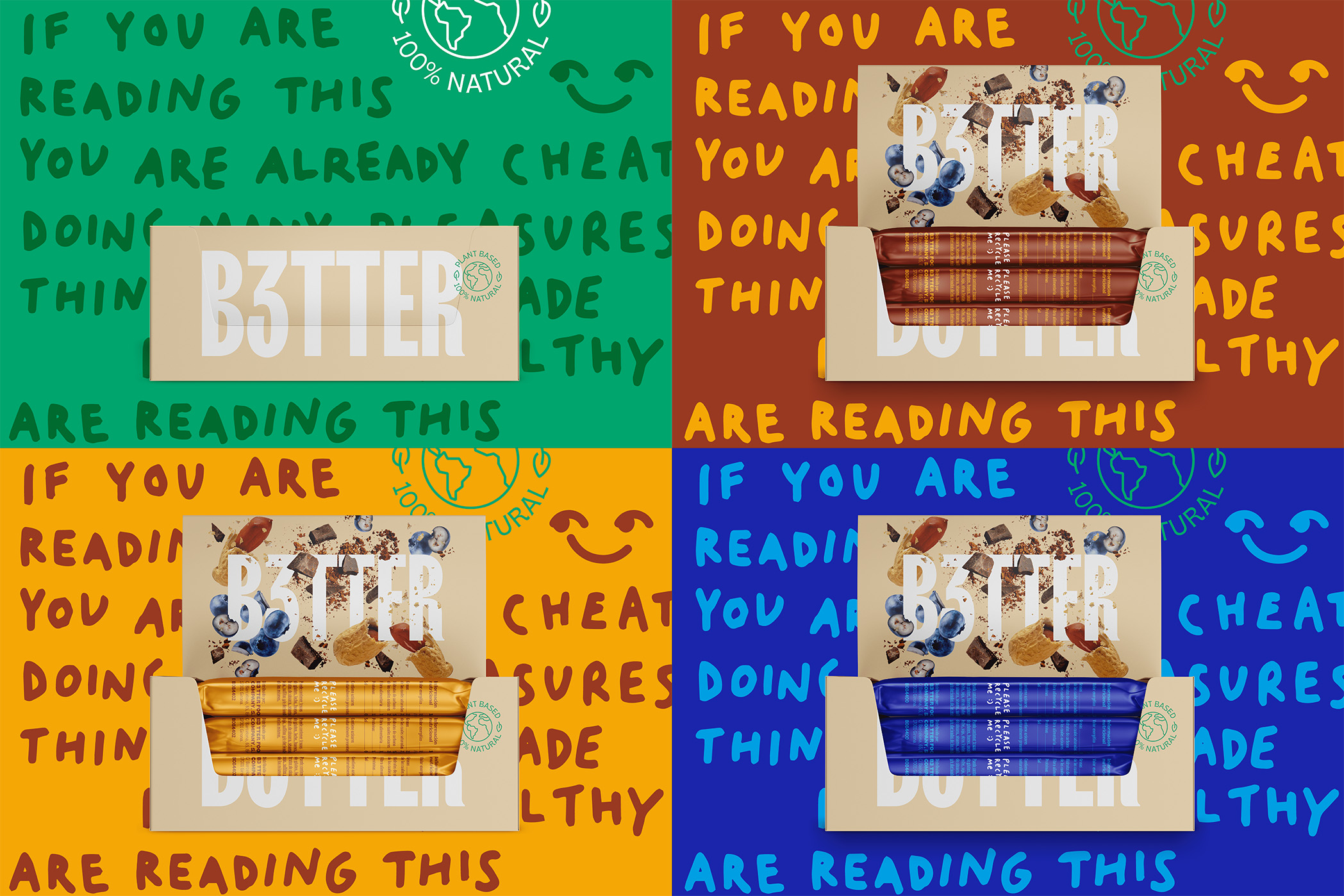
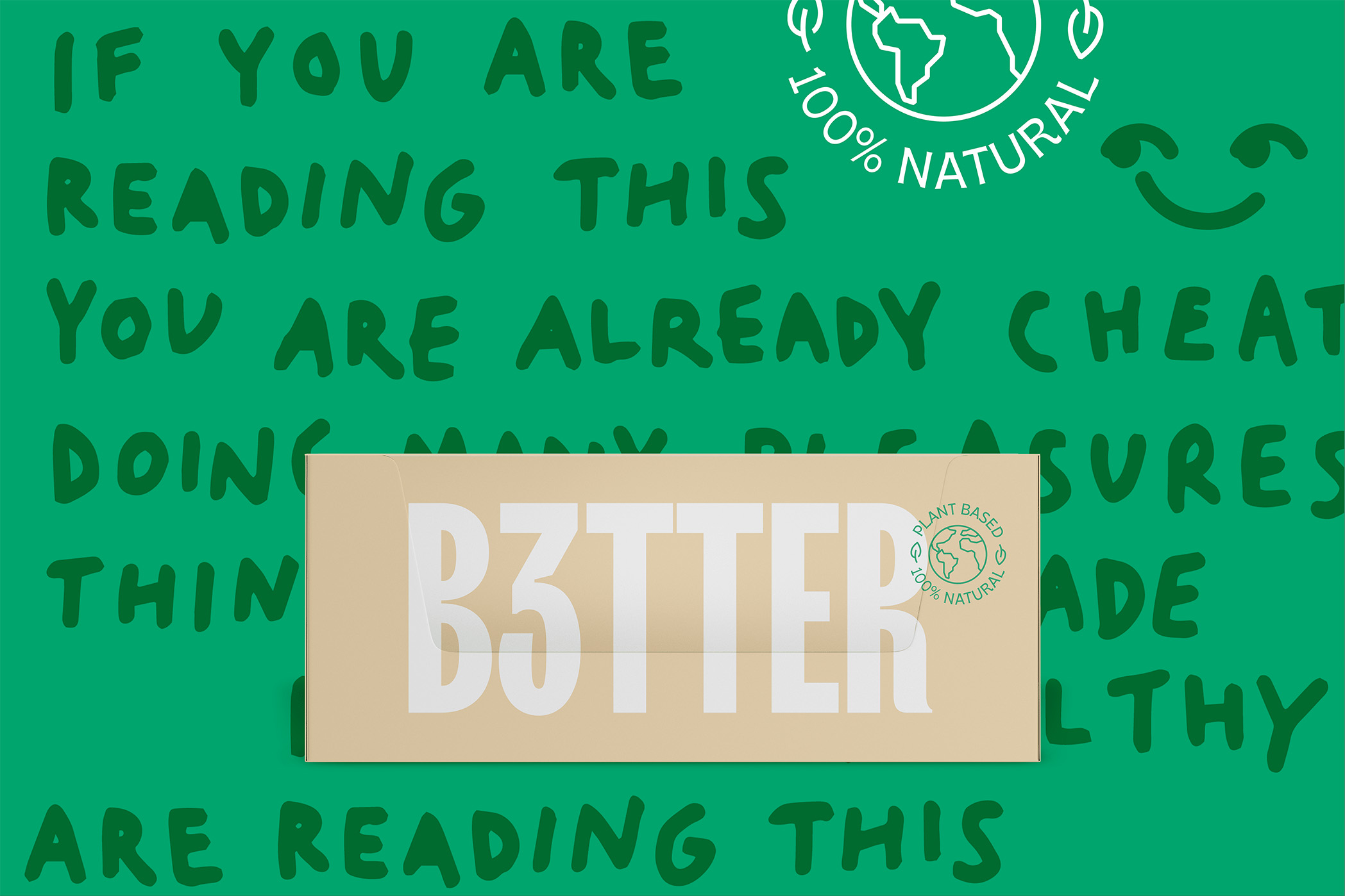
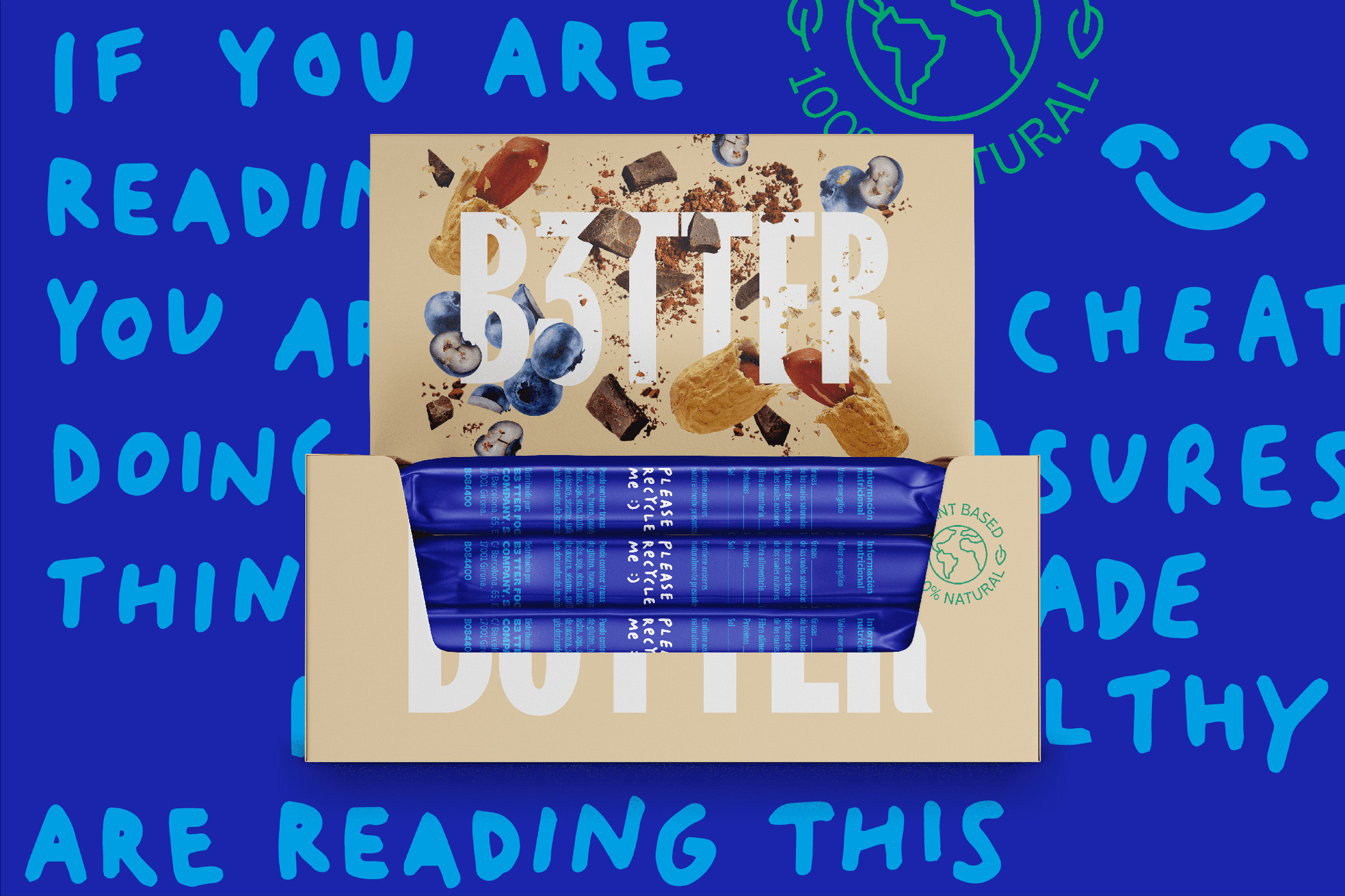
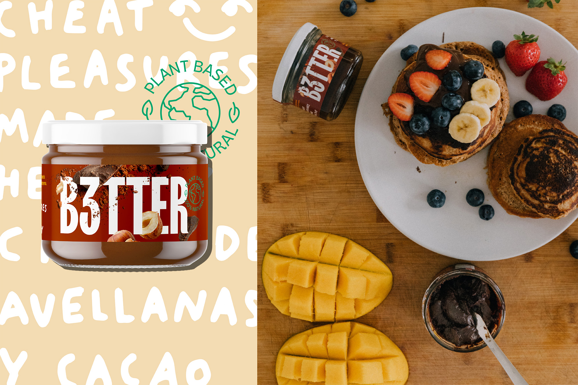
Nowadays, we live in a context where people look for alternatives that helps them to live a healthier and more conscious life. Here’s where B3TTER come to action, a food brand that was born as a healthy alternative to conventional snacks. They have just launched their first line of bars and a cocoa cream 100% natural and sugar-free, ensuring its original taste.
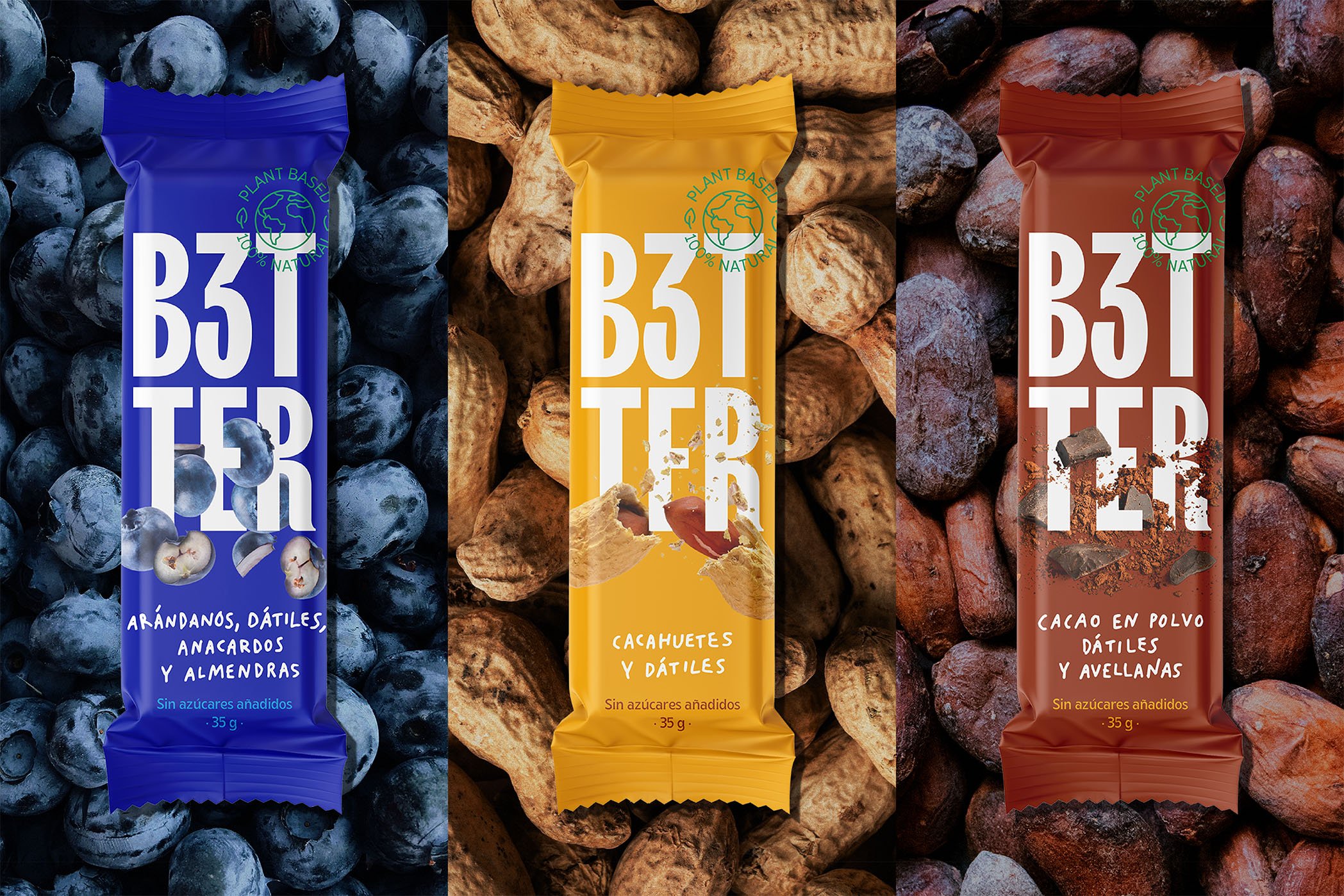
Our challenge was to shape a new brand and packaging identity that would convey its authentic flavour and its contemporary personality. Moreover, this new brand must connect with young adults in a close and bold way. Hence, our design team worked with the brand to shape an outstanding identity. For the logotype, we used condensed typography that allows us to build a strong wordmark for a small package.
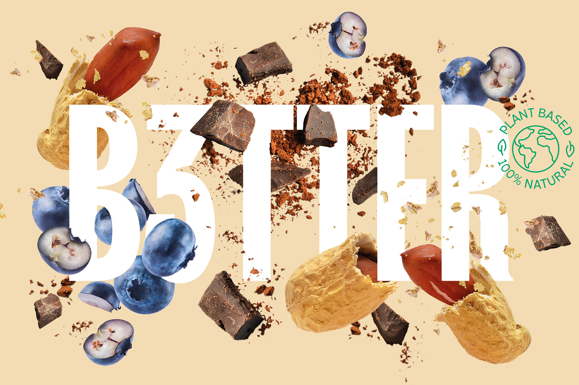
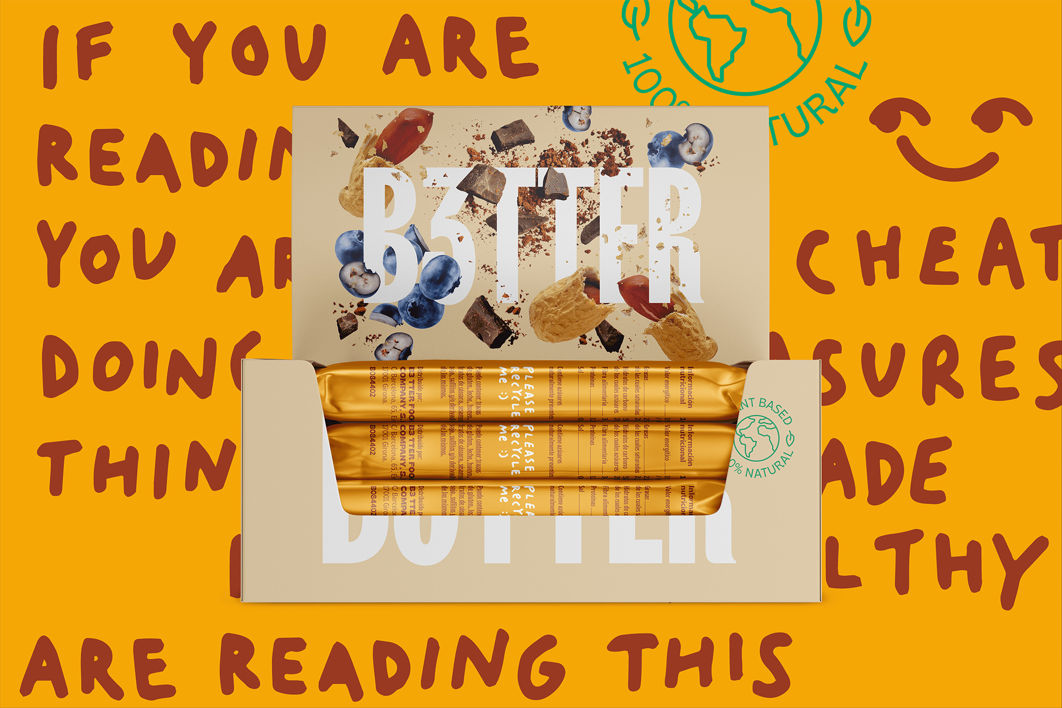
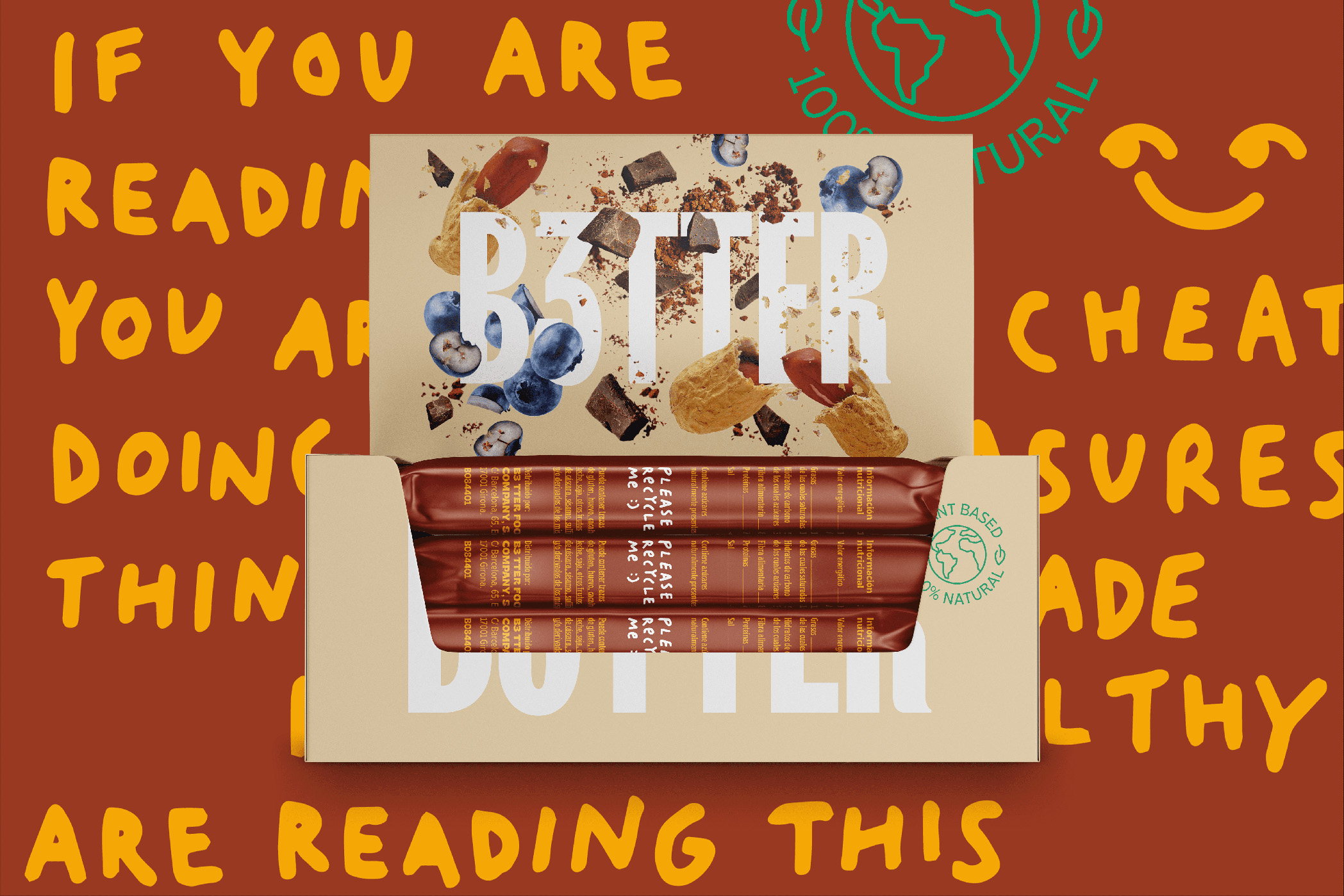
Its enlarged proportions, the accentuated curviness of the letterforms, or the exaggerated ink traps of some of the characters, works towards the creation of a disruptive approach, and a proprietary and prominent identity. The package design needed to convey a sensation of crunchiness and naturality, we achieved this feat by generating a burst of ingredients emerging from B3TTERS logotype, enhancing the irreverent character of the brand and the packaging appeal. This proposal accentuates the flavour of the product by using a range of powerful and bright colours that also divide the product range. In addition to the colour segmentation, we created custom lettering for each product, giving a proprietary and direct style to help consumers identify every product range.
This combination of elements lands in a relevant and disruptive brand that reflect its fresh essence and reach its audience. A visual proposal that won’t leave anyone indifferent.

CREDIT
- Agency/Creative: Morillas Branding
- Article Title: B3TTER Breaking the Healthy Snacks Category
- Organisation/Entity: Agency
- Project Type: Packaging
- Project Status: Published
- Agency/Creative Country: Spain
- Agency/Creative City: Morillas Branding
- Market Region: Europe
- Project Deliverables: Brand Identity, Graphic Design, Packaging Design
- Format: Flow-Pack, Jar
- Substrate: Glass, Plastic
- Industry: Food/Beverage
- Keywords: Snack, Healthy, Superfood, Cereal Bar, Spreadable, Plant-based, Natural
-
Credits:
Agency: Morillas Branding
Lettering Designer: Marion Cardona


