


Following the retirement of the Dundurn founder after forty-five years, the press has new owners and a new direction for their literary list. They have been signalling this change through the media for a year now and it was time for the brand identity to catch up.
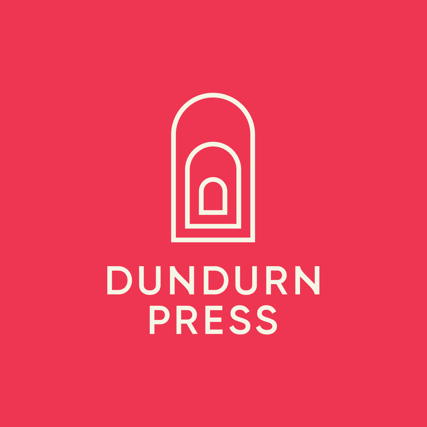
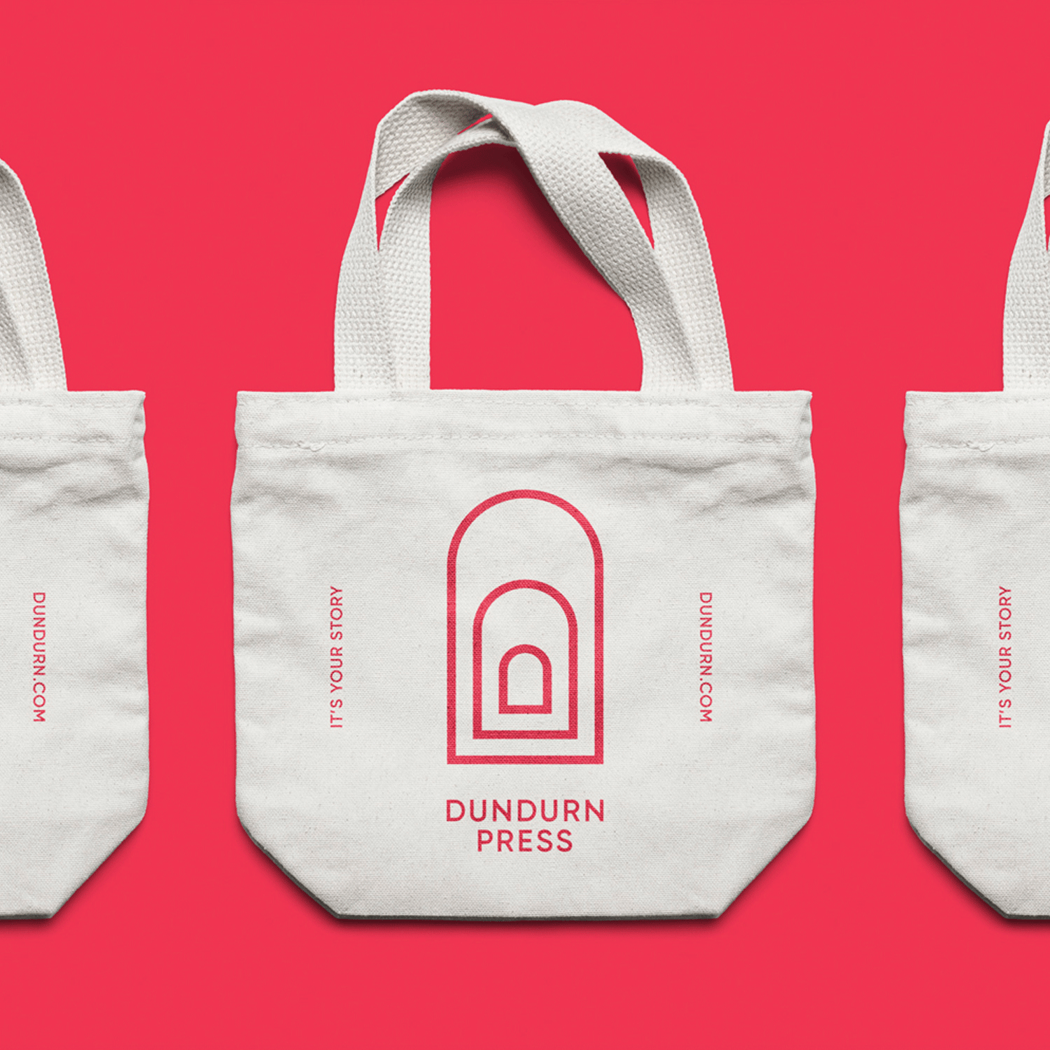
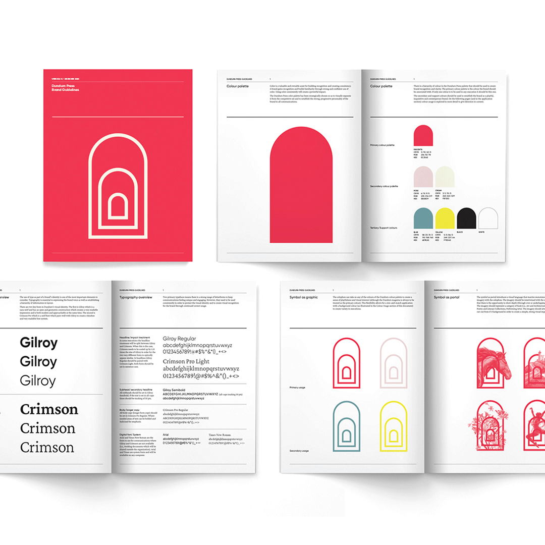
The Dundurn colophon, a signature element of the visual identity, was inspired by the architecture of the Folly from the grounds of the Dundurn Castle in Hamilton, Ontario. Using a repeated key architectural feature the result is a portal. This window or keyhole creates a sense of dimension and escapism for the brand that mirrors the mental escape that people enjoy when connecting with a great book. The colophon is the cornerstone of the Dundurn brand and has great flexibility of use in order to be an engaging and memorable element of the visual identity.
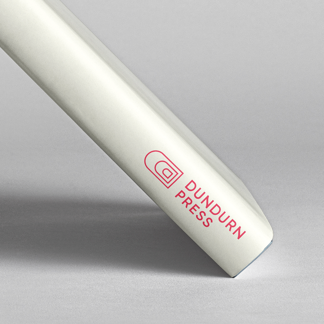
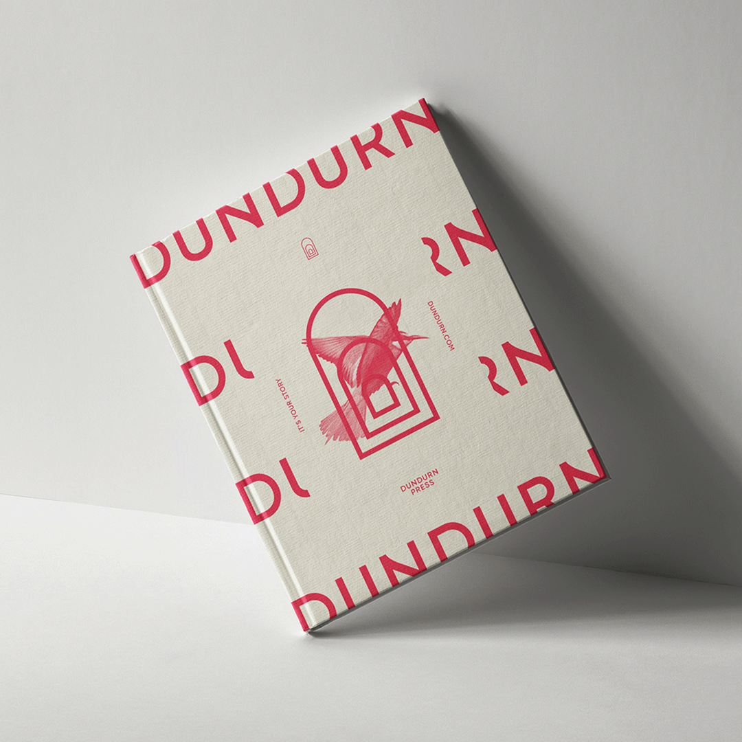
One of the most important applications for the Dundurn logo was a book spine. Whether the colophon is just the symbol or the full lock-up it needed to have clarity and impact. We created a number of logo variations to ensure Dundurn had an arsenal of options at their disposal. And the great thing about a book spine is that it highlights the layered arch if the book is placed upright and it shows off the layered D monogram when laid flat. #ambidextrouslogo
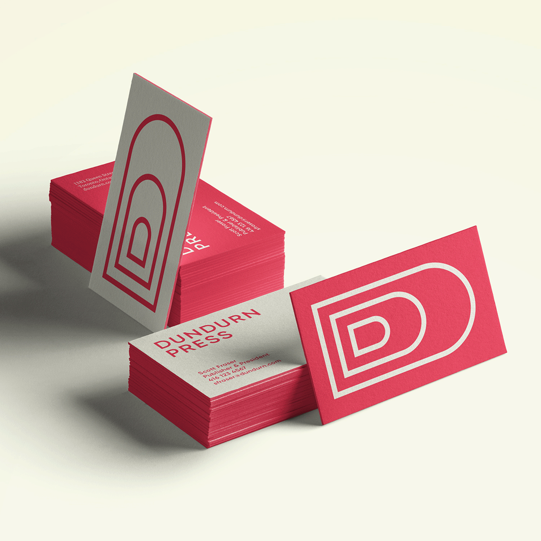
For the Dundurn business cards we wanted to continue to play with the ambidextrous nature of the symbol. By having two different type orientations on the back side of the card it created a sense of playfulness and allowed the recipient to view the symbol as both the arch and the D monogram.
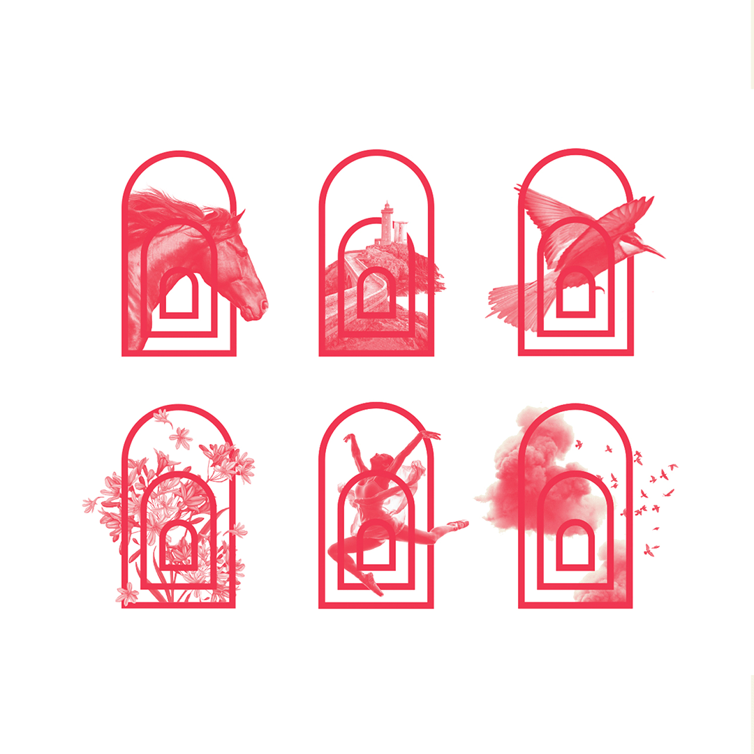
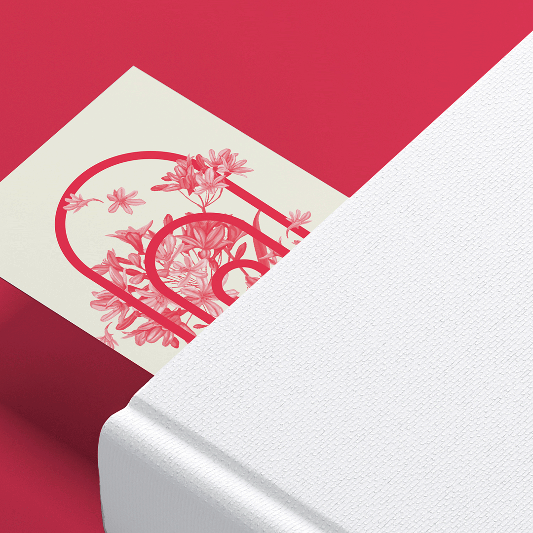
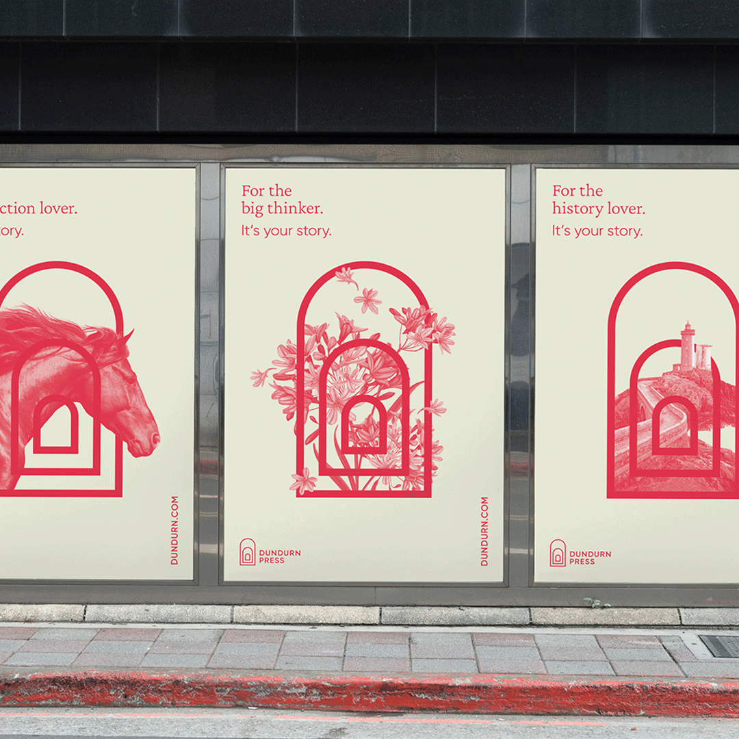
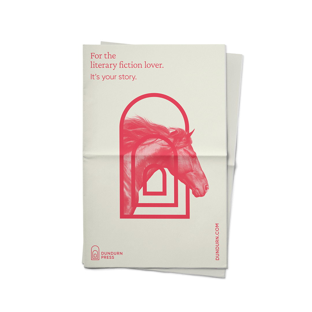
The layered window arches in the Dundurn symbol were meant to create a visual portal evoking a sense of dimension and escapism for the brand that mirrors the mental escape that people enjoy when connecting with a great book. Here’s where things get interesting: in application the outer arch can open up into a portal that displays photography which creates a visual connection to specific books or to Dundurn’s published categories.
The photographic visual language is extended even further with monochromatic cut-out images which are intertwined into the architecture of the symbol to create unique visual messaging. This allows for an amplification of the brand and for some playful and engaging storytelling which can be inspired by book categories (i.e. Poetry, Mystery, Nature) or by specific book titles.
CREDIT
- Agency/Creative: Awake Studio
- Article Title: Awake Studio Create New Visual Identity for Dundurn Press
- Organisation/Entity: Agency, Published Commercial Design
- Project Type: Identity
- Agency/Creative Country: Canada
- Market Region: North America
- Project Deliverables: Brand Architecture, Brand Creation, Brand Guidelines, Brand Identity, Brand Redesign, Brand Refinement, Brand Rejuvenation, Branding, Graphic Design, Identity System, Rebranding
- Industry: Education
- Keywords: Publishing, publisher, book, books, Toronto, design, branding, castle, history, rejuvenation, visual identity, book press, change, colophon, symbol, logo, palette, magenta


